Are you struggling to grow your email list and want to engage your website visitors more effectively? When you add email popups to your website, you can turn casual browsers into loyal subscribers. With the right strategies, you can use email list popups to grow your list, promote your business, and boost your revenue.
At OptinMonster, we’ve helped thousands of businesses master the art of lead generation. From startups to industry leaders, our clients have seen incredible results, like growing their email lists by 900%.
In this guide, I’ll share the best email popup examples and proven best practices to help you maximize your results. Whether you’re new to email popups or looking for fresh inspiration, you’re in the right place.
What Is an Email Popup?
An email popup is a type of website feature that displays a small window or dialog box to visitors, usually to capture their email addresses.
These popups can appear during a visitor’s interaction with a website, such as upon entry, after spending a certain amount of time on the site, or when the visitor is about to leave the page (known as exit-intent popups).
The primary purposes of email popups include:
- Email List Building: They are a popular tool for growing a website’s email subscriber list. By encouraging visitors to subscribe, site owners can build a database of potential customers or interested readers.
- Marketing and Promotions: Email popups often offer incentives like discounts, free ebooks, or access to exclusive content in exchange for the visitor’s email address. These lead magnets are an effective way to boost marketing efforts.
- User Engagement: They can promote specific content, events, or announcements to engage visitors and encourage them to interact more with the site.
- Feedback Collection: Some popups are designed to gather feedback from visitors, helping website owners improve their site or understand their audience better.
- Customization and Targeting: Modern email popups can be highly customized in terms of design, content, and timing. They can also be targeted to specific segments of a website’s audience based on their behavior or other criteria.
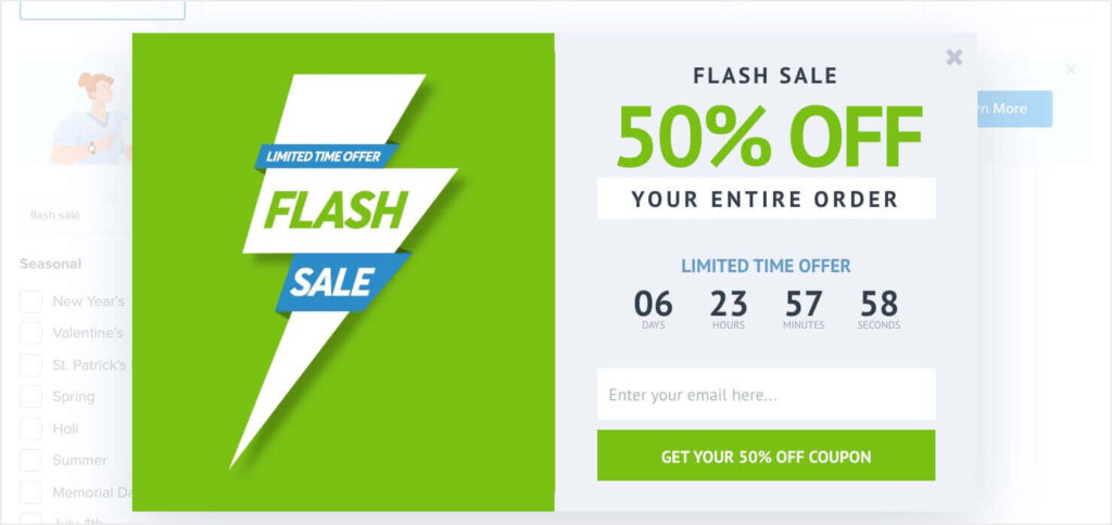
OptinMonster has 700+ premade templates, and over 400 of them focus on growing your email list. For example, here’s an email popup template for promoting a flash sale:
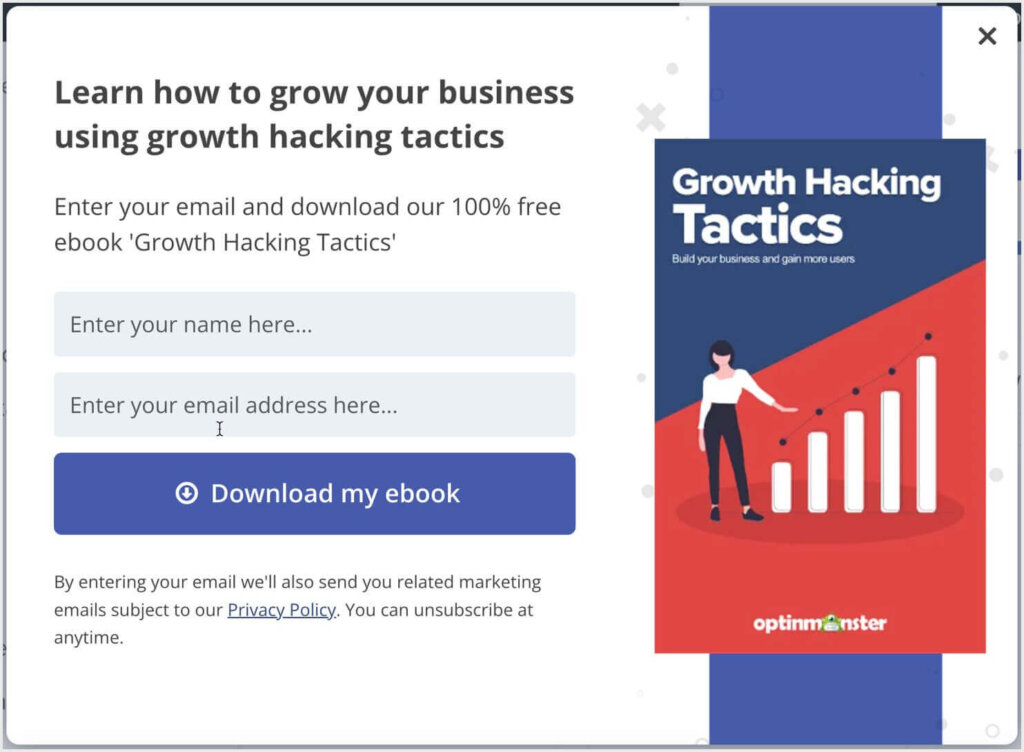
And here’s a template for offering an ebook as a lead magnet:
No matter what strategies you choose for getting more email subscribers, OptinMonster is the best tool for creating and targeting your email popups.
23 Proven Email Popup Examples
1. Storyly’s Content-Gating Email Popup
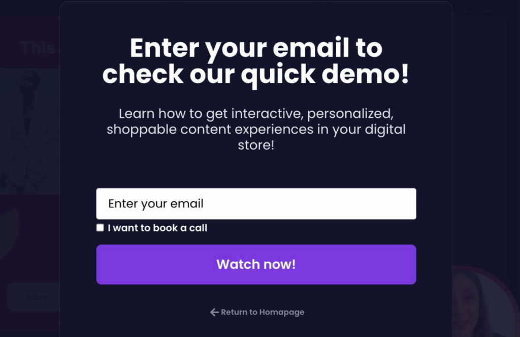
This simple email list popup is from Storyly, a content platform that lets eCommerce businesses create full-screen, shoppable content experiences. Storyly uses this email popup to lock access to their quick demo video. Visitors have to enter their email if they want to watch a brief video overview of how Storyly works.
With popups like this one, Storyly grew their email list by 45%!
2. Crossrope‘s Coupon Popup
Crossrope is a fitness company that used this effective email popup:
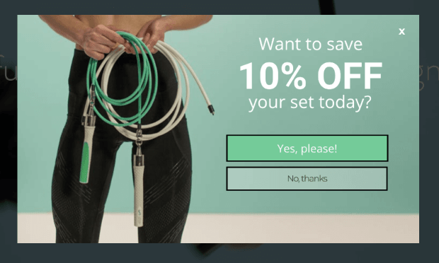
They used OptinMonster’s Yes/No View to engage users with a simple yes/no question. After visitors clicked “Yes,” The popup asked for their email address in exchange for the 10% off coupon code.
This specific email list popup converted 7.65% of abandoning visitors, and it helped Crossrope explode their list by over 900%.
3. Adam Enfroy‘ s Free Course Popup
Adam Enfroy is an entrepreneur and professional blogger. He used OptinMonster to add over 11,000 newsletter subscribers to his list in just 1 year!
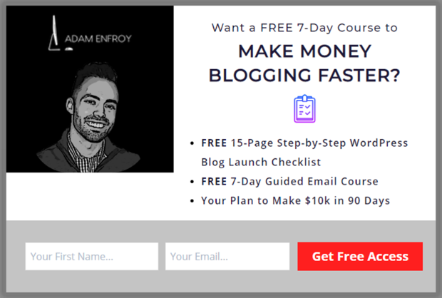
He used an OptinMonster popup to offer access to a free course in exchange for a newsletter signup. Using this popup and others like it, he grew his list to over 500,000 newsletter readers.
OptinMonster helped him make $812,718 in 1 year from his online blog and mailing list.
4. Snack Nation‘s Exit-Intent® Free Gift Popup
Snack Nation is a subscription service that delivers healthy snacks to your home or office. They used OptinMonster’s Exit-Intent® technology to show users this popup when they tried to leave their site:
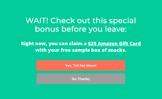
Like the Crossrope example above, this popup uses a 2-step optin which poses a simple Yes/No question to the audience. When readers click Yes, they’ll likely finish the signup process. In this case, that means entering their email address to get their free sample box and bonus Amazon gift card.
This email popup example recovered an astonishing 31.85% of abandoning visitors. Instead of losing those visitors forever, OptinMonster helped SnackNation turn nearly a third of them into highly-engaged leads.
In total, SnackNation added 1,200 subscribers to their list every week using OptinMonster.
5. Shotkit’s Free Resource Email Popup
Shotkit is a website for professional and amateur photographers who want to get the highest-quality gear. Here’s one of the email popup examples they used to get more leads. First, they asked visitors browsing specific pages whether they’re wedding photographers:
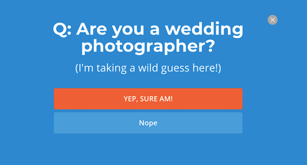
For visitors who selected Yes, Shotkit offered them a download of free wedding presets in exchange for an email address:
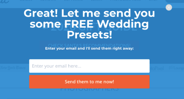
They offered a valuable resource that was precisely targeted to their target audience. The result? Shotkit now adds over 40 new leads to their list every single day.
6. Human Food Bar‘s Discount Offer Popup
Human Food Bar is a niche website that focuses on nutrition and energy bars. Here’s the lightbox popup they used to grow their email address:
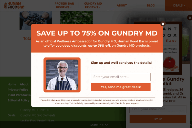
This discount campaign saw incredible results. Now Human Food Bar adds over 1800+ new emails to their list every month. Plus, they saw average sales shoot to $17,000 and a 35% increase in retention rate.
Sign up for OptinMonster and start growing your email list and driving more sales!
7. DateID
DateID helps online daters verify their new connection before meeting in person. This adds a layer of protection to online dating and is an incredibly valuable service to the company’s target audience.
To build their email list, DateID offered a free instant background as a lead magnet:
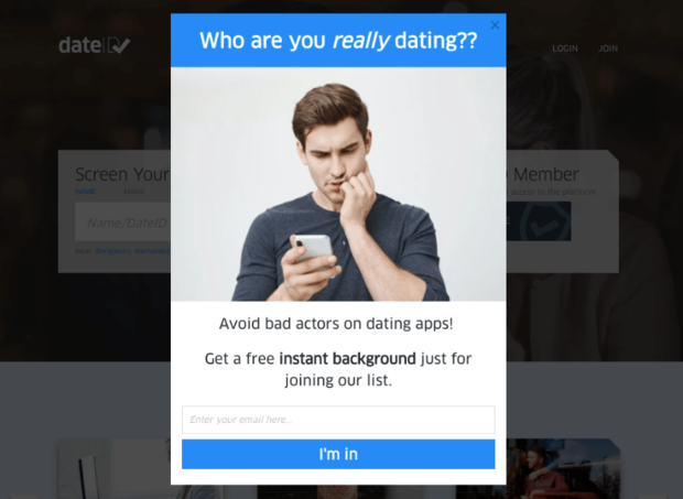
With this email popup example, DateID saw their email list grow by 175%. They also saw over 75% increases in sales and conversions.
8. Woodside Communities
Woodside Communities, a real estate developer, used OptinMonster popups to capture email addresses and phone numbers from potential residents:
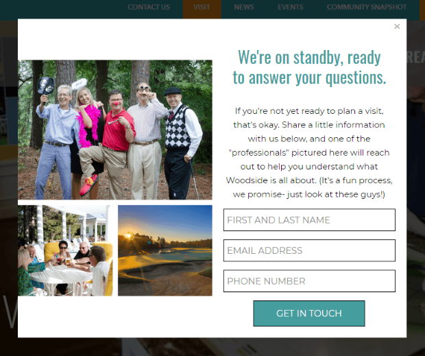
That email signup popup above led to a sale of $294,435 in just two months. It also increased their lead generation by 476%.
9. Medstar
Medstar is a digital marketing agency specializing in private spas and providers of aesthetic medicine.
They started using lightbox popups on their site to book more free consultations for their marketing services:
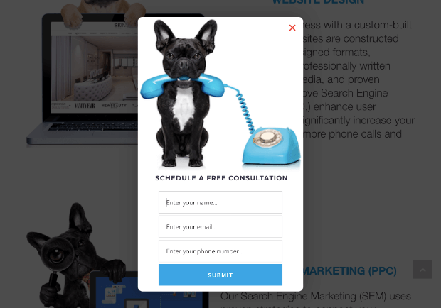
They also used OptinMonster to help their clients capture more leads from their websites:
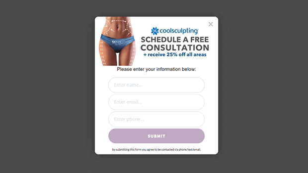
As a result, Medstar saw a 500%+ increase in client conversions and generated millions of dollars with the leads they attracted.
10. Shockbyte‘s Exit Discount Popup
Shockbyte is a game server provider for games like Minecraft, ARK, Survival Evolved, and more. They used OptinMonster to stop abandoning visitors in their tracks with an email popup offering a 50% discount code:
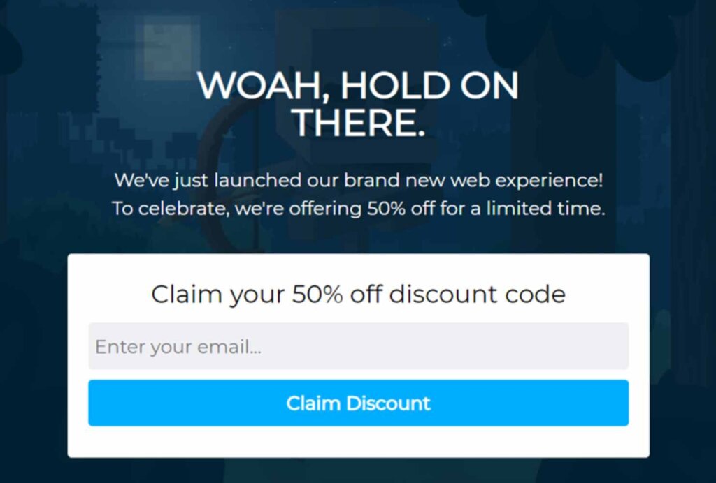
Popups like the example above led to a 52% increase in revenue and a 10x growth of their business.
11. AutoAnything‘s Coupon Popup
AutoAnything is an auto parts store that sells most of its products online. To grow its email list, it used email popups, which allowed it to run more promotions and generate more sales.
They used email popups to offer special deals like this one:
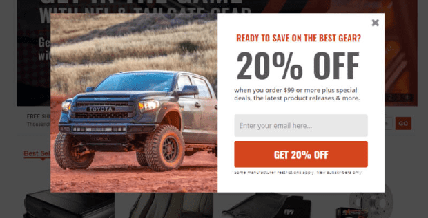
These email subscription popup campaigns helped AutoAnything achieve a 2.5x increase in daily email options. They also led to over 20% growth in their revenue from email marketing.
12. Cosmetic Packaging Now‘s VIP Email List Popup
Cosmetic Packaging Now creates and distributes laboratory-grade cosmetic packaging containers. They created a VIP email list for their customers and leads to get early access to new products, and they promoted this initiative with a popup from OptinMonster.
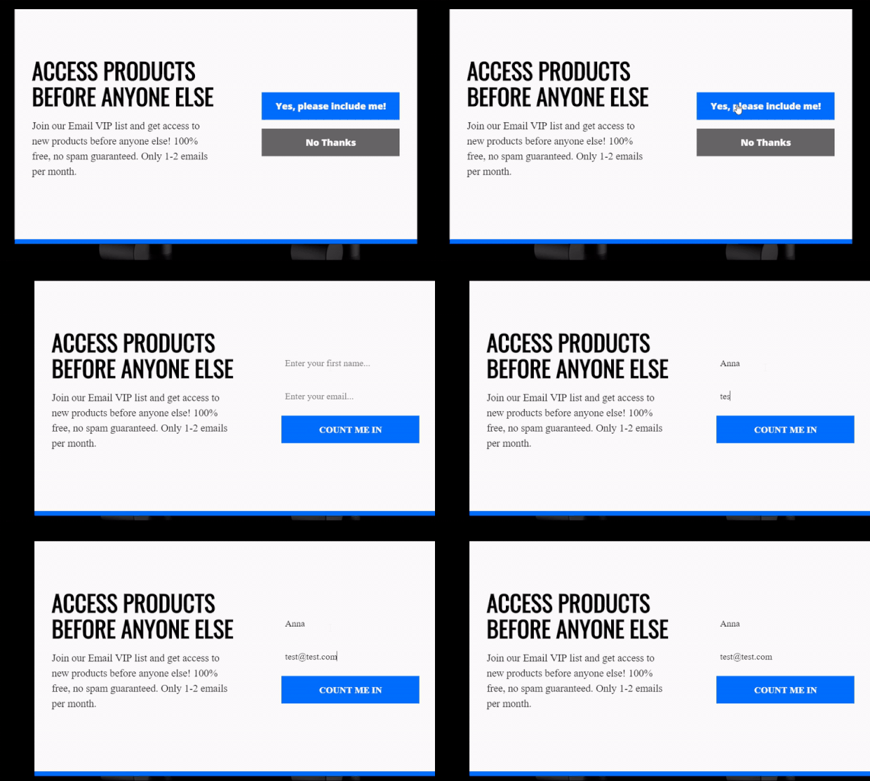
By deploying email popup examples like this one, Cosmetic Packaging Now increased its subscribers by 758% and saw sitewide revenue explode by 2,326.72%.
13. Singularity University‘s Email Reminder Popup
Singularity University trains global leaders and corporations on how to thrive and lead to the most change. They used OptinMonster popups to offer email updates for their live streams:
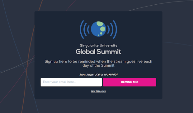
This one email subscription popup brought in 967 new leads. And since it was made with OptinMonster, this kind of newsletter popup can be built in under 5 minutes.
14. Christopher Place‘s Click-Triggered Email Popup
Christopher Place is an upscale B&B/wedding venue that overlooks the Smoky Mountains.
They wanted their email popup to display when website visitors clicked a link. They set this up easily using OptinMonster’s MonsterLink™ feature:
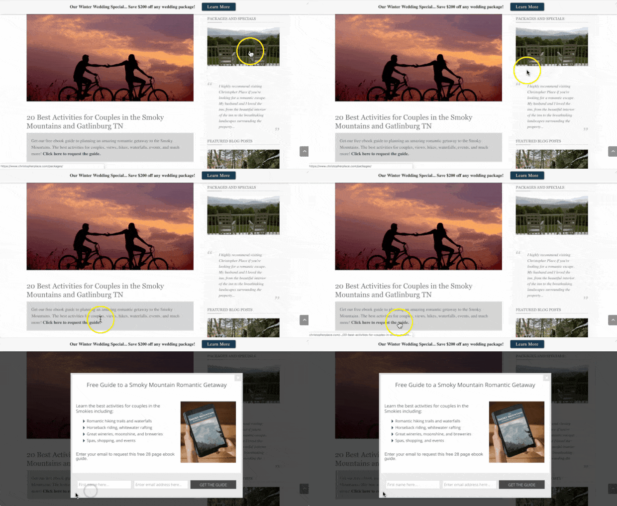
This MonsterLink™ campaign led to a 60% conversion rate (and 6% conversions for more targeted leads into customers).
15. Inbound Marketing‘s Free Report Popup
This Australian-based marketing agency helps its clients boost traffic, leads, and sales. Visitors to their site are looking for marketing help, so they created a lead magnet targeted to that audience:
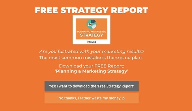
This fullscreen campaign increased conversion by 189% and recovered 3.59% of abandoning visitors.
16. Flywheel‘s Redirecting Email Popup
Flywheel is a managed WordPress hosting company. They use OptinMonster on their blog to increase conversions and boost engagement with their audience.
They’ve used a wide variety of OptinMonster popups across their site. In the free course popup example below, they take a slightly different approach. Users who Click Sign Me Up were redirected to an optin landing page where they could enter their email address to sign up for the free course.
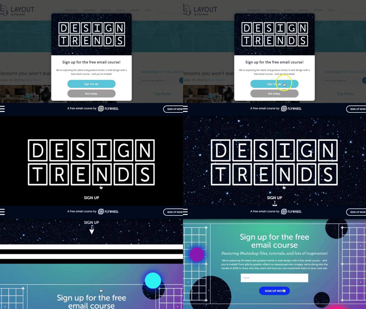
From campaigns like the email popup example above, Flywheel saw 660% MORE impressions than they were getting and converted 4.7% of their targeted users.
17. Lead Guru‘s Case Study Popup
Lead Guru is an online digital agency that helps companies generate new leads and increase sales. They added a button on their website to access a marketing case study, and they used a MonsterLink™ to make that button open an email popup.
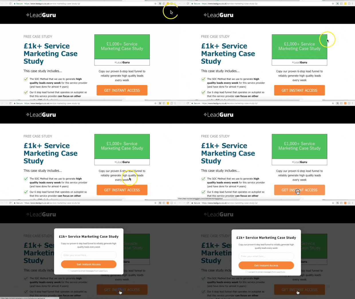
This email popup example converted a whopping 81.8% of visitors who clicked the MonsterLink™.
18. RocketBots‘s Fullscreen Email Popup
RocketBots is an AI platform that allows companies to increase conversions and sales through live chat. This software allows users to manage, respond to, and automate their business’s live chat.
They used a variety of fullscreen OptinMonster campaigns to offer lead magnets and grow their email list:
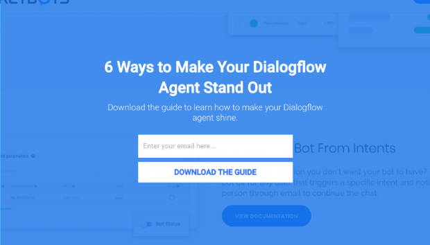
With OptinMonster’s email popups powered by OnSite Retargeting®, they were able to recover 7.33% of their site’s abandoning visitors and convert 2.65% of their website visitors.
That led to an overall list growth of 680%.
19. Cosmetic Capital‘s Floating Bar
Cosmetic Capital used a type of popup called a floating bar to generate leads. The floating bar offered free shipping and included a Countdown Timer to create a sense of urgency.

With this single floating bar, Cosmetic Capital boosted their daily leads by 300% for a to18,000+ new subscribers.
Should you use floating bars on your site?
Learn about their benefits and uses in our guide to floating bars.
20. Libratone‘s Slide-In Email Popup
Libratone created one of the first wireless speakers. They take pride in these speaker’s sound quality while maintaining a minimalist design. To grow their email list, they added a Slide-In Scroll Box to ask visitors to sign up for their newsletter:
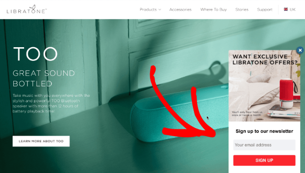
Slide-in boxes are less disruptive than traditional popups. They catch users’ attention without blocking the entire screen.
Because OptinMonster is so easy to use, Libratone quickly created 81 different targeted popups to use throughout their site. The result? Libratone grew their email list by 400%.
21. OptimizeMyAirbnb‘s Monthly Roundup Floating Bar
OptimizeMyAirbnb is run by Danny Rusteen, a consultant who helps people understand how to make their Airbnb listings stand out. He used a simple and unobtrusive floating bar to offer his monthly roundup of tips and tools for Airbnb hosts.
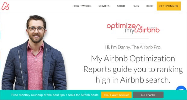
With email popups like this one, Danny added 1500 new subscribers for a total list growth of 600%.
22. Cole’s Classroom‘s Testimonial Email Popup
Cole’s Classroom is a website dedicated to helping and supporting new photographers. This email popup offers free lightroom presets as a lead magnet:
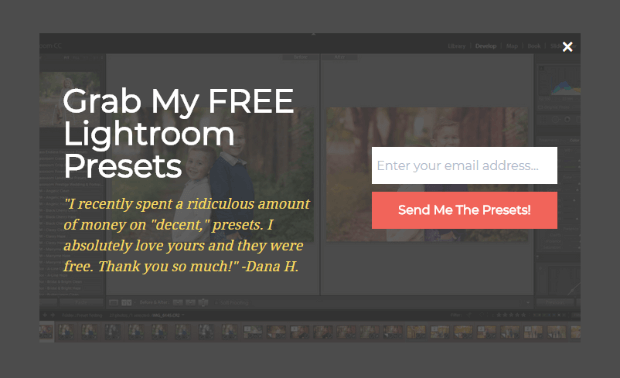
What’s special about this popup? It includes a glowing testimonial from another user who already signed up for this lead magnet. Testimonials are examples of how social proof can encourage uncertain leads to sign up or buy.
With campaigns like the one above (and other similar email popups), they converted 6.9% of their visitors for a total of $55,949 in increased sales.
Learn more about the power of testimonials
• How to Ask for Testimonials: 7+ Tips to Get Glowing Quotes
•. 10 Creative Examples of Testimonials to Win Customers
23. Guido’s
Guido’s is a Spanish and Italian restaurant in Saint Louis, MO. They used the marketing agency Insite Advice to work on their marketing strategy. When they began using OptinMonster, they made an email popup like this:
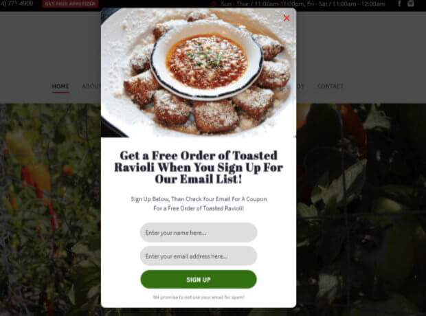
With the help of OptinMonster’s email popup examples, they converted 16.74% of their site’s visitors and added 1,000+ emails to their list in under four months.
Now that you’ve gone through our list of the best email popup examples, let’s have a look at some of the email popup best practices with which you can achieve the same results as our OptinMonster clients.
11 Email Popup Best Practices
We’ve identified 11 email popup best practices that will get you on your way to a thriving email list filled with high-quality leads:
- Create a clear call to action
- Personalize your popups
- Offer an irresistible incentive
- Use an eye-catching design
- Create targeted campaigns for desktop and mobile
- Use Exit-Intent® to capture visitors before they leave
- Show a popup or inline campaign at the end of your post
- Keep your request noticeable with a floating bar
- Create a friendly slide-in request
- Ask for visitor feedback
- Create a plan for new subscribers
Let’s take a closer look at each of these best practices.
1. Create a Clear Call to Action for Your Email Popup
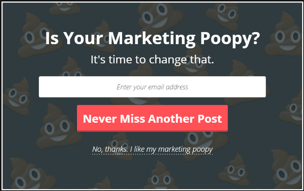
Your email popup should focus on one clear call to action (CTA), such as signing up for updates or grabbing a discount. Keep the design simple and the message direct. Avoid clutter or multiple CTAs that confuse visitors. For example, instead of a long, unclear popup, use a clean design with one prominent button to boost conversions.
2. Personalize Your Email Popups
Personalization makes a popup feel more friendly and less of an intrusion. OptinMonster makes it easy to show popups that feel relevant for every visitor. For example, you can use:
- Page-Level Targeting to show offers related to the blog post or product the visitor is viewing
- Referrer Detection to target your popup based on how the visitor arrived on your site
- Geolcoation Targeting to tailor your message based on the visitor’s physical location
For instance, if you’ve written a guest post or been featured somewhere recently, you can create an email popup specifically for that audience.
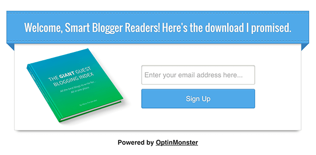
Personalization makes visitors feel like the popups are offering something exclusive, just for them.
3. Offer an Irresistible Incentive
People love incentives. This makes incentives and special offers like coupon codes, giveaways, and free shipping really good at helping you build your email list.
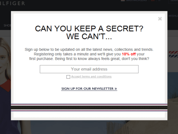
This doesn’t mean you just offer a discount to every visitor. Incentives can be anything of value, such as a free downloadable guide.
Not sure what to offer? Here are 63 lead magnet ideas you can use to increase your site’s subscribers.
4. Use an Eye-Catching, On-Brand Design
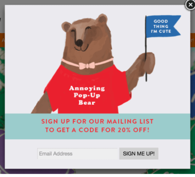
Your popup should complement your site’s design while standing out enough to grab attention. Lightbox popups are a great option because they dim the background, making the popup the focal point. Stay on brand with colors, fonts, and tone to create a seamless experience.
The “Annoying Pop-Up Bear” below aligns perfectly with the whimsy and fun of the host website. It’s eye-catching and fun but stays on brand.
5. Target Desktop and Mobile Users Separately
Desktop and mobile visitors interact with popups differently., so design platform-specific campaigns to optimize engagement. We have an entire guide to mobile popups to help you create a great user experience for mobile users
OptinMonster’s Device-Based Targeting lets you easily target mobile and desktop users separately.
Salt Strong was able to get a 185% increase in conversions by creating an email popup designed for mobile platforms.
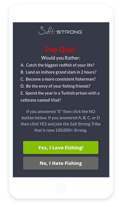
OptinMonster offers dozens of mobile-optimized popup templates, which you can easily customize in our drag-and-drop builder.
6. Use Exit-Intent® to Capture Abandoning Visitors Before They Leave
Did you know that 95% of visitors who abandon your site will never come back again?
You can convert an additional 2-4% of visitors into email subscribers and customers by using an email popup triggered on exit-intent.
OptinMonster’s Exit-Intent® technology allows you to track your visitor’s mouse movement. When they gesture quickly to the top of the page, your popup appears, giving visitors one more chance to opt in before they leave your website.
For more about exit-intent lightbox popups, check out these exit popup strategies.
7. Show a Popup or Inline Campaign at the End of Your Post
Visitors who get all the way to the end of your post are highly interested in your content. That makes the end of your article the perfect time to ask them to join your mailing list.
Add a popup that triggers once they reach the end of your content (or about 80% of the way down the page) and ask for a commitment right away. You can accomplish this in just a few clicks with OptinMonster’s Scroll Trigger.
Learn more about OptinMonster’s powerful display rules!
8. Keep Your Request Noticeable With a Floating Bar
Floating bars are a great way to make sure your call to action stays in clear view at all times without getting in the way of your visitor’s enjoyment.
You can place the floating bar at either the top or bottom of the page, and it stays there as your visitor scrolls.

9. Create a Friendly Slide-in Request
Slide-in campaigns are another gentle way to collect visitor information without interrupting the user experience.
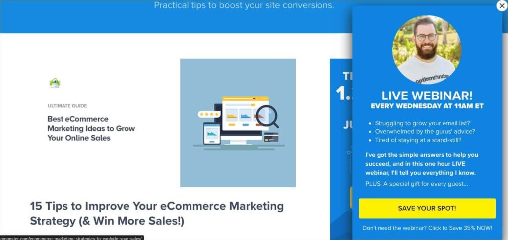
These email popups don’t appear until your visitor has already viewed some of your content. And even then, they simply slide in from the side of the page. This makes them eye-catching but unobtrusive.
Here’s an example of a slide-in campaign we’ve used to promote our webinars right here on OptinMonster’s site:
10. Ask for Visitor Feedback
A popup survey can help your business in so many ways:
- Discover how your visitors are interacting with your site
- Figure out potential problems that are getting in the way of conversions, leads, and sales
- Get real-time feedback from visitors and customers
- Reduce site or cart abandonment and increase conversions by interacting with visitors before they leave your site
- Segment your visitors for future digital marketing
- Grow your email list
Here’s an example of an OptinMonster template that’s set up to collect email addresses as well as visitor feedback:
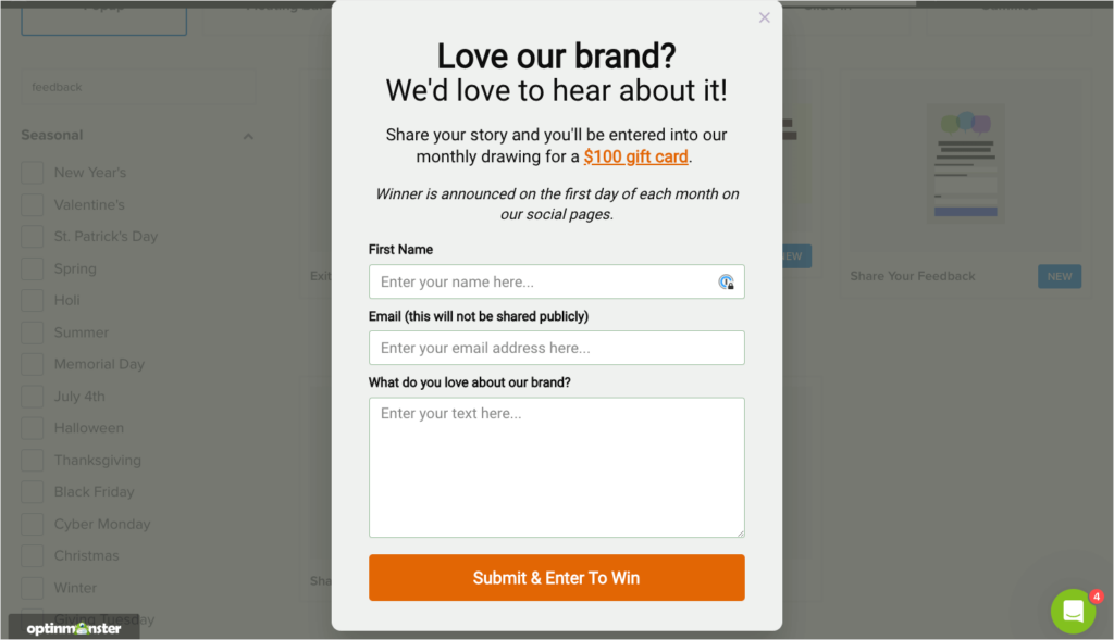
With OptinMonster, you can easily add custom fields like:
- Text Areas
- Radio buttons
- Checkboxes
- Dropdowns
- And more!
These options let you collect valuable insights with your email popups.
11. Send Welcome Emails to New Subscribers
You’ve created an email popup that’s generating tons of new leads. That’s great! But those new email signups won’t matter if you don’t continue nurturing them through your customer journey.
It’s important to have a plan for your new email leads. Every person who signs up for your email list should receive at least one welcome email. Preferably, they’ll receive a welcome email series. Learn how to get started in our guide to writing the perfect welcome email series.
You can also get inspiration from our list of 14 welcome email examples.
Create High-Converting Email Popups With OptinMonster
With these examples and best practices, you’re ready to start creating email list popups that will convert more of your website visitors into subscribers.
Want to learn more about website popups? Check out these resources:
- 7 Best WordPress Popup Plugins
- 11 Types of Popups You Should Be Using (With Examples)
- eCommerce Popups That Work: How to Increase Sales
With OptinMonster, you can have high-converting email popups up and running on your site TODAY. Our 700+ templates, drag-and-drop builder, and powerful display rules allow you to grow your email list fast without breaking a sweat.
BONUS: Done-For-You Campaign Setup ($297 value)
Our conversion experts will design 1 free campaign for you to get maximum results – absolutely FREE!






Add a Comment