You know that old expression, “the devil is in the details.”
That may be true, but there’s something else hiding out in those details:
A higher lead conversion rate.
Because if you want to capture the most leads, you should be thinking about every single detail in your lead generation strategy. That includes building the perfect lead capture form.
Too many marketers lose sales because they don’t take the time to customize their lead capture form to serve its main purpose: building a relationship with a soon-to-be customer.
So today, we’re going to teach you how to build the perfect lead capture form. We’ll cover:
- What is a lead capture form?
- What qualities make a powerful lead capture form?
- How to capture more leads fast
- 5 examples of lead capture forms that convert
By the end of this article, you’ll know what to add and what to avoid when building your lead capture form to maximize your lead conversion rate.
Let’s get started!
What Is a Lead Capture Form?
A lead capture form is a marketing tool that serves one specific and crucial purpose: to gain contact information from your site’s visitors.
Typically, your lead capture form will offer some promotion or piece of content (which are called lead magnets) in exchange for a name, email address, or whatever other contact information you need.
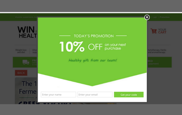
You’ve likely run into these before. They look something like this:
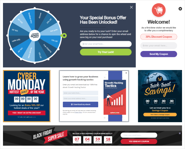
Lead capture forms are most often found on a capture page. While capture pages are commonly thought of as landing pages, they can also be popups, sidebars, floating bars, or any other specialized campaign that targets user’s emails.
But one of the most common questions we get is:
What Is a Lead Capture Page Used For?
Despite what some marketers will tell you, a lead capture page is good for a lot more than just getting an email address. It’s where you set the tone for the relationship you’re about to start with your lead.
Sounds cheesy, we know. But think about it:
When someone comes to your site, it wasn’t by chance. Something brought them there. Whether that was from a Facebook ad, an Instagram post, or they found a popular piece of content from Google, there was something about your site that appealed to them.
And your lead capture page may be the first experience your user has with your brand. It’s where they’ll begin to see your brand’s personality, which is why it’s super important you nail your lead capture page.
Otherwise, your visitor’s first experience with your site might also be their last.
So let’s take a look at what makes a powerful lead capture form.
What Makes a Powerful Lead Capture Form
We’ve already written a killer article on the anatomy of a perfect landing page. If you haven’t read that yet, you definitely need to check it out.
Now, let’s focus on one smaller piece of your landing page: building a powerful lead capture form.
A lead capture form has 3 necessary qualities that make it effective:
- Position on the lead capture page
- Lead capture form length
- Submission button color and text
And then there are 2 optional qualities that some business owners choose to add to their lead capture forms which aren’t as crucial, but are nice to have:
- Privacy policy notification
- CAPTCHA spam blockers
Let’s start by looking at the 3 necessary qualities for a lead capture form.
Position on the Lead Capture Page
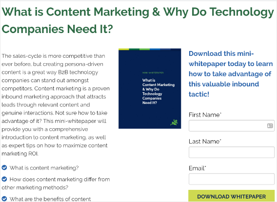
As we said earlier, lead capture pages can take many forms. They can be entire landing pages:
Fullscreen welcome mat:
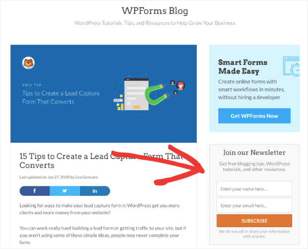
Sidebar forms:
Or even pre-sell and sales pages when the offer includes a free trial period for a product.
But regardless of the type of capture page that your lead capture form is on, it needs to be:
- Highly visible
- Clearly labeled
- Placed underneath a headline and description of your lead magnet or offer
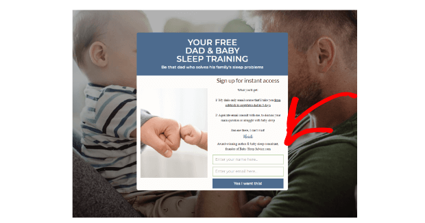
Here is an example of a lead capture form that checks off all these boxes:
Notice that the lead capture form isn’t hidden, the fields have clear instructions for what information is needed, and there is good web copy enticing visitor’s to hand over their email address.
Lead Capture Form Length
Some marketers may disagree, but for the most part, your lead capture form should contain at most three fields:
- First name
- Last name
You want the customers first name because it will help you personalize your emails with your email service provider. Instead of a general greeting like “Hey there,” you can start each email with “Hey [customer’s first name].”
This creates a personal touch and nurtures the relationship.
But you want to keep the field for their last name separate because otherwise, your emails will greet your customer with their full name.
And that can sound weird.
When you receive an email that says, “Hey [first name],” you know the email is likely automated. But it doesn’t feel automated.
When you get an email that says, “Hey [first and last name],” it quickly feels like an automated sales pitch.
Finally, you want to get the user’s email address. And frankly, that’s all you need from a lead capture form.
Why? Because once you have your visitor’s email address, you can build your knowledge of them through progressive profiling. That will allow you to gain more information about them over time without being too aggressive upfront.
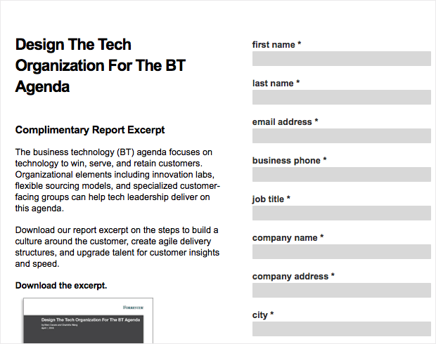
Otherwise, you end up with long lead capture forms like this one:
NoteThere are some exceptions to this rule, particularly for delivery services or restaurants that need your ZIP code. However, in the majority of cases, a name and email address are all you should try to get at first.
And if you really need more contact information or personal details, then you probably shouldn’t be using a lead capture form. Instead, you should try an application funnel to gather in-depth information about your clients.
Remember, your lead capture form should be as short as possible. Every additional field you ask for increases the chance of form abandonment.
So simply include 3 fields max and gather more information as you build your relationship with the client.
Submission Button Color and Text
Believe it or not, the text and color that you put in your submission button matters.
The text of your submission button is important, but you shouldn’t overthink it. A good rule of thumb is to make sure your submission button has a verb in it.
So a simple “Yes” is probably not the best submission button text you could use.
But changing that to “Yes! Sign me up!” is better because there is an action verb telling the user what to do. People need to be told what to do in very specific terms if you want them to take action.
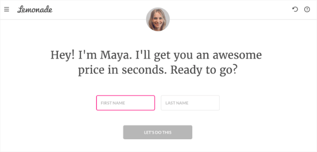
Even something as simple as “Submit” will work, though many choose to get more creative and let their brand’s voice show. Take the following example:
Using the phrase “Let’s Do This” shows off the brand’s enthusiastic personality. It’s more personal than a simple “Yes, please” or “Download Now!” message.
Next, you have to choose a color. Fortunately, there’s no right or wrong choice here (despite what some marketing gurus will tell you). It really all depends on your brand’s color palette and is up to your discretion.
But the color for your submit button does need to:
- Stand out from the rest of the page
- Match your brand
- Be consistent across your call to actions
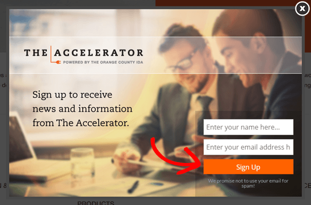
The Accelerator, for example, uses an orange color for their call to action buttons:
You can see from their headline that orange is a part of their brand’s color palette. It also matches the color of the header text on the webpage behind the popup.
This kind of brand consistency is small but can have a big impact on your conversion rate.
Now, let’s see some optional information you may choose to add to your lead capture form.
Privacy Policy Settings
This is a small message that simply lets the visitor know that you won’t be selling or sharing their personal information.
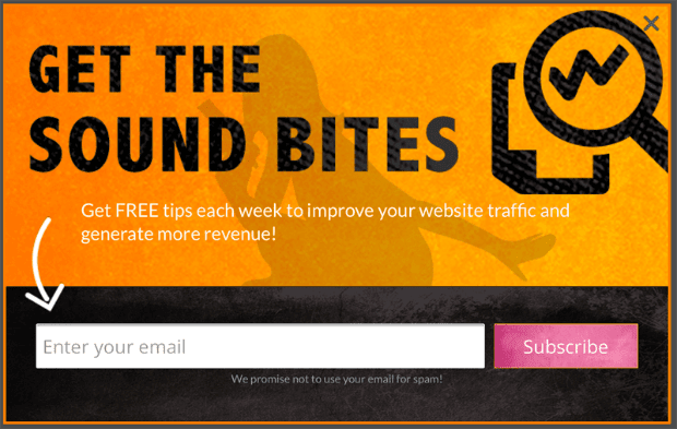
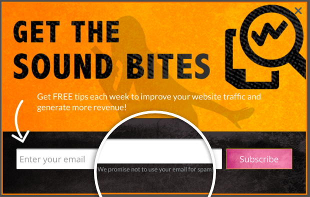
If you use a lead capture campaign software like OptinMonster, you can customize this text to say whatever you want. Take a look at the same example we saw at the start of this post:
They have a small message letting users know their email address is safe. If it’s hard to see, that’s ok. The information is available for people concerned enough to look for it.
For those who really aren’t worried about being spammed, this message should hardly be noticeable.
Keep in mind that you don’t need to be too creative with the privacy message, either. A short message like the one from the image above is fine.
CAPTCHA to Block Spam Submissions
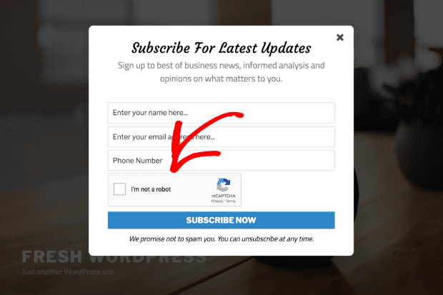
Some marketers are worried about getting lead submissions from spambots. To avoid that, you can simply use CAPTCHA, which is easy for humans to navigate but difficult for bots.
You’ve likely seen one before:
This is a good feature to install if you find that you’re getting high lead conversions (meaning lots of emails) but very low open rates from your email service provider. If you find that spam bots are becoming a problem, add CAPTCHA to your lead capture form.
But keep in mind that the most effective lead capture forms are super simple. Each additional step to your lead capture form will, again, increase form abandonment.
Ok, now that we know what makes a good lead capture form, let’s look at a few real-world examples.
How to Capture More Leads Fast
Now that you’re a master of lead capture forms, you’re probably wondering, “How can I capture more leads from a website?”
We’ve written extensively on how to generate and convert traffic into leads, but let’s get a quick refresher on how to capture more leads fast.
First, you need to come up with a lead magnet. This is some kind of offer, promotion, or piece of content that you are willing to give away for free.
Popular lead magnets are checklists, infographics, and ebooks, but there are many others. Remember, this needs to be something that isn’t already in your free online content (like in your blog, for example).
It should be created exclusively for growing your email list.
Once you have a quality lead magnet in place, it’s time to drive traffic to your website. You can do this in one of two ways:
- Paid advertising
- Organic content marketing
If you choose to bring traffic to your site through paid advertising, you’ll want to direct that traffic to a landing page. Your lead capture form should be embedded directly on that landing page, so visitors see it immediately.
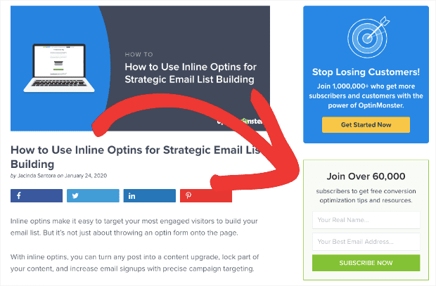
If you use organic content marketing, you should have a lead capture form in the sidebar:
And you should also build a specific lead capture page with a popup, slide-in optin campaign, floating bar, or any other lead generating campaign that targets your users’ email.
That way, when the user comes to your content, like a blog, they’ll see a subtle optin form on the side but also get a targeted message with a lead magnet while browsing through your site.
Once they’ve filled out your lead capture form, you should automatically integrate their email address into an email sequence and start nurturing the lead.
Here’s how easy it is to create a lead capture form with OptinMonster:
1. Create Your Campaign
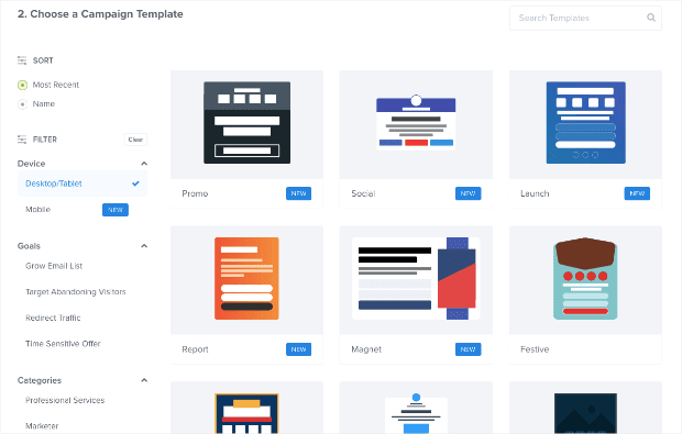
Login to your OptinMonster dashboard and click Create New Campaign. Then, choose a campaign type and template.
Name your campaign and press Start Building to go to the campaign builder.
2. Customize Your Campaign
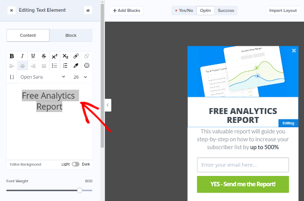
Next, it’s time to customize your campaign. The campaign builder loads with a pre-filled example, but you’ll want to change that to match your offer and brand.
Just click on the campaign preview to open up the editing tools and customize your campaign.
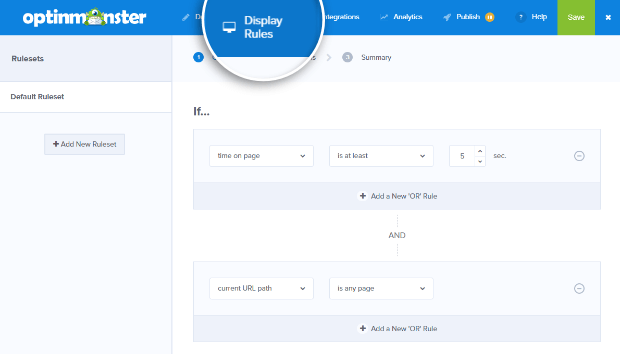
3. Set Up Your Display Rules
OptinMonster has a delightfully powerful display rules engine. Here, you can set your campaign to show on exit, target specific pages on your site, and more.
4. Publish the Campaign
Save your changes and publish your lead capture form by going to the Publish tab and clicking on the status button to make your campaign live.
You can use OptinMonster’s WordPress plugin to add your new lead capture form to your WordPress site or use our easy embed codes to add your campaign to any site you want.
And that’s it!
Generating leads fast really can be that simple. But remember, simple doesn’t always mean easy.
You should spend a lot of time creating a quality lead magnet, writing great sales copy for your paid ads, and developing killer content that brings traffic to your site.
From there, capturing leads is about making a good landing page or building campaigns that specifically work to gain a visitor’s email address.
Most conversion optimization software on the market is designed to do just that. OptinMonster, for example, has loads of campaign templates that allow you to make lead capture pages, floating bars, exit-intent popups, and more in a matter of minutes.
We also have targeted display settings so you can set rules for your campaigns. Our Exit-Intent® technology, for example, delivers a campaign whenever a visitor attempts to leave your website or close the browser window.
Now that you know how to create a lead capture form with OptinMonster, check out these examples to inspire you.
5 Lead Capture Form Examples
1. OptinMonster
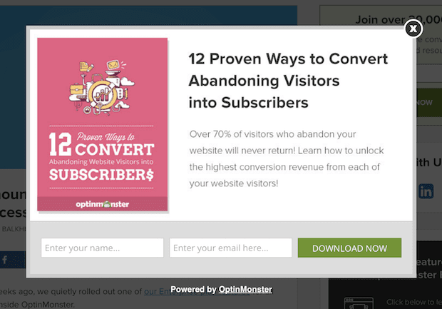
This is one of our standard lead capture forms. Super simple: it asks for your name, email address, and has a green button with a concrete call to action (Download Now).
The lead capture page is well designed, too. The heading takes advantage of power words to inspire users to sign up. The subtext describes what the user will get when they sign up. And the photo of the lead magnet is visually appealing without being distracting.
Our lead capture form is proof that you don’t need to make users fill out a long application form during the lead capture process. Instead, just ask for a name and an email address to reduce form abandonment.
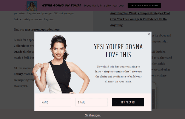
2. Marie Forleo
Marie Forleo’s lead capture form is totally straightforward. The heading is positive, the subtext describes what you’ll get when you sign up, and at first glance, the only option is “Yes Please!”
Though we would change the submission button’s text to have a verb, the rest is spot on. Plus, Marie adds her picture to the lead capture page, which helps users put a face to the brand. This is particularly good for personal brands.
It helps your visitors feel more connected with the company and encourages more conversions.
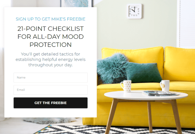
3. Mike Lardi
We love this lead capture form because it’s totally stripped down. It tells you exactly what you’ll get when you give your email address, the submit button text reminds visitors that it’s a totally free offer, and there’s nothing distracting about the signup process.
That helps reduce form abandonment.
Plus, it has a really professional, sleek looking photo on the back of the lead capture page.
If you were looking for a lead capture form to mimic, this would be an excellent choice.
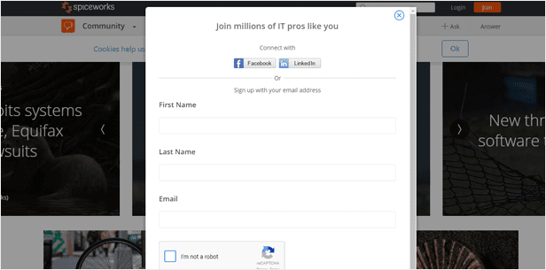
4. Spiceworks
This lead capture form is simple, clearly labeled, and asks for just the right amount of information. It also uses the CAPTCHA feature to avoid spambots. Since the offer here is joining the platform, there’s not much need for more catchy headers and subtext.
Overall, this simple lead capture form is an excellent example of how less can often be more.
5. Entrepreneurs on Fire
This lead capture form is great for a few reasons. The colors are loud and consistent. It isn’t asking for too much information (just an email address). It has an excellent headline with a subtext that further explains the offer.
And directly underneath the popup, you can still see a list of well-known companies this brand has worked with. That last one isn’t necessary for an effective lead capture form, but it’s a cool bonus!
If you need more inspiration, check out our list of amazing lead generation form examples.
There you have it! Now you know exactly how to create a lead capture form and why you need one.
Your next step is to sign up for OptinMonster and get serious about capturing more leads from your site. OptinMonster is the best and easiest way to take your anonymous website traffic and turn it into happy, paying customers.
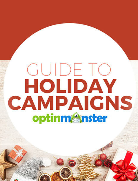
Did you enjoy this article? If so, you might want to check out the following resource: 9 Best Lead Generation Plugins for WordPress (Compared).
That post will have even more information on tools you can use to grow your list, boost conversions, and drive MORE sales today.








Add a Comment