Are you struggling to get enough conversions on your sales pages?
Or, like a lot of new marketers, are you scratching your head right now wondering, “Wait… what is a sales page, exactly?”
If you want to skyrocket your sales and revenue, it’s vital that you learn how to create and optimize sales pages on your website.
That’s why I’m going to show you how to do just that in this post!
By the end, you’ll know how to write a sales page that converts like crazy, so your business revenues stay healthy and growing.
Along the way, you’ll get proven tips, and you’ll see sales page examples to use as inspiration for your own website.
Let’s get started!
- What Is a Sales Page?
- Elements of Effective Sales Pages
- How to Create a Great Sales Page (19 Tips With Examples)
- 3 More Sales Page Examples from Top Brands
What Is a Sales Page?
A sales page is a type of landing page that has 1 goal: to convince visitors to purchase a specific product or service. Effective sales pages include all of the information potential customers need to decide to buy your product.
A sales page is your best opportunity to explain your products and services to visitors and make them want to buy. It needs to be attention-grabbing, informative, and persuasive, all at the same time.
And if it’s not optimized for conversions, you’re losing money. That means any marketing and advertising budget you’re spending to promote your products will be wasted.
How should you use your sales pages?
- You can link your website’s “Buy Now” and “Learn More” call-to-action (CTA) buttons to your sales page. That way, when a website visitor shows interest in your product, they’ll see your strongest sales pitch on a single page.
- When you make social media posts about a specific product, link directly to that product’s sales page. You want to give interested leads the most direct path to making a purchase.
- Link to your sales pages in your email marketing campaigns. Your subscribers who cared enough about your business to sign up for your email list. Use sales page links to move them through your sales funnel.
In short, sales pages are vital tools in your marketing strategy. They let you direct users to a single page that provides the most important details about your product, along with an easy way to buy.
With a fully optimized sales page, you’ll see higher conversion rates and more revenue.
Elements of a High-Converting Sales Page
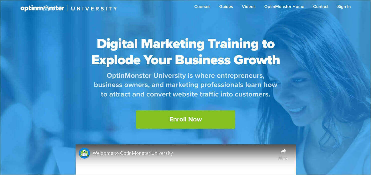
To discuss the elements of a sales page, we’ll explore a page on our own website:
This is the top of our sales page for OptinMonster University, our learning platform for digital marketing courses. Access to OptinMonster University is included for all OptinMonster customers.
This above-the-fold screenshot includes several of the most vital elements for any sales page:
- An attention-catching headline: The best sales page headlines explain the “what” and “why” of your product. Our headline explains that the product is “Digital Marketing Training” and that its primary benefit is “to Explode Your Business Growth.”
- Subheading/descriptive text: You’ll need to follow up that headline with a bit more information. Here, we describe who our product is for. We also give more detail about the benefits. In our case, the benefits are “to attract and convert website traffic into customers.”
- CTA button: You should always include a bold CTA above the fold, so visitors don’t have to search for it. For our “Enroll Now” CTA, we chose our brand’s bright green as the color for the button.
- Visual element: You need more than just text to entice visitors. Our page has a background image of a woman using a computer. Above the fold, you can also see the top of our embedded YouTube video called “Welcome to OptinMonster University.” If someone isn’t sure enough to click “Enroll Now,” the peek at this video encourages them to scroll down to see more.
Our OptinMonster University sales page is an example of a longer-form page. For simple products or services, you may only need a bit more information below the fold. Our longer page includes several elements that you should consider.
Establish Authority
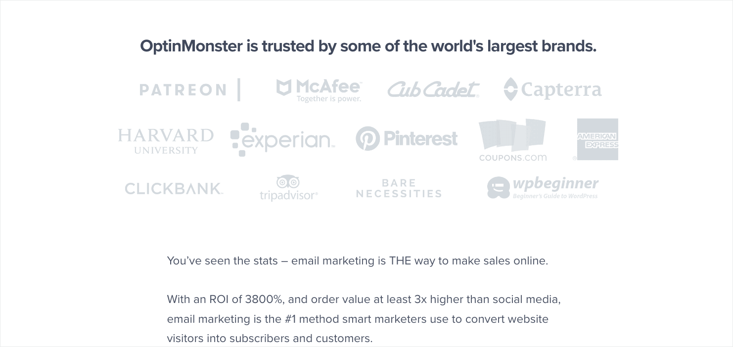
Do you have impressive clients or customers? Take a page out of our book and display them on your sales page.
A website visitor might be thinking, “Why should I take marketing advice from this company?”
Then they see that our marketing software is trusted by the likes of Patreon and Harvard University. That goes a long way toward showing our authority and expertise in the digital marketing field.
Show Social Proof
Consumers look to their peers to know whether a product is worth their money and time. That’s called social proof.
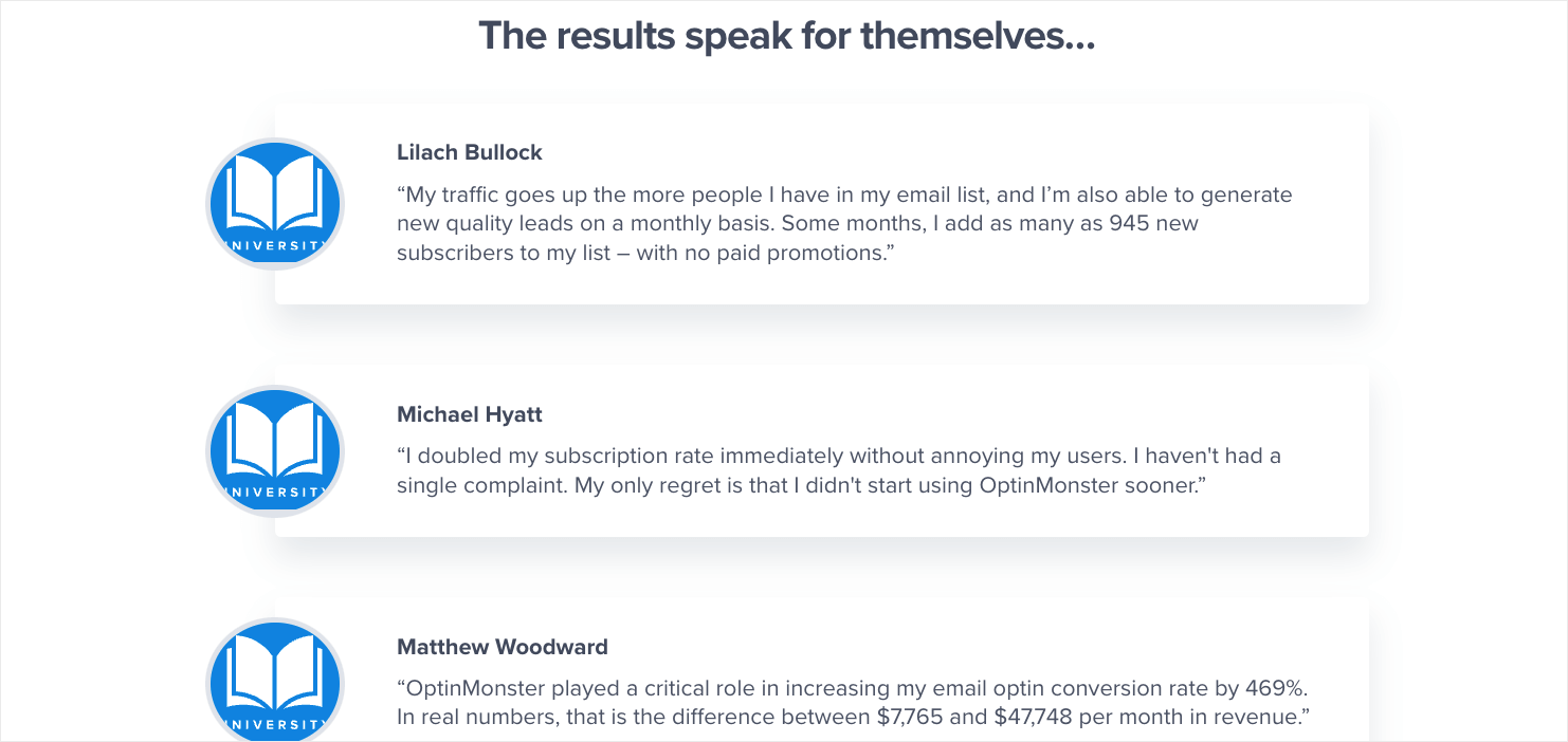
That’s why we include a collection of customer testimonials on our sales page. You can also add a review feed, the number of 5-star reviews you have, or the number of subscribers using your service.
Answer Visitor Questions
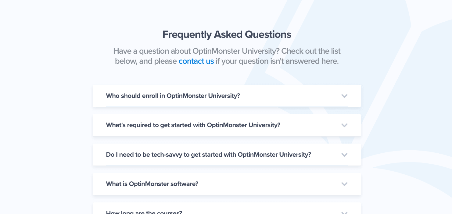
Your sales page should answer the questions that visitors are likely to have about your product. An FAQ section is an efficient and easy-to-use way to do just that.
Write a Sales Letter
We’ve touched on the fact that some sales pages are short and sweet while others are longer and more detailed.
Those longer sales pages are where a sales letter comes in.
Most long sales pages still begin with short, scannable bits of text, along with images and CTA buttons. If you scroll down, however, many include a full sales letter.
The term “sales letter” was introduced by Russel Brunson, entrepreneur and founder of ClickFunnels. A sales letter is simply a long sales page. It has tons of information about your product and its benefits. It also usually has some back story about why it was created.
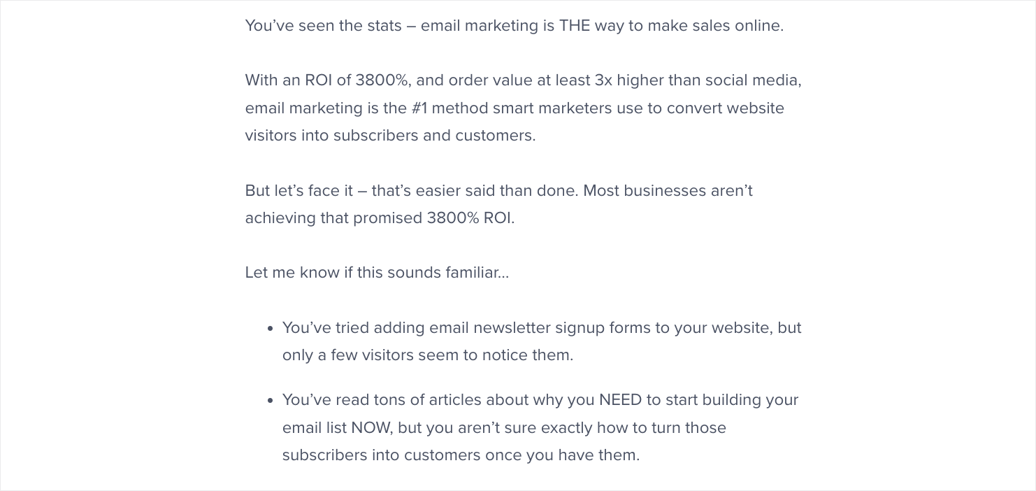
Our full sales letter for OptinMonster University addresses the user directly to explain how our courses can help them overcome their biggest challenges.
How To Create a Sales Page That Will Win Customers (19 Tips With Examples)
We’ve shown you some of the most important elements of the best sales pages. Now, you need to learn how to get those elements right. Here are 19 tips to help you create a sales page that converts.
- Understand Your Audience
- Create a Value Proposition
- Get the Price Right
- Determine the Right Length
- Nail the Headline and Subheadings
- Describe Your Product
- Show the Benefit of the Benefit
- Get the Language Right
- Handle Objections
- Prove Visitors Can Trust You
- Incorporate Images and Video
- Make Your Copy Scannable
- Eliminate Distractions
- Design a Dynamic Layout
- Use Responsive Design
- Make a Clear Offer that Impels Action
- Use Multiple Calls to Action
- Make It Urgent
- Use Exit-Intent
1. Understand Your Audience
First things first: You can’t write good sales copy unless you know who you’re talking to.
Before putting pen to paper (or fingers to keys), it’s essential to understand who your audience is. And you need to know they look for when deciding to buy your product or service.
One of the best ways to do this is to create a customer avatar or buyer persona. That’s a fictional person who represents your ideal customer. While the persona may be fictional, it’s based on real data collected from:
- Customer surveys
- Web analytics
- Social media analytics
- Other online research
Once you’ve got a buyer persona, you’ll understand your prospective customer’s influences, pain points, challenges, and motivations so you can create copy that addresses them.
And you can use this information in your copy to specify the audience you’re targeting,
Here’s our guide to creating a concrete buyer persona to help with this process.
2. Create a Value Proposition
When you know who your customers are, you’ll be able to articulate your value proposition. A value proposition is a statement that explains the benefit you provide and the problem you solve for your customer. If possible, it should also show that your benefits outweigh the cost, and that you’re better than the competition.
Ideally, this will be a single sentence or short phrase that’ll guide the rest of your copy.
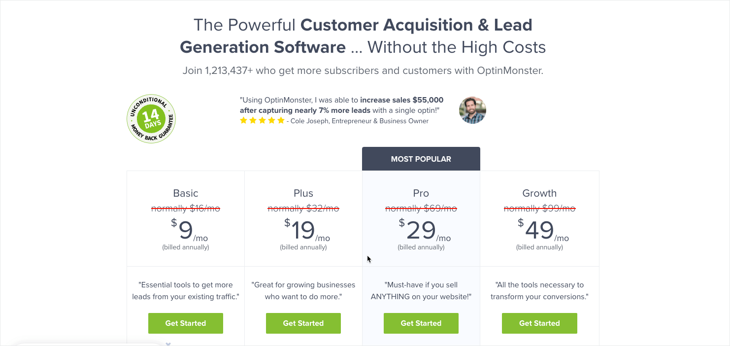
Here’s our value proposition on OptinMonster’s main pricing page:
“The Powerful Customer Acquisition & Lead Generation Software . . . Without the High Costs”
For a complete guide to value propositions, check out this resource: How to Write an Irresistible Value Proposition (Tips, Examples, & Templates)
3. Get the Price Right
One last thing to determine before you start writing: How much does your product or service cost?
One of the big sticking points for many prospective buyers is the price. To succeed in winning the value vs. cost argument, it’ll help if you can make your product’s price less of a sticking point.
Some proven techniques to try include:
- Offering more than one price point
- Labeling your price points with descriptive names to help users to self-select
- Make sure your price ends with the number 9 because research shows that more people gravitate towards this
OptinMonster uses several of those pricing strategies:
Learn more about pricing strategy in our article on pricing page tips.
4. Determine the Right Length
After you understand your target audience and what you have to offer them, it’s time to start writing your sales page.
But how long should a sales page be?
The short answer is: as long as it needs to be to get the job done. That’ll vary depending on what the copy is for, and how your visitors respond.
Long copy lets you deal with more customer objections and is useful for products and services that need a lot of explanation.
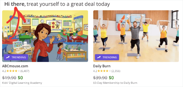
But if you can explain your offer simply, you don’t need to add more copy. For example, Groupon explains its purpose in a sentence and takes you straight to the deals.
Even long sales pages will include both short and long sections of copy within the page.
The short copy caters to those who are already convinced. It’s usually accompanied by a call to action near the top of the page. The long copy helps you make a case for those who are less easy to persuade and will include a couple more CTAs.
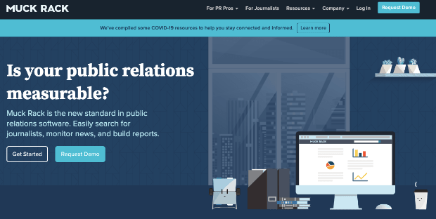
For example, here’s the short copy for Muck Rack’s landing page:
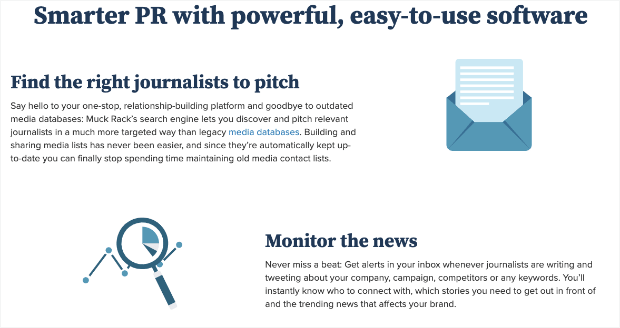
And here’s some more detail further down the page:
The page also includes testimonials and a final CTA.
How do you know which type of sales page will work for your audience?
In the end, the decision will come down to A/B testing. That’s the best way to separate sales pages that convert from those that don’t.
5. Nail the Headline and Subheadings
Now you’re ready to start writing.
The first step is to create the headline. This is the most crucial part of your sales page because if you get it wrong, your visitors will be quick to leave.
The best headlines are short and to the point. For example, here’s one headline from marketing expert Neil Patel:
This is a sales page for a consultation with Patel, but that headline doesn’t waste any space. In some cases, you’ll need a subheading to add a bit more context if your message is more complex.
OptinMonster, for example, uses a large headline with a subheading to convey more information to the reader:
Check out our guide to creating high converting headlines for help with this tip.
Or, if you really want to level up your headlines, go visit OptinMonster’s headline analyzer today.
6. Describe Your Product
Now, it’s time to go into more detail about what your product is and what it does. This is where you’ll reiterate the core problems your visitors face, and break down your solution.
The more descriptive and unique you can get, the better your description will be. By writing detailed descriptions of each feature, you’ll not only have an easier time convincing shoppers to convert. You can also get some SEO ranking benefits in the process.
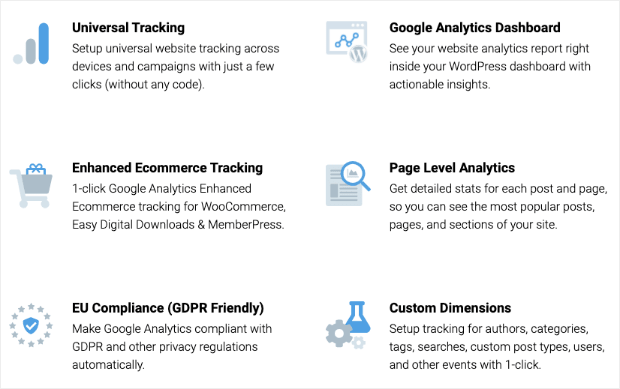
For example, here’s part of the sales page for MonsterInsights, showing how it provides the key features users want:
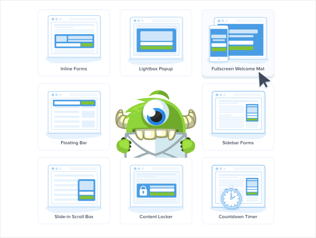
OptinMonster does the same with all of our features, such as this section showing the many types of marketing campaigns you can build:
Describing the ins and outs of your product gives your potential customers more confidence. Just make sure you can deliver on all the promises your product descriptions make.
7. Show the Benefit of the Benefit
Anyone wondering how to write a sales page that converts has to understand the principle of features vs. benefits. Your visitors care more about what your product or service will do for them than they do about all its fancy attributes.
That’s why when you look at sales page copy templates, they focus on benefits and not features.
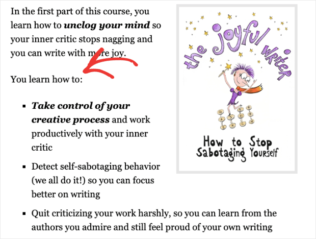
Your benefits will often be listed on your sales page as bullet points, as in the example below from Enchanting Marketing:
You can even go one step further and focus on the benefit of the benefit. For example, if you are selling fitness videos, the benefit is access to a certain number of workouts, but the benefit of the benefit is becoming stronger and healthier.
Whenever you think you have your benefit nailed down, try to take it one step further. Will your product save time, money, or effort for your clients? And after that, what will your client be able to do with the time, money, or effort saved?
8. Get the Language Right
How do you write a sales landing page? Getting the language just right can be tricky.
Visitors want to know you understand them, so you can use techniques like:
- Addressing your customer directly, using “you”
- Making them feel like part of the family by using “we”
- Showing that you empathize
- Telling a story that they can relate to
- Using power words to elicit and show emotion
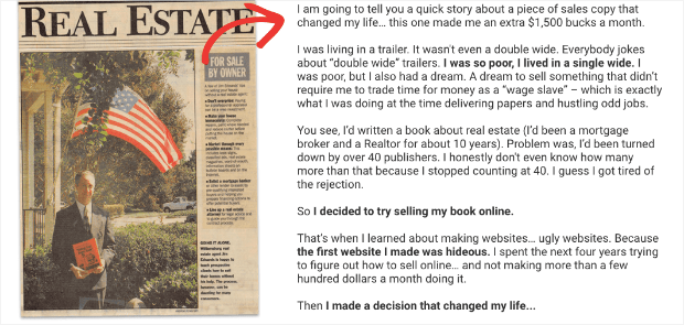
Here’s a storytelling example from Jim Edwards, copywriting master. He used storytelling for a sales page for his book Copywriting Secrets:
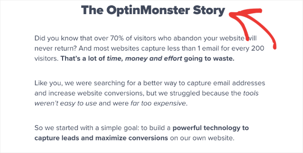
OptinMonster devotes an entire section to telling our story, too:
This strategy helps customers connect with your brand on a deeper level.
You can make your sales page copy even more targeted by including a “who is this product/service for” section. This allows you to make sure you’re talking to the right people.
9. Handle Objections
As we said at the start, some people will be willing to buy the minute they land on your sales page. However, others will need more convincing to part with their cash.
The truth is, people can always think of reasons NOT to buy. The best sales pages blow their objections out of the water. Here are some ways to do that.
To address visitors who are unsure why they should buy now, a time-limited discount or offer can help make the sale. WPForms does an excellent job of this on their pricing page:
You can also create a popup coupon with OptinMonster to highlight this offer.
If you’ve explicitly explained who your product is for, then you’ll dismiss the objection that your visitor doesn’t think it’s right for them.
If price is the issue, you can address this by highlighting the value of your product to them, and by using some of the pricing strategies we’ll discuss a bit later.
And if they don’t trust you, you can handle this with social proof and other trust builders, which we’ll discuss in the next tip.
Our article on lead capture has more information on overcoming objections.
10. Prove Visitors Can Trust You
Did you know that 90% of companies only buy from companies they trust? And that 78% of consumers go to brands they trust FIRST when shopping for products and services?
Those are just two reasons why building trust is so important for creating sales pages that convert. Ways to build trust on your sales page include:
- Offering proof of any claims you make
- Highlighting testimonials from happy customers
- Including other forms of social proof that help to enhance your reputation, such as social media mentions and expert endorsements
- Giving customers peace of mind with a money-back guarantee
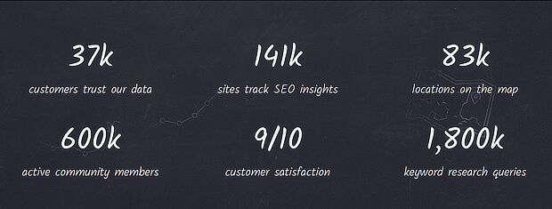
Moz showcased its key stats as part of this sales page:
When you help customers trust you, it’s easier for them to make the decision to buy.
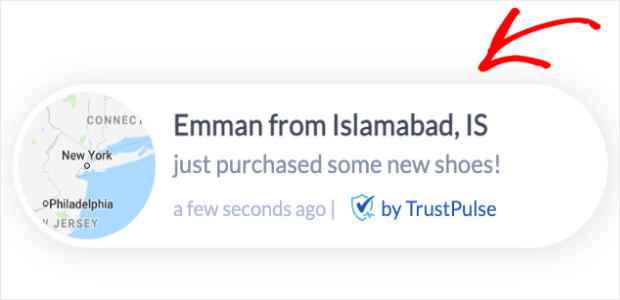
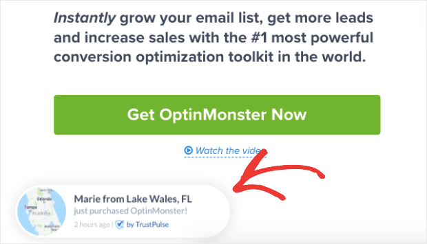
To really kick your sales into high gear, check out TrustPulse. With TrustPulse, you can further leverage the power of social proof. They do that by adding recent activity popups to your screen. Those look something like this:
When people see that other people have signed up with or purchased your services, it builds instant trust.
Adding TrustPulse to your site can give you an instant lift in site conversions by up to 15%. We were so impressed with the results that we’ve kept these recent activity popups on OptinMonster’s site:
For such a small modification to your site, you can see the same big results in sales.
11. Incorporate Images and Video
Done writing your sales page? Not so fast.
Don’t forget about the impact of visuals.
Even still images grab attention, and you can use them to cleverly direct your readers’ gaze to the most critical areas of the page. Here’s the perfect example from Vistage:
You can also kick it up a notch by using video. Video marketing statistics show that 89% of consumers say that watching a video has convinced them to buy a product or service.
An excellent way to catch users’ attention is to have a video pop up at the right time. You can do this with OptinMonster by following the steps in our tutorial on boosting engagement with a video popup.
You can also check out our roundup of sales promotion examples for design inspiration.
12. Make Your Copy Scannable
Once you have your content ready to go, you’ll need to make sure your audience can easily read it.
One of the most important design tips for any piece of online copy is to make it scannable. That means breaking up the text to make readers pause as they skim the page.
In other words, there should be no walls of text to make people’s eyes glaze over. In fact, at a glance, your sales page should look like it’s broken into easily digestible sections.
The best sales pages include:
- A combination of short and long lines
- Lots of short paragraphs
- Lists, usually with bullet points
- Subheadings
- Quotes
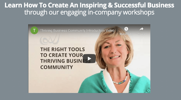
You can highlight these by adding design elements like boxes and outlines where appropriate. Here’s an example from Thriving Business Community.
Sales pages that convert will also use a font that’s easy to read. It needs to be legible and large enough for those reading on small screens. Google recommends a minimum font size of 16px.
Check out this list of readable and web-safe fonts to help with choosing fonts to make sure your sales page is scannable.
13. Eliminate Distractions
If you want visitors to focus on your sales copy, you’ve got to use design to help them.
That means removing any distractions from the core purpose of the page to inspire readers to click through and convert by making a purchase.
The best sales page examples have no sidebars and often have minimal headers and footers, or none at all. Everything that’s on the page is related to what the site is trying to sell.
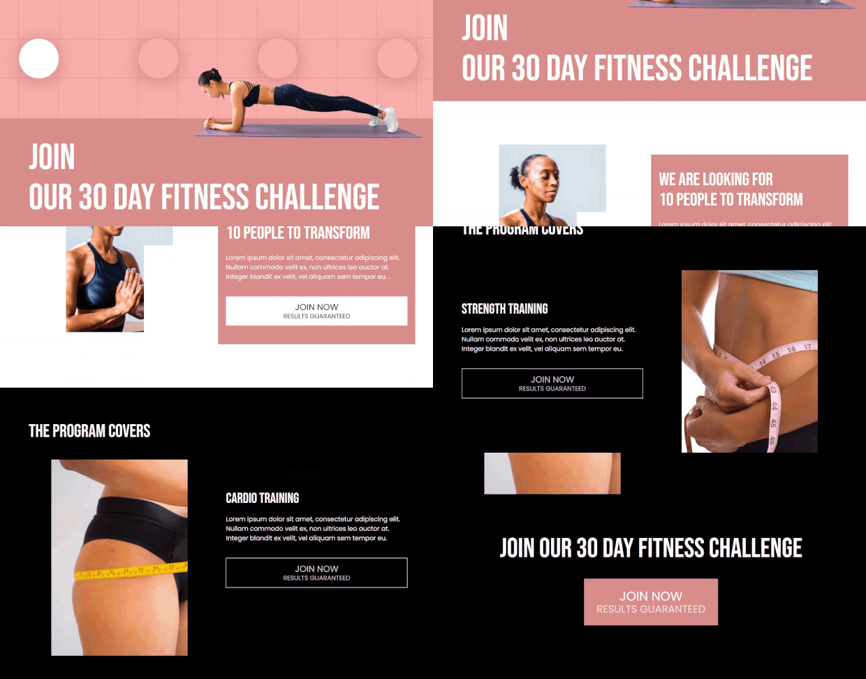
Here’s an example from SeedProd. This is one of their sales page templates:
All header menu options have been removed, and there is nowhere else for the reader to go except to continue reading and sign up for a 30-day fitness challenge.
A good starting point for nailing your sales page design is this list of SeedProd’s WordPress sales page templates.
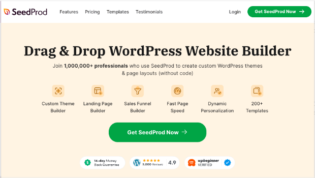
In fact SeedProd is the very best way to build landing pages on WordPress. With its drag-and-drop page builder and sales page templates, you’ll be able to create beautiful and effective sales pages in a snap.
14. Design a Dynamic Layout
You can catch your users’ attention with a great value proposition and attractive design. If you want to keep visitors engaged, you’ll need some novelty throughout your sales page. That’s why it’s important to mix things up a bit in terms of design. For example, you can:
- Vary the placement of images, so they’re not all on the same side of the page
- Break up the page with different layout elements and styles
- Change the on-page messaging
Here’s a great example of what we mean. This template from SeedProd uses multiple images with colorful shapes in the background to maintain visual interest.
As you scroll down, you see similarly designed images in different positions on the page.
Do this, and your page will be more interesting visually, keeping visitors engaged. The longer they’re engaged, the better your chances of making the sale.
You don’t have to be a professional designer to create a dynamic sales page layout either.
With SeedProd, you can easily build a visually-appealing landing page like the one above, without having to touch a line of code.
As we mentioned earlier, SeedProd is the best landing page builder for WordPress. With the user-friendly drag and drop builder and the hundreds of beautiful landing page templates to choose from, you can create a professional-looking sales page in minutes.
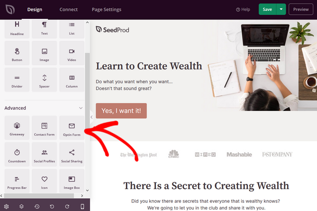
Simply drag ready-made landing page blocks and drop them into place to create a custom high-converting sales page. You can add blocks like optin forms, contact forms, buttons, images, videos, countdown timers, star ratings, and much more.
15. Use Responsive Design
With mobile devices responsible for 60% of holiday shopping traffic and 42% of holiday purchases, you’ve got to make sure your sales page still works on small screens.
That’s where responsive design comes in. It’ll make sure your page resizes (and still looks good) no matter what size screen your visitor uses.
Luckily, if you use SeedProd, any page you create will be responsive and mobile-ready.
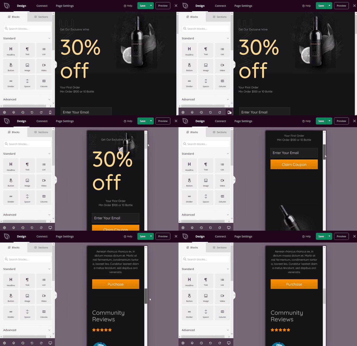
For example, here’s how a sales page made with SeedProd looks on a phone screen:
And when marketing your sales page, you can use OptinMonster for well-designed, responsive mobile campaign templates that make your sales page even more effective.
Here’s how you create a high-converting mobile popup.
16. Make a Clear Offer that Impels Action
Finally, your sales page can’t do its job without a clear call to action.
Remember, your visitors are only interested in WIIFM (what’s in it for me?), so now’s your chance to tell them again.
It’s the sentence that’s going to seal the deal for you, such as this one on Envira Gallery.
It reminds people that publishing is quick, and it’s a great way to showcase photos in one tidy sentence that sits next to the CTA button.
17. Use Multiple Calls to Action
Look at any sample sales page, and you’ll likely see at least 3 CTA buttons, maybe even more, depending on the length of the page.
The purpose is to make it easy for visitors to buy at whatever point they become convinced.
At the very least, you’ll have a CTA button at the top of the page where your headline and summary copy are. And at the end of the page, you’ll also include a button anywhere you give a compelling reason to buy.
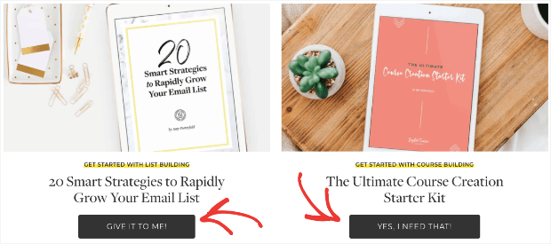
Amy Porterfield, for example, used a few calls to action on this sales page example. In this case, she offers a couple of different CTAs, rather than repeating to same one. This strategy offers users multiple ways to begin a relationship with her:
But as you scroll down the page, you see more CTAs along the way, each pushing you toward a sale.
A good CTA:
- Shows the benefit of clicking
- Uses action words and power words
- Highlights value
For help with getting your CTA just right, read our guide to writing the perfect call to action.
Finally, you can add a few finishing touches to compel your readers to take action if they’re still on the fence …
18. Make It Urgent
If you really want your sales page to convert like crazy, you’ve got to use urgency. Human beings hate missing out on anything, and a time-limited offer fuels that fear, increasing conversions and sales.
You can have time-based urgency, where there’s a discount or offer that’s only available for a short time. And then there’s scarcity-based urgency, where there’s a limited supply of whatever’s on offer.
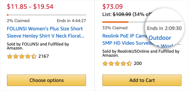
Amazon uses scarcity-based urgency all the time by highlighting products that are about to be sold out in red, by showing when deals are almost fully claimed, and by adding a countdown timer for deals:
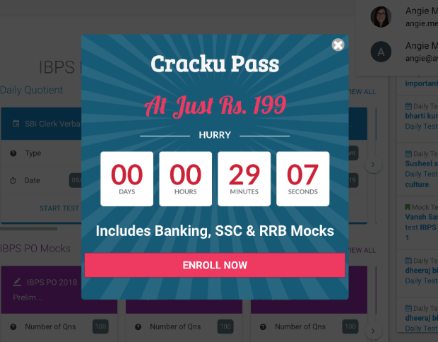
You can do the same on your sales page by using an on-page countdown, or by using OptinMonster to create a countdown popup. Here’s an example used by a Cracku:
With this little popup, Cracku was able to increase conversion by 300%. Just imagine what a countdown timer can do for your sales pages, too!
19. Use Exit-Intent®
Sometimes, visitors need a little extra help, or can’t find the information they’re looking for. When this happens, you can save the sale by prompting them to get in touch with you before they leave the site.
One of the best ways to do that is to use OptinMonster’s Exit-Intent® technology, which detects when people are about to leave and shows your campaign at just the right time.
We use it here on the OptinMonster site to encourage visitors who’ve been browsing for a while to ask us their questions:
This is a powerful tool for re-engaging customers who are leaving your sales page.
And that’s all! By putting these tips into practice, you’ll see a boost in your conversions and your bottom line.
To help you even more, we’ve lined up a few more sales page examples you can use as inspiration.
3 More Sales Page Examples
Want to really understand how to make a great sales page? Sometimes, the best way is to step away from the theory and look at some real-life examples from big brands.
Here are 3 short examples of great sales pages.
1. Litmus
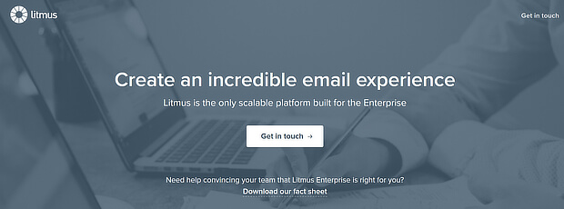
Litmus keeps it simple with a clear statement of purpose and a subheading that underlines its advantage. The page includes two CTAs. Can you spot them?
The calls to action here are Get in touch and Download our fact sheet. Both will lead you toward purchasing one of their products.
This is an example of a sales page that’s extremely simple. However, it’s still convincing due to its confident copywriting and friendly CTAs.
2. Udemy
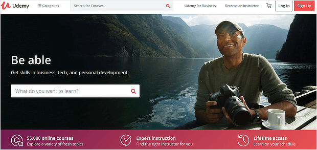
Udemy keeps the headline and subheading short. This sales page shows Undemy’s key benefits in a banner in a contrasting color further down the page:
The colors for the main image draw the eye to the What do you want to learn? search box to get you started. They’re leveraging one psychological trick by marketers that suggests once a user starts a process, they’re more likely to finish.
When potential visitors start searching for courses, they’ll be one step closer to signing up for Udemy’s services.
3. CloudApp
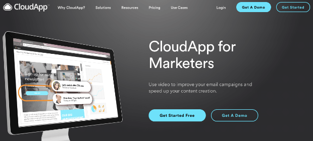
CloudApp (now Zight) used this sales landing page to highlight key features, reinforced with attractive images:
At the top of the page, they have their calls to action. You can either get started for free (which is a great value proposition) or get a demo. The emphasis, however, is on the call to action that will more likely lead to an eventual sale.
Convert Even More with Exit Popups
That’s it! All that’s left is to design and publish your sales page. Now that you’ve learned from these tips and examples, you’re ready to create a sales page that will convince visitors to go ahead and buy.
If you want to explore even more ways to increase conversions, check out these resources:
- What’s a Winning eCommerce Conversion Rate? Benchmarks & Insights
- Conversion Rate Optimization Statistics You Need to Know
- 11 Web Design Principles That Can Boost Your Conversion Rate
And remember to give your visitors 1 last chance with an exit popup from OptinMonster!
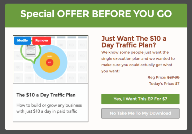
DigitalMarketer used an OptinMonster exit popup to offer a downsell option. In other words, when people tried to click away from their sales page, they saw a popup featuring a special deal on a less expensive option:
DigitalMarketer converted a whopping 15% of visitors with this popup!
With a single popup that took minutes to create, this company attracted new customers and made more sales.
Want to do the same on your sales pages? Get started with OptinMonster today!












Add a Comment