Anatomy of the Perfect Optin Landing Page (Tips & Best Practices)

Do you know the secret of creating a good optin landing page? Landing page creation is an essential skill if you want to improve conversions and make more sales. This guide will explain everything you need to know to create your own high-converting optin landing pages.

What Is a Landing Page?

A landing page is a web page created as a destination for visitors to your website to get information about a particular offer or resource that’s relevant to them.

A landing page focuses on a single purpose, like promoting a webinar, a free ebook or a free trial, and it encourages people to take action. It’s a lead generation tool, encouraging people to provide their email address and other contact details in exchange for the offer you’re promoting.

Why Do You Need a Landing Page?

There are several reasons why it’s a good idea to have an optin landing page. As we’ve said, landing pages are an excellent way to capture leads. Since each landing page is focused on a particular goal, people who come to your landing page are likely already interested in what you have to offer and therefore are more likely to opt in.

This also means that landing pages help you meet customers’ expectations. If you’re talking about conversion optimization on your Facebook page, and share a link to a landing page promising a relevant resource, people who follow the link will be reassured by finding what you’ve promised when they arrive at your landing page. It’s a great way to build trust. Compare that to just sending them to your homepage, where they can’t find the resource they were promised.

Hubspot’s book on landing page design says landing pages can improve search ranking. That’s because some landing pages are evergreen content that’s always relevant, and that’s good for search engine optimization (SEO).

Landing pages also help you target your marketing. Hubspot does this well. If you opt in to get one of their free ebooks, the next offer you see will be related to the topic you’re interested in, which makes it more likely you’ll take that offer, too.

Overall, landing pages can help you connect with customers and keep them interested in your brand. That makes them more likely to think of you when they need a service or product you offer.

7 Parts of a Perfect Optin Landing Page

Statistics from Nifty Marketing show that 77% of landing pages are home pages. In this sense, the term landing page refers to the page on your site that most people first arrive at. These aren’t created for particular products or services, but as you’ll see, they still have many of the same parts as traditional landing pages.

While many businesses use their home pages this way, if you’re promoting an offer or a product or want to segment your traffic so you can target your marketing better, it’s best to create a dedicated landing page for each.

Start by knowing your goal: the action you want people to take when they arrive on the landing page. Then make sure everything on the page helps you achieve that goal. Here are the parts you need to include to create the perfect optin landing page:

1. Headline

Just because people arrive at your landing page, it doesn’t mean they’re going to opt in. So you’ve got to get their attention, and the best way to do that is with the headline. Get it wrong and you can lose your audience forever. Get it right, and your visitors might stick around to read the rest of the content on the page.

Like all headlines, landing page headlines have to be concise, offer a specific, highly desirable benefit that solves the visitor’s problem, and deliver on the promise of whatever marketing brought the visitor to the page. For example, Moz’s home page has a headline that gets to the core of its visitors’ key issue: getting found in a crowded online landscape.

perfect landing page - moz

Good optin landing page headlines may:

  • Ask a burning question
  • Promise pain-free results
  • Tease a solution to a problem
  • Provide social proof or a testimonial
  • Offer a guide people can’t resist

Of course, they won’t do all of those at the same time, but any one of those could give visitors enough encouragement to keep reading. Read our guide to writing high-converting headlines to help you rock headline creation, and use one of these headline creation tools to help with the process.

2. Subheadline

Jeremy Smith says the subheadline is often neglected in talking about landing page design, but it shouldn’t be. That’s because subheadlines allow you to give the headline more context.

Most good headlines are short, which doesn’t leave a lot of room to persuade visitors. But if the headline gets their attention, the subheadline can help you keep it by elaborating on the promise of the headline.

For example, on Jeff Bullas’s site, the subheadline shows a clear benefit for subscribers:

jeff bullas landing page

The subheadline is a great place to reinforce the value proposition for the visitor. It may:

  • Provide the answer to a question-based headline
  • Underline or restate the benefits the visitor can gain
  • Provide a teaser for the call to action

And more. In essence, it adds another layer to the hook that keeps people engaged with your page and persuades them to stay right where they are.

3. Lead Magnet

You wouldn’t create a landing page unless you had something to offer, and that something is either your lead magnet or a product or service you’re offering for sale.

Lead magnets are a great way to give something of value to people who aren’t quite ready to buy, to keep them interested in your business. They’re called lead magnets because they help you generate leads online by offering an “ethical bribe” in exchange for an email address.

Lead magnets can be webinars, reports, ebooks, checklists, and other digital or downloadable products. If you’re stuck for inspiration, we’ve got 69 lead magnet ideas to help.

You’ll need to know for sure what lead magnet you’re offering to craft the headline, subheadline, copy, and call to action, and to create your optin form and any other items that will flesh out your landing page (like a video). And you’ll also need to find images that represent it, as in the Constant Contact example below.

constant contact optin landing page

Find some eye candy for your landing page with our list of 39 places to find free images.

4. Landing Page Copy

The next important part is the landing page copy itself. This will vary depending on whether you’re using a short or long landing page.

On a short landing page, copy is likely to be a brief introduction restating the issue, and offering a solution, with a list of bullet points showing how the solution solves the problem and what the benefits are for your visitors. Long landing pages will have a lot more of all the landing page elements.

Research from Marketing Experiments suggests that either long or short landing page copy can perform well depending on visitor motivation, anxiety about the company or product, and the level of commitment and cost required for conversion. That’s why it’s always a good idea to split test your landing pages to see what works for your business.

While Unbounce doesn’t use bullet points on the page below, which is part of a long landing page, the copy clearly lists the key benefits for people using their service.

unbounce landing page benefits

It can be tempting to spend a lot of time on product features, but don’t. Your visitors want to know what opting in will do for them. That’s what your landing page copy has to deliver. Your best bet is to keep it simple and clear and, if it works for your audience, short.

Your landing page copy will also include your offer, which is the part that tells people exactly what they’ll get when they handover their email. The offer is also likely to appear on the optin form (see #6) and call to action (see #7).

Copyblogger suggests that you find out what people are saying about your topic on social media and in forums and use that language as part of your landing page copy. That will make it more relatable.

For more advice, see these expert tips for writing landing page copy that converts.

5. Social Proof

If you want people to opt in, you have to ensure they trust you. That means providing evidence that:

  • You’re a good company.
  • Other people like what you do.

So if a million people have subscribed to your blog because they value your advice, you can talk about that on the landing page. And if someone’s used the lead magnet to achieve success, you’ll want a testimonial from them to say so.

Hiten Shah uses social proof well on this landing page for the Content Marketing Playbook:

hiten shah landing page social proof

If you do all the talking, then you’re not providing the reassurance visitors need. External validation will provide that trust factor. External reviews will work too, as will case studies. Here’s how you can create a great case study that will help boost the effectiveness of your landing page.

Another way to show social proof on your landing page is with TrustPulse. TrustPulse is a social proof app that lets you display real-time notifications on your site every time someone takes an action like subscribing to your email list or making a purchase.

social proof notification from trustpulse

When visitors to your site see these social proof notifications pop up, they’ll be more likely to convert. In fact, with TrustPulse you can boost conversions by up to 15%!

6. Optin Form

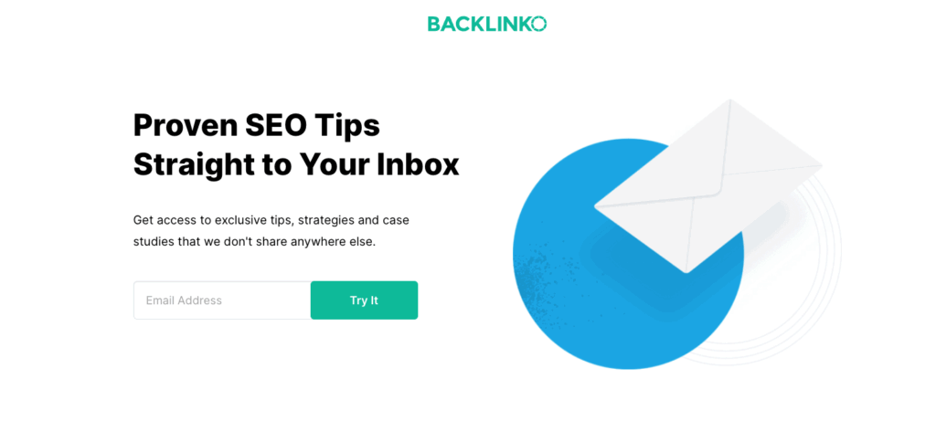
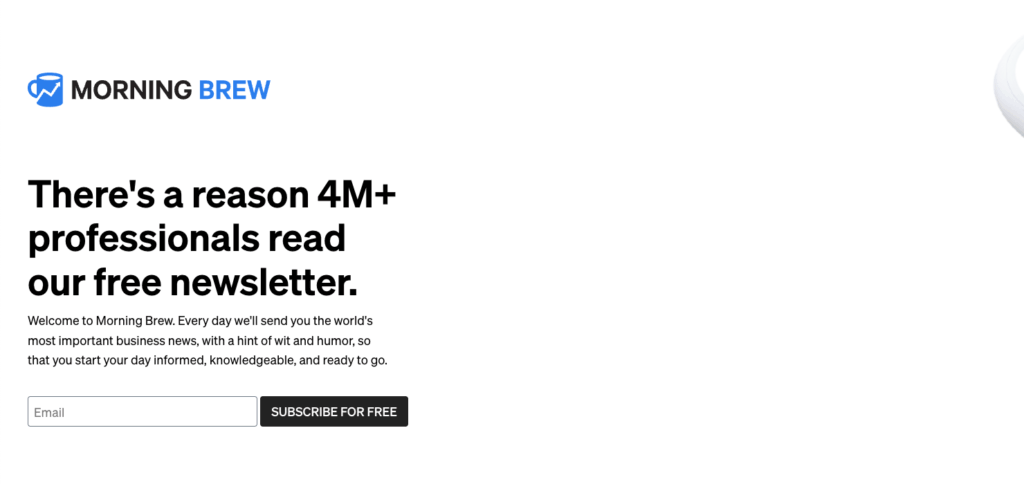
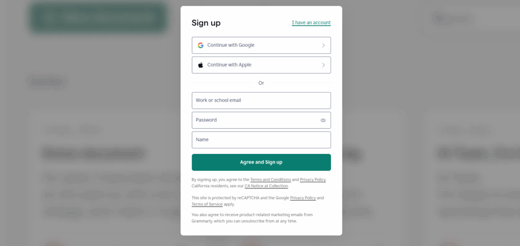
Your optin form is a crucial part of the perfect landing page. A lot of studies have been done about form design and most agree that less is more. In other words, ask for the minimum information you need to get people to sign up. For many, that’s just an email address.

picography optin landing page example

Some people are successful with longer forms, as in the Zoom example below, while others use progressive profiling to ask people for more information on successive visits. This stops you from turning people off by being too demanding before they get to know you.

zoom optin landing page with longer form

Here’s some guidance on optimizing form conversions, though we always recommend testing to see which forms work best with your audience.

Your optin form may also include a picture of the lead magnet or an image that represents your offer, and it’ll include a call to action, which we’ll look at in the next section. Later on, we’ll also look at some key mistakes to avoid with your optin landing form.

7. Call to Action

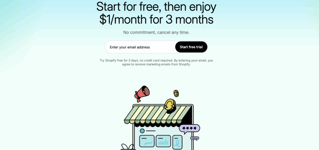
Next to the headline, the most important part of your optin landing page is the call to action (CTA). The call to action tells people what you want them to do and what they will get. Here’s our guide to writing the perfect call to action to help with this. This is usually a clickable button that allows people to take up your offer after entering their information, or triggers a signup form, as in this example from Shopify.

shopify landing page cta

On some landing pages, the CTA appears only on the form, but on others, you’ll include it multiple times on the landing page.

Landing Page Mistakes to Avoid

Now that you know the basic steps in creating a landing page, there are a few mistakes to avoid to make your optin landing page more successful.

First, and most important, don’t try to make your landing page be all things to all people. If you’re focusing on multiple segments, your landing page won’t be effective. Know who you’re trying to reach and target your landing page to that segment of your audience.

You can also use your landing page to segment your audience, as Khan Academy does here:

khan academy optin landing page to segment users

Don’t neglect trust factors. It’s easy to get so caught up in creating your landing page that you forget that every landing page is part of building a relationship with your visitors. Sure, it’d be great to be able to send visitors to a landing page and get an immediate conversion, but that won’t happen unless they trust you. Trust factors to include are:

  • A privacy promise on your optin form, letting people know you won’t spam them, and that they’re free to unsubscribe at any time.
  • Social proof, which we mentioned earlier.
  • Trust seals, in case it’s a landing page where you’re asking for financial information.

The event landing page includes testimonials to reassure new visitors that they’re making a good choice when they sign up.

optin landing page created with seedprod

We created the landing page above using SeedProd, keep reading to find out how you can create your own.

Don’t forget about responsiveness. Landing pages that don’t work on mobile devices are another mistake that we still see far too often. More than half of your audience will visit your landing page from a smartphone or tablet, so make sure the landing page is mobile-optimized, and that includes your optin forms. Here’s our guide to optin forms to help you choose the best one.

Don’t speak like a marketer; speak like a human being. Write like you’re talking in a friendly tone to someone who’s in the room with you. That said, make sure your spelling and grammar are perfect; a typo can turn people off, even if they’re not sure why.

Check out our roundup of expert advice on writing landing page copy for more mistakes to avoid.

Landing Page Best Practices

You only have a few seconds for your landing page to make a good impression. Here are some best practices for landing page design and copywriting you’ll want to pay attention to.

Maintain message match. Message match is exactly what it sounds like, making sure what you say about your offer in one place, like on social media, your blog or your ads, matches what’s on the landing page. It’s a way to make sure people who arrive at your landing page get what they expect. The Content Marketing Institute does this well for its CMI World event, using consistent branding and messaging wherever you see event promotions:

content marketing institute landing page example

Some people recommend that you put your optin form at the top so people who arrive and are ready to sign up can do that immediately. That advice also applies to your call to action, which as we’ve said can appear on multiple places on your landing page. Don’t take this as gospel, though; see if it works for you.

Remove unnecessary distractions. Anything that gets in the way of visitors completing the desired action doesn’t need to be there. That applies to navigation, sidebars, footers, links to your social media profiles, and too many links in general.

Use search engine optimization (SEO) to help people find your landing page easily when they’re searching for help with the issue your offer solves. A short, memorable URL is also good for SEO, and it helps people remember it when they want to share.

Deliver your lead magnet immediately, as well as by email. You can do that with OptinMonster, by linking the file to your optin form submission button.

Avoid clutter. Give the different parts of the page breathing room; they’ll be more effective that way. Pay attention to typography; too many fonts competing for attention just looks messy. Here’s a good example of simplicity from SeedProd:

minimalistic landing page design from seedprod

Add media. Use high-quality images to reflect your high-quality brand and place them in the right way to focus people’s attention on your optin form. That gives them a subtle cue to sign up.

Also, consider using video marketing. It’s highly trustworthy, gets attention, and keeps people on the page longer. That’s why it’s surprising that Nifty Marketing’s stats show that only 26% of top landing pages include a video.

Make sure your page loads fast. This improves the experience for visitors. A good way to do this is with a content delivery network, as recommended in this guide to boosting WordPress performance and speed.

Use color wisely. Understand how color psychology can create an image of your business and encourage people to click.

Make sure the benefits, offer, and call to action are clear. Then read your landing page again and check that everything that’s there:

  • Needs to be there
  • Is in the best location

There’s one more thing, and even though it’s at the end of this list, it’s essential. Split test your landing pages to see that every element is working to achieve your goal. Here’s our split testing guide to help you improve optin landing page performance.

How to Create an Optin Landing Page

So, now that you know what it takes to make a great optin landing page, how do you actually build one?

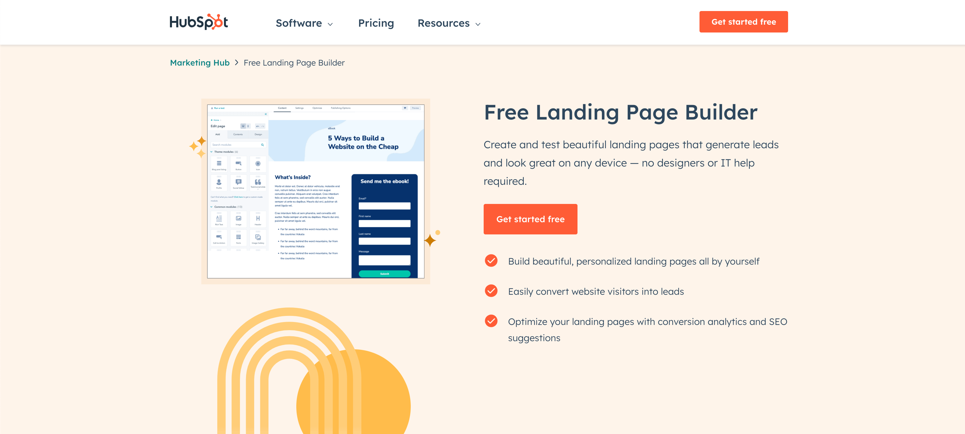
Don’t worry, you don’t have to hire a designer to create a sleek, high-converting landing page. Creating a successful optin landing page is easy if you use the right tools.

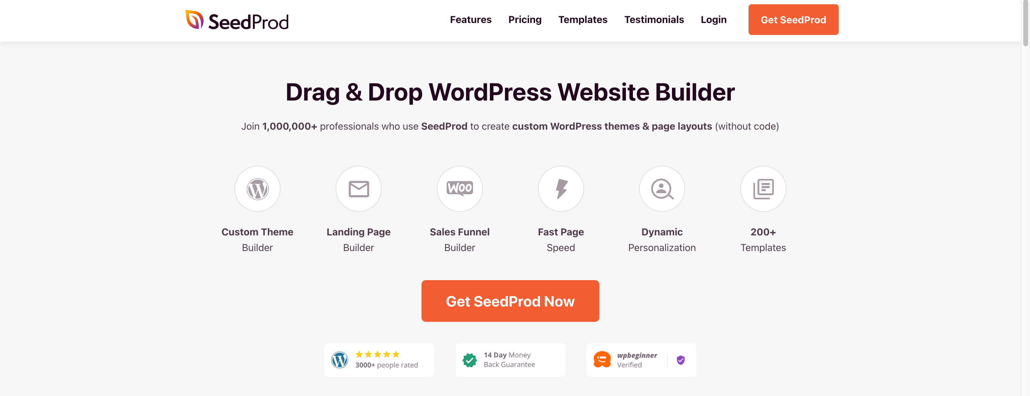
We recommend using SeedProd, it’s the best landing page builder for WordPress.

SeedProd landing page creation tool homepage-min

SeedProd offers a drag and drop builder and over 100 landing page templates so you can quickly create a beautiful optin landing page.

Plus, it also comes with ready-made landing page blocks like optin forms, images, videos, countdown timers, star ratings, and more. This makes it super easy to create a landing page for your exact needs.

Here’s an example of an optin landing page created with SeedProd:

optin landing page example seedprod

Try it out by following our tutorial to create a simple landing page in under 5 minutes!

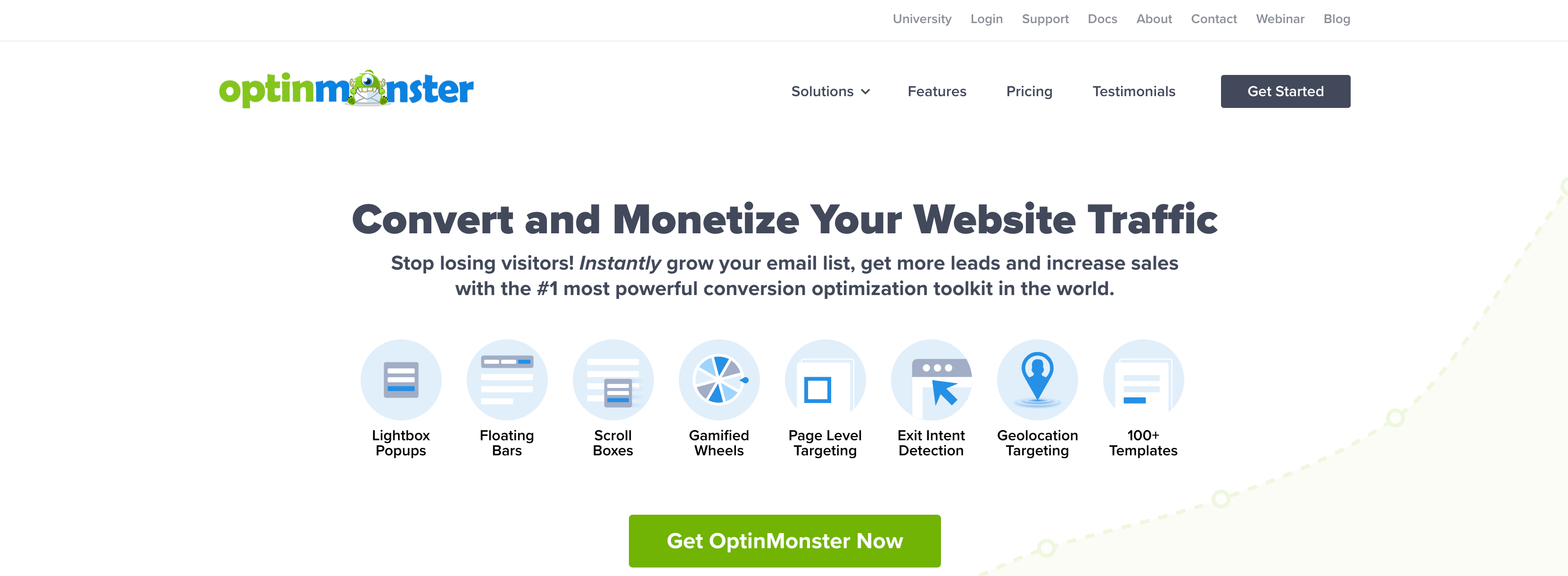
As an alternative, you can use OptinMonster to create an optin landing page.

simple landing page using optinmonster

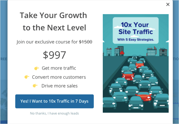
With OptinMonster, you can create a fullscreen campaign that appears overtop of your regular website. This is an effective way to grab the attention of your website visitors.

Using the campaign triggers, you can choose when to display your optin landing page. For example, you can display your campaign after visitors have been on the page for a certain amount of time.

Want to create your own fullscreen optin campaign with OptinMonster?

Click the button below to start your 100% risk-free OptinMonster account today:

Create an Optin Landing Page Today!
 

Now you understand how to create the perfect optin landing page so you can convert more of your visitors into subscribers, leads and sales.

And remember, once visitors have opted in, the trick is to nurture the relationship. Check out our beginner’s guide to email marketing to help with this. And don’t forget to follow us on Facebook and Twitter for more in-depth guides.

Stuck on what to create? Here’s a list of landing page ideas to get you started.

Or, you may want to check out this article on landing page optimization (7 tips + 5 case studies).

Sharon Hurley Hall has been a professional writer for more than 25 years, and is certified in content marketing and email marketing. Her career has included stints as a journalist, blogger, university lecturer, and ghost writer.

Disclosure: Our content is reader-supported. This means if you click on some of our links, then we may earn a commission. We only recommend products that we believe will add value to our readers.

Comments

  1. Thomas Griffin June 26, 2017 at 8:00 am

    Thanks for reading this article – I hope you found it helpful.

    I wanted to let you know about our powerful Exit Intent® technology that converts abandoning website visitors into email subscribers and customers. Typically 70% of the people who visit your website will leave and never return, meaning all those marketing efforts to reach them have gone to waste.

    OptinMonster’s Exit Intent® technology detects user behavior and prompts them with a targeted campaign at the precise moment they are about to leave.

    You can unlock this powerful technology 100% free when you purchase our OptinMonster Pro plan.

    Get started with OptinMonster today and see why 1,000,000+ choose OptinMonster to get more subscribers and customers.

    Thomas Griffin
    President of OptinMonster

  2. Liked your content & presentation very much. Thank you!

  3. Truly informative and directive enough. Importantly good live examples etc.

Add a Comment

We're glad you have chosen to leave a comment. Please keep in mind that all comments are moderated according to our privacy policy, and all links are nofollow. Do NOT use keywords in the name field. Let's have a personal and meaningful conversation.