One of the simplest ways to lift conversions is using exit-intent popups.
An exit-intent popup is a type of overlay that appears just as a visitor is about to leave your site, triggered based on the user’s mouse movements or mobile scroll. With the right design and messaging, exit-intent popups can re-engage visitors by presenting an irresistible offer, valuable message, or compelling call to action.
In this article, I’ll show you 40 (that’s right) exit popup strategies that our customers have seen success with again and again. And along the way, I’ll share some of our favorite exit-intent popup examples, along with data from real-life case studies.
Why Trust OptinMonster
At OptinMonster, we’ve spent over 10 years helping businesses skyrocket their conversions with perfectly targeted popups. Our industry-leading Exit-Intent® technology lets you easily trigger popups that stop abandoning visitors in their tracks. Should you trust our expertise on exit-intent popups? The answer lies in the success of our customers:
Shockbyte more than doubled their sales conversions with OptinMonster exit popups.
Reliablesoft.net increased their conversion rate by 300% with a single exit-intent optin popup.
And that’s just the tip of the iceberg. Over a million websites rely on our premiere lead-generation software to convert their website traffic into subscribers and revenue.
How Do Exit-Intent Popups Work?
Exit popups let you make one last effort to convert visitors as they’re about to leave your site. OptinMonster’s Exit-Intent® technology detects when visitors are about to leave your site and delivers targeted messages at precisely the right moment. This patented technology uses smart tracking algorithms to monitor user behavior and identify exit intent in real-time.

How It Works:
- Cursor Tracking on Desktop
For desktop visitors, Exit-Intent® technology tracks mouse movement. When a user’s cursor moves toward the top of the screen, such as to close the tab or navigate to another URL, the popup is triggered. - Scroll and Button Tracking on Mobile
On mobile devices, where cursor tracking isn’t an option, OptinMonster uses intuitive behavioral cues. The popup appears when users scroll upward, which often indicates they’re navigating away. Users can easily customize the popup trigger sensitivity to their liking.
Here’s what Exit-Intent® looks like on mobile:
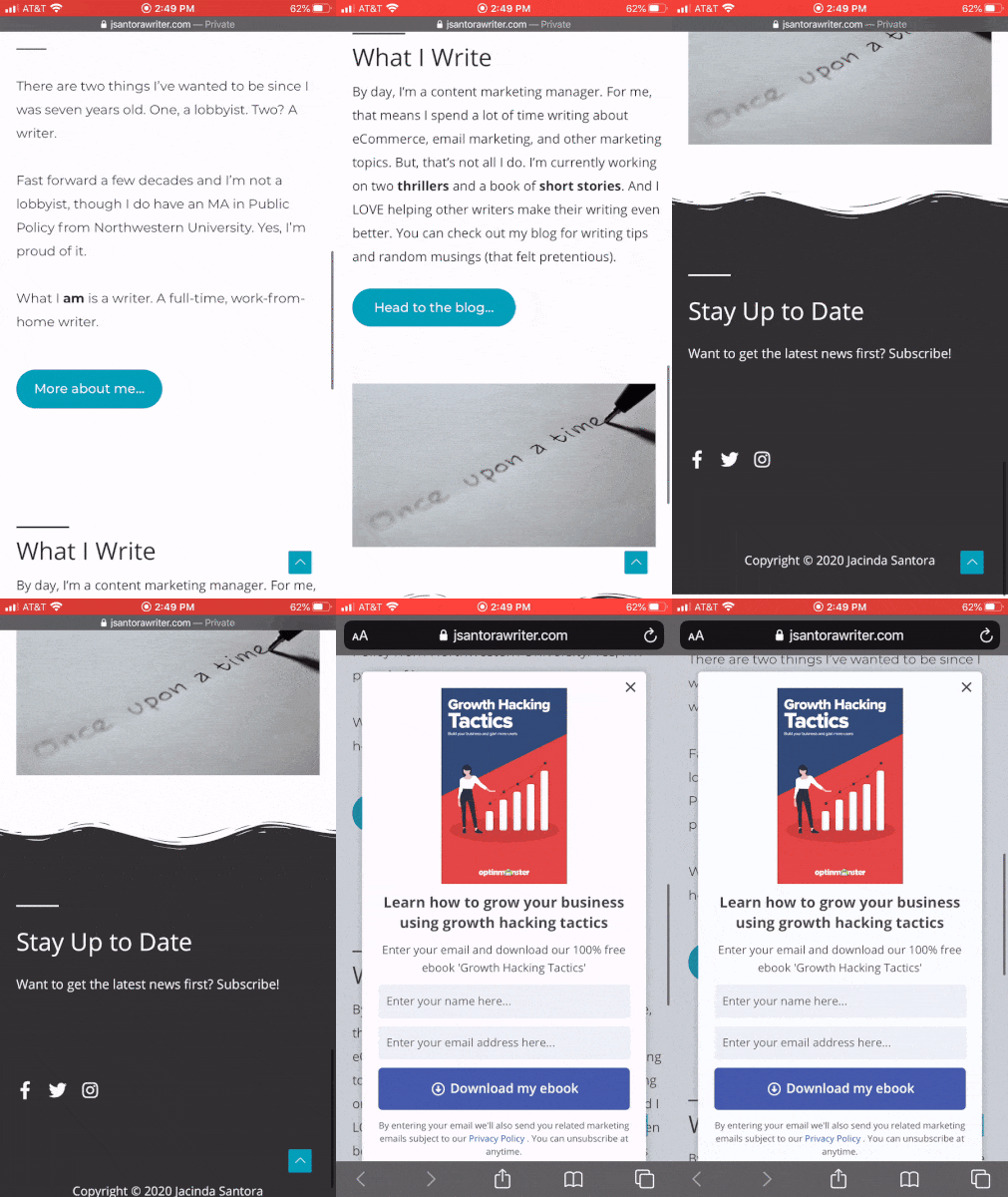
You can set up your Exit-Intent® trigger in just a few clicks in OptinMonster’s Display Rules. First you select Exit-Intent® as your trigger:

Then, you’ll select the level of sensitivity:

That’s how easy it is to set your OptinMonster popups to display when users try to exit your site.
When popups first started appearing on the web, many felt they were annoying. They were overused, and the same ‘special offer’ appeared to every visitor.
But OptinMonster changed that. Our powerful targeting features, such as Page-Level Targeting and Referrer Detection, let you show each visitor the offer they’d be most interested in. And with our Exit-Intent® trigger, you avoid interrupting your visitor’s experience on your site. Instead, you show them your most enticing offer to capture email addresses and win sales before they leave.
Are Exit-Intent Popups Effective?
Yes, exit-intent popups are extremely effective.
Our customers consistently see higher conversion rates with exit messages than other kinds of popups. Exit popups typically convert an additional 2 to 4% of your website visitors.
I mentioned earlier that Shockbyte doubled their sales conversions with OptinMonster. They used this simple exit popup to capture the attention of abandoning visitors:
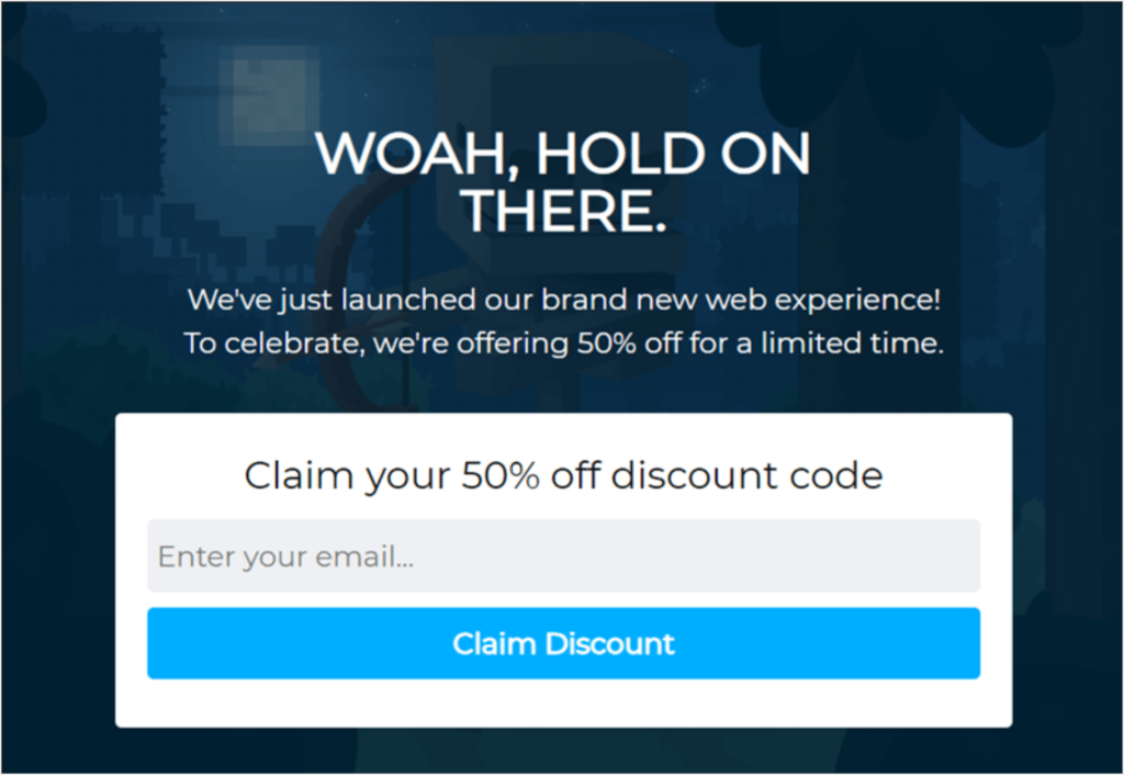
This campaign converted a phenomenal 13.73% of visitors. Instead of losing those visitors forever, Shockbyte captured their email address for future email marketing campaigns. And the 50% discount was a fantastic incentive to encourage visitors to make a purchase.
Overall, OptinMonster helped Shockbyte grow their business 10x in just 3 years.
There are so many benefits to using exit-intent popups on your website. Here are just a few ways these campaigns will help your business:
- Grow Your Email List: Attract new subscribers with fast results.
- Distribute Lead Magnets: Entice new visitors with valuable content, coupons, freebies, and more.
- Keep Visitors on Your Site Longer: Reduce your bounce rate and improve your average time on page. Get more chances to convert visitors into customers!
- Reduce Cart Abandonment: Provide incentives to buy at a critical moment in the customer journey.
- Boost SEO: Engage in smart popup SEO by encouraging engagement and redirecting users to popular posts.
BONUS: Done-For-You Campaign Setup ($297 value)
Our conversion experts will design 1 free campaign for you to get maximum results – absolutely FREE!
Exit-Intent Popup Strategies To Boost Engagement and Sales
Precise Targeting & Personalization
If you want your exit popups to be successful, you need to show your visitors targeted offers based on their behavior and demographics. Sound complicated? It doesn’t have to be with OptinMonster. OptinMonster offers advanced targeting rules that help you reach specific segments of your audience with perfectly tailored messages.
1. Target Exit-Intent Popups Based on Page Content
The page your visitor is reading gives you a lot of information about their interests and motives. OptinMonster’s Page-Level Targeting lets you display exit popups based on the content the visitor is browsing. For example, eCommerce stores can promote discounts for specific product categories. Publishers can target their lead magnets based on which blog post the visitor is reading. This ensures your offers align with the visitor’s interest, increasing engagement and conversions.
Here’s an example of a lead magnet popup we’ve used here on OptinMonster’s site. We use Page-Level Targeting to show this offer on posts that are closely related to email marketing campaigns.
![optinmonster-fullscreen-lead-magnet-popup-example - OptinMonster OptinMonster fullscreen website popup that says "How to Run a Successful Email Marketing Campaign [Cheatsheet] Create high-converting email campaigns EVERY time." Fields ask for name and email address. CTA button reads "Give Me the Cheatsheet!"](https://cdn.optinmonster.com/wp-content/uploads/2020/07/optinmonster-fullscreen-lead-magnet-popup-example--1024x485.png)
2. Display Messages Based on Traffic Source
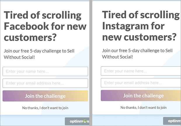
Detect where your visitors are coming from and customize your exit popups accordingly. With Referrer Detection, you can display unique messages for traffic from social media platforms, partner sites, or even paid ad campaigns. Here’s an example of how you could show different messages for visitors coming from Facebook vs. Instagram.
3. Tailor Exit Popups to Physical Location
Do you have special offers that are only relevant in specific countries, regions, or cities? Geolocation Targeting allows you to adjust your messaging based on the visitor’s physical location. Highlight region-specific offers, such as free shipping for U.S. customers or event details for local audiences. It’s an easy way to make your campaigns feel personal and relevant to each visitor.
Skates.co.uk used Geolocation Targeting to target shoppers in specific countries where they offered free, fast shipping. Here’s the popup they showed to visitors in France. It assured them that they would receive their orders in just 3 days, and it offered a 5% discount code:
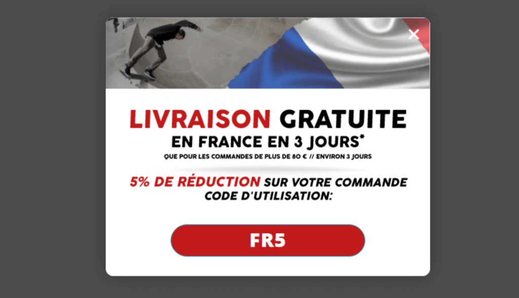
By using OptinMonster, Skates.co.uk converted 10.97% of abandoning visitors as many as 39% of geotargeted visitors.
4. Show New Popups to Existing Subscribers
If someone has already taken the action you wanted them to take, such as subscribing to your email list, don’t show them the same popup again! That’s a recipe for annoying your visitors.
You should, however, show a different popup with a different offer to those visitors.
You can do just that with OptinMonster’s display rules engine, especially by using OnSite Retargeting® and OnSite Follow Up Campaigns®.
Once you’ve gotten a visitor to subscribe to your email list through your popup form, you can show them a different exit popup. Your next popup should encourage them to take the next step in your sales funnel. For instance, you could direct them to a webinar or offer an exclusive discount.
5. Use Your Visitor’s Name or Location
Catch visitors’ attention by personalizing your exit popup text specifically to them. With OptinMonster’s Smart Tags, you can include your visitor’s first name or their location right in the text on your popup.
Here’s an example of using a user’s first name in a popup:
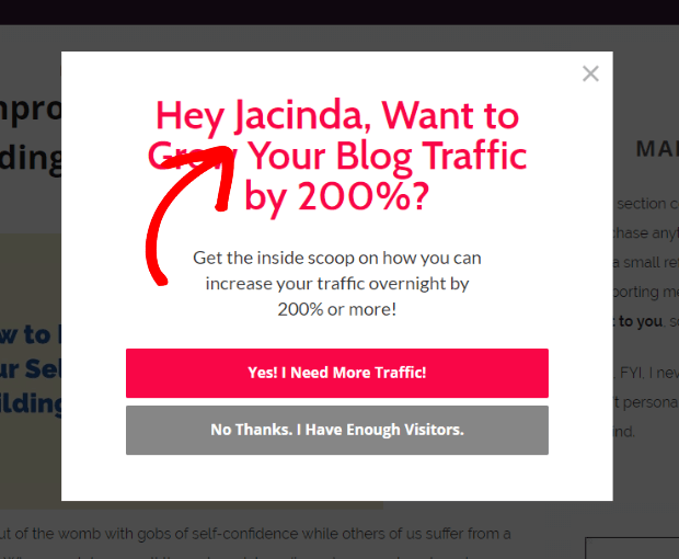
And here’s an example of combining Smart Tags and Geolocation Targeting to personalize your popup based on physical location.

If you’re ready to start precisely targeting every exit-intent popup on your site, OptinMonster has all the tools and features you need.
Exit Popup Offers
If you want to stop exiting visitors in their tracks, show them an offer that can’t resist. You can use plenty of offers in an exit-intent popup to tempt visitors to stay. Check out our favorites below.
6. Offer a Content Upgrade
How about presenting your abandoning visitor with an upgrade to the content they were just reading?
By offering content upgrades, RazorSocial increased its conversion rate by a whopping 520%!
Here’s the exit popup example:
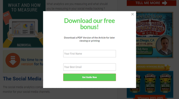
A content upgrade is a more in-depth or a higher-value version of a particular blog post. So, if your blog post is about how to create an email newsletter, your visitors might read it and be very interested in getting started. As they go to close the browser, present them with a free download of a PDF version of the post or a checklist with the steps they need to follow.
7. Offer a Discount
It’s always a great idea to use an exit-intent popup to offer a discount in exchange for the visitor’s email address. This tactic accomplishes 2 things at once:
- Offering a discount code encourages shoppers to go through with a purchase they were on the fence about.
- Even if they don’t buy today, offering a coupon lets you collect their email address, so you can market to them in the future.
Here’s an example of one of OptinMonster’s popup templates that features a discount offer:
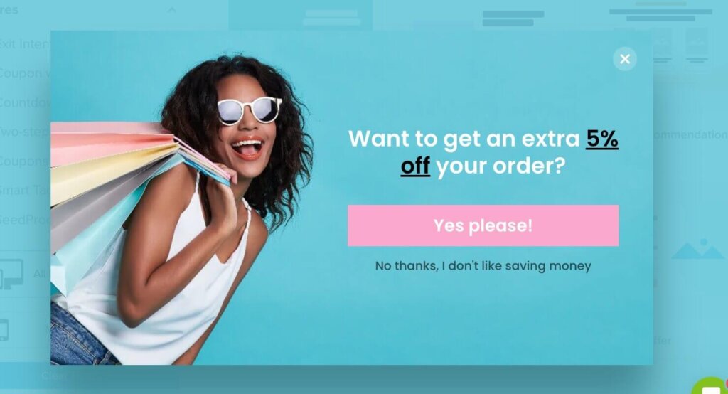
This is just one of the 700+ premade templates that OptinMonster customers can choose from.
If you’re looking for a surefire way to recover visitors who are about to abandon your eCommerce site, coupon exit-intent popups are the way to do it. After all, if someone is interested in buying your products, why wouldn’t they accept an easy discount?
8. Offer Free Shipping
Did you know that unexpected costs, such as shipping, are the #1 reason for shopping cart abandonment? Offer free shipping in your exit-intent popup, and you stand to convert some of those abandoned carts into purchases.
A free shipping popup can look something like this:
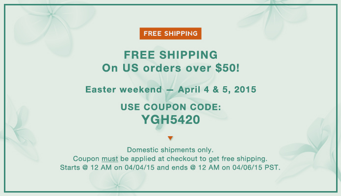
When you include a price threshold for free shipping, you can also improve your average order value.
9. Offer a Done-for-You
Sometimes your visitor enjoys your content but is too busy to implement your advice. Solve that problem for your visitors by offering a done-for-you solution.
For example, Betty Means Business offers 3 essential done-for-you scripts to attract more clients and optimize conversions.
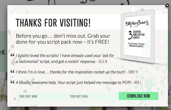
You could offer something similar with a fill-in-the-blank PDF template, an Excel spreadsheet, a Photoshop file, a Word Document, or even audio clips.
On product pages, you could implement an exit-intent popup with an offer to configure the product for the customer. Or, if the product requires any work on the customer’s part, offer a complete done-for-you service.
Put yourself in your visitor’s shoes and think, “What can I do to make their life easier?” You’ll have the perfect hook for your exit message if you can save them time or frustration.
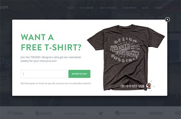
10. Give Visitors a Chance To Win
Sometimes visitors need a little extra incentive to take action by hosting a giveaway or contest. Free digital downloads are increasingly common prizes, but physical items tend to have a higher perceived value. So, why not give away something physical?
You don’t need to give everyone a physical gift. Just give them a chance to win the gift when they sign up for your newsletter.
For example, the design app Invision offered users an entry into their free t-shirt drawing in exchange for their email address.
Yorkdale, a shopping center in Toronto, offered an entry into their monthly drawing for a $150 Yorkdale gift card.
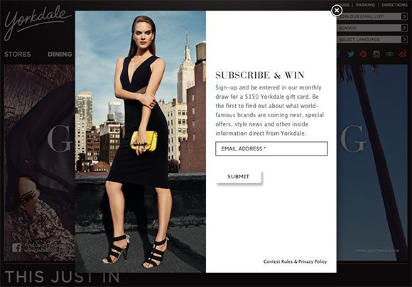
You could also offer additional entries for other actions, like sharing on social media or referring a friend via email. Giveaways are a powerful means of driving traffic to your website, so put them to good use in your exit popup.
Helpful Hints
When someone’s about to leave your site, it’s likely because they couldn’t find something they needed. Encourage them to stick around by sharing some helpful hints.
11. Suggest Related Posts
Whether you’re a publisher or an eCommerce store, your website acts as your online storefront. The longer someone stays in your store, the better. So, sometimes your main objective is to reduce your bounce rate and have your visitors spend more time on your site.
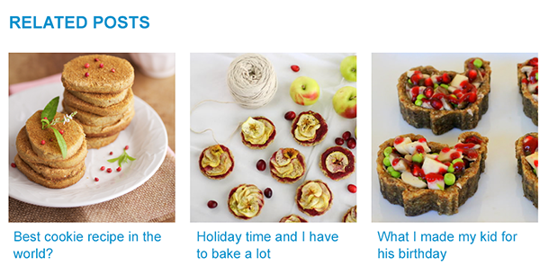
A great way to do that is by using an exit-intent popup to suggest blog posts related to the one they were just reading.
Remember, there are several different reasons someone might click away from your site, and it doesn’t always mean they aren’t enjoying your content. Perhaps they simply got distracted by something, like a new email or social media notification.
Remind them why they visited your site in the first place: to get specific information from your content.
The key to the related posts technique is making sure that your headlines are highly clickable. Also, use enticing images that draw the eye and relate specifically to the post topic. If your related posts are appealing, you’re more likely to re-engage distracted visitors and persuade them to stick around for a while.
12. Suggest Related Products
Just like you can suggest related posts in an exit popup on a blog, you can also suggest related products on product pages.
If you have a wide range of products (like clothing or shoes), it’s extremely helpful to recommend other similar products related to the one that the shopper is viewing. The product they’re looking at might not be the right fit, but a similar product might be exactly what they need.
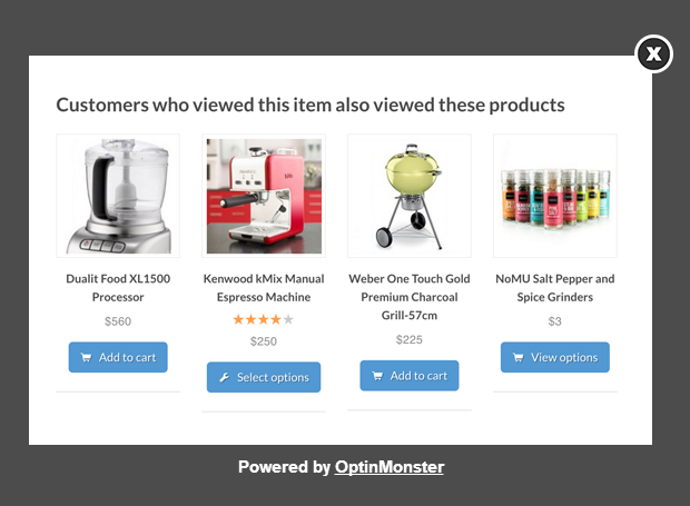
OptinMonster offers a template to make product suggestion popups a breeze:
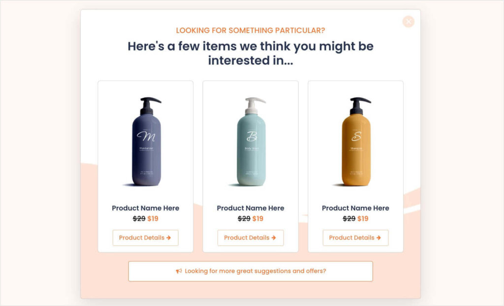
13. Suggest Popular Products
Throw some social proof into the mix and suggest your most popular items in an exit-intent popup.
Not only does this help keep shoppers on your eCommerce site for longer, but it also reminds them that other shoppers love your products!
Muubbaa, a leather apparel company, used the headline “Most Wanted” to reinforce the desirability of their clothing.

14. Overcome Objections
This is one of the best exit popup hacks for eCommerce product pages and checkout pages.
What if your potential customer is on the fence about purchasing your product? What if you could overcome that objection it would be the last nudge they need to make the purchase?
One of the biggest objections shoppers have is the worry they’ll buy your product and later regret it. The dreaded Buyer’s Remorse.
You can use your exit popups to reassure visitors about your product or service’s value.
In this exit message example, Neil Strauss focuses on the benefits of joining his membership community. The exit popup increased conversions by 125%.
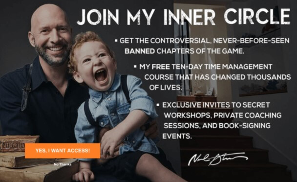
Take inventory of all the likely objections your shoppers may have. Then make sure that you’ve thoroughly covered them all, either on your product or checkout page or exit-intent popup.
Most Common Objections
Here are online shoppers’ most common objections, along with ideas for how you can overcome those objections in your exit popup:
- I need to think about it. People make purchases based on emotion, so if you appeal to them on an emotional level, you’ll likely overcome this objection.
- I need to talk to my wife/husband/partner. Give them a reason why their significant other will be grateful that they got this product.
- I can find it cheaper somewhere else. Demonstrate that you’re the best value or the best price around.
- I’m happy with what I already have. Show them how their life will be better with your product.
- I don’t have the budget. Offer a payment plan. Or, calculate how your product will save them money or make them money in the long run.
- I’m not sure if it will work for me. Offer a free trial or money-back guarantee.
- How do I know my credit card information will be safe? Display a security badge.
- I don’t have time right now. Throw in a limited-time bonus.
- Why should I choose you instead of the other guy? Show what makes you better than your competitors.
15. Give a Reminder of Items in Cart
When a shopper is about to abandon their cart, exit popups offer the best chance to recover them.
Simply remind them that they still have items left in their cart, creating a strong, sometimes irresistible, urge to get closure by completing the purchase.
Your copy could say something like, “Wait! You still have these items in your cart…” or “Wait! Don’t leave without your.” And then includes images of the items they’re about to leave behind.
Sometimes, however, shoppers just need more time to be ready to buy, even though they’re still interested. Offer to save their basket and collect their email in the process. Then it will be super easy for them to come back to your site and pick up where they left off, and you can even start sending them emails to remind them of what they’ve left behind. Check out our list of abandoned cart email examples for inspiration.
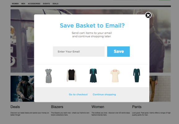
16. Offer a Free Trial
It takes approximately 7 touches to make a sale. That means that potential customers interact with your business an average of 7 times before they make a purchase. Offering a free trial gives you a great chance to get your foot in the door and warm up your leads with multiple touches.
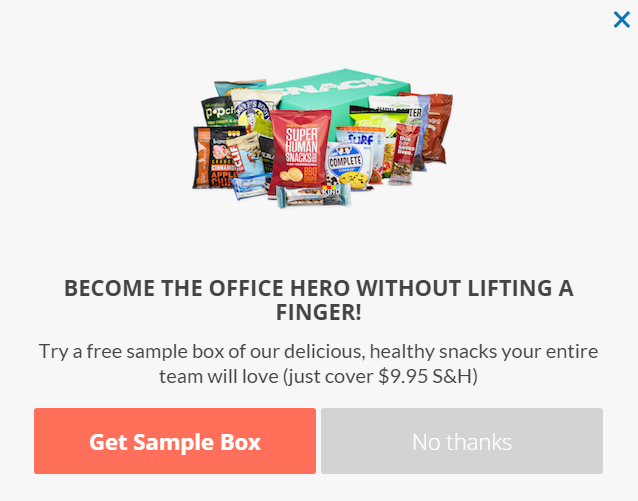
SnackNation understands this well. All you have to do to get a free sample box delivered is cover the $9.95 shipping and handling.
Web Designer Depot offers 7 days of free downloads. This popup is smart because it highlights how valuable this free trial is, with over 250,000 graphics to choose from.

17. Offer To Chat
You’ve probably been on a sales page before where you saw a chat box pop up, like this one from Xchop:
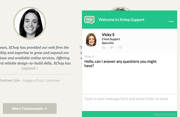
This lets you give your potential customers answers to any questions they may have about purchasing your product or service.
Want to learn more about live chat options? Check our list of the 13 best WordPress live chat plugins.
Micro Conversions
Micro conversions are the small steps that website visitors take before making a purchase. This category of exit popup hacks is about getting the visitor to take a small first step. Once they start, they’re more likely to continue. Making the first step easy can increase your overall conversions.
18. Give Visitors a Few Choices
The problem with so many exit-intent popups is that they need to offer something the visitor wants. This happens because many businesses have several different buyer personas, and each persona will respond to offers differently.
Sure, your popup might be offering the greatest ebook known to man about how to juggle 6 balls in the air. But what if a segment of your visitors has already mastered that technique? Then your offer is useless for capturing those visitors.
A simple way to get around this problem is to let them choose what they’re most interested in.
You can do it by first presenting an exit popup with 2-3 options to choose from:
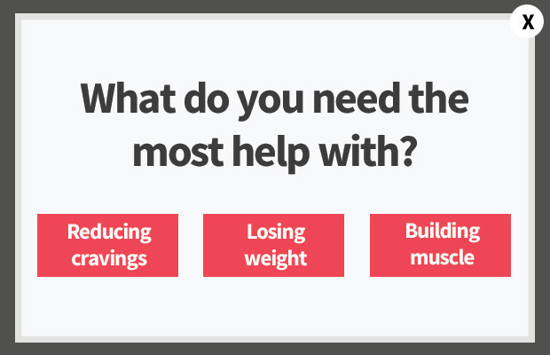
Once they select an option, present them with the optin form to get a lead magnet tailored to their chosen topic.
19. Present a Survey
Customer feedback surveys are a great way to learn more about your visitors and how you can make your website better. However, many sites use them at the wrong times, which makes for a terrible customer experience.
Imagine landing on a website for the first time and then being hit with a survey about how your experience has been on the website. Or being right in the middle of a purchase and getting interrupted by a popup survey. That would be annoying.
The good thing about exit-intent popups is that they don’t interrupt visitors as they’re reading your content. This makes exit popups great for surveys. Just make sure that you don’t include a survey on your homepage or on any other page where it wouldn’t make sense for a survey to be.
Also, be respectful of your visitor’s time and don’t expect them to fill out a survey for nothing. Give them something in exchange. Here’s an exit popup example of a quick 15-second survey with a free gift:
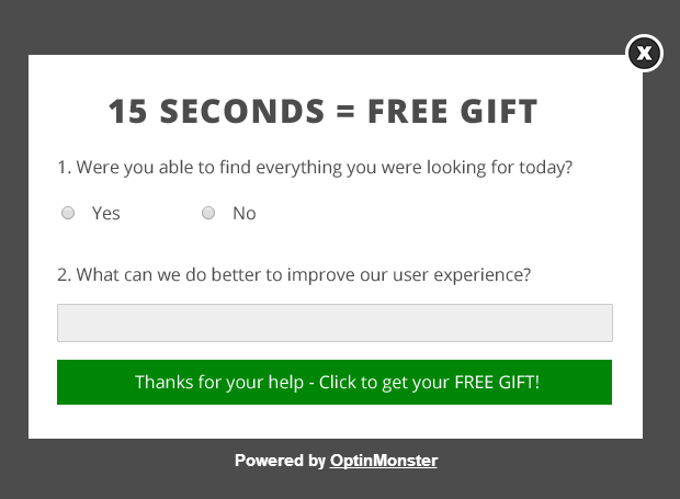
Quick Tip: You can also use the Field Mapping feature to add custom fields to your survey forms, like radio buttons, phone fields, text areas, number fields, lists, and more!
20. Use a 2-Step Optin
Getting visitors to take action is easier when you break the process into smaller, simpler steps. That’s the idea behind 2-step optins. Instead of immediately showing a form, you start by asking visitors to click a button with an easy yes-or-no question or a tempting offer. Once they’ve taken this first step, they’re more likely to follow through and complete the next one, like entering their email address.
OptinMonster makes it easy to create 2-step optins with features like Yes/No View and MonsterLinks. Here’s how you can put them to work:
- Yes/No View: Create an exit-intent popup with a simple yes-or-no question, such as “Want 20% Off Your First Order?” When visitors click “Yes,” the form appears, inviting them to claim the discount. This eliminates the overwhelm of seeing a form right away and makes the process feel effortless.
- MonsterLinks™: Turn any text, image, or button on your site into a clickable link that triggers a popup. For example, use a CTA like “See the Secret to SEO Success” that opens a form to download a lead magnet.
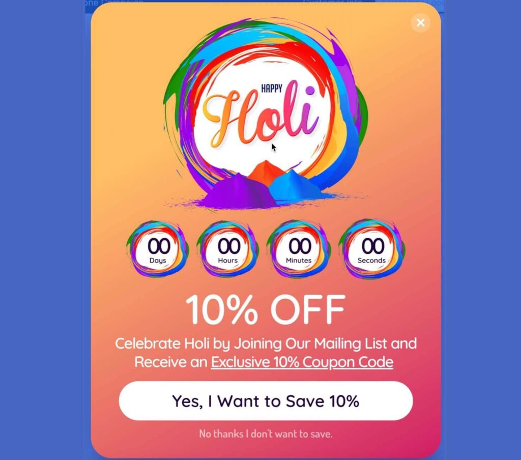
By default, most of OptinMonster’s templates include an optional Yes/No View:
Kinobody used MonsterLinks™ to trigger waiting list popups for their upcoming products:
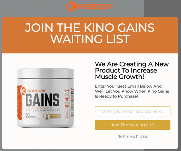
Kinobody converted 39.87% of visitors who clicked one of their MonsterLinks™. This phenomenal result is a testament to the power of 2-step optins.
Read the full Kinobody case study.
People feel more comfortable taking small steps. By presenting a clickable button instead of an immediate form, you reduce friction and encourage visitors to start engaging. That initial click creates momentum, making them more likely to follow through.
FOMO
No one wants to lose the chance to get something they want or that’s valuable. Your exit popup is the perfect place to stir up some fear of missing out (FOMO) right before visitors leave your site.
21. Create Scarcity
It’s well-known that scarcity increases the urge to buy. Nobody wants to miss out on getting something they want, and it doesn’t feel good when someone else gets a great deal, and you don’t.
Discount retailer Zulily did an amazing job of creating scarcity. When you added an item to your cart, they included the number of items left in big red letters on the shopping cart page. In the example below, you can see a cart that says “HURRY—only 6 left!”

Now imagine how effective this could be as an exit message that appears when someone is about to abandon their cart.
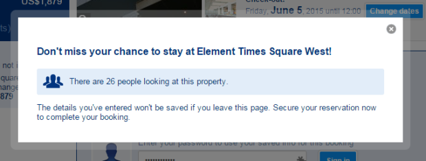
Booking.com used this popup during the reservation process to show how many other people are looking at the same hotel. This adds to the sense of urgency to book right away. Better act now before someone else gets your room!
22. Add Urgency With a Countdown Timer
It’s human nature to procrastinate. People tend to put off making decisions like completing a purchase or subscribing to a newsletter.
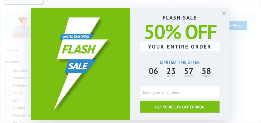
When you add a Countdown Timer to your popup campaign, you can create a sense of urgency that encourages visitors to act quickly.
For example, Cosmetics Capital increased their leads by 300% by using a Countdown Timer:

Many of OptinMonster’s templates include a Countdown Timer, but you can also easily add one to any popup with our drag-and-drop builder.
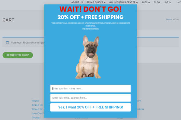
23. Use the Word “Wait”
Stop your visitors with the powerful word “wait.”
Perhaps it’s due to our need for closure, but there’s a sense of urgency and intrigue about the word “wait.”
This exit popup example combines “wait” with a free shipping offer.
Green Mountain Mustard knew you were thinking about buying mustard since you were browsing their site, so their exit popup gives you a friendly, tongue-in-cheek reminder.
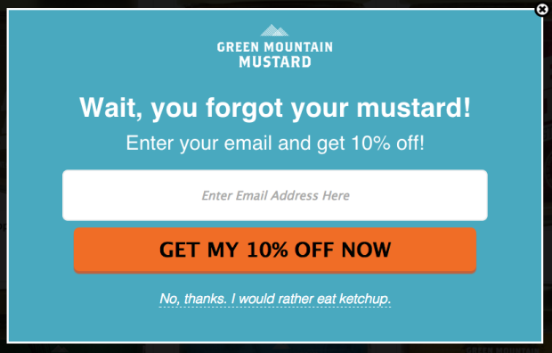
Do the same on a landing page or a product page. Remind visitors what they’ll miss out on if they click away now.
Authority
We often look for external authority figures to help us make decisions. Appeal to that need for authority in your exit-intent popups to drive more conversions.
24. Use Social Proof
Social proof works because we tend to look to others to decide the right thing to do.
Over 100,000 web developers can’t be wrong, right?
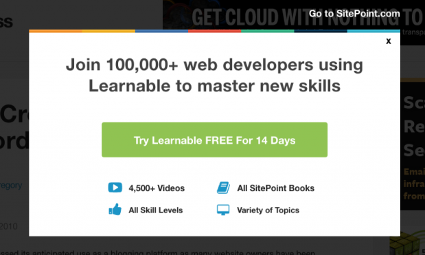
Or how about 310,000+ dog lovers? If you’re a dog lover, you might ask yourself, “Why didn’t I join this community sooner? If so many others have joined, they must know something I don’t.”
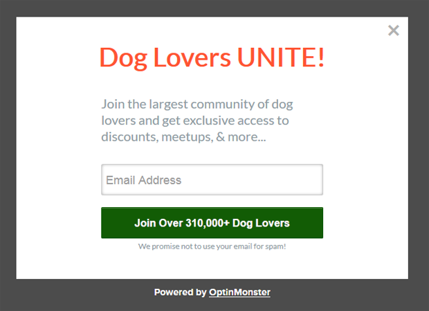
These are some impressive examples, but you don’t necessarily need huge numbers to leverage social proof in your marketing. You don’t need your numbers at all. A glowing testimonial or customer review can be just as effective as an impressive statistic. (More on testimonials later).
25. Use Your Credentials
Authority is a powerful tool that you can use to increase conversions on your exit popups.
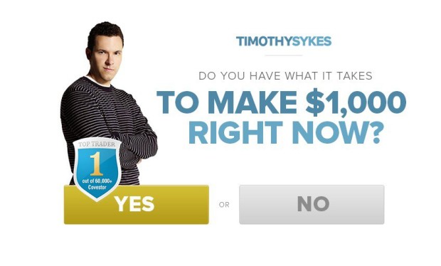
Do you have any special certifications or qualifications that can give visitors greater confidence in your authority and expertise? Show that off on your exit popup!
Timothy Sykes displays his “Top Trader” badge right on his exit-intent popup:
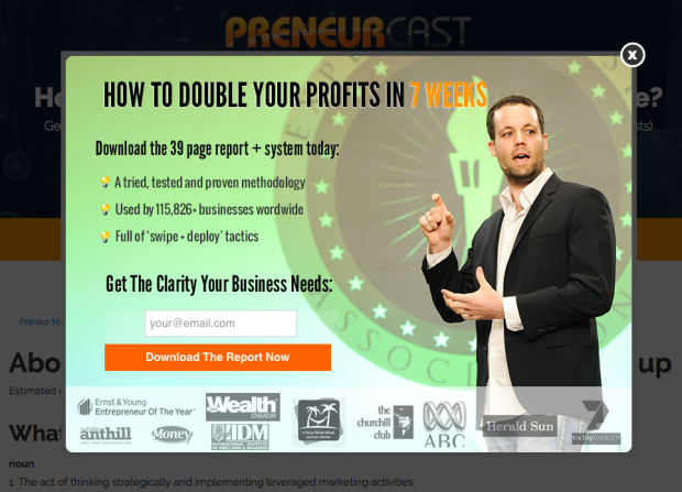
Have you written any guest posts for popular blogs? Have you been featured in any magazines? Display all of those logos at the bottom of your popup as PreneurGroup did:
Remember, people have a natural tendency to follow authority figures. Position yourself as the expert, and it will be much easier to get visitors to take the action you’re asking of them.
26. Include Testimonials
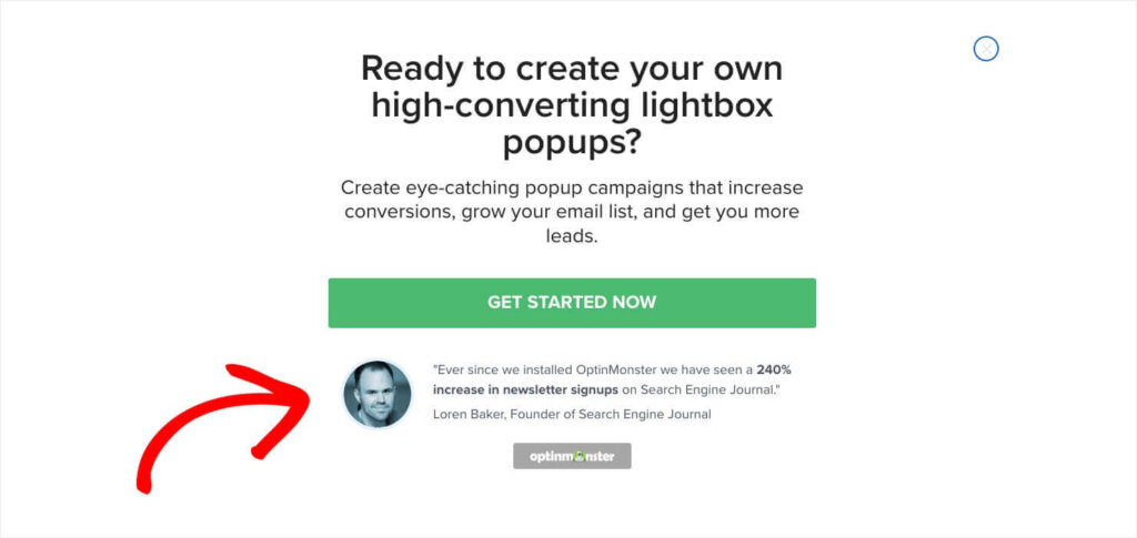
We all know how important testimonials are on sales pages, but what about exit popups? The fact is, your exit-intent popup is a mini sales page. Convince visitors to take action by using recommendations from your customers and subscribers. If you can include a photo of their faces, all the better.
Here’s an example of one of our own exit popups that we use on OptinMonster’s site. It includes just one of our many glowing testimonials:
Learn More About Testimonials
• How to Ask for a Testimonial: 7+ Tips to Get Glowing Customer Quotes
• 10 Creative Examples of Testimonials to Win Customers
Design
Web design best practices also apply to popups. Here are some specific ways to use design in your exit-intent popup strategy.
27. Add a Progress Bar
There is a psychological phenomenon that makes people feel uncomfortable leaving things incomplete. It’s known as the Zeigarnik Effect, coined by the 20th-century Russian psychologist Bluma Zeigarnik.
Zeigarnik saw that waiters could remember long food orders and match the correct meal to each customer, but they promptly forgot these orders as soon as the food was delivered. She wondered why, so she conducted a series of experiments to figure it out.
Her theory was that the pending order created a state of “incompleteness” in the waiter’s mind, which made them unable to let go of the information until that state of mind was resolved through the delivery of the meal.
Through her experiments, Zeigarnik discovered that unfinished tasks are remembered twice as well as completed ones. Humans tend to have a child-like impatience to gratify this need for closure.
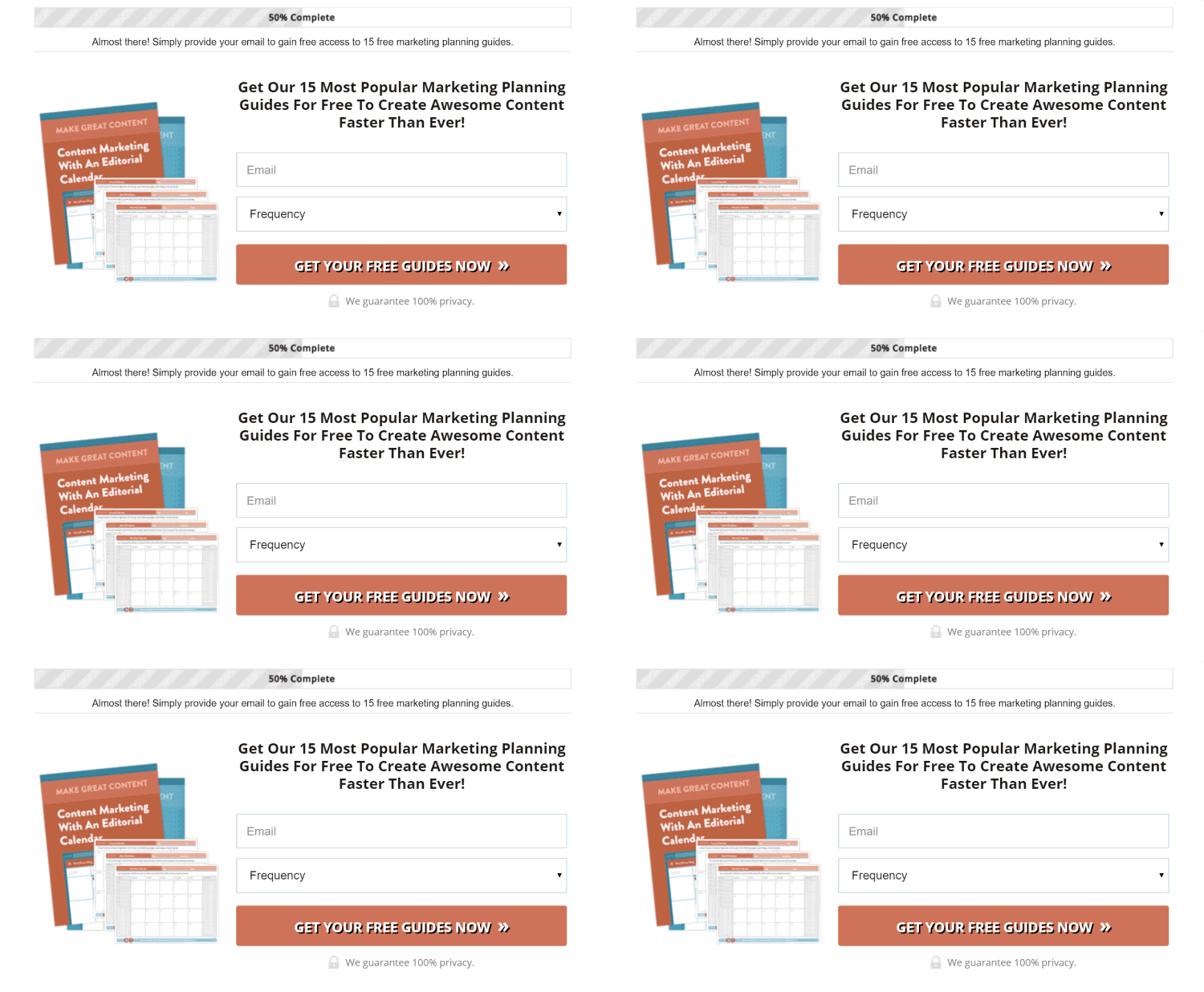
You can use the Zeigarnik Effect to coax your visitors into action by showing them that they have an incomplete task. By pointing out the “incompleteness,” you’ll encourage them to seek closure by finishing the task.
This can work for exit popups as well. All you have to do is display a progress bar at the top. Here’s a popup page from CoSchedule:
28. Include a Picture of the Lead Magnet
Images can make a huge difference in any online marketing campaign, and exit popups are no exception.
In eCommerce, shoppers often are drawn to the product photo before they notice the item’s name.
Images are vital to shoppers when deciding whether to purchase a product. They’re also crucial to getting them to do something smaller, like entering their email addresses for your free ebook.
Brian Dean of Backlinko included a mockup of his site traffic book in this exit popup example:

Since he’s using an image of the product, which includes its title, he doesn’t even need that much copy to get the point across.
29. Use Arrows
Like great copy, great popup design can increase conversions on your exit-intent popups by drawing the eye where it needs to go.
Our eyes have the ability to take in so much visual information that it’s more than our brains can consciously process. So, we’re hardwired to focus on only the most compelling information, the information we believe to be the most important. We simply skim over the rest.
People naturally look for visual cues to tell them what information they need to pay attention to. Because of this, we can direct where the eye will look by guiding the eye using visual cues, like arrows.
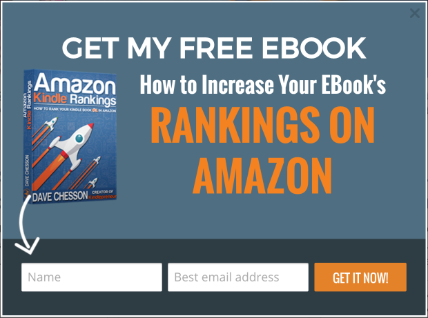
Arrows help the viewer comprehend information better than written directions alone. They point the way, direct the viewer’s focus, and help the viewer filter out unimportant information.
Use arrows on your exit-intent popups to direct attention toward your call to action.
Here’s an exit popup example from Kindlepreneur:
30. Use Animation
Another way to guide the eye toward your call to action is with movement.
An animation like the one below is nearly impossible for the eye not to follow. This animation points at the call to action button, combining a directional visual cue with movement. The result is an extremely powerful exit-intent popup.
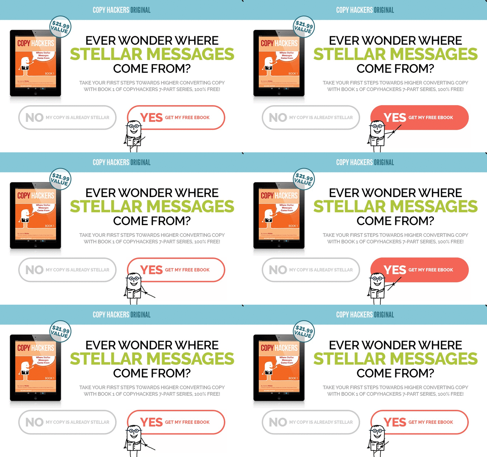
Hard to look away, isn’t it?
31. Use a Striking Image
Sometimes, you need a striking image to grab your visitor’s attention.
For example, home furniture retailer Made used this unusual image of a model with chairs stacked on top of each other to grab your attention:
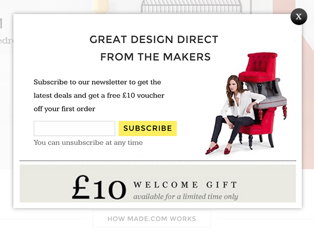
Use a dramatic or unexpected image in your exit popup, and you’ll stop your visitors right in their tracks.
32. Use Color To Direct the Eye
Remember how we mentioned that our eyes could take in way more information than our brains can process?
Color is one of those important visual clues to find important information. The specific color you use isn’t so important, but using high-contrast colors is.
Studies show that the eye naturally skims a website from top to bottom, making forays into the middle from left to right, forming an “F” shape.
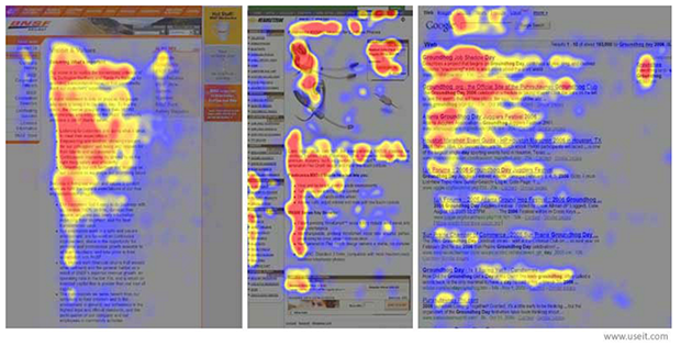
Once you understand this, you can place important elements along that natural F-shaped path and use color to place greater visual weight on some elements.
Take a look at this exit popup from Marie Forleo:
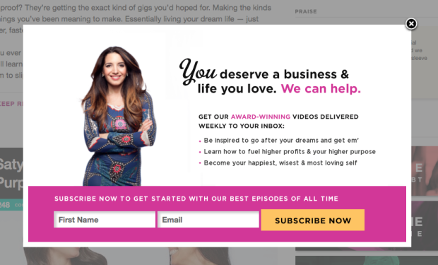
Do you see how the color pink was used to place emphasis on certain words? “We can help” and “award-winning” pop right out at you just before your eyes land squarely on the signup form at the bottom.
Also notice that the “Subscribe Now” button is yellow, which contrasts with the pink background. It’s also the only element of that color, so it stands out even more than the pink text.
Copy
Good design is important, and so is clear and effective copy. Here are some specific tips to use on your exit-intent popup copy.
33. Make Them Laugh
Another reason visitors bail on your site is that they’re simply bored. But if you can make them smile or laugh, it’ll be hard for them not to take you up on your parting offer.
KlientBoost used “Is Your Marketing Poopy?” as the heading for their popup. That’s a line that’s certain to stop an abandoning visitor in their tracks.
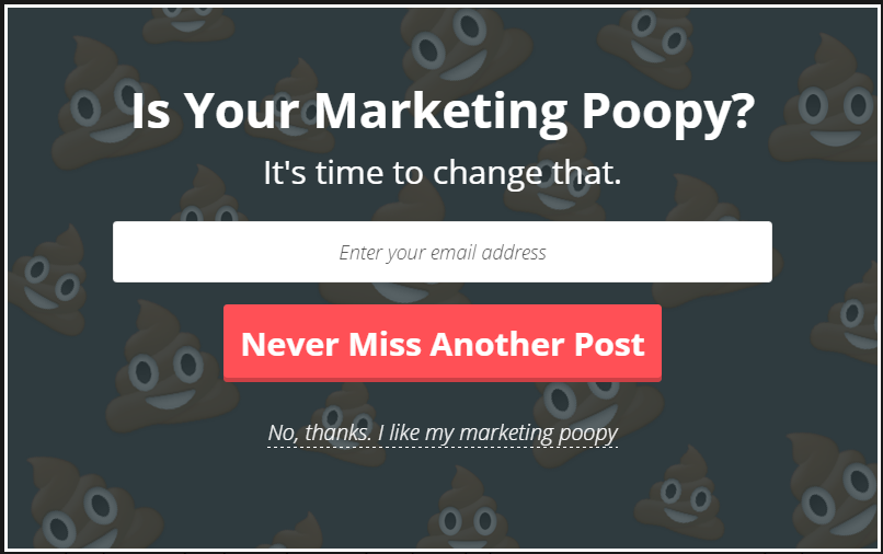
If humor fits with your brand, this is not the time to hold it in, so let it loose in your exit popup!
34. Use Numbers
Numbers can be used to increase conversions on your exit-intent popups.
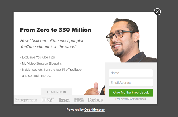
For starters, numbers are great attention-grabbers. There’s just something about seeing a number that makes us take notice. Especially if it’s a very specific number, like 1,837.
And if you have big numbers to show off, like Syed Balkhi, then by all means, do it!
35. Use Compelling Button Copy
Is your call-to-action (CTA) button copy generic, like “Subscribe,” “Download,” or “Sign Up?”
This type of button copy can be easy to ignore.
If you want your button to be clickable and compelling, use copy that focuses on the benefits visitors will get from your offer.
For instance, Shoe Money offers free case studies as their lead magnet. Instead of a generic “Download Now” button, their button copy reads, “I Want Millions of Dollars Now.” How’s that for compelling?
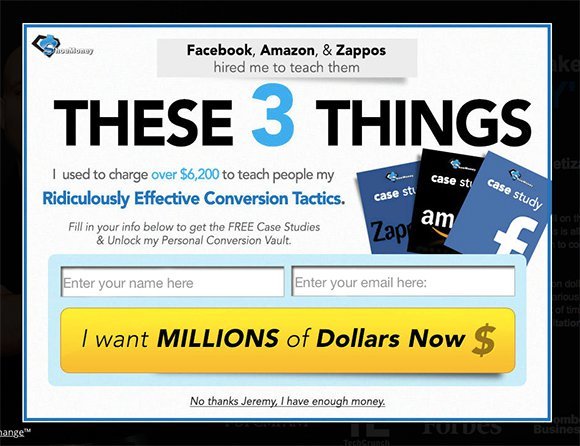
Of course, that level of boldness won’t be the right fit for most brands. You can also make your button copy more enticing simply by being more specific about what users are getting or the action they’re taking.
If you’re giving away a coupon, use a specific dollar amount on the button: “Get My $10 Off.”
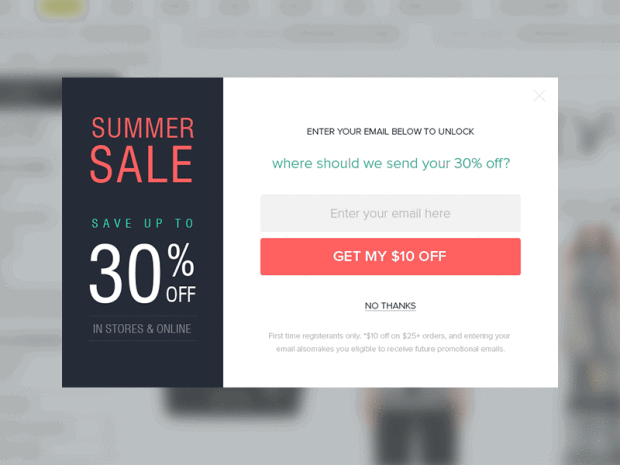
To give you some inspiration, here are even more great examples of call-to-action button copy:
- “Start writing” – Medium
- “Give Basecamp a try – it’s free for 60 days” – Basecamp
- “Find your gym & get membership” – Anonymous case study
- “Show Me My Heatmap” – CrazyEgg
- “Build a Manpack” – Manpacks
- “Send a GiftRocket” – GiftRocket
- “Talk to us” – Contently
- “Let’s Do It!” – Less Accounting
36. Ask Visitors To Follow You on Social Media
Asking for an email address can be tough. Due to information overload, people can be fiercely protective of their email inboxes these days.
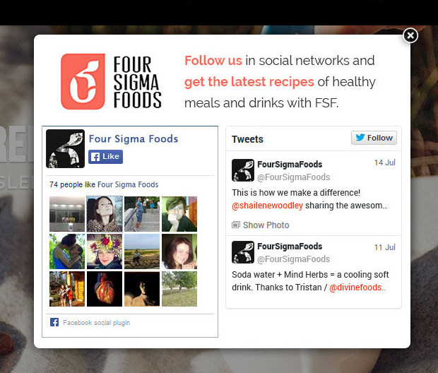
However, convincing them to follow you on social media is easier. Especially if your social media channels have a significant following, it should be relatively simple to get an abandoning visitor to click the “Like” or “Follow” button.
37. Assume the Close
A particularly gutsy move is to stop asking whether visitors want to take action and just assume that they do.
Neil Patel‘s exit-intent popup on his webinar registration page is a simple registration form.
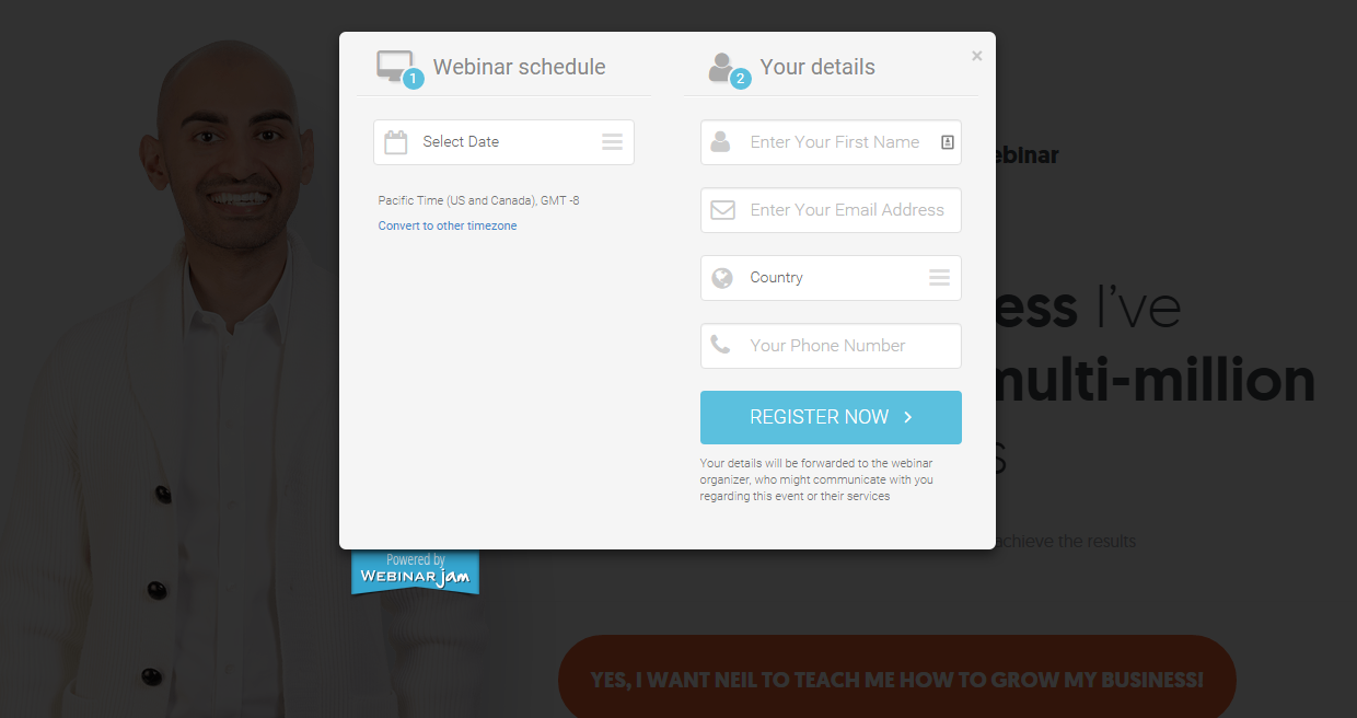
Notice he doesn’t try to sell you on the webinar at all. There’s no headline or any details about what the webinar is about. He simply assumes that you want to register.
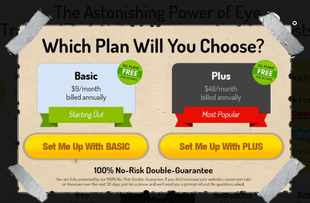
CrazyEgg assumes that you want to buy one of their plans. Rather than trying to sell you on their plans, they simply ask, which one will you choose?
38. Incite Curiosity
The information gap theory of curiosity states that we get curious when we think there’s a gap between what we know and what we don’t know. It’s like a mental itch that we just have to scratch.
If you want a surefire way of making your visitors stick around longer, use an information gap to incite curiosity. Once visitors get the curiosity itch, they’ll have to stick around to satisfy it.
In this popup, the headline promises to reveal the strategy that Gary Vaynerchuk used to get 832,241 YouTube views:
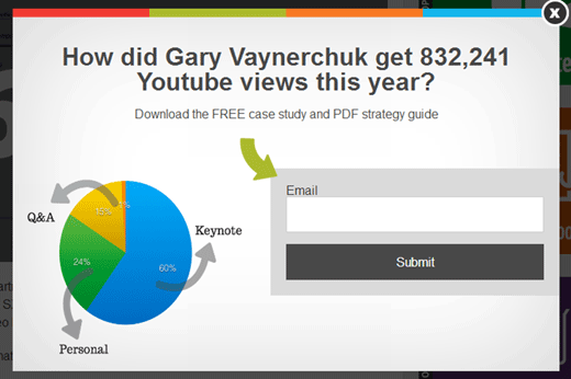
Because there is a perceived information gap, visitors will be driven to enter their email out of curiosity.
Derek Halpern offers five templates for crafting headlines that incite curiosity. These are perfect headlines for your exit popups:
- How’d you like to learn about [new remarkable thing] that [desirable outcome]?
- How can you earn [desirable outcome] with [new remarkable thing]?
- There’s a way for you to [desirable outcome] with this [new remarkable thing].
- If you heard about a [new remarkable thing] that could [desirable outcome], would you be interested in learning more about it?
- The key to a [desirable outcome] is to use [new remarkable thing].
39. Get Inside Your Visitor’s Head
The best way to get big results from your exit-intent popups is by putting yourself in your visitor’s shoes. Then you can offer them exactly what they need and want at that moment.
Ask yourself the possible reasons for a visitor to leave this particular page on your website. Out of those, which are the most likely reasons?
CountryLiving knows their visitors would love to have a mouth-watering meal for dinner tonight. However, the main thing holding them back is time. Most people feel they simply don’t have the time to cook an elaborate meal. So, CountryLiving swoops in and saves the day with “26 Easy Dinners that Can be Made in 30 Minutes or Less!”
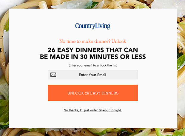
This is an exit-intent popup at its best. Get inside your visitor’s head, solve their reason for leaving, and become their hero.
40. Optimize Your Exit Popup Copy With AI
OptinMonster’s AI tools help you nail the copy of each and every exit popup.
OptinMonster’s Smart Optimizations utilize artificial intelligence to refine your campaign copy, ensuring your messages resonate with your audience.
You can use this feature in just a few steps:
- Access the Campaign Builder: Log in to your OptinMonster account and select the campaign you want to optimize.
- Select Text to Improve: Click on the text field you wish to enhance.
- Apply Smart Optimization: Click the “Improve with AI” button to generate alternative text options.
- Choose the Best Variation: Review the AI-generated suggestions and select the one that best fits your campaign objectives.
By integrating AI through Smart Optimizations, you can create more effective popups that engage visitors and drive conversions.
Bonus Tips: Best Practices for Exit-Intent Popups
There’s a lot of strategy that goes into creating the best exit popups, but these simple best practices will always be a good guide:
- Alignment: Your popup messaging and display behavior should always match your customer’s intent.
- Targeting: Each exit popup should be designed specifically for a certain part of your overall audience. One size does not fit all!
- Behavior Triggers: Browsing behavior can give clues about the visitor’s intent. Use these clues to trigger the appropriate popups. In Google Analytics, you can see your exit pages or the pages your visitors exit most.
- Interaction: Make it easy for visitors to take the first step. They’ll be more likely to take another step toward conversion once they do.
- Personalization: Show the customer that you understand their needs with customized messaging and display rules.
Skyrocket Your Conversions With Exit Popups
These 40 exit-intent popup strategies will help you grow your email list, keep visitors on your site, and drive more sales. With OptinMonster, you can create exit-intent popups in 5 minutes or less! Learn more about our excluding Exit-Intent® technology in these articles and documents:
And if you’d like to learn more about popups in general, these resources will help:
- 11 Types of Popups You Should Be Using (With Examples)
- Mobile Popups Demystified: Best Practices for a Better User Experience
- Email Popups That Convert: Creative Ideas to Grow Your Email List Fast
- eCommerce Popups That Work: How to Increase Sales and Recover Abandoned Carts
- How to Create GDPR-Compliant Popups: Tips for Privacy and Trust
With OptinMonster’s powerful lead-generation tools, you can create exit popups that will get you more leads, sales, and subscribers right away.





Add a Comment