
Website Popup Design: 9 High-Converting Examples Proven to Work
Last updated on
by

Do you want to improve your popup design so you can generate more leads and drive more sales?
The design of your website popups can make or break their success. Your popups need to catch attention, showcase your offer or incentive, and persuade your website visitors to take action.
Here at OptinMonster, we’re experts at popup design. For over a decade, we’ve been helping businesses use popups and other onsite marketing campaigns to convert their website traffic into leads and revenue.
Our team has created over 700 premade templates, all optimized for the best popup design possible. Over 1.2 million websites use our software to design popups, floating bars, inline forms, and more.
In this article, I’ll share 9 high-converting popup design examples, and I’ll explain exactly why these popups work, so you see the same success.
The popup design examples below all come from OptinMonster customers, and each popup has been hugely successful for that business. That means when you browse this list, you’ll be seeing real-life popups, and you’ll learn how and why each one succeeded.
Let’s get started!
Elements of Website Popup Design
Before we dive into our examples, let’s talk about the most important popup design elements:
- Text Formatting, such as the font, size, color, and spacing of headings and subheadings
- Images, including any photos or graphics used in the popup
- Color Scheme, such as using brand colors or contrasting colors
- Call-to-Action (CTA) Button, especially its size, button and text color, and position
- Special Elements, such as Countdown Timers, Yes/No buttons, and videos
- Functional design, such as the number of steps and views in your popup campaign
As I list our examples, look for these design elements, and consider how you can mimic them in your own popup campaigns.
9 Popup Design Examples With Proven Success
Let’s dive in to our list of popup design examples. These popups all come from our own case studies, so we know without a doubt that these popups had great conversion rates.
1. Lilach Bullock‘s Simple Text-Only Popup Design

Think this example is too simple? You can’t argue with what works.
Lilach Bullock converted 57% of website visitors with this very simple approach. Here’s why it works:
Copy: The headline makes a bold statement about what’s on offer, using language that gets readers’ attention. The promise of something free is always an incentive to subscribe, and the message is repeated on the call to action (CTA) button. The subheading asks a question that identifies the core problem for her audience and ensures that she’s reaching the right people.
Design: The design is pretty simple, but it works because the green and purple mirror the site’s branding, creating recognition and a consistent experience for her visitors. Lilach Bullock keeps this consistent for all her campaigns. She does this by duplicating and changing the campaign as needed.
To do this with your own campaigns, follow our instructions for creating your first campaign. Once you have a campaign you’re happy with, you can duplicate it like this:
Log in to your OptinMonster dashboard and click on the campaign you want to copy. That campaign will then be displayed to the right of the campaign list.
Then click the Duplicate icon at the top of the the right .

You’ll be prompted to name your campaign copy, and then you’ll be taken to the campaign builder, where you’ll be able to edit your copied popup design.
Another factor in Lilach Bullock’s success was message repetition. She created an inline optin form and used it multiple times within the same piece of content.
To do the same, follow our instructions to create an inline campaign.
2. USSLC‘s 2-Step Mobile Popup Design

Looking for the best email popups to reach mobile visitors? Take a leaf out of the US Student Loan Center’s book.
The USSLC uses multiple modal popup designs to convert 25% of visitors, and achieve a 10% boost in sales. Here’s why this one, targeted specifically to mobile devices, works:
Copy: The copy uses the word “Forgiveness” in all caps to make sure it stands out and is immediately visible to the audience. It also establishes the USSLC’s authority with the phrase “everything you need to know,” which is mirrored on the image with the words “definitive guide.” The promise to make student loan forgiveness easy to understand is also an attraction. The words “send me my guide” on the call-to-action button encourage readers to take ownership of the action.
Design: This popup design features an image of their free guide on student loan forgiveness. Since images get attention, this will catch the eye of their core audience. The colors on the image mirror the colors on the popup, which in turn match the branding of the site. This creates consistency for site visitors. The black of the CTA button also stands out from the more pastel background.
This mobile optin had an excellent conversion rate of 34%.
This popup didn’t just “pop up” unexpectedly for the mobile user, however. Instead, it was a multi-step optin. The popup was triggered when a website visitor clicked a “Download Now” CTA button.

How did they accomplish that?
They used an OptinMonster feature called MonsterLinks™. With MonsterLinks, you canturn any image, button, or text on your site into a link that triggers your popup.
Creating MonsterLinks is easy. When you publish your campaign, you’ll see a Share Link as one of the available options.

Click on the button to show the URL for the campaign. Then you can use that link anywhere.
This multi-step optin literally psychs your visitors into subscribing by using the Zeigarnik Effect. This psychology principle says when people start something, they’re more likely to finish it.
You’ll see more examples of 2-step optins later in our list.
3. Eczema Company‘s Lightbox Popup Design

Eczema Company converts 13.76% of mobile visitors, using a number of campaign types and triggers to get visitors to sign up for their lead magnet. Here’s why this one worked:
Copy: The offer of a free ebook, which is a guide to healing eczema, is repeated three times on this popup, reinforcing the message. The copy on the bar across the main image highlights the core benefit for subscribers: reducing eczema flare-ups by eliminating diet-related causes. The “Get my free ebook” CTA encourages readers to take ownership of the action.
Design: This popup pairs an image of an attractive woman (who looks happy, and is therefore NOT itchy) with an image of food. This pairing reinforces the message that the free ebook is about dietary causes of eczema. The green CTA button mirrors the green copy but stand out against the white background. This shade of green is used for CTA buttons throughout their site, creating consistency for visitors.
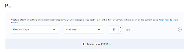
While split testing was one of the success factors for the company, we’re going to look at another: timed campaigns.
Timed campaigns display only after a visitor has spent a certain amount of time on your web page.
To experiment with the timing for your own OptinMonster campaigns, go to Display Rules and choose the Time on Page condition.

You’ll then see drop-down boxes where you can set the exact timing for your popup.
4. Cloudways Yes/No Seasonal Popup Design

Cloudways’ holiday marketing campaigns resulted in a 120% increase in free trials. Here are some of the reasons why this example works:
Copy: The copy is tied closely to the seasonal imagery. The word “gift” evokes seasonal good cheer, and even the word “drop” makes use of the dual meaning of dropping a gift under the tree and getting a price drop in the form of a 30% discount coupon. The copy on the promo code also relates to the seasonal theme.
Design: The design and copy are closely linked in this popup design. The blue background evokes the colder weather common at that time of year. Blue also evokes trust and is a subtle way of reinforcing the trustworthiness of the brand. The images of Santa, the Christmas tree, and gifts all underline the message. The use of a red button both relates to the seasonal theme and is designed to get attention, since it’s a contrasting color.
Looking for seasonal popup designs? OptinMonster has several ready-to-use holiday popup themes:

Halloween more your speed? Here’s just 1 of the awesome Halloween templates available:

5. WholeWhale University’s Popup Design

Here’s another simple but very effective design. It shows that when you get your copywriting down, you don’t even need flashy images.
In this case, WholeWhale doubled their email list by matching campaigns to their existing marketing messaging. Here’s why this popup works:
Copy: The copy reinforces the idea of education with the “Swim Up the Learning Curve” headline and the “Go Back to School” CTA. It makes it seem easy for readers to get the knowledge they need.
Design: The red background matches the on-site branding for their resources, making it a seamless experience for visitors.
WholeWhale also matched their popup to user behavior. They did this by using OptinMonster’s page-level targeting to create a campaign specifically for one of their most popular pages.
To apply this on your own site, create your campaign, then go to the Display Rules section of the OptinMonster campaign builder. You’ll be able to set exactly which page or pages you want your campaign to display on.

By using page-level targeting, you can tailor your popups based on the visitor is looking at. Doing so will help you generate more leads, because you can appeal more precisely to each visitor’s interests.
Building an email list is just the first step towards your success. Learn how to create nonprofit newsletters that reach your target audience.
6. Logic Inbound Popup Design With Arrow

Here’s why this example from Logic Inbound works:
Design: In this example, a simple arrow draws the visitor’s eye to the popup form design. The muted colors mirror some of the colors on the site, and the contrast in buttons makes the desired one stand out.
Copy: The first person CTA makes the action personal for site visitors and answers the question asked in the headline copy. The copy also entices visitors by promising to change the way they view work.
Logic Inbound got a 1500% increase in conversions by combining a number of OptinMonster features.
You may have noticed that this popup doesn’t ask for an email address. Instead, it asks visitors to click a “Yes” or “No” button. If they click yes, they’ll see a form to set up a tour.
This multi-step optin literally psychs your visitors into subscribing by using the Zeigarnik Effect. This psychology principle says when people start something, they’re more likely to finish it.
To implement this on your own site, follow our instructions for creating a campaign.
Most of our popup templates default to including a Yes/No View.

If you want to give 2-step optins a try, you don’t have to do any extra work. With OptinMonster, it’s already set up for you!
7. IMSource Geo-Targeted Popup Design

One interesting approach to web popup design came from IMSource. Here’s why it works:
Copy: The copy is targeted to the core audience’s desire for high earnings from affiliate marketing, and the “no BS” promise appears to guarantee that the method works. The “I want to learn” CTA encourages subscribers to take responsibility for pressing the button.
Design: The design itself is simple, consisting of a plain white box with red letters so that visitors can’t miss the message.
The company also wanted to make sure that their highest spending customers from particular geographical areas saw their best offers. So they used OptinMonster’s geo-location targeting feature to achieve this. The result? A 6500% increase in international conversions.
To put this into action for your business, add a Physical Location display rule to your campaign.

Then, you can type in the geographical areas you want to target.

Then click the validate button to complete the validation process. Once you validate your location, you’ll be good to go.
8. Digital Marketer Exit-Intent® Popup Design

Digital Marketer used our signature Exit-Intent® technology to recover 15% of abandoning visitors. The company also used Yes/No forms to direct visitors to the purchase page if they were interested in an offer. Here’s why this design works:
Copy: The copy acknowledges that visitors are about to leave and gives them a reason to stick around. Offers and coupons are powerful incentives for visitors. This is a low-cost tripwire offer designed to appeal to their core audience of people interested in digital marketing.
Design: The colors and fonts on the optin form match the site’s branding. The green CTA button is highly visible, in contrast to the grey No button.
You can enable Exit-Intent® in your campaign’s Display Rules.

Then, you can which devices you want to use Exit-Intent® on, as well as the sensitivity level.

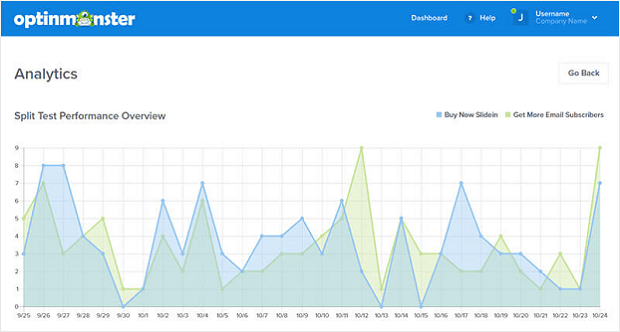
9. Social Media Examiner‘s Split Tested Popup Design

Sometimes, the only way to figure out what’s going on with your campaigns is to test. That’s what Social Media Examiner did, trying out different templates and experimenting with using or omitting images in their popup designs. The result: 250,000 new subscribers.
Here’s why this example works:
Copy: There’s a lot of copy on this popup form, but it all has a purpose. The large headline promises a free report, which will appeal to the site’s core audience. The rest of the copy teases what’s inside to make the offer more attractive. The inclusion of the size of the report, plus social proof about the site’s audience, makes it a no-brainer to sign up.
Design: This example has no images, relying on the copy on a plain white background to sell the offer. The contrasting button colors highlight the desired option.
Of course, as we said, this isn’t the only variation Social Media Examiner tried.
In OptinMonster, creating a Split Test is a breeze. Simply select the campaign you want to test in your dashboard. Then click the icon that looks like a line splitting into 2 arrows:

You’ll be prompted to give your test a name and description, and then you’ll be taken to the campaign designer.
Change a single element on your campaign, then publish it. OptinMonster will automatically split your traffic evenly and collect conversion analytics data, so you can decide which is the winning variation.
That’s it! These are some of the highest-converting website popup designs we’ve seen from OptinMonster users.
For more popup design inspiration, check out these resources:
- Exit-Intent® Popup Example Gallery
- 25 Email Popup Examples (& Best Practices) to Explode Your List
- 11 eCommerce Popup Examples That Actually Convert
Are you ready to design stunning popups in mere minutes? Sign up for OptinMonster, and watch your business grow!
Disclosure: Our content is reader-supported. This means if you click on some of our links, then we may earn a commission. We only recommend products that we believe will add value to our readers.

-01 - OptinMonster")


Add a Comment