TLDR
Best places to add signup forms on your website are:
Splash Page – Make signup the homepage focus
Welcome Gate – Full-screen popup on entry
Floating Bar – Persistent top/bottom bar
Above the Fold – Visible without scrolling
Blog Posts – At end or middle of content
Sidebar – Traditional widget placement
Timed Lightbox Popup – After time spent on site
Slide-In Scroll Box – Appears while scrolling
Footer – Bottom of every page
About Page – One of most-visited pages
Sign Up Landing Page – Dedicated conversion page
Exit-Intent Popup – When users attempt to leave
Key Best Practices: Keep forms short (minimum fields only), ask only for necessary information, use affirmative consent, segment subscribers, A/B test messaging, and track conversions.
Do you need help finding the best places to add signup forms on your website for optimum conversions?
Your email signup forms play a crucial role in growing your email list. And email is an important digital marketing strategy you should pay attention to.
But just as important as the form’s design or message is the location. It can be tricker to decide where to add signup forms forms on your website.
In this post, we’ll tap all that experience to share 12 of the highest-converting places to put your online signup forms.
But Why Should You Listen to Our Advice?
OptinMonster is the best lead generation software in the world. In fact, placing signup forms on websites is our #1 focus! We’ve been helping businesses convert web traffic into leads and subscribers for over a decade.
The results speak for themselves. Just ask AutoAnything, who increased their daily email optins by 2.5x using OptinMonster’s signup forms.
What Is a Signup Form on Your Website?
A signup form, also known as a registration or subscription form, is a web form that collects information from website visitors. The information is typically used to create an account, subscribe to a newsletter, or sign up for a service.
The form usually contains fields for visitors to input their personal information, such as their name, email address, and password, and may include additional fields depending on the form’s purpose.
Signup forms are critical for website owners who want to build an email list and engage with visitors, convert them into customers, or provide targeted content.
A well-designed signup form can help increase website conversions, enhance the user experience, and ultimately drive business growth.
Let’s dive straight into our list of where to put signup forms on your website.
Best Places to Add Signup Forms on Your Website
1. Splash Page
Do you use a splash page to highlight your signup form? If not, it’s time to jump on the bandwagon. Many smart marketers are now using splash pages to make their optin the first thing visitors see when they land on their homepage.
An excellent way to structure your splash page is to move the main navigation from the top of the page to the bottom of the page. Then, devote everything on your page to displaying your email signup form, along with an enticing incentive.
This ensures that your email signup is the main focus of the page. If visitors want to see other parts of your website, they can still do so via the links at the bottom of your splash page.
This is a great marketing strategy for bloggers who don’t have products to sell but still need to grow their email list.
Tim Ferris uses the headline “Start Here” to clarify that signing up for his email list is the first step visitors should take. The email signup form is the clear focus of the page, but users can still browse the site with the navigation buttons at the bottom.

How To Add an Email Signup Splash Page
The quickest way to add a splash page to your site is by using SeedProd – WordPress’s best landing page builder.
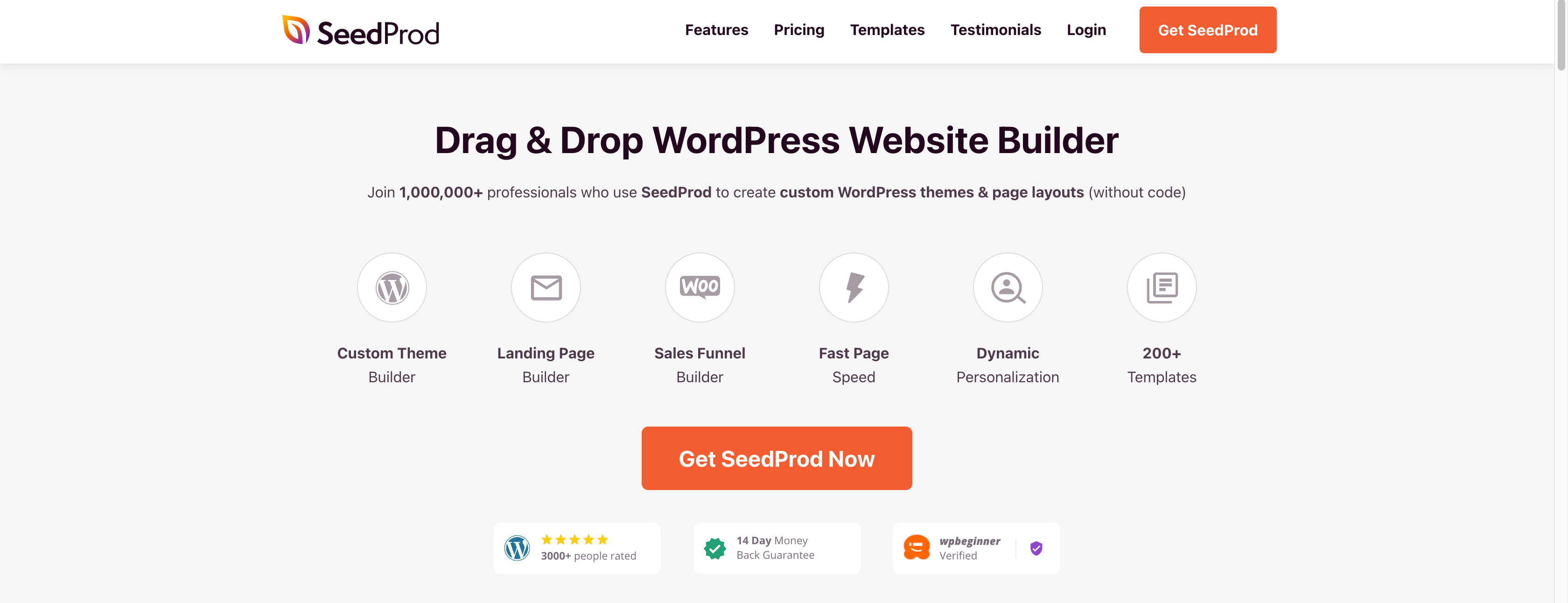
SeedProd has 150+ pre-made templates, so you don’t have to start from scratch. You can choose one that suits your brand and goals and easily customize it with the drag-and-drop builder.
You can use smart sections and blocks to create unique pages. SeedProd has many elements, like countdown timers, optin forms, giveaways, animated headlines, and more.
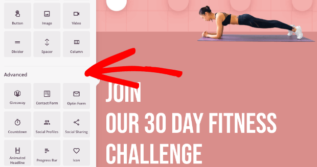
And when your design is ready, you can integrate the page with your email provider to grow your email list and send automated campaigns to subscribers.
This is one of the best methods for boosting newsletter subscriptions for your website.
Learn more: What Is a Splash Page & How To Create One (With Examples)
2. Welcome Gate
A welcome gate is similar to a splash page, except it’s a full-screen popup, rather than an actual webpage. It obscures the web page’s content as soon as the user visits the page or perhaps a few seconds after. The welcome gate, also called a welcome mat, asks the user to take an action, such as sign up for an email list.
Here’s a quick video on fullscreen optin campaigns:
Many welcome gates have a simple headline and a signup form on a colored or plain background. Sportique, however, used a beautiful photo for their welcome gate background.

They used OptinMonster’s fullscreen campaign option to offer visitors a 10% off coupon in exchange for signing up for their email newsletter. Sportique saw an excellent 4.92% conversion rate on this welcome gate. This strategy, combined with other OptinMonster campaigns, helped Sportique grow their email list by 300%!
How To Add an Email Signup Welcome Gate to Your Site
Setting up a welcome gate takes just 5 minutes with OptinMonster.
When you sign up for an OptinMonster account, you’ll get access to 700+ templates to create all sorts of lead generation campaigns, including welcome mats.
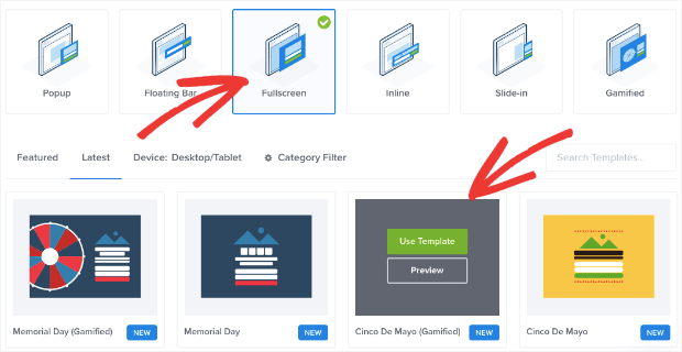
Then you can customize the campaign using OptinMonster’s drag-and-drop builder. You can add custom fields like radio buttons, phone fields, text areas, number fields, lists, and more to your campaign.
You can also choose between tons of targeting rules to control where, when, and to whom your welcome gate appears.
Learn more: How to Create a Welcome Mat Popup to Increase Conversions
3. Floating Bar
A floating bar is a great way to ensure your email signup call to action (CTA) stays in clear view. The bar may be located at the top of the page above the header or at the bottom. It stays in view as the visitor scrolls, making it accessible and unobtrusive.
Here is an example of a floating bar from Cosmetic Capital.

They added a countdown timer to their floating bar to create a sense of urgency for visitors. The email signup form is prominent, and the CTA button is a bold color that stands out.
With this one floating bar campaign, Cosmetic Capital captured over 18,000 new leads!
Clearly, floating bars can be an extremely effective way to display your signup forms to your website visitors.
How To Add an Email Signup Floating Bar to Your Site
If you sign up for OptinMonster, you can create stunning floating bars designed to convert.
There are beautiful templates to choose from, including ones for holidays and big marketing days like Black Friday and Cyber Monday.
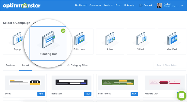
You can choose which pages you want your floating bar to display on. You’ll also select whether it appears on the top or bottom of your page.

Learn more: How To Create a Floating Bar Campaign
4. Above the Fold
Above the fold is a term for website content you see before you scroll. It’s an excellent place to put an email signup form because visitors can see it immediately without having to scroll down your page.
Michael Hyatt featured an image of his free eBook, which you could get when you signed up for his email list. The blue background contrasts nicely with his hero image and is consistent with his page’s overall call-to-action color.

How To Add an Email Signup Form Above-the-Fold
OptinMonster’s floating bar option is your best bet for adding a campaign above the fold. By default, the signup bar appears at the bottom of the screen and is pinned in place.
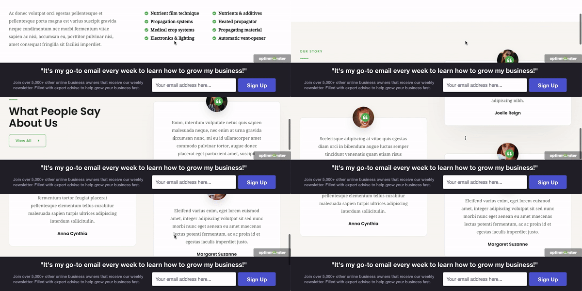
So as the user scrolls, the bar stays in position. It doesn’t disturb the user’s browsing experience and gives them a chance to sign up anytime while scrolling through the page.
5. Blog Posts
Another excellent place to put an email signup form is at the bottom or in the middle of blog posts.
Why are these forms effective? If a visitor reaches the very bottom of your blog post, they’ve enjoyed your content enough to read the entire post. This is when they’re perfectly primed for opting into your email list.
Chris Lema’s blog post signup form looks like this:

With its dark background, this optin form stands out amid his otherwise light color palette.
But don’t just include an optin form at the bottom of your posts. You can also have opportunities to sign up in the middle of your posts.
Neil Patel includes a variety of calls to action sprinkled throughout his blog post content. This way, even casual readers will likely see one of his optins as they scan his blog content. He also often offers lead magnets, such as the example below:

How To Add an Email Signup Form in Blog Posts
You’ll create an inline form to add a signup form inside a blog post. You can do this with OptinMonster.
Inside the OptinMonster dashboard, select the Inline campaign type and choose a template.
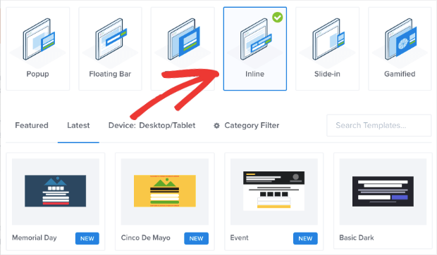
Then you can customize and integrate the design with your favorite email service provider. When your campaign is ready, you have several options for placing your inline signup form exactly where you want it in your post.
For instance, if you have a WordPress site and use the Gutenberg block editor, you can simply drag and drop the OptinMonster block.
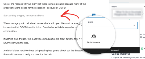
Search for the block inside your page builder and select your inline campaign from the dropdown menu.
Learn more: How to Use Inline Optins for Strategic Email List Building
6. Sidebar
If your website design includes a sidebar, then you have the perfect place for an email signup widget. This is another example of placing your signup form in a place where users expect to see it. Then, while they’re enjoying your content, they’ll know exactly where to look when they decide to subscribe.
Here’s an example of a sidebar signup form from OptinMonster’s site:
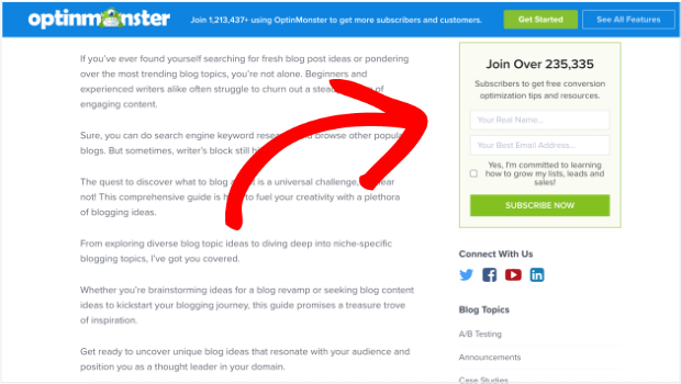
The text in the signup box says, “Join Over 235,335 Subscribers to get free conversion optimization tips and resources.” This statement both leverages social proof and explains the value of our email newsletter.
Alternatively, you can use MonsterLinks to create a CTA button that triggers a signup form popup.
You could even redirect users to a case study that converts traffic into subscribers. This will help you turn casual website visitors into loyal and paying customers.
How To Add an Email Signup Widget to a Sidebar
There are 2 perfect tools for creating sidebar signup forms: WPForms and OptinMonster.
WPForms is the best WordPress plugin to build forms for your website.
WPForms has a lite version so that you can get started for free. If you want access to more advanced features, you’ll want to sign up for the premium version.
Then you can choose a template and create the signup form.
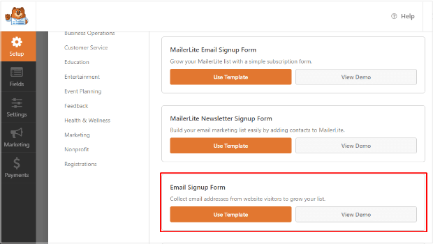
When it’s ready, you can choose any location for your form, including your sidebar.
WPForms is a particularly good choice if you need to create a lot of different web forms, such as contact, payment, registration, and survey forms.
Get started with WPForms today!
You can also create stunning signup campaigns with OptinMonster and add them to your sidebar widget similarly.
Doing so will help you show your newsletter signup forms across every blog post or site page. As a result, you could easily add hundreds of subscribers to your list each year, with only 5 minutes of prep work!
Learn more: How to Create an Email Signup Widget in WordPress to Get More Subscribers
7. Timed Lightbox Popup
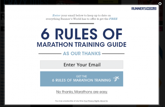
When it comes to getting email signups, timing is everything. A lightbox popup is the traditional popup you’re most used to seeing on websites. These popups display a signup form or special offer, while dimming the web page’s content.
They also are timed to pop up after a user has spent a designated amount of time on your website or web page.
So instead of bombarding your visitors the second they land on your site, they will get to look around a little and enjoy your content before you ask them to subscribe.
Here is an example of this type of form from Runner’s World:
How To Create a Timed Lightbox Email Signup Form
OptinMonster ranks #1 when it comes to timed lightbox popups. Our software has more lightbox features and targeting rules than any other lead generation tool on the market.
From the OptinMonster dashboard, select the Popup type and choose the template you want.
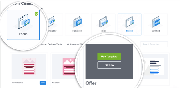
Then customize the design and create display rules to control where the popup appears.
OptinMonster automatically enables lightbox mode for every popup template. That means you don’t need any coding knowledge or technical skills to create a lightbox optin for your site.
Learn more: How to Open a Lightbox Popup on Page Load (The Easy Way)
8. Slide-In Scroll Box
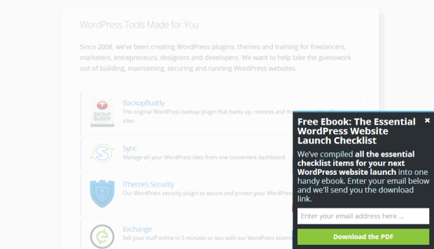
A slide-in scroll box is an even more “polite” version of a popup that appears in the bottom right-hand corner of the page as the visitor scrolls down.
By presenting the box while the visitor is scrolling, you can display a highly visible signup form without obstructing the visitor’s view of your content and without interrupting their natural flow.
How To Add a Scroll Box Email Signup Form to Your Site
OptinMonster lets you create slide-in scroll boxes as well. You can customize the design and add a personalized message.

Plus, you can control how the slide-in appears to visitors. It can appear as a slide-in popup or a collapsed box at the bottom of the screen.
Users can click on the collapsed box to open the sign-up form, much like a chatbox.
With OptinMonster’s slide-in scroll boxes, you can trigger your form to display a different message based on time spent on the page, location on your website, and even referral source.
9. Footer
Once a visitor hits the very bottom of your page, you can be sure that they are very interested in what you have to offer. Also, web users know that the footer often contains important links. Therefore, take advantage of this opportunity to present them with a way onto your email list.

Above, you can see a footer that we’ve used in the past at OptinMonster. The signup form for our email list was right there in the footer, making it easy for people to subscribe.
How To Add an Email Signup Form to Your Footer
This process is similar to the sidebar signup widgets we discussed earlier. You can create a signup form in either WPForms or OptinMonster and place it in your footer.
Learn More: How to Add a Contact Form Footer (With a WordPress Widget)
10. About Page
Did you know that the about page is one of the most frequently visited pages on any website? Make sure you are capturing new subscribers here too!
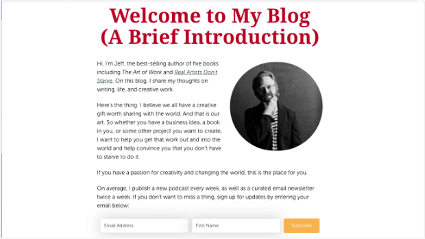
Jeff Goins uses a straightforward email signup form within the context of his about-page copy. This way, it flows seamlessly as you read and feels like the natural next step.
How To Add an Email Signup Form to the About Page
You can use OptinMonster’s inline campaign type here, too. Just follow the same steps listed in #5 on this list.
11. Sign Up Landing Page
Consider creating a designated landing page just for email sign-ups. This way, you can direct undecided traffic to this page and convince them that they should sign up for your list.
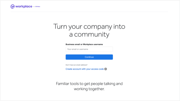
Here’s an example of a very simple sign up page from Workplace by Meta:
How To Add an Email Signup Landing Page to Your Site
To create a dedicated signup page, we recommend using SeedProd. It has stunning Lead Squeeze templates to build a beautiful signup page in minutes.
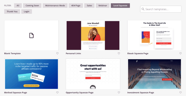
These templates are designed to increase your conversion rate and boost engagement on your site.
Learn more: How to Design a Sign Up Page (+7 Examples)
12. Exit-Intent Popup
You’d be surprised how many email signups you can gain when you make just one last attempt.
Exit-intent popups detect when a visitor is about to leave your site. Exiting visitors will then see your signup form right at that critical moment.
These popups are perfect for growing your email list, building your social media followers, reducing cart abandonment (for eCommerce stores), and much more!
Here’s an excellent exit-intent popup from Shockbyte.

Their popup acknowledges that the user is leaving the site and offers a huge discount in exchange for an email address.
How well did it work?
Shockbyte’s popup saw a HUGE 13.73% conversion rate, and they now attribute over 50% of their sales to OptinMonster campaigns.
Read the full Shockbyte case study.
Exit-intent popups aren’t just effective. They give you one last chance to serve your potential customers and, in doing so, will increase the user experience (UX) across your site.
Be sure to limit the number of form fields, though, as you’re engaging with people who were prepared to leave your site. That means you should limit the information you ask to just their email address and possibly their name.
How To Add an Exit-Intent® Popup to Your Site
OptinMonster has a powerful built-in exit detector. You can decide the sensitivity level of exit detection as well.

When you enable the Exit-Intent® trigger, OptinMonster will detect when visitors hit the ‘X’ or back button in their browser.

It will display your campaign to get them to sign up before they’re gone for good.
Exit-Intent® campaigns are proven to be powerful. You can learn more about it here:
Learn more: How To Create Exit-Intent Popups That Convert
Best Practices for High-Converting Signup Forms
Regardless of where you place your signup forms, here are a few best practices you can follow to boost your conversion rates:
- Keep your signup forms short. Long forms look overwhelming and intrusive to the visitor, so limit the number of fields to the absolute minimum.
- Ask only for the information you need. Customers value their privacy and want to avoid being bombarded with marketing. For instance, you generally shouldn’t ask for a phone number unless you send SMS messages.
- Practice affirmative consent. Your signup form should be an optin, not an opt-out. Customers should actively click a checkbox or button to receive your emails. They should not be added by default because they bought from you or visited your storefront.
- Segment your new subscribers. You’ll see higher conversion rates when you sending relevant content based on subscriber interest, behavior, or needs. There are many ways to automate lead segmentation.
- Use A/B testing to find the most effective messaging. OptinMonster makes it easy to test different variations of the same campaign to see what works best.
- Track your form conversions to identify areas for growth. OptinMonster tracks conversions automatically, but you can also set up form submission tracking in Google Analytics using a different signup tool.
If you’d like some visual inspiration, check out our list of best lead generation form examples.
That’s all we have for today. This article has given you new ideas for strategically placing your email signup forms. Knowing when and where to present your signup offers will help you convert many more visitors into email subscribers.
Want to grow your email list with stunning optin campaigns right away?
OptinMonster is the perfect solution! Our software is available as an easy-to-use WordPress plugin and a standalone SaaS product for other website-building platforms.
Click below to start your 100% risk-free subscription today!








Add a Comment