TL;DR:
A call to action (CTA) is a prompt that directs people toward the next step, like subscribing, downloading, or buying. The most common types include buttons, links, banners, and in-text prompts, each suited to different placements such as landing pages, emails, or blog posts. Effective CTAs use clear language, compelling design, and strategic placement to capture attention and guide visitors toward action.
A great call to action (CTA) is like the “next step” sign your visitors can’t ignore. Whether you want them to join your email list, click “Buy Now,” or sign up for a free trial, your CTA is what turns interest into action.
But here’s the catch: a weak CTA blends into the page. A strong one grabs attention, makes the benefit crystal clear, and inspires an instant click.
Quick CTA Formula:
Verb + Benefit + Urgency
Example: “Download Your Free Guide Today”
(Verb = Download, Benefit = Free Guide, Urgency = Today)
In this guide, you’ll learn:
- What a Call to Action Is (and Why Every Click Depends on It)
- The 5 Most Common CTA Types and Where to Use Them
- Call to Action Examples for eCommerce Websites
- Call to Action Examples for Lead Generation
- Call to Action Examples for Social Media
- Call to Action Examples for Landing Pages
- Call to Action Examples from Popular Brands
- How to Design CTAs That Stand out on Any Page or Device
- FAQ
By the end, you’ll be able to write CTAs that your audience can’t scroll past — and watch your conversions rise.
What a Call to Action Is (and Why Every Click Depends on It)
Call to action Definition: A call to action (CTA) is a marketing term that refers to a prompt or instruction that encourages a person to take a specific action
In the context of digital or eCommerce marketing, a CTA is typically a button, link, or message that prompts the user to take some kind of action, such as purchasing a product, subscribing to a newsletter, or signing up for a service.
CTAs can be found in various marketing materials, including email campaigns, landing pages, social media posts, and eCommerce websites.
Their purpose is to guide users toward a desired action and help businesses achieve their marketing objectives.
Effective CTAs typically use action-oriented language, create a sense of urgency, highlight the benefit to the user, and are visually prominent.
But it’s important to remember that not all calls to action are created equal. Some are strong, powerful, and persuasive.
Others are weak, boring, and uninviting.
We’ll learn how to create the perfect call to action for your website and content in a moment. Before that, though, let’s check out five common types of CTAs and where you can use them.
The 5 Most Common CTA Types and Where to Use Them
Whenever you create a piece of content, you likely want to insert a call to action. This is true for blog posts, YouTube videos, social media posts, podcast episodes, and more.
But here are five of the most common places you’ll see CTAs online:
- Web page buttons
- Optin campaign buttons
- Anchor texts in blog posts
- Buttons or text in emails
- Text in social media posts
Let’s quickly look at each type.
1) Web Page Buttons
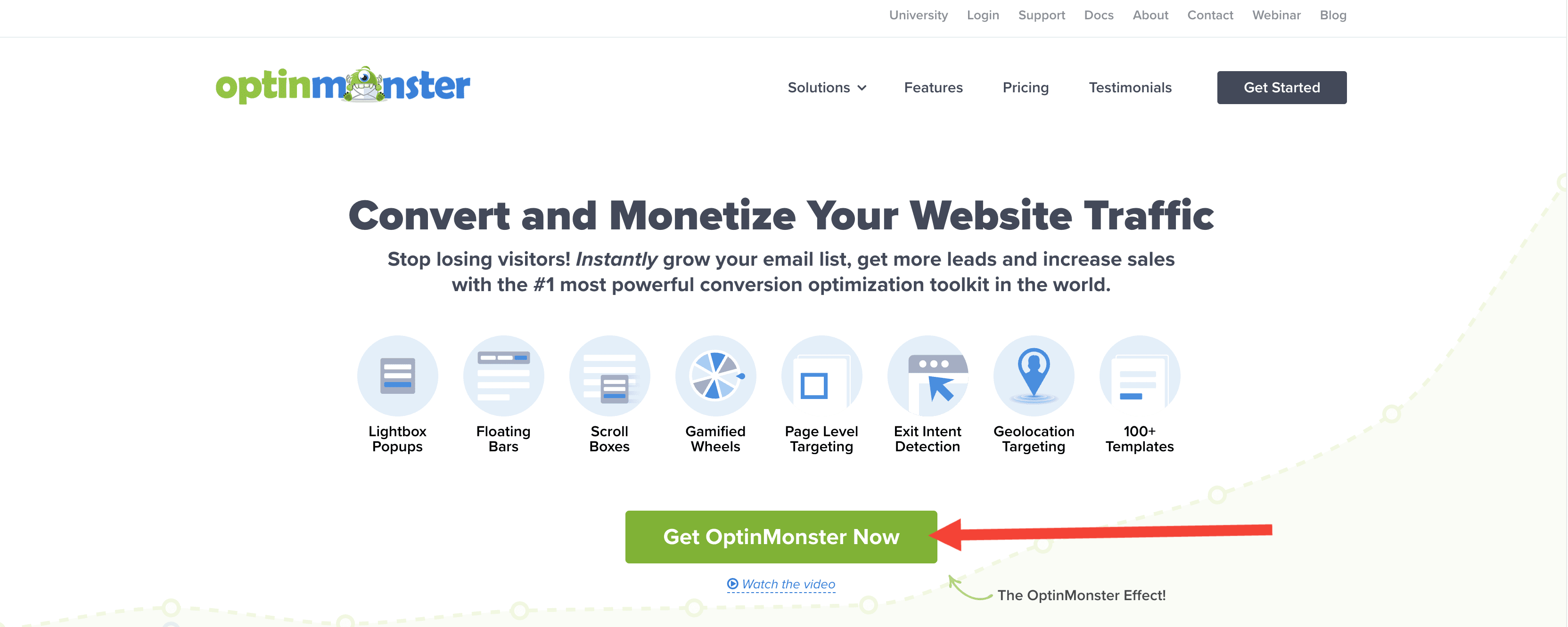
This is one of the most common placements for a call to action. If you’ve ever been to a webpage, you’ve seen them before. In fact, we’ve already seen one this article:

When done well, CTA page buttons will be large and stand apart from the rest of the page.
You’ll notice in the image above, OptinMonster’s call to action has a bright green background and is supported by a compelling headline with subheader text.
The web copy leads your eyes down to the call to action, Get OptinMonster Now.
Also, the button is easy to click because it’s so big. This is particularly helpful for mobile users who navigate your page with their fingers (not a mouse cursor).
2) Optin Campaign Buttons
When you show an optin campaign (like a popup, slide-in box, floating bar, and so on), your copy will be essential. It needs to be short, catchy, and persuasive.
But most importantly, it needs to lead to a powerful call to action button:
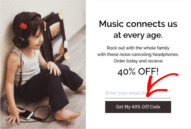
The image above is from a popup campaign built with OptinMonster in under 10 minutes.
The call to action was modified to show the offer in the button, Get My 40% Off Code.
This works because many website visitors won’t take the time to read every word on your optin campaign. Instead, they’ll browse to the spots that catch their attention the most.
When their eyes land on the button, they’re tempted to click because they instantly see the benefit of doing so.
3) Anchor Texts in Blog Posts
In many blog posts, you’ll see a call to action written out with a link embedded somewhere in the text. You may have noticed these in OptinMonster’s blog:
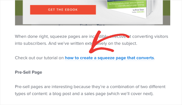
In the image above, the part in blue is the clickable link that redirects users to another tutorial. But the entire sentence (starting with “Check out our tutorial”) is the call to action.
In-text CTAs can help improve user experience (UX). You can invite your readers to go read related posts, look at other tutorials if they’re confused about a concept, or go follow you on social media.
The most important call to action, though, is when you ask users to signup for or buy your product. These CTAs are usually placed somewhere early in the content and at the end of your post:

You can test where your CTAs function best in your blog with your target audience.
4) Buttons or Text in Emails
You can also use CTAs in email marketing. We see these every day when we get emails asking us to:
- Read the full article
- Download a resource
- Take advantage of a discount or freebie
- Get more information about the subject of the email
Here’s an excellent example from our Customer Success Manager, Angie:
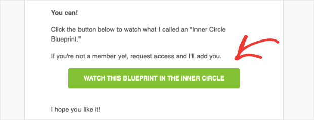
Notice the color of the call to action is a huge contrast to the white background. That draws your attention and makes the CTA impossible to miss.
5) Text in Social Media Posts
If you use social media as part of your content marketing strategy, you know how important a good call to action is.
You need to make the call to action in your social media post incredibly clear. That’s because other things will always be fighting for your users’ attention on social platforms.
But you want them focused on your offer or CTA.
Take this example from an OptinMonster post on Facebook:
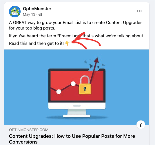
The call to action is Read this and then get to it! That’s about as straightforward as it gets.
This helps readers understand what the next step is to reach whatever problem you’re helping them solve.
Now that we’ve seen the types of CTAs you can create, let’s jump to our list of the most effective call to action examples.
Call to Action Examples for eCommerce Websites
eCommerce websites often rely on CTAs to encourage visitors to make a purchase. Here are some CTA examples for eCommerce:
- “Add to Cart” button: This is a classic CTA for online shopping, and for a good reason. It’s simple and straightforward, making it easy for users to add items to their cart and continue shopping or proceed to checkout.
- “Buy Now” button: This CTA is more direct than “Add to Cart”, as it takes the user to checkout. This can be effective for products with lower prices or time-sensitive sale promotions.
- “Shop Now” button: This CTA is broader than the previous examples, as it encourages users to browse and explore the website. This can be effective for websites with a wide range of products or for users still in the early stages of the buying process.
- “Subscribe and Save” option: This CTA is often used for subscription-based products, such as meal delivery services or pet food. By highlighting the potential savings that come with a subscription, this CTA can encourage users to make a long-term commitment.
- “Limited Time Offer” banner: This CTA can create a sense of urgency and encourage users to make a purchase before a promotion or sale ends. It can also help to increase the perceived value of the product.
Call to Action Examples for Lead Generation
Lead generation is the process of capturing information from potential customers, such as their name, email address, or phone number. Here are some effective CTA examples for lead generation:
- “Download our free guide” button: This can be a compelling call to action for websites that offer educational resources, such as white papers or ebooks. This CTA can attract leads interested in your industry or products by providing valuable content in exchange for contact information.
- “Register for our webinar” button: Webinars can be a powerful tool for lead generation, as they offer an interactive and engaging way to share information. By requiring registration, this CTA can help to capture contact information and build a list of leads.
- “Sign up for our newsletter” button: Newsletters can be a great way to stay in touch with leads and customers, providing them with updates and promotions. By making it easy to sign up, this CTA can help to build a subscriber list.
- “Get a free quote” button: This CTA can be effective for service-based businesses, such as insurance or home improvement. By offering a personalized quote, this CTA can help to capture contact information and provide leads with a clear next step.
- “Request a demo” button: This CTA is often used for software or technology products, as it allows users to see the product in action before making a purchase. By requiring a request, this CTA can help to capture contact information and provide leads with a personalized experience.
Call to Action Examples for Social Media
Social media is the most popular medium for engaging your target audience with your brand and routing traffic to your website. Below are some handy CTA which you can use on your social platforms.
- “Follow us on Twitter” button: This is a simple CTA to increase your social media following and keep your audience engaged with your content. The “Follow us on Twitter” button can be placed on your website or in your email signature, and it encourages visitors to connect with you on this popular platform.
- “Like us on Facebook” button: This CTA is similar to “Follow us on Twitter” but is specific to Facebook. The “Like us on Facebook” button can be placed on your website, blog, or other digital channels, and it encourages visitors to become a fan of your Facebook page and receive updates on your latest news and offers.
- “Subscribe to our YouTube channel” button: This CTA is ideal for businesses that create video content and want to grow their YouTube audience. The “Subscribe to our YouTube channel” button can be placed on your website, email signature, or video descriptions, and it encourages visitors to subscribe to your channel and receive notifications when you upload new videos.
- “Share this post” button: This is a great call to action to increase the reach and visibility of your content. The “Share this post” button can be placed on your blog or social media posts, encouraging visitors to share your content with their followers and friends.
- “Join the conversation” prompt: This CTA is a more open-ended way to engage your target audience and encourage participation. The “Join the conversation” prompt can be included in your social media posts, blog comments, or forum discussions, and it invites visitors to share their own opinions, feedback, or questions.
Call to Action Examples for Landing Pages
The whole idea behind a landing page is to make sure the user converts. The following call to action examples can help you achieve that goal.
- “Fill out this form” button: This CTA is crucial to lead generation and conversion optimization. The “Fill out this form” button prompts visitors to provide their contact information in exchange for a specific offer or benefit, such as a free trial, consultation, or demo.
- “Start your free trial” button: This CTA is ideal for SaaS businesses or other subscription-based models. The “Start your free trial” button encourages visitors to sign up for a limited free access period to your product or service and experience its benefits firsthand.
- “Get your free quote” button: This CTA is similar to “Get a free quote” but is specifically tailored to landing pages. The “Get your free quote” button prompts visitors to fill out a form and receive a personalized quote or estimate based on their specific needs and preferences.
- “Book a demo” button: This CTA is similar to “Request a demo” but is more focused on landing pages and conversion optimization. The “Book a demo” button encourages visitors to schedule a live or recorded demo and learn more about how your product or service can help them solve their problems.
- “Schedule a consultation” button: This CTA is ideal for businesses that offer professional services or consulting. The “Schedule a consultation” button prompts visitors to book a one-on-one session with your team and receive personalized advice and recommendations.
Call to Action Examples from Popular Brands
The following CTA examples are used by high-converting brands that nailed their calls to action. Let’s dive in!
- Crossrope
Crossrope is a fitness brand that gets people in shape through their jump rope programs. In one of their optin campaigns, they include a clever CTA:
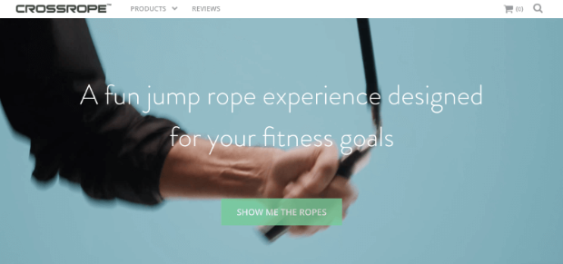
Using the play on words Show Me the Ropes, they were able to boost conversions.
Crossrope actually built this campaign (and others) with OptinMonster. Then they saw a 900% increase in their email subscriptions.
- Shockbyte
Shockbyte, a game server host provider, used this exit-intent popup to capture abandoning visitors. Their call to action focuses on providing value:

The message is clear: “click here to save money.” That makes this CTA particularly powerful.
In fact, Shockbyte used campaigns just like this to more than double their sales conversion rate.
- Singularity University
Singularity University helps leaders, organizations, and entire industries grow. They often hold virtual summits. One of the challenges they face, though, is making sure people remember to attend.
They have an excellent optin campaign to remind visitors about their summits:
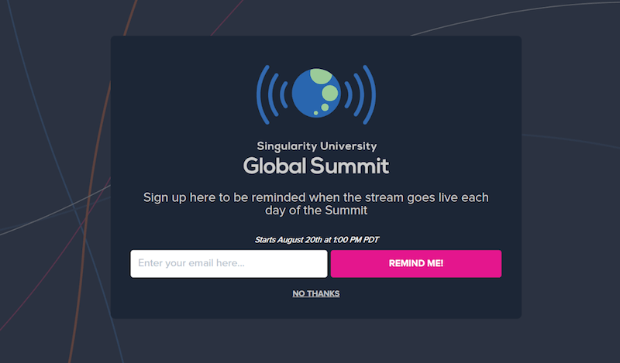
Their call to action, Remind Me!, is a great message that lets users know why they’re signing up: to get notifications ensuring they don’t miss any valuable content.
As a result, Singularity University got over 960 new leads from that one campaign.
- Cracku
Cracku helps students prepare for upcoming exams. On an offer they ran, they used a countdown timer to build a sense of urgency:
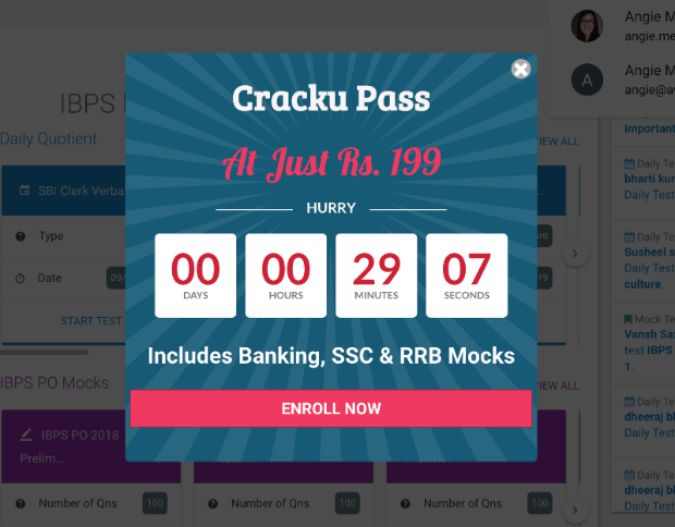
Then they reinforced that with the call to action, Enroll Now.
The word “Now” inspires readers to act fast. It’s no surprise that Cracku used this campaign to increase conversions by 300%.
- Bulkly
Bulkly is a social media tool for Buffer. It automatically reuses your social media updates and sends them to Buffer to make scheduling posts even easier.
They offered a free email course with the following campaign:
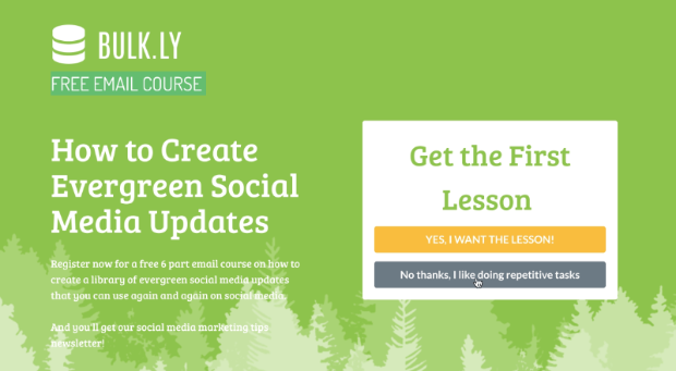
Notice that they did 2 things with their call to action:
- Told users exactly what they would receive (the lesson)
- Made the alternative sound off-putting
If you use a Yes/No campaign, you can make your “No” option reinforce your call to action. Bulkly makes their “No” option, No thanks, I like doing repetitive tasks.
Since most people wouldn’t agree with this statement, more visitors will click on the “Yes” option.
This was so effective that Bulkly increased their free trial signups by 135%.
- OptinMonster
We’ve already seen a few calls to action from OptinMonster, but here’s one from an email campaign that did particularly well:
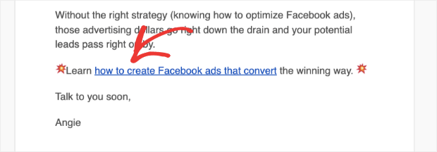
Notice there’s no button, just an anchor text and a link. This call to action invites users to learn how to create Facebook ads that convert.
Since our email lists are properly segmented, the email could be personalized to the right audience. As a result, a clear call to action like this will drastically boost conversion rates.
- Brevo (formerly Sendinblue)
Brevo is one of the best email service providers on the market. They coupled their homepage CTA with eye-grabbing animation effects of a person driving away in a car:

Brevo’s animation reinforces the light-hearted CTA copy, “Take a free test drive!”
This message is clear, inviting, and focuses on value (with the word “free”).
- RafflePress
RafflePress is an awesome online giveaway plugin. It helps your contests go viral so you can:
- Grow your followers
- Make more sales
- Increase your site traffic
And much more. We love their homepage CTA:
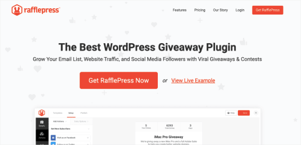
This is an effective CTA for 2 reasons:
- Size
- Color
It’s a huge button that makes the CTA nearly impossible to miss. This is great for mobile users who are less accurate when they click CTAs and need larger buttons.
The color is another component that makes it stand out. The website’s background is light grey, but the button color is bright orange.
As soon as you land on this page, your eyes immediately see the call to action, and you’re tempted to click.
- SEMrush
SEMrush is a great tool to help with your digital marketing strategy. When you land on the homepage, they get straight to the point:

SEMrush immediately invites you to start using their services. They don’t offer to let you “learn more” or “explore products.” They take a more direct approach.
You simply enter a domain name, keyword, or URL that you want to explore. Then the CTA follows with Start now.
The color contrast between the background and button also helps strengthen this call to action. But the clear and concise message gets users excited to dive into the program.
- Grammarly
Grammarly is a spelling and grammar checker that works for all your documents, including emails. It makes sure your writing is effective and mistake-free.
Here’s a call to action from their Twitter account:
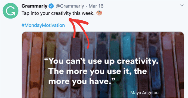
This CTA works because it uses the same kind of language as its users. Because their target audience consists of writers, Grammarly creates a powerful call to action, inviting users to Tap into their creativity.
Notice that their entire tweet is a call to action. This is a good lesson for social posts proving that sometimes less is more.
- WordStream
This is an excellent example of a clever CTA for social media. This Facebook Ad does 2 things:
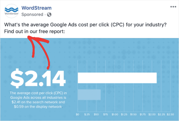
- Creates curiosity with a question
- Offers to resolve that curiosity if you click the CTA
By using action phrases like “Find out” to start their call to action, they leverage FOMO (fear of missing out). It makes users want to get on the inside of this secret.
Now that we’ve seen the types of CTAs you can create, let’s look at how to make them. Here are five actionable tips you can start using today to make the perfect call to action.
How to Design CTAs That Stand out on Any Page or Device
- Use Action Words
- Focus on Value
- Foster Curiosity and Anticipation
- Design Your CTA Buttons
- Test Your Calls to Action
Let us look at these five actionable tips to make sure you’re writing strong calls to action that will increase your click-through rate.
1. Use Action Words
The best CTAs use action words that let viewers know the specific action they should take next.
Here’s an example of a popup campaign built with OptinMonster:

Notice that the CTA is clear and tells the user exactly what to do: Join the Webinar Today!
Plus, it uses the action verb “Join” to motivate people to signup.
Struggling to come up with the right words for your CTA? We’ve got you covered. You can use power words to evoke an emotional response and create more persuasive calls to action.
Here’s a helpful list of over 700 power words to get you started.
2. Focus on Value
Some CTAs focus on the value they offer. This is usually accomplished by adding the word “Free” or “Risk-Free” to your calls to action.
Here’s an example from TrustPulse’s homepage:
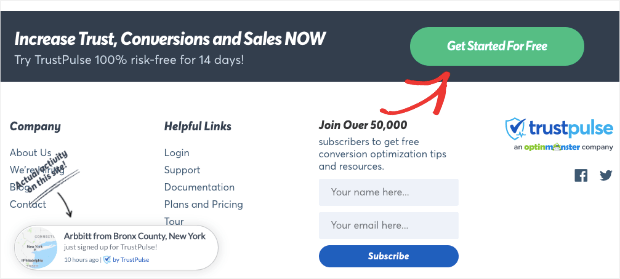
This CTA button is very tempting to click. Letting your users know they can get something for free (or at a discounted rate) directly in the CTA will boost your conversions.
3. Foster Curiosity and Anticipation
A good call to action relies on psychology, combining curiosity with anticipation.
A great way of building curiosity is through gamification. If you turn your optin forms into a game, you’re more likely to get people to click your CTA.
OptinMonster offers a Coupon Wheel optin that can be used to gamify any promotions you run:
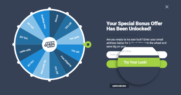
By providing multiple prizes and using the CTA Try Your Luck, many visitors are anxious to sign up and play.
4. Design Your CTA Buttons
Design is also an important part of getting the CTA right.
But how do you make your call to action stand out? Let’s take a look at a few key CTA design elements.
Most marketers agree that you should:
- Use white space effectively so your button stands out
- Ensure that your CTA button contrasts with the colors on the rest of the page
- Frame the button to create contrast, if necessary
- Pay attention to the size of the button because it has to be large enough to click but not overwhelming
- Optimize the CTA button for mobile
Again, we try to check off all these boxes here at OptinMonster:
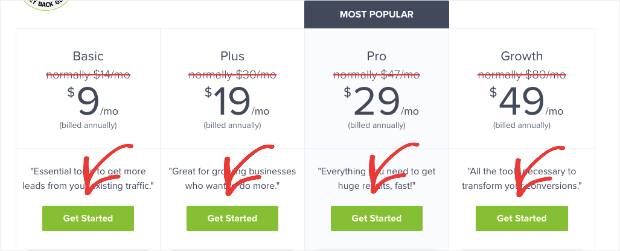
Notice that in the image above, two things are happening:
- Each pricing plan has its own CTA (to stay organized)
- Each CTA stands out from the background
We use a bright color on the CTA button as a way to draw attention to it. With that bright green button over a white background, our call to action is hard to miss.
If you need some design help, check out this article on 16 web design principles you should start using today.
5. Test Your Calls to Action
It’s not enough to create a call to action and trust your gut about how to write and design it.
You need data to see how your CTA is working.
Some professional copywriters struggle with writing good calls to action every day. So don’t get discouraged if it takes you some time to find the right one. How do you know when you’ve found the right one, though?
The data will tell you. 🤓
The best way to do this is by split testing. You can experiment with button color and size, button text, text links, form, page design, and CTA placement. Start with one design and quickly create an A/B split test in your OptinMonster dashboard:
Then change 1 element and run the test. When you’re done, choose the one with the highest conversion rate. Finally, rinse and repeat by changing 1 other element.
Why change only 1 element at a time? Because then you’ll know which specific parts are working with your target audience, and which ones aren’t.
Split testing is an essential part of creating the perfect CTA. To get started, see our list of A/B tests to run on your popups to get more subscribers.
And that’s it. You now know the fundamentals of writing the perfect call to action!
And there you have it. In this post, we covered the following:
- What a CTA is
- Five common types of calls to action
- 31 great examples of powerful calls to action that convert
- Five actionable tips for creating the perfect CTA
But remember, calls to action don’t exist in a vacuum. They usually require supporting text to strengthen them. To write better copy to reinforce your CTAs, we recommend the following posts:
- 10 Expert Tips to Write Landing Page Copy That Converts
- 69+ High-Quality Copywriting Templates Proven to Work
- 21 Viral Headline Examples and How You Can Copy Their Success
Once you learn to write compelling copy with persuasive CTAs, you’ll see dramatic increases in conversions and sales.
Ready to put these call to action tips into practice? Sign up for OptinMonster now and start creating high-converting campaigns today!
FAQ
1. What is CTA?
CTA stands for “Call to Action.” It refers to a prompt or instruction that encourages a user or reader to take a specific action, such as clicking a button, filling out a form, or making a purchase.
2. What is CTA in marketing?
In marketing, a CTA (Call to Action) is a directive or encouragement designed to prompt an immediate response from the audience. It often takes the form of a button, link, or graphic in digital marketing materials (like websites, emails, or ads) that urges the viewer to take a specific action, such as “Buy Now,” “Sign Up,” or “Learn More.”
3. What is a call to action in writing?
A call to action in writing is a statement or phrase that encourages the reader to take a desired action. It can be found in various forms of writing, from persuasive essays to marketing materials. In essence, it’s the part of the content that tells the reader what you want them to do next, whether it’s to believe a certain viewpoint, make a purchase, sign up for a newsletter, or engage in another specific behavior.





Add a Comment