
11 Slide-In Popup Examples (and How to Use Slide-In Optins)
Last updated on
by
A slide-in optin shows your offer to a visitor without a popup covering the page. But because it’s meant to be subtle, it can sometimes fade into the background more than you’d like.
Whether anyone notices the campaign comes down to the template you choose, the moment it appears on your website, and who you show it to.
So, alongside the tactics below, I’ve included real examples from OptinMonster customers and the display rules that make them work. In this guide, I’ll cover 11 of my favorite strategies for getting the most out of your slide-in optins.
Why Use Slide-In Optins?
Have you ever visited a website just to get a quick answer to a question and BAM – you get hit in the face with a huge popup? We all have.
Nobody likes to be greeted that way.
Slide-in optins are a non-invasive, high-converting alternative to popups. They “slide” in from a corner of the page, letting the visitor continue to read the page content until they’re ready to turn their attention to the offer.
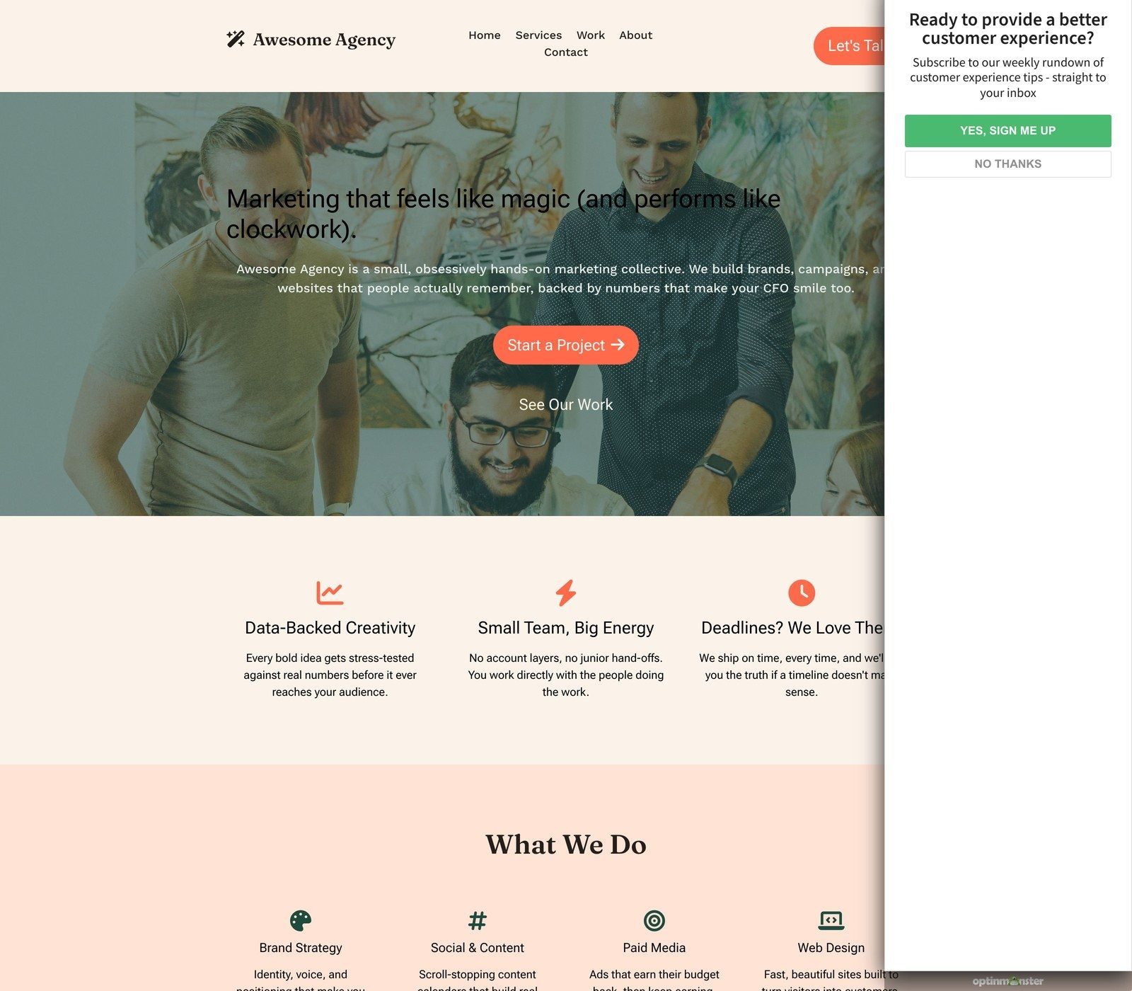
We built OptinMonster’s slide-in campaign to show your offer without taking over the screen. The examples below come with the tactic behind each one, and our slide-in scroll box gallery has the designs on their own if you’d rather just browse.
11 High-Converting Ways to Use Slide-In Optins
1. Choose a Template That Stands Out
The first step in creating a high-converting slide-in optin is to choose the right template for your website.
OptinMonster offers 87+ slide-in templates, as part of our overall 700+ campaign templates:
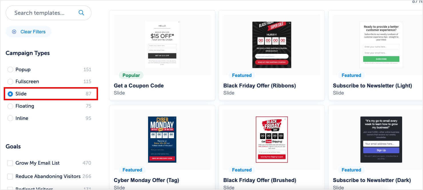
Each one is fully customizable and easy to build with the drag and drop feature. You can change up colors, fonts, add your own copy, and even insert your own photos.
Expert tip: a slide-in sits in the corner while your visitor keeps reading, so it has to earn a second look. I recommend a template that uses your own brand colors but stands slightly apart from the page behind it.
2. Get the Size of Your Slide-In Right
Because slide-in optins are so subtle, getting the sizing right is very important to make it stand out. If nobody notices your slide-in or it’s so small that they can’t read it, then you’re not going to get the conversions you want.
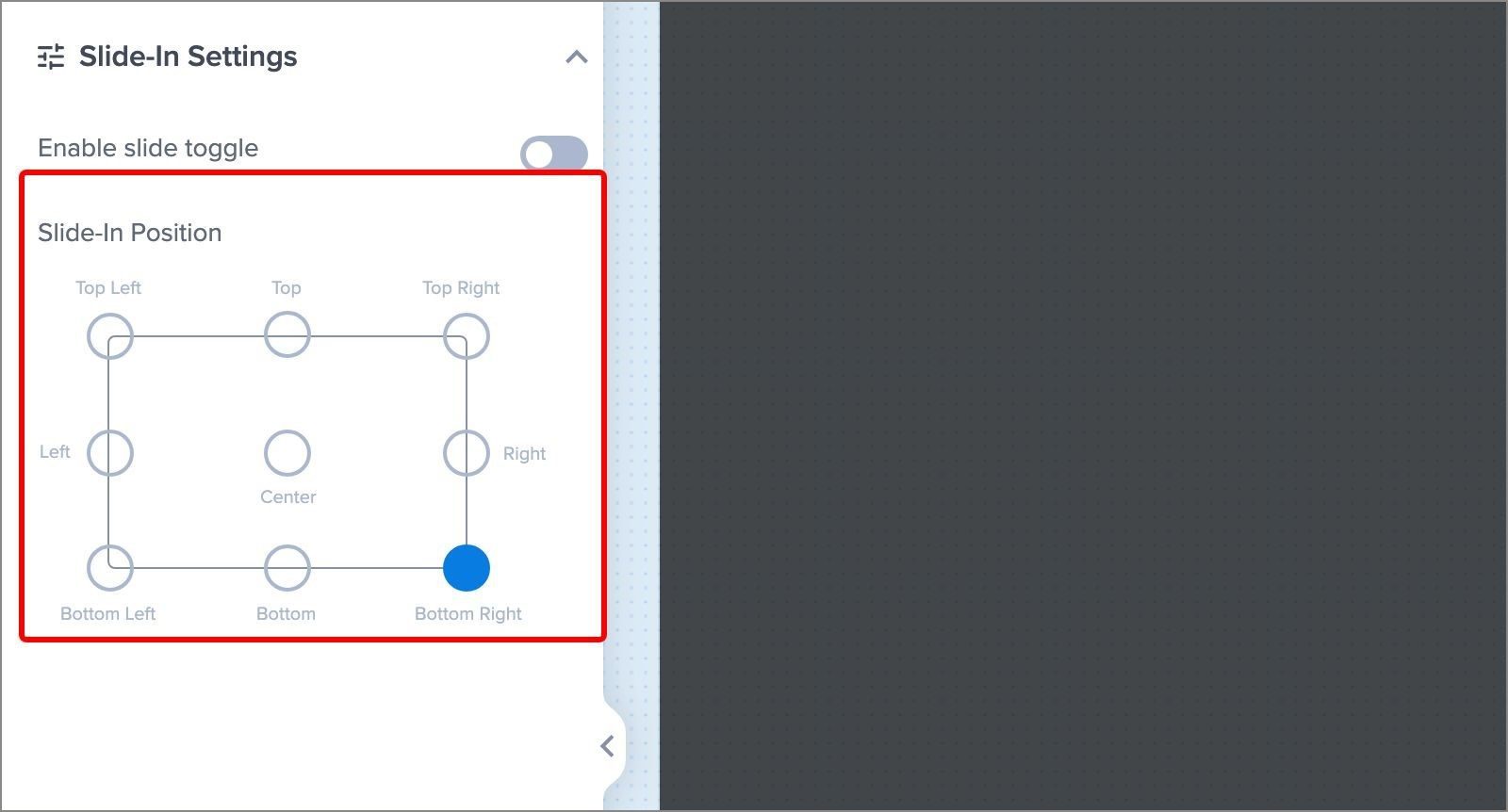
Some websites are wider than others, so make your slide-in just large enough that it stands out without blocking the rest of the page. You can also move the campaign to a different area of the screen if the bottom-right corner clashes with your page.
For full details, see our guide on how to reposition the slide-in optin.
3. Use Page-Level Targeting to Display Highly Relevant Offers
If your website has a bunch of different topics, then page-level targeting will make it easy to convert as many people as possible. You can match the offer to whatever your visitor is reading at the time.
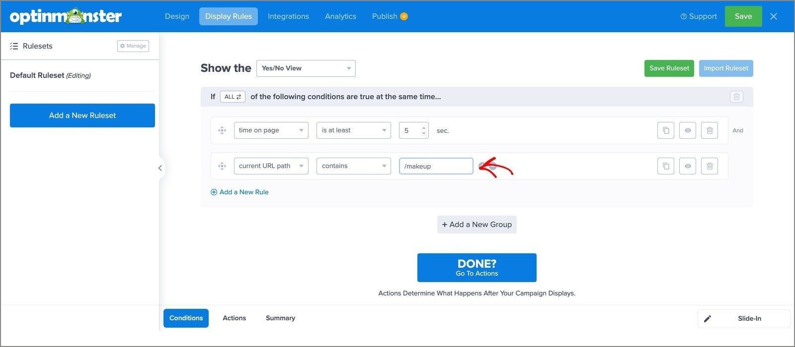
For example, you could create a slide-in with a deal on cosmetics and show it only on your makeup category pages:
And if you’re running an eCommerce store, you could suggest related products or upselling offers specifically on your cart and checkout pages.
In our case study with Storyly, they added slide-in boxes to specific blog posts asking readers to join their email newsletter. That gave their organic blog traffic an unobtrusive way onto the list.
In the OptinMonster campaign builder, you’ll need to point the slide-in at one URL, one category or a whole section of your website. That’s the current URL path rule, which you’ll find in Display Rules.
4. Consider Using Links Rather Than Asking for Emails
What’s the main thing you want users to do on the page they’re reading? If you’re running an affiliate site, then you might favor affiliate conversions over collecting emails.
Why it works: the chances of converting somebody are much higher while they’re on your website looking for a solution. A call to action that links straight to your affiliate partner will do more for you than an email field.
A great example of a business that does this well is Fit Small Business.
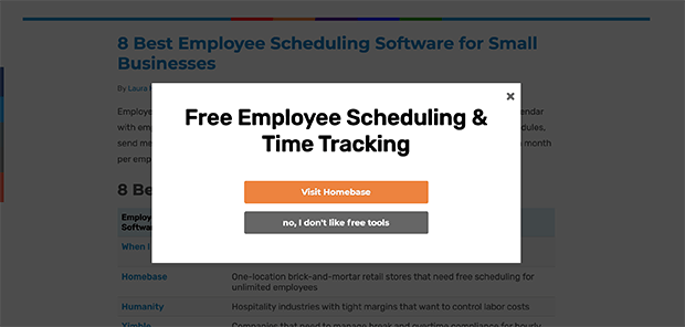
They use page-level targeting to display different calls to action depending on what page the user is on. And each popup links to their affiliate partner as the solution to what the reader is reading about.
And in our case study with Reliablesoft.net, they used a slide-in scroll box to send visitors to their SEO courses page. It ran on desktop only and still got a lot more people onto that page.
So where a click is worth more to you than an email address, I suggest building the slide-in around a button. Send people straight to the page you want them on, and leave the form field turned off.
5. Use Geolocation Targeting to Reach Specific Regions
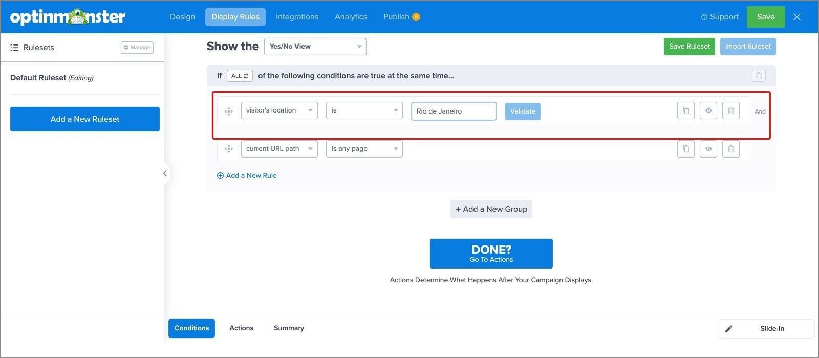
The visitor’s location rule shows your slide-in only to people in the places you pick. You can choose by country or region, and even narrow it down to a city.
The benefit is that your campaigns feel more relevant.
Here’s an example:
Imagine you’re on a working holiday in Dubai, but you’re seeing campaigns for mittens and thick parka coats. This would be so irrelevant to you that you probably wouldn’t even look at it.
You can also build slide-ins around the holidays and events of one region. If some of your customers are in Brazil, you could start showing campaigns for the Rio Carnaval around the time that it happens.
In the builder, you’ll add it from Display Rules, under Who (Personalization), where the list calls it Physical Location. You’ll type the city or country into the field, then click Validate so that OptinMonster can confirm the match.
In our case study with Aish.com, they used geolocation targeting to show one promotion only to visitors from New Jersey. That campaign converted 5.15% of their users.
Read next: How to translate campaigns, if your website runs in more than one language.
6. Use Referrer Detection to Track Traffic Sources
Want to know where your traffic is coming from? With referrer detection, you can find out.
OptinMonster’s referrer detection tool tracks when visitors have followed one of your external marketing campaigns to your website. This way, you can create slide-in optins customized specifically for these visitors.
So a reader who arrives from a partner’s newsletter can get a slide-in that names the partner and picks up where that email left off.
And if you’re running a blog, you’ll be able to find out whether your guest posting strategy is working, which social media platforms are most effective, and how other lead generation campaigns are doing.
Read next: Our guide to lead generation
Want your first slide-in built for you?
Our conversion experts will design 1 free campaign for you, display rules included, so you can run it on your own traffic before you build the rest.
7. Use Device-Based Targeting for Mobile Optimization
Plenty of your visitors are reading content on a phone, and a slide-in that works on a desktop can behave differently on a small screen. So, make sure to decide what your mobile traffic sees before you publish.
With device-based targeting, you choose which devices a campaign appears on. The Visitor’s Device rule gives you three categories: mobile phones, tablets and desktop.
For slide-ins, we recommend hiding them on phones with that rule and showing your mobile visitors a popup they can scroll instead. A slide-in taller than the screen can leave its close button out of reach, and somebody who can’t close your campaign will just leave the page.
8. Use Scroll Trigger to Time it Right
Popups have a reputation of showing up at the wrong time and appearing too pushy, which leaves visitors feeling frustrated. If you use scroll trigger, then the slide-in optin will show up at the right time, once the visitor has already gained interest and is ready for more content.
You get to decide where on the page your slide-in shows up. With scroll triggers, you can set what percentage of the page a visitor sees before it appears.
In Display Rules the list calls this one Scroll Distance. Once you add it, the row reads distance scrolled is at least, and you set the percentage beside it.
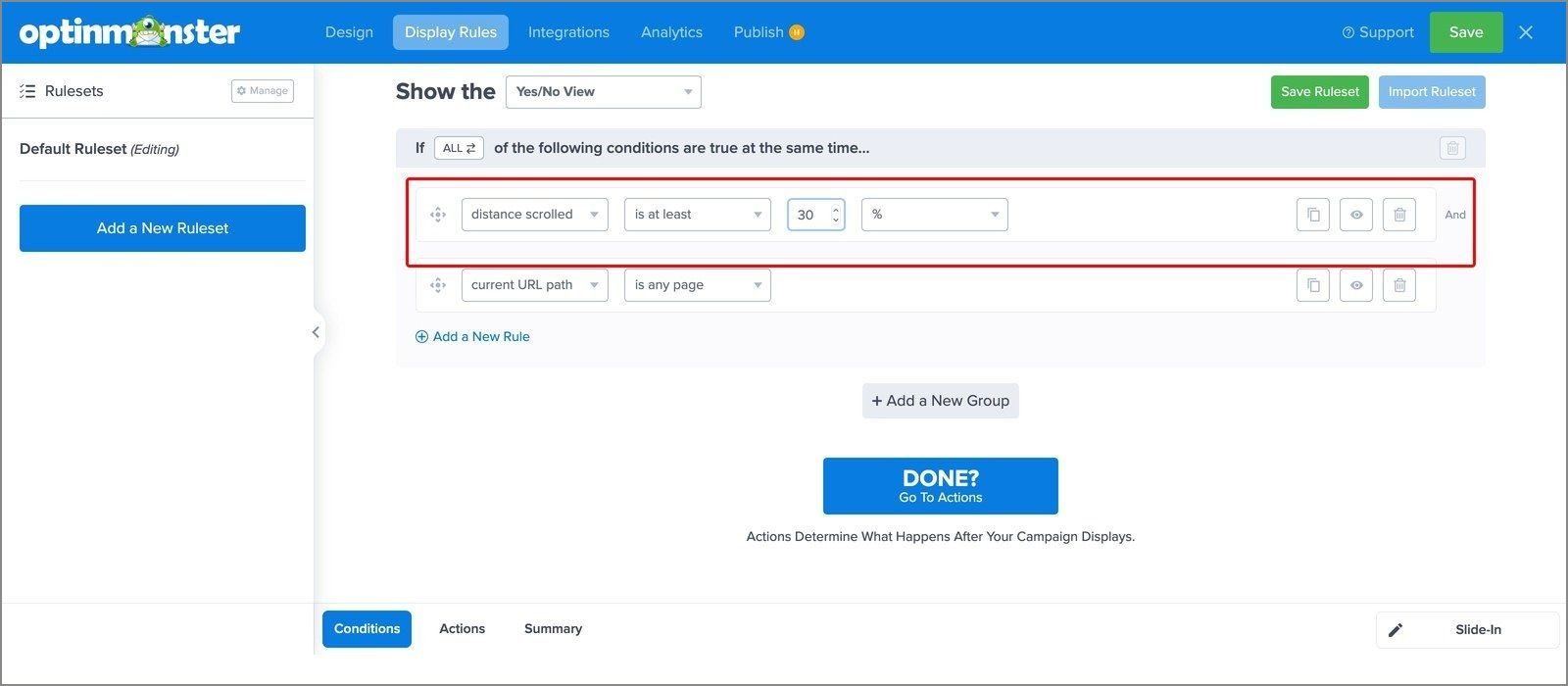
Why it works: somebody who has read a third of your page has already told you they’re interested, and the same offer lands differently after that. In our case study with Libratone, their slide-in appears from the bottom right once the visitor has scrolled at least 30% of a page.
Your visitor also isn’t interrupted the moment they land. They get time to decide whether your content is worth their attention before you ask for anything.
I recommend starting at around 30%, then moving it later if your slide-in arrives before people reach the part of the page your offer relates to. And if you’d rather it stayed available after somebody closes it, the close button can minimize it to a teaser.
Read next: How to enable the minimized state for slide-in campaigns
9. Use Exit-Intent® Technology to Capture More Leads
An alternative to scroll trigger for creating high-converting slide-in optins is Exit-Intent® technology. With Exit-Intent®, the slide-in optin only appears when the user’s cursor starts heading towards the exit or back button.
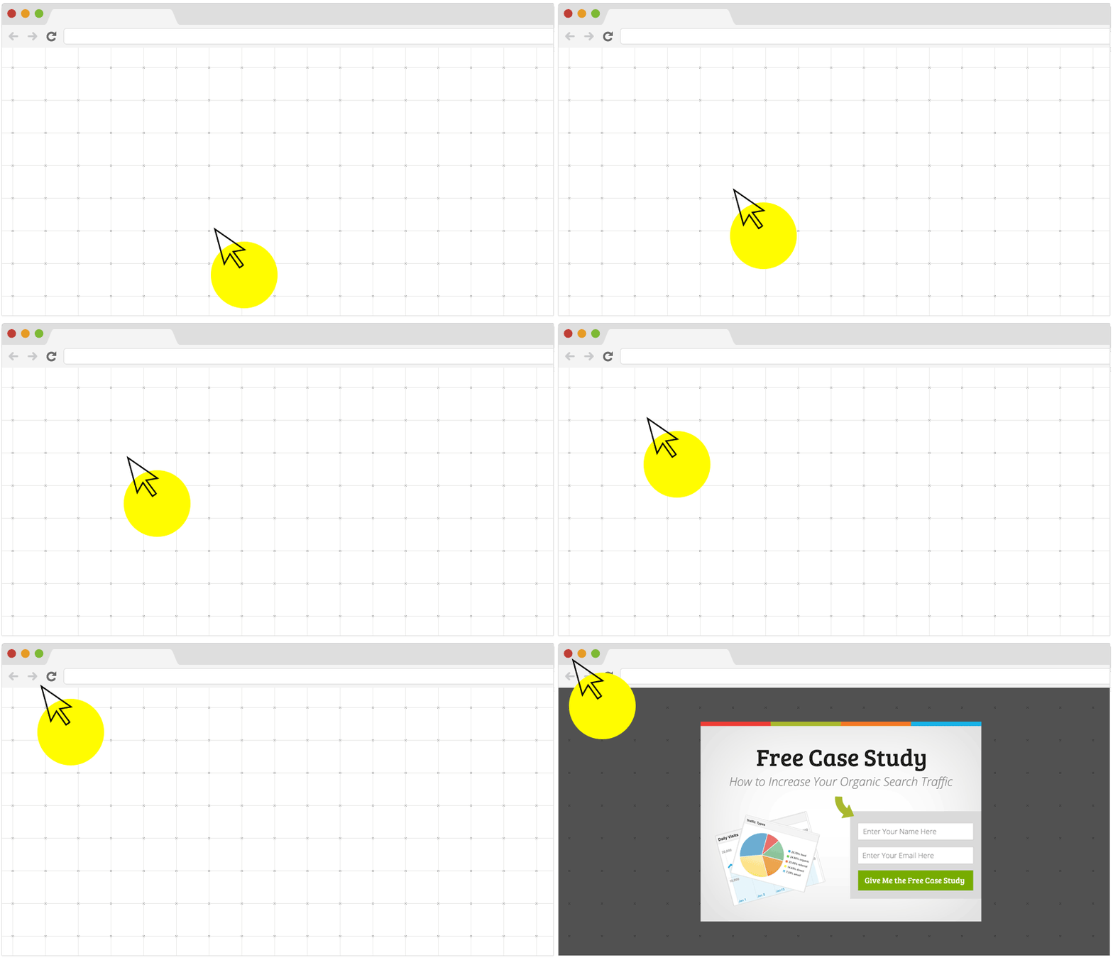
Why it works: the visit is ending anyway, so an offer at that moment costs your reader nothing to consider. In our case study with Fastrack, an Exit-Intent® campaign offered a limited-time discount for joining a loyalty club. 53% of abandoning visitors clicked the button to get it.
You could offer a chat with a support agent, a discount to encourage an on-the-spot conversion, or a lead magnet in exchange for an email address.
For full details, see our guide on how to turn on Exit-Intent®.
10. Run A/B Tests
A/B or split testing is an excellent way to try out different slide-in optins and get a real answer as to which one converts the best.
You can set one up inside OptinMonster in a few clicks, and test different designs, headlines, copy and triggers against each other. For full details, see our guide on how to create a split test.
OptinMonster then shows your campaigns to visitors at random until there’s enough data to say which one is driving more conversions. You’ll also get analytics for impressions, conversions and your best-performing pages.
In our case study with Storyly, they split-tested two Exit-Intent® versions on their Contact Sales page. The one that sent abandoning visitors to a demo video converted at 6.14%, and the one pointing at their G2 awards converted at 2.4%.
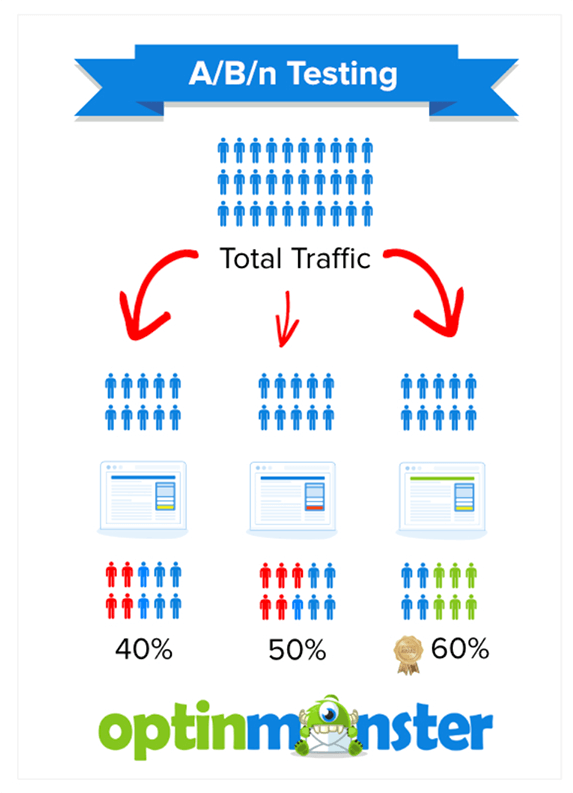
For your eCommerce store, I recommend using split tests for campaigns aimed at getting survey responses from customers, attracting subscribers to a loyalty program, and making more sales.
I suggest testing one thing at a time. A test that changes the design and the incentive together can’t tell you which of the two had the biggest impact.
11. Offer Irresistible Incentives for Higher Converting Optins
Asking people to sign up for your newsletter is one of the lowest converting optin incentives. Unfortunately, it’s one of the most commonly used by businesses.
A newsletter signup gives your reader nothing today, while a discount or a checklist is something they can get straight away. So, offer something they want enough to trade an email address for. If you’re an eCommerce store, offer a limited-time discount on one of your products. If you’re a blog, you could offer a high-value PDF or checklist.
In our case study with Singularity University, a simple slide-in on their online course page promised a sneak peek of a course for an email address. It converted 10% of visitors.
With OptinMonster, you can also use fear of missing out (FOMO), like countdown timers, to increase your conversion rates.
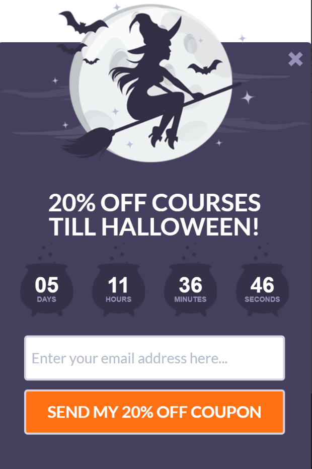
And if you combine lead magnets with page-level targeting, you can offer an incentive that matches exactly what your reader is already looking at.
Slide-In Popup FAQs
What is a slide-in popup?
A slide-in popup, also called a slide-in optin or scroll box, is a small campaign that slides up from the bottom corner of the screen while the visitor scrolls, and stays there without covering the page. In OptinMonster it’s the Slide-In campaign type, and you can trigger it by scroll depth, time on page or Exit-Intent®.
Should you use a slide-in or a popup?
I recommend a slide-in on a content page, because it sits in the corner without covering what your visitor came to read. A lightbox popup makes more sense when the offer is the whole point of the visit, like a discount on a checkout page or a sales deadline you want everyone to see.
Do slide-in campaigns work on mobile?
They can, but a slide-in stays at the bottom of the screen, so one that’s taller than a phone screen can hide its own close button. We recommend hiding slide-ins on phones with the Visitor’s Device display rule and showing mobile visitors a popup they can scroll instead. For full details, see our guide on how to create a slide-in scroll box optin form.
Get Started With Slide-In Optins
Slide-in optins are a more subtle way to get more subscribers and sales. Plus, they’re much less intrusive than other forms of popups, while still being effective.
If you’re ready to start making your own slide-in optins, get started with OptinMonster today!
Related Resources
Disclosure: Our content is reader-supported. This means if you click on some of our links, then we may earn a commission. We only recommend products that we believe will add value to our readers.
Add a Comment