Looking for A/B testing ideas to boost your website conversions? A/B testing, also known as split testing, is essential for optimizing your marketing strategy, as it helps you make data-driven decisions that resonate with your audience. However, getting started with testing can feel overwhelming. That’s why I’ve compiled 60 practical A/B testing examples that you can use right away to enhance your opt-in rates, boost sales, and ultimately grow your business. Each example offers a simple, actionable change you can test today to see what truly works best for your audience.
Why You Need to A/B Test Your Campaigns
If you’re using a lead-generation tool like OptinMonster, it can be tempting to create a few generic popup campaigns and hope for the best.
With A/B testing, instead of simply hoping for the best, you can make informed decisions based on what resonates best with your audience.
One successful A/B testing example is from the marketing company Logic Inbound. They used OptinMonster’s split testing to increase their client’s conversions by over 1500%.
Want to learn more about how OptinMonster increases conversions? Check out this post: How Does OptinMonster Work (3 Powerful Use Cases).
The bottom line is that A/B testing is pivotal in any marketing strategy. And, today, I’m going to give you 60 split testing ideas so you can get started.
A/B test in just a few clicks in OptinMonster!
Use OptinMonster’s built-in split testing to optimize every aspect of your onsite marketing campaigns. Start converting more visitors right away!
Sign up for OptinMonster, risk-free with our money-back guarantee!
60 A/B Testing Ideas to Increase Conversions
Choose the Right Offer
1. Promotion vs. Informational Lead Magnet: One of the most powerful ways to entice customers to opt into your campaign is with a promotion or lead magnet. Test whether your audience would prefer to have a discount on your product or whether they’d like an exclusive piece of content.
2. Change Your Lead Magnet: If you offer a lead magnet to your audience for your optin campaign, try changing the type of lead magnet you use. You could test whether your audience likes checklists, infographics, eBooks, or other types of information-based lead magnets.

3. Size of the Discount: If you offer your audience a discount, try changing the amount you offer. You may assume that the more you give, the more conversions you’ll have.
But if you find that a 10% discount brings in the same amount of leads as a 20% discount, you can cut your losses by continuing with the 10% promotion.
4. Adding a Countdown Timer for Urgency: If you’re running a limited-time offer, try adding a countdown timer to create an even greater sense of urgency. Run an A/B test, you can see if a countdown timer encourages more visitors to convert.
Cracku, a company that helps students prepare for exams, increased conversions by 300% with a simple countdown timer.
Drive Sales With Countdown Timers
With OptinMonster’s drag-and-drop builder, you can add a countdown timer to any campaign in seconds.
5. Using Scarcity: If you’re running a promotion on limited items that may go out of stock, try testing that in your campaign’s copy. In one version, you can let users know “products are running out,” and in the other, you could give specific numbers as to how many of these items are left.
Campaign Design Tests
6. Template Design: At OptinMonster, we have over 700 pre-built templates that you can choose from. You should take advantage of this by replicating campaigns with different designs and styles. That way, you can figure out what type of design your target audience is drawn to.
7. Desktop vs. Mobile: Whenever you create a campaign with OptinMonster, you can filter the template designs by device. You can choose templates that work for Desktop/Tablet or others that are Mobile Optimized:
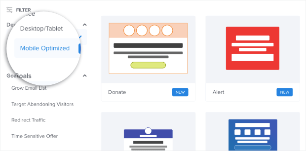
Test out which templates perform better with your audience.
Want to keep better track of how your audience visits your site? Try out MonsterInsights, the best Google Analytics plugin for WordPress.
8. Layout (Columns): When you’re building a template from scratch, you can choose how many columns you want in your optin campaign. Test whether your campaign gets more conversions with a single, double, triple, or quadruple column layout.
You’d be surprised how a minor design component like columns can impact your conversion rates.
9. Headline Color: Your headline is the first thing people will likely see on your optin campaigns. Check whether specific colors are better at attracting your audience’s attention in the headline.
10. Headline Font: Many professional designers compare choosing your font to choosing a pair of shoes: the ones you select say a lot about your style and personality. Use A/B testing to determine whether certain fonts perform better than others.
11. Background Color: Did you know that different colors have often been associated with different emotions? Change the background color of your campaigns to see if specific colors connect with your audience in a way that affects conversion rates.
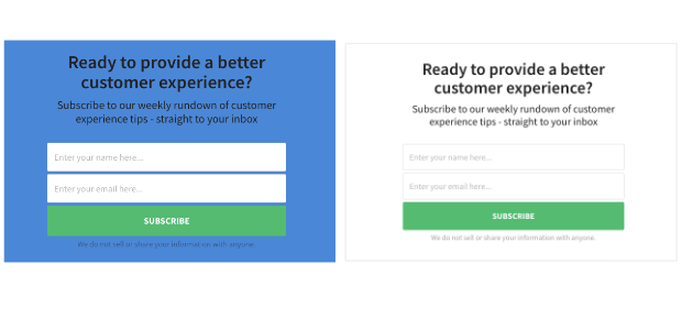
12. Background Image: We often think that images are part of the campaign itself, but you can put your copy (and other images) over a background image. An evocative image might increase conversions, or it might distract from your main CTA. Use split testing to find out.
13. Subheading Color: Just like you did with your header, try playing with the color of your subheading. You can try matching the color to your header or trying ou a whole new color to lead up to your CTA.
14. Subheading Font: Again, like your header, test what font you use for the subheader. If you’re adding new information about your offer, use different fonts to highlight that section.
15. Privacy Message: Your privacy message is a small note under your call to action that lets subscribers know how you’ll use their contact information. For some audiences, this is reassuring.
For others, it raises more red flags than anything else.
Create a campaign with a privacy message, and one without to see how it changes conversion rates.
16. Font Sizes: Whenever you change your fonts for your heading, subheading, or buttons (which we’ll discuss soon), you can also play with the font sizes. Try making larger fonts to grab attention. Or, lower the size to see if it improves the style of your design.
17. Font Weights: Some people confuse font size and font weight. Your font weight will change the thickness of the letters. That can make some sections of your campaign’s copy stand out more. Try to adjust the font weights in your A/B tests to see if it has an impact on your overall results.
18. Images vs. No image: We’ve already covered using a background image, but you should also experiment with adding an image to your campaign. Sometimes the right visual image alone can get people to opt into your offer.
19. Image vs. Image: Another good A/B test with images is to try different images with the same campaign. Professional designers spend years finding ways to visually entice their audience. To think that marketers can get the perfect image the first time around might be overly ambitious.

With A/B testing, you can try out different images until you find the one that resonates with your target audience.
20. Image vs. Video: It’s no secret that videos are gaining more popularity among marketers. Whether used in blog posts, social media posts, or paid ads, videos definitely get results.
Try swapping our your static image for a dynamic video to see if it brings you more conversions.
Optimize Your CTA Buttons
21. Button Color: Your button is really your call to action. It’s where you want people to click to take the action you want them to. Use different colors to see if people respond better to a bold CTA or a more traditional one.
Learn more about button color in Which Is the Best Call to Action Button Color for Your Website?
22. Button Placement: There are general rules for how your optin campaigns should be. Usually, it goes:
- Header
- Subtext
- Optin form
- CTA
But these aren’t universal laws. You can experiment with where your button is placed on your campaign to see if a different layout improves your audience’s response.
23. Button Font: Try using a different font for your CTA button than the rest of your campaign. It might be helpful to give your button a unique style to make it stand out more.
24. Button Icon: At OptinMonster, you have the option of adding small icons to your CTA. This small visual detail might resonate more with your target audience. Try different variations with and without an icon, or test different icons.

25. Button Action: In many cases, your optin campaign will go from the optin view (which asks for your user’s email address) to the success view (which gives a small thank you message).
But, again, this isn’t set in stone. You can play with your button actions, especially if you’re trying to increase page views on your site. You can redirect users to various landing pages and test which ones lead to more overall sales.
26. Button vs. Yes/No Buttons: Try using a different number of buttons on your campaigns. A good example of this is with changing a simple “yes” button option with a “yes or no” option.
The Yes/No campaigns are incredibly effective because of the Zeigarnik effect. This is a psychological phenomenon that shows people tend to finish a process once they’ve started. Smart marketers know that if you can get users to click “yes,” they will be more likely to finish opting into your offer.
Try changing the layout of your campaign from a single button to a “yes or no” offer or vice-versa.

27. Button vs. Yes/Yes Buttons: Another test you can do is trying out a Yes/Yes campaign. In a traditional “Yes/No” campaign, the “no” option typically closes the campaign.
A Yes/Yes campaign will take users to the same URL no matter what option they choose, but for different reasons. Here’s an example:
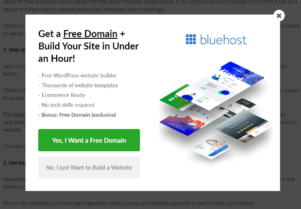
If a user clicks the first option, it’s to redeem the free domain. If the user clicks the second option, it’s to get hosting services, but they may not need the domain.
Either way, all roads lead to higher conversions for you.
A/B Test Your Copy
28. Headline Copy: We’ve already mentioned how important your headline is. You should take the time to A/B test various headline copy to see what resonates with your buyer persona.
Remember, the copy you write isn’t successful just because you like it. It’s successful when it works. A/B testing is the best way to ensure you’re using the best possible copy.
29. Subheader Copy: Similar to your header copy, you should experiment with the phrasing of your subheader text.
In some cases, you may also test removing the subheader completely. When it comes to writing compelling copy, less is often more.
30. Button Copy: We’ve written extensively on writing strong calls to action. Test out different language in your CTA button for the highest conversions possible.

Need some ideas for good action verbs? Check out this list of over 700 power words you can use for more compelling CTA copy.
31. Specific Numbers: In your campaign copy, try using specific vs. non-specific numbers. So instead of saying, “We’ve served over 2,000 clients,” you could say something like, “2174 clients can’t be wrong!”
Specifying the exact number of people can grab your audience’s attention and build credibility. But you won’t know what works best without split testing.
32. First vs. Second person: Test out whether to write in first person (I, me, we, & us) or second person (you, your, yours). For example, should your button say “Download your free copy” or “Download my free copy”?
A good rule of thumb in writing copy is to focus on the reader and what they’ll get. But you can test the perspective of your copy from first to second person to be sure it gets you as many conversions as possible.
Find the Right Social Proof
33. Using a Testimonial: Adding a testimonial to your optin campaign can build trust and get higher conversions.

If you find that a testimonial is getting higher conversion rates, don’t stop there. You can change the testimonial or add a photo, name, and title of the person who gave it. All of these elements can help optimize your conversion rates.
34. Adding a Review: Similar to a testimonial, you can add a review that your product or service received. This is most often done with a visual star rating to show how many stars you received out of 5.
35. Display Past Clients: Test whether showcasing well-known clients can build trust and encourage conversions. Include recognizable logos from past clients on your campaigns, and see if this added credibility resonates with your audience. If successful, you can experiment further to find which specific client logos drive the most engagement and opt-ins.
36. “As Seen On” References: Have you been published on credible sites across the web? Why not share some of the big names that have featured your product or service?
By using trustworthy third-party sites that have featured your work, you can build more trust in your brand, which often leads to higher conversions.
Test out showing these different publications on your optin campaigns.
37. Statistics: Try adding a few statistics to your optin copy. Show how much impact your product or service has added to a specific niche. You can also test whether you should give general stats or provide detailed and specific numbers in your copy.
Functionality
38. Campaign Types: Many marketers think of lightbox popups when it comes to optin campaigns. But there are so many others.
At OptinMonster, we want our users to have the freedom to take a multi-campaign approach to increase their conversion goals. One A/B test you can try is which one of these campaign works best. You could, for example, compare using a lightbox popup against a floating bar campaign.
We have 9 different campaign types that you can start using and testing today.
39. Sidebar Forms: Sidebar forms are controversial. Some marketers think they aren’t effective enough to use. Others believe it catches enough low-hanging fruit to justify the 10-minute setup.
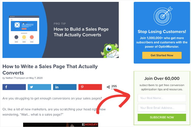
You can A/B test your sidebar widgets on your site to see how many new leads they bring you each month. Why is this important? Because if you run a page with ads on it, that space on your site has a certain monetary value.
If your sidebar widget is taking up the spot of a paid ad but not generating any revenue by capturing leads, then it may not be the best campaign to use.
40. Upsell: Once you’ve sold a product, test an upsell campaign to see if you can boost overall customer sales. Upsells show a different product at a higher price point than the one a customer previously purchased.
If you’re tracking your customers’ journey, you can test upsells to see if they have an impact on sales.
41. Downsell: Another approach would be to A/B test downsell campaigns, too. Your target audience may not respond well to campaigns that offer more expensive offers. But, they may appreciate a good value!
For that, you can test follow-up campaigns to see if you can boost total sales with a good downsell campaign.
42. Cross-Sell: Another type of campaign to test out would be cross-selling. Rather than thinking about the price-point of your offer, you can show customers related items to ones they’ve shown an interest in.
You can create cross-selling campaigns and see if they lead to noticeable increases in your revenue.
43. Multiple Campaigns: Every page should have one goal. But that doesn’t mean every page should have just one campaign.
You can combine different campaigns to boost your page’s overall conversions. Test out the number and types of campaigns that you attach to each page.
Over time, you’ll find the balance that will achieve maximum conversions. But you can only reach this point through detailed A/B testing.
44. Personalize by Name or Location: Another helpful OptinMonster feature is the ability to show follow-up campaigns with your user’s name or location, through our Smart Tags and Geolocation targeting. This is an excellent way of grabbing your customer’s attention.
Try personalizing your campaign by adding the visitor’s name or location on the campaign itself. Then, wait to see if this personalization leads to higher conversion rates.
45. Phone Number or No Phone Number: Depending on what niche you’re in, you may or may not need your customer’s phone number.
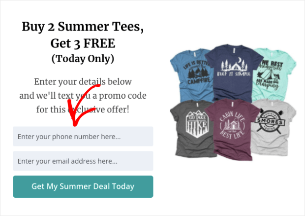
But, you may find that when you ask for a phone number, your conversion rates drop.
A/B test to see what happens when you prompt users to add their phone number to opt into your offer.
Need phone numbers for SMS marketing? Check out this post on how to create an SMS popup with OptinMonster.
46. 2-Step vs. 1-Step Optin: Earlier, we discussed the standard flow of an optin form. The user typically sees an optin form, fills out and submits their information, then goes to the success page (with a nice thank you message).
But you can add a step with a “yes or no” question before the optin form appears. This can be a great way of making sure your visitors don’t feel pressured to immediately hand over their contact information.
You can also use a clickable MonsterLink™ to engage your site’s visitors. Users click this link (as the first step) and see your optin form (your second step). So, for example, you can test whether a clickable MonsterLink™ campaign brings you more conversions than an exit-intent popup that goes straight to an optin form.
Either way, you should test whether a 2-step optin or a traditional campaign works best for your goals.
47. Yes/No vs. Yes/Yes: Another test you can run is comparing a Yes/No campaign vs. a Yes/Yes campaign.
A Yes/No campaign has 2 options with 2 different results:
- Yes, which leads to the optin form
- No, which closes the campaign
A Yes/Yes campaign has 2 options, both with the same result:
- Yes, which leads to a webpage
- No, which leads to the same webpage as “yes” but for a different reason
For a small explanation on why and how to make this work, go back to tip #27.
You should test out whether a Yes/No or a Yes/Yes campaign gets you more conversions.
48. Removing Placeholders from Fields: If you’re using an optin form to get information like name, email address, and phone number, then you may use placeholders in the fields. This is the small text in the field box that lets users know what information they should enter.
Test out whether there are any changes when you remove placeholders from your form.

You can also test whether there’s any effect on changing the text of your placeholders.
49. Modify Your Error Message: When a user enters the wrong information into a field box, they’ll receive an error message. You can test whether your error message is increasing or decreasing the number of people opting into your offer.
If your error message isn’t crystal clear, your visitors may get frustrated and leave. You can know if your error message is effective by a simple split test.
50. Turn Double-Optin on or off: A double-optin is when users need to confirm that they want to subscribe to your contact list from their email inbox. This can be important for making sure that you get engaged people on your list rather than spam.
On the other hand, it may discourage users from signing up for your list because there’s an added step. If you test how double-options affect your mailing list, don’t just look at the total number of sign-ups. You’ll also want to check the quality (and authenticity) of these new leads.
Then you can determine which method is getting you better results.
51. “X” Button or No “X” Button: In most option campaigns, there’s a small “X” button in the top right corner of the screen. This button lets users close the campaign if they don’t want to opt into the offer.
Test the placement of the close button and whether or not you need one at all. Removing the “X” still allows users to close the campaign (by clicking off of it). However, if the “X” isn’t immediately visible, it may encourage users to read your campaign.
Targeting and Trigger Rules
52. Location of Your Campaign: Where you display your campaign on your website will likely affect your conversion rates. Test out whether there’s a difference if you show the same campaign on a specific page, various URL paths, or on every page of your site.
53. Personalization (from a 3rd-Party Site): We already discussed personalizing your campaign by name and location, but you may want to try referencing 3rd-party sites.
With OptinMonster’s Referrer Detection, you can show targeted campaigns based on how your visitors arrived on your site. If your visitors are coming from Facebook, for example, you can personalize the campaign with a message like “We’re glad you found us on Facebook! Here’s a coupon for your first purchase.”
This message may or may not grab your audience’s attention long enough to convince them to choose your option. The only way to know for sure? A quick A/B test.
54. Exit Intent Sensitivity (Low, Medium, High): Exit-Intent® Technology is one of our most effective triggers.

The fitness company Crossrope increased their conversion rates by 900% with a simple exit-intent popup.
That said, you may want to test the effectiveness of how sensitive your trigger is. The higher the sensitivity, the quicker your exit-intent popup will display if users are trying to leave.
An A/B test for exit-intent sensitivity can tell you if your popup is showing too soon (or not soon enough!).
55. Exit Intent Device (Mobile, Desktop, Both):
OptinMonster’s Exit-Intent® feature works on mobile devices, as well. Instead of mouse movements, it tracks when the user tries to quickly scroll back to the top of the page.
As a result, you might want to check whether your exit-intent campaigns are as effective on mobile devices as they are on desktop.
If you notice a clear difference in conversions between the two, then you may need a different campaign type for different devices.
We recommend checking out this article on how to create a mobile exit-intent popup that converts.
56. Scroll Length Depth: One of OptinMonster’s campaign triggers will make your campaign appear depending on how far down the screen your user scrolls. You can modify the depth of the trigger to determine the most effective time for displaying your campaign.
57. Time on Page Time: Similar to our last tip, you can set your campaign to display after the user has passed a certain amount of time on your page.
A/B test the amount of time to see if it’s better to wait longer to show your campaign, or if you can get better results by showing it more quickly.
58. Inline Campaign Placement: If you use inline campaigns, you should test where they’ll be most effective. This is especially true for blog posts.
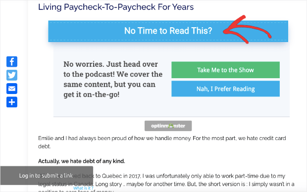
Most readers won’t read your blog posts from start to finish. Instead, they’ll either skip around or read the first 30% before moving on.
You can test where your inline campaigns are more effective by moving them closer to the top or lower toward your call to action at the end.
Where you place a campaign can sometimes be just as important as what’s on it.
59. Schedule Start and End Time: Just as important as where your campaign appears is when it appears. You can schedule start and end times for your campaigns. But, you can also A/B test this component.
See if scheduling shorter amounts of time will build more urgency and lead to more conversions. Or, if you let the campaign run longer, perhaps you’ll get even more people to optin over time.
Split testing is the only way to know for sure.
60. Animated Inactivity Sensor™: Are you losing some of your readers because they aren’t engaged with your site after a certain amount of time? Using OptinMonster’s Inactivity Sensor™ campaign can be a great way to re-engage your site’s visitors.
A/B test these campaigns by adding dynamic animation and sound effects to see if this draws more people back to your site.
And there you have it! 60 A/B split testing examples that you can start using today. Want to learn more about A/B testing best practices?
We recommend checking out the following articles:
- 11 A/B Testing Best Practices You Can Start Using Now
- 13 A/B Testing Mistakes That Are Wasting Your Time
- How to Create a Split Test (and Why You Should)
These posts will have everything you need to make sure that you’re not leaving any conversions on the table.
Did you know that OptinMonster makes split testing ridiculously easy? You can run A/B split tests in a matter of seconds to optimize your campaigns.
Get started with OptinMonster risk-free to start boosting conversions today!





Add a Comment