Do you have an awesome product that you are struggling to sell at a premium price point? If so, we have just the right funnel strategy to help you boost your sales:
A tripwire funnel.
A tripwire funnel is a super powerful marketing strategy that can turn cold traffic into big spenders in minutes. And, today, I’ll show you how to create a tripwire funnel step-by-step for your website using OptinMonster.
By the end of this article, you’ll have a successive tripwire funnel template that you can use to increase your conversion rate.
Feel free to use this table of contents to jump directly to the section that interests you the most:
- What Is a Tripwire Funnel?
- Are Tripwire Marketing and Lead Magnet the Same?
- Why Are Tripwire Funnels a Good Marketing Strategy?
- How to Create a Tripwire Funnel With OptinMonster
Let’s dive in!
What Is a Tripwire Funnel?
A tripwire funnel is a digital marketing strategy that entices customers to make a small purchase to get them to make larger purchases in the future.
By creating a low-ticket offer that your audience truly can’t refuse, you’re able to get clients in a funnel where you can upsell, downsell, or send to a confirmation page. The offers that you design for this type of funnel are called ‘tripwires.’
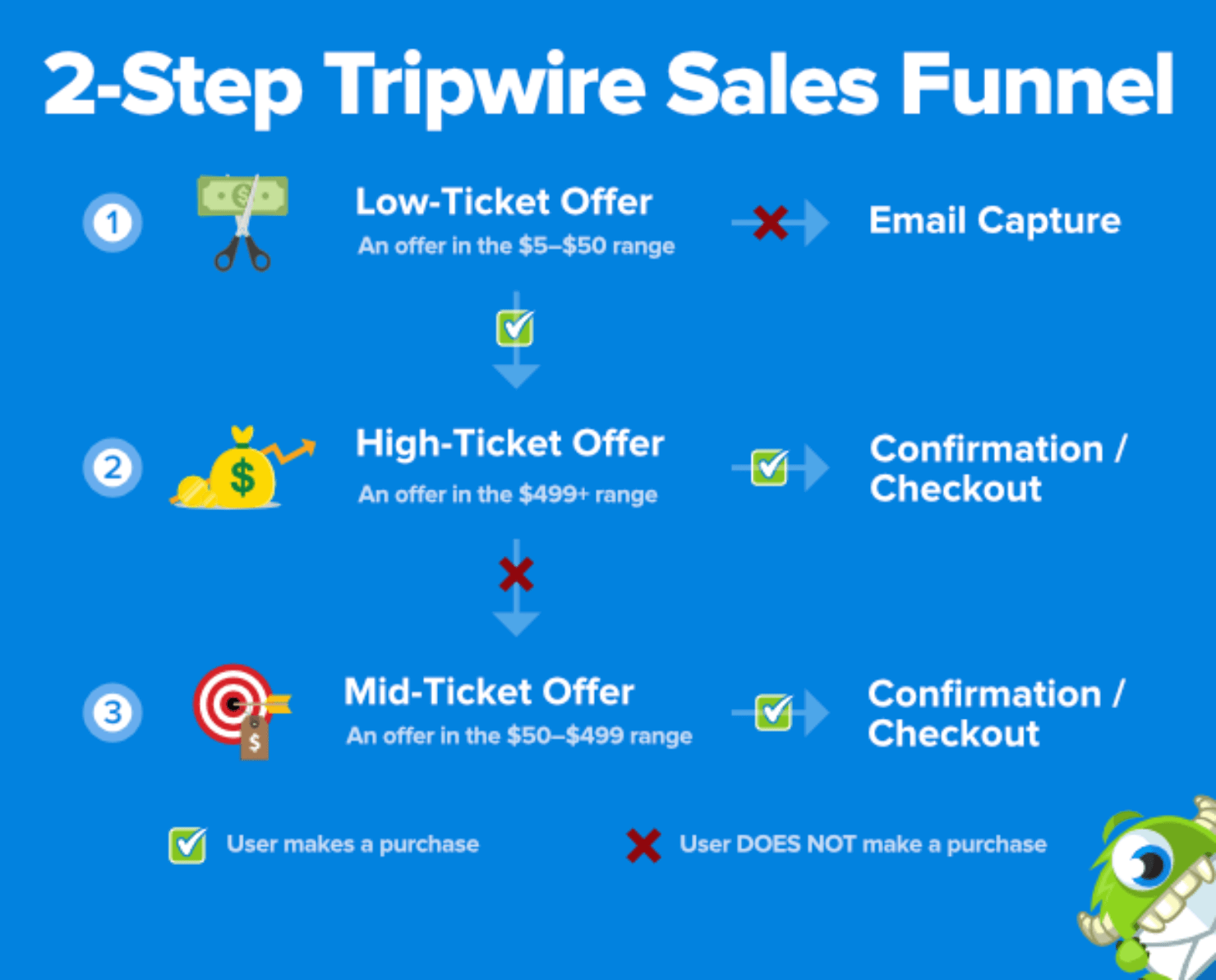
A typical tripwire funnel has 4 parts:
- An original low-ticket offer.
- A one-time-only high-ticket offer.
- A one-time-only mid-ticket offer.
- A success or confirmation page.
So how do tripwires work? They’re surprisingly simple to understand:
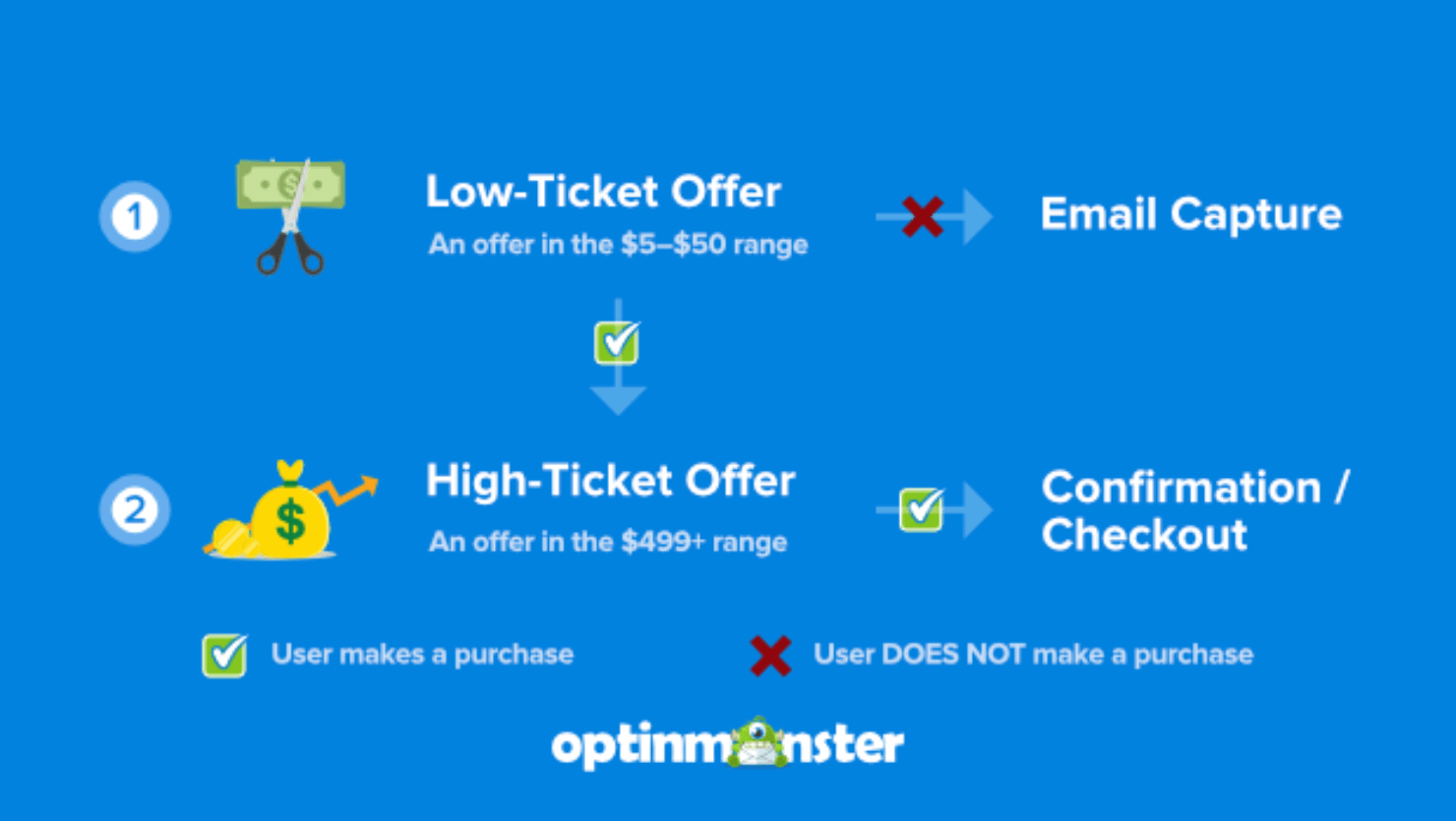
First, you start with a low-ticket tripwire offer. Usually, these are freebies or low-cost digital products that sell between $5–50.
If leads don’t buy your offer, you can still capture their email addresses. But that shouldn’t be the primary goal for tripwire funnels.
If the customer takes up the offer, they’ll go to the purchase page and see your upsell offer.
Here, you’ll give them a one-time offer at a higher price point. This product is one of your more expensive products, typically in the range of $500 and up.
You can send customers this core offer immediately after the low-ticket item was purchased or wait 24 hours to trigger an email campaign.
If the customer opts into your high-ticket offer, you’ll redirect them to the product page to complete the purchase. Finally, you’ll send them a confirmation message.
Here’s what the entire process looks like visually:
But what happens when they don’t take you up on the high-ticket offer?
You can send another limited-time offer but, this time, for a mid-ticket product. This is something more expensive than the original purchase, but less expensive than the high-ticket offer they just saw.
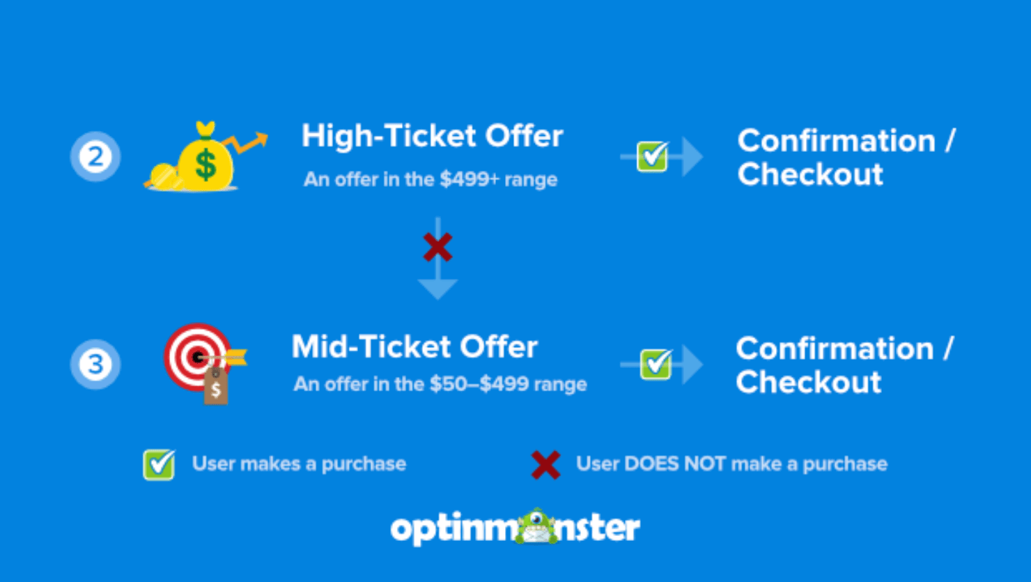
In other words, you drop your high-ticket offer down to a mid-ticket offer. Typically it’s between $99–500 price point.
The best part? Even if your client doesn’t opt into your mid-ticket item, they’re still on your email list from their initial purchase. That means you can nurture them for the future with email campaigns about:
Or anything else you think would add value to your customers’ lives while creating revenue for your online business.
Once you set up your tripwire, you’ll always come out ahead. Here is a tripwire template that shows how the funnel works in its entirety:
Now that you know what a tripwire sales funnel is, let’s take a look at how they are different from lead magnets.
Are Tripwire Marketing and Lead Magnets the Same?
No, tripwire marketing is not the same as lead magnets. Lead magnets are a top-of-the-funnel strategy used to convert website visitors into leads. But tripwires are a middle- and bottom-of-the-funnel strategy built to turn leads into potential customers.
It’s easy for people to confuse the 2 because both are digital marketing strategies used to improve website conversions.
And tripwire campaigns make use of free lead magnets as their low-ticket offer all the time.
According to MailOptin, tripwire marketing can help you increase your upsells by up to 26%.
Lead magnets are great for conversions, but they don’t present the multiple revenue opportunities of tripwire campaigns.
eCommerce business owners use lead magnet strategies, such as free shipping or discounted shipping costs to attract more customers. But these ideas can help you get lead conversions, not necessarily sales conversions.
Why Are Tripwire Funnels a Good Marketing Strategy?
Much like lead magnets, tripwire marketing offers 3 amazing advantages:
- Grow your email list.
- Save a Lot of Money.
- Boost your sales.
Let’s discuss the 3 at length.
1. Grow Your Email List
Tripwire funnels are great for growing your email list. Growing your email list is critical for business because email marketing is the best method for making your business succeed.
When compared to other marketing channels like social media, marketing through email offers great benefits:
- Email marketing is more targeted and personalized than social media platforms.
- While your account and data in social media are at the mercy of a 3rd-party platform’s policies and algorithms, email offers you complete ownership.
- Email marketing is more cost-effective than running ads on social media networks.
Email marketing is also the best tool to succeed with a tripwire marketing campaign.
For instance, when you make the initial low-cost offer on your website, you’ll earn new leads that you can nurture through automated email campaigns. From there, the sky truly is the limit.
Therefore, the better your tripwire funnel, the bigger your email list can be.
2. Save a Lot of Money
One of the best things about a tripwire marketing funnel is that it doesn’t cost you anything. That’s because you can price your original low-ticket offer to cover the advertising costs of bringing in your cold traffic.
Or, if you’re getting loads of organic traffic through content marketing, your initial offer will more than pay for the software you’re using to create your sales campaigns.
OptinMonster, for example, starts at $9/month. And you can build every part of your tripwire funnel with OptinMonster.
This means that just 1 low-ticket purchase priced at $10 would cover the cost of your campaign creation for the entire month.
Again, whether you’re relying on organic or paid traffic, the best tripwire funnels cover their own costs.
3. Boost Your Sales
Tripwire funnels are one of the best ways to create more revenue. Not only do they pay for themselves, but their entire purpose is to get people to make more expensive purchases over time.
You can start seeing those higher streams of revenue more immediately, too.
Imagine you have 3 tripwire products:
- Low-ticket item at $10
- Mid-ticket item at $200
- High-ticket offer at $997
Let’s say you are driving 500 visits to your site every month. Assume that 25% take up the lower-priced offer at $10. That’s $1,250 per month just to get things going. It’s also revenue that you likely wouldn’t have gotten at all without a low-ticket offer.
Out of the people who opt into your offer, 1% decide to buy your high-ticket upsell instantly. That’s another $1,246 of revenue for the same month.
And let’s assume that at least 2% of visitors take you up on your mid-ticket item. That’s an additional $500 per month.
This simple tripwire funnel can earn you close to $3,000. If you take out a generous $1,000 cut for marketing and ads, you’re still making over $35,000 in profit per year. And that’s just from 1 simple tripwire sales funnel!
Imagine what you can do if you can grow your email list and run multiple tripwire marketing offers simultaneously in a year.
It’s no wonder why some of the biggest companies in the world use this strategy to get more sales. Here are a few tripwire funnel examples from real-world brands:
- Top 6 Digital Increased Affiliate Revenue 30%
- How SnackNation Adds 1200 Segmented Leads Every Week
- Nick Gray Used Yes/No Forms to Increase Conversions by up to 7.33%
And, today, you’re going to learn how you can build your own tripwire funnel using OptinMonster.
But why OptinMonster?
OptinMonster is the world’s #1 lead generation software that gives you all the tools you need to create powerful optin campaigns in a matter of minutes.
Its drag-and-drop funnel builder lets you make stunning popups that engage your site’s visitors. With OptinMonster’s powerful targeting rules, you can set up your campaigns to appear to the right people at just the right time in their customer journey.
Ready to see how it works?
Step-by-Step Guide to Creating a Tripwire Funnel
For ease of understanding, I’ll break this tutorial down into 2 parts:
Let’s start with that low-ticket offer.
Part I: Create Your Tripwire Low-Ticket Offer
Step 1: Select Your Campaign Type and Template
The first thing you need to do is log into your OptinMonster account. Once you’re in, click Create New Campaign in the upper right-hand corner of your dashboard:
The next screen will prompt you to choose a campaign type. For today’s demo, I’ll select a Popup campaign:

That said, you can choose any type of campaign for low-ticket tripwire offers.
Your first goal with this campaign is to grab your visitor’s attention. Creating an irresistible offer will make the rest of the process easier.
Since all of OptinMonster’s campaign types are designed to get your audience’s attention, any of them will work just fine.
Next, you need to select your template. OptinMonster has over 100 templates to choose from.
For today’s tutorial, I’ll choose the Lead Magnet Download template:
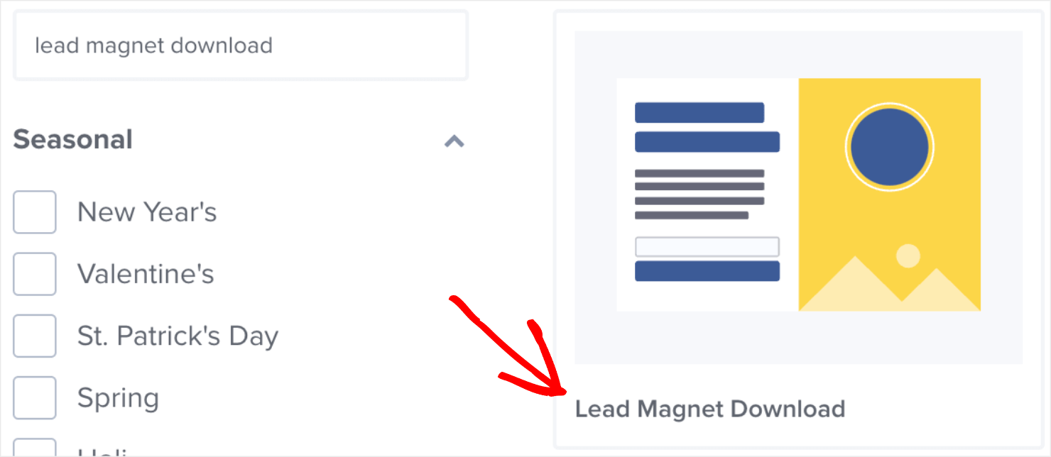
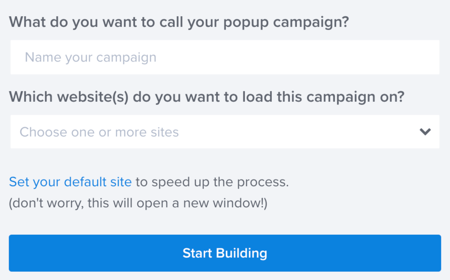
Next, name your campaign and assign it to one of your websites:
This will take you to the OptinMonster campaign editor. This is how the template looks in my editor:
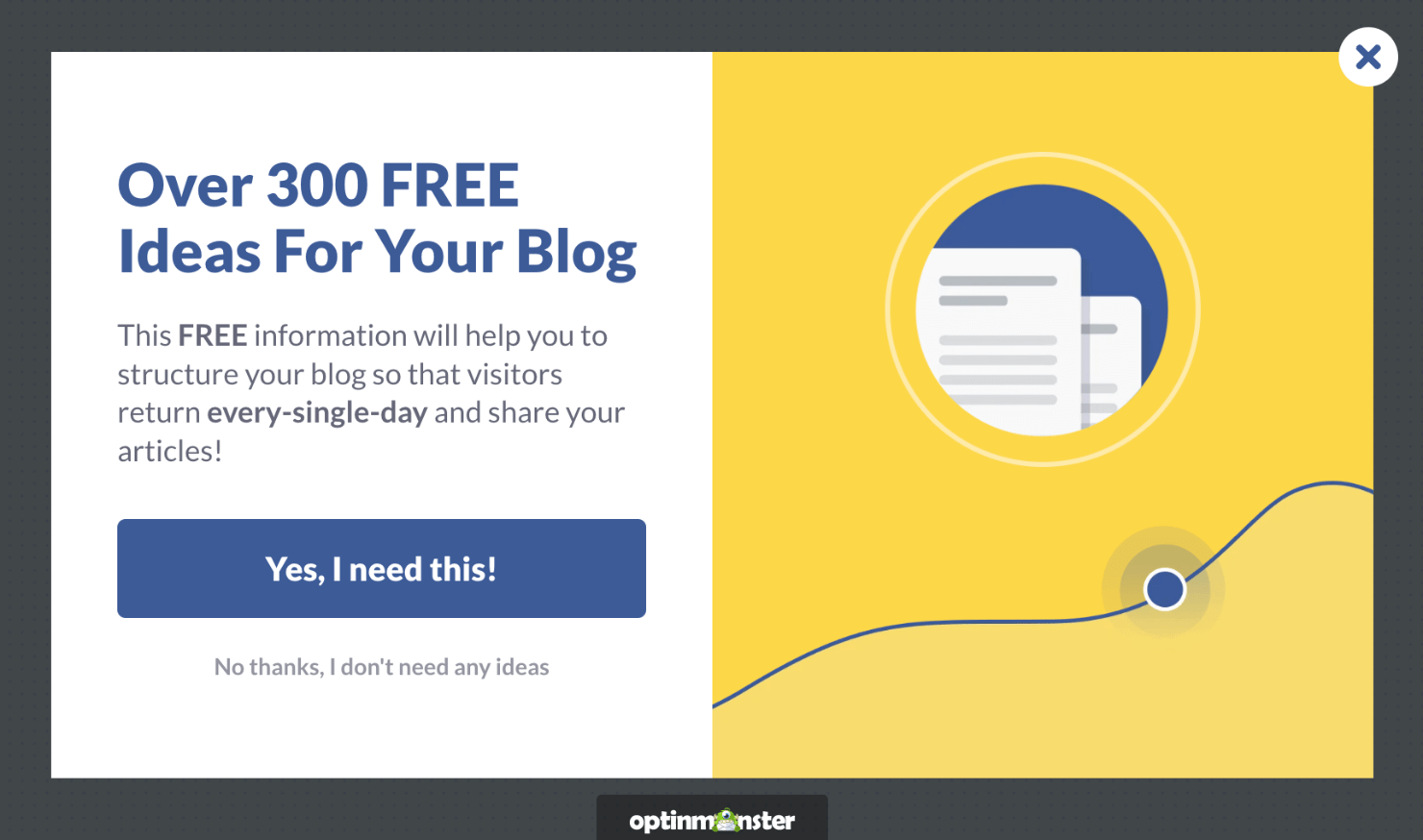
Now we’re ready to start making visual changes to the campaign.
Step 2: Design Your Campaign
When your campaign is in the OptinMonster editor, the first thing to do is ensure that the Yes/No form is enabled.
In the template that we have chosen, the Yes/No button appears at the bottom-left of the OptinMonster editor. By default, the option is already enabled:
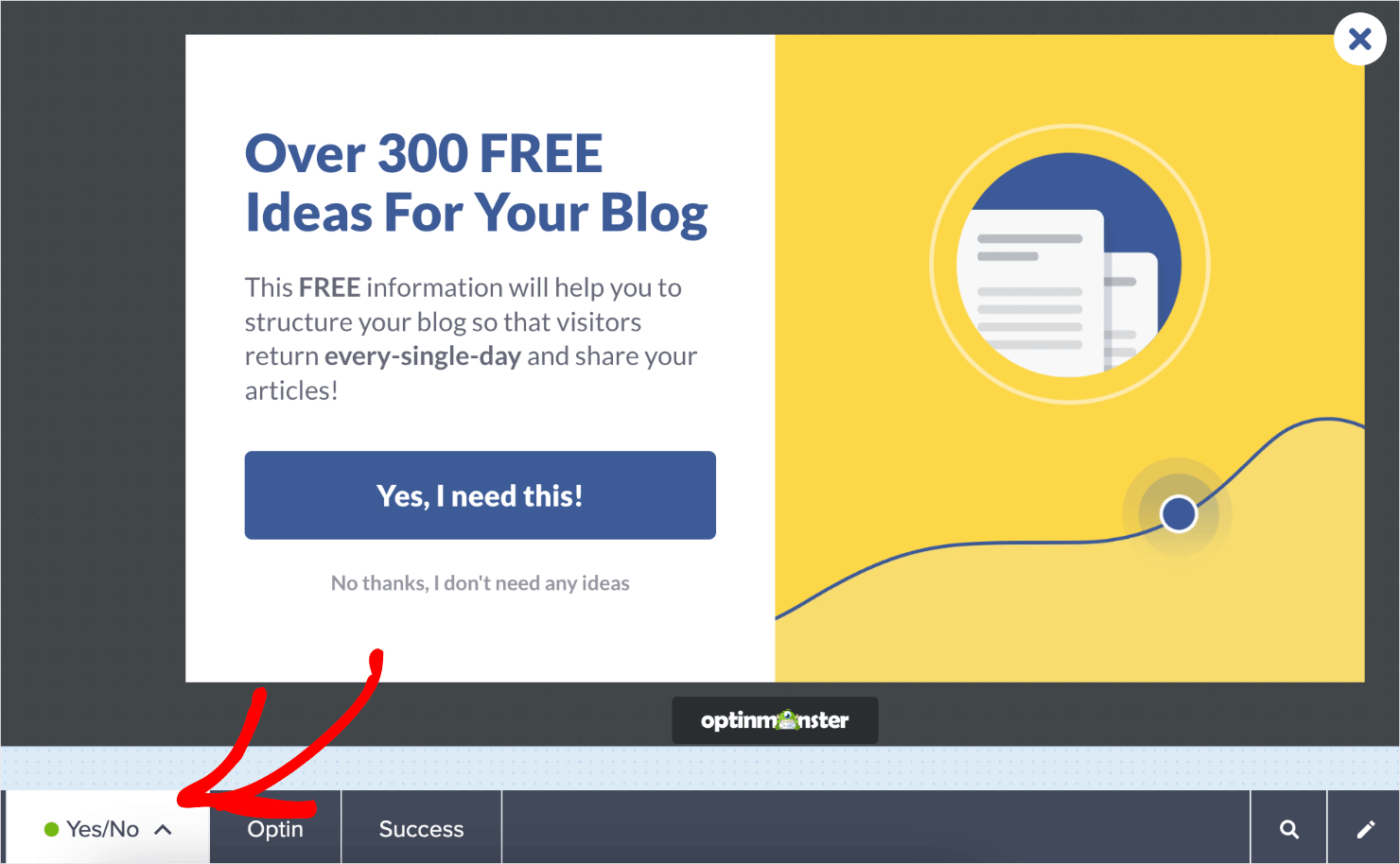
You can click on the icon next to the Yes/No option to disable the option if you don’t need it:

For this tutorial, we’ll leave the option enabled.
Note that this form doesn’t have an optin field asking for your customer’s name and email address. That’s because the goal of a Yes/No form is to get your visitors to take one small positive action: clicking Yes.
This is effective because of a psychological principle known as the Zeigarnik effect. In short, the Zeigarnik effect suggests that people are more likely to finish an action once they’ve started.
By getting your visitors to click Yes, there’s a higher chance they’ll opt into your offer.
For the first part of this tripwire funnel, you want to treat your Yes/No form like a sales page with a free lead magnet offer.
If you’ve never written a sales page in the past, check out our guide on how to write a sales page that converts.
Here are the main takeaways that can help you craft an irresistible sales page as part of your tripwire sales funnel:
- Write a strong, catchy headline to grab your visitors’ attention.
- Show the tangible benefits your product will have for consumers.
- Explain why the product is worth much more than the price tag.
- Create high-quality photos or images for your core products.
We won’t be getting into every small detail on how to modify your campaign in this tutorial. There are just too many design options to cover in one post.
Fortunately, OptinMonster’s editor is incredibly intuitive. For example, you can click on the text area to make changes to your copy:
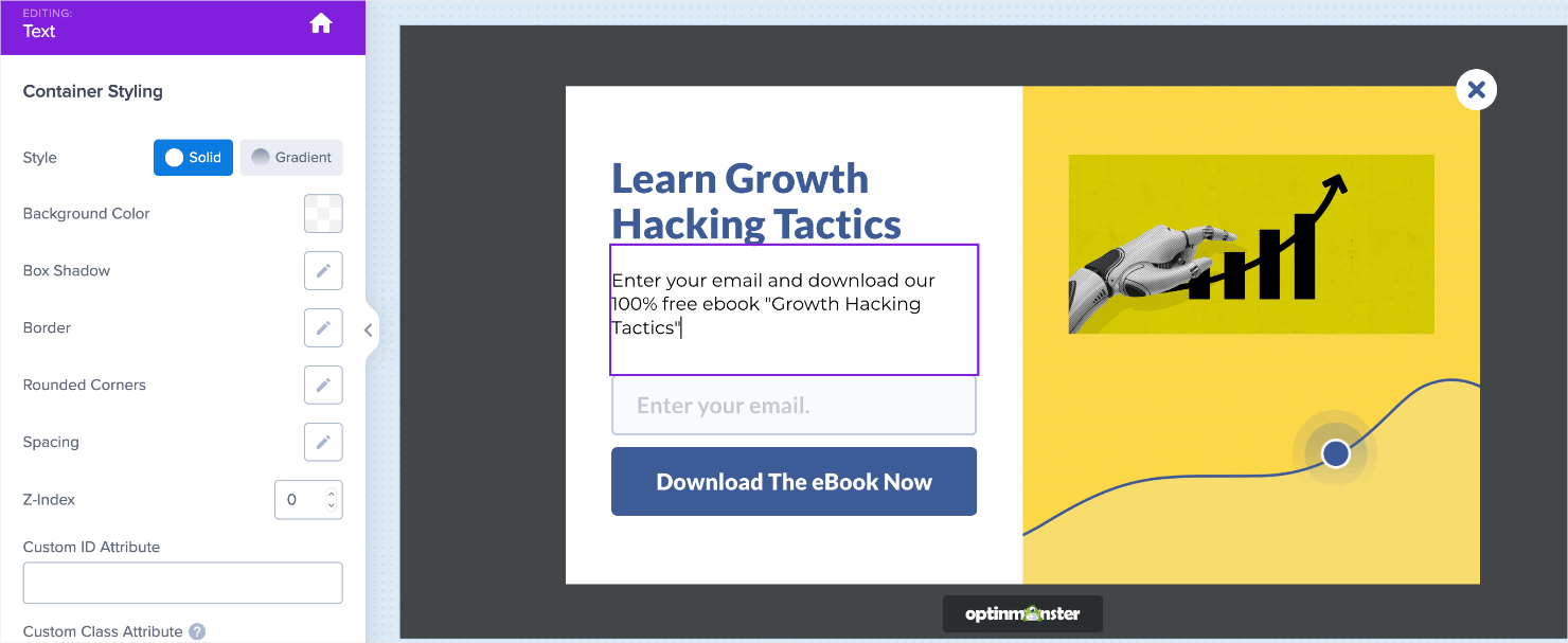
To change other parts of your campaign, click on the element you want to modify and use the tools on the left-hand side to make the changes you want:
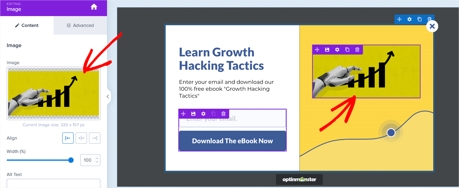
The editing tools let you easily change your campaign’s:
- Text
- Images
- Background color
- Button
- Optin field forms
- Button actions (which we’ll cover in a bit)
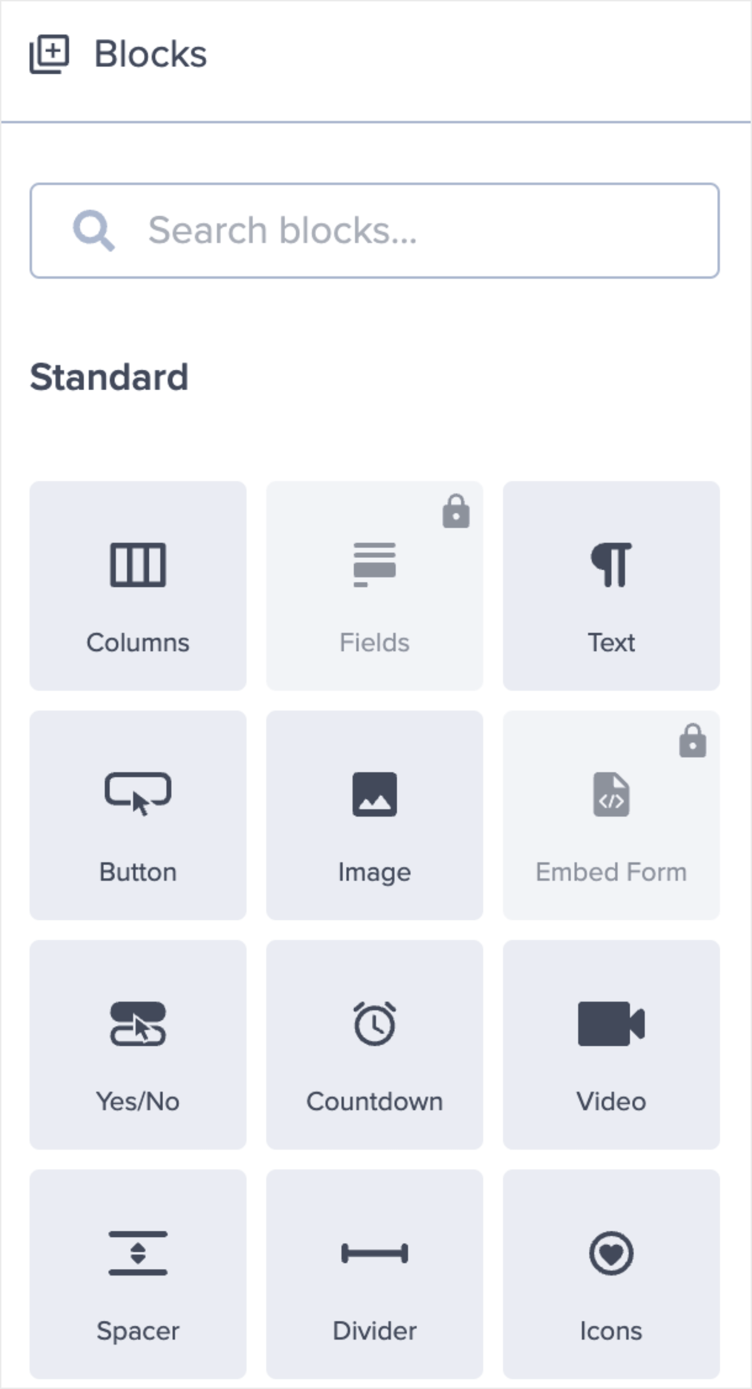
And much more. Plus, you can add elements like videos, images, text, optin fields, icons, and more. To do so, click on the home icon at the top of the menu on the left:

From the Blocks menu, choose the correct block from the options and drag and drop it into place:
For a more in-depth walkthrough on how to design your popup in OptinMonster, read how to create your first campaign.
For now, let’s get back to designing an irresistible lead magnet for our tripwire funnel using the Yes/No form.
Here’s a campaign I created for an online course with just a few customizations:
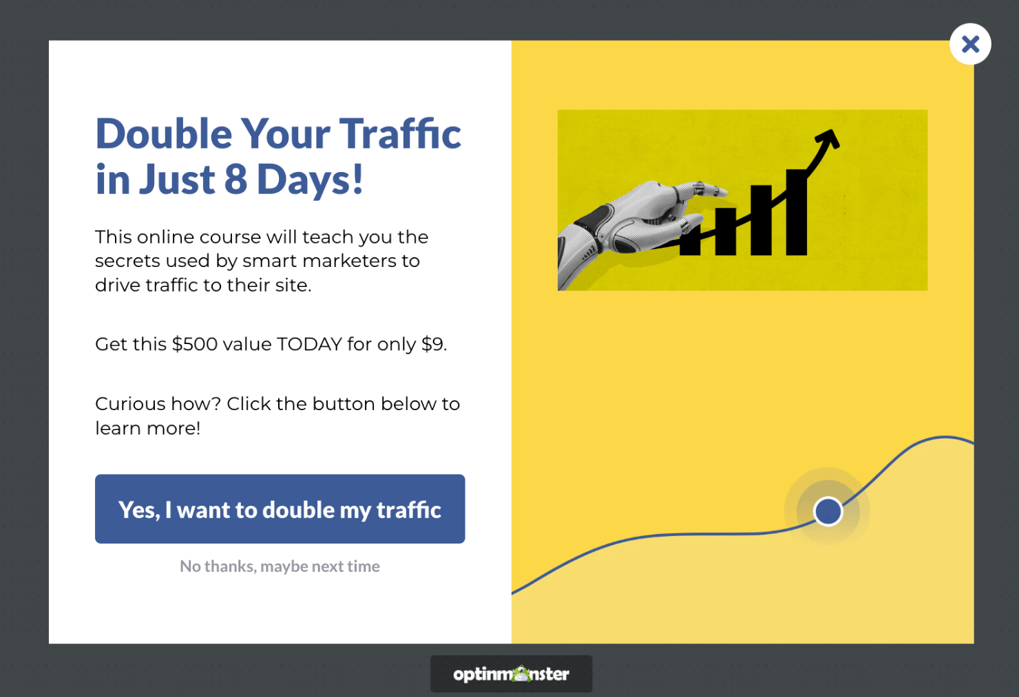
Note the strong headline that communicates the tangible results. The value proposition shows the low price point (at just $9).
Everything in this campaign is priming the visitor to click the Yes button. And what happens when they actually do?
For that, you’ll want to redirect your clients to the product page where they can go through with checkout. Here’s how you do that.
Step 3: Configure Your Tripwire Funnel’s Button Actions
Click on the Yes button element in your editor. This will bring up the editing tools on the left:
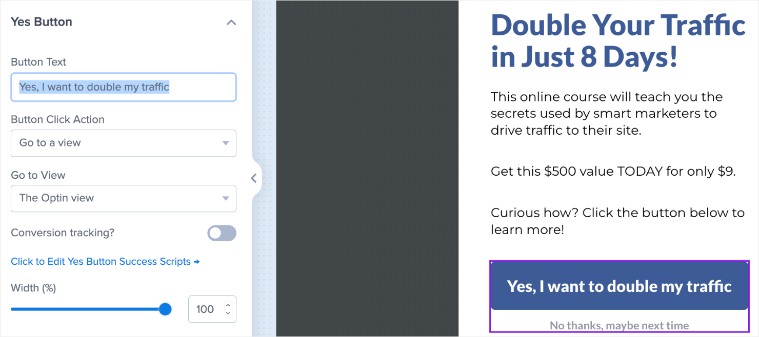
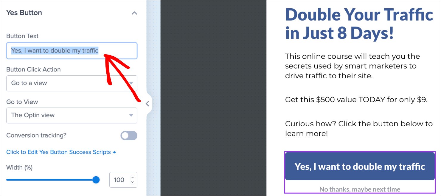
Change the copy of the Yes button if you want:
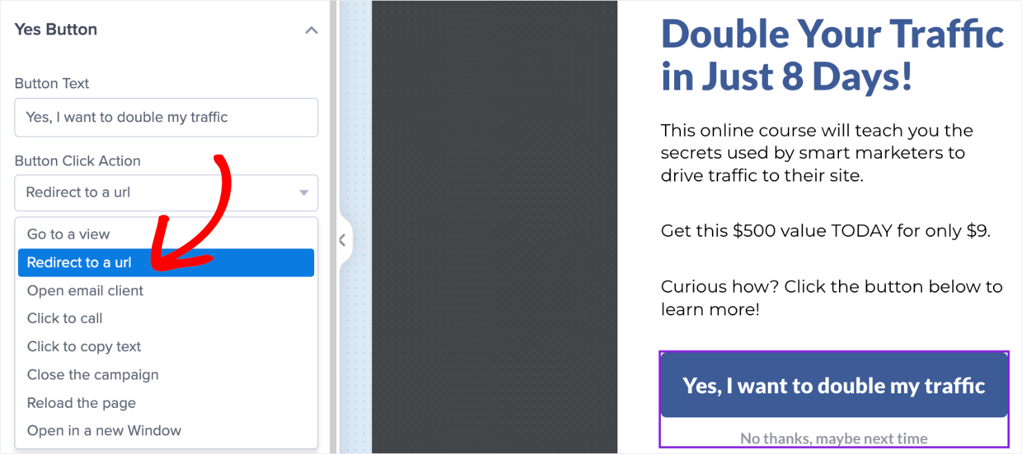
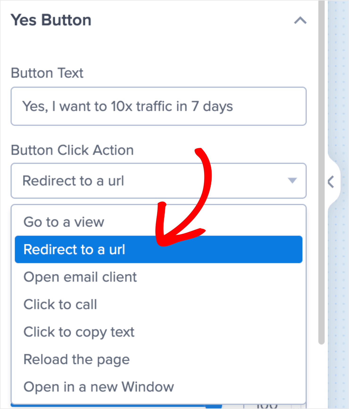
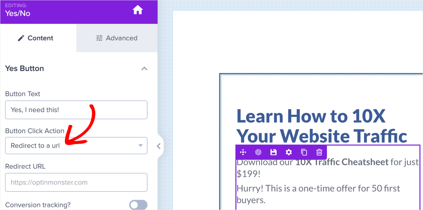
Under Button Click Action, select Redirect to a url:
Insert the URL for your product’s sales page in the field below:
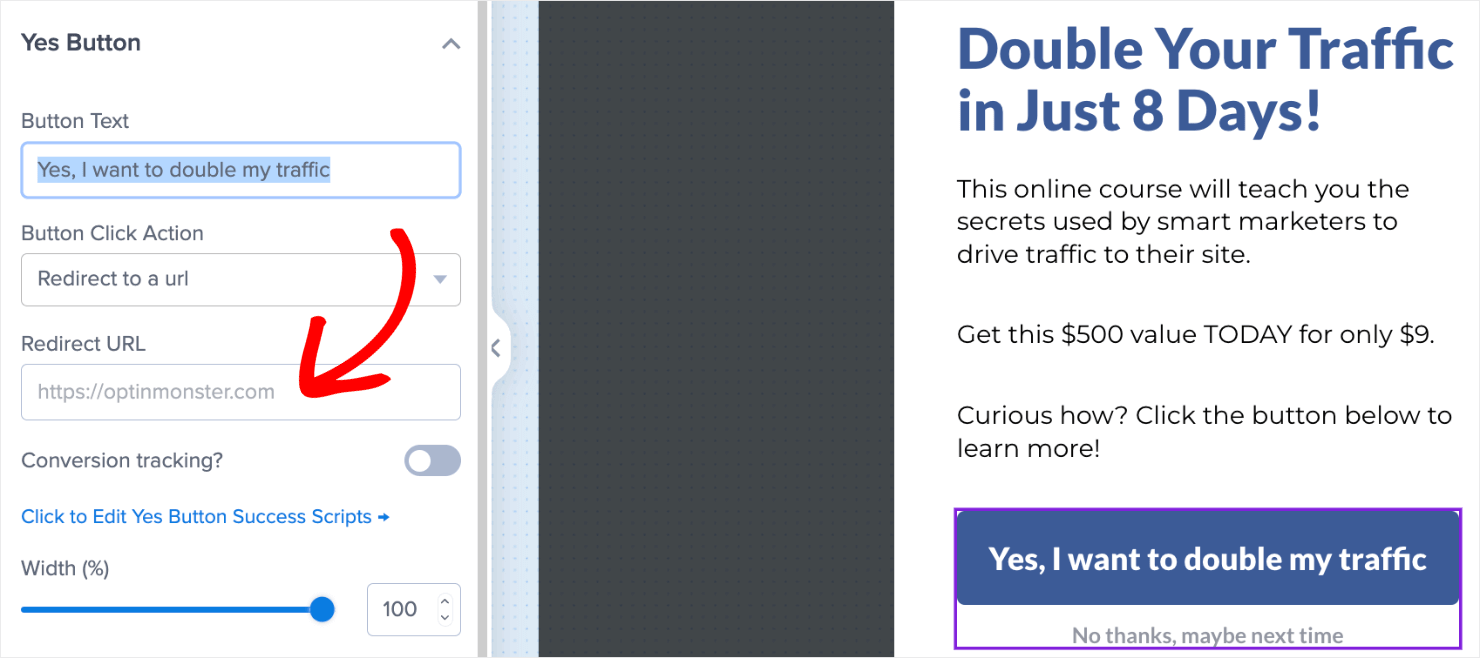
Once you publish your campaign, visitors will be redirected to your sales page to complete the checkout process when they click on your Yes button.
But what if they click on the No button?
You’ll still want to get their email addresses so that you can send them marketing emails in the future.
To do so, click on the No button element in the editor. This will bring up the editing options on the left:
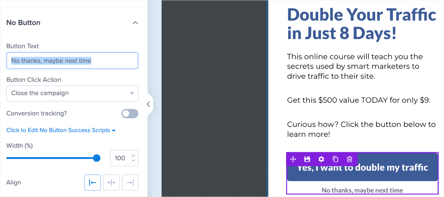
By default, you’ll notice the No button’s action is set to Close the campaign. We want to change this option to Go to a view:
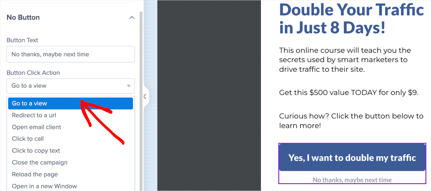
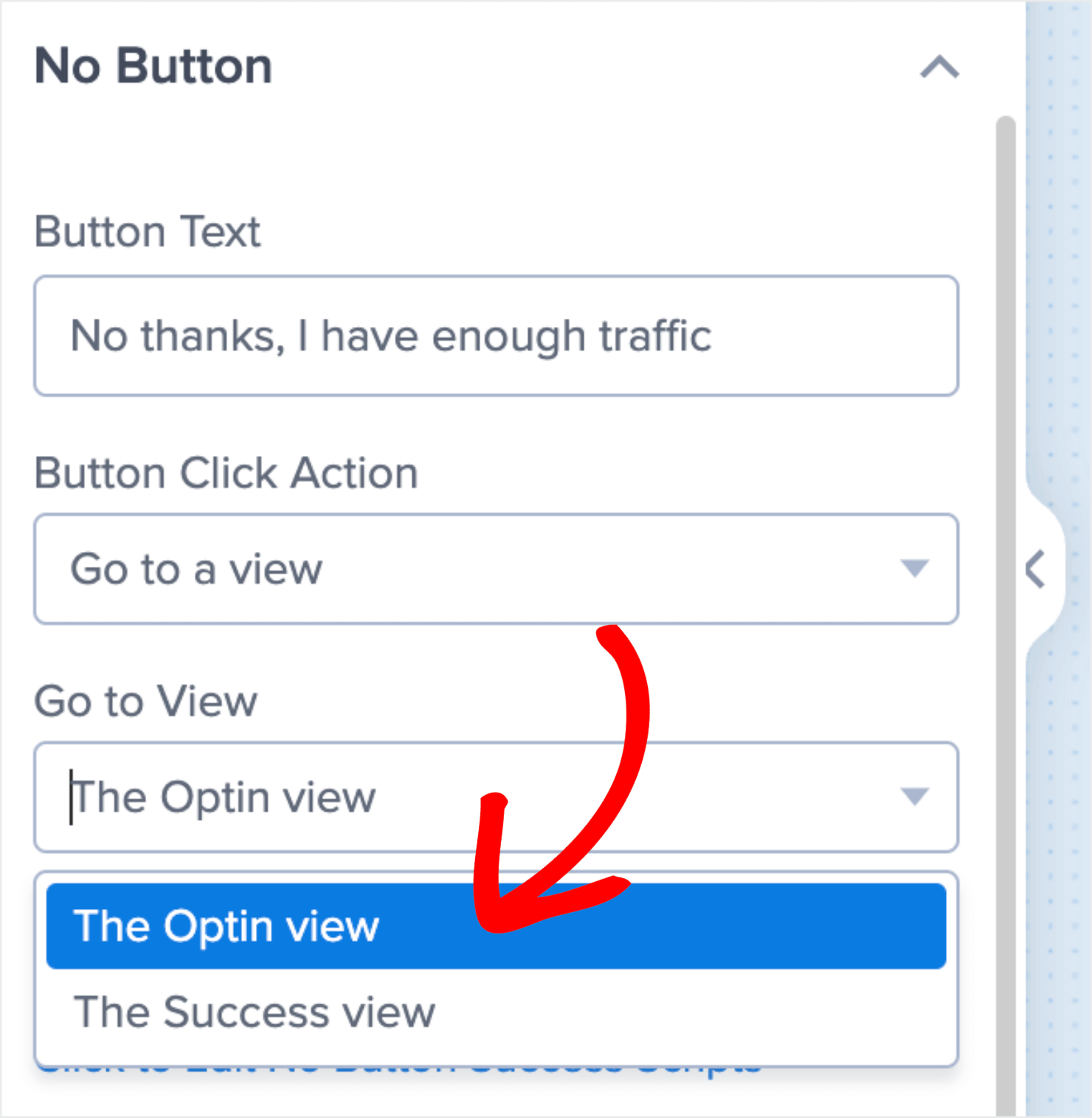
Under the Go to view field, change the default choice from The Success view to The Optin view:
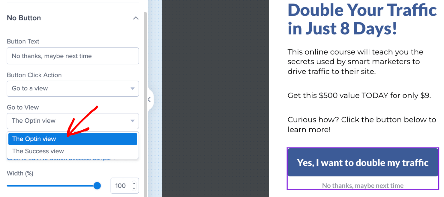
Why are we doing this? Because we want to be sure that even if your visitors select your No option, you’ll still have the chance to capture their email.
Back in the editor, click on Optin button at the bottom pane:

Then you can design your optin form. Here’s a simple example of how I changed my default template:
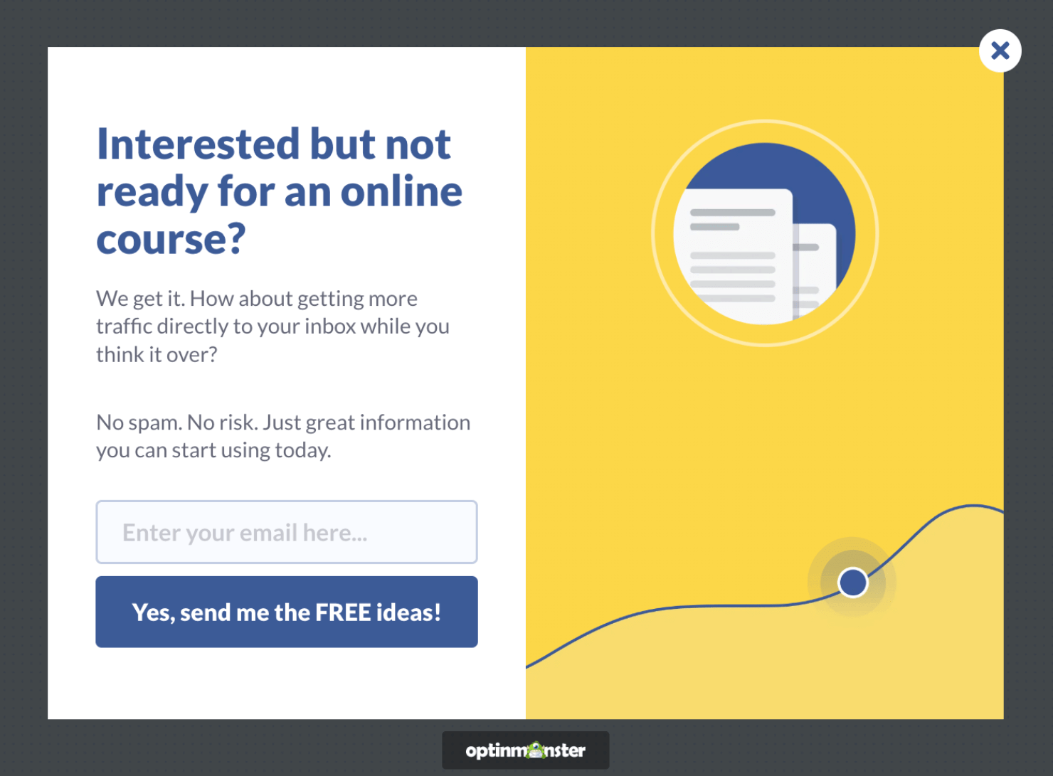
I suggest you take some time to make your optin form as enticing as possible. Use persuasive language and powerful words to connect with your audience.
And from there, your low-ticket offer is almost ready.
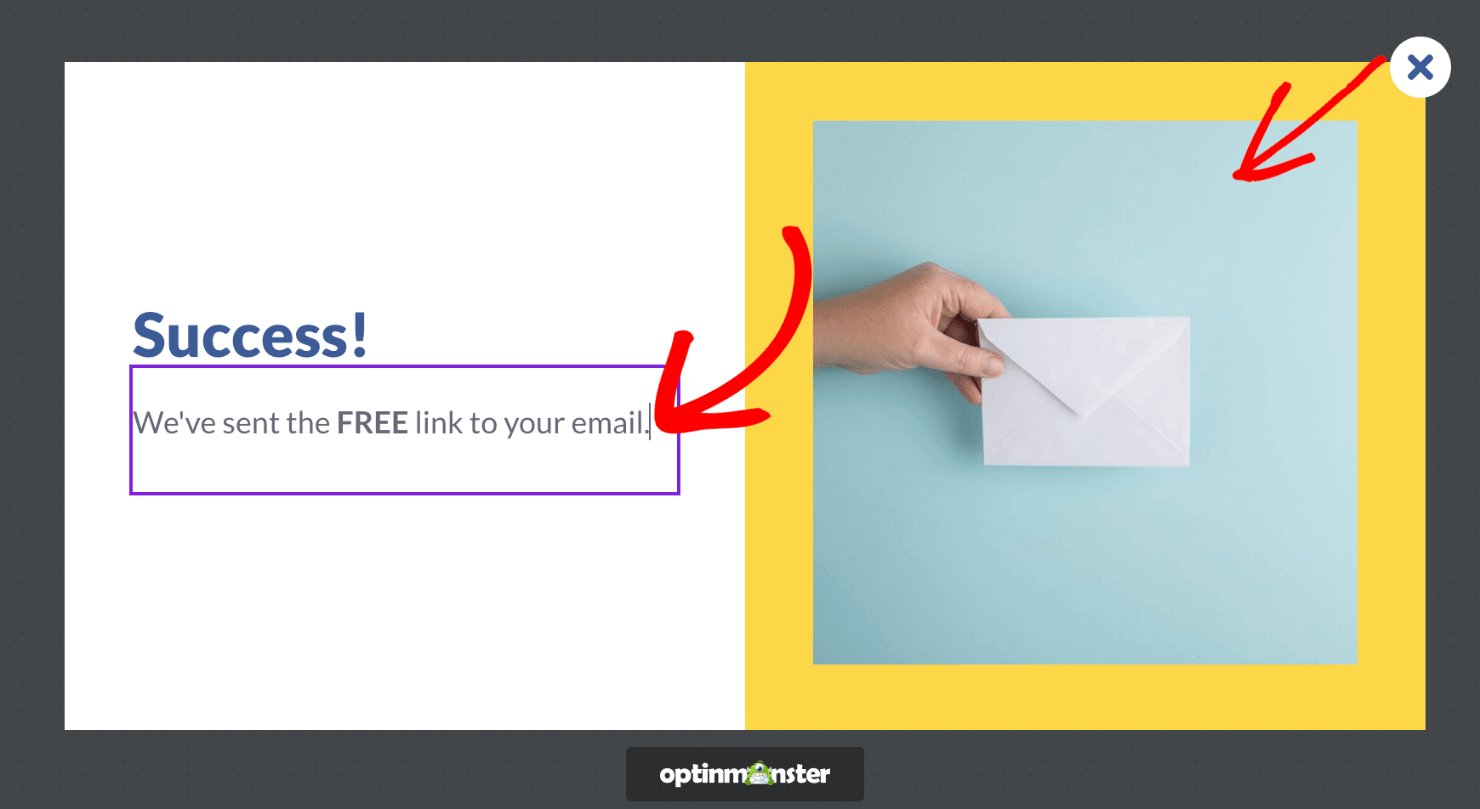
When customers enter their name and email address and click Yes, they’ll be redirected to your success view. You can edit that view by clicking Success at the bottom of your editor:

You can edit this view to look like a thank you page by changing the text, adding an image, or changing the background color if you want. I changed my success view to look like a confirmation page:
Next, it’s time to make sure you’re showing this campaign to the right people at the right time.
Step 4: Configure Your Display Rules
Click on the Display Rules at the top of your campaign editor:

By default, the campaign will show on every page of your website after your visitor has been there for at least 5 seconds.

You can choose from OptinMonster’s multiple display rules to show your campaign to the right audience segments at the right time, and on the right pages. This will make the popup more contextual and personalized for your visitors.
Some of the most popular targeting rules in OptinMonster are:
- Page-Level Targeting
- Exit-Intent®
- Time on page
- Referral Targeting
- Scroll Distance
- And much more
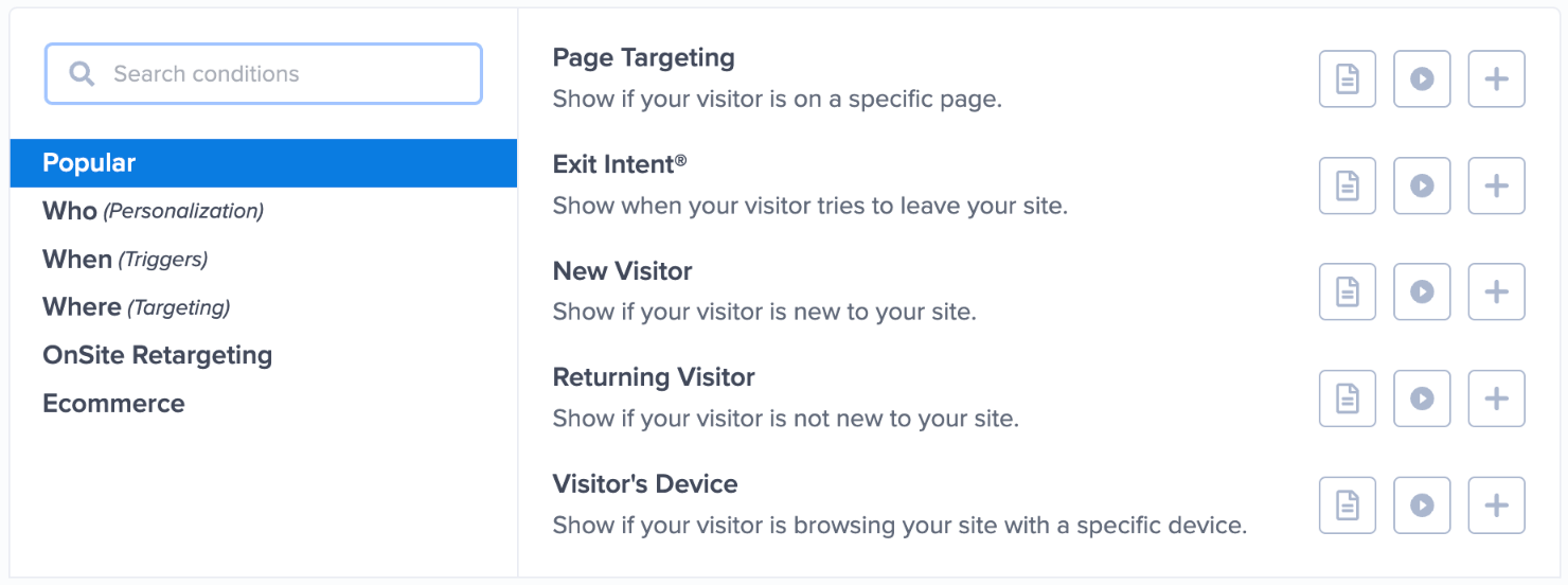
To make your tripwire funnel more successful, you can also choose the Exit-Intent® rule to capture abandoning visitors’ attention.

To enable this, change your rule to exit detected. Choose the device if you want to enable this rule only on desktop, mobile, or both.
I’ll select on all devices to ensure visitors will see the campaign on both mobile and desktop devices.
You can also choose the Exit-Intent® sensitivity as low, medium, or high.

Exit-intent popups are incredibly powerful at engaging visitors who are about to leave your site. Once you get their attention with Exit-Intent® popups, you can add them to your funnel and turn them into repeat customers.
Check out some of these success stories from some of OptinMonster’s customers who have benefitted from Exit-Intent® popups:
- Crossrope exploded its email list by 900%
- Rich Page increased conversions by 316%
- Bonjour Lisbonne doubled its conversions and increased sales by 30%
An important part of a tripwire sales funnel is capturing your traffic’s email address. For that to happen, you’ll need to integrate your email service provider (ESP) with OptinMonster.
Step 5: Integrate Your ESP With OptinMonster
Click on Integrations at the top of the dashboard:

Search for your ESP or scroll through the page to locate it from the available options:
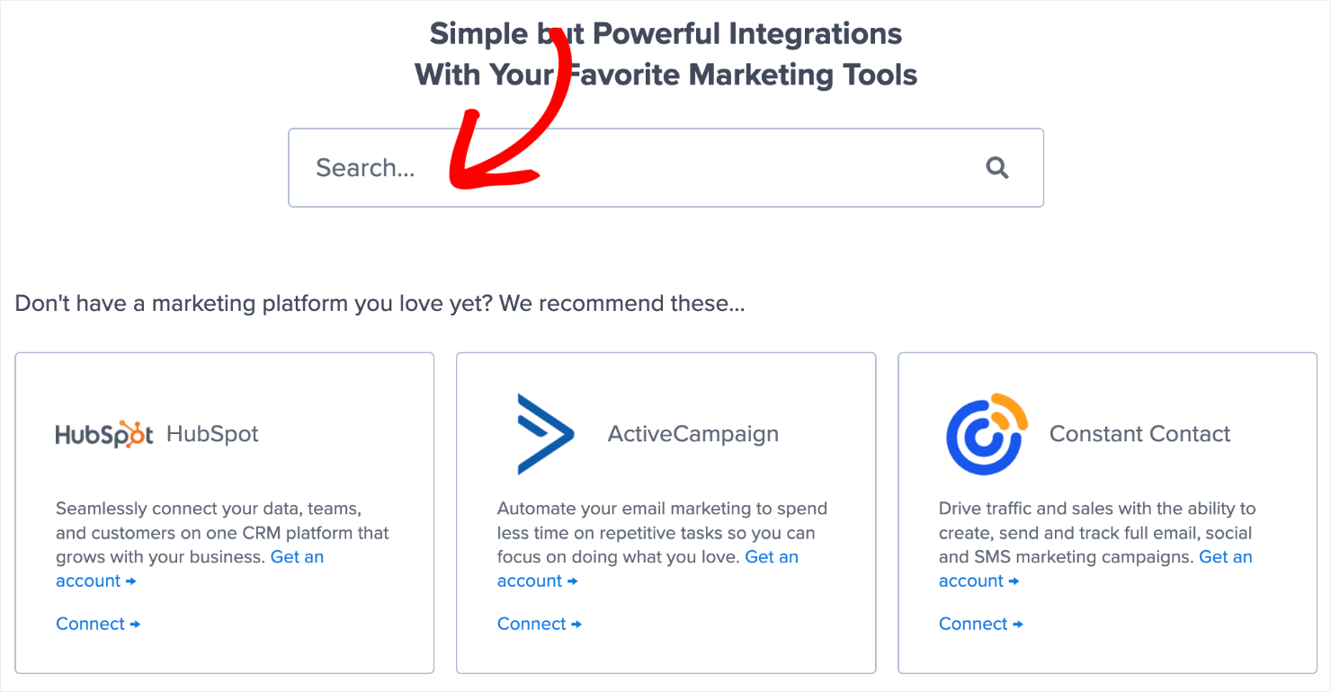
From there, the exact steps for connecting OptinMonster with your ESP depend on which email marketing automation software you’re using. For the most part, it’s as simple as copying and pasting your email account’s API key.
Here’s a detailed guide on how to connect your email service provider with OptinMonster.
Pro-tip: Don’t see your ESP available? You can get started with Monster Leads, OptinMonster’s internal lead storage option. Monster Leads lets you store your lead data, export it, and send individual emails from your existing email client.
Back to our tripwire campaign, you’ll need to save and publish your campaign.
Step 6: Publish Your Campaign
You can publish a campaign in OptinMonster in just one click. Click on the Publish button in the dashboard:

Under the Publish Status, switch the campaign from Draft to Publish:

And that’s done. If your website isn’t connected to your OptinMonster account yet, check out these resources to learn how to do it:
- Add OptinMonster on Any Website
- Connect OptinMonster to WordPress
- Integrate OptinMonster With Your Shopify Store
At this point, we’re halfway through with our tripwire funnel. You now have a campaign that will display a low-ticket offer that’s hard for your site visitors to ignore.
But now comes the fun part: making your one-time-only offer.
Part II: Building Your One-Time-Only Upsell and Downsell
Building a one-time-only offer is all about recreating what you’ve already done so far.
Simply create a new campaign in your OptinMonster account, like we did earlier. When it comes time to choose a campaign, you have 2 options that work best for creating a one-time-only offer:
- Lightbox Popups
- Fullscreen Welcome Mats
This is really up to you, but these are the best campaigns for upsell or downsell offers. That’s because while all our campaigns capture your audience’s attention, lightbox popups and fullscreen campaigns are more attention-grabbing.
And that’s exactly what we want. Now, let’s dive into the second part of this tutorial.
Step 1: Select and Create Your New Campaign
For this part of the post, I’ll go with a fullscreen campaign:

The benefit of a fullscreen campaign is that it comes with more space and can act as a floating landing page.
You can add videos, add more images, and fill out the entire page with quality information about an order bump campaign.
In other words, this fullscreen campaign can act as a full-fledged sales page.
And because it doesn’t have a fixed URL, it can be used for a variety of marketing campaigns. Not just your tripwire funnel.
After you choose your campaign type, choose your template. I’ll use the same template Lead Magnet Download that we used earlier:

Then name your campaign, assign it to your site, and click on Start Building. This will take you to the editor dashboard so that you can start designing the fullscreen campaign.
Step 2: Design Your Campaign
The first thing that you’ll want to do is activate the Yes/No form like we did earlier. Click the Yes/No button at the bottom of the dashboard:

By default, the Yes/No optin will be enabled. You don’t have to take any action here.
But you can edit the look and feel of your campaign like we did for the low-ticket offer.
Once you’re happy with the design, the next thing you want to do is turn the Yes/No form into a high-ticket sales page.
Since this is a more expensive offer, you’ll want to strengthen your campaign to make it more enticing. For example, you may want to include:
- A video demonstration of the product.
- Customer testimonials.
- Social proof.
- Any trust signals you can add such as free offers, free shipping, or money-back guarantees.
The goal is to create a compelling offer with a strong call to action (CTA) and tons of social proof.
Here’s an example of the compelling high-ticket offer I made for today’s tutorial:
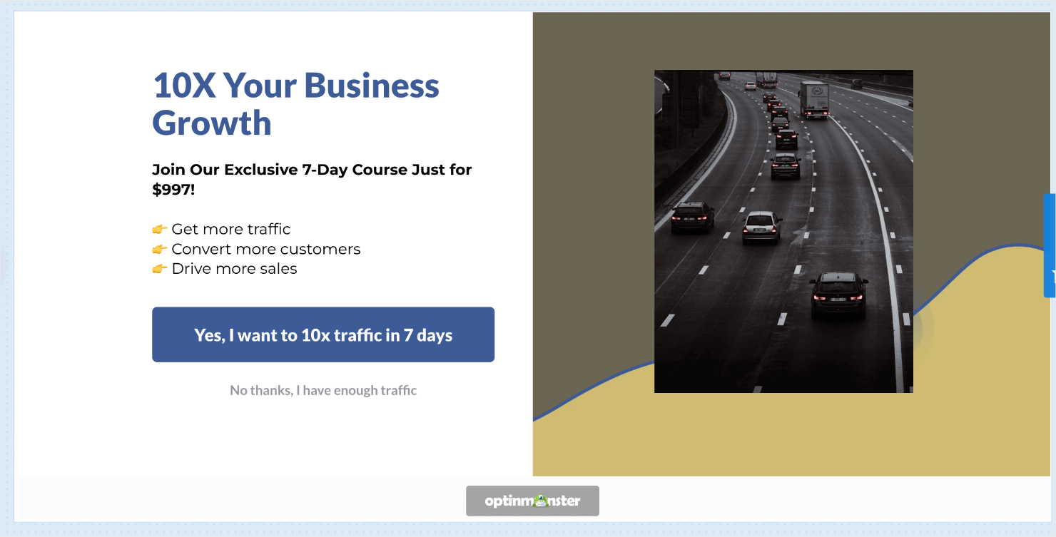
This took me less than 5 minutes to create. You can add testimonials and social proofs to your campaign to make it more compelling.
The next step is to change your Yes button action so that you can redirect your visitors to a sales or product page. This follows the same process we had for the low-ticket offer.
Step 3: Change Your Campaign’s Button Actions
We’ve already gone through this step earlier in the tutorial. That means you’ve already done all the hard work!
But in case you need a quick refresher:
- Click on the Yes button element in your editor.
- Scroll down and click Button Click Action on the left-hand side editor.
- Change the button action to Redirect to a url.
- Insert the URL in the field below.
Then repeat the same process for changing your No button action as you did with your low-ticket offer.
- Click the No button element in your editor.
- Select Go to a view under Button Click Action.
- In the Go to View field, select The Optin view.
Now you have a high-ticket upsell page ready to go live.
When your visitors click Yes, they’ll be redirected to a sales or checkout page. If they click No, they’ll be redirected to the optin page, which we’ll create next with a mid-ticket offer.
Step 4: Create Your Mid-Ticket Offer
At the bottom-left of your screen, click Optin to get to your optin form:

Then create a sales page in the same way we did for the low- and high-ticket offers. However, you’ll need to remove the optin field from the template and add a Yes/No button block.
That’s because the campaign currently only has the email field and the yes optin. We want to make sure customers have the option to opt out of the campaign.
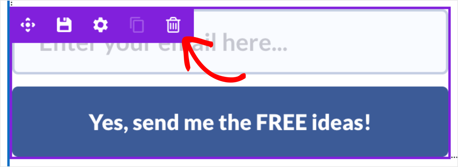
Deleting a block in the OptinMonster editor is easy. Just click on an element in your editor, and click the trash can icon:
Now it’s time to add a button. On the left-hand side menu, click on the home icon to go to Blocks:

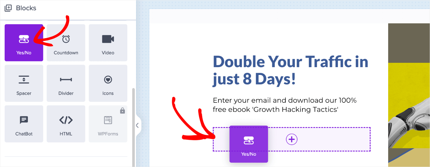
Scroll down until you find the Yes/No block:
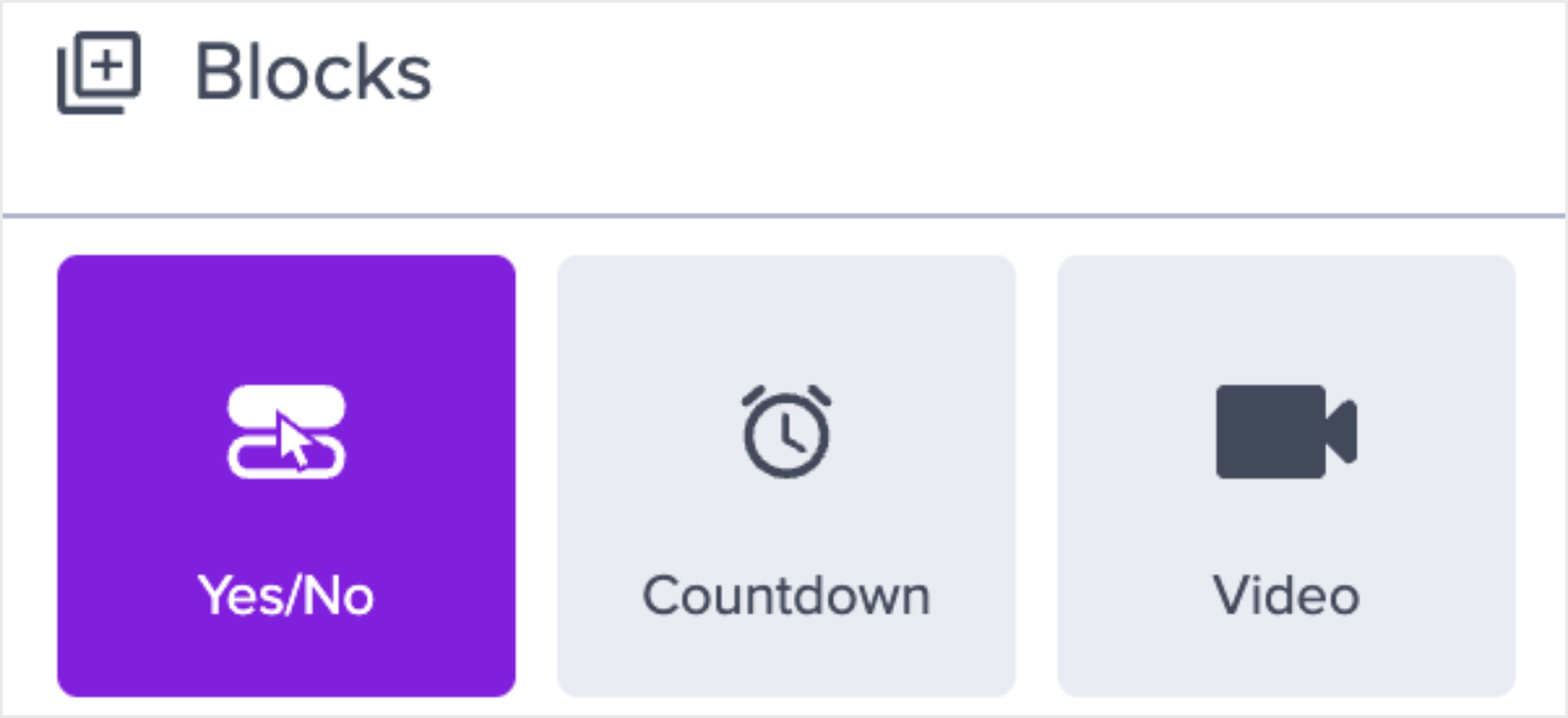
Drag and drop the Yes/No block into your editor where the optin form block used to be:
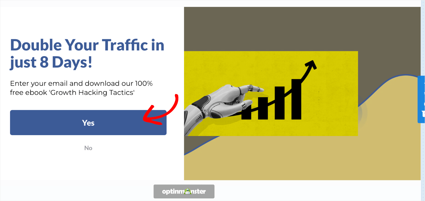
Your campaign should now have the default template with a Yes/No button block in the campaign:
You can change this popup view in the same way that you did with your low- and high-value offers.
To reiterate, we’re changing the optin form to a mid-ticket sales page as one last chance to upsell your customers after they purchased the low-ticket item.
This is effective since you have already configured this second tripwire campaign to show a high-ticket item on the form first. By contrast, people who weren’t interested in the high-ticket offer are more likely to be interested in this mid-ticket offer.
However, both offers are a big jump in sales from your initial low-ticket tripwire campaign.
Once you’ve changed the mid-ticket offer campaign, you need to redirect the Yes button action to your product’s sales page as you’ve done for the two other campaigns:
The good news is that you don’t need to change anything for your No button action.
Since you already have your client’s email address from your low-ticket offer, the campaign will simply close if your visitors select the No button in this campaign.
There’s just one last step: setting up the display rules for your upsell offers.
Step 5: Triggering Your Upsell and Downsell Campaign
For this next part, you’ll need to decide how soon you want to show your upsell and downsell campaigns to visitors after they’ve made the initial purchase.
If you want to display your campaigns immediately after your visitors purchase the low-ticket offer, you’ll need to target it on the order confirmation page.
With OptinMonster, this is easy.
A confirmation page has 2 parts to it:
- A fixed URL path that’s the same for every customer.
- A unique slug that changes for each order.
To target your tripwire campaigns, you need the fixed URL path from your order confirmation pages.
In your OptinMonster dashboard, go to Display Rules:

Click on the Edit button to configure the if conditions.

For the 1st condition, pair time on page with immediate instead of the default at least 5 sec.

In the 2nd condition, the rule is set for the current URL path by default.
Click on the second field and change on any page to contains. Then in the last field, insert the fixed part of your site’s confirmation page URL:

Don’t forget to hit Save on the top-right corner of the dashboard.

All that’s left is to save and publish your upsell and downsell tripwire campaign, like we did earlier.
Your campaign will appear immediately after your visitors make their initial low-ticket offer purchase.
With that, we have successfully built 3-step tripwire funnel:
- An irresistible lead magnet as a low-ticket offer.
- A one-time-only offer to upsell a high-ticket product.
- A mid-ticket offer to convert customers who opted out of the high-ticket product.
Every stage of the funnel is designed to help you generate qualified leads and improve your sales conversions.
Build The Perfect Tripwire Campaign Today
And that’s it! Now you know how to create a multi-step tripwire campaign to improve your upsells and downsells. Apply the ideas we discussed in this post and see your revenue soar through the roof
If you did enjoy this post, check out similar other resources:






Add a Comment