TL;DR
What they are: Popup notifications are message overlays that appear on webpages to capture attention and drive actions like email signups, sales, and engagement.
Types that convert best:
Lightbox popups for email capture
Exit-intent popups to recover abandoning visitors (53% recovery rate possible)
Slide-ins for non-intrusive engagement
Fullscreen welcome mats for major offers (up to 80% conversion increase)
Keys to success:
Time strategically (wait 10-15 seconds, use scroll triggers)
Make mobile-friendly (60%+ of traffic is mobile)
Target the right audience with relevant offers
Always provide easy exit options
Test and optimize continuously
Biggest mistakes to avoid:
Showing too many popups (kills bounce rates)
Poor timing (instant popups are intrusive)
Weak value propositions (be specific about benefits)
Ignoring mobile users (hurts SEO and conversions)
Best tool: OptinMonster offers drag-and-drop creation, advanced targeting, exit-intent technology, A/B testing, and mobile optimization without coding.
Are you looking for ways to convert your website visitors into leads or paying customers? Wondering if popups can help you improve your lead generation efforts?
Popups convert anywhere between 1-8% on average. But popups can be annoying if you don’t use them correctly.
If you haven’t used popups on your website before, you should know the possibilities you can unlock with them. Since there are different types of popup notifications you can use for different purposes, it can be difficult to know which one suits your goals best.
This comprehensive guide covers everything you need to know about popup notifications:
- What Is a Popup Notification?
- Why Should You Use Popups on Your Site?
- How to Create Effective Popup Notifications: Best Practices
- 9 Types of Popup Notifications
- Common Popup Mistakes to Avoid
- How to Personalize Popups to Improve UX
- Popup Notifications: Frequently Asked Questions
- So Which Is the Best Type of Popup?
By the end of this guide, you’ll know exactly which popup types to use, how to implement them effectively, and how to avoid the mistakes that kill conversions and frustrate visitors.
Let’s get started.
What Is a Popup Notification?
A popup notification is a message overlay that appears on a webpage to capture visitor attention and drive specific actions like email signups, purchases, or engagement with your content.
These messages range from small corner banners to full-screen overlays. They trigger at strategic moments: when visitors arrive, scroll through content, attempt to leave, or click specific elements.
Here’s an example of a standard lightbox popup used to capture email addresses and phone numbers:
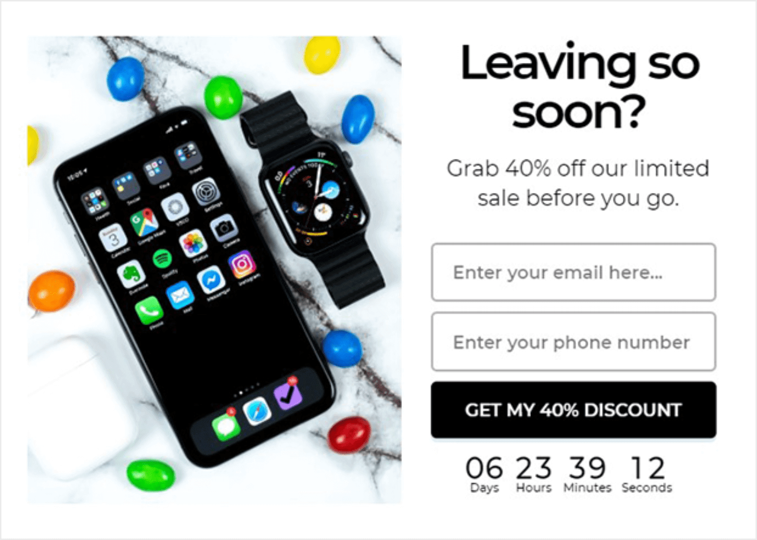
This is a classic lightbox popup, one of the most recognizable types you’ll encounter across the web.
Understanding the Different Types of “Popups”
Website popups are distinct from other notification types. Here’s what makes them different:
Website Popups (what this guide covers): Messages that appear within your browser while visiting a website. Created using JavaScript and CSS, they include email capture forms, promotional offers, and exit-intent messages.
Push Notifications: Browser-based alerts that appear even when you’re not on a website. They require user permission and work through your browser’s notification system. Best for time-sensitive updates like flash sales or breaking news.
Desktop/System Notifications: Operating system alerts that appear outside your browser from installed applications. Examples include calendar reminders or software updates.
Mobile App Notifications: Alerts sent directly from mobile apps to your phone’s notification center.
This article focuses specifically on website popups: the interactive messages you display to site visitors to boost engagement, capture leads, and drive conversions.
Common Popup Terminology You Might Encounter
Popups go by many names depending on their style and behavior:
- Lightbox popup
- Exit-Intent® popup
- Modal window or dialogue box
- Toast notification
- Snackbar popup
- Slide-in or scroll box
- Welcome mat or splash screen
- Floating bar or sticky banner
These terms all refer to specific styles or behaviors of website popups. We’ll break down each type in detail throughout this guide so you know exactly when and how to use them.
Why Should You Use Popups on Your Site?
When designed with your audience in mind, popup notifications can become one of the highest-converting elements on your site. Here’s why marketers and business owners rely on them:
- Generate high-quality leads – Capture email addresses, phone numbers, or sign-ups directly on-page, making it easy to grow your list.
Example: Adam Enfroy used OptinMonster popups to gain over 11,000 subscribers in 12 months. - Recover abandoning visitors – Use Exit-Intent® technology to present a targeted offer before a user leaves.
Example: Fastrack Digital recovered 53% of abandoning visitors with exit popups. - Boost sales & revenue – Offer time-sensitive discounts, upsells, or free shipping reminders at the right moment.
Example: Shockbyte more than doubled their sales conversions with targeted exit popups. - Increase event and webinar signups – Present registration forms in high-visibility popups to maximize participation.
- Grow brand awareness & engagement – Use visually striking popups to announce new products, share important updates, or showcase content.
- Collect valuable customer feedback – Trigger surveys and polls inside popups to learn about your audience and improve your offers.
- Build social proof and trust – Highlight recent purchases, sign-ups, or reviews using social proof notifications.
Proven Impact:
Across thousands of campaigns, OptinMonster customers report popup conversion rates ranging from 1% to 8%, with some niche campaigns achieving increases of 600% or more in conversions. (Source: OptinMonster internal campaign data)
Now that you know what a popup notification is and how it can grow your business, let’s look at how to create effective popups that convert.
How to Create Effective Popup Notifications: Best Practices
The difference between a high-converting popup and an annoying one comes down to execution. Follow these best practices to create popups that drive results without frustrating your visitors.
1. Time Your Popups Strategically
Don’t bombard visitors the second they land on your page. Give them time to engage with your content first.
What works:
- Wait 10-15 seconds after page load before showing a popup
- Trigger popups after visitors scroll 50-75% down the page (shows genuine interest)
- Use exit-intent technology to catch visitors as they’re about to leave
- Show welcome popups only to first-time visitors, not returning users
Why it matters: A popup that appears too soon feels intrusive. Strategic timing ensures visitors see your message when they’re most receptive.
2. Design for Clarity and Simplicity
Cluttered popups confuse visitors and kill conversions. Keep your design clean and focused.
What works:
- Focus on one clear call-to-action (CTA) per popup
- Use 2-3 colors maximum that align with your brand
- Keep copy concise (headline + 1-2 short sentences + CTA)
- Make your CTA button large, bold, and action-oriented (“Get My Discount” beats “Submit”)
- Use plenty of white space to avoid visual overwhelm
Why it matters: Visitors should understand your offer and what action to take in 3 seconds or less.
3. Make Your Popups Mobile-Friendly
Over 60% of web traffic comes from mobile devices. Your popups must work flawlessly on small screens.
What works:
- Test popups on multiple mobile devices before launching
- Ensure close buttons are large enough to tap easily (minimum 44×44 pixels)
- Use responsive designs that adapt to screen size
- Avoid popups that cover critical content or navigation on mobile
- Consider using slide-ins or floating bars instead of full-screen popups on mobile
Why it matters: A popup that’s difficult to close on mobile creates a terrible user experience and can hurt your mobile search rankings.
4. Target the Right Audience with the Right Message
Generic popups convert poorly. Personalize your message based on visitor behavior and characteristics.
What works:
- Show different popups to new vs. returning visitors
- Tailor offers based on the page visitors are viewing (product-specific discounts on product pages)
- Use geographic targeting to show location-relevant offers
- Display exit-intent popups with stronger offers to abandoning visitors
- Create separate campaigns for different traffic sources (social media vs. search vs. email)
Why it matters: Relevant popups feel helpful rather than intrusive. A first-time visitor needs different messaging than someone who’s visited 5 times.
5. Offer Real Value in Exchange for Attention
People will close your popup unless you give them a compelling reason not to. Make your offer irresistible.
What works:
- Provide exclusive discounts (15-20% off for email subscribers)
- Offer valuable free resources (ebooks, templates, checklists, guides)
- Give early access to new products or sales
- Create urgency with limited-time offers (“Next 100 subscribers only”)
- Be specific about the value (“Get 47 conversion tips” beats “Subscribe to our newsletter”)
Why it matters: Visitors exchange their attention (and often their email) for your offer. If the value isn’t clear and compelling, they’ll bounce.
6. Always Provide an Easy Exit
Forcing visitors to engage with your popup creates frustration and damages trust. Make closing simple and obvious.
What works:
- Include a visible X button in the top-right corner
- Add a “No thanks” or “Maybe later” text link below the CTA
- Allow users to close popups by clicking outside the popup box
- Never require form completion before allowing dismissal
- Respect the close action (don’t immediately show another popup)
Why it matters: Trapped visitors leave your site entirely. Giving them control over the experience builds trust and keeps them browsing.
7. Test, Measure, and Optimize Continuously
Your first popup won’t be perfect. Use data to improve performance over time.
What works:
- A/B test different headlines, offers, designs, and timing
- Track conversion rates, bounce rates, and time on site
- Test popup frequency (showing too often hurts conversions)
- Monitor feedback and complaints about popup experience
- Refresh popup designs quarterly to prevent banner blindness
Why it matters: Small changes can dramatically impact conversion rates. A popup that converts at 2% vs. 5% makes a massive difference in your results.
Bonus Tip: Follow Legal Requirements
Depending on your location and audience, you may need to comply with regulations like GDPR, CCPA, or accessibility standards.
What works:
- Make popups keyboard-navigable for accessibility
- Provide clear privacy information when collecting emails
- Honor “Do Not Track” signals where required
- Ensure cookie consent popups meet legal standards
- Include proper contrast ratios for visually impaired users
Why it matters: Non-compliance can result in fines and damage to your brand reputation.
When you combine these best practices with the right popup tool, you’ll create campaigns that convert visitors into leads and customers without hurting user experience. OptinMonster makes implementing all of these best practices simple with its targeting rules, A/B testing features, and professionally designed templates.
9 Types of Popup Notifications
The type of popup notification you choose will depend on your marketing goals. But regardless of which type you need, 2 factors will make or break your popups’ success. Your popup needs to:
- Look visually appealing
- Reach the right people
To do this consistently, you need a tool that allows you to create professionally designed popups that you can trigger to the right audience on the right pages and at the right time.
And for that, there’s no better tool than OptinMonster:
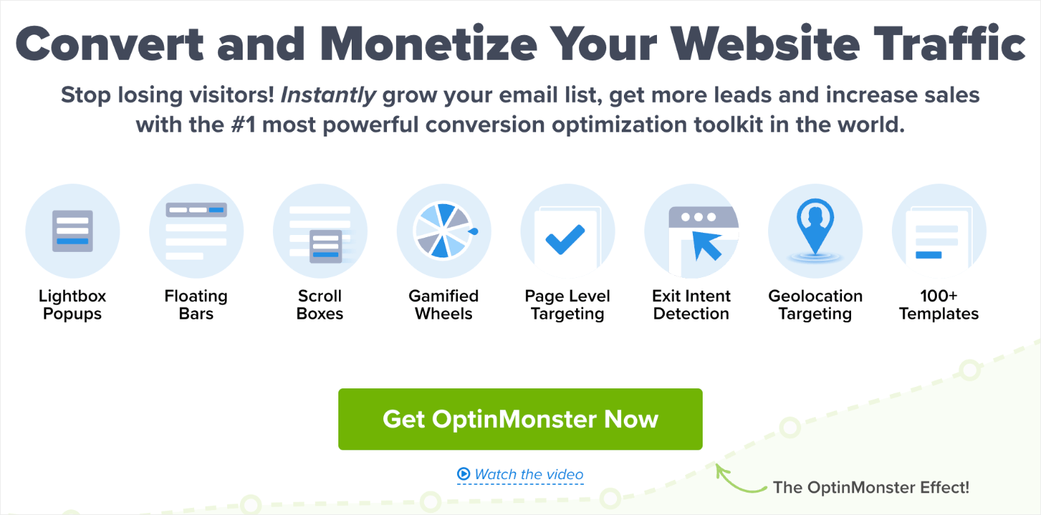
OptinMonster is hands down the world’s most powerful lead generation software and WordPress plugin.
OptinMonster lets you create stunning popups in a matter of minutes. Its drag-and-drop builder frees you from the burden of coding popups manually. That means you can design amazing popups even if you have never created one before.
OptinMonster’s targeting rules allow you to show your popup messages on the right pages, and based on user behavior. This helps you improve UX, connect more deeply with your target audience, and drive conversions.
With that said, let’s dive into our list of 9 types of popup notifications. You can design most of these popups in OptinMonster:
Quick Overview: 9 Types of Popup Notifications
| # | Popup Type | What It Is | Best For | When to Use |
|---|---|---|---|---|
| 1 | Lightbox Popup | Centered overlay that dims background content to focus on a message or offer. | Email list growth, promotions, lead magnets. | Trigger on exit intent, after time delay, or on high-intent pages (e.g., blog posts, pricing pages). |
| 2 | Modal / Dialogue Box | Similar to lightbox but forces action before continuing. | Age verification, login validation, language selection. | Use on regulated product sites, gated content, or when confirmation is legally required. |
| 3 | Slide-in Popup | Small box that slides in without blocking main content. | Non-intrusive promotions, content recommendations. | Trigger after scroll depth (50–75%) or time on page for engaged readers. |
| 4 | Fullscreen Welcome Mat | Covers the entire screen like a landing page. | Major announcements, high-value offers, pre-sell pages. | Show on first visit, during product launches, or limited-time campaigns. |
| 5 | Floating Bar | Persistent bar at top or bottom of page. | Announcements, free shipping alerts, countdown timers. | Use sitewide during seasonal sales, or to promote evergreen offers. |
| 6 | MonsterLink™ Popup | Popup triggered by clicking a link, button, or image. | Warm lead generation, gated content access. | Use in blog posts, navigation menus, or banners to convert already-interested users. |
| 7 | Social Proof Notification | Small, timed alerts showing other users’ actions. | Building trust, increasing urgency (FOMO). | Trigger after a few seconds on-page, or during checkout to reinforce purchase decisions. |
| 8 | Push Notification | Browser-based alerts sent even when user isn’t on your site. | Product launches, flash sales, content updates. | Use for time-sensitive deals, new blog post alerts, or cart recovery sequences. |
| 9 | Video Popup | Popup containing an embedded video. | Product demos, tutorials, event promotions. | Trigger on product pages, sign-up confirmations, or as a follow-up to a lead magnet. |
1. Lightbox Popup
A lightbox popup is a design overlay that appears on a webpage you’re viewing. Like any other popup, the job of a lightbox popup is to attract visitor’s’ attention to a relevant offer with a CTA.
Lightbox popups are most commonly used as optin campaigns for capturing email addresses. Here’s a lightbox popup example:
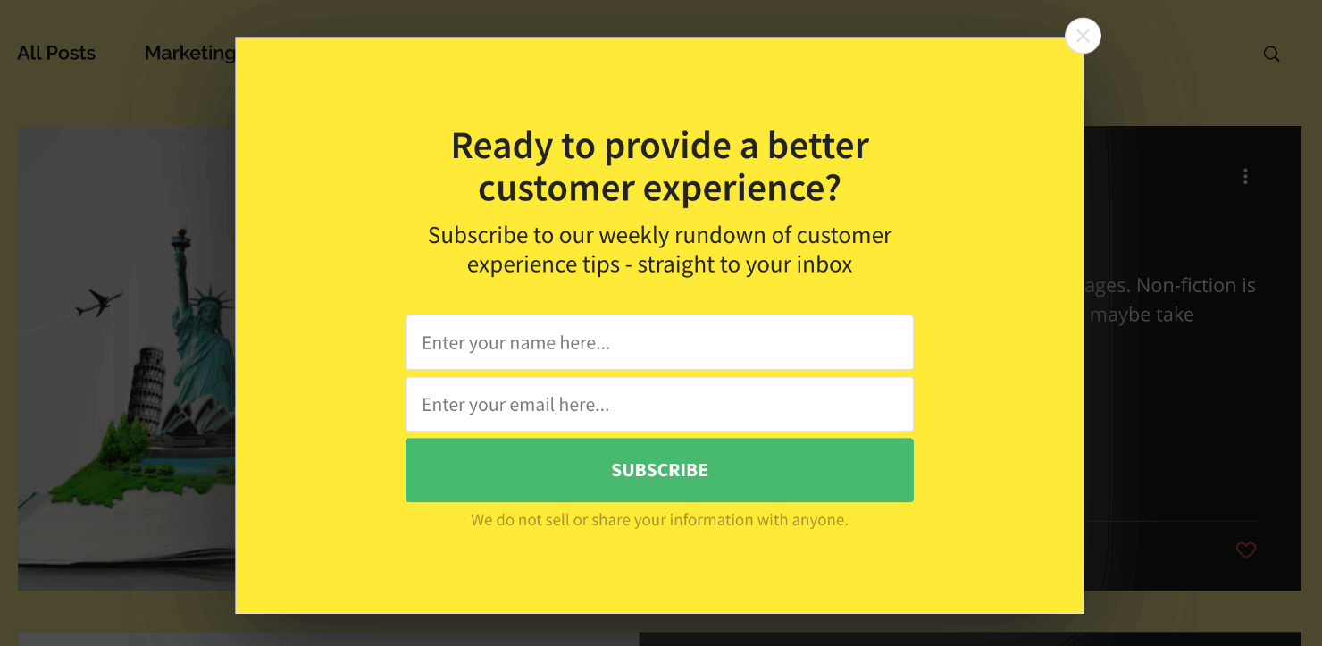
Notice how the lightbox popup stands out and draws attention to its content in contrast to the dark background around it. This quality in lightbox makes them hard to ignore.
And that’s why they convert like crazy! Crush Empire used the website lightbox popup below to convert 12.40% of its website visitors.
When to Use Them: Lightbox popups are great for just about every marketing goal you could have. They can be used to:
- Grow your mailing list
- Boost pageviews
- Get more webinar signups
- Trigger a customer survey
- Drive sales with discount codes or limited time offers
Lightbox popups are extremely flexible and can be used with different ‘display rules’ to create sub-types of popups.
We’ll talk more about display rules or the different ways you can use OptinMonster’s targeting features to make your popups more effective in the next section.
2. Modal/Dialogue Box
A modal popup or ‘dialogue box’ is similar in design to a lightbox popup. Modals bring the popup notification to the center of your users’ attention by making its background darker.
So how are they different from lightbox popups? Modal popups force the user to interact with the content before allowing them to get back to the browser page.
Putting up an age verification window on your website is a perfect example of a modal popup:
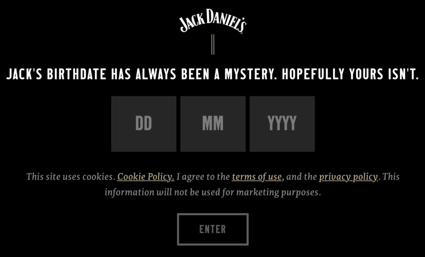
In this case, if you don’t enter your birthdate, or if you enter an age less than the legal drinking age, the modal won’t let you visit the website.
When to Use Them: Modal popups are great when you need to verify some type of information from your users before letting them access your site.
This includes validating login credentials on a site, verifying age on adult websites, forcing people to choose a language, or making them agree to terms and conditions.
3. Slide-in Popup
A slide-in popup notification appears on your users’ web page without blocking the background content. That means the user can still see and interact with the site they are browsing while the notification appears on their screen.
Unlike modals, slide-ins don’t interfere with the users’ browsing experience. Here’s an example of a slide-in scroll box popup:
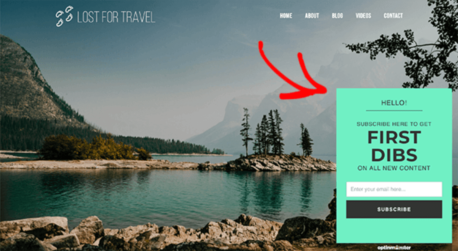
When to Use Them: Slide-in popups are non-intrusive to your audience. These are good for showing promotional deals, redirecting users to related content, or alerting users about changes to your site or business.
The slide-in scroll box lets you strategically show your popups at the perfect time. For instance, OptinMonster’s slide-in popups appear at the bottom right corner of a web page as site visitors scroll down.
They work well with the Scroll Trigger rule, which lets you control when you want to show the notification based on how far down the page visitors scroll.
Related Content 11 Ways to Use Slide-In Optins To Skyrocket Conversions.
4. Fullscreen Welcome Mat
A Fullscreen welcome mat takes up an entire screen on the website. But this doesn’t mean the user is forced to engage with the popup’s graphical interface. They can close the window at any time and continue browsing the website.
A Fullscreen popup acts like a landing page, allowing you more real estate to add extra text, images, videos, or even social proof to your campaign.
Because they look like landing pages, it’s impossible to ignore Fullscreen popup notifications. It’s also the reason why Fullscreen popups can increase conversion rates by as much as 80%.
Here’s a great example of a Fullscreen welcome mat campaign:
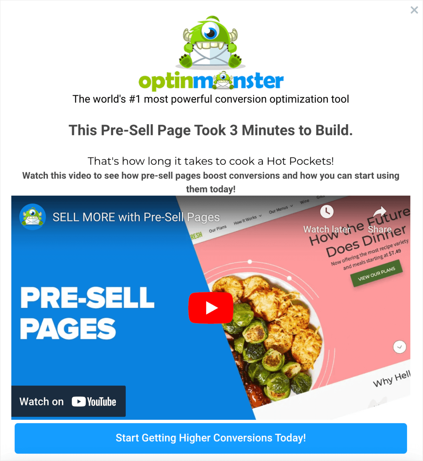
When to Use Them: Fullscreen popups are great when you need your user to see an offer or deal. You can use them to create engaging pre-sell pages or any other landing page that shows unique offers related to the content on the main browser page.
Related Content How to Create a Welcome Mat Popup to Increase Conversions.
5. Floating Bar
You can use floating bars either at the top or bottom of your website page. A floating bar, or a website notification bar, is a perfect tool to display informational or promotional notifications.
Like slide-in scroll boxes, floating bars provide a non-intrusive way of getting the right information to the right people on your website.
Here’s an example of a floating bar:
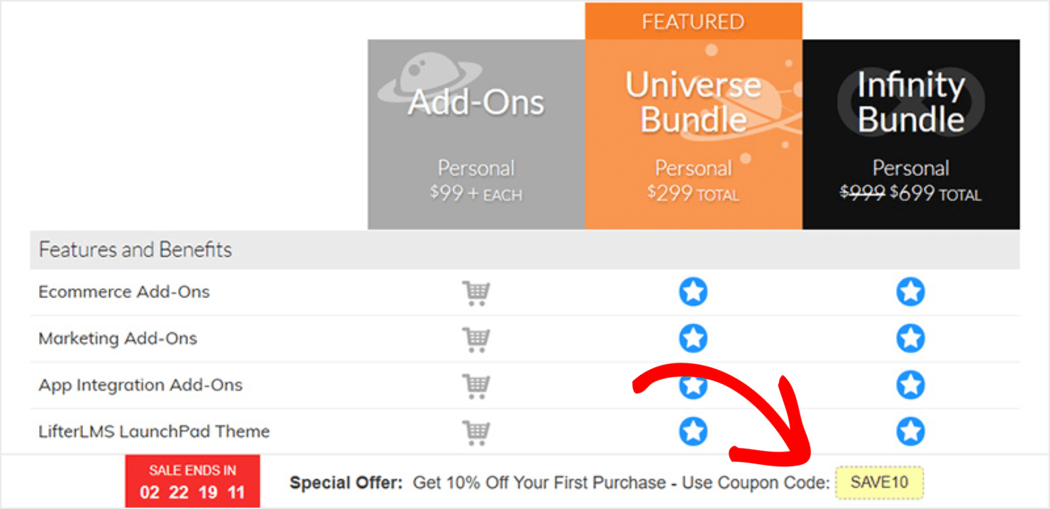
When to Use Them: Floating bars serve many purposes, such as announcing:
- The launch of a new product.
- Promotional deals like free shipping.
- Updates, alerts, or general changes in company information.
- Time-sensitive offers (and they work best with a countdown timer).
Floating bars can also complement other types of popup campaigns on your site to boost overall conversions.
Related Content 6 Simple Floating Bar Hacks to Boost Conversions.
6. MonsterLink™ Popups
So far on this list, we’ve covered different types of popups that aren’t connected to display rules or user behavior. But MonsterLinks™ popups are so effective that they deserve a mention here.
MonsterLinks™ is OptinMonster’s unique optin technology that uses 2-step campaigns to help you boost website conversions.
A MonsterLink™ allows you to display a popup when users click (or hover) a link, button, or image. Here’s what a clickable MonsterLink™ popup looks like in action:
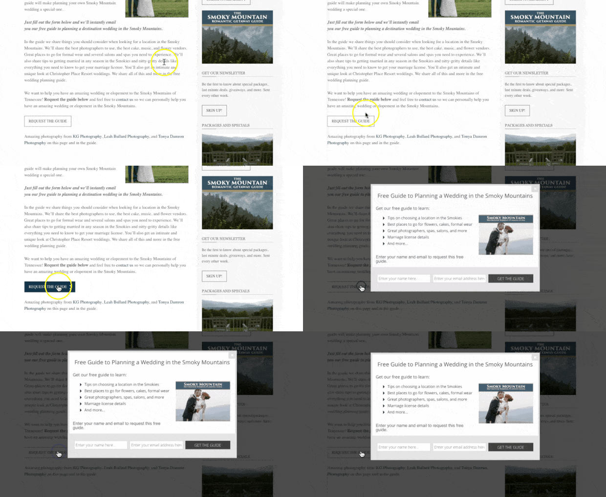
When to Use Them: You can use MonsterLinks™ for just about all of your marketing goals. They generate really warm leads because the popup triggers based on user behavior, like them clicking on a link or an image.
And people only click if they are bought into an offer or a CTA’s promise. As a result, people who see the popup are more likely to convert since they are already invested in what the link offers.
To learn more about MonsterLinks™, watch this short video:
7. Social Proof Notifications
A social proof notification shows how other people are interacting with your website or product. It leverages social proof to build trust and improve conversions.
These messages show up on one corner of your website, like an automated chatbot widget, without disrupting the UX.
Here’s an example of a social proof notification popup:
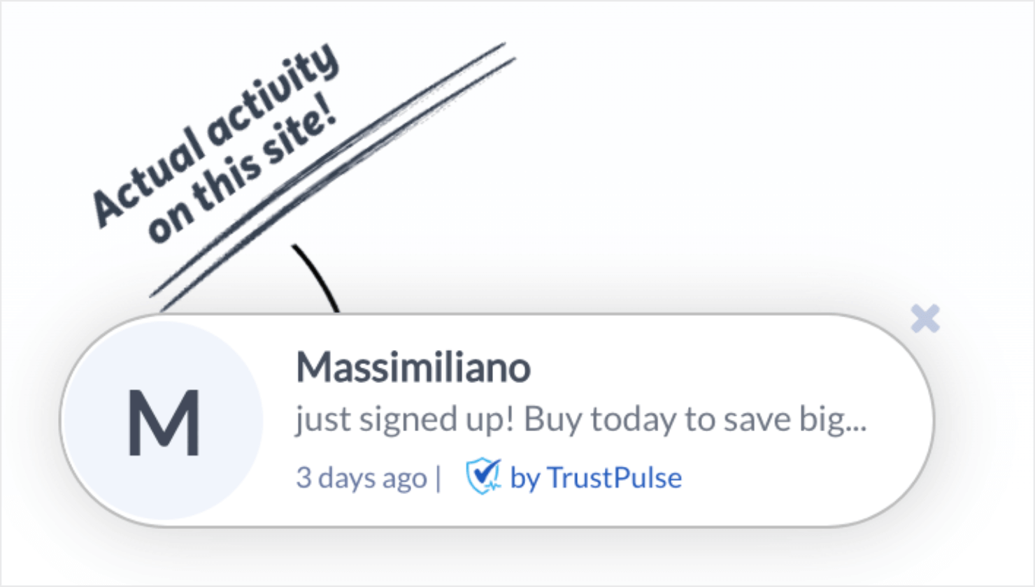
When to Use Them: Social proof notifications can help you with just about any marketing goal you have. They use FOMO (‘fear missing out’) to persuade potential customers to take action. You can use social proof notifications to:
- Increase pageviews
- Grow your mailing list
- Drive sales
TrustPulse is one of the best social proof notification tools that you can use to trigger real-time notifications:
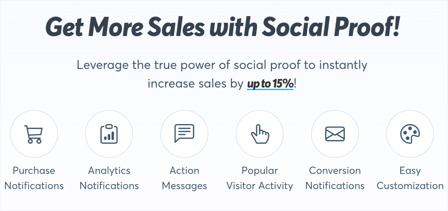
TrustPulse helps you add instant credibility to your site by showing verified website actions like:
- Purchases
- Demo Registrations
- Signup Form Submissions
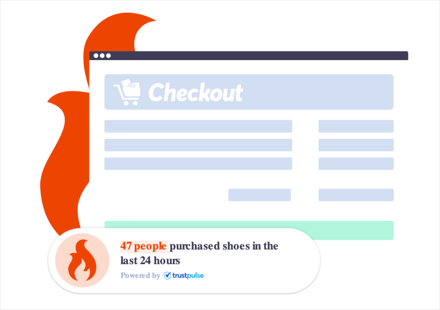
TrustPulse is also great at triggering FOMO. For instance, its On-Fire campaigns create a sense of urgency by showing off hot products or other actions to your site visitors:
Related Content TrustPulse Review: Is It the Best Social Proof Software?
8. Push Notifications
Push notification popups make connecting with your audience incredibly easy. All other popups we have covered so far require people to visit your website for them to work.
That’s not the case with push notifications.
Push notifications can appear on your user’s browser even if they aren’t on your site. But they have to give you prior permission to send them push notifications. Once they optin, you can configure the notification settings to send users various kinds of transactional or promotional notifications.
And there are plenty of push notification tools that help you set this up in minutes. Here’s an example of a push notification for desktop and mobile from PushEngage:
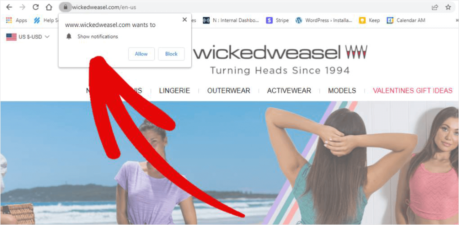
When to Use Them: You can use push notifications for all of your major marketing and sales goals. People are likely to sign up to receive push notifications because they don’t require users to provide personal contact information like email addresses or phone numbers.
Push notifications are best for eCommerce brands that want to drive sales to their new product launches and special offers. Since customers don’t need to be on your site to see these notifications, they allow you to instantly engage your audience and:
- Increase pageviews for new content.
- Improve sales through special offers.
- Alert users about changes or updates in your company.
Want the best tool for creating push notifications? Then you need to try out PushEngage:
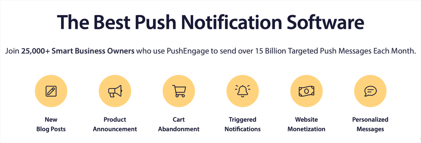
PushEngage makes creating push notifications simple. Once you persuade website visitors to consent to your messages, you can use PushEngage to quickly and easily create real-time notifications.
Want to give it a try? Get started with PushEngage today!
Related Content How to Create a Push Notification in WordPress to Boost Traffic.
9. Video Popup
Using videos in your marketing is a great way to improve brand awareness and generate qualified leads. According to Wyzowl’s research, 88% of people confess to buying software or an app because of the brand’s persuasive video.
You can extend the benefits of video marketing by creating video popups to engage your site visitors while keeping your site speedy.
OptinMonster lets you load videos within a popup campaign, which means the video won’t be hosted on your site and your site’s loading speed won’t suffer.
Here’s an example of a video popup created in OptinMonster:
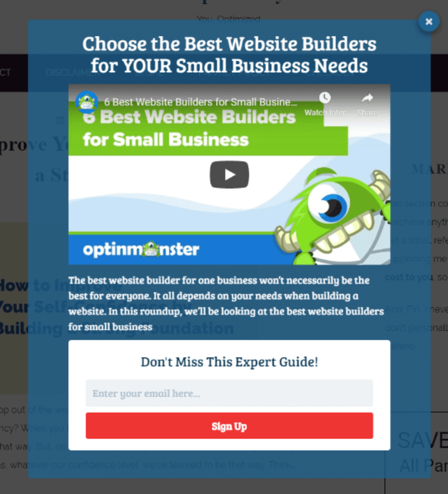
When to Use Them: You can use video popups if you have product tutorials that you want your customers to see during their free trial. You can also use video popups to drive up subscriptions for your YouTube channel.
Next, let’s look at a few ways you can personalize your popup notifications to improve customer engagement.
Common Popup Mistakes to Avoid
Even well-intentioned popups can backfire if you make these critical errors. Here’s what to avoid and how to fix it.
Mistake 1: Showing Too Many Popups
The Problem: Bombarding visitors with multiple popups in a single session creates frustration and increases bounce rates. If someone sees a welcome popup, then an exit popup, then a slide-in, then a floating bar, they’ll leave your site.
The Solution:
- Limit popups to one per session for each visitor
- Use frequency capping to control how often returning visitors see popups
- Space out popup campaigns (if someone closed your email popup, don’t show them a discount popup 30 seconds later)
- Consider using a single multi-purpose popup instead of multiple single-purpose ones
- Track popup impressions across your site to avoid overlap
Real Impact: Studies show that sites with more than 2 popups per session see bounce rates increase by up to 35%.
Mistake 2: Poor Audience Targeting
The Problem: Showing the same generic popup to everyone regardless of their behavior, location, or stage in the customer journey. A first-time visitor from organic search needs different messaging than a returning customer who abandoned their cart.
The Solution:
- Segment your audience based on behavior (new vs. returning, pages visited, time on site)
- Create location-specific campaigns (different offers for different regions)
- Show product-specific popups based on browsing history
- Don’t show “welcome” offers to customers who already purchased
- Use referral source targeting (social traffic vs. paid ads vs. email clicks)
- Exclude converted visitors from seeing the same offer again
Real Impact: Targeted popups convert 3-5x better than generic ones. OptinMonster’s targeting features make this segmentation simple.
Mistake 3: Terrible Timing
The Problem: Popups that appear instantly when someone lands on your page are intrusive and annoying. Visitors haven’t had time to understand your content or decide if they’re interested.
The Solution:
- Wait at least 10-15 seconds before triggering your first popup
- Use scroll-depth triggers (50-75% down the page) to target engaged readers
- Implement exit-intent technology to catch abandoning visitors at the right moment
- Avoid showing popups during critical actions (checkout process, form completion, video watching)
- Time promotional popups to align with user intent (discount codes on product pages, not blog posts)
Real Impact: Delaying popup appearance by just 10 seconds can increase conversion rates by 20-40% while reducing bounce rates.
Mistake 4: Difficult or Hidden Close Buttons
The Problem: Making it hard for visitors to close your popup destroys trust and damages user experience. Hidden X buttons, tiny close areas, or requiring form completion before closing creates immediate resentment.
The Solution:
- Place a visible X button in the top-right corner (standard convention)
- Make the close button at least 44×44 pixels for easy clicking (especially on mobile)
- Use contrasting colors so the close button stands out
- Add a “No thanks” or “Maybe later” text link as a secondary exit option
- Allow clicks outside the popup box to close it (except for critical modals like age verification)
- Never require information submission before allowing closure
Real Impact: Popups without clear exit options see 50-70% higher bounce rates and generate negative brand perception.
Mistake 5: Overcomplicated Design
The Problem: Cramming too much text, multiple CTAs, clashing colors, and excessive form fields into a popup overwhelms visitors. They can’t quickly understand what you’re offering or what action to take.
The Solution:
- Focus on one clear call-to-action per popup
- Keep headlines to 5-10 words maximum
- Limit body copy to 1-2 short sentences
- Ask for minimal information (email only beats email + name + phone for conversion)
- Use 2-3 brand colors maximum
- Include plenty of white space to improve readability
- Make your CTA button the most prominent element
Real Impact: Simplifying popup design can increase conversions by 25-50%. Every additional form field reduces conversion rates by approximately 10%.
Mistake 6: Ignoring Mobile Users
The Problem: Popups designed only for desktop often break on mobile devices. They cover entire screens, have tiny close buttons, or don’t resize properly, creating a terrible mobile experience.
The Solution:
- Test every popup on multiple mobile devices before launching
- Use responsive design that adapts to screen size
- Increase close button size for mobile (easier tapping)
- Consider alternative formats for mobile (floating bars or slide-ins instead of full-screen overlays)
- Ensure popups don’t violate Google’s mobile interstitial guidelines
- Load popups faster on mobile (optimize images and code)
Real Impact: Mobile-unfriendly popups can hurt your mobile search rankings and increase mobile bounce rates by 40-60%.
Mistake 7: Weak or Unclear Value Propositions
The Problem: Generic offers like “Subscribe to our newsletter” or “Sign up for updates” don’t give visitors a compelling reason to convert. They don’t understand what they’ll receive or why it matters.
The Solution:
- Be specific about what visitors will get (“Get 25% off your first order” vs. “Get a discount”)
- Highlight the benefit, not the feature (“Learn 47 ways to increase conversions” vs. “Download our ebook”)
- Create urgency with limited-time offers or scarcity (“Only 50 spots available”)
- Show social proof in your popup (“Join 10,000+ subscribers”)
- Match the offer to the page context (relevant content upgrades convert better)
Real Impact: Strong value propositions can increase popup conversion rates by 100-300%. The difference between “Subscribe” and “Get my free SEO checklist” is massive.
Mistake 8: No Testing or Optimization
The Problem: Launching a popup once and never improving it means you’re leaving conversions on the table. What works for one audience might not work for yours.
The Solution:
- Run A/B tests on headlines, offers, designs, and timing
- Test different popup types for different goals
- Monitor key metrics (conversion rate, bounce rate, time on site)
- Analyze which traffic sources respond best to popups
- Refresh popup creative every 3-6 months to combat banner blindness
- Track revenue impact, not just email signups
Real Impact: Companies that consistently test and optimize their popups see 50-100% improvement in conversion rates over 6 months.
Avoiding these mistakes is just as important as implementing best practices. When you combine mistake prevention with strategic popup design using a tool like OptinMonster, you’ll create campaigns that grow your business without annoying your visitors.
The key is balance: popups should feel helpful and timely, not intrusive and aggressive.
How to Personalize Popups to Improve UX
Creating stunning popup campaigns that are visually appealing is only half the battle. The other half is making sure that you show these popups to the right people and at just the right time in their customer journey.
That way, you can get the most out of your popups and offer your site visitors a delightful customer experience. When done the right way, popups can help you improve UX.
The best way to do this is by setting ‘display rules’ to whichever type of popup notification you’re using.
Display rules are settings that you can add to popups to determine whether the campaign should appear. These display rules break down into 2 categories:
- Targets
- Triggers
Targets are rules that will show a popup based on your users’ characteristics. This can be things like where the user is located, what type of device they’re using, or how they’ve interacted with your site in the past.
Triggers, on the other hand, are rules that use your site traffic’s behavior to determine if a popup should appear. This includes events such as when users are about to leave your webpage, if they click a link or button, or how far down the browser page they scroll.
If you’re planning to publish a popup on your site, make sure you personalize it to match your customers’ expectations based on where they are in their buying journey.
And OptinMonster offers you the best targeting and trigger options. Read our review of OptinMonster to learn more about all the features it offers, including the targeting and display rules.
Popup Notifications: Frequently Asked Questions
What’s the difference between popup notifications and push notifications?
Popup notifications appear within your browser window while you’re actively visiting a website. They’re embedded in the web page itself and disappear when you leave the site.
Push notifications are browser-based or app-based alerts that appear on your device even when you’re not on the website. They require explicit user permission and work through your browser’s or device’s notification system. Push notifications can reach users hours or days after they’ve left your site, making them ideal for time-sensitive updates like flash sales or breaking news.
Key difference: Popups work only when someone is on your site. Push notifications work even when they’re not.
What’s the difference between an alert and a popup?
Alerts are simple, system-level messages that require immediate acknowledgment. They’re typically plain text boxes with an OK button and can’t be customized with images, forms, or branding. Alerts are most commonly used for error messages, warnings, or critical system notifications (like cookie consent requirements).
Popups are fully customizable, interactive elements that can include images, videos, forms, multiple buttons, and branded design elements. They’re designed to encourage specific actions like email signups, purchases, or content engagement rather than just delivering information.
Key difference: Alerts are functional and plain. Popups are designed, branded, and conversion-focused.
Do popups hurt SEO or search rankings?
Popups themselves don’t hurt SEO, but poorly implemented popups can harm your rankings. Google penalizes intrusive interstitials on mobile devices that block main content and make it difficult for users to access the page.
What Google penalizes:
- Popups that cover the main content immediately after a user navigates from search results
- Standalone interstitials that must be dismissed before accessing content
- Layouts that push main content below the fold with an interstitial above
What Google allows:
- Exit-intent popups (triggered when leaving, not arriving)
- Popups with legal requirements (age verification, cookie consent)
- Small, non-intrusive elements like floating bars or slide-ins
- Popups triggered after meaningful engagement (scroll depth, time on page)
Use strategic timing and mobile-friendly designs to stay compliant with Google’s guidelines.
How do popup blockers work?
Popup blockers are browser features or extensions that prevent unwanted popups from appearing. They work by detecting JavaScript code that creates new browser windows or overlays and blocking that code from executing.
What popup blockers typically block:
- New browser windows opened automatically
- Popups triggered on page load without user interaction
- Aggressive or deceptive popup scripts
What popup blockers usually allow:
- Popups triggered by user actions (clicking a button or link)
- Modern website overlays built with CSS and controlled JavaScript (like OptinMonster popups)
- Legitimate modals for login, age verification, or legal notices
Most modern popup tools like OptinMonster use techniques that work within browser guidelines and aren’t blocked by standard popup blockers. The focus has shifted from blocking all popups to blocking only aggressive, disruptive ones.
Are popups effective for lead generation?
Yes. When implemented correctly, popups are one of the most effective lead generation tools available. Average popup conversion rates range from 1-8%, with well-optimized campaigns achieving even higher rates.
Why popups work:
- They capture attention at critical moments
- Exit-intent technology recovers abandoning visitors
- Targeted offers match user intent and behavior
- Clear CTAs reduce friction in the conversion process
Real results:
- Adam Enfroy gained over 11,000 email subscribers in 12 months using OptinMonster popups
- Fastrack Digital recovered 53% of abandoning visitors with exit-intent popups
- Shockbyte more than doubled their sales conversion rate with targeted popups
The key is using the right popup type, timing, and offer for your specific audience and goals.
Can I use popups without annoying my visitors?
Absolutely. The difference between helpful and annoying popups comes down to execution.
How to keep popups helpful:
- Time them strategically (wait 10-15 seconds or use scroll triggers)
- Limit frequency (one popup per session maximum)
- Make them easy to close (visible X button, click outside to close)
- Target the right audience (show relevant offers based on behavior)
- Provide real value (exclusive discounts, valuable content, helpful resources)
- Optimize for mobile (responsive design, large close buttons)
When popups feel relevant and timely rather than intrusive and aggressive, visitors appreciate them. Many users actively look for signup forms or discount offers, and well-designed popups make finding them easier.
Do I need to comply with GDPR or privacy laws when using popups?
If you collect personal information like email addresses through popups, you need to comply with relevant privacy regulations based on where your visitors are located.
GDPR (European Union):
- Obtain explicit consent before collecting personal data
- Clearly explain how you’ll use the information
- Provide easy opt-out mechanisms
- Include links to your privacy policy
CCPA (California):
- Disclose what personal information you collect
- Allow users to opt out of data sales
- Provide clear privacy notices
Best practices:
- Add a privacy policy link near your popup forms
- Use clear, non-deceptive language about what users are signing up for
- Honor unsubscribe requests promptly
- Don’t pre-check consent boxes (users must actively opt in)
Most popup tools like OptinMonster include features to help you stay compliant, but consult with a legal professional for specific guidance based on your business and audience.
What’s the best type of popup for my website?
The best popup type depends on your specific goals and audience.
For email list growth: Lightbox popups with exit-intent technology work best. They capture attention and recover abandoning visitors.
For promotions and sales: Fullscreen welcome mats or floating bars with countdown timers create urgency and drive conversions.
For non-intrusive engagement: Slide-in scroll boxes appear after users show interest without blocking content.
For warm leads: MonsterLinks triggered by user clicks generate highly qualified leads who’ve already shown interest.
For building trust: Social proof notifications display real-time activity to increase credibility.
Start with exit-intent popups if you’re new to popup marketing. They’re the least intrusive and consistently deliver strong results across industries.
So Which Is the Best Type of Popup?
The type of popup that will work for you depends heavily on your marketing goals. It also depends on who your target audience is, how they interact with your site, and how effective your popup is.
If you want to see immediate results, start with Exit-Intent® popups. These appear as users are leaving the browser page and are great at recovering visitors who are about to abandon your site. OptinMonster’s Exit-Intent® technology works on mobile devices, too.
And they convert like crazy!
As an example, Fastrack Digital used Exit-Intent® popups to recover 53% of its abandoning visitors.
If you enjoyed this post, you’ll love these related resources:
- 37 Types of Popups to Use on Your Website
- How Does OptinMonster Work? 3 Use Cases
- Email Marketing Made Simple: A Step-by-Step Guide
Want to create a popup notification for your website?






Add a Comment