Do you want to learn how to improve eCommerce UX?
User experience is one of the most critical aspects of increasing your revenue. But more often than not, many small business owners leave user experience up to chance.
That’s why, in this article, we’ll go over 15 eCommerce user experience best practices you can start using today to turn more traffic into sales.
But first, let’s look at what user experience is and why you need to care about it.
What Is User Experience?
User experience (UX) is how a customer feels about the interactions they have with your website, your company values, your product, and your team.
In other words, it’s how people feel when they engage with any part of your business.
But UX is one of the most overlooked aspects of eCommerce stores. Companies pour thousands of dollars into ads, design, and product research.
After all that work and money put into getting traffic, they often fail to realize why their conversion rates aren’t as high as they’d hoped.
This problem stems from a poor eCommerce UX. It affects your visitors, customers, and business.
Not to mention your profits.
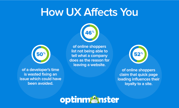
Think about how these stats from Truelist on eCommerce UX can affect your bottom line:
-
Developers spend 50% of their time fixing issues which could have been avoided
-
46% of online shoppers list not being able to tell what a company does as the reason for leaving a website
-
Intentional and strategic user experience has the potential to raise conversion rates by as much as 400%
-
52% of online shoppers claim that quick page loading influences their loyalty to a site
-
Airbnb attributes eCommerce UX for taking them from being a near-failure to being valued at $10 million
To create a better experience for your visitors, and increase your bottom line in the process, let’s take a look at 15 eCommerce UX best practices.
15 eCommerce User Experience Best Practices
1. Use Fullscreen Welcome Mats to Showcase A Product or Offer
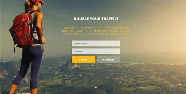
Kind of like a popup, a fullscreen welcome mat is an optin that slides over the entire page. It draws the visitors’ attention to your best products or offers.
Doing this has been proven to increase conversions by up to 80%.
You can use OptinMonster to create fully customizable fullscreen welcome mats. Here’s an example:
This improves eCommerce user experience because it delivers a product that will engage and delight your visitors. Who doesn’t love that?
With OptinMonster, you can set specific display rules and triggers so you always show your offers to the right people at the right time.
This goes a long way in improving eCommerce UX since it allows you to only show personalized offers to visitors who are most likely to be interested.
2. Create a Clean, and Clear Homepage
You only get about half a second to make a first impression.
Your homepage is the first thing your users will see when they come across your site, and it’s usually the page that gets the most traffic. It’s crucial to make it look clean, uncluttered, and have a clear purpose.
Here are some tips to make sure that your site makes an excellent first impression:
- Use a simple, minimal design
- Emphasize elements that make an impact like your recent blog posts, for example
- Stick to a consistent color scheme
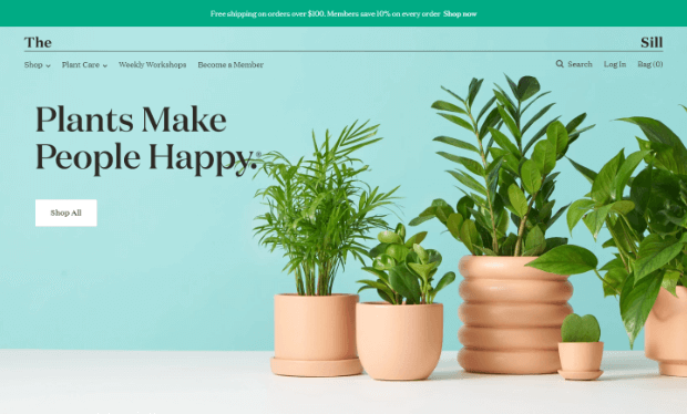
Here’s an example of a website that has a clean and simple design.
The webpage isn’t too cluttered and uses high-quality images. A good reminder that sometimes less is more.
3. Make it Easy For Users to Navigate Your Site
Think about how you would feel wandering through a store with no signage showing where anything is.
Or what if there were signs everywhere with arrows pointing in all directions. You’d likely end up leaving empty-handed and confused.
Your site’s visitors feel the same way. When they arrive, they want to know where they can go without feeling overloaded.
Here’s how to keep navigation user-friendly:
- Use visual cues like color contrast and arrows to draw attention to your call to action
- Divide your products into different categories with columns and sidebars
- Always include a search bar for those who know exactly what they want
- Use familiar words when labeling
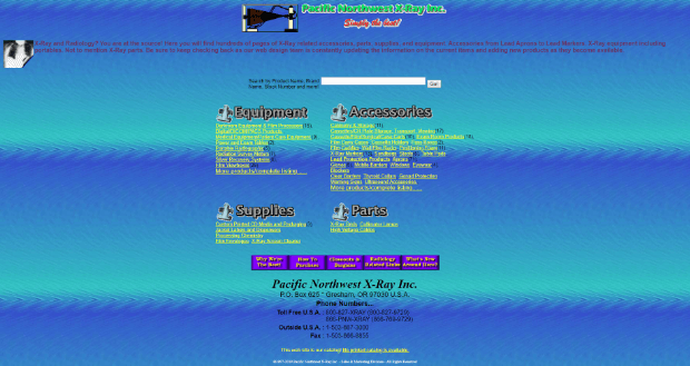
Here’s an example of a real website (that still exists), and is doing everything wrong. It’s messy, there’s too much color, no clear CTA, and it’s not obvious what their main product is.
Just try navigating this page and actually finding what you need.
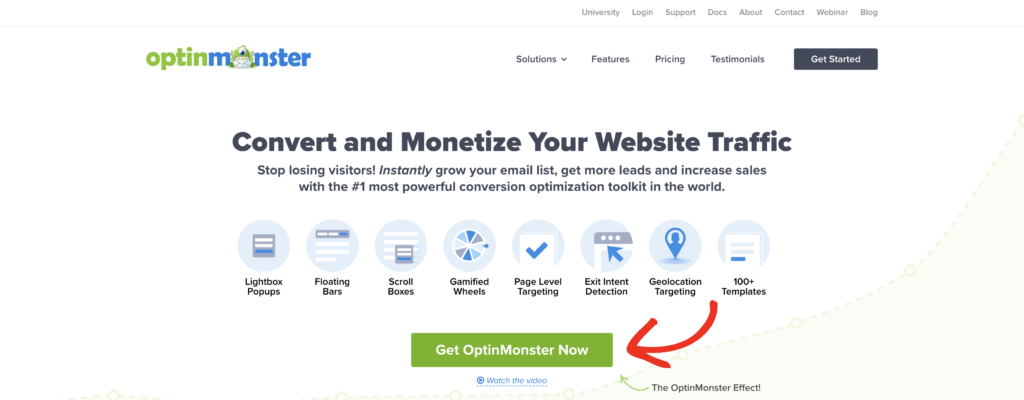
At OptinMonster, we pride ourselves on how easy it is to navigate our site. We do that by having 2 menus at the top of the browser:
- One for support, troubleshooting, and login for the dashboard or OM University
- Another for casual browsing about the product
You’ll notice the bottom menu in the image above is bigger and bolder. That helps our new users navigate the site more easily. For users who are more familiar with our website, everything they need is conveniently above in a separate header menu.
4. Use Exit-Intent® Popups To Offer Deals
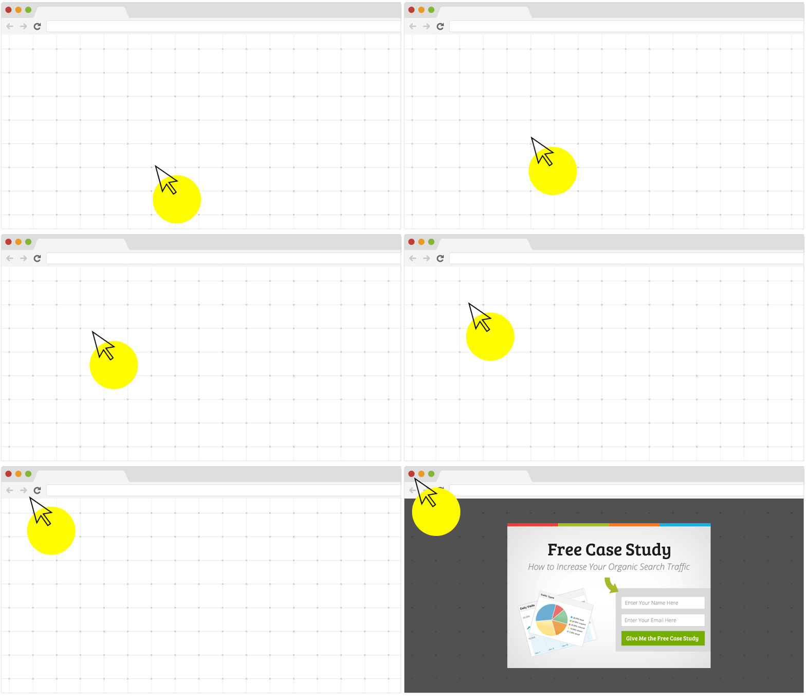
You can use an exit-intent popup tool like OptinMonster to detect when visitors are about to leave your website.
Your popup can be anything from an invitation to chat with a support agent, a special discount offer, or an invitation to download a lead magnet by joining your email list.
The truth is that most consumers appreciate popups if it’s for something that interests them. How do we know this?
Because we have data coming from our AdBlock Detection triggers.
With OptinMonster, we can display campaigns to users with adblockers turned on. And roughly 77% of people who see this popup choose to turn off their ad blocker to see the promotion.
Turns out, it’s just the spammy ads they don’t want.
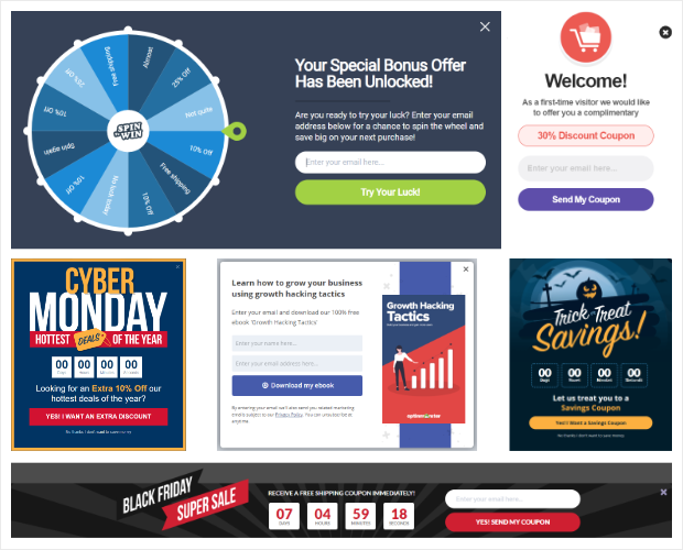
OptinMonster comes with countdown timers, coupon code popup, slide-in boxes, and other tools that help you promote your sales and boost conversions.
So you can improve your eCommerce UX by showing a promotion or deal that your audience will love as they go to leave your site.
5. Improve Your Website Speed
Have you been neglecting your site speed? Just know that 53% of visitors will abandon a webpage if it takes more than 3 seconds to load.
Yikes.
Many times slow speed affects user experience because people treat surfing the web like talking to people. If you ask someone a simple yes or no question and they take longer than 3 seconds to answer, things can get… awkward.
It’s the same for your website. If it’s slow, users will look for something else that says more in less time.
If you’re not sure what your website speed is, you can use Google’s Lighthouse.
That will give you a good indication of how well your site is loading on mobile.
6. Avoid Automatic Sliders, Video Backgrounds, Transparent Buttons, and Parallax Scrolling
Your eCommerce website design can be top-notch, but if it doesn’t function well, you’re going to have some issues.
Design trends like automatic image sliders, video backgrounds, transparent buttons, and parallax scrolling are popular because, well, they look nice. When they work, that is.
But in reality, they’re prone to glitches.
These design elements can also slow down your website if carried out poorly and may distract the visitor from reaching the checkout page.
And considering how both site speed and user experience are SEO ranking factors you need to consider, these design elements may not be worth it.
Functionality is what UX is all about. It’s not about adding extra elements and creating “fluff.” Every aspect of your page needs to support what you want the visitor to do.
If you look at a website like Amazon, it doesn’t have the most beautiful design. But it has excellent functionality.
Amazon exists to convert traffic into sales, and everything about their site design supports that.
7. Use Geo-Location Targeting
Advanced eCommerce owners use geo-location targeting to display location-specific offers.
If you’re selling internationally, or even in a few select cities, you can use OptinMonster’s geo-targeting feature to segment offers by climate and culture.
This can also help you advertise to customers in another language. Anyone searching on your site from France, for example, would get their promotion in French:
Geo-location targeting also lets you swap images and promotions, so you can make the right offer to the right customer at the right time.
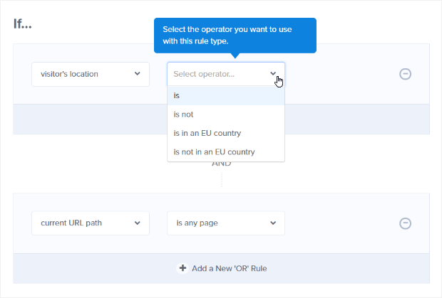
Setting your target location in OptinMonster is easy. Just go to the Display Rules tab and choose the visitor’s location rule. Then, you can set locations you want to include or exclude!
You can take geo-location targeting one step further by combining it with OptinMonster’s advanced page-level targeting options. That will allow you to segment your audience based on their interactions with your website and interests.
8. Use a Clear Call to Action
For eCommerce sites, your purchase call-to-action (CTA) will generally be an Add to cart or a Buy now button. Having a clear CTA is essential to converting traffic into sales.
The button should stand out from the rest of the page. A great way to do this is by adding color contrast and bold lettering.
The wording of the CTA should be kept short, but have a clear message: this is where to click to finalize the purchase.
Phrases such as Buy now, Check out, and Add to cart work really well. They’re tested, tried, and true.
For OptinMonster, we use Get OptinMonster Now as our primary CTA on the homepage.
It’s also common for a lot of eCommerce site owners to create a sense of urgency along with their call to action.
For example, putting in a notice that there are only 2 items left in stock can push people to purchase sooner rather than holding it off until later.
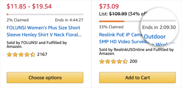
Or that they only have a certain amount of time before an offer expires. Amazon is, as you may suspect, really good at this:
Knowing that the offer expires in a few hours make their call to action, Add to Cart, very tempting.
9. Create a One-Click Checkout
Adding calls-to-action is a good step towards getting visitors to add items to their cart. Unfortunately, the average cart abandonment percentage is 76%.
In other words, nearly 8 out of 10 visitors that add a product to their cart will leave before paying a single cent.
However, there are things you can do to optimize checkout and keep those shoppers moving forward with their purchase.
Consider skipping the cart and adding a one-click checkout button right on the product’s page. Amazon does this and used to have exclusive rights to the technology.
But since they lost their patent for the one-click checkout button, you can use it to your benefit.
10. Let Users Checkout As Guests
Another reason for consistent cart abandonment is requiring users to create an account to complete their purchase.
But what about getting their email address and contact information?
Sure, you can push them for it. So long as you’re OK with 34% of your guests walking away because there isn’t a guest checkout option.
That’s right. If you don’t allow guest checkout, over 1 in 3 customers will move on to a competitor’s page.
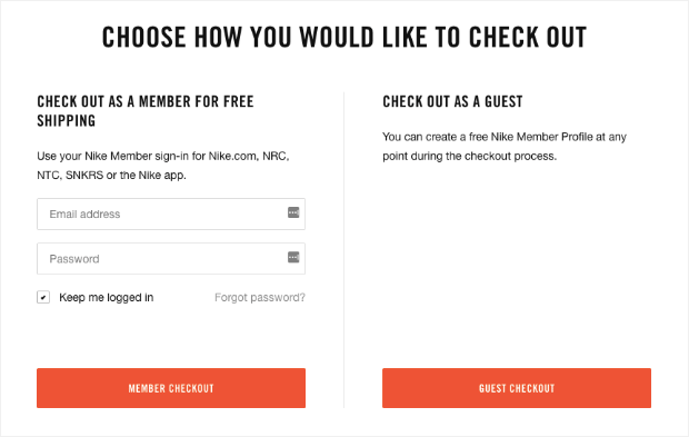
Hence why so many big companies, like Nike, always allow guest checkout:
Plus, you can still get your customer’s email as part of a typical checkout flow. Then, you let your impressive email marketing skills take care of the rest.
Simply add those emails into a funnel, starting with an automated email series. Then you focus on making changes to your checkout flow, like adding a guest checkout.
The fewer steps your visitor has to go through, the more likely they are to finish their purchase.
11. Make Your Product’s Listing Page Informative
If you have a product listing page loaded with information, it will do the selling for you, which is what you created it for, right?
Some essentials to include in your listing pages are images, price, availability, breadcrumbs (for easy navigation), and product options.
These best practices won’t only help your eCommerce UX, but will also help you with SEO.
You want people (and Google) to understand the contents of your page. And content-rich, user-friendly pages consistently rank higher.
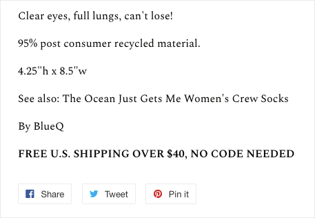
Let’s look at one of Get Bullish’s product pages as an example.
The top half of their screen has a quality product image, breadcrumbs in the upper menu, the price clearly listed, and the call to action (Add to Cart) in an easy-to-find location.
Then, as you scroll down a bit, you have more information about the product, and it includes a product recommendation, along with an incentive to buy (free shipping over $40) and ways to share the product on social media.
Everything about this product page design helps the user AND makes Google happy. That’s the sweet spot you should be looking for with your product pages, too.
12. Include Reviews on Product Pages
Including customer reviews or testimonials on your product pages can be a very powerful tool in converting visitors into buyers.
Visitors aren’t only looking for reviews of the product itself but also want to learn about the service customers received when ordering products.
By displaying customer reviews on the product’s listing page, you’re showing new visitors that you’re a trustworthy seller.
And since 88% of consumers make purchases from eCommerce sites with primarily positive reviews, you can’t afford to leave them off your product pages.
Note the distinction “primarily” positive reviews.
If you have a few negative reviews, don’t worry. Those can actually help make your site and products look more credible.
After all, you can’t please everyone!
You just need to learn how to respond to negative reviews in a way that puts you in a positive light.
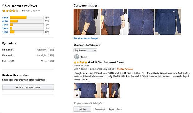
Amazon’s review sections are the perfect example. They have ratings, show responses by feature, and almost all products have over 50 reviews.
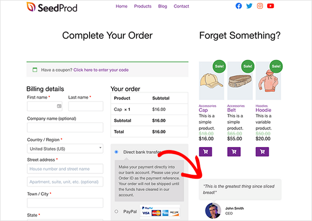
You can even display reviews and testimonials right on the checkout page to make shoppers feel more confident about their decision to buy.
If your online store is built with WooCommerce, you can easily add testimonials and star ratings to the checkout page with SeedProd.
SeedProd is the best drag and drop page builder for WordPress. It offers a ton of templates to get you started quickly and you can customize them with ready-made landing page blocks like testimonials, email optin forms, star ratings, videos, countdown timers, and much more.
Plus, SeedProd has WooCommerce blocks like add to cart, checkout, cart, and product grids. This makes it easy to create a custom WooCommerce checkout without having to hire a developer.
13. Use Social Proof
We just talked about customer reviews and testimonials, which are great for social proof. But, there’s a lot more you can do.
Here are some social proof ideas to start using now:
- Case studies
- Media mentions
- Social share and user/subscriber/customer counts
- User-generated content
- Real-time stats
- Trust badges on your website
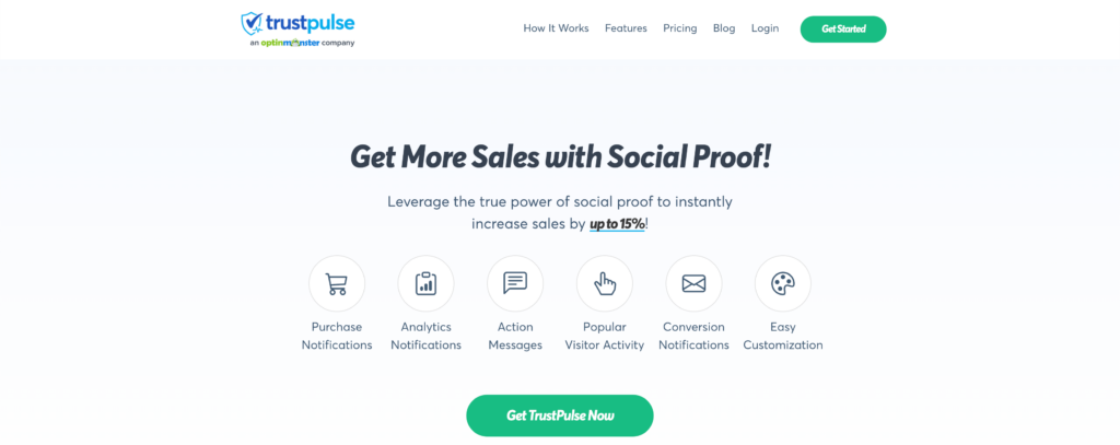
One of the best and easiest ways to add social proof to your site is by using TrustPulse.
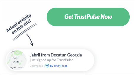
TrustPulse is the most powerful social proof tool for business websites. You can use it to automate social proof by showing recent activity notifications on your website in the form of an eye-catching popup:
TrustPulse takes less than 5 minutes to set up and can give you an instant increase to site conversions by up to 15%.
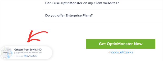
That one little popup packs quite a big punch. And we should know. We’ve added those to OptinMonster’s website with impressive results:
And you can see the same boost in sales for your own site with TrustPulse.
14. Offer Different Payment Methods
Offering different payment methods on your eCommerce store has loads of advantages, including:
- Customer convenience
- Payment customization
- More security
- Higher international sales
But the biggest reason? People just like knowing they have options.
And if visitors don’t see their preferred method of payment, they’re much more likely to abandon their cart.
Although there are over 200 different ways to take payments online, you don’t need to include all of them. You can find the best ones through market research.
Simply use the methods that are most popular with your target audience and their location.
Some popular payment methods are PayPal, Alipay, Stripe, and credit cards. You can even offer to finance if your product is expensive.
Just don’t forget to make all your payment methods available for mobile checkout.
15. Mobile-Friendly UX
Did you know that over 40% of people prefer using their mobile devices for the entire shopping process?
Making your website mobile responsive is not enough when it comes to optimizing your eCommerce website.
Mobile screens mean more scrolling, so it becomes much more important to consider what you have displayed on the page. You may even want to create an entirely separate eCommerce UX for mobile visitors.
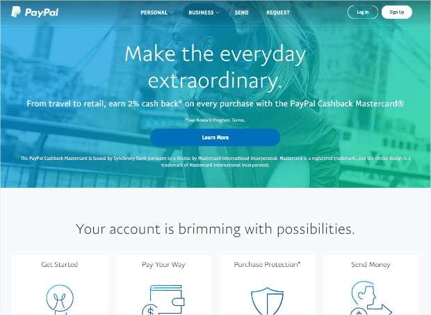
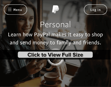
PayPal does an excellent job of making their web design help their visitors. For instance, their desktop site, while minimalist, is visually engaging:
But PayPal’s mobile landing page eliminates scrolling by using 2 buttons: Personal or Business.
Visitors on the mobile landing page can select the option they want from those 2 buttons, log in to their account, or use the menu to see more options.
Go further in testing things like hiding certain elements that are unnecessary on specific screen sizes, making any non-essential text smaller, and playing around with different icons for better visibility on important links.
The bottom line is that user experience on mobile shouldn’t be your afterthought anymore. In fact, many big companies are starting with mobile-first design and making their desktop website a secondary priority.
There you have it!
15 eCommerce UX best practices to turn traffic into sales and improve your SEO.
And like we saw, one of the best ways to improve eCommerce UX is to target specific campaigns to users that you know they’ll love. The best way to do that is with OptinMonster’s targeting and triggering rules. With OptinMonster, you can target users by:
- Location
- Cookie referral
- URL path
- AdBlockers
- Device (desktop, mobile, or tablet)
Plus much more.
These targeting rules allow you to personalize campaigns to make visitors feel more welcome on your site. And that’s what improving eCommerce UX is all about!
Of course, the best way to boost your conversion rate, build your email list, and generate more revenue is by using OptinMonster.
Get started with OptinMonster today risk-free with our 14-day money-back guarantee.









Add a Comment