
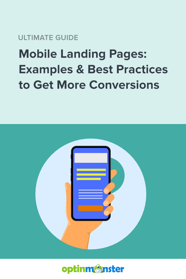
Nail Your Mobile Landing Page: Top Examples + Best Practices for 2026
Last updated on
by

Do you want to create a mobile landing page that will encourage visitors to buy your products?
When creating your landing pages, you have to keep mobile in mind. In the United States alone, there will be an estimated 187 million active mobile shoppers in 2026.
If your landing pages load slowly, look bad, or function poorly on mobile, then you risk losing a ton of potential customers.
How can you avoid these problems? In this article, I’ll explore tips for creating a stellar mobile landing page. I’ll also share some of the best mobile landing page examples and discuss why they work.
- What Is a Mobile Landing Page?
- Why Are Mobile Landing Pages Important?
- Mobile Landing Page Best Practices
- Effective Mobile Landing Page Examples
What Is a Mobile Landing Page?
A mobile landing page is a standalone webpage that is optimized for mobile and features a single call-to-action (CTA).
Usually, visitors land on this page when they click on an online ad, a search result, or a link in a marketing email or on social media.
Like all landing pages, mobile landing pages have a single goal. You’re trying to get visitors to take an action, such as:
- Buy a specific product
- Enroll in an online course
- Register for a webinar or demo
- Sign up for a free trial
- Opt in to your email marketing list
- Call your business’s phone number
In order to be optimized for mobile, these landing pages must load quickly, look great on a small screen, and be responsive to varying screen sizes.
Why Are Mobile Landing Pages Important?
Mobile landing pages offer a range of advantages that can significantly enhance your digital marketing strategy. Here are some of the key benefits:
- Enhanced User Experience: Mobile landing pages are designed specifically for mobile devices, ensuring faster loading times and a user-friendly interface. These features can lead to higher user engagement and satisfaction.
- Increased Conversion Rates: Optimized for mobile users, these pages reduce distractions and focus on core calls to action, making it easier for users to make decisions, such as clicking “Buy Now” or entering their email address.
- Improved Search Engine Ranking: Google prioritizes mobile-friendly websites in its search results. Having a mobile-optimized landing page can improve your site’s search engine ranking, making it more visible to potential customers.
- Easy A/B Testing: The simplicity of mobile landing pages makes it easier to conduct A/B testing, allowing you to quickly refine your strategies based on real-time user data and feedback.
With all of these potential benefits, mobile landing pages can be a great asset for your business.
Mobile Landing Page Best Practices
The best mobile landing pages grab attention, demand action, and convert visitors. Let’s take a look at some tips for making sure your landing pages are successful.
1. Use Mobile-First Design
Whenever you design your landing page, design it with mobile users in mind. There are 2 different approaches to mobile web design.
- Responsive design is when you design a page primarily for desktop, but you make sure it also displays well on mobile.
- Mobile-first design is exactly what it sounds like. It’s when you build a webpage based on how it will look on mobile screens and then make sure it also works on desktop.
I recommend using a mobile-first design approach.
The market share for mobile devices has far surpassed desktop, according to March 2024 data from Statcounter:

This shift is likely why Google predominantly uses the mobile versions of websites when determining SEO rankings.
A mobile-first approach is especially helpful for landing pages. That’s because good mobile design and good landing page design have a lot in common.
Mobile pages and landing pages both need to be simple, bold, to the point, and easy to use. When you take a mobile-first approach to your design, you’ll get a landing page that’s built to convert, regardless of whether it’s viewed on mobile or desktop.
2. Craft Concise Copy
Because mobile screens are small, use a shorter, abbreviated copy. You can and should still be clever and colorful, but you should get to the point quickly, or your visitors will get frustrated and leave.
Here are some ways you can reduce the text on your mobile landing page:
Cut Anything You Can, Without Sacrificing Clarity
The goal is to be brief and succinct, not to cut out key points that will make or break your message. If something adds value, leave it.
Use Bullet Points
Bullet points are great for getting key points across in smaller chunks without having to use supporting copy around them. They also have the added benefit of drawing the visitor’s eye, making them less likely to be overlooked.
Keep Headings, Sentences, and Paragraphs Short
Your text should be short and easy to read. There should be no walls of text on your page. Breaking up the text keeps the visitor interested and makes it easier to find key points.
Don’t forget that a mobile landing page has less space than a desktop site. A 12-word headline can end up being 7 lines of text, like on this mobile landing page that HubSpot used to have:

Below is a better, more recent landing page from HubSpot. While it includes some explanatory paragraph text, the heading is much easier to read, and the user can see the CTA button without scrolling. (We’ll discuss that more in our next best practice tip.)

Notice that the 2nd heading, “Popular features,” is also above the fold. This placement signals to users that they’ll see more details if they scroll.
3. Place Calls to Action Above the Fold
“Above the fold” still applies to mobile landing pages. Yes, mobile users are conditioned to scroll, but it’s still best to offer the option to click your CTA right away.
Drift keeps its CTA toward the top of the page and draws attention to it with a little color-changing action. They’ve since changed this cool feature, but we wanted to use it here to show you what can be done.

As you scroll down Drift’s page, you get the same CTA (without the changing colors) about midway through to remind you why you’re there.
If you’re unsure about what makes a great call to action, we can help you create the perfect CTA.
BONUS TIP: If you want your CTA button to stand out, make sure you use high-contrast colors. Learn more here:
What Are the Best Call to Action Button Colors? 3 Proven Ways to Get More Clicks
4. Try Sticky Headers & Floating Bars
Sticky headers and floating bars keep important information visible as your user scrolls.
It can be useful, for instance, for your website’s main navigation menu to stay in place.

You can also use an OptinMonster floating bar to keep you CTA visible at all times. That CTA could be a coupon code, email signup, or “buy now button.”
Here’s an example from DigitalMarketer. Their floating bar offers a discount on tickets to an upcoming event.

Case StudySee how DigitalMarketer used OptinMonster to increase event registrations by 15%!
5. Consider a Click-to-Call Button
Not all business can be done over the internet. Sometimes, your website visitors need to give you a call, especially if they need customer support or to ask a sales rep some questions.
Rather than just listing your phone number, add a click-to-call button to your mobile landing page.
You can easily add a click-to-call button to any OptinMonster campaign. If you use WordPress, you can add them anywhere on your site with the WP Call Button plugin.

With WP Call Button, you can create static call buttons or floating buttons with no coding required. Plus, if you’re using Gutenberg, you can use the built-in WP Call Button Block to easily create and customize beautiful click-to-call buttons in minutes.
Top Tools AlertNeed a way to manage your calls? Check out the best business phone systems and VoIP providers we’ve found.
Most importantly, WP Call Button seamlessly integrates with all top business phone services across the world, as well as working with other popular WordPress plugins like WPForms, Elementor, WooCommerce, and more.
Check out how to get more calls from your website and get those visitors the info they need to make the connections and sales you want.
6. Use Mobile-Optimized Popups
Popups can be a great way to collect more leads on your mobile landing pages. However, you don’t want to distract visitors from your landing page’s primary goal. That’s why I suggest using exit-intent popups that only display when your visitor is leaving your website.
With OptinMonster’s Exit-Intent technology, you can set your popups to display on exit with just a few clicks. Check out this resource to learn how OptinMonster’s mobile exit intent technology works:
Learn MoreHow to Create Mobile Exit-Intent Popups That Convert
By default, all OptinMonster campaigns display on all devices. However, you can easily create a mobile-only campaign that is designed specifically for mobile visitors. We offer dozens of mobile-optimized templates to choose from.

Then, easily customize that template in our drag-and-drop builder.

You can use our Device Targeting Display Rule to show your mobile-optimized campaign only to mobile visitors.
For example, Salt Strong saw an excellent 3.8% conversion rate on this mobile-only popup:

Here are 2 more examples of OptinMonster customers who have had great success with mobile popups:
- ChinaImportal increased leads by 18%
- The Advisor Coach saw 3X sitewide conversions
When used correctly, popups are an awesome addition to your conversion rate optimization strategy.
7. Limit & Optimize Your Images and Videos
Images and videos take data. Not all users reaching your mobile landing page are going to be on WiFi. Many will be using their limited cellular data. Keep images and videos to a minimum, and make sure they’re compressed to the smallest file size possible.
A landing page doesn’t have to be bogged down with images and videos to be visually appealing. Just look at this beautiful mobile landing page from Evernote:

It’s simple, there’s no question about the call to action, and it loads really fast. It’s also very eye-catching due to its lack of heavy imagery.
Text-only mobile landing pages won’t be the best choice for every brand. But if they do make sense for your product, they can be extremely effective.
8. Make Sure Your Mobile Landing Page Loads Fast
Load times are incredibly important for mobile. As page load times increase, bounce rates also increase. Bounce rate refers to how many visitors visit a webpage and leave without taking any action.
Here’s data that Google uncovered in their research:

If you’ve compressed any images and videos, then your site should already be loading faster. You can also upgrade your hosting plan to a faster one.
One of the quickest and easiest ways to keep your website speedy is by using a Content Delivery Network (CDN). Find the right one for you on this list of the best CDN providers to speed up your website.
9. Stick to Single Column Layouts
Because of the smaller screen size, you should avoid multiple-column layouts for your mobile landing pages. Single-column is almost always the way to go on mobile.
Let’s take a look at the difference in action. First, here’s an older version of the official government site for the state of Alaska. In the past, their website design wasn’t mobile responsive. It looked exactly the same on mobile as it did on desktop.

The multiple columns that work on a regular webpage just do not work on a mobile site. Can you imagine how difficult it would be to navigate this site on your phone?
However, they have since updated their design to display in a single column:

Although this example isn’t a landing page, it still demonstrates how important a single-column layout is for mobile. Users will have to scroll more on this mobile-optimized version, but they can easily read and click links without zooming in.
10. Optimize Forms for Mobile
Many landing pages include a signup or registration form, and it’s important to optimize your forms for mobile visitors. Include as few fields as possible in the forms on your mobile landing pages. You can always ask for more information after your new lead has signed up.
Quick TipIf you have a WordPress site, you can use a plugin like WPForms to help you quickly and easily build responsive forms that are going to work beautifully for your mobile visitors.
This form from Learn Jazz Standards is a great example of what a mobile form should be:

Notice how simple this form is. It only has 3 fields: first name, email address, and a dropdown to select the instrument you play. Boom. Click “subscribe,” and you’re on your way to learning jazz standards.
If you need help crafting just the right optin, check out this post about how to create mobile optins that win more business.
11. A/B Test
We saved the most important mobile landing page best practice for last: A/B testing.

Here’s the basic format of running an A/B test:
- Decide what issue you want to solve, such as increasing conversion rates.
- Determine what you want to compare. For example, should you include a photo above the fold, or should you only have text and a CTA button?
- Perform the test by creating 2 versions of your mobile landing page, the only difference being the item you want to compare.
- Figure out the winner by analyzing your data and reviewing the results of your A/B test.
There are literally thousands of ways to split-test your website. For some ideas, take a look at our ultimate guide to A/B testing.
Effective Mobile Landing Page Examples
Now that you’re an expert on designing and testing, let’s look at some mobile landing page examples. You’ve already seen some of our favorites above, but here are a few more of the best examples we’ve found.
1. Todoist

Why We Love It:
- High contrast
- Call to action toward the top of the page
- Plenty of white space for scannability
- Minimal graphics
2. Operator

Why We Love It:
- Fun use of graphics
- Super simple form
- High contrast
- No giant wall of text
3. Zero Financial

Why We Love It:
- Uses video, but it doesn’t autoplay
- The signup CTA is at the top of the page
- Great imagery
4. Vivint

Above is what users see above the fold. Here is the page as the visitor scrolls down:

Why We Love it:
- Sticky header remains in place, with navigation options and click-to-call button
- Click-to-call CTA is repeated multiple times
- Simple form only includes 3 fields
There you have it! With these mobile landing page examples and best practices, you’re ready to start getting more conversions on your website.
Want to learn more about landing pages? Check out these resources:
- Create a Landing Page in 10 Minutes: Step by Step Tutorial
- Optin Page Perfection: Examples & Tools to Boost Conversions
- 20 Easy Landing Page Design Tips to Boost Conversions
And if you want to add high-converting popups, floating bars, inline forms, or other marketing campaigns to your website, try OptinMonster! You can add our mobile-optimized campaigns to your landing pages and anywhere else on your site.
Disclosure: Our content is reader-supported. This means if you click on some of our links, then we may earn a commission. We only recommend products that we believe will add value to our readers.
2 responses to “Nail Your Mobile Landing Page: Top Examples + Best Practices for 2026”
-

Unfortunately, you lost me early in the article when saying that websites are designed for desktop rather than mobile. Only, that isn’t true if you are following a “mobile-first” approach to design and development. In 2019, everyone should be following this approach, as it’s certainly not a new concept.
-

You’re 100% correct that the mobile-first design approach is nothing new. 🙂 Unfortunately, as we mention in the article, the responsive design elements that many people are using to create their “mobile-first” sites were designed to take desktop elements and resize them to look okay on many devices.
What we’re advocating in this article is to focus on a true mobile-first approach rather than depending on design elements that aren’t built specifically for mobile and aren’t effective all the time.
Thanks for the comment!
-


-01 - OptinMonster")


Add a Comment