Everyone says they hate popups. But websites with popups often outperform those without, and some popups increase conversions by up to 2100%! The data clearly shows that people interact with popups all the time.
So, if people claim they hate popups, how can we as marketers and business owners solve this dilemma?
In this post, we’ll break down the top 6 common popup mistakes that drive users away and share practical solutions to help you create popups that convert—without annoying your visitors.
Struggling With Popups That Drive Users Away?
Don’t let common popup mistakes harm your conversions. OptinMonster’s advanced features help you create high-converting popups that don’t annoy users:
Exit-Intent® Technology: Detects when a visitor is about to leave and displays a targeted popup, reducing interruptions during content engagement.
Behavior Personalization: Tailors popups based on user behavior, ensuring relevance and enhancing user experience.
Mobile-Friendly Campaigns: Offers responsive templates optimized for mobile devices, providing a seamless experience across all platforms.
With OptinMonster, you can improve user experience with popups and learn how to make popups less annoying, transforming them into a powerful conversion tool.
Why Popups Get a Bad Rap
1. “Popups Are Rude and Interruptive.”
Popups suck because they interrupt you as you’re trying to accomplish something. And, yeah, interrupting your visitors is pretty rude.
Put yourself in the position of your user for a moment, and imagine the path they probably took to arrive at your site.
First, they have a problem. To find a solution, they head to Google and search. Your blog post comes up as one of the results, so they give it a click.
Just as they start reading, BAM! The screen is taken over by a welcome gate

They escape the welcome gate, read two words of the blog post and get greeted by a popup
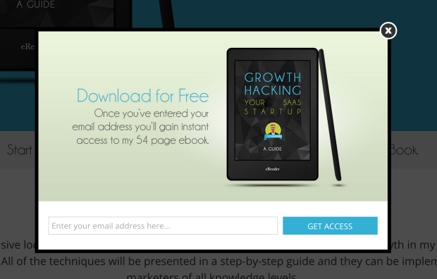
Within 2.5 seconds of closing the popup, the visitor then has their attention once again pulled away from your blog post by a slide-in.
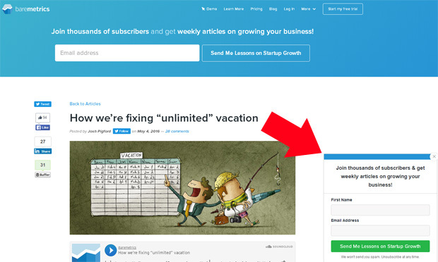
Popups can convert really well when done right.
But right now this visitor is just cranky. And they have every right to be.
When a visitor is forced to read a headline about some offer they have no interest in from a person or company they’re not all that familiar with when all they really wanted was the specific information they came for your popups are doing the opposite of what they should be doing.
You’re putting your visitors into a stressful situation, forcing them to switch tasks and make decisions before you’ve even provided them any value. You’re distracting them and creating a negative impression of you and your site. And you’re decreasing the chances that they’ll stick around or come back.
If they’ve been around the Internet for a while, it’s also possible that they’ve developed “popup blindness”.
That means they’ve conditioned themselves to ignore the popup or welcome gate entirely and to click out of it as quickly as they can. The result may just be a minor annoyance for the visitor, but it still does nothing for you, the business owner who wants to drive conversions on their site.
The Fix: Adjust Your Popup Timing
It sounds simple, but timing is everything when it comes to popups, welcome gates, and slide-ins. OptinMonster’s display rules are a great way to set timing rules for popups that will trigger the popups when they’ll be least intrusive and most likely to convert.
There are four basic types of timing that you need to pay attention to when defining the display rules for your popup:
- Time on page (or scroll amount)
- Time on site (or page views)
- Specific date or time
- Exit-intent
There are many other ways to refine the timing of your popup, such as with referrer detection, using a specific URL parameter, cookies, anchor tags, campaign interaction history, etc., but these are the basic types. Let’s go into each in more detail…
1. Time on page
Time on page is how many seconds you want to delay your popup from appearing after the page is loaded.
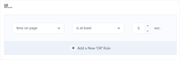
Or how far the user has scrolled down the page before a slide-in appears.

This allows you to delay your popup long enough that the visitor has had a chance to read your content and digest it before being asked to re-direct their attention to your offer.
Just as you aren’t likely to appreciate a salesman accosting you and pushing their product in your face the second you walk in their store, this can be a more polite way of suggesting something that the visitor might want, well after they have had a chance to settle in a bit.
However, seconds after page load is only one piece of the puzzle. Another critical piece is the time spent on-site or pageviews.
2. Time on site
Time spent on site is how many pages the visitor has viewed on your site before the popup appears.
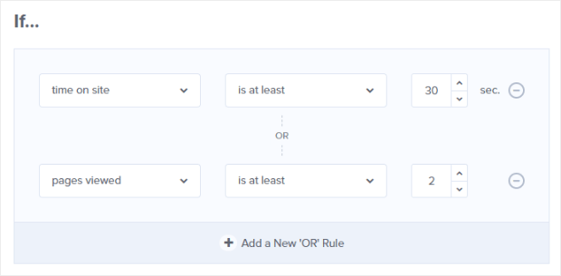
This is like a store clerk waiting until a shopper has browsed around a bit before asking if they need any help. Not only does this allow the shopper to settle in and orient themselves with the store, but it also allows the clerk to observe the shopper so they’ll know how to assist them better. You can do the same thing with popups using behavior personalization (more on that in #2).
3. Specific date or time
The third type of timing is using a specific date and time (in your user’s timezone) to display your popups.

This is useful for date/time-specific promotions, such as when you have a Labor Day sale that is only for a limited time.
Back to the retail store analogy, a shopper is more likely to forgive an immediate pitch from a clerk when it has to do with a limited-time promotion.
Imagine walking into a clothing store and being greeted by a clerk handing out coupons for 20% off your purchase, good for today only. Well, that seems perfectly justifiable, so you take the coupon thinking that there’s no harm in holding on to it, especially since you don’t want to miss out on a good sale. Your website visitors can have a similar experience with date/time specific popups.
4. Exit-intent
The final type of timing to consider is exit-intent: this is when a popup appears just as the visitor is about to leave the site.

This is pretty tough to replicate in a retail store, but it’s actually very easy to accomplish on your website.
There is absolutely no good reason not to take advantage of exit-intent technology. Your visitor is about to leave anyway, and most likely will abandon your site forever unless you get their attention.
And what do you have to lose by trying? If your popup annoys them on the way out then you’re no worse off than you were before.
More importantly, exit popups can recover 10-15% of abandoning visitors and can increase your conversions by 316%.
2. “Popups Make Me Leave a Website Instantly.”
Popups suck because they drive people away from your site.
Assuming this is true, you should see a higher bounce rate and a decrease in conversions, right? More people abandoning your site should result in fewer email subscriptions.
However, the data shows that this isn’t happening. In fact, it’s quite the opposite. When tested against a sidebar opt-in form, popups have been shown to drive 1375% more email subscribers.
Related ContentHow to Create a Sidebar Widget in WordPress to Get More Subscribers
There are countless case studies that prove the effectiveness of popups, welcome gates, and slide-ins. The data shows that the majority of people aren’t leaving websites just because they have a popup, they are actually opting in.
Despite what their actual behavior shows, it’s true that many users continue to say they just hate popups.
The Fix: Behavior Personalization.
Behavior personalization is a technology that OptinMonster uses to observe your user’s behavior and present a highly targeted popup that is personalized to the user’s specific needs and interests.
Back to the brick & mortar retail store analogy again, this would be like the store clerk observing the shopper’s browsing behavior before approaching with a specific offer to help.
For instance, they might see that the shopper has picked up several articles of clothing, so they ask the shopper if they can get a dressing room started.
Will this interaction make the shopper want to leave the store? Of course not. They have their hands full, so it’s a welcome offer that improves their shopping experience. For the store clerk, this interaction helps to ensure that the shopper will make it into the dressing room: the next step towards making a purchase.
You can do the same thing on your website, and turn your “annoying” popups into personalized offers that your visitors will actually thank you for.
Quick TipPersonalize even more by adding user names to popups with Dynamic Text Replacement!
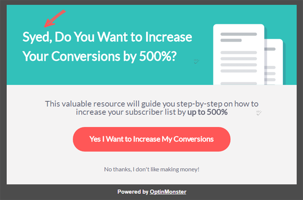
For example, let’s say your visitor is reading a blog post about how to grow their own garden. After allowing them time to read the post (with a scroll-triggered slide-in), or using an exit-intent popup, you could present them with some garden-growing assistance, such as a printable checklist of all the tools/supplies they’ll need to get started.
Here’s another example. Let’s say you have an eCommerce store and your visitor has been browsing one of your products or product lines. As they are about to leave, you could present them with a popup that says, “If you loved XYZ, we think you’ll adore this…” and show them a related or similar product.
You could even add, “And by the way, it’s 10% off through Thursday” (or some other discount) with a button to redeem the offer.
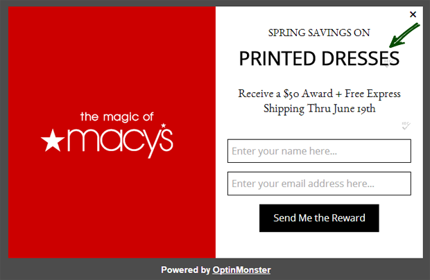
Or you could say, “Want to save this for later? Add it to your wishlist.” and include an email signup form that registers them with your site and adds the product they were viewing to their wishlist.
Or, perhaps your visitor has been reading through your pricing page, indicating that they are thinking about buying. However, they are about to abandon your site. Using an exit-intent popup, you could ask them if they have any questions about your product, and include a contact form, or even a live chat option.
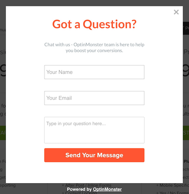
The possibilities for behavior personalization are truly endless. It takes a bit more thought than just slapping up a “catch-all” popup and hoping it sticks, but the results will be well worth it.
3. “Popups Are Insulting.”
Popups suck because they’re insulting.
How would you like it if a salesperson told you that you’d have to be a complete idiot not to take them up on their offer?
It’d be pretty insulting, right?
Unfortunately, this is why so many popups suck. They just do it wrong.
You may have seen one of these “Yes/No” popups before:
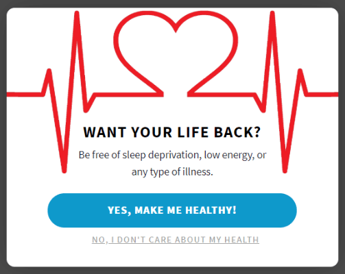
This type of popup gives you two options: you can either opt in to the offer, or you can reject the offer.
Although the above example is not something we suggest you emulate, there is nothing inherently wrong with the yes/no type of popup. In fact, yes/no popups convert really well because they are essentially a 2-step optin crossed with a popup (and 2-step optins have been shown to boost conversions by as much as 785%.)
Case StudyHow Cosmetic Packaging Now Grew Their Email List by 754% with 2-Step Optins
The problem is when the copy for the reject button insults the visitor’s intelligence. In this example, “No, I don’t care about my health” is something that no one would agree with, and that can come across as insulting to people.
To give them some credit, there is some real reasoning behind this tactic: that is, to persuade the visitor into accepting the offer by making the alternative sound so ridiculous that there is no way they would ever choose it. However, while this can convert, it can also leave a bad taste in people’s mouths. It can even make some people angry.
The Fix: Use Humor and Creativity in Your Copy
The reason humor works is that humor dissipates anger. People will forgive nearly anything so long as they can laugh about it.
Tumbler used this principle to dissipate anger when their service was interrupted by displaying these green, fluffy creatures with the notice:
“We may have forgotten to feed the wild Tumbeasts that roam our datacenter, resulting in gnawing and/or mutiny. Animal control has been alerted.”
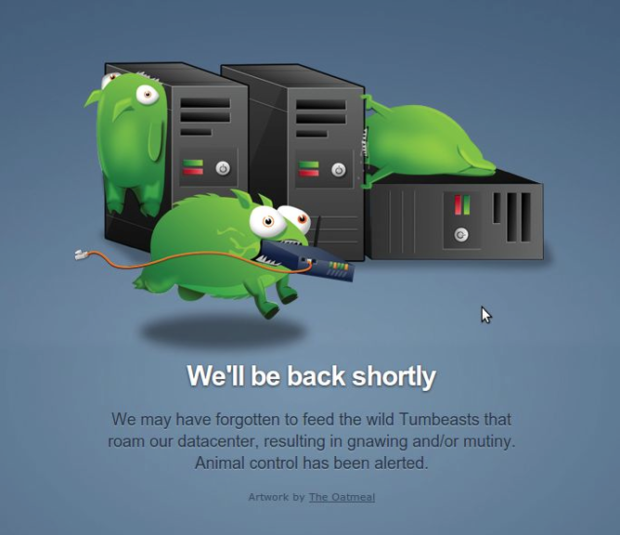
It’s really not that difficult to do the same thing with your reject button. For example, instead of “No, health means nothing”, you could say, “Nah, I’m happy with my jelly-filled doughnuts, thanks!”
For your inspiration, here are some humorous yes/no popups done right…

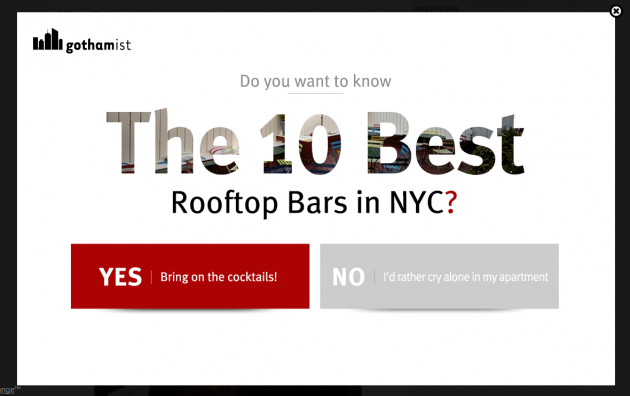
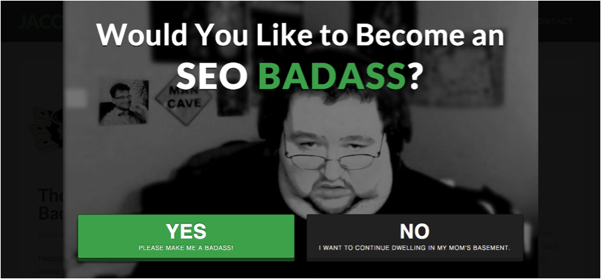
But if humor isn’t your brand’s thing, not to worry. All you have to do is use the reject button in a more creative way.
After all, who says the reject button has to simply exit the popup? Why not actually offer some value to the visitor if they click it? Why not make both options a win-win?
For example, Which Test Won uses a yes/no popup to either offer an optin or simply continue to the site where there are some blog posts to read and other goodies to consume.
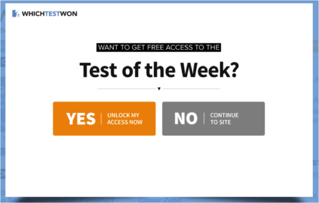
There really are so many other possibilities besides insulting your visitors. You just have to think outside the box! The popup box, that is. (Ok, ok, bad joke. On to the next problem…)
4. “Popups Ruin the User Experience.”
Popups suck because the very nature of popups ruins the user experience.
However, that would mean that any application which uses popups has bad UX. Like oh, I don’t know, the company that coined the term (Apple)?
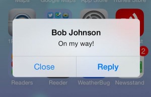
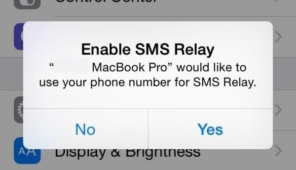
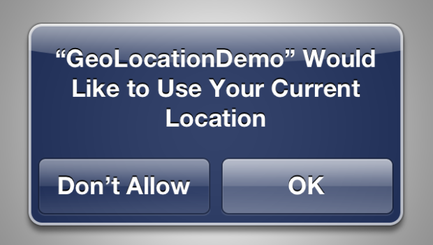
The truth is, user experience or UX design is not just about pleasing the user, it’s about meeting the objectives of both the user and the owner to create positive outcomes for both parties.
Are there some popups that ruin the user experience? You bet.
The most common offenders are the websites that don’t optimize their popups for mobile. This leads to a highly aggravating experience for the mobile user, and may even render the site completely unusable.
The Fix: Optimize for Mobile Devices
Optimizing your popups for mobile devices means that they are responsive and they will appear and behave exactly as they should, even on tiny screens.
But, why stop at mobile responsiveness? Why not show targeted messages to your mobile users as well?
With OptinMonster, we’ve taken mobile popups one step further. You can now use popups to invite users to download your mobile app or show specific messages only to your mobile audience.

5. “Popups Cater to People With Short Attention Spans.”
This argument is actually quite true. Popups suck because they cater to people with short attention spans.
But here’s the thing: even though we’d rather not admit it, nearly everyone has a short attention span these days.
Yes. You’d have an easier time getting a goldfish to pay attention to your optin form than a rational human being. (Provided the goldfish was literate and provided with a waterproof, fishy-sized laptop, of course.)
The Fix: Leverage Simple, Clear Calls-to-Action
Popups are effective when they provide a clear, singular call-to-action. Avoid adding extra text or choices that can distract from the main goal. OptinMonster’s templates help create streamlined popups focused on conversion.
6. “I Still Hate Popups!”
Even with all these solutions, some people simply don’t like popups. But if you want high-converting popups, the data speaks for itself—they work!
The Fix: Offer Valuable Content and Targeted Options
If popups are here to stay, why not make them as valuable as possible? Create popups that greet returning visitors, use location-based targeting, or add animations to make them engaging.
Welcome Returning Visitors: Show a special popup for repeat visitors.
Location-Based Popups: Customize offers based on the visitor’s location.
Animation Effects: Use subtle animations to capture attention without annoying the user.
Want to create popups that don’t suck? Check out these beautiful, high-converting popup designs or head over to our exit intent popup gallery.
If you want to create targeted popups why not try creating popups to welcome back returning visitors, popup based on location, or adding animation to your popups.
And you’ll definitely want to check out these high-converting ways to use slide-ins!
You can’t beat ’em, so join ’em. If you aren’t yet part of the OptinMonster family, join us today!






Add a Comment