High-converting landing pages don’t happen by chance. They follow time-tested best practices that balance design, psychology, and user intent. In this guide, we’ll walk through 18 landing page best practices, complete with examples, so you can create pages that attract attention and drive action
OptinMonster: The Ultimate Tool for Website Conversions
Are you already driving traffic to your website and landing pages? Your next step is to convince more of those visitors to become subscribers and customers. If a visitor doesn’t convert on your landing page, use an Exit-Intent® popup to sweeten the deal and land the sale.
Why You Need a Landing Page
A landing page is a standalone page on your site created for a specific offer or campaign. Its main task is to attract people who are interested in your offer and convince them to take a single action.
That single action is what sets landing pages apart. They’re different from your website’s homepage, which has many different options for visitors to choose from.
You can create a landing page for many different purposes, like:
- Offering a lead magnet in exchange for contact information
- Promoting a specific product or service
- Selling tickets for a one-time event
- Getting registrations for a webinar
- And much more
When visitors arrive on your landing page, there are no other options or choices to distract them. Instead, they can focus on taking your desired action.
18 Best Landing Page Practices (With Examples)
The most basic of landing pages have the following elements:
- Headline
- Subheadings
- Copy
- Images
- Call-to-Action (CTA)
In addition to these basics, landing page best practices can turn your page into a lead-generation machine.
Here are some landing page best practices to help you create the highest-converting landing pages.
1. Stick to a Single Goal on Your Landing Page
The whole purpose of a landing page is to be laser-focused on a single goal. When there are too many options and choices to make, visitors will be less likely to take the desired action.
So, you need to make sure your landing page message is clear and focused.
Here is a focused landing page example from Taboola:
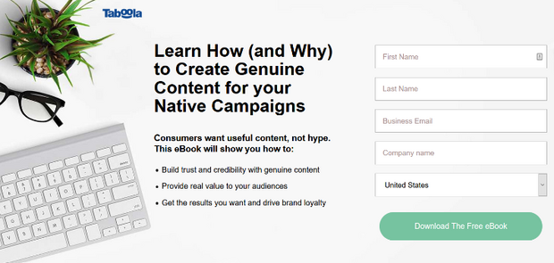
It has 1 single offer on it: Download a free ebook to learn more about creating content for native campaigns.
If you have more than 1 ebook you want to offer as a lead magnet, create separate landing pages for each.
When you keep your landing page focused on a single goal or offer, you can increase conversions easily.
2. Keep Your Landing Page Design Distraction-Free
When designing your landing page, make sure there are no distractions that will cause users to leave.
For example, if you include a navigation menu on your landing page, visitors can easily click away without opting in to your offer.
Remove any external and internal links from your landing page. These include like navigation menus, footer links, and so on.
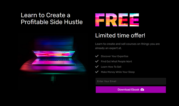
After removing all of the unnecessary links, the only one left to click will be your CTA button.
A distraction-free landing page will help you increase conversions and reduce your bounce rate.
3. Consider Using a Landing Page Template
Designing a professional landing page yourself can be difficult. That’s why we often recommend using a landing page template.
Landing page templates are created by professionals, so you can ensure your page is well-designed. Plus, you can customize them to match your brand and particular offer.
SeedProd is the best landing page builder on the market. Here’s an example of creating a landing page with SeedProd:
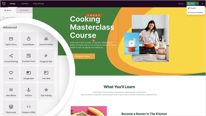
SeedProd comes with 180+ professionally-designed landing page templates.
You can get ready-made designs for:
- Sales pages
- Webinar pages
- Video landing pages
- Coming soon pages
- Squeeze pages
- Thank you pages
- And more
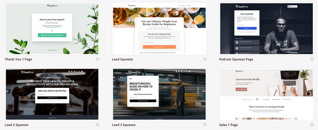
With the drag and drop builder, you can easily customize any template. Click on any existing element to edit it, delete it, or move it. And to add new elements, drag landing page-specific blocks and drop them into place.
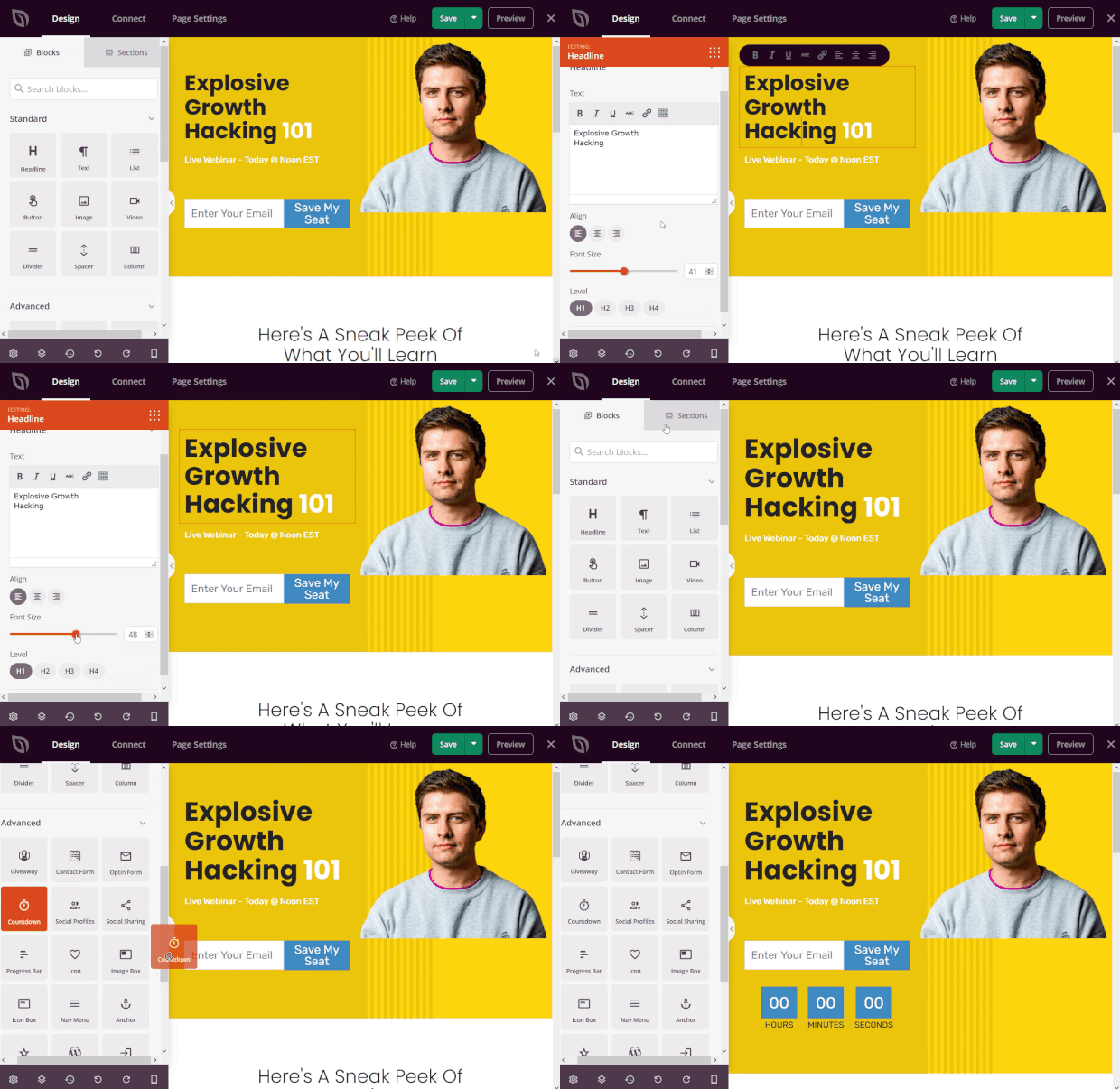
SeedProd offers conversion-focused landing page blocks like optin forms, contact forms, countdown timers, testimonials, and more.
You can create the highest-converting landing page in no time by starting with a SeedProd landing page template.
4. Pick the Right Colors
Did you know that the colors you choose for your landing page can have an effect on your conversion rates? I have another article called Which Is the Best CTA Button Color? 3 Proven Ways to Get More Clicks. While researching, I discovered that there’s no right or wrong color to use for conversions. Instead, contrast is what matters most.
Here’s an example of one of our own landing pages for OptinMonster:
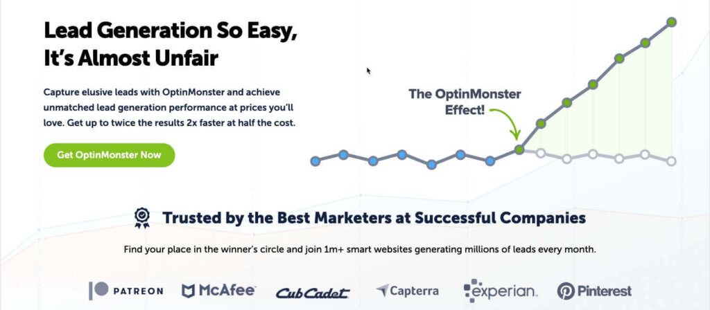
We use a white background and black text. The only pop of color on the page is the bright green CTA button.
When choosing colors for your landing page, use your brand colors or colors that work well with them. Then, focus on readability and directing attention to your CTA.
5. Be Mobile-Friendly
People aren’t going to visit your landing page from just their desktop browsers. They’re also going to visit it from their smartphones and tablets.
Because of this, you need to make sure your landing page is responsive so that it looks great on all devices.
Luckily, if you use SeedProd to create your landing page, you don’t have to worry about it being difficult to read on a small screen. Here’s an example of how a SeedProd landing page adjusts for mobile screens:
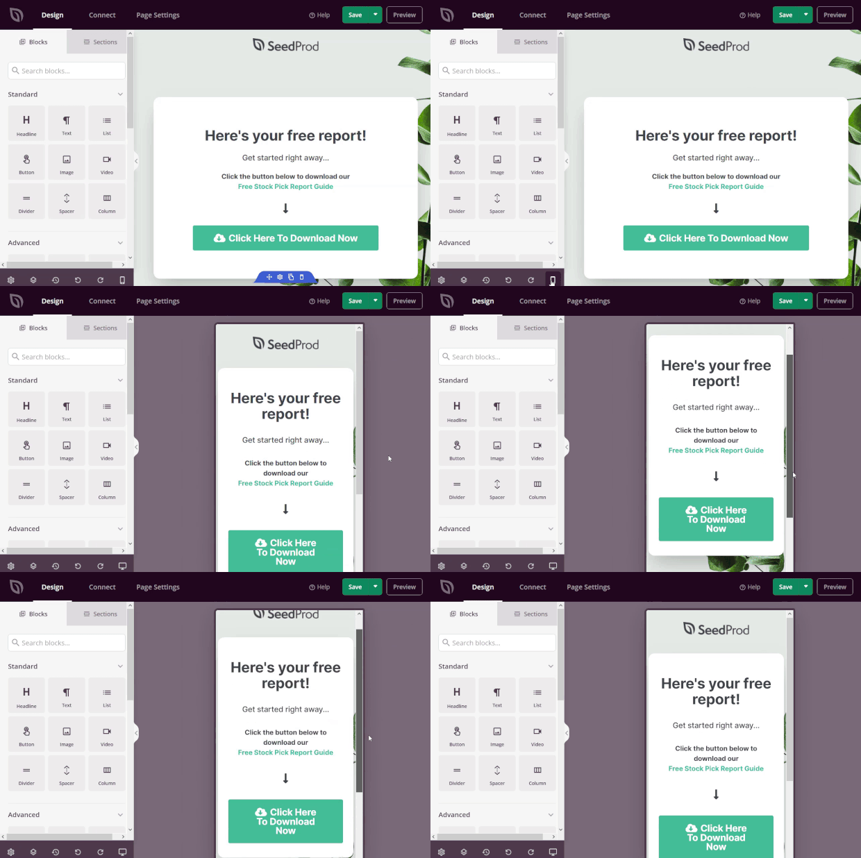
Any page you create with SeedProd is fully responsive and mobile-friendly. Simply click on the mobile preview button to see how it looks on smaller devices.
You can even edit your page right from the mobile preview. So, if a headline is too small on mobile, you can make it bigger without having to go back to the desktop view.
Any changes you make will be automatically applied to both versions of the landing page.
6. Attract Attention With a Compelling Headline
Your headline is often the first thing a visitor sees when they land on your page. So, you need to make it good.
With a compelling headline, visitors will stick around to learn more. With a bad headline, they’ll leave.
Here’s an example of a great landing page headline from Airbnb:
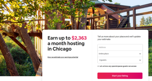
It’s simple, to-the-point, and tells the benefit to the visitor.
There’s no need to be metaphorical with your headlines or come up with some unique play on words.
The best way to inspire your visitors to take action is by telling them exactly how they’ll benefit from the offer.
7. Make your Text Copy Easy to Read
The text on your landing should formatted so it’s easy to read and scan.
Keep these tips in mind:
- Avoid any long paragraphs
- Use plenty of white space
- Use bulleted or numbered lists when possible
- Use simple, easy-to read fonts
For that last tip, SeedProd comes with a ton of ready-made font pairings, so you don’t have to spend a lot of time make sure your text looks clean.
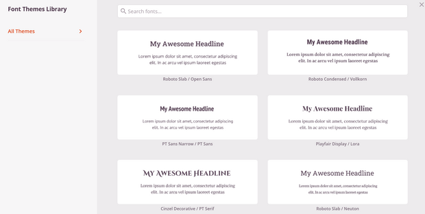
This makes it easy to use multiple fonts on your landing page while maintaining a clear and cohesive look.
8. Offer Value Above the Fold
The best landing page structure is one that keeps all of the most important landing page content above the fold.
Above the fold refers to the section of your landing page that is immediately visible. In other words, it’s what visitors see before scrolling.
Here is an example from Bluehost:
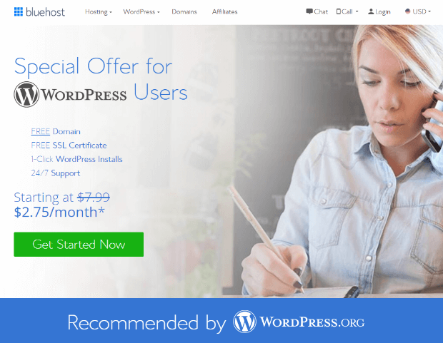
Anything below this section is below the fold, and users have to scroll to see it.
You don’t have very much time to convince visitors to take action. So, you don’t want to waste that time by having visitors scroll through your page to get to the good stuff.
Put your most important content, like your offer and call-to-action, above the fold so it’s the first thing they see.
9. Make Your CTA Persuasive
The call-to-action (CTA) is the most important element of your landing page. It’s the button that visitors click when they’re ready to opt in.
Your CTA button should be big, have a contrasting color to draw the eye, and it should be persuasive.
Making your CTA button more persuasive is as simple as changing the button text.
For example, your CTA button could read:
- Download the Ebook Now
- Claim Your Discount Today
- Get “Product Name” Now
- Try “Product Name” For Free
Instead of having a CTA that reads something boring like “Submit” or “Contact Us,” you can make it more persuasive by demonstrating the value of opting in.
You can get even more creative, like this CTA from Radical Design, which reads “Let Me Buy It!”
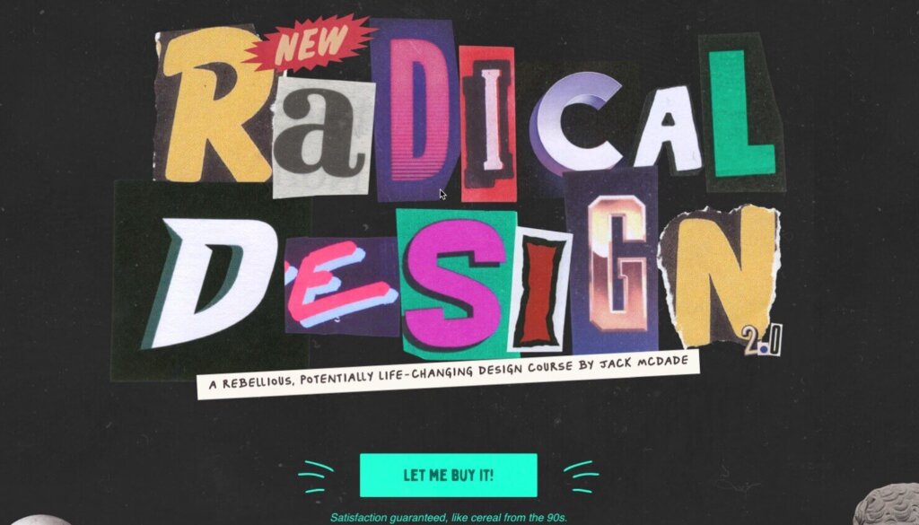
If your brand voice is more light-hearted and humorous, try out funny CTA text.
10. Add Video to Explain Complex Information
Adding a video to your landing page is a great way to boost engagement and drive more conversions.
In fact, 82% of people say they’ve been convinced to buy a product or service by watching a brand’s video. Learn even more benefits in our list of video marketing statistics.
Plus, you can use video to explain more complex information about your product or service, instead of crowding your landing page with difficult-to-read text.
We have an embedded video on our OptinMonster University landing page:
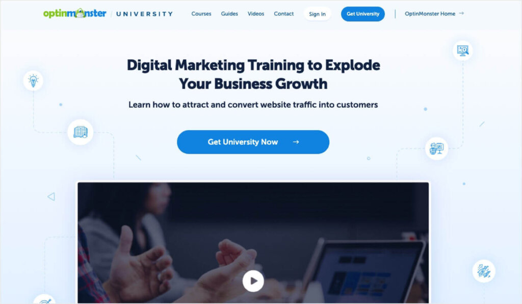
The top of the video is above-the-fold, which signals to visitors that they can scroll down to watch the video.
11. Integrate with Social Media
Imagine if everyone that visited your landing page shared it with their family and friends online. Having your landing page go viral would be an awesome way to get more traffic and conversions.
But, most people won’t share your page on their own accord. You need to encourage them and make it easy by adding social sharing buttons to your landing page.
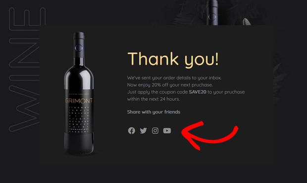
With social share buttons, visitors can share your content with 1 click.
12. Display Social Proof to Increase Trust
If you want to convert visitors into leads or customers, then you need to gain their trust.
That’s where social proof comes in. Social proof is a psychological and social phenomenon where people look to the actions of others to decide what to do.
Learn How to Win Customers with Social Proof
What Is Social Proof in Marketing? Definition, Benefits & Examples
For example, customer reviews are a form of social proof. If a user is unsure about buying a product, they’ll read the reviews. Just a few glowing reviews can convince them to buy.
So, be sure to add social proof to your landing page. You can add:
- Customer Reviews
- Testimonials
- Star Ratings
- Well-Known Client Logos
- User-Generated Content
- And More
Another way to add social proof to your landing page is with TrustPulse.
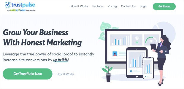
TrustPulse is a social proof notification software that displays recent activity notifications across your website.
These small messages let visitors know how other people are currently interacting with your business.
Here’s what they look like:

You can display social proof notifications when someone signs up for your email list, purchases a product, leaves a review, and more.
These messages not only help you gain trust with visitors, but they also help you create FOMO (the fear of missing out).
When visitors see notifications about the awesome experiences others are having with your brand, they’ll be more likely to convert so they don’t miss out on the fun.
It’s a powerful way to boost your conversions.
Want to add social proof notifications to your website? Sign up for your free TrustPulse account today!
13. Keep Your Forms Short
There’s nothing that will turn off visitors to your landing page more than a long form. With too many fields to fill out, visitors will abandon your page before they even get started.
That’s why it’s important to keep your forms short.
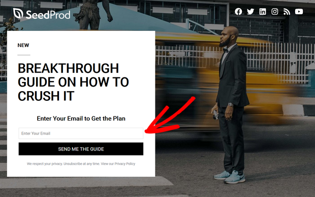
Only ask for the information you really need from your visitors, like their email addresses.
When your form takes less than a minute to complete, visitors will be much more likely to take action.
14. Use a 2-Step Optin
On most landing pages, people can sign up for your offer in 1 of 2 ways:
- Clicking the CTA button
- Filling out a form
Many people will be scared off by seeing a form right away, no matter how short it is. So, using the CTA button method is better for conversions.
But, the issue with using a CTA button is that it redirects visitors to a different page, which can cause friction in the user experience.
That’s why we recommend using OptinMonster’s MonsterLinks™ 2-step optin technology.
This technology lets you display an optin campaign when people click on the CTA button. The form will display on the same page, instead of redirecting people to a different one.
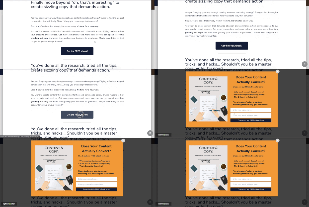
A visitor that clicks on your CTA button already has an interest in your offer, so they’ll be more likely to complete the form.
This landing page design tip also takes advantage of the Zeigarnik effect, which is a psychological principle that says that people are more likely to finish a process once they’ve started it.
Take a look at this tutorial to learn how to create a 2-step optin form.
15. Create Urgency with Countdown Timers
Instead of having visitors to your page mull over whether they should opt in or not, you want them to act fast.
And you can get users to make a decision faster by creating a sense of urgency.
You can do this by using urgency words in your headlines, copy, and CTA that implies urgency, like:
- Now
- Today
- Fast
- Don’t Wait
But an even more powerful way to create urgency is by using a countdown timer on your landing page.
With a limited-time offer and a timer that’s counting down the minutes until it expires, visitors will rush to make a purchase before it’s too late.
You can easily add a countdown timer to your page with SeedProd.
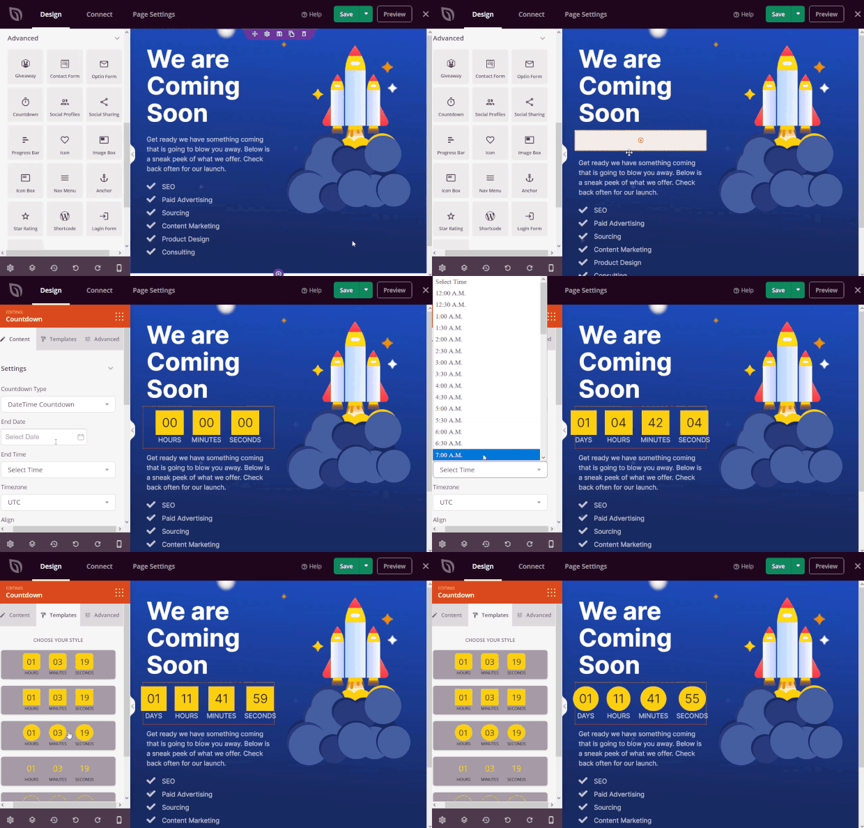
Simply drag the ready-made countdown timer block and drop it into place on your landing page. Then, click on the block to customize the style, set the end date, time, and more.
16. Answer Questions With an FAQ Section
Most people have questions before they sign up for something or make a purchase. If these questions aren’t answered, they’re unlikely to convert.
So, this landing page tip will help you ease the concerns of your potential customers and move them closer to conversion.
Adding an FAQ section to your landing page is a great way to answer common questions like how your product works, what’s included in the deal, or how to cancel/return the product.
Here’s how Netflix does it:
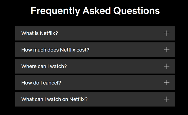
With SeedProd’s built-in landing page sections, you can easily add an FAQ section to your landing page.
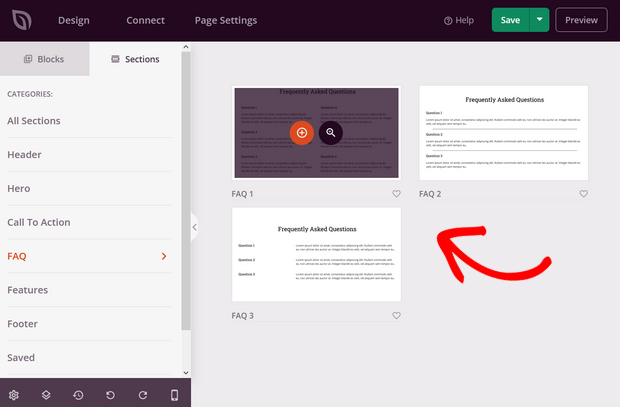
Simply click on the style of FAQ section you like and SeedProd will automatically add it to your page.
SeedProd also offers pre-built sections like Features, Hero, Footer, and more, so you can create a helpful and beautiful landing page layout in minutes.
17. Do A/B Testing
Wondering whether a green CTA button works better than a red CTA button? Not sure which version of your landing page headline results in more conversions?
You’ll never know how well your landing page design works, unless you do A/B testing.
A/B testing is when you compare 2 different versions of a webpage against each other to find out which one works better.
For example, you can test which CTA button phrase converts better:

A/B testing is an important step of designing your landing page. Even the smallest of changes can result in more conversions.
So, make sure you A/B test each element of your landing page.
You can check out this article to discover more A/B testing examples.
18. Add an Exit-Intent® Popup to Recover Abandoning Visitors
If a visitor abandons your landing page, they might never come back and you’ve missed your shot at converting them.
Luckily, there is a way to recover abandoning visitors on your landing page. Just use Exit-Intent® campaigns from OptinMonster.
With Exit-Intent® technology, you can track when a visitor is about to leave your landing page and send them a targeted message at exactly the right time.
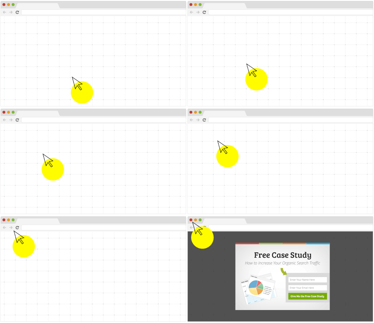
A campaign like this will re-engage your visitors’ attention and give them another opportunity to convert.
In fact, InternetSuccesGids used this tactic to convert 24% of visitors and grow its email list by over 250%!
You could see similar results if you add Exit-Intent® to your landing page.
Create an Exit-Intent® Campaign Today!
Why Trust These Best Practices
That’s a wrap! With these landing page best practices, you can easily create a landing page that is beautiful and high-converting.
These best practices are based on analyzing thousands of high-converting pages built with OptinMonster, plus research from marketing leaders. Our team has helped 1.2M+ websites generate more leads, so these aren’t just theories—they’re proven strategies.
Here’s a quick checklist to keep handy as you optimize your landing pages:
✅ Clear headline – Communicate the value of your offer in seconds.
✅ Compelling call-to-action (CTA) – Use action-driven words and make your button impossible to miss.
✅ Mobile-first design – Ensure your page looks and works perfectly on any device.
✅ Social proof & trust signals – Add testimonials, reviews, or trust badges to remove doubt.
✅ Fast page speed – Keep load times under 3 seconds to prevent drop-offs.
✅ Minimal distractions – Remove navigation or extra links that take attention away from your goal.
If you found this article helpful, you may also enjoy the following resources about landing pages:
- How to Easily Create a Landing Page (in Under 5 Minutes)
- 36 Best Landing Page Creation Tools to Win You the Most Conversions
- Opt-in Page Perfection: Examples & Tips to Boost Conversions
These articles will guide you through each step of designing and creating a successful landing page.





Add a Comment