Is your website struggling to convert visitors into customers? Do you want to learn how to create a pre-sell page to improve your conversions and increase sales?
Sometimes, people land on your sales page but they aren’t ready to buy anything yet. It’s likely because there’s some friction in your sales funnel.
But if you can create a pre-sell page, you grease up the entire process and make everything run smoothly again.
In this article, I’ll show everything you need to create a high-quality pre-sell page. More specifically, I’ll go over the following topics:
- What is a pre-sell page?
- Why should you have a pre-sell page?
- What makes a good pre-sell page?
- What are some good pre-sale page examples?
- How can you use a pre-sell page even if you have nothing to sell?
- How can you build a creative pre-sell page in minutes?
By the end of this article, you’ll have the tools you need to warm up your site visitors, increase your conversion rate, and turn casual visitors into paying customers.
But first things first, let’s understand what a pre-sell page is.
What Is a Pre-Sell Page?
A pre-sell page is exactly what it sounds like, a landing page for your visitors to go through before they’re shown an actual product or offer.
In many cases, the pre-sell landing page is the bridge between an advertisement (for example, Google Ads) and your product page.
NOTE Pre-sell pages go by many names, such as pre-cart pages, pre-lander pages, bridge pages, and advertorials. For the sake of consistency, this article will use ‘pre-sell pages’ as the standard name..
A lot of people use the terms ‘pre-sell page’ and ‘landing page’ interchangeably. However, this isn’t always accurate.
A pre-sell page is always a landing page, but a landing page isn’t always a pre-sell page.
Their difference lies in the purpose and goal of a page. Landing pages have one of 2 goals: generate leads or improve pre-sales.
When it comes to lead generation, your landing page may collect information about your visitors. This usually involves putting up a lead capture form to collect email addresses so that you can grow your email list.
When a landing page is used specifically for lead generation, it’s typically called a ‘squeeze page.’ It’s a great tool to have for your email marketing campaigns.
Your pre-sell page, on the other hand, has a different purpose: to warm up your cold traffic and prime them for a purchase. Pre-sell pages help your customers buy into a product before they actually make the purchase.
Why Should You Create a Pre-Sell Page?
You must have pre-sell pages if you’re running an online business and are serious about generating revenue from your website. And the reason is simple: they work.
According to research, 96% of buyers aren’t ready to buy from you even after clicking on an ad for a product. A good pre-sell page drastically increases your odds of making an immediate sale.
As an example, Tier 11 reports using pre-sell pages which increased its return on advertising spend (ROAS) by 77%.
But while pre-selling pages are super effective, you shouldn’t take them as magic bullets. They’re simply designed to help customers better understand a product and ease them into buying from you.
The good news is that pre-sell pages are extremely easy to make. All you need to know is what pieces to include.
What Makes a Good Pre-Sell Page?
Your pre-sell pages will look different depending on the product you want to sell or the audience you want to target. In general, however, all pre-selling pages have some similarities regardless of your niche.
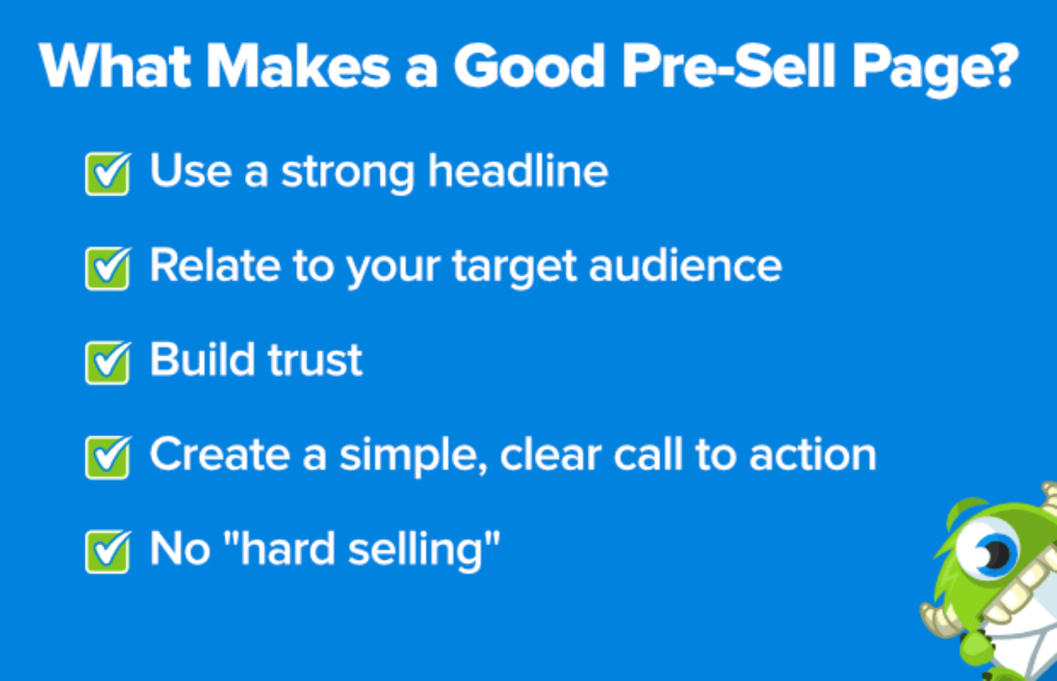
For instance, every good pre-sell page will:
- Have a strong headline: A great headline is the first thing people see. It should be short, catchy, and clickable. Using power words is a plus.
- Relate to the targeted audience: Does your audience use mobile or desktop devices? Do they prefer videos or text? You should know your buyer persona to ensure your pre-sell page effectively communicates the message that draws them in.
- Build trust around your company and product: 88% of customers say that they prefer social proof over ads. To build trust with customers, show the logos of companies that use your product or include customer reviews. These trust signals let your customers know that your brand is reliable.
- Create a simple, clear call to action: Once your visitors reach the pre-sell page, they should have a compelling call to action (CTA). For many SaaS companies, that can be a free trial offer for a limited number of days. For others, the CTA may be visiting the product page or completing the checkout.
- Avoid ‘hard selling’: This is the #1 rule when it comes to selling something: don’t be too pushy. With pre-sell pages, your goal is to educate the visitor on who you are, what you offer, and how your product solves their pain points. If you pressure your visitors into a sale, they might turn away and never come back.
Next, let’s look at some real-life pre-sell page examples to understand it better.
What Are Some Good Pre-Sell Page Examples?
1. Zendesk
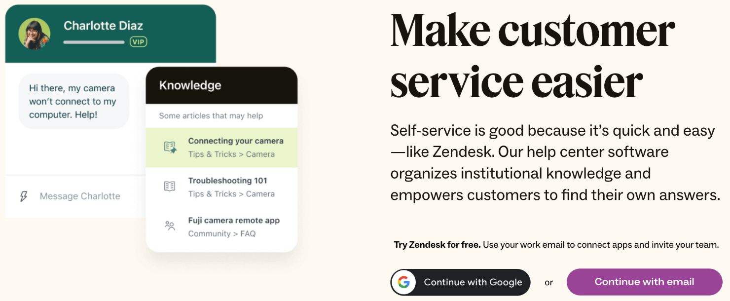
This Zendesk landing page checks off all the boxes when it comes to pre-selling pages. If you type the term ‘best CRM software’ into Google, you see a pay per click (PPC) ad for Zendesk:
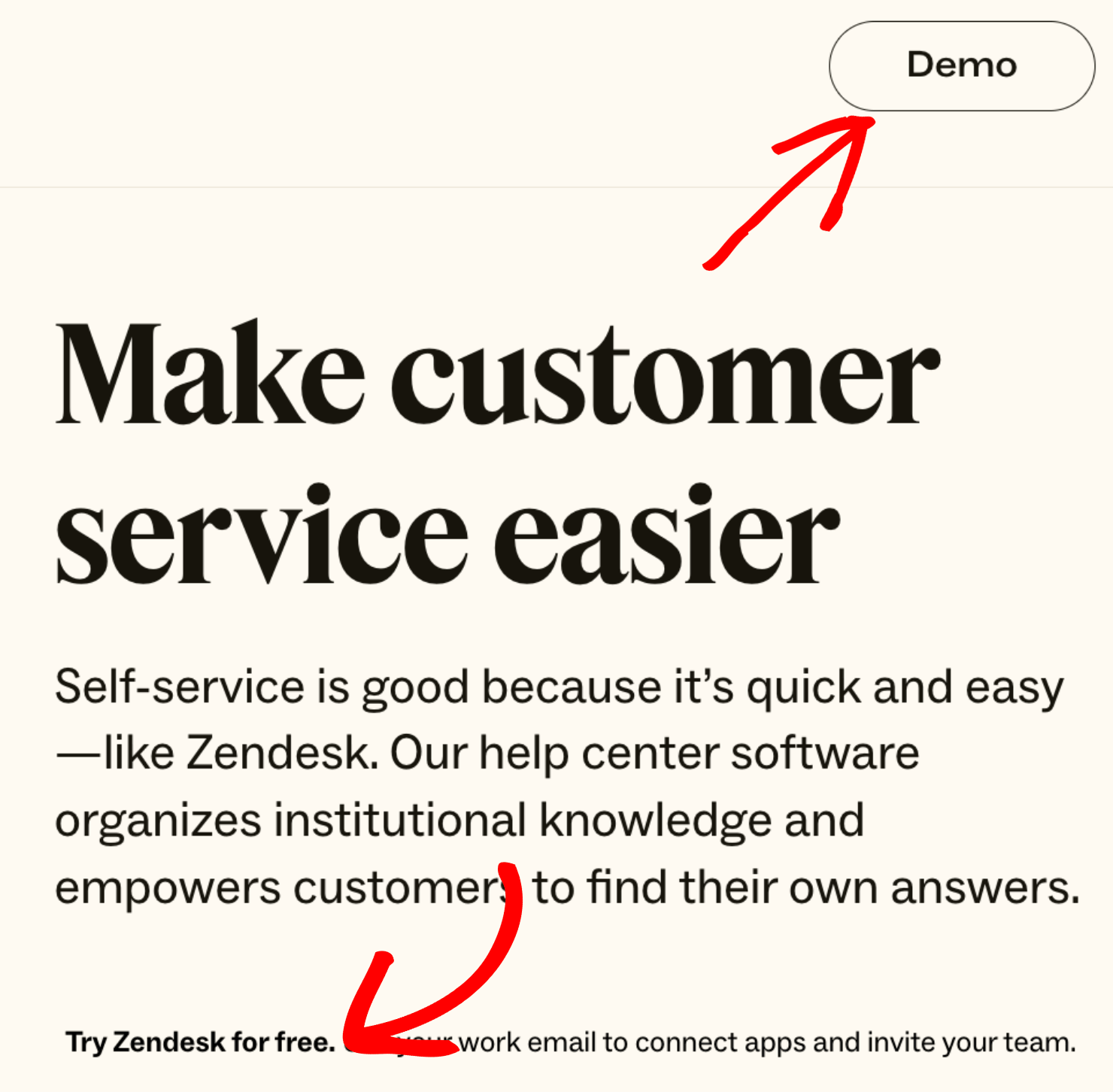
Click it, and you’re taken to Zendesk’s pre-sell page:
Right away, the 1st fold talks about why you need CRM software to improve your customer service. The copy explains why Zendesk is the best at it.
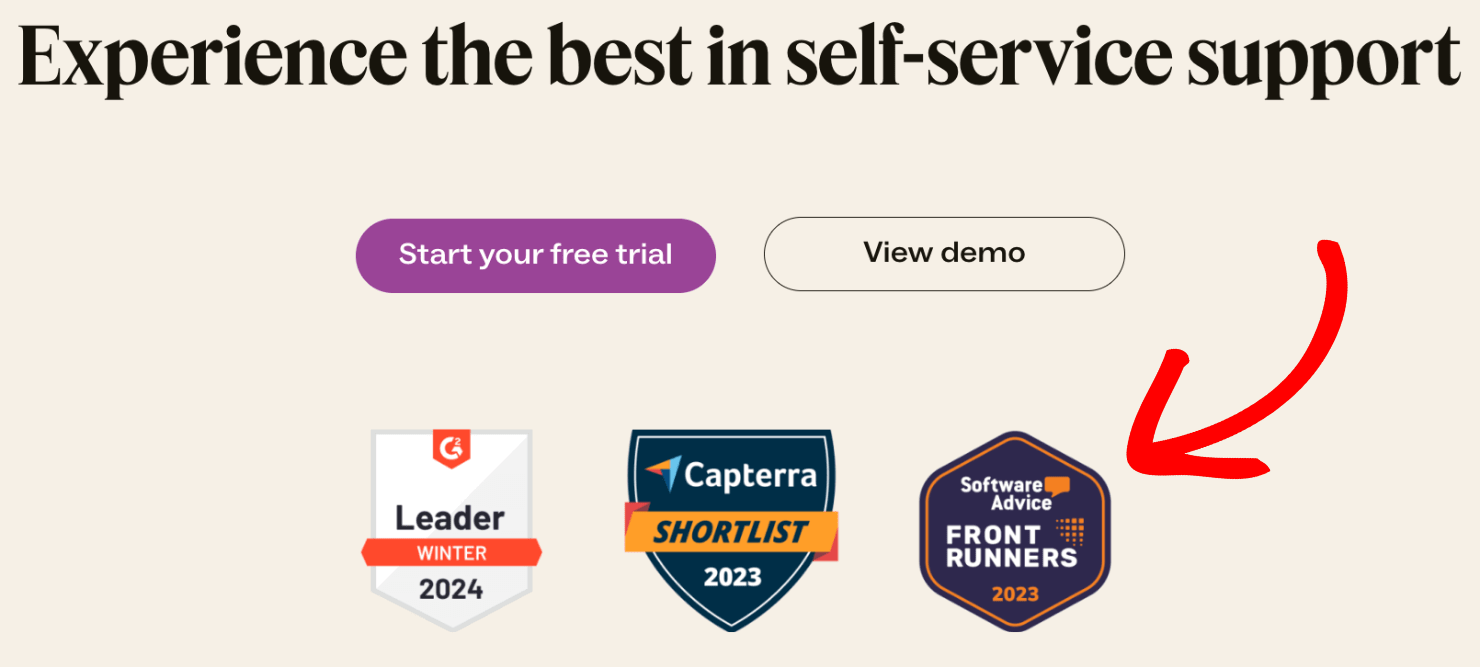
All of the sections that follow lead to 2 clear CTAs: start your free trial or watch the product demo.
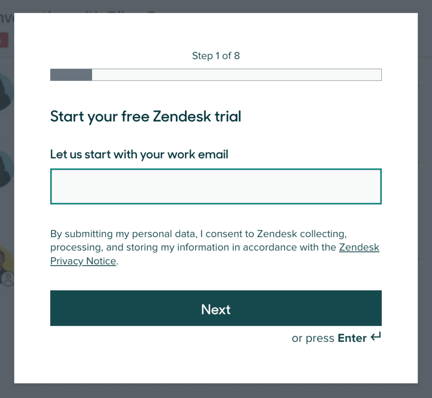
When you click on the free trial CTA, Zendesk will redirect you to its sign-up process:
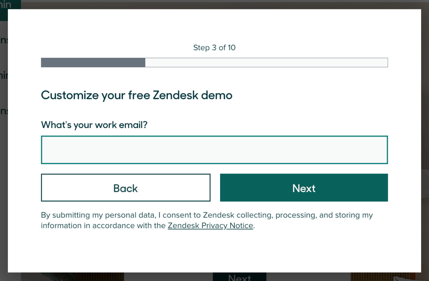
Here’s the optin view when you click on the product demo CTA:
In the last fold, Zendesk includes trust badges from reputed software review sites to establish social proof:
2. Audible
When you search for ‘audiobooks’ in Google, one of the top results is Audible:
When you click on it, you’re taken to their pre-sell page, which is more detailed than Zendesk’s pre-sell page. The headline and a subheader lead to a clear CTA to try the product free for 30 days:
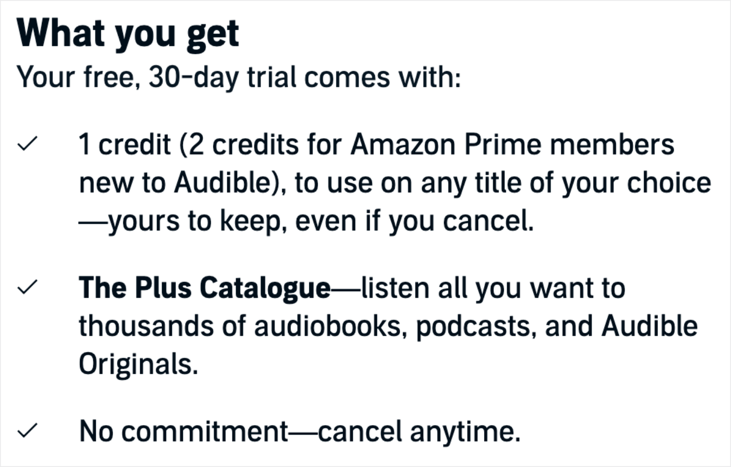
In the 2nd fold, Audible explains what you’ll get if you sign up for the free trial:
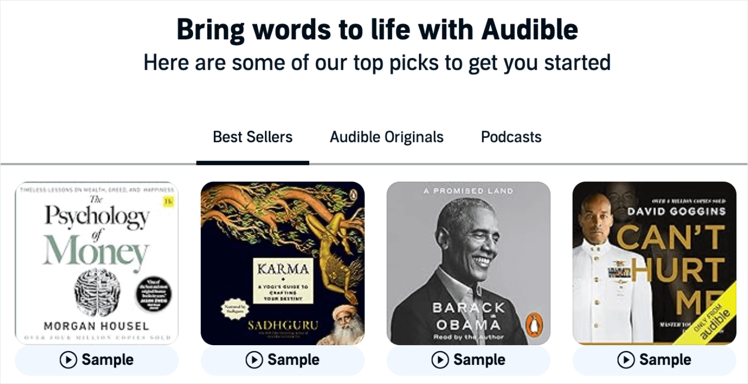
The next section is an example of great copywriting coupled with demonstrating product value that most bibliophiles will be hard-pressed to pass on:
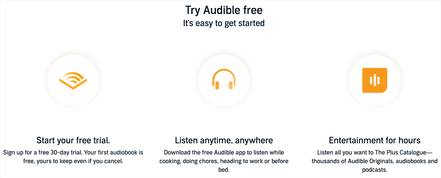
And the page ends by reminding you of the ease of getting started plus the benefits of using Audible:
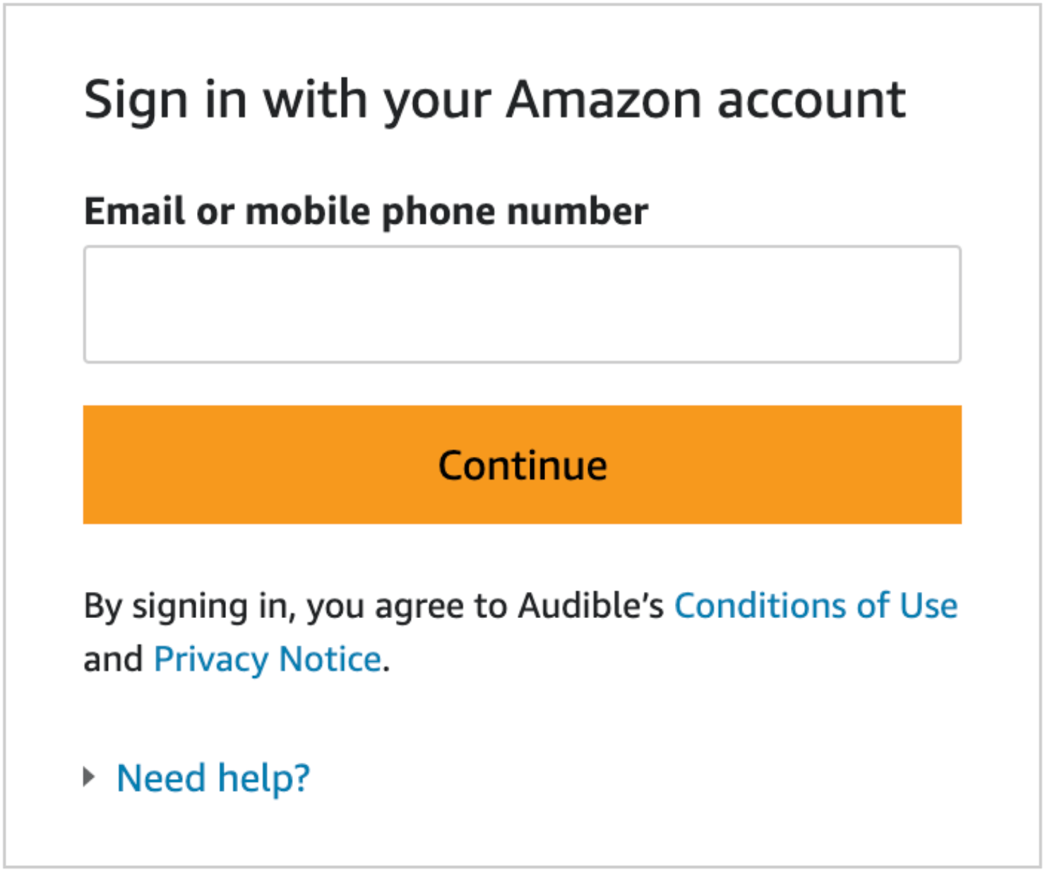
Once you optin, you’ll need to sign in with your Amazon account:
3. Loom
If you are looking to build a video course or create an online tutorial, you’ll most likely search for keywords like ‘screen recording app’ in Google.
Depending on where you’re located, you might see Loom’s ad ranked at the top of your search engine results page:
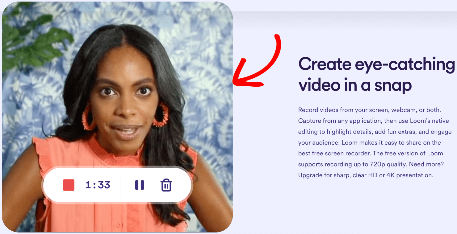
When you click on the link, you’ll land on Loom’s pre-sell page. The 1st fold talks about what is Loom and what it is used for:
Loom uses clear headlines, subheadings, CTAs, and videos to get its message across to you:
Using videos in your marketing is a great way to share more information about your product without cluttering your webpage with too much text. Plus, considering that 83% of marketers say that videos increase their sales, it’s a good call to incorporate them in a pre-sell page.
And it makes even more sense for Loom to include videos in their pre-sell page since they are in the business of recording videos.
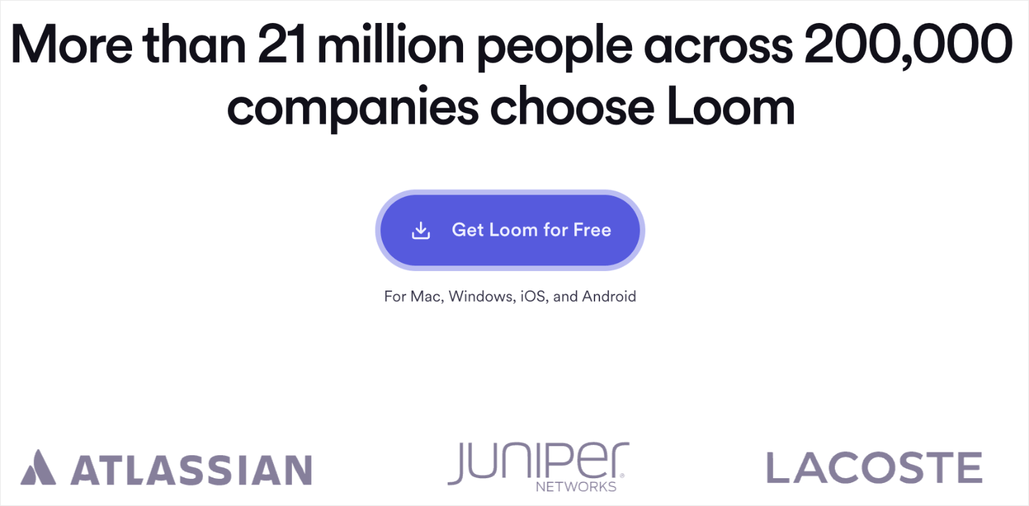
Towards the end of the page, Loom includes powerful social proof such as customer testimonials and logos of brands who love the product:
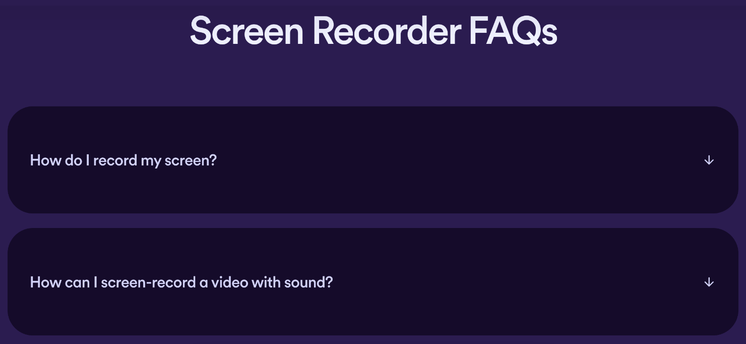
Finally, Loom’s presell page includes a list of frequently asked questions (FAQs) to answer the common concerns people might have about the video recording product. Plus, the FAQs also doubles as a way to improve Loom’s search engine optimization (SEO) rankings.
4. Semrush
If you type ‘best keyword research tool’ in Google, Semrush will appear as one of the top results in the sponsored ads section:
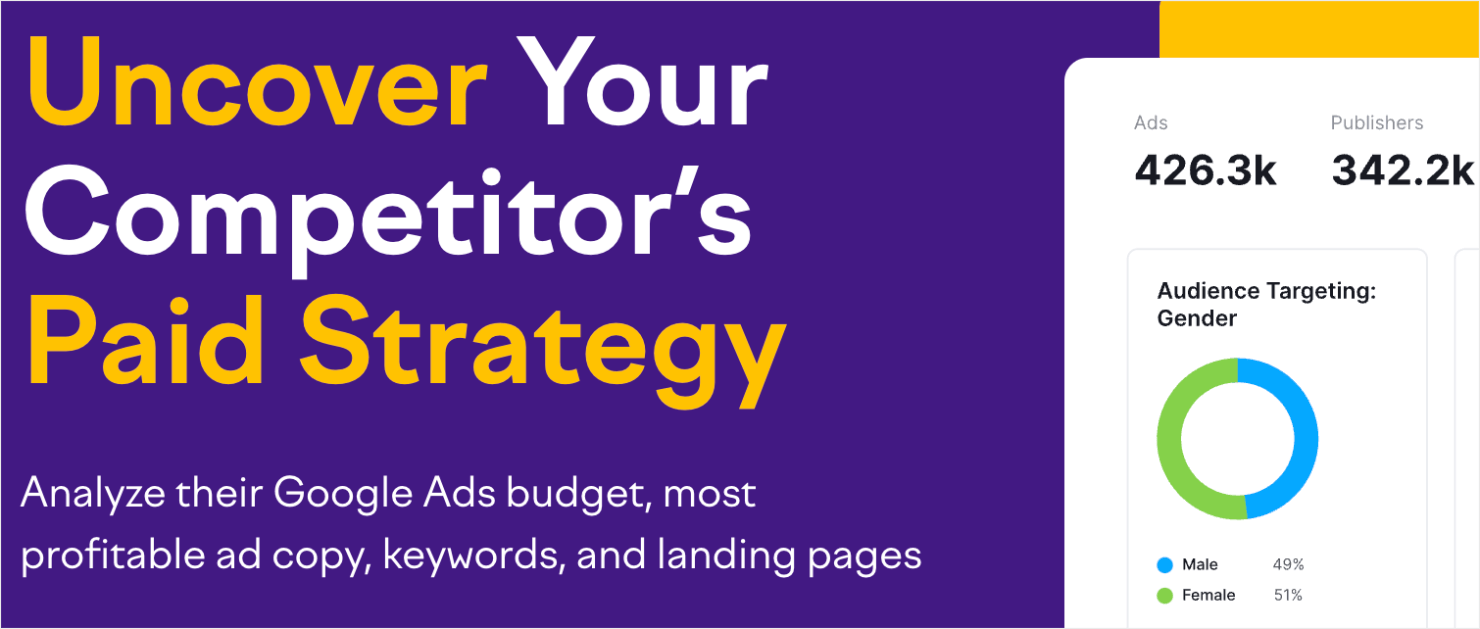
When you click on it, Semrush’s pre-sell page explains the benefits of using its product:
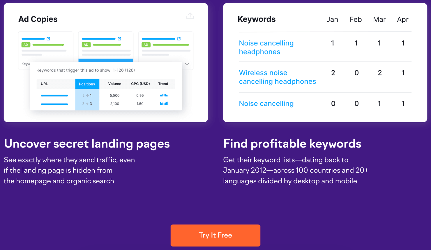
The page also mentions a list of features that you can use to beat your competition, with a compelling free trial CTA:
Semrush takes its pre-sell pages more seriously than the other examples we saw earlier.
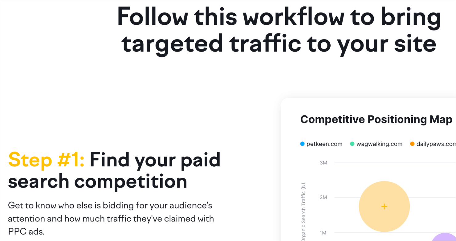
It even includes a workflow on the page to let potential customers know how they can bring targeted traffic to their site:
And finally, the page ends by showing off trust badges to establish Semrush’s credibility:
How Can You Use a Pre-Sell Page Even If You Have Nothing to Sell?
So you love the idea of a pre-sell page, but there’s just one problem: you’ve nothing to sell!
This is likely if you’re a blogger who doesn’t have any tangible product to sell.
No worries! Pre-selling pages can still be a valuable asset to increase your site’s overall revenue. How?
With affiliate marketing.
If you’re making money through your blog, chances are you’re already using affiliate links in your blog content.
With OptinMonster, you can create affiliate pre-sell pages that function as a bridge between you and the products you sell. Product comparisons or product reviews are a few examples of this.
These content pieces teach readers about specific products in a niche and promote the products that pay you. They also include affiliate links that readers can click on to buy these products.
It’s part content marketing, part advertising, and it’s really effective.
If you don’t want to create tons of new product reviews and comparisons, there’s another option.
You can create a pre-sell page in the form of a Fullscreen popup that shows up on pieces of content where your affiliate link appears.
Then your headline would cleverly talk about how a certain product solved a specific problem you were having. Finally, you’d close with a CTA to visit the product’s website.
Pro Tip: For pre-selling pages in the form of popups, you can also use videos. Videos allow you to connect with your audience, explain who you are, and what problem your product solves without relying on too much text.
Next, go over the step-by-step process to create a pre-sell page campaign.
How to Create a Pre-Sell Page in Minutes with OptinMonster
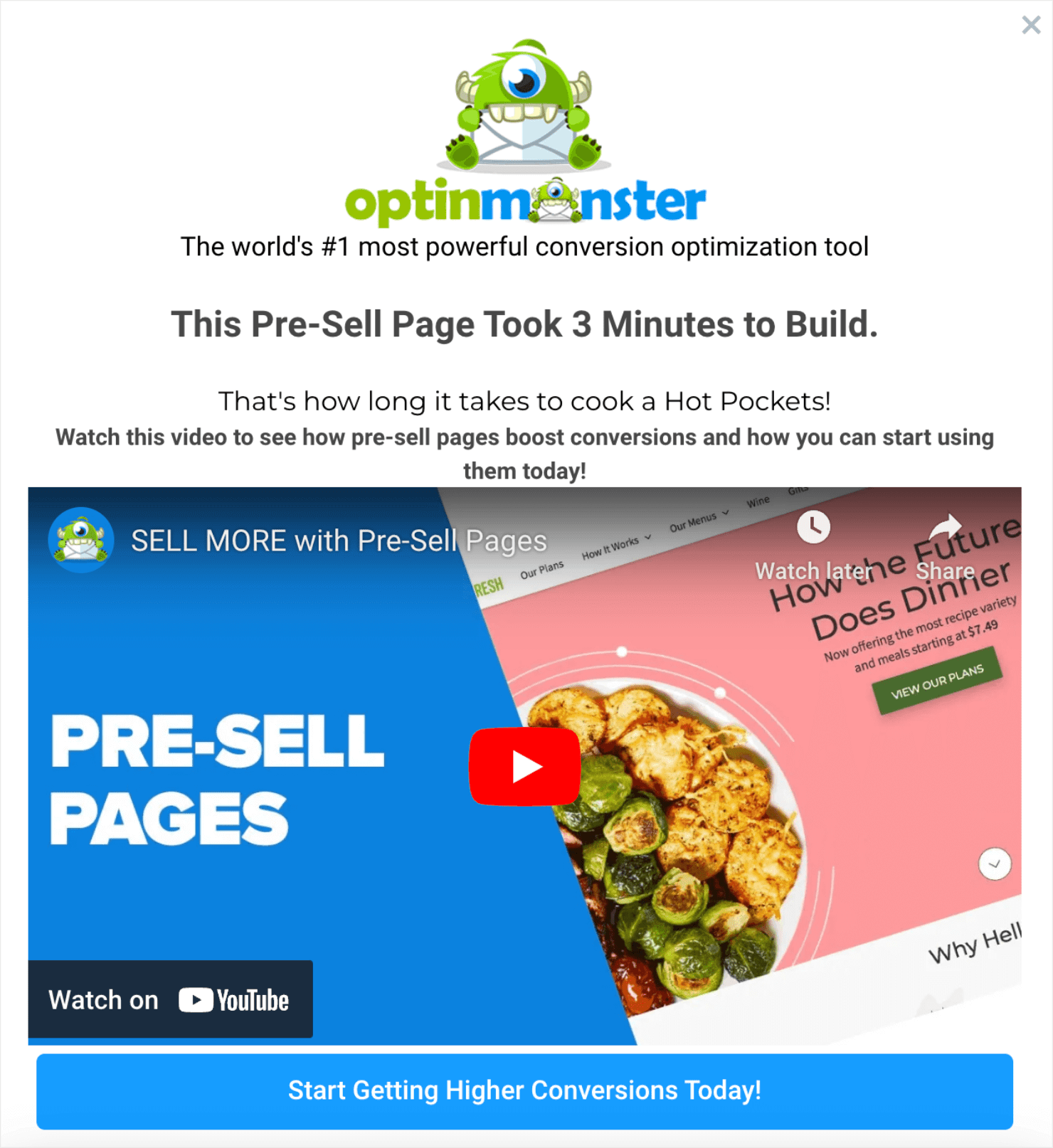
Here’s the pre-sell page campaign we’ll create today:
Step 1: Create Your Campaign
Creating a pre-sell page with OptinMonster is easier than you think. Just log in with OptinMonster and click Create New Campaign:
Then choose the type of campaign you want. For pre-selling pages, I’ll go with the Fullscreen campaign:
A Fullscreen popup is an ideal choice for this use case because it covers the entire webpage and acts like a landing page. A Fullscreen popup can also increase conversion metrics by as much as 80%.
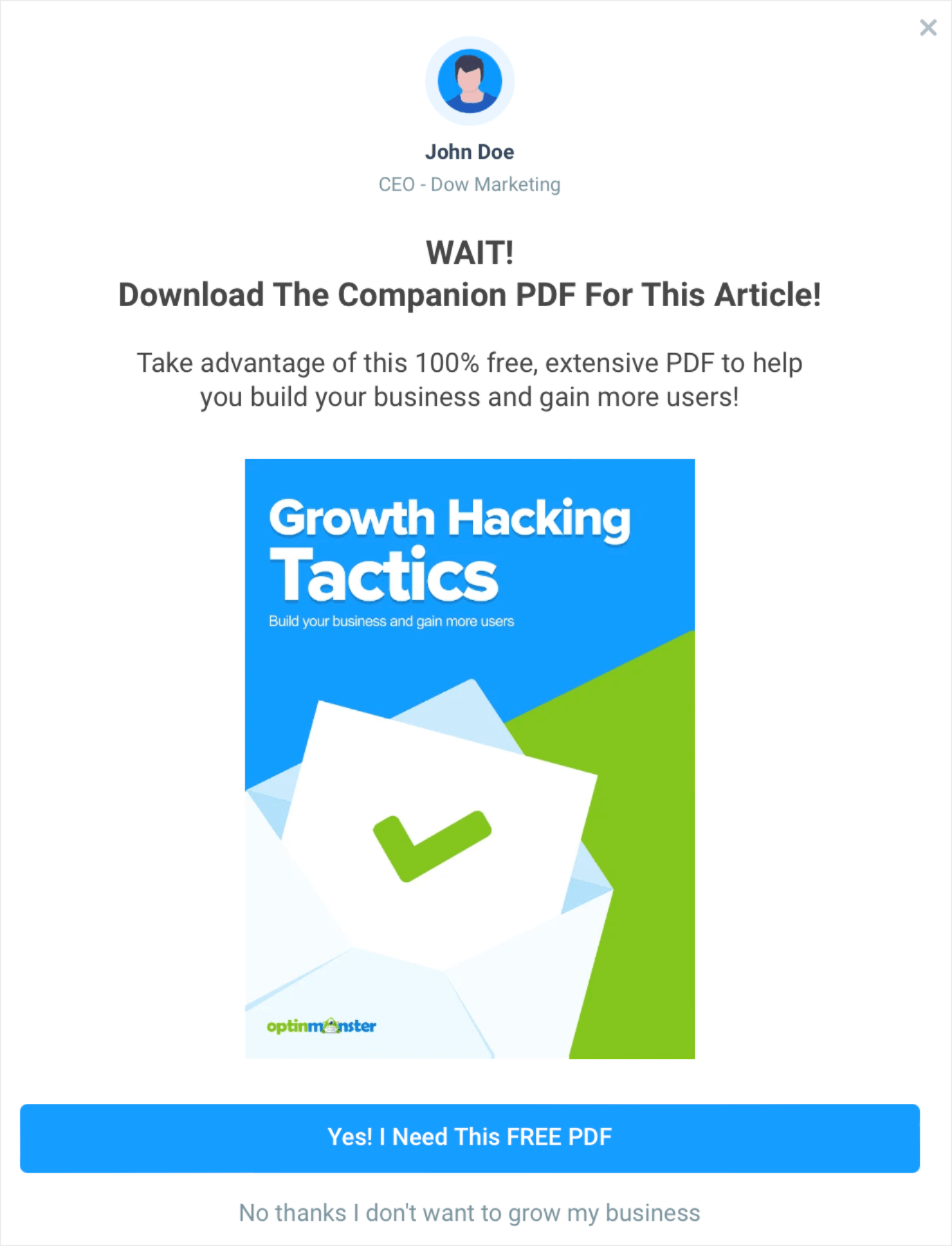
Next, choose your template. For this demo, I’ll use the Free PDF Download template:
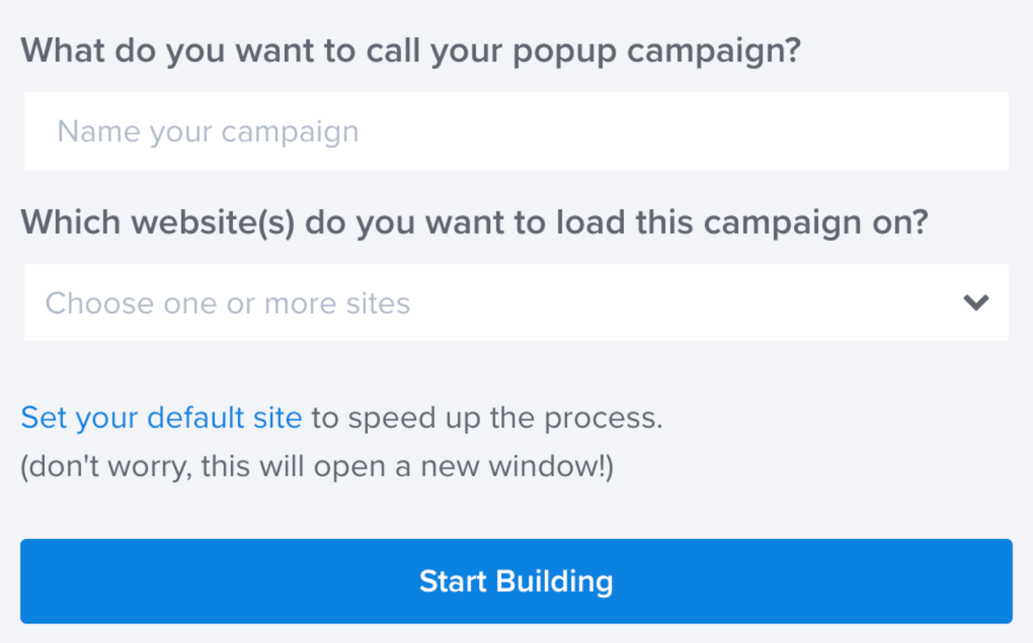
Then give your campaign a name and choose which website you would like it to appear on:
Now you can start editing the campaign’s appearance.
Step 2: Design the Template
This is how the template looks in the editor:
At the top of this template, you can upload a picture that matches your campaign goals. I’ll upload the OptinMonster logo in place of the default image that’s there.
To do this, hover over the image element in the editor and click on the gear icon that appears:
On the left-hand menu, click on the Content tab:
Hover over the image placeholder and click on the green icon to open the Image Selection option:
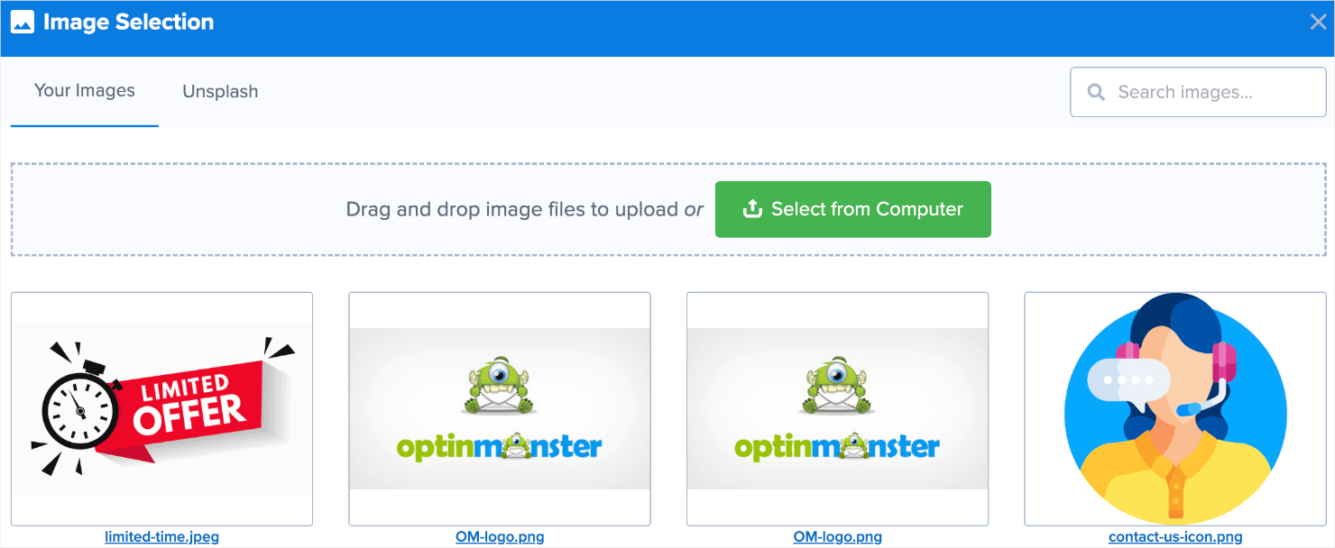
Click on Select from Computer to upload an image from your device. Since I already have the logo uploaded in my library, I’ll just click on the image to add it to the template:
The image now appears in the editor:
Next, change the text underneath to represent your brand and slogan:
Then change the heading and subheading to give upfront information about why your visitors are seeing that page.
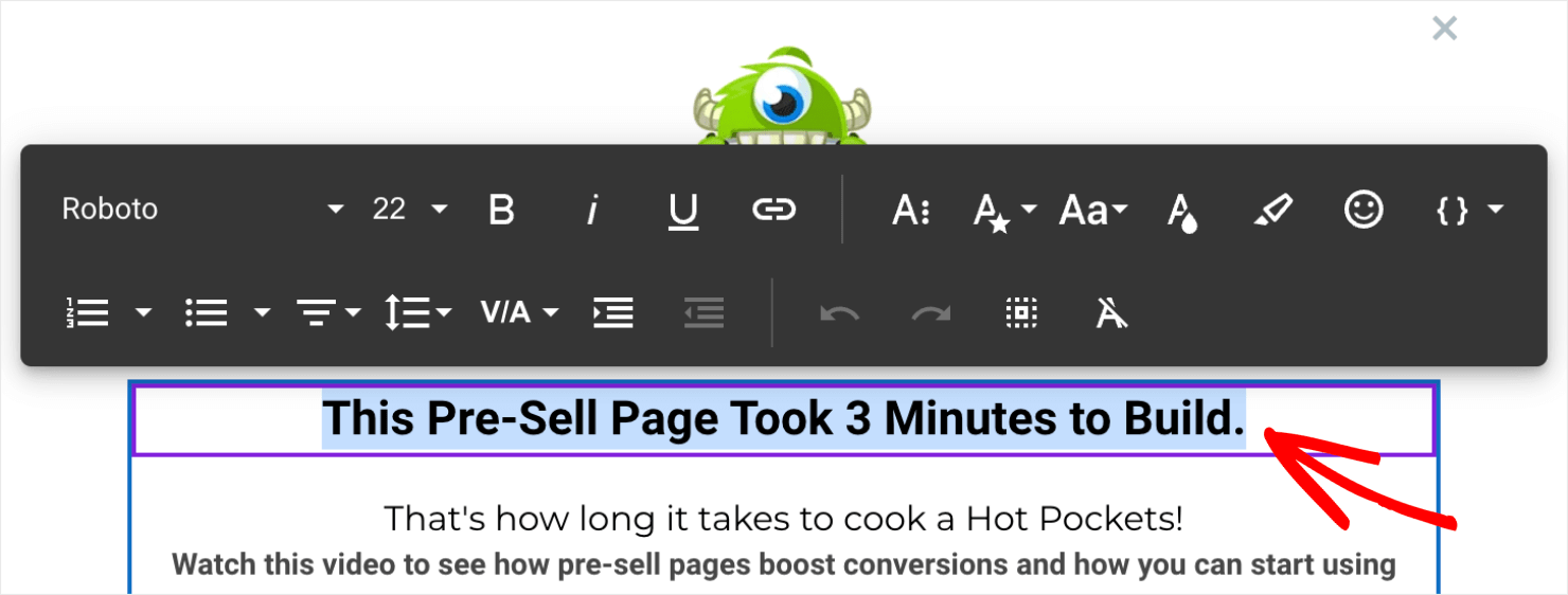
To do this, click on the text block and edit the copy directly in the editor:
Remember to keep the heading and subheadings short and to the point.
Like I mentioned earlier, using videos on a pre-sell page can help you avoid too much text. To add a video, click on the home icon on the left-hand menu:
You’ll see the Blocks menu appear:
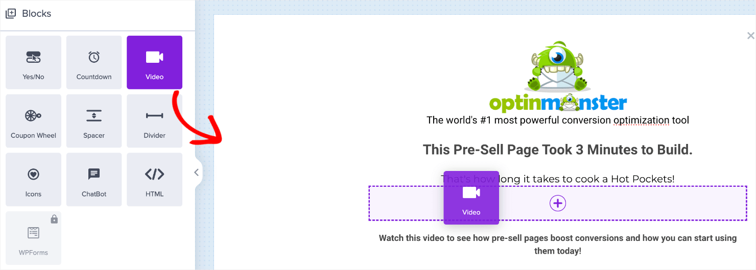
Locate the Video block from the options. Then, drag and drop it into the editor:
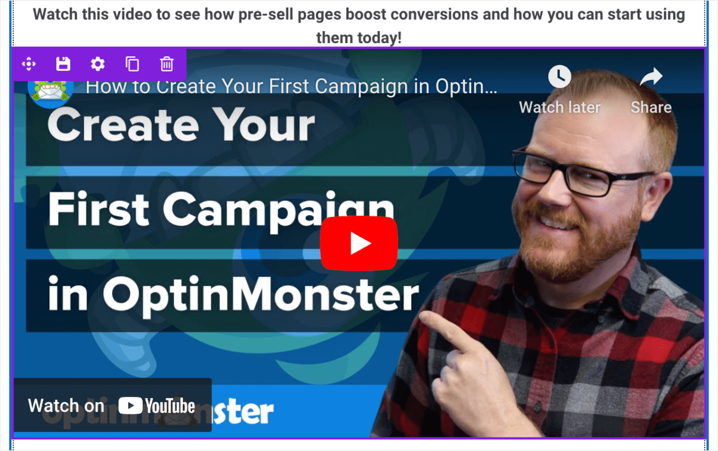
The default video that appears shows first-time users how to use OptinMonster to create their first campaign.
Click on the gear icon on to top-right to replace it:
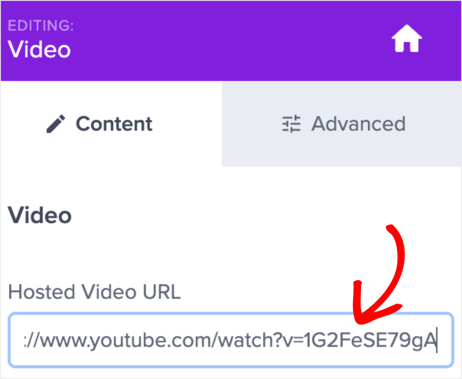
Now go to the Content tab and paste the URL of the video that you want over the existing URL:
Finally, delete the optin field block:
We’re deleting this because we don’t want a 2-step optin on our pre-sell campaign. We want 1 clear CTA that leads people to take a specific action.
Now, let’s add a Button block. Go to the Blocks menu, locate the Button block, and drag and drop it in the editor the same way you did with the video:
When people click on the button, you can redirect them either to a sales page or a checkout page:
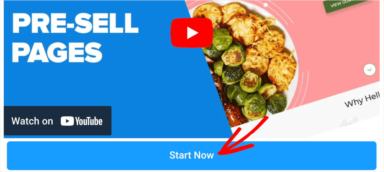
But first, let’s spruce up the button’s text. Click on the button element in the editor to change how the existing button copy reads:
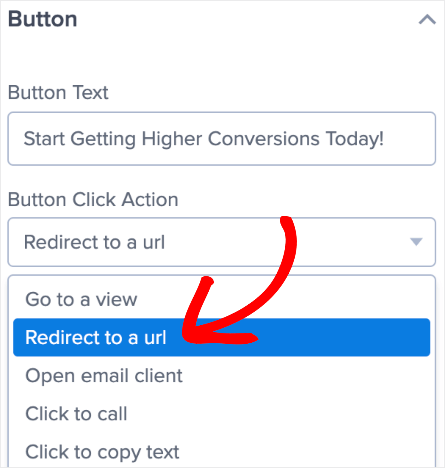
Here, you can also change what happens when people click on the button.
In the Button Click Action, I’ll choose Redirect to a url. That’s because I want customers to go to a different page after they click on the button.
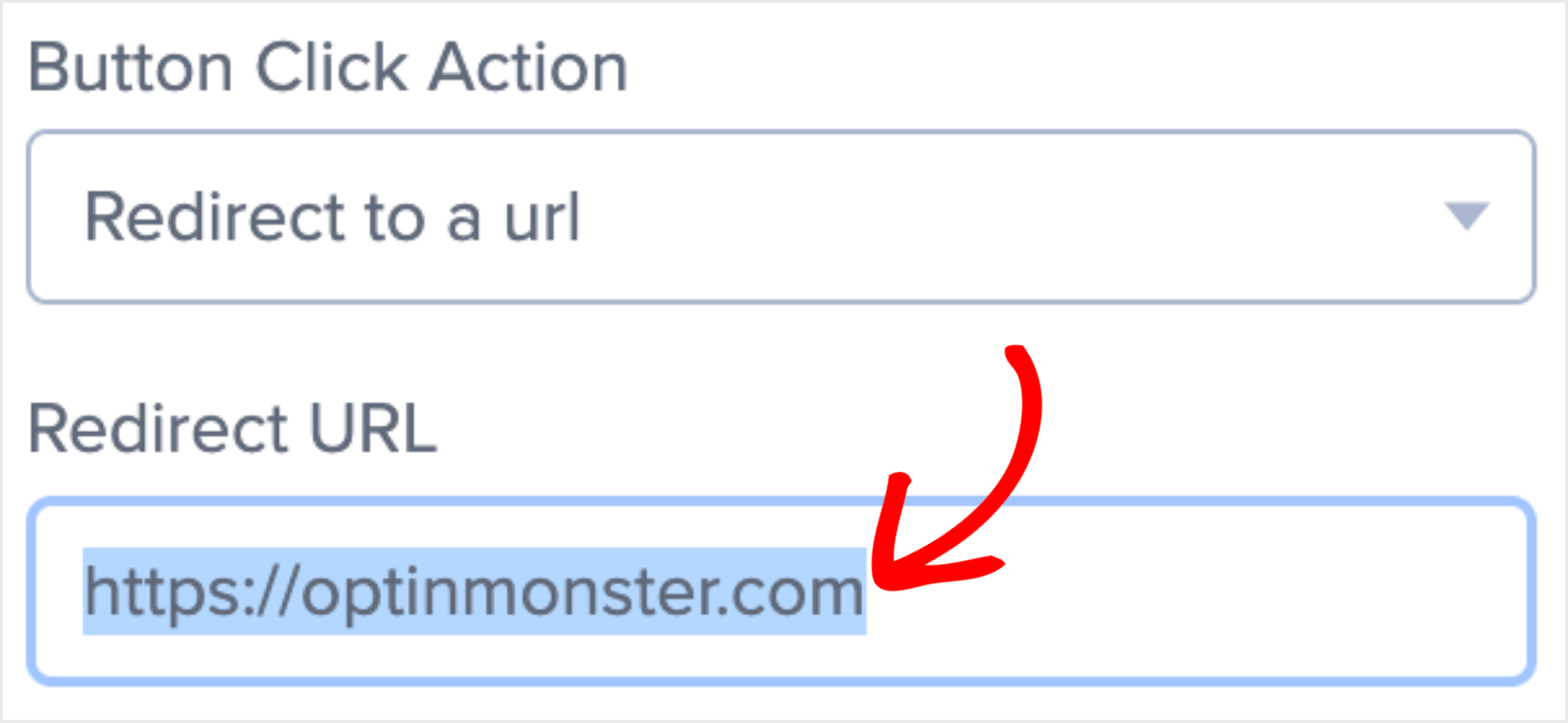
Then in the Redirect to a url field, enter the product page URL or the affiliate link that you want your visitors to go to. I’ll add OptinMonster’s website URL for demo purposes:
And with that, we have all the elements we need for this pre-sell campaign.
Remember that you can add as many elements to the campaign as you like. For instance, you can use the Blocks menu to add:
- Email Field
- Text
- Countdown Timer
- Icons
- Coupon Wheel
- Embed Forms
You can also add brand logos to showcase social proof or social media icons for people to follow your Facebook or LinkedIn pages.
For the tutorial, we’ll keep things simple and stick to what we already have. It’s also because we already have a great combination of text, images, video, and CTA.
Next, we’ll set the display rules so that you can decide when and where the campaign offers on your website.
Step 3: Set Display Rules
Click on the Display Rules tab at the top of your screen:
Here’s what the Display Rules are set to right now:
As you can see, OptinMonster’s default settings will:
- Show the popup to a visitor 5 seconds after they land on your website.
- Show it to visitors on every page of your website.
It’s up to you to decide if these settings work for your campaign. As a rule of thumb, it’s not a good idea to show a popup to customers on every page of your website.
So I’ll change the second setting to make sure the campaign appears on specific pages.
To do so, click on the is any page dropdown menu and select contains:
Here, you’ll need to enter the URL slug of the pages where you want the Fullscreen campaign to appear.
For instance, let’s say you have an eCommerce store that sells school supplies, toys, and board games.
You might have a website structure where each of your product pages includes the URL path, such as:
- www.mysite.com/school
- www.mysite.com/toys
- www.mysite.com/games
So if you’re creating a pre-sell page specifically for toys, you’ll have to enter the 2nd URL slug. To apply this condition, add the term ‘/toys’ in the field next to contains:
With that, we’re almost done!
Step 4: Save and Publish the Campaign
Click on the Save button on the top-right of the screen to make sure you don’t lose any changes you’ve made so far to the campaign:
Next, go to the Publish tab:
Click on the Publish option under Publish Status:
And that’s it. Here’s how the Fullscreen pre-sell campaign will appear on your website:
Ready to Create a Pre-Sell Page?
If you’re not using pre-sell pages, you’re probably losing out on potential sales opportunities. But you’ll never know until you have one on your website.
As you can see, building a pre-sell pages with a powerful headline, image, copy, CTA, and video takes less than 5 minutes. If you have a website that sells products, there’s no reason why you shouldn’t have a pre-sell page if it means more sales.
Sign up with OptinMonster today to improve your website’s conversion metrics and increase your revenue potential!




















Add a Comment