Email marketing still has distinct advantages over other marketing channels, making email lead generation vitally important to the growth of your business.
Building a targeted email list is much easier with the right tools. That’s why we’ve created this tutorial to guide you through creating a long-form optin, called a squeeze page.
Squeeze pages are not only effective, but they’re also actually pretty fun to create and navigate.
What Is a Squeeze Page?
A squeeze page is a special type of page designed for a single purpose: collect contact information. That’s it. ?
While you could take the time to create a special webpage for your squeeze page every time you need one, why not just use an optin? OptinMonster’s own Fullscreen template is a perfect option for creating a high-converting, long-form squeeze page.
We’re going to be using the Fullscreen template in this very guide!
How to Create a Squeeze Page Step-by-Step
Creating an effective, high-converting squeeze page is easy. Over the next 7 steps, we’re going to walk you through how to create a squeeze page, start to finish. Are you ready to have some fun?
Step 1. Build an Irresistible Offer
Before you design your squeeze page, you need to create something to offer visitors in exchange for their email address. This is called a lead magnet. They’re typically in the format of digital, downloadable content, like a free PDF checklist, report, eBook, whitepaper, or something else along those lines.
You can use psychographics like your visitors’ values, interests, and attitudes to create strong customer avatars that will help you make sure your offer and message are hitting the mark. Then, build an amazing lead magnet they can’t help but be drawn to.
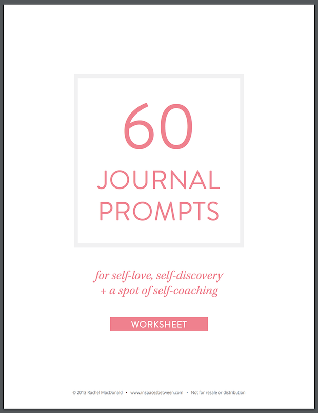
One self-help site offers their visitors a lead magnet of 60 journal prompts for “self-love, self-discovery + a spot of self-coaching.” This sounds like a perfect fit and exactly what their audience would be looking for!
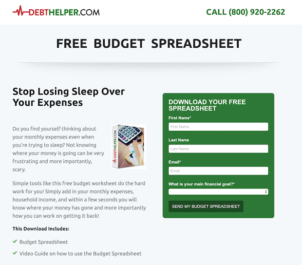
Here’s another example of a lead magnet offer from a budgeting website.
This site also knows exactly what will drive their visitors to part with their email addresses and offers just the right thing.
So, what will you offer? Here are some awesome lead magnet ideas to get you started. If you need a bit more, we have an execution plan on OptinMonster University that will take you from zero to having a lead magnet published in about an hour!
Once you have your lead magnet figured out, you’re ready to start drafting your squeeze page.
Step 2. Craft a Killer Headline
The first thing visitors are going to notice when they land on your squeeze page is your headline. If you want to get visitors past those 15 or so words, your headline has to be benefit-driven.
This means that, more than anything else, your headline has to clearly inform the visitor of the benefit your lead magnet will provide them.
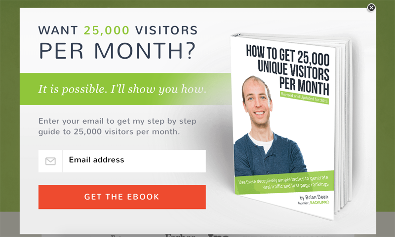
For a great example of a benefit-driven headline, take a look at this optin from Backlinko:
The headline is definitely attention-grabbing and the benefit immediately clear: who wouldn’t want to increase their traffic by 25,000 visitors per month?
If your headline doesn’t communicate the benefit of your lead magnet, visitors aren’t going to click and you’re going to miss out on leads.
Check out our guide to creating high-converting headlines for help with this step.
Step 3. Write a Compelling Supporting Headline
Sometimes visitors will be intrigued by the headline, but not quite ready to sign up. For those visitors, a compelling supporting headline is a must.
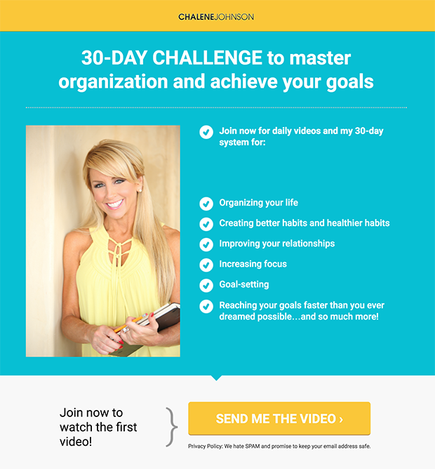
Chalene Johnson nails the supporting headline in this optin:
The headline does a great job on its own, but for those who aren’t convinced, the supporting headline sells it. For more advice, see these expert tips for writing landing page copy that converts.
Step 4. Choose the Right Imagery or Video
Including a 3 to 10 minute video on your squeeze page can increase conversions by up to 80%. Wild, right?
People find videos incredibly engaging and videos do a great job of increasing the length of time visitors stay on your site. This comes in handy for search engine rankings.
If you don’t have a video to use, just choose an image that is consistent with your page’s design. You can also take a page out of Backlinko’s book and create an image showing the lead magnet that visitors will be getting once they sign up!
Step 5. Include the Best Social Proof
Social proof, like testimonials from current satisfied customers, is also a great addition to a high-converting squeeze page.
You’ll want to use testimonials that include results, or that gush over the product. Even better if they do both!
Testimonials like this are your reward for having a great product or great service, and your potential customers are going to respond to that.
Step 6. Create the Perfect Call to Action
A call to action (CTA), quite simply, encourages a visitor to your site to take action. “Buy now,” “click to subscribe,” and “book a demo” are all examples of calls to action.
Your call to action should be specific; the more specific it is, the easier it is for a visitor to follow it.
A strong call to action gets the conversion. To help, here’s our guide on how to write the perfect call to action.
Step 7. Build an Awesome Squeeze Page in OptinMonster
Now we get to take what we’ve learned in the first 6 steps and put it together into a killer squeeze page using the Fullscreen template from OptinMonster.
This is by far the easiest way to create your squeeze page and you can get started with OptinMonster in about 60 seconds.
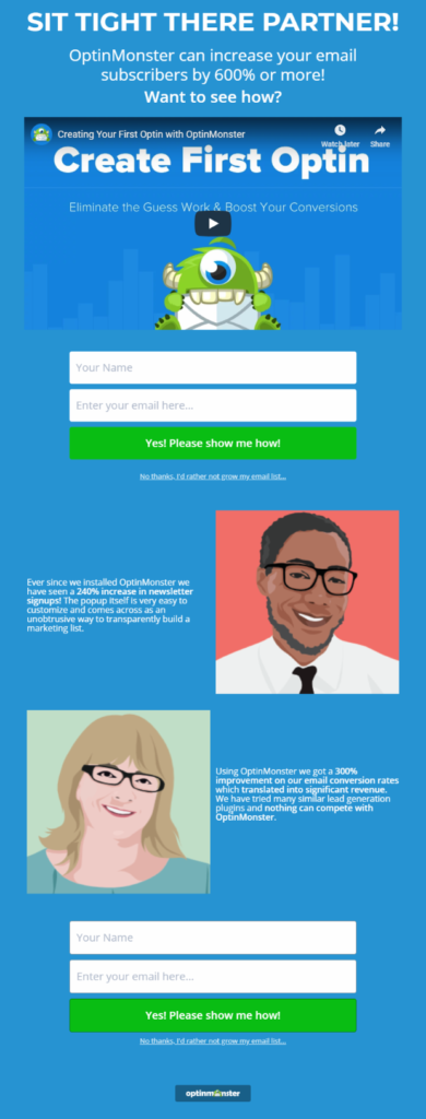
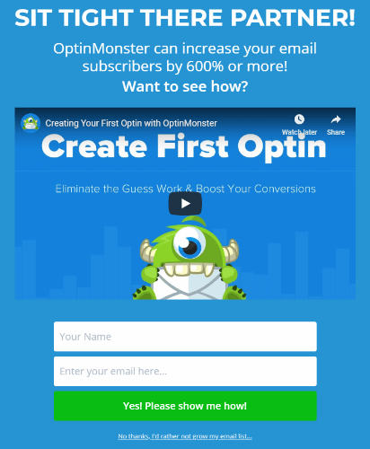
Here’s what our page will look like:
You’ll start at your OptinMonster dashboard.
Create a New Campaign
Once you’re logged in to OptinMonster, click the Create Campaign button to create a new optin campaign.
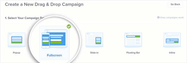
Select the Fullscreen campaign type to create your squeeze page.
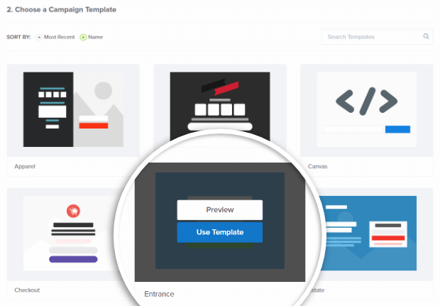
Next, select the template you want to use. We’re going to use the Entrance template for our campaign. You can select the template you want by hovering your mouse over the template and clicking the Use Template button. You also have the option to Preview the template.
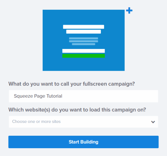
Now, name your campaign, add the website you’re using it on, and click Start Building.
Design Your Campaign
Right after you click Start Building, you’ll be taken into OptinMonster’s drag and drop campaign builder. Each template comes with a cool default design that just needs your personal touches to be ready to launch on your own site, so we’re only going to be adding to what’s already here.
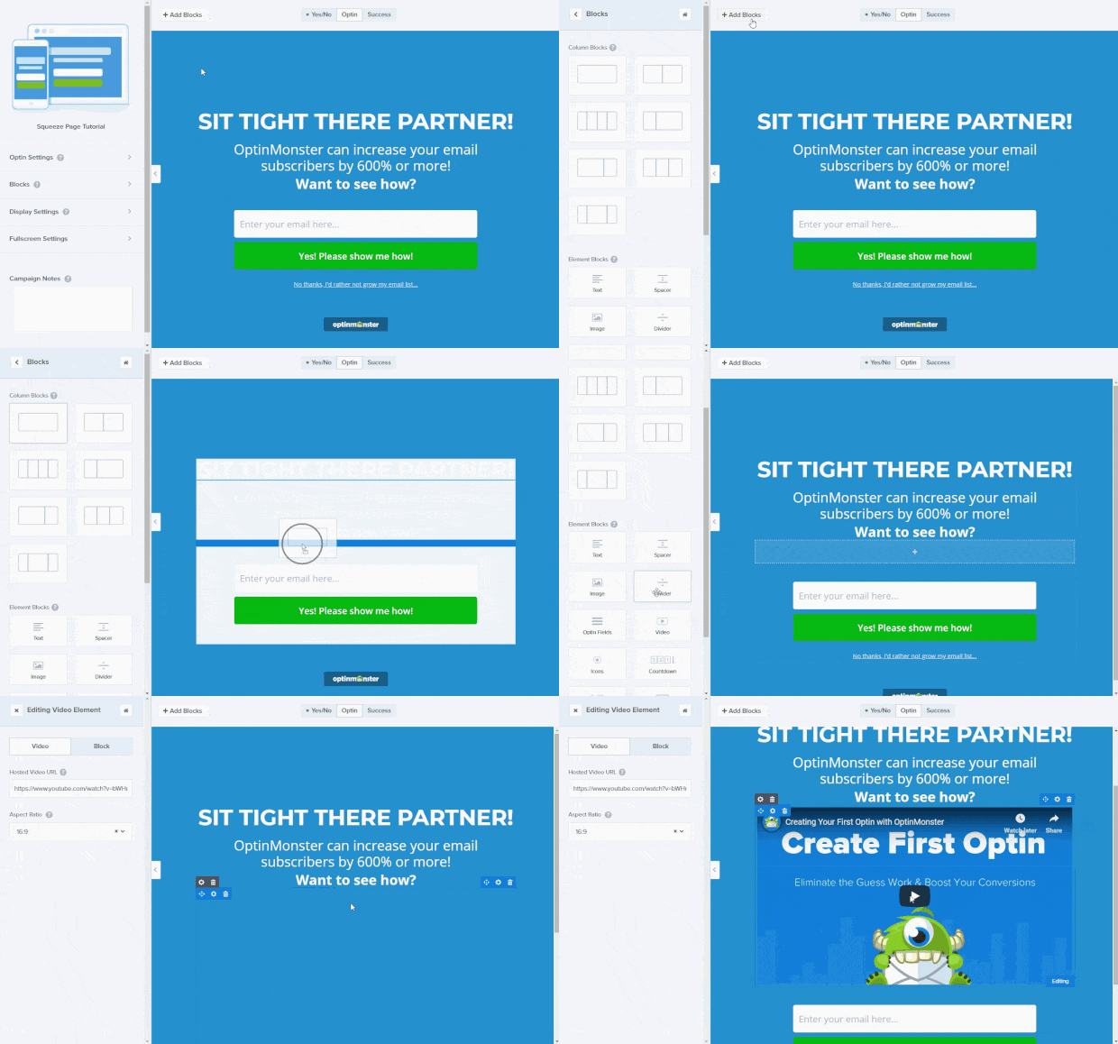
Let’s start by adding a video.
To do that, we’re going to click +Add Blocks then drag and drop the blocks you want from the editing tools on the left to where you want to place them in the live preview on the right, like this:
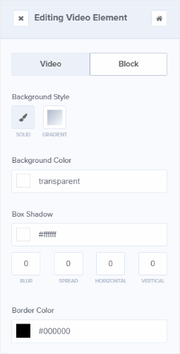
You can edit the video URL or aspect ratio, or edit the block formatting by clicking the corresponding button in the editing tools.
We have our block set up with a top margin of 20px. You can set this in the Block tab.
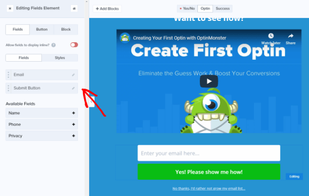
Now that we have our video added, we’re going to move on to our first optin section. Click on the optin fields in the live preview to bring up the editing tools to the left.
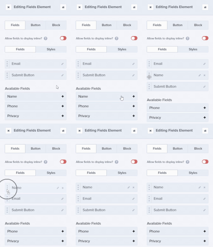
The only thing we need to do here is to add the Name field. To do that, simply click on the Name field in the Available Fields section. Then, drag the Name field so that it appears before the Email field in the Fields list.
Here’s what our squeeze page looks like so far:
Pretty cool, right? We’re at the halfway point and it’s only been about 5 minutes. And that’s if you had to sign up for an OptinMonster account!
Next, we’ll add our social proof.
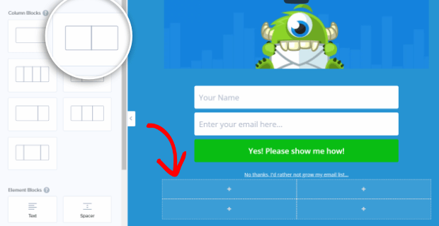
For this tutorial, we’re using 2 of the blocks that are divided down the middle. This will keep our testimonials formatted nicely. Remember, adding blocks is as easy as drag and drop!
Now that you have your sections in place, you can add your testimonial text and images.
We went with a staggered text and image to add interest, but you can set your squeeze page up however you want.
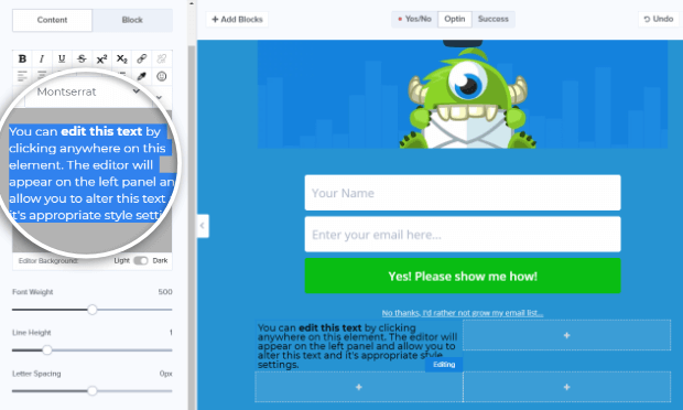
Let’s start by adding and editing a text block.
In addition to adding our customer testimonial text, we’re going to make these changes on the Content tab:
- Font: Open Sans
- Color: hex code #FFFFFF
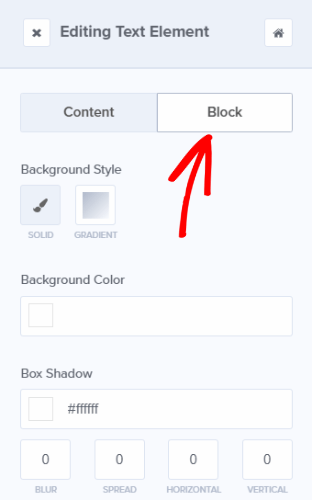
Next, we’re going to the Block tab
On this tab, we’re going to set the top margin to 165px.
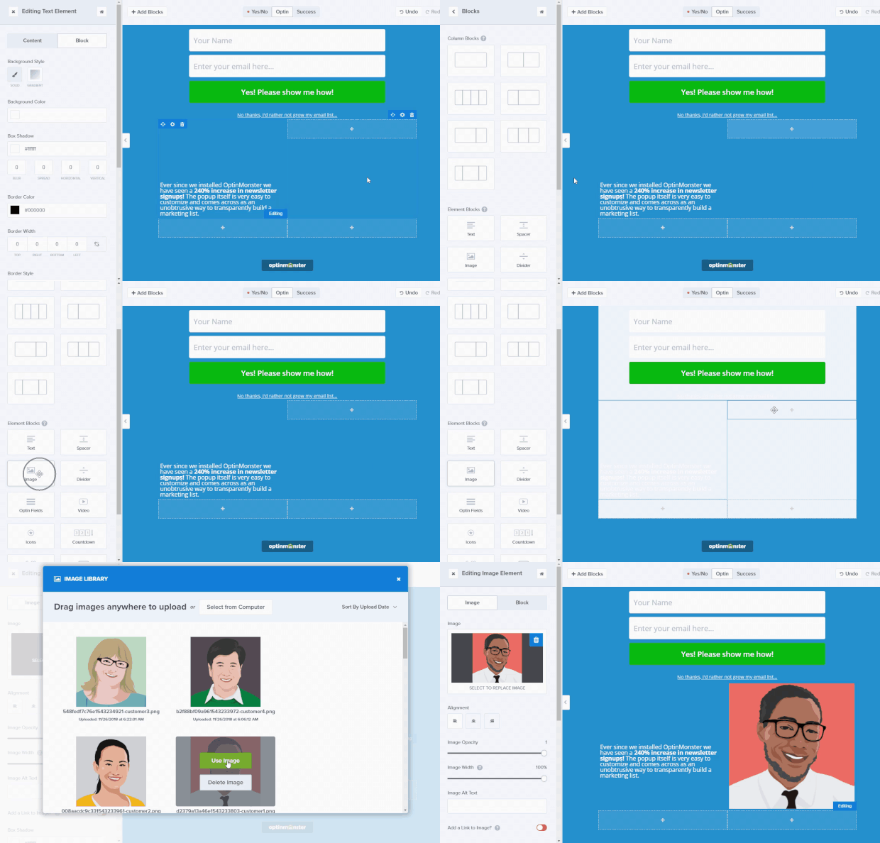
Now, let’s add an image for this testimonial. To do this, click on the + Plus symbol in the empty box in the next section to bring up the blocks in the editing tools. Drag and drop the image block to the empty block next to the text you just added and select an image or upload one:
The only edit we need to make here is to go to the Block tab and set the top margin to 40px. You may need to go back to your text block and adjust the top margin to make sure you like the way it looks.
Using the same process, go ahead and add your second customer testimonial. Here’s what ours look like once they’re completed:
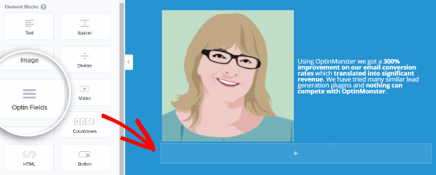
The last piece of the squeeze page is adding our final set of optin fields after the testimonials. It’s probably taken longer to find just the right testimonial than it has to put this page together, hasn’t it? ?
Click the + Add Blocks button to add a new block. We’re going to use the large, single block this time. Drag and drop it over to your live preview, just under your testimonials.
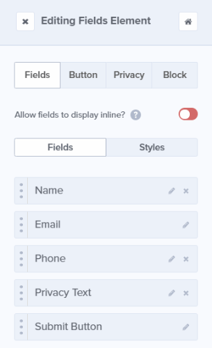
Here are all of the things you can edit for the optin fields:
We want to match our second optin to our first, so we got rid of the Phone and Privacy Text fields to start. You can do that by clicking the X next to the field.
Now, click on the Block tab and scroll down to the Padding. Set the right and left padding to 12%. Then, set the top Margin to 40px.
Next up, let’s change the button to match the button from our first optin section. Click on the Button tab and make these changes:
- Text: Yes! Please show me how!
- Color: Hex code #12be00
- Font Color: Hex code #fff
- Font Size: 20px
- Font Weight: 600
- Border Radius: 4px
- Padding, Top/Bottom: 20px
- Padding, Left/Right: 12px
- Margin, Bottom: 8px
We also need to change the Hover settings for our button. We can do that by going to the hover tab, clicking on Copy Regular Styles and changing the background color to hex code #13cd00. This will give the button a glowing effect when the mouse hovers over it. Neat!
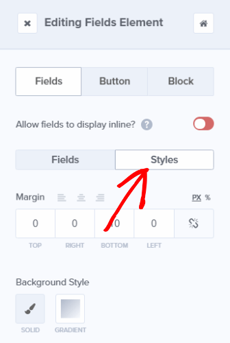
Now that our button is how we want it, let’s edit our optin field styles by clicking on the Fields tab and then into the Styles section:
Here we’re just changing the Border Radius to 4px and the Top/Bottom Padding to 15px.
We just need to add our opt-out button and we’ll be done with our design!
By now, you’re a pro at this, so go ahead and click that + Add Blocks button and drag and drop a button block right underneath your super cool yes button.
Here are the changes we made to our opt-out button:
- Text: No thanks, I’d rather not grow my email list…
- Font Color: rgba(255, 255, 255, 0.84)
- Font Size: 13px
- Text Decoration: Underline
- Border Style: None
- Border Radius: 0
- Padding: 0
We also need to make changes to the hover formatting. Click into the Hover section and then click on Copy Regular Styles. This will take care of most of the formatting for you. From there, we only need to change the font color to hex code #ffffff.
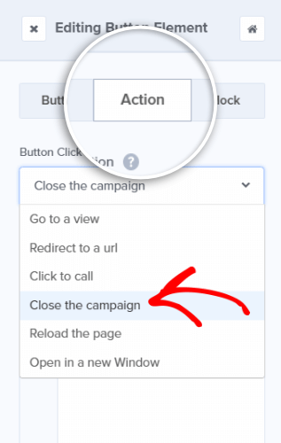
When a visitor clicks the opt-out, we want the squeeze page to close and our regular website to show, so we’re just going to set the button action to close the campaign. To do that, click the Action tab and select Close the campaign from the Button Click Action dropdown.
Save your squeeze page by clicking the Save button in the upper right corner.
Our design is solid. It’s time to move on to our display rules.
Decide When to Show Your Squeeze Page
We can use Display Rules to tell our squeeze page when to show up.
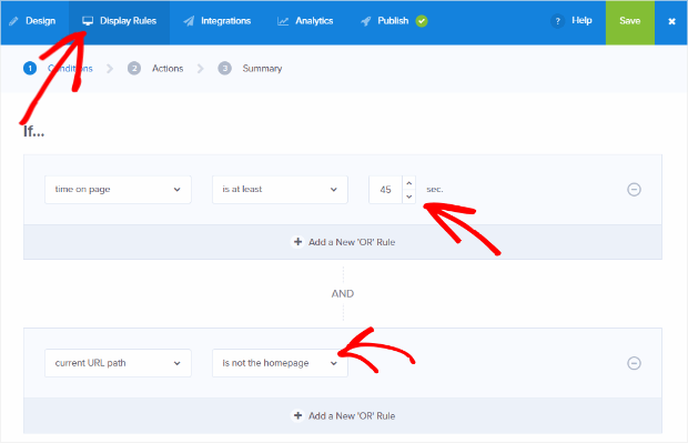
To do this, go to the Display Rules tab. You’ll see that the default rules are set to show optins on any page after 5 seconds. You can delete a condition by clicking on the – Minus button next to it.
For this tutorial, we’ve set our page to appear after 45 seconds and not on our homepage. Go ahead and make those changes.
Then, click the Save button.
Add Your Email Service Provider
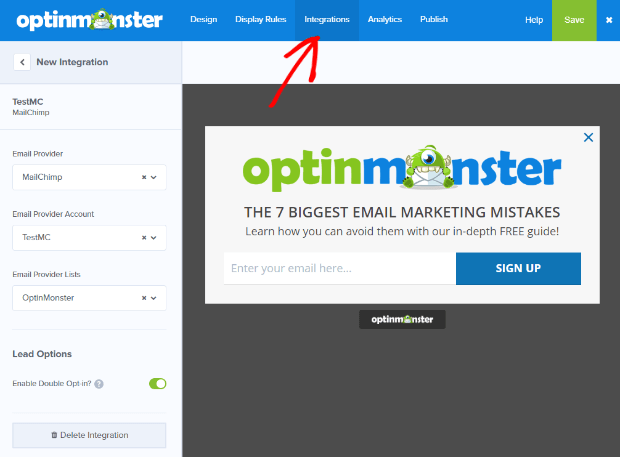
To collect email addresses with your optin fields you’re going to have to connect your Email Marketing Service Provider through the Integrations tab. OptinMonster integrates with all major email marketing platforms. Find your email marketing platform integration instructions here!
Here’s an example of what Mailchimp integration looks like:
Don’t Forget! If you’re offering a lead magnet you’ll need to set up your email provider to send that lead magnet to subscribers once they sign up!
Track Your Results
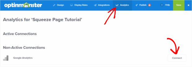
The final step before publishing your squeeze page is to set up analytics so you can always stay on top of how your squeeze page is performing and make adjustments if needed. If you don’t have a Google Analytics account, sign up for one here.
Go to the Analytics tab and click the Connect button next to Google Analytics.
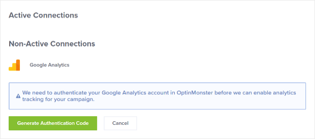
In the screen that comes up, click the green Generate Authentication Code button.
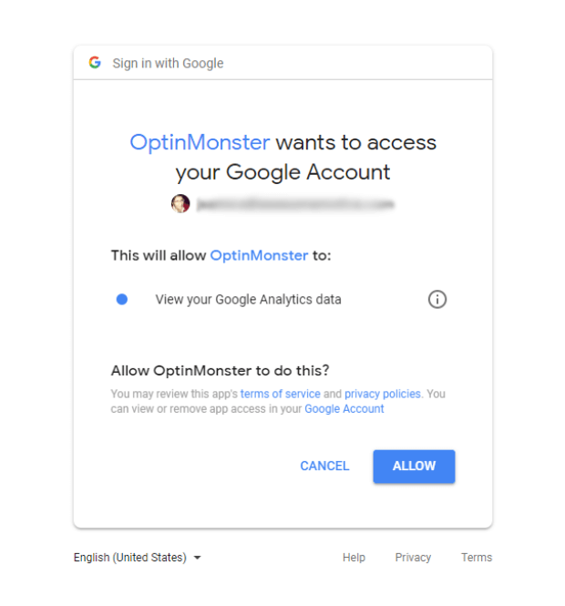
A new browser tab will open up to ask you if you will allow OptinMonster to view your Google Analytics data. Click the blue Allow button.
Next, it will give you a code. Copy this code, and then go back to the browser tab with your OptinMonster edit screen.
Paste the code into the Authentication Code field. Then, give your Google Analytics account a name in the Account Label (just pick a name that will help you remember which account you are connecting to). Hit the green Next button.
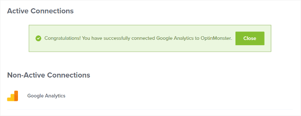
You should see this success message after clicking Next:
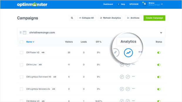
Now you’ll be able to get data from Google Analytics and see your conversion rate right from your OptinMonster account by clicking on the analytics icon next to your optin form:
Publish Your Squeeze Page
Now we’re ready to publish!
To do this, click Publish in the top menu and change the Status from Paused to Live.
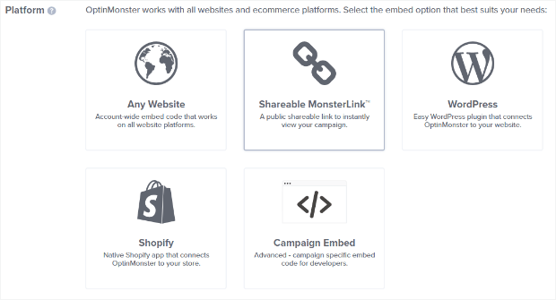
Scroll down the Publish page a little bit to see OptinMonster’s range of publishing options. If you need more information, take a look at the documentation for embedding OptinMonster on your site.
Test and Revise
One of the best ways to ensure that your squeeze page is converting leads and sales effectively is to split-test.
This doesn’t mean making changes to your page just for the sake of making changes. The purpose of split-testing, also called A/B testing, is to try specific changes to your marketing against existing marketing to determine what works best.
And, split-testing works.
Logic Inbound spent the time to split-test their call to action with jaw-dropping results: a full 1500% increase in conversions over their original CTA!
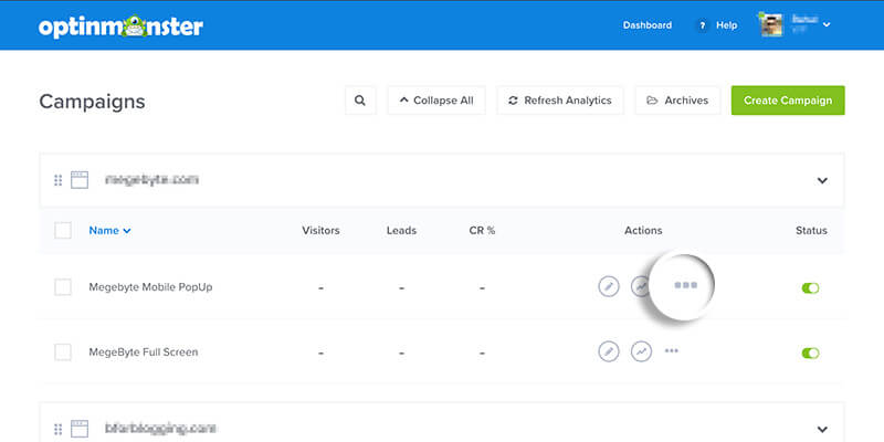
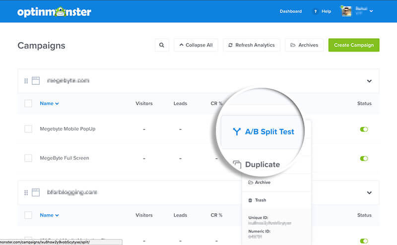
Split-testing in OptinMonster is really easy. From the OptinMonster Dashboard select the More Options button.
Next, select the A/B Split Test option from the dropdown list.
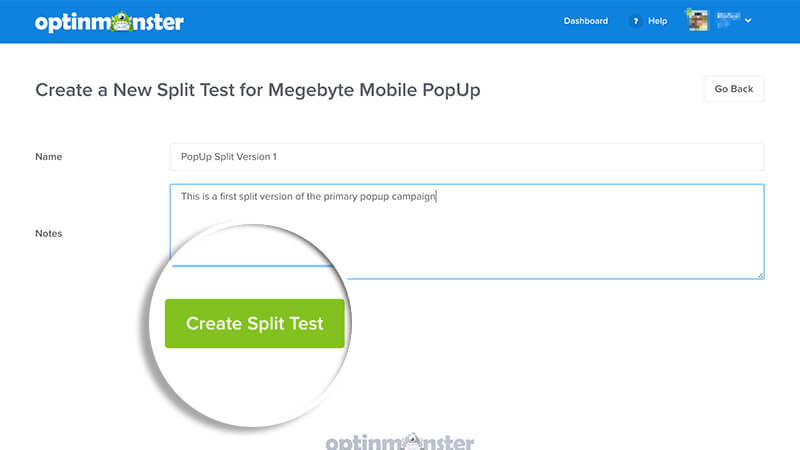
On the next screen, you’ll be required to add a Title and can also add Notes for your new split test. We strongly recommend adding notes about the changes you made to the split-test optin so you remember what changes you made, what worked, and what didn’t later on.
Click the Create Split Test button and you’re done.
That’s it! From start to finish, creating a squeeze page with a video, client testimonials, and 2 optin sections takes about 15 minutes (we timed it ?). If you want even more control over the look of your squeeze page, you’ll love the freedom of our Canvas template that lets you design your own optin using HTML, CSS, JavaScript, and even WordPress shortcodes.
Need something a little simpler than a squeeze page? Create a simple landing page instead! ?
Are you looking for more ways to get the most out of OptinMonster? Subscribe to our YouTube channel!












Add a Comment