Are you trying to create a responsive optin form that looks great on mobile, desktop, and any screen size in between?
Responsive design is very important now that so many users browse the Internet from smartphones.
If your site uses optin forms to generate leads and grow your email list, you need to make sure those forms are responsive and mobile-friendly.
In this article, we’ll share a step by step tutorial on how to create responsive forms on any website.
Let’s get started!
What Is A Responsive Optin Form?
First, let’s review what it means for a form to be responsive.
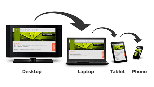
Responsive web design allows the layout to adjust to fit the user’s screen. The content, navigation, and element design may change depending on whether the user is on desktop, tablet, or mobile. Sometimes even the functionality may change based on the screen size.
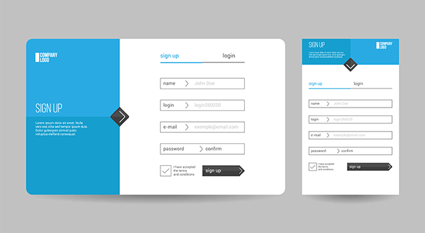
A responsive online form usually resizes the form fields for different screen sizes. The form elements may also be stacked instead of side by side. Some form design elements like images may be left out of mobile responsive forms to speed up page loading.
Benefits of Responsive Web Forms
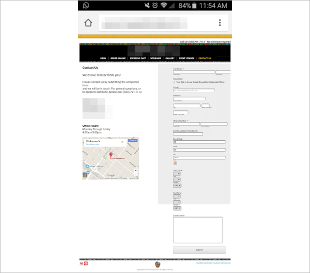
Responsive forms are important for creating the best user experience for more people. For example, this non-responsive form simply shrinks on a small screen and is very difficult to read.
Given the popularity of mobile devices, making your forms responsive makes them more effective for lead generation.
In fact, The Advisor Coach used responsive optins to triple their conversion rate. Their responsive optins took advantage of the lower cost of mobile advertising on social media platforms by targeting mobile users. Then they created mobile-specific responsive optins that converted up to 58% of readers.
With all the different devices available now, you can’t always predict what screen size someone will be using. Responsive design lets you automatically adjust your web page layout for every reader.
How Do I Create A Responsive Optin Form Without Coding?
Fortunately, it’s very easy to create a responsive form. You don’t even need to know how to code HTML or CSS! All you need is a plugin like OptinMonster.
OptinMonster is the best lead generation software ever for building mobile-specific responsive forms. With just a few clicks, you can create optin campaigns like:
- Popups
- Floating bars
- Fullscreen welcome mats
- Slide-in scroll boxes
- Content lockers
- Spin to win discount wheels
Best of all, all of OptinMonster’s templates and custom-built forms are automatically responsive. There are also mobile-specific templates available for even better results.
You can also add extra fields to your optin forms. Without any coding, you can capture more than basic contact information by adding custom fields like:
- Text Areas
- Numbers
- Dropdowns
- Radio Buttons
- Checkboxes
- And more!
In addition to designing beautiful mobile campaigns, OptinMonster lets you target those campaigns to your most engaged mobile users. You can mix and match OptinMonster’s precise display rules to show the right message to the right person at the right time.
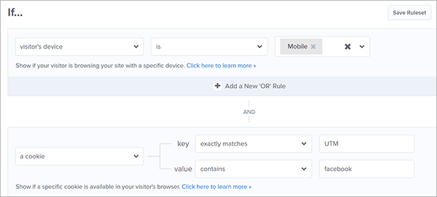
For example, you can combine the device and cookie display rules to retarget mobile users who have already seen your ads on Facebook.
Or you can combine the device and geolocation display rules to target mobile users who are close to your storefront.
OptinMonster works on WordPress websites, Shopify stores, and any other platform you can think of. Plus it integrates with a variety of marketing tools directly and through tools like Zapier.
The possibilities are truly endless with OptinMonster. Check it out for yourself!
If you’re still on the fence, we’ll show you exactly how to create a responsive optin form with OptinMonster. It truly couldn’t be easier.
Step 1: Install OptinMonster
The first step is to subscribe to an OptinMonster plan. Mobile responsive forms are available on all plans, including the Basic plan. Pricing starts at just $9/month. You can get more pageviews and advanced integrations through the Plus, Pro, and Growth plans.
Once you’ve signed up for OptinMonster, it’s time to create your first campaign!
Step 2: Create A Mobile-Specific Campaign
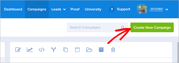
From the OptinMonster dashboard, click the Create New Campaign button.
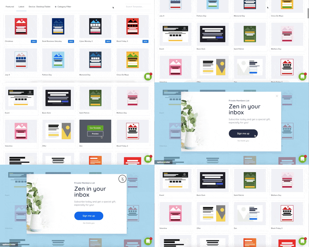
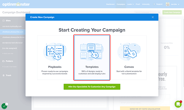
Next, click on Templates.
For this tutorial, we’re going to use a mobile-specific template. All of OptinMonster’s optin form templates and canvas design elements are responsive by default, but we’ll use an optimized mobile-specific template for even better results.
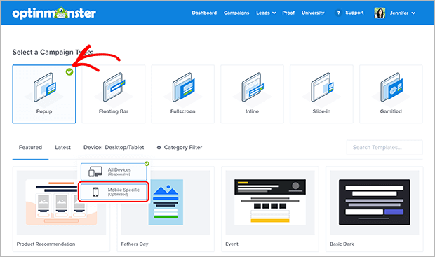
Choose the Campaign Type you want. We’ll be creating a simple responsive popup. You can also create floating bars and slide-in campaigns, make an inline form that can also be placed in a widget, or build a fullscreen welcome mat to use as a landing page.
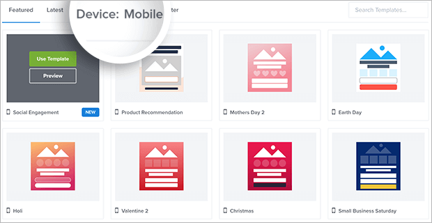
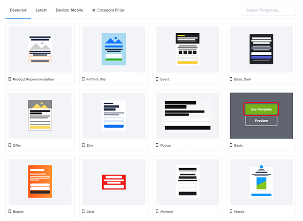
Next, click on Device: Desktop/Tablet and select Mobile Specific.
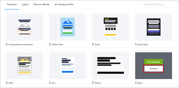
If you want, you can preview a template before you choose.
When you find one that you like, click Use Template. For this tutorial, we’ll use the Basic template and customize it in the next step.
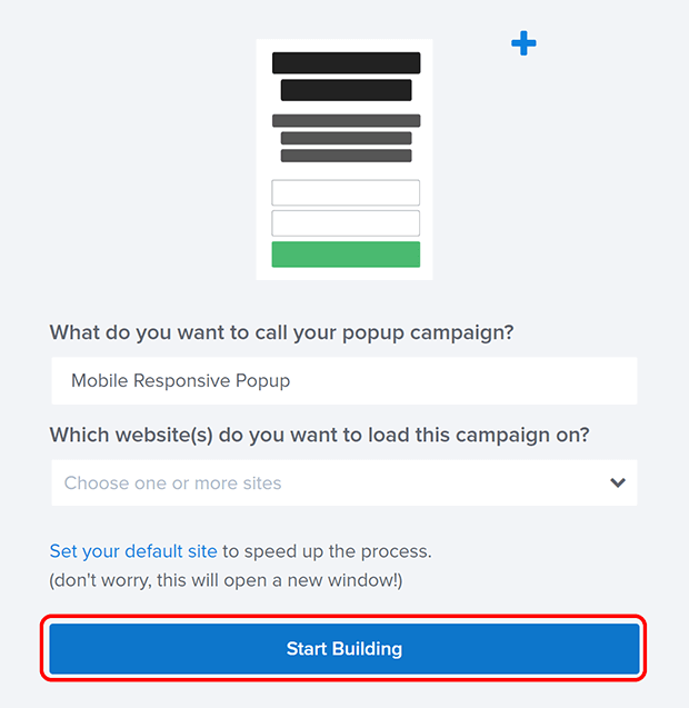
Give your campaign a name. Don’t worry about adding it to your website yet, we’ll do that later. Click on Start Building when you’re ready!
With OptinMonster’s drag and drop form builder, you can click directly on any element to edit it. You can change the text, the font styling, colors, and more. Here’s a video walkthrough of the drag and drop builder if you need some help.
You can add a phone number custom field to your optin form by clicking on the Optin Fields block in the builder. Click on Add a New Field and choose the Phone Field.
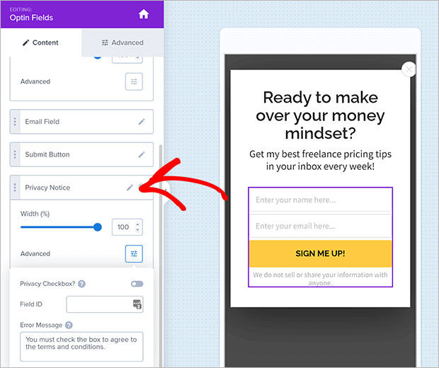
OptinMonster even has built-in GDPR tools so you can create compliant responsive forms with just a few clicks. Click on your Optin Fields and scroll down to the Privacy Notice options. Click on Advanced to customize your GDPR consent settings.
You can add a privacy checkbox that must be checked before the optin is successfully processed. You can also customize the error message that displays if the privacy checkbox is not checked.
Once your optin looks the way you want, click on Success to customize the success view. This is what the visitor sees after they opt into your responsive form.
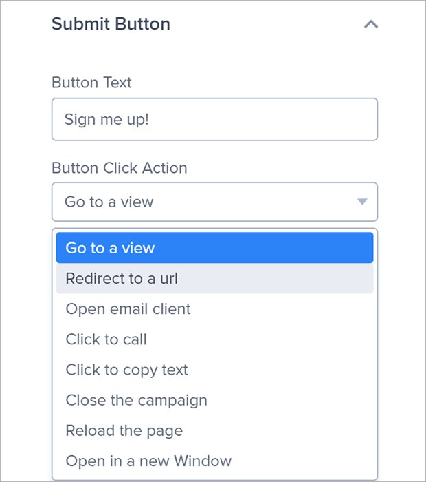
There are also several other actions you can link to the submit button, such as redirecting to a landing page, click to call, or closing the campaign. To choose one of these alternate actions, click on the Submit Button section in the Optin Fields block.
You can also add a Yes/No view to boost conversions. Here are some creative ways to use Yes/No popups and a step by step tutorial for how to create Yes/No campaign.
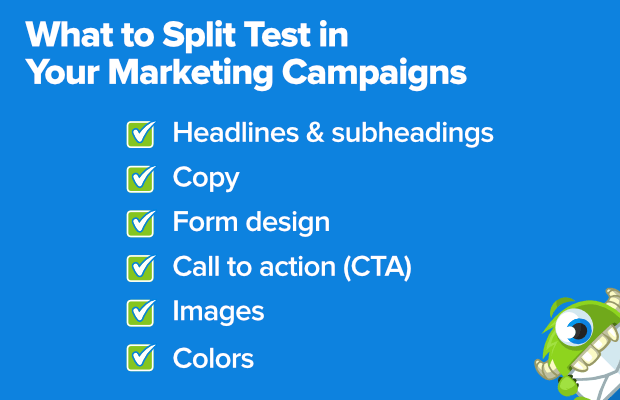
If you’re not sure which messaging or design will be most persuasive, OptinMonster makes it easy to A/B test your campaigns.
Once you’re finished with the campaign design, click Save. Now it’s time to make sure the right visitors see it.
Step 3. Set Display Rules
Because we selected a mobile-specific template, your popup is already set to display only to mobile users.
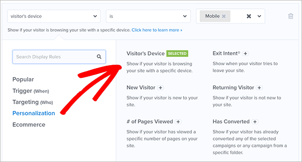
If you’re using a template that isn’t mobile-specific, all you need to do is add a display rule targeting Visitor’s Device.
You can find this under Personalization or simply search for the term “device.”
You can set it to mobile only or add tablet and desktop as needed. For this campaign, we’ll be displaying to mobile only. Again, if you chose a mobile-specific template earlier, you can skip this step!
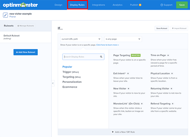
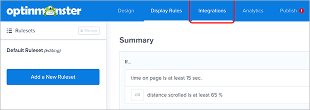
Feel free to add and edit the display rules as needed for your website and audience. In this example, we want to target mobile users who are pretty engaged with the content. To do this, we use Time on Page or Scroll Distance to select users who have spent awhile on the page or scrolled down more than halfway.
You can also set the popup to appear when the visitor is about to leave, hasn’t been active for a certain time, comes in through a specific referral, or any of the many Display Rules available in OptinMonster.
When you’re done, click Save. Now we’ll connect OptinMonster to your email list.
Step 4. Integrate Your Email Marketing App
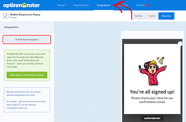
First, click on the Integrations tab.
Next, click on Add New Integration.
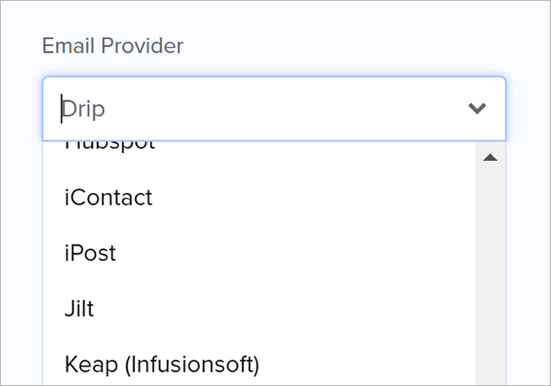
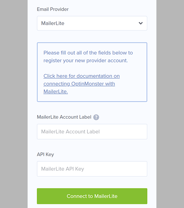
Choose your email marketing provider from the dropdown list and follow the provided instructions.
Each provider works a bit differently, so we’ve provided additional documentation for connecting with different email providers like MailChimp or Aweber.
After you connect your email provider, click on Save. All that’s left is to add OptinMonster to your website.
Step 5. Add OptinMonster to Your Website
We’re almost done! Now we’re going to connect your website to OptinMonster.
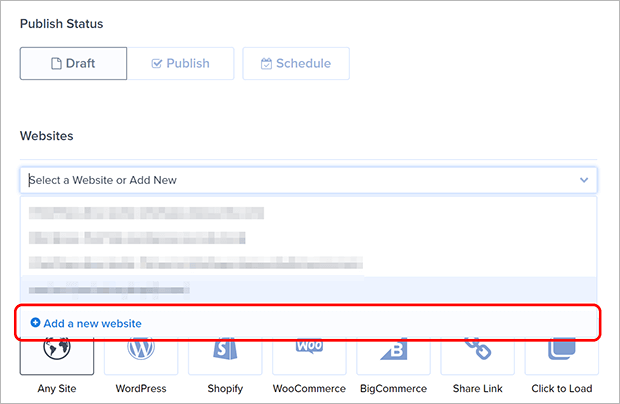
First, click on the Publish tab.
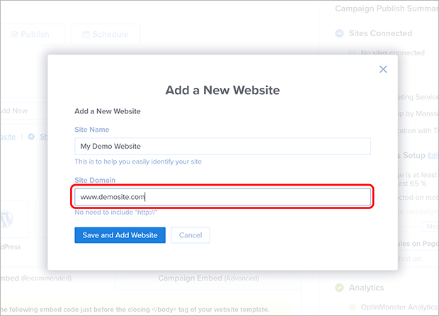
Click on the dropdown menu labeled Select a Website or Add New. If you’re brand new to OptinMonster, you won’t see any websites listed. Click on Add a new website.
Enter your site name and domain. After you do that, click Save and Add Website.
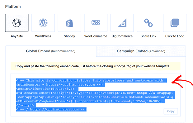
You’ll see that your site is not yet connected. Let’s take care of that! Scroll down to the section labeled Platform.
Choose your platform from the options provided. There’s a WordPress plugin, a Shopify app, and a BigCommerce app for OptinMonster if you’re using any of those platforms.
For all other platforms, copy the embed code provided under Any Site.
Paste this Javascript code on your website template just before the closing </body> tag of your website template. You can find specific embed instructions for many different platforms in our documentation if you get stuck.
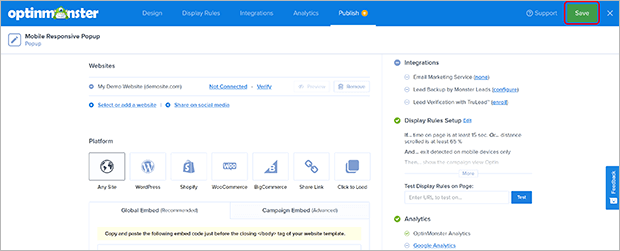
Once you’ve got OptinMonster connected to your website, come back to the campaign builder and click on Save.
That’s it! Your responsive optin form will now show up automatically on mobile devices targeted by your display rules.
Once you create your mobile optin form, you may also want to set up other marketing automations like an email autoresponder series or sending new leads to your CRM. You can also set up other marketing campaigns on your site with OptinMonster connected to this one.
Now you know how to create mobile responsive optin forms for your website. Your forms should work perfectly for users on any device size.
If you’re curious, learn about other ways to increase your mobile conversion rate.
If you like this article, please follow us on Facebook and Twitter for more free articles.













Add a Comment