Do you want to learn how to create a user flow diagram?
User experience design is an underrated feature that can boost your website’s performance.
If you’re not getting the leads you expect and conversions are falling, poor UX design could be the reason.
The key to enhancing user interaction with your website is understanding their navigational patterns and behaviors. This is precisely where a user flow diagram becomes an invaluable tool!
This article will talk about the importance of user flow show you how to create a user flow diagram for your website so you can optimize both users’ experience and your conversions.
- What Is User Flow?
- Why You Need a User Flow Diagram?
- Pitfalls of Not Mapping User Flow
- Performing a User Flow Analysis
- Questions to Ask About Website User Flow
- How To Find Your Existing User Flow
- How To Create a User Flow Diagram Step-By-Step
- User Flow Diagram Tools
- User Flow Examples And Template
- What To Do Next?
What Is User Flow?
User flow is the steps a user takes to accomplish a task on your site. It includes all the different pages and touch points that are part of that interaction.
If your website was a city, says Orbit Media, there would be roads running through it. These roads are the “user flow” or “task flow” that visitors follow.
A lot of people get confused about the difference between the terms “user flow” and “user journey”. That’s likely because they’re related, though they aren’t identical.
User journey is like customer journey map. It includes user flow, but also includes external factors that bring people to your site and what they do after they leave as part of the whole experience of becoming your customer.
Why You Need a User Flow Diagram?
Here’s why a user flow diagram is important:
Understanding User Behavior: User flow diagrams help understand how users interact with your website. It maps out a user’s journey from the entry point through completing a task, like making a purchase or finding information.
Identifying Pain Points: With a visual representation of the user’s journey, you can identify potential pain points or areas where users might get confused or frustrated. This allows you to address these issues early in the design process.
Improving User Experience: A well-designed user flow diagram ensures a more intuitive and efficient user experience. It helps create a logical flow that guides users to their goals with minimal effort.
Facilitating Team Communication: These diagrams provide a clear and concise way to communicate the intended user experience to all team members, including design team, product managers, developers, and stakeholders. It ensures everyone is on the same page regarding the product’s design and functionality.
Streamlining Design and Development: With a clear user flow, designers and developers can work more efficiently. They have a roadmap to follow, which reduces the likelihood of unnecessary revisions and rework.
Testing and Validation: User flow diagrams are useful for testing the user experience. They can be used to conduct usability tests to validate if the flow is as intuitive as intended.
Documentation and Reference: They serve as a reference point for future updates or redesigns. Understanding the existing user flow is crucial when making changes to ensure continuity and consistency in the user experience.
Strategic Planning: User flow diagrams help in strategic planning by aligning the user journey with business goals. They ensure that the user’s journey is designed in a way that also supports the achievement of business objectives.
Pitfalls of Not Mapping User Flow
So what happens when you don’t pay attention to user flow? For both you and your visitors, it’s like trying to find your way around a big city without GPS or a map.
They might end up missing something they really want or need to see. And you might not know which parts of your site you need to optimize to give them a great experience.
If you don’t know which pages they visit when they need to do something, you might interrupt their progress through the site or fail to put a call to action (CTA) where you most need it. That won’t help conversions.
Performing a User Flow Analysis
Before you can diagram user flow, you first have to understand it. That means performing a user flow analysis. As you’ll see, that means you’ll also have to figure out the user journey.
To get started, know who’s using your site. If you’re marketing, you likely already have customer avatars. If you don’t, here’s how you create them. You can use the same process to create avatars for your site visitors.
Different types of users have different goals at different times. At the same time, you have goals for your business. Keep both in mind as you start the process of mapping user flow.
The next step is to know how users get to your site. There are usually several possible ways, known as “entry points”. These include:
- Direct entry, where they come straight to your site
- Organic search, where they find you via a search engine
- Referrals, where they follow a link from another site
- Social media
- Email marketing
- Ads
The entry point is important because it affects what they do next on your site.
For example, if they find you via search, they’ll probably spend some time looking at the content they came for, then browsing to learn more about you. If they come direct to your site, then they’ve probably been there before and know exactly what they want.
Next, see how successful users get what they want on your site. You’re checking for what works well and where there might be bottlenecks that get in the way of conversions.
Pay attention to the starting points and end points for each task. This will be different depending on what users want to do.
If someone does a Google search and finds your site, they might look at a few pages before they decide to sign up for your newsletter.
In contrast, if someone follows a newsletter signup link from your Twitter profile, they’ll probably sign up straight away, as that’s what they came to your site to do.
Questions to Ask About Website User Flow
As you start to map website user flow, 1stWebDesigner suggests a few useful questions to ask. We’ve added our take on what those might mean:
- What do people love about your site that is unique to your business? In other words, how does your site showcase your value proposition?
- Who will find this feature most interesting? This is about identifying your target customers.
- What else do those same user need? People are complex and they may need to do more than one thing when they land on your site.
- What stops them from getting what they want on your website? Again, this is about identifying bottlenecks.
- What do they want to know about your business? This could be general information about your business values or specific information about the cost of shipping a product, but either way, that info needs to be available when they want it.
- What’s likely to stop them from taking the next step in the conversion funnel? When you perform a conversion funnel analysis by creating a user flow diagram, you’ll be able to make some hypotheses and test this.
- Finally, what can you do to help users decide to act? This is about putting in incentives and guides that help move them onto the next stage.
How To Find Your Existing User Flow
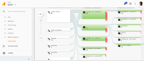
Whether you’ve mapped it or not, if you have a website, you already have a user flow. Orbit Media suggests you find it with Google Analytics. There are three places where you can find the information you need:
- Go to Audience » Users Flow
- Go to Behavior » Site Content » All Users
- Go to Conversions » Goals » Funnel Visualization. This only works if you have set up goals in Google Analytics.
All of these reports provide insight into how people move through your site and where and when they leave. It’s useful to know that every website has a “top path”, which is the route most people take. This is always a good place to start with user flow optimization.
Lemonstand also suggests that eCommerce sites pay attention to the devices people use, how they sign in, their payment methods and any difference between desktop and mobile user interactions. We love their view of checkout user flow:
“Your checkout process should not be designed like an obstacle course… it should be like a wind tunnel.”
How To Create a User Flow Diagram Step-By-Step
Step 1: Identify Your User’s Objectives
Start by identifying the primary goals of your users. What are they trying to achieve when they visit your website?
For instance, if you run an ecommerce site, a primary user goal might be to find and purchase a specific product. User research is crucial in designing a flow that guides users to their destinations efficiently.
Step 2: Define Entry Points
Consider the various ways users can enter your site. Entry points could include a homepage, a landing page from a marketing campaign, social media links, or search engine results.
Each entry point may cater to different user intents and should be considered in your user flow diagram.
Step 3: Map Out User Actions
Once you know the user’s goals and entry points, map out the actions they need to take to achieve their goals. This includes every click, scroll, and form submission.
For example, in an online store, this might include selecting a product category, choosing a product, adding it to the cart, and completing the checkout process.
Step 4: Identify Decision Points
Throughout their journey, users will encounter decision points where they must choose how to proceed. These points are critical in your user flow diagram as they can significantly impact the user’s journey.
Ensure that these decision points are clear and guide the user towards their goal.
Step 5: Simplify the Journey
Analyze the mapped-out user journey for any unnecessary steps or complications. The goal is to create a flow that is as straightforward as possible, removing any obstacles or distractions that might prevent the user from achieving their goal.
Step 6: Incorporate Feedback Loops
Feedback loops, such as confirmation messages or error alerts, are essential in guiding users through their journey. They provide reassurance or corrective information that helps users stay on track towards their goal.
Step 7: Test and Iterate
Finally, test your user flow with real users. Gather feedback on their experience and identify any areas where they encounter confusion or frustration.
Use this feedback to refine and iterate your user flow diagram, ensuring it aligns with user expectations and behaviors.
Creating an effective user flow diagram is a process that requires careful consideration of your users’ goals, actions, and decision points. By following these steps, you can create a user journey that is intuitive, efficient, and aligned with your business objectives.
Remember, a great user flow is not just about guiding users; it’s about creating an experience that feels natural and effortless, encouraging them to return and engage with your site repeatedly.
User Flow Diagram Tools
There are several tools available that cater to different needs, from simple diagramming to complex UX design. Here are some of the best user flow diagram tools:
1) Lucidchart
Features: Offers a range of diagramming tools suitable for creating user flow diagrams. It’s known for its ease of use and collaboration features.
Best For: Teams looking for a versatile tool that supports real-time collaboration.
2) Adobe XD
Features: Known for its user interface design capabilities, Adobe XD allows for creating interactive user flow diagrams with prototyping features.
Best For: Users already familiar with Adobe products, looking for integration with other Adobe tools.
3) Microsoft Visio
Features: A part of the Microsoft Office suite, Visio is a powerful diagramming tool with a wide range of templates, including for user flow diagrams.
Best For: Businesses looking for a robust diagramming tool that integrates with other Microsoft Office applications.
4) Miro
Features: An online collaborative whiteboarding platform that’s great for brainstorming and mapping out user flows in a collaborative environment.
Best For: Remote teams and individuals who prefer an online, collaborative approach.
5) Figma
Features: A web-based UX/UI design tool that includes vector graphic editing and prototyping, suitable for designing user flows.
Best For: Designers and teams looking for a collaborative, web-based design tool.
Each of these tools has its unique strengths, and the best choice depends on your specific needs, team size, and the complexity of the projects you’re working on.
User Flow Diagram Examples And Template
Lets look at a few user flow examples which includes wireflows, wireframes and user flowcharts.
A login interface serves as the gateway to an app, website, or service, playing a crucial role in verifying user identity.
The typical login flow encompasses not only the main login page but also an extensive recovery process. This includes options like ‘forgot password’, resetting passwords, and alternative login methods.
The primary objective of the login process is to facilitate a smooth sign-in experience for users. This particular flow achieves this by offering a familiar and intuitive interface, ensuring that users don’t face any confusion while navigating it.
Moreover, the design is intentionally minimalistic, prioritizing quick and hassle-free login. Should users encounter any issues, they can easily find their way back on track with the aid of clear and informative error messages.
The simplicity of the design, its linear progression, and the comprehensive inclusion of all necessary elements make this login interface both effective and user-friendly
In today’s digital-dominated landscape, where most shopping transactions occur online, e-commerce represents a quintessential example of a common user flow globally.
This user experience (UX) flow scenario typically involves a customer navigating an e-commerce website to locate and purchase a desired item. The process unfolds in several distinct steps:
1) Initiating the Product Search:
The customer begins their journey by entering a search term into the website’s search bar. This action prompts a search through the website’s comprehensive database containing many product names and descriptions.
The results of this search are then displayed on the screen, often accompanied by suggestions for similar products, if such are available.
2) Engaging with Search Results:
The customer then engages with the search results by clicking on one of them to gather more detailed information about the product. This includes specifics about the product’s features, pricing, and availability directly from the store or brand, providing a deeper insight into what’s being offered.
3) Making a Purchase Decision:
After reviewing the product details, the customer decides to click on their chosen item with the intention of purchasing it from one of their preferred stores or brands.
This streamlined sequence exemplifies a typical e-commerce user flow, highlighting the seamless integration of search functionality, detailed product exploration, and the final purchasing action, all designed to facilitate an efficient and satisfying online shopping experience.
Tracking user flow involves monitoring the user’s path while navigating a website.
By examining the various levels of the site and the user’s interactions with them, businesses gain valuable insights into how visitors engage with their online presence.
Understanding this journey is crucial for companies aiming to enhance their website’s usability and customer experience.
Here’s a breakdown of how this process typically unfolds:
1) Initial Website Visit: The journey starts when a user lands on the website. This initial interaction sets the stage for their experience and can influence their subsequent actions on the site.
2) Product or Service Discovery: The user is then guided to a page showcasing a product or service available for purchase.
This step is critical as it’s where the user’s interest is captured or lost, depending on how effectively the product or service is presented.
3) Selection and Checkout Process: Once the user decides on an item, they click on it, initiating the purchase process.
This stage involves navigating through the checkout process, which includes selecting options (if any), entering payment and shipping information, and finalizing the purchase.
4) Post-Purchase Redirection: After completing the purchase, the user is often redirected back to the site, either to the page where they found the product or another relevant section.
This step is an opportunity to further engage the customer by suggesting related products or confirming their purchase details.
By analyzing these steps, companies can identify areas for improvement, streamline the user experience, and make strategic changes that enhance customer satisfaction and increase conversions.
What To Do Next?
Once you know what your website user flow is, what people are trying to accomplish and where the barriers are, you’ll be able to optimize your site. CrazyEgg also suggests mapping user flow to your optin and followup sequence so they support each other.
User flow optimization could include:
- Removing items that people don’t use from navigation and web pages.
- Making the most important items more visible.
- Linking relevant pages so they match the typical user path through your site.
Most importantly, says Smashing Magazine, don’t just design for the first conversion such as signing up for your newsletter, but for the ultimate conversion which is deciding to buy your products or services. You need to keep the ultimate goal in mind to design your website user flow properly.
Now that you have more insight into user flow on your website, you can create your own user flow diagram.
Follow this up by checking out our tips on creating a high converting website, so you can really optimize the user experience while meeting your business goals.
And, if you want to know just how much does it cost to build a website, you can find out in our guide!
Want to know how people behave on your website when they see or interact with your OptinMonster campaigns, as compared to other visitors? Check out our tutorial on How to Analyze the Effects of OptinMonster Campaigns on User Behavior.
You may also be interested in this article where we teach you what is conversion-focused web design. Or, check out this post on how to upload custom fonts to your OptinMonster campaigns.


Add a Comment