Do you want to convert your website traffic into sign-ups or sales? Looking for ways to boost your website conversion rate?
Yes/No popups can help you improve your site conversion. Yes/No popups are super versatile, proven to boost conversions, and there are many different ways you can use them.
In this article, I’m going to share what makes Yes/No optins so effective and give you 6 creative ways to use them on your own site.
Here’s everything I’ll cover in this post:
Why Use Yes/No Popups
Yes/No popups have 2 call-to-action (CTA) buttons: one button to opt in and the other one to opt out.
Here’s a Yes/No popup example in the form of a confirmation dialog box:
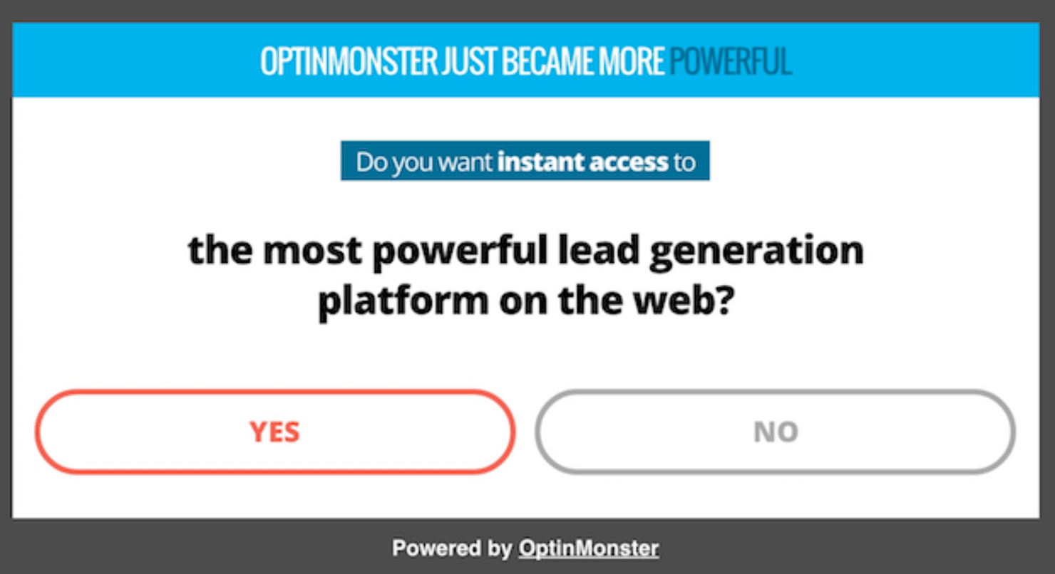
This type of popup converts really well for the same reason that 2-step optins boost conversions by as much as 785%: they use the Zeigarnik Effect.
The Zeigarnik Effect states that after people initiate a process, they are more likely to finish it.
2-step or yes and no optins don’t ask you for your email address until you begin the process by clicking one of the buttons. But after you commit to starting the process of opting in, you are more likely to finish the process by submitting your email address.
Case Study How Cosmetic Packaging Now Grew Their Email List by 754% with 2-Step Optins.
Yes/No popups use psychology in another way, too. Researchers claim that the feeling of freedom leads to greater compliance with requests.
Yes/No popups use that effect by giving you the freedom to decide for yourself. You can either pick the Yes or No button, the choice is yours. When given the freedom to choose, people tend to respond positively, resulting in more optins.
And the best part? There are a ton of ways to use Yes/No optins. I’ll cover them in detail in the next section.
6 Ways To Use Yes/No Popups
Let’s take a look at 6 creative ways to use these forms on your site:
- Answer Questions
- Warm Up the Leads
- Politely Offer a Content Upgrade
- Promote an Affiliate Product
- Design a User-Friendly Splash Page
- Offer a Different Option
1. Answer Questions
What if a visitor is looking at your pricing page or your sales page, but isn’t quite ready to buy yet? If they can talk to a representative and get their questions answered, it might be all they need to make a purchase.
You can make it easy for people to get in touch with you with a Yes/No popup box that uses a contact form.
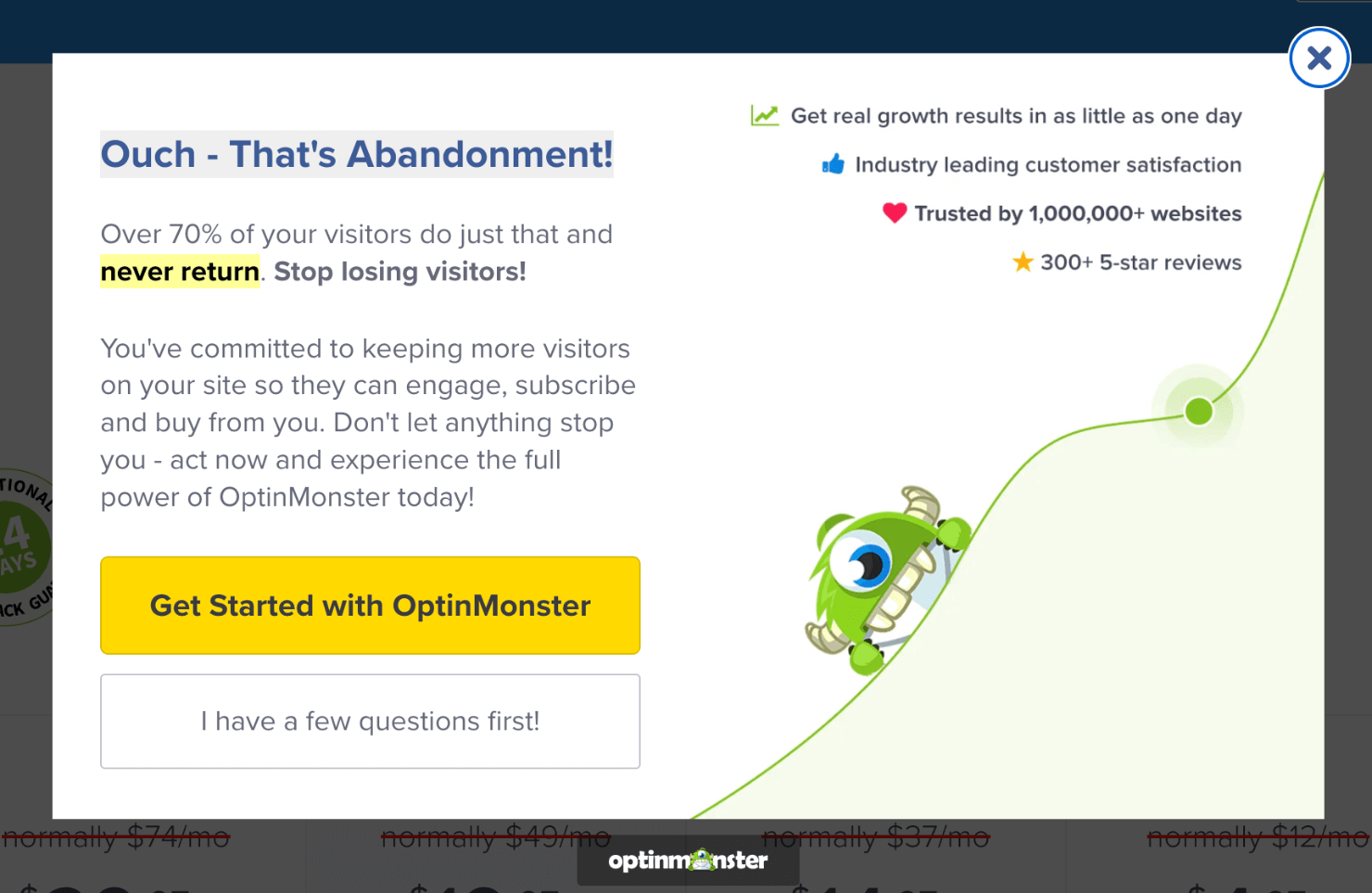
Here’s an example from OptinMonster’s pricing page. When a visitor is about to exit, this popup appears:
Click on the yellow button and the popup goes away. But when you click on the ‘I have a few questions first!’ button, you can choose between if you are an existing subscriber or a non-subscriber.
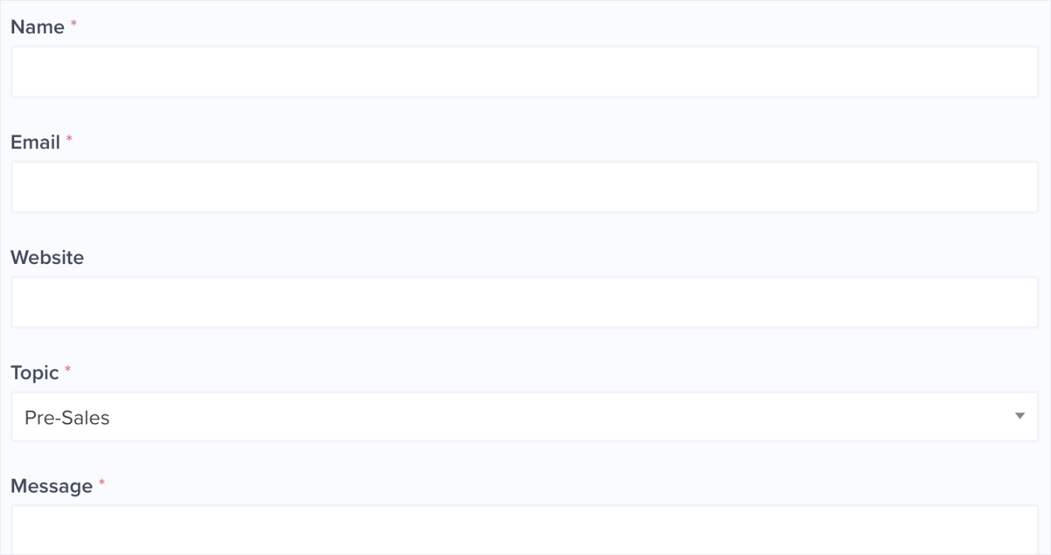
Once you confirm that you are a non-subscriber, you’ll get the following form to share your question:
Want to recreate this on your pricing page? Here’s how to:
- Step 1: Create a New Yes/No Popup Campaign
- Step 2: Edit the Yes/No Buttons
- Step 3: Edit the Optin Form
- Step 4: Set Your Display Rules
- Step 5: Integrate with Your Email Provider
- Step 6: Save and Publish the Campaign
Step 1: Create a New Yes/No Popup Campaign
First, go to your OptinMonster dashboard and click on the Create New Campaign button:
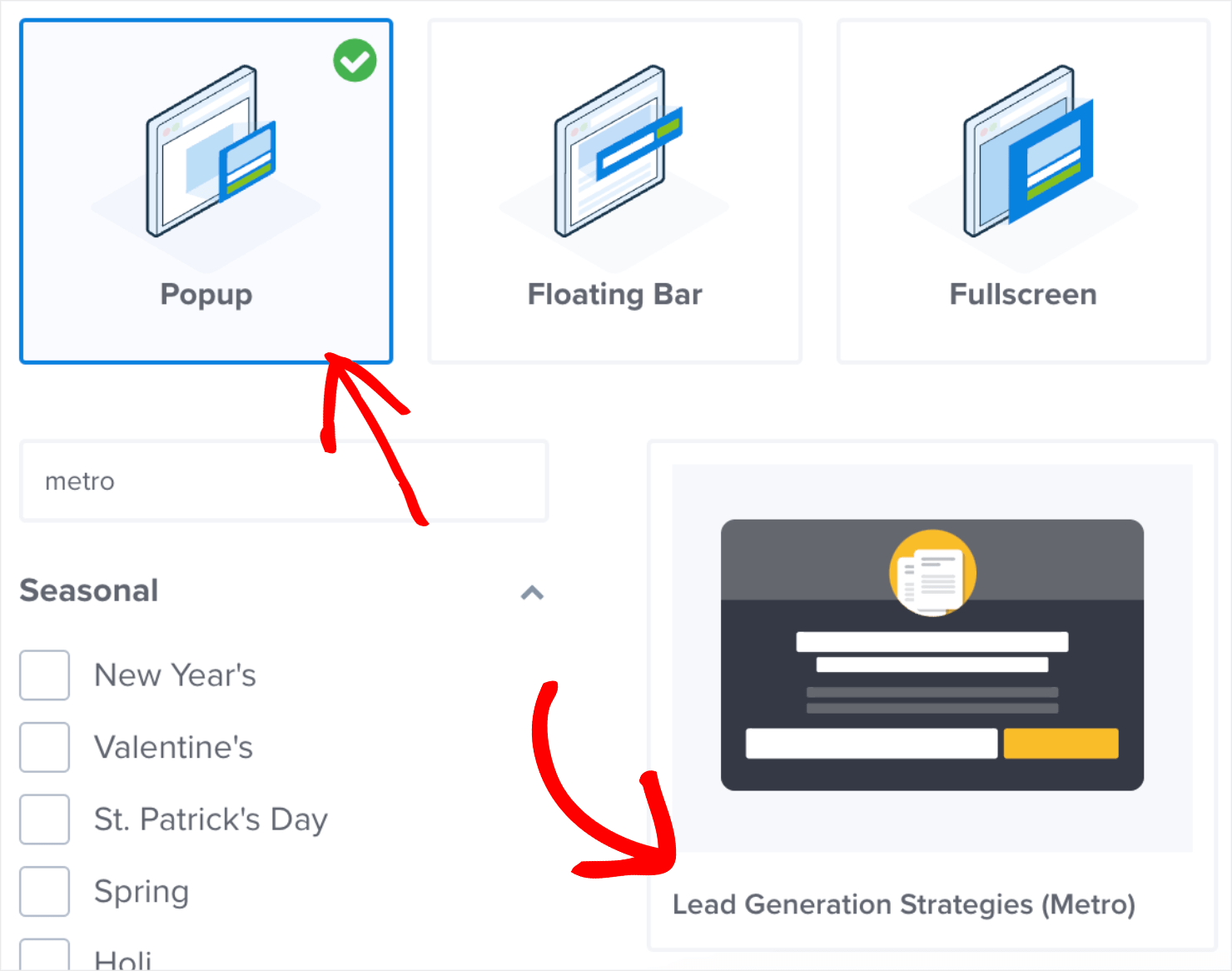
Next, choose Popup as your campaign type. Then choose from OptinMonster’s 100+ templates.
For this example, I’ll use the Lead Generation Strategies (Metro) template:
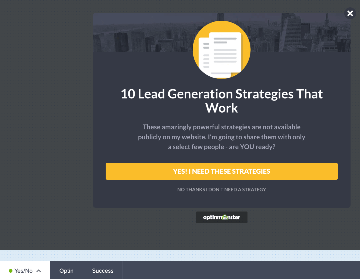
Here’s how the template will look in OptinMonster’s drag-and-drop campaign builder:
Notice that you landed on the campaign’s Yes/No view by default:
From here, you can customize the campaign’s text, colors, background, and images to your liking.
For a detailed guide, go through our guide on How to Edit a Campaign.
Step 2: Edit the Yes/No Buttons
To edit your Yes/No buttons, click on the button element in the campaign preview. This will bring up the editing tools on the left:
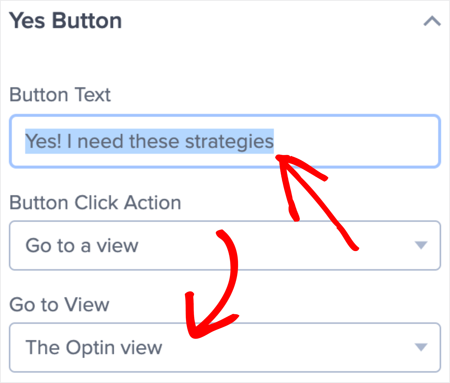
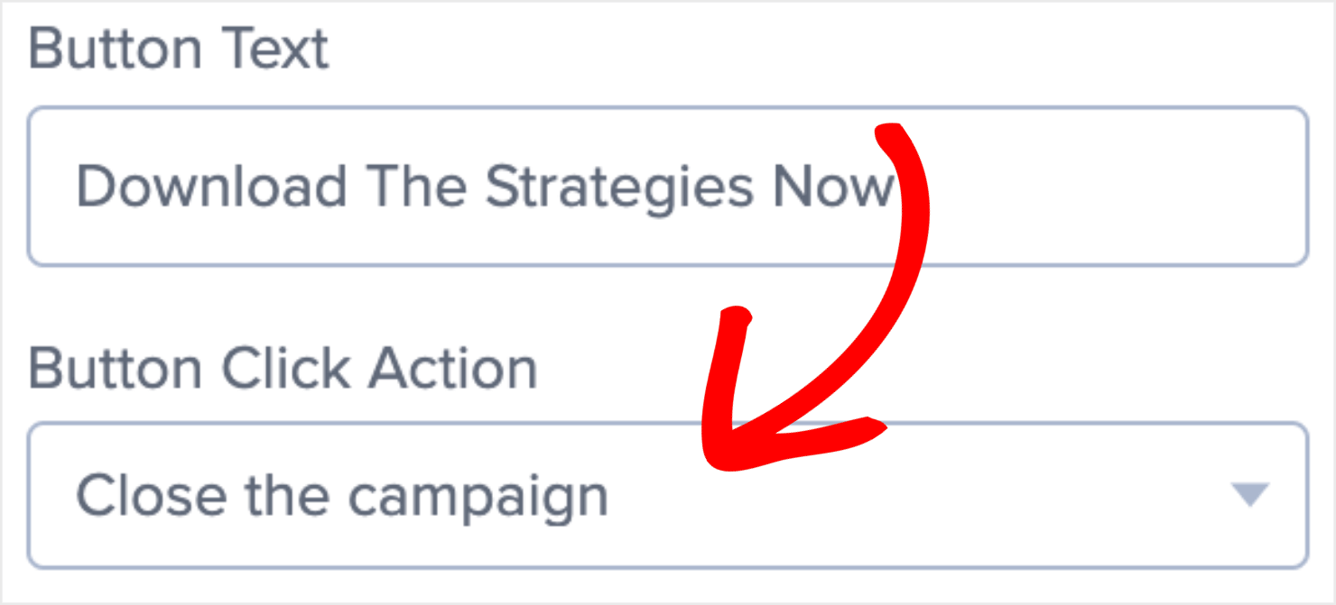
Let’s start by editing the Yes button copy:
Next, I’ll set the button action to Close the campaign since I want the visitors to go back to the pricing page if they decide to close the popup:
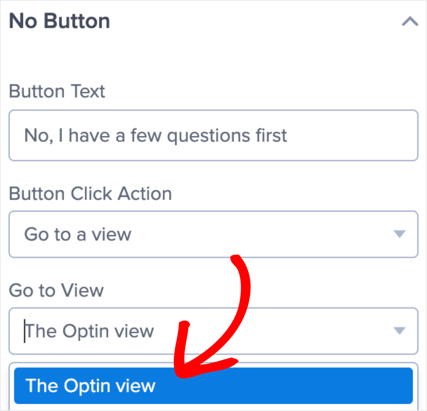
I’ll set the No button action to Go to a view. To do that, click on the No button element on the template.
Change the No button copy if you want. Then select to show The Optin view if a user clicks the No option:
Step 3: Edit the Optin Form
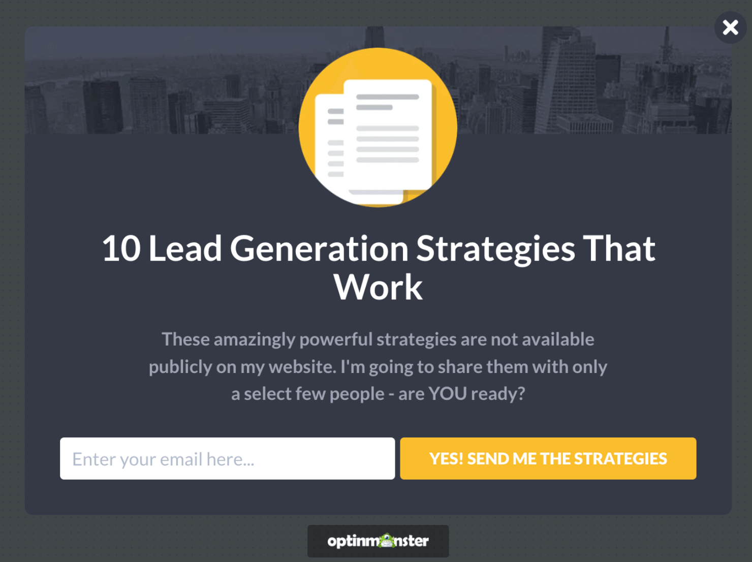
Click on the Optin view tab to edit the optin form:
Here, you can edit the default text, tweak the CTA copy, and make other changes to make the offer more compelling.
Here’s how I designed mine:
Edit the copy and click on the Save button at the top-right of the screen once you are done:
Step 4: Set Your Display Rules
Go to the Display Rules tab:
Click on the time on page rule. Click on When and choose Exit Intent® from the dropdown options:
Next, I’ll choose which device I want your exit-intent popup to appear on. You can choose between:
- Desktop-only
- Mobile-only
- Both
Then you can also choose the Exit-Intent® sensitivity level as low, medium, or high:
To learn more about how exit-intent popups work on mobile, read how to create mobile Exit-Intent® popups that convert.
In the 2nd rule, leave the current URL path as it is. But replace is any page with contains:
Enter the URL slug of your pricing page to make sure the popup appears on your pricing page. For instance, I’ll enter ‘/pricing’ since that’s how most pricing page URLs end:
Step 5: Integrate with Your Email Provider
Creating a Yes/No popup means you are encouraging people to share their email addresses with you. It’s a great way to improve your lead generation and grow your email list.
But if you are generating leads, you’ll also need a tool to manage all the lead data. That means you would either need CRM software or an email marketing tool.
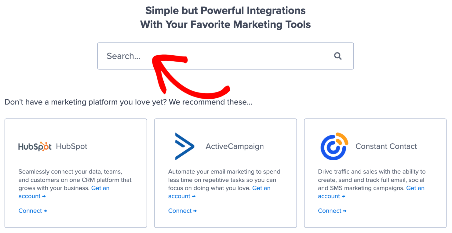
OptinMonster integrates with 30+ email marketing tools. To integrate with your email service provider, go to the Integrations tab:
Next, search for your email service provider:
From there on, the exact steps to connect OptinMonster with your ESP depend on which email marketing automation software you are using. For the most part, it involves copy-pasting your email account’s API key.
For more specific instructions, read our detailed guide on how to connect your email service provider with OptinMonster.
Pro-tip: Don’t see your ESP listed? You can get started with Monster Leads.
Step 6: Save and Publish the Campaign
Click on the Save button at the top-right of your screen to make sure you don’t lose the changes you’ve made so far:
Now go to the Publish tab:
Under the Publish Status section, click on Publish:
And that’s it! With this, your Yes/No popup should be live on your website.
2. Warm Up the Leads
In many cases, visitors are so new to your brand that they aren’t quite ready to optin to your offer yet. But if they can consume a bit more content first, they might be more willing to enter their email address in exchange for something valuable, like a lead magnet.
For example, let’s say you have a timed popup that appears 3-5 seconds after visitors land on your homepage. Some visitors will optin right away, but many others may just want to have a look around first.
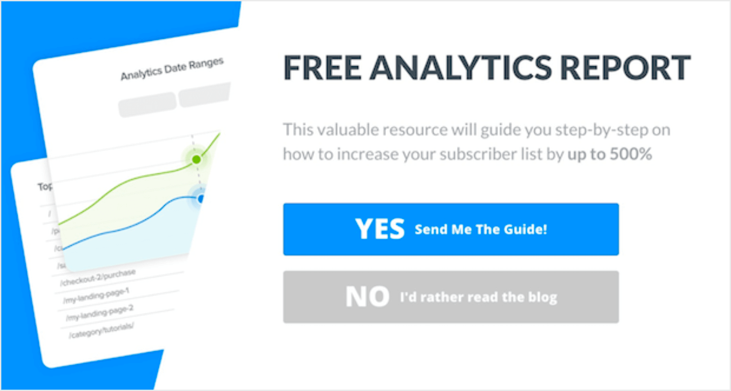
So instead of your typical Yes/No optin form, you can link the No button to your blog or a specific piece of content.
Here’s an example of a Yes/No popup campaign that does this:
To do this in OptinMonster, go to step #2 which we discussed earlier.
For the Yes button, it’s very simple: you’ll link to the optin page where people can enter their email addresses and download the guide.
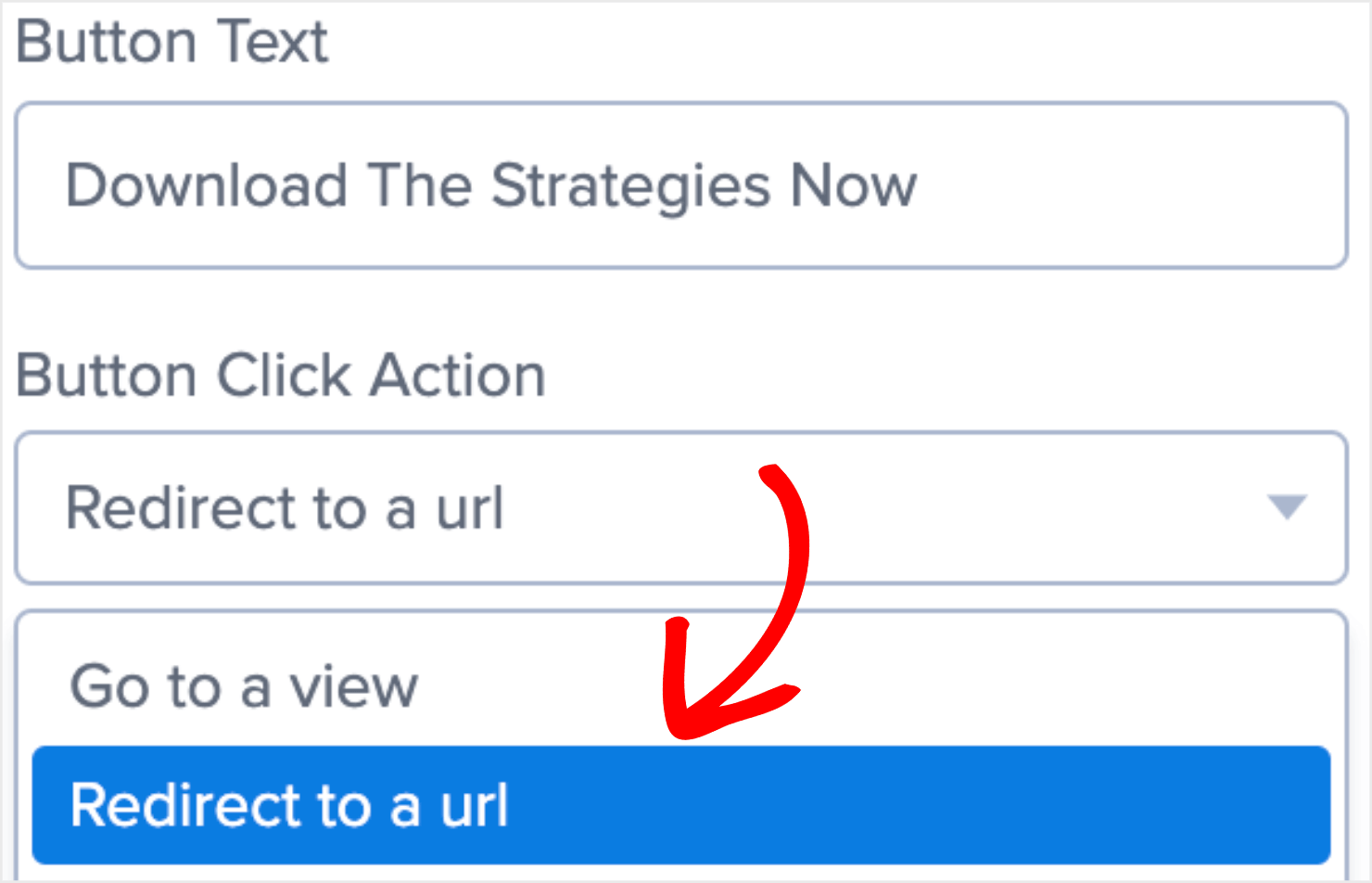
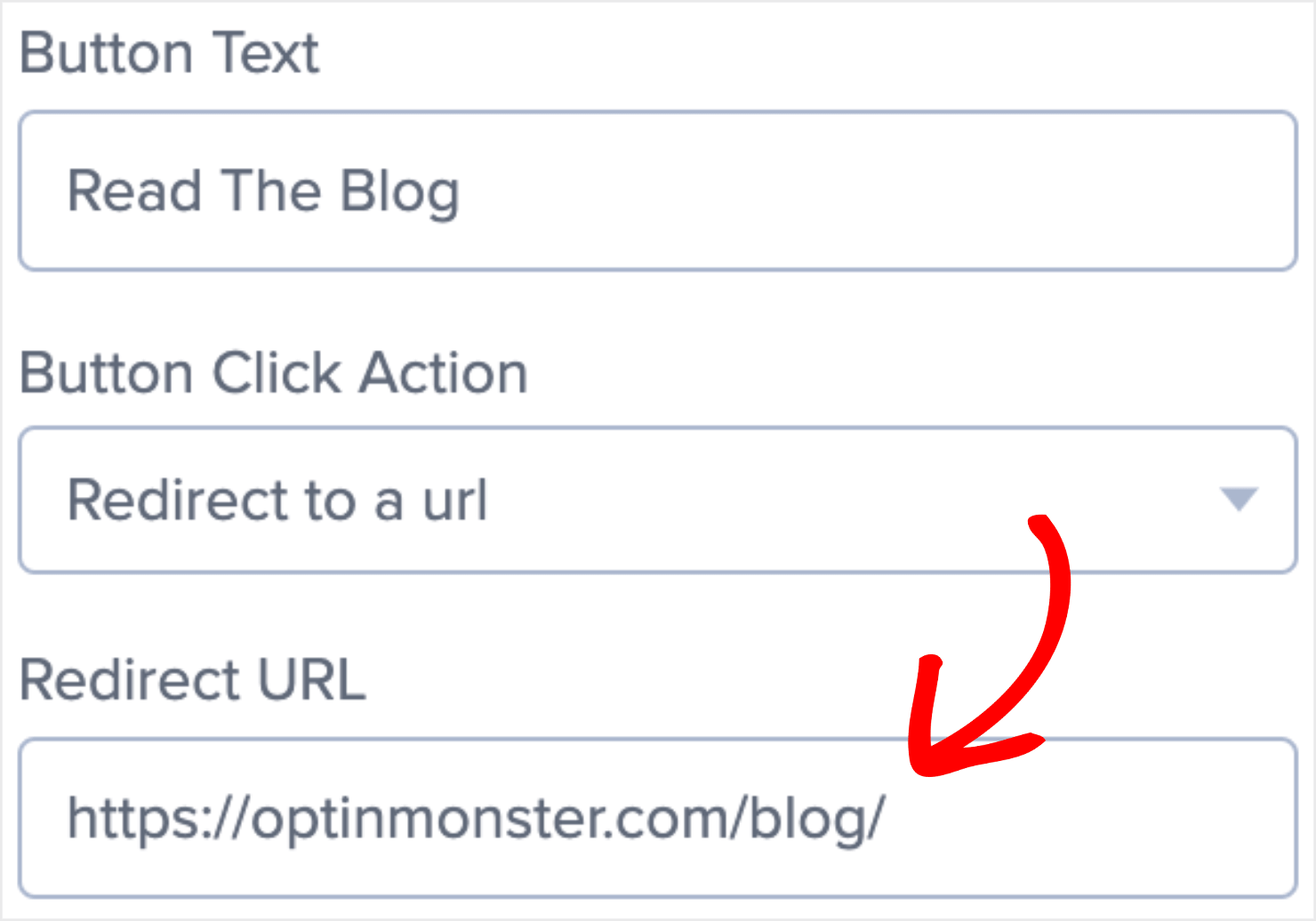
When it’s time for you to select the No button click action, choose Redirect to a url from the dropdown menu:
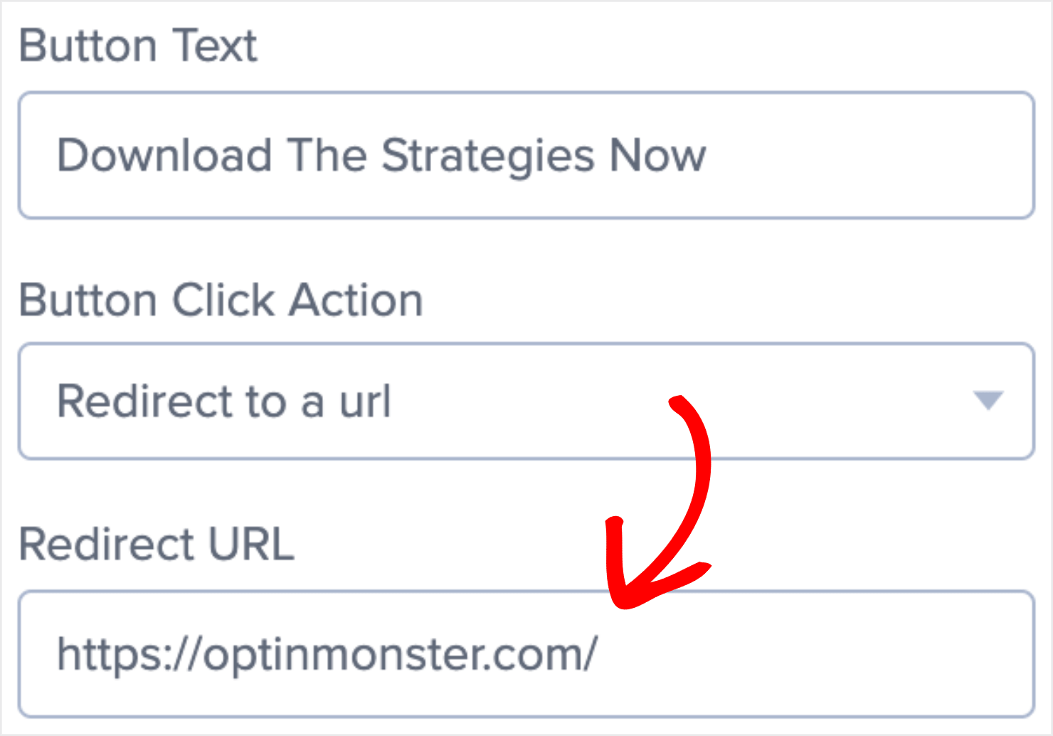
Enter the URL for the blog that covers the same topic as the guide:
With this, you can optimize both buttons in your Yes/No popup campaign for conversion.
Once people are in your blog page, you can trigger a content upgrade popup to convert them. Let’s talk about content upgrades in more detail in the next section.
3. Politely Offer a Content Upgrade
So far, I have shared tips on how you can use Yes/No popups to convert visitors to your homepage and pricing page.
But what if your blog page gets a lot of traffic and you want to convert your blog readers into email subscribers?
One way to convert your blog page traffic is to leverage content upgrades, a lead magnet that is specific to a particular blog post.
Different readers react to content upgrades differently. For example, some visitors will briefly skim the blog or only read the first few paragraphs before opting in for the upgrade offer. However, other visitors will want to read the entire blog post before they are ready to grab your content upgrade.
You can address both types of visitors with a polite, timed Yes/No popup or scroll box.
For example, you can trigger a popup that appears after a visitor has been reading your blog post for 60 seconds.
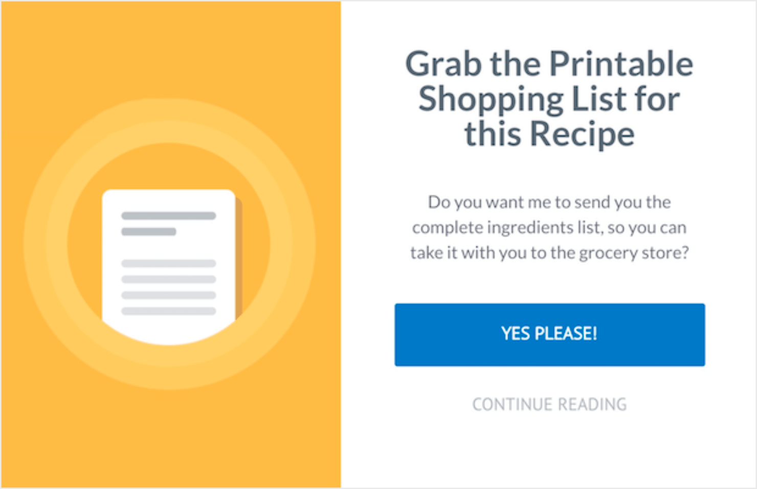
The popup offers the content upgrade, but if they aren’t ready for it yet, clicking the No option will let them continue reading the blog post.
Here’s an example of a content upgrade with a similar optin:
To create a popup like this with OptinMonster, go to step #2 of the above tutorial. When it comes to choosing the No button action, go with the Close the campaign option:
Want to convert the people who rejected the content upgrade offer the first time around?
You can use MonsterLinks™ to add a link at the end of the blog post. This will trigger an optin popup that lets the readers enter their email addresses right there on the blog page.
4. Promote an Affiliate Product
Are you into affiliate marketing? Do you have blog posts that promote affiliate products?
You can use Yes/No popups to increase conversions on those content pieces and earn healthy affiliate commissions.
To do this, you can create an exit intent popup like we discussed in the tutorial above.
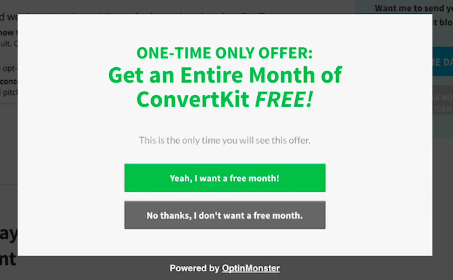
Here’s an example of an exit intent popup with an irresistible free trial offer from ConvertKit:
The Yes button goes to the affiliate link, and the No button closes the optin form. You can also set the display rules to hide the popup from visitors who opt out of the offer.
To learn more about this, read our guide on How to Hide Popups from Your Existing Subscribers.
To create a popup that promotes your affiliate product, simply set the Yes button action to Redirect to a url. Then enter your affiliate link in the Redirect URL field:
You can set the No button action to close the optin (just like we did for the pricing page campaign earlier).
Let’s go ahead and set our display rules so that a visitor who has opted out won’t see this popup again.
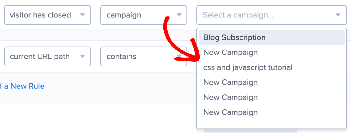
In the Display Rules page, go to OnSite Retargeting and click on Has Closed from the dropdown:
Next, select the campaign from the available options that you don’t want to appear to visitors who close the popup:
Save and publish the campaign to ensure that the changes reflect immediately on your site.
Quick Tip: Only active campaigns will show up in the dropdown.
5. Design a User-Friendly Splash Page
Do you want to create a full-screen welcome gate or a splash page to increase your email subscriptions?
Full-screen welcome mats are great for conversions since they cover the entire page, just like a landing page. Adding Yes/No buttons to a welcome mat can help you boost your conversions further.
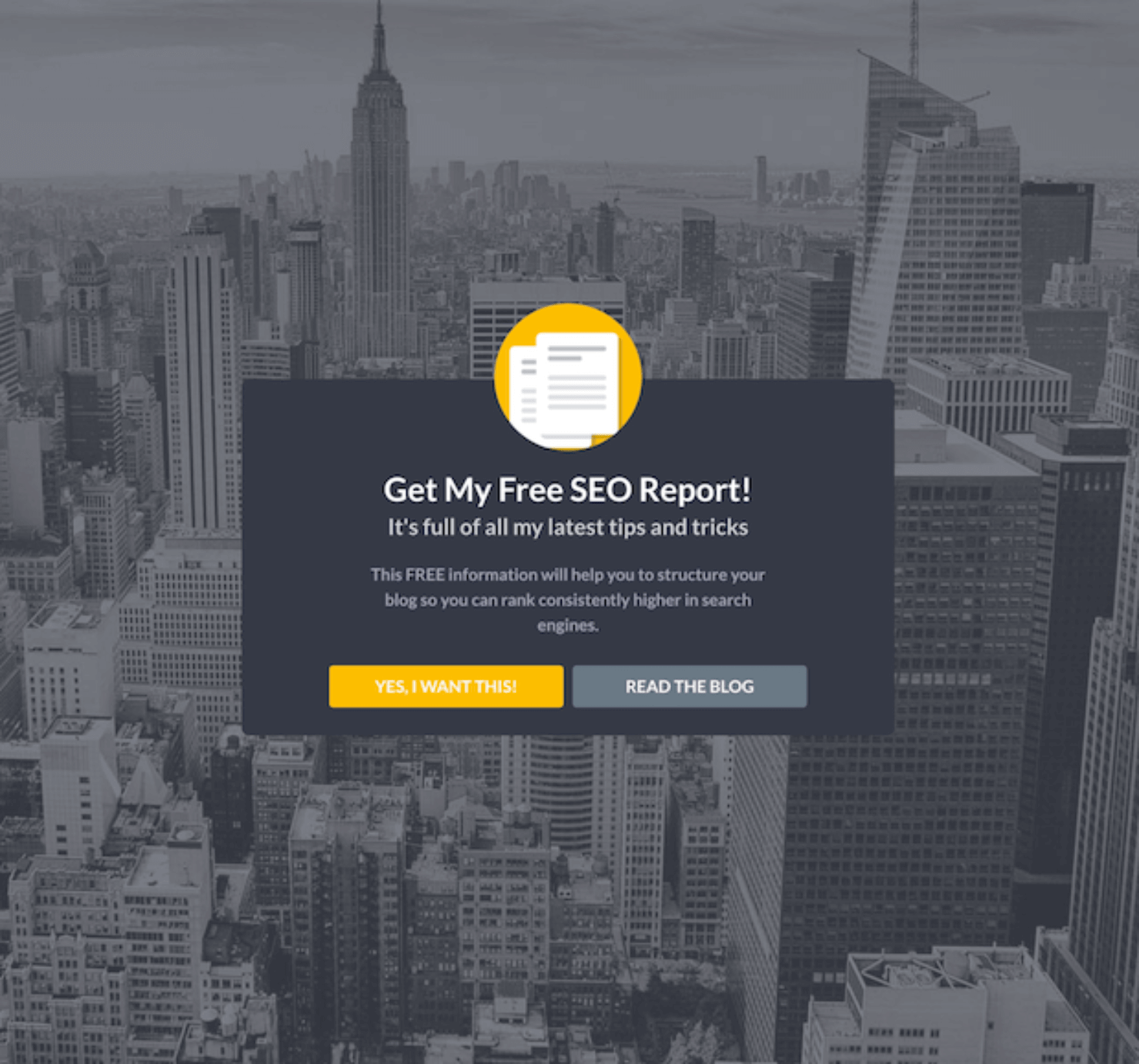
For example, when a visitor spends more than 3 minutes on your homepage, you can show them a welcome gate optin like the one below:
This gives the visitors a choice between opting in to your email list or reading your blog posts. Unlike a conventional homepage with a ton of options, this makes it easy for visitors to choose from 2 simple choices, which helps to boost conversions.
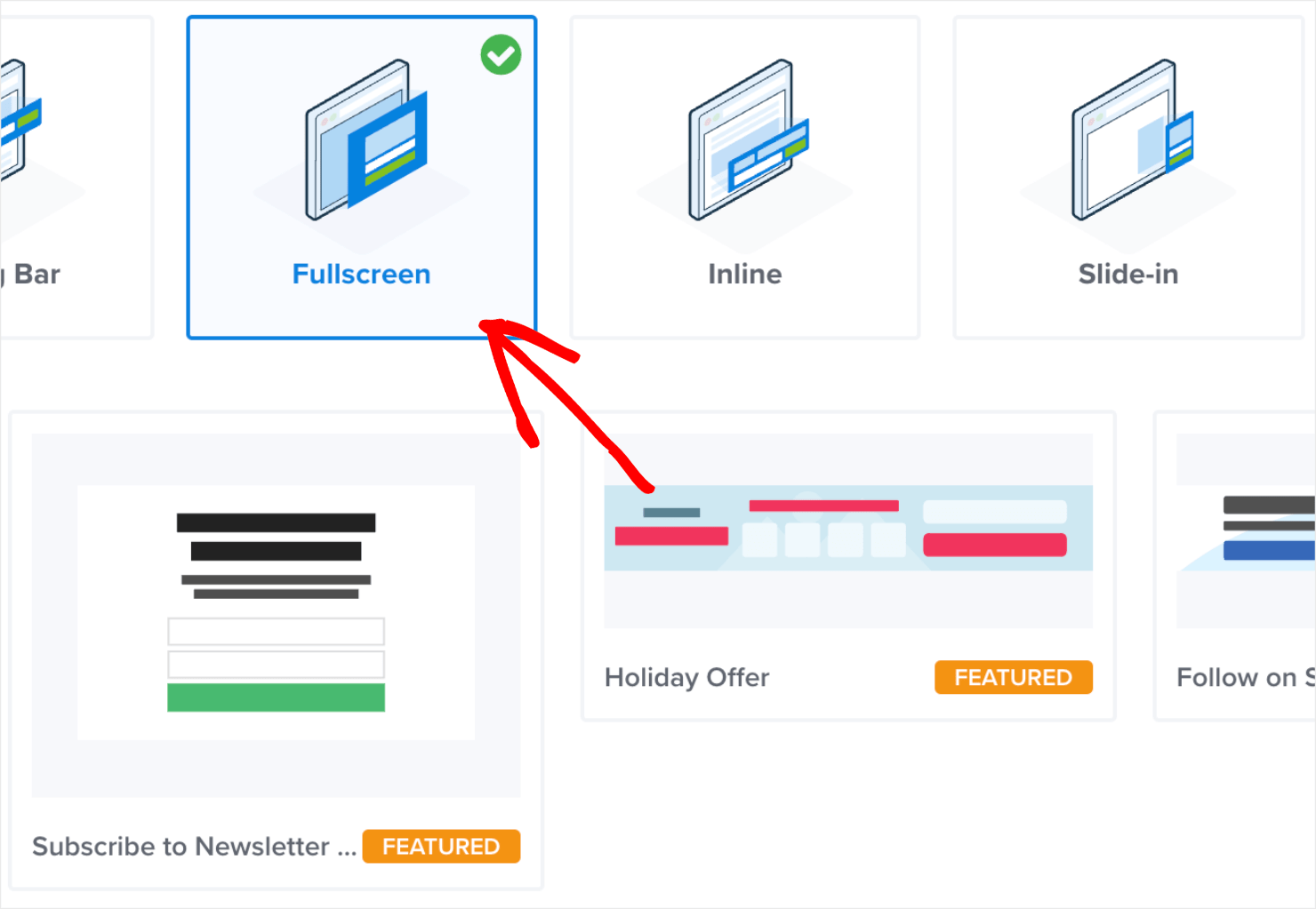
To create a beginner-friendly fullscreen welcome gate like this, just use one of our fullscreen optin templates:
Then, set the No button action to Redirect to a url and enter the URL for your blog into the Redirect URL field like we did earlier:
6. Offer a Different Option
Sometimes, you just need to make a different offer to entice visitors to opt in. Some people like to attend a live webinar, while others might want to read an eBook or a whitepaper at their own pace.
You can use a Yes/No optin form to offer more than one choice. The Yes button could go to a webinar registration page, and the No button could go to an optin form for a download.
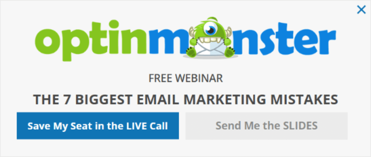
Here’s a similar optin example that we created a while ago at OptinMonster:
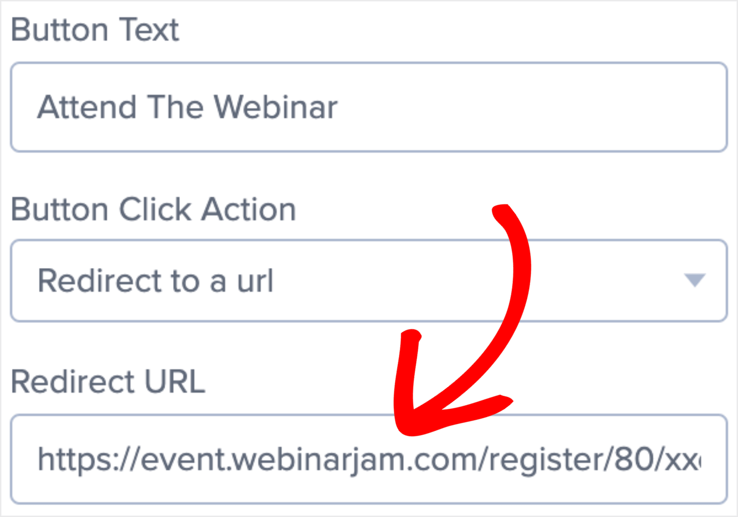
To create a popup like this, you’ll want to set the Yes button to Redirect to a url. Next, enter the URL for your webinar registration page in the Redirect URL field:
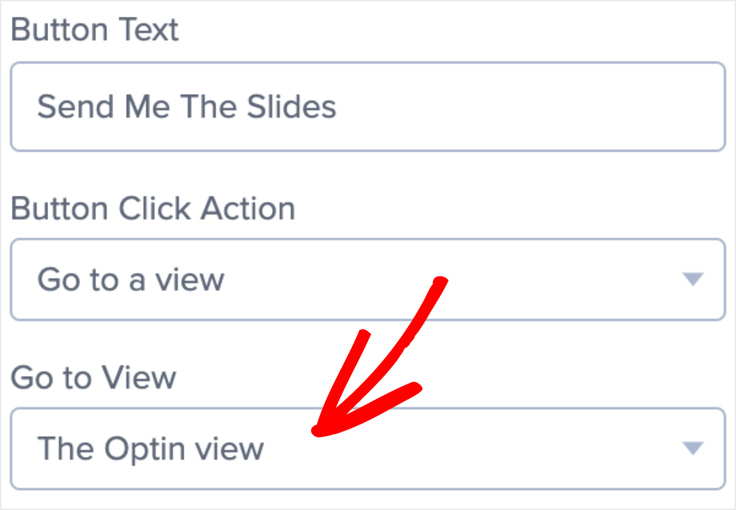
Then set the No button action to show an optin form:
And that’s it!
Ready To Boost Your Site Conversion?
Now that you know 6 ways to use Yes/No popups to engage website visitors, you can use these ideas to improve your website conversion rate and increase sales.
If you enjoyed this article, you may also want to check out the following resources:
- How To Create an Optin Feature Box Step-by-Step (With Examples)
- 25 Email Popup Examples (and Best Practices) To Explode Your List
- Discover the Best WordPress Lead Generation Plugins for 2024
- How To Create a Gravity Forms Modal Popup in 6 Simple Steps
- How to Add Multi-Step Popups to Boost Conversions
Want to create a Yes/No popup campaign like the one we covered in today’s tutorial?















Add a Comment