A thank you page is a webpage that loads after a visitor has made a purchase, subscribed to an email marketing list, or completed another action. If you run an online business, these pages are vital to building trust with your customers.
In this article, I’ll discuss the importance of thank you pages and explain how to create them. I’ll also share 8 thank you page examples that you can draw inspiration from.
Why Every Business Needs a Thank You Page
A thank you page does more than just confirm an order or action. It’s a vital touchpoint in the customer journey that can enhance user experience, build trust, and even boost sales. Here are several reasons why every business should use a thank you page:
- First Impressions: The thank you page sets the tone for future interactions, creating a positive experience that can increase customer loyalty.
- Building Trust: A personalized thank you page reassures users that their action was successful and appreciated, which creates trust and credibility.
- Upselling and Cross Selling: Include personalized recommendations for related products or services. This tactic can increase your average order value (AOV).
- Encouraging Engagement: Use the thank you page to ask customers to follow your brand on social media, join your community, or participate in other offers.
- Customer Retention: A well-crafted thank you page can reinforce the customer’s decision to buy, reducing buyer’s remorse and increasing the likelihood of repeat business.
- Survey and Feedback Collection: Ask for customer feedback with a quick survey, helping you gather valuable insights to improve your website and products.
- Nurturing Leads: Keep the relationship going by offering additional content, guides, or special deals. Doing so will help you nurture new leads through your sales funnel.
How to Create a Thank You Page (2 Methods)
There are 2 different ways you can create a successful thank you page:
- Build a thank you page with SeedProd (for WordPress)
- Create a thank you popup with OptinMonster (for any site)
1. Build a Thank You Page With SeedProd (for WordPress)
SeedProd is our #1 choice for WordPress page builders. It has a specific focus on building specialized landing pages such as thank you pages. However, you can also use it to build your entire website.
SeedProd has 350+ pre-made page templates, including several thank you page templates:
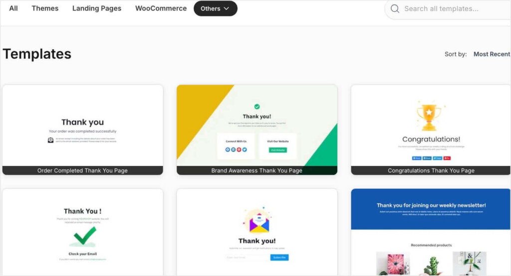
SeedProd also has an easy drag-and-drop builder, so you can customize any template in just a few minutes.
You can customize your thank you page to generate leads and boost conversions with pre-built blocks like contact forms, giveaways, countdown timers, social profiles, and much more.
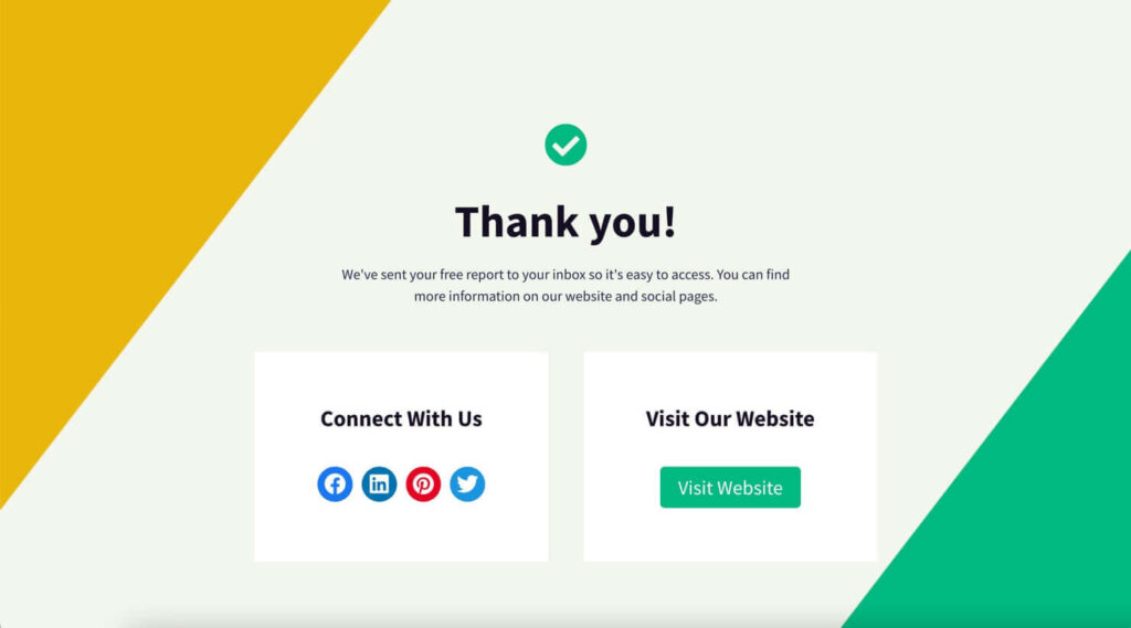
Sign up for SeedProd and make custom thank you pages in minutes!
2. Create a Thank You Popup With OptinMonster (for Any Site)
On the other hand, if you don’t want to create a separate landing page, you can create a thank you popup with OptinMonster.
By default, most of our 700+ templates include 3 views:
- Yes/No View: Ask visitors a simple yes/no question such as “Do you want to save 30% off today’s purchase?”
- Optin View: Ask visitors to submit an email address, feedback, and/or other information.
- Success View: Confirm that the submission was successful and offer next steps.
The Success View is essentially the popup version of a thank you page, and you can optimize it in many of the same ways.
For example, here’s what the Success View looks like for our Birthday Discount popup template:
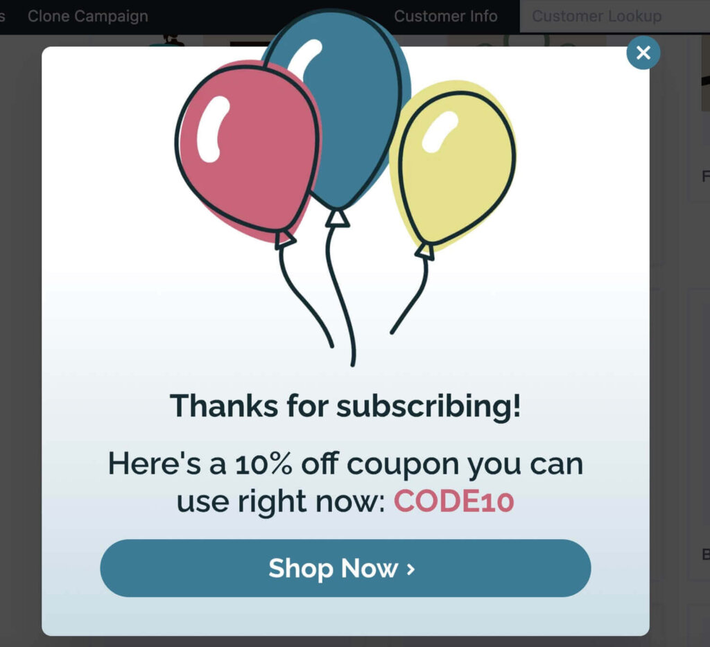
This Success View does 3 important things:
- Thanks the visitor for subscribing to your email list.
- Provides the promised discount code.
- Includes a large call-to-action (CTA) button to start shopping.
No matter which template you choose, you can add any elements you want in our easy drag-and-drop builder:
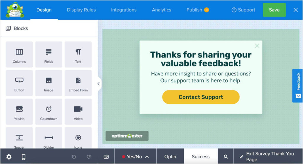
Here are just a few of the types of blocks you can add to your popups:
- Text fields informing users of next steps (such as checking their email to confirm their subscription)
- Embedded videos
- Countdown timers
- Buttons linking to product pages, customer support, and more
- Social media links
- ChatBots
- and more
Plus, OptinMonster offers robust targeting and triggering rules, so you can show your messages to the right people at exactly the right time. Try OptinMonster today, with our 14-day money-back guarantee!
3 Essential Elements of a Thank You Page
Some thank you pages are seen by new email subscribers, and others are seen by new or returning customers. However, every thank you page must have these 3 essential elements.
If any one of these key ingredients is missing, then your thank you page will fall short.
1. Confirmation Message
For a good user experience, and to serve its primary function, your thank you page must include a confirmation that the user’s action was successful.
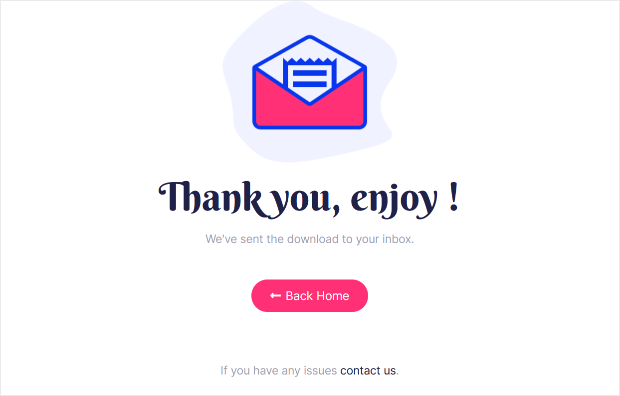
You need to actually spell it out for them. Otherwise, you’ll risk leaving them confused or disoriented.
A simple, “Thank you for subscribing!” or “Your order is complete!” will do just fine. Just make sure the user knows what has happened, as well as what they should expect to happen next, if necessary.
Unfortunately, this is where most thank you pages stop. If you want to stop leaving money on the table, you’ll need to get your users to take another action right away. Which brings us to the next thank you page element.
2. Call to Action (CTA)
Now that you’ve confirmed their successful action, it’s time to take your thank you page to the next level by adding in a call to action (CTA).
A very clear CTA will move your users to take the next step in your sales process.
This is the part where most thank you pages fall short, but adding this one thing to your thank you page will make the world of difference in terms of your conversions and sales.
Your CTA could be as simple as a button to download the lead magnet your subscriber just signed up for.
Or, it could be more complex, like offering a coupon code and encouraging users to start shopping. You can see that in this thank you page example created with SeedProd:
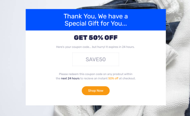
So what other CTAs can you include? Here are some great thank you page call to action examples:
- Ask them to whitelist your email address
- Ask them to share on social media
- Ask them to register for a webinar or event
- Ask them to purchase a related product
- Ask them to create an account
- Ask them to fill out a survey
3. Specific Instructions
The 3rd element to put on your thank you page is specific instructions on exactly what to do next.
You already have a call to action that gives users the next step. But to get users to actually take you up on it, you should be specific about what they should do and how.
For example, many email newsletters require a double opt-in. That’s when someone has to complete 2 steps before they’re added to your email marketing list:
- They have to sign up for your email list on your website.
- They have to click a confirmation link in an email you send them.
If you use a double opt-in, you must make that clear in your thank you page. That way, users know that they have 1 more step to complete.
For example, your thank you message can say:
“Thank you for signing up! To start receiving our weekly newsletter, you must click the confirmation link in the email we just sent you. Check your inbox now!”
That single sentence includes all 3 essential thank you page elements: a thank you, specific instructions, and a CTA to check their email.
Now that you know the 3 essential elements, let’s look at some thank you page examples.
These 8 thank you pages are highly effective at moving new subscribers and customers further along your sales funnel.
I’ve divided the examples into 2 categories: thank you pages that appear after an optin and after a purchase.
After-Optin Thank You Page Examples
When someone successfully opts into your email list, you can use your thank you page to accomplish 1 of 3 main goals:
- Drive more traffic to your optin by encouraging sharing
- Begin to nurture leads
- Acquire customers right away
Here are some examples of after-optin thank you pages:
Thank You Page Example #1: Social Sharing
Did you know that your thank you page can actually drive more optins?
When you use your thank you page to drive more traffic to your optin form, you can increase your signups. For example, users saw this thank you popup when they signed up for a live webinar, which was used as a lead magnet to get more email subscribers.
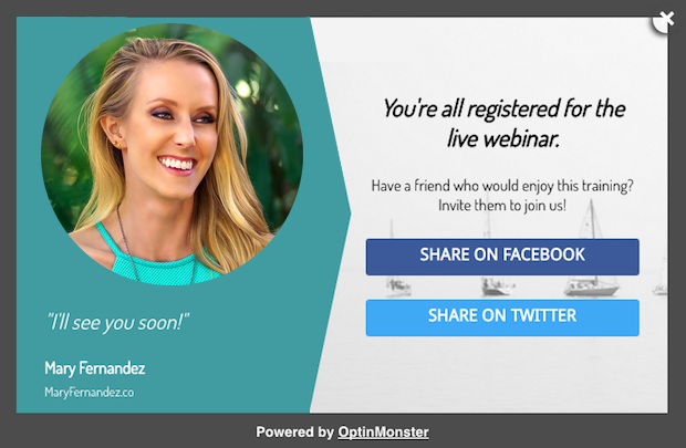
The Success View of this popup encourages new subscribers to invite friends to also sign up. There are 2 CTA buttons to share the signup form on social media.
As the subscribers’ friends sign up for the webinar, they’ll also see this thank you page that encourages them to share the signup form, as well. This creates a powerful snowball effect that can help you grow your email list and webinar attendance quickly.
You can even include an extra incentive for them to share. RafflePress is the best giveaway plugin for WordPress, and you can use it easily add a giveaway to your thank you page.
This is a fun and effective way to incentivize new subscribers to share your optin page.
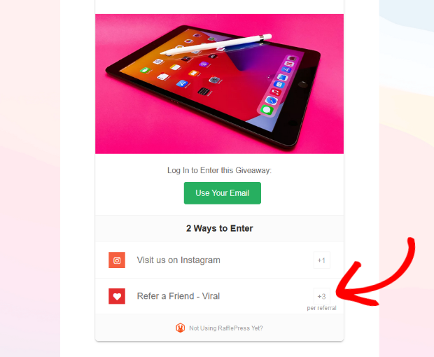
With the verified bonus actions, you can reward users with extra giveaway entries for sharing your page.
Many users will be more than willing to share your optin page for a better chance of winning an awesome prize.
Thank You Page Example #2: Related Blog Content
You can also use your thank you page to begin the lead nurturing process right away.
After all, why wait? The more you can increase your touch points with a lead, the more likely they will become a customer.
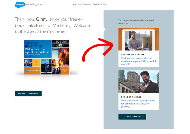
One way to nurture new subscribers is to recommending posts on your blog that are related to the lead magnet they just signed up for. This will keep them reading and browsing your site for longer.
Here’s a thank you page example where Salesforce included extra resources to explore:
Thank You Page Example #3: Webinar Promotion
You can also nurture your leads by asking them to register for a webinar or an event. Your new subscriber has just shown a high level of interest in your content, so your thank you page is the perfect time to promote your webinar.
Here’s an example of a webinar registration thank you page from Wisita.

Thank You Page Example #4: Community Building
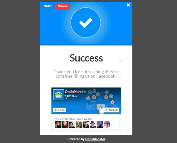
Another way to start nurturing leads right off the bat is by asking them to participate in your community. By bringing new leads into your community and social platforms, you’ll be able to have more of a dialog with them.
In this example, the thank you message includes a call to action to “like us on Facebook”.
Did You Know . . .
. . . that you can create a custom “Like us on Facebook” popup using OptinMonster? Grow your Facebook fanbase fast—get started with OptinMonster now!
Thank You Page Example #5: The Tripwire
After someone opts in with their email address, you can monetize your thank you page to immediately turn that new lead into a customer. Here’s how to monetize your thank you page:
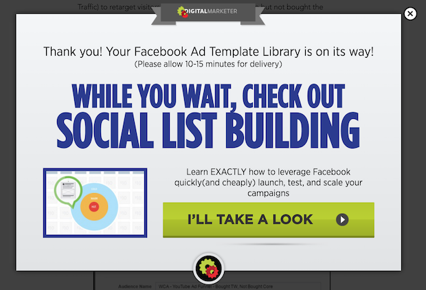
First, you’ll need to have a low-dollar offer, or a “tripwire.” A tripwire is an offer that is a complete no-brainer. It usually falls in the ballpark of $1-$20, depending on the regular price of your products.
Even though it’s priced so low, the tripwire offer still requires someone to pull out their wallet and become a paying customer. This is important because the first sale is the hardest. But when someone has bought from you once, it’s much easier to get them to buy from you again.
Digital Marketer has a great thank you page example with a tripwire. Their success message says that your lead magnet is on the way, and while you’re waiting for it to arrive, you should check out this other offer.
Want to create a similar success message?
Start using OptinMonster to convert more website visitors into subscribers and customers.
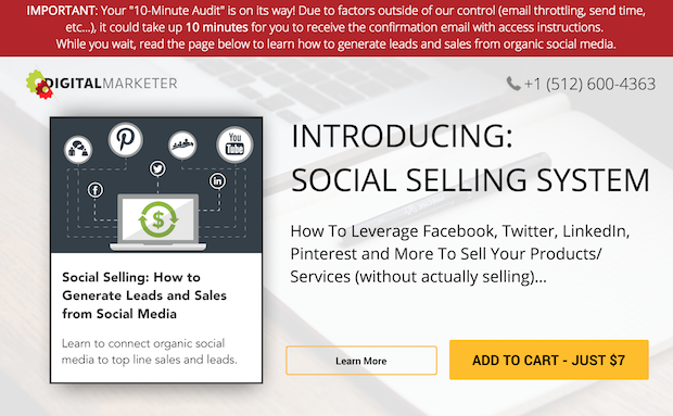
Once you click on the “I’ll take a look” button, you’ll be taken directly to the sales page with a $7 tripwire offer.
Now that we’ve seen some thank you page examples that are shown after an email optin, let’s look at some examples of thank you pages that are shown after the user completes a purchase.
After-Sale Thank You Page Examples
When someone completes a purchase, the goals for your thank you page are going to be a bit different. Your 2 main goals are usually to:
- Maximize customer value
- Increase customer retention
Here are some examples of after-sale thank you pages…
Thank You Page Example #6: The Value Maximizer
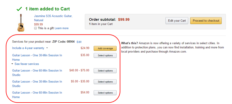
If your thank you page’s goal is to increase your customer’s value, you can offer a cross-sell or an up-sell.
Here’s an example of how Amazon does it. After you check out with this acoustic guitar, you’ll see some additional options to add a 4-year warranty or add some guitar lessons.
For more ideas to increase customer value, check out our post on increasing your sales funnel conversion rate.
Thank You Page Example #7: Account Creation
If your goal for your thank you page is to increase customer retention, you could ask them to create an account with you.
The thank you page is the ideal time to ask someone to create an account. If you require an account before the purchase, the speed bump might stop the sale. Once the customer has reached the order confirmation page, they’ve already decided that they trust your brand enough to buy.
Crate and Barrel asks you to create an account on their thank you page by suggesting that you “save your information for next time.” This is a great way to word it because it presents the ask as a benefit to the user.
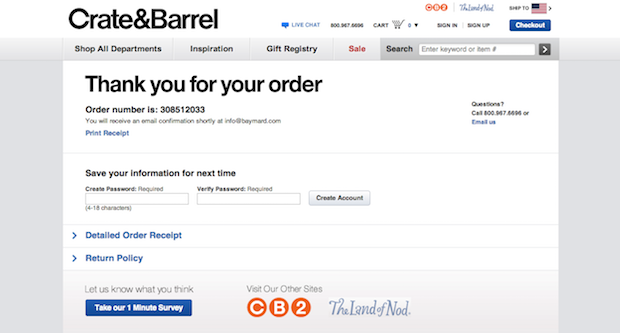
Also note the blue “Take our 1 Minute Survey” button. Including a survey on your thank you page is a great way to gather market research and further improve your sales process!
Thank You Page Example #8: Social Proof
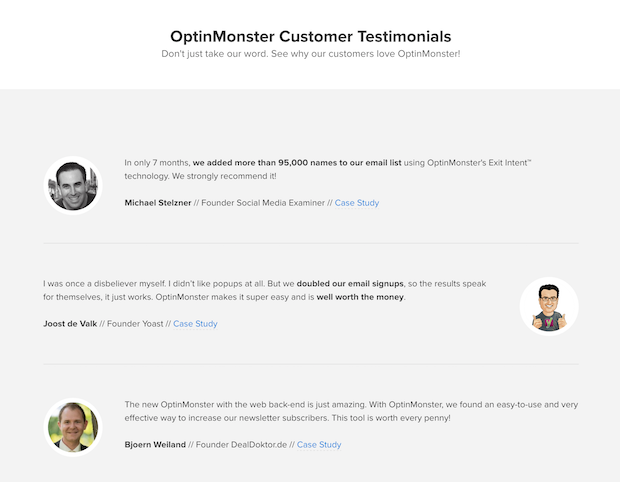
Another way to increase customer retention is to reinforce the decision to buy. When you show the customer that they’ve made a smart purchase, your thank you page helps to eliminate buyer’s remorse. It can also increase the chances of a customer returning to make another purchase.
You can do this by including customer testimonials or even case studies on your thank you page. Any kind of social proof will help new customers to feel good about their decision to buy.
For more ideas like this one, check out our complete guide to social proof.
How OptinMonster Can Enhance Your Thank You Page:
- Design Templates: Choose from a variety of professionally designed templates tailored for thank you pages.
- A/B Testing: Experiment with different designs and messages to see what resonates most with your audience.
- Seamless Integration: Connect with popular email marketing platforms to personalize the user experience further.
- In-depth Analytics: Understand user behavior on your thank you page to continually refine and improve.
With its intuitive design templates, robust A/B testing capabilities, and in-depth analytics, OptinMonster empowers you to create thank you pages that not only express gratitude but also drive action.
Whether you’re looking to upsell, gather feedback, or deepen the connection with your audience, OptinMonster is the partner you need. Elevate your post-conversion strategy with OptinMonster and watch your digital relationships flourish.
Get started with OptinMonster today.
Related Resources:







Add a Comment