With web traffic shifting increasingly toward mobile devices, mobile popups are vital for capturing leads and boosting sales, but only when done right. When designed specifically for mobile-first users, these website popups help you connect with visitors seamlessly and avoid disruptions.
In this article, I’ll explore how to create mobile popups that improve conversions without frustrating users. Specifically, I’ll share 9 mobile popup practices to improve the user experience on your site.
What Are Mobile Popups?
Mobile popups are on-screen messages or forms designed specifically for mobile devices. They’re an essential tool for engaging users, capturing leads, and driving conversions, especially in today’s mobile-first world. Unlike desktop popups, mobile popups are tailored to smaller screens, offering a seamless experience without disrupting usability.
Mobile-Responsive vs. Mobile-First Popups
- Mobile-Responsive Popups: These popups automatically adjust their size and layout to fit mobile screens. They’re ideal for ensuring your existing popups look great across all devices without extra effort.
- Mobile-First Popups: These are popups designed exclusively with mobile users in mind. They prioritize usability for touchscreens, use vertical layouts, and optimize for smaller, portrait-oriented displays.
OptinMonster offers both options among our 700+ premade templates, so you can choose the best fit for your marketing strategy. Whether you want to make your desktop campaigns mobile-friendly or create dedicated mobile campaigns, OptinMonster has you covered.
Device-Based Targeting for Maximum Impact
OptinMonster’s Device-Based Targeting feature takes mobile popups a step further by ensuring the right message reaches the right audience. With this functionality, you can:
- Display mobile-specific popups only to visitors on smartphones or tablets.
- Show desktop campaigns to users on larger screens.
- Customize offers for mobile users without disrupting the desktop experience.
This precise targeting helps you deliver personalized, relevant experiences for all visitors, increasing your chances of conversions while keeping your campaigns sleek and effective.
With mobile-responsive and mobile-first options, plus advanced targeting, OptinMonster empowers you to create popups that fit any strategy and device.
Why You Need to Optimize Your Mobile Popups
It’s no secret that the digital world is going mobile-first. According to StatCounter, mobile devices have over 60% market share:

This shift is why Google now indexes the mobile versions of websites instead of the desktop versions. If your popups aren’t optimized for mobile, you risk losing out on traffic, leads, and conversions from this dominant group of users.
By optimizing your mobile popups, you can unlock a range of benefits, including:
- Better User Experience (UX): Mobile-friendly popups are seamless and non-intrusive, making it easier for visitors to engage without frustration.
- Increased Conversions: Well-designed mobile popups capture leads effectively by providing a tailored experience for users on smaller screens.
- Higher Search Engine Rankings: Mobile-optimized websites align with Google’s mobile-first indexing, boosting visibility in search results.
- Improved Engagement: Mobile-first popups match the browsing habits of mobile users, increasing the likelihood of clicks and interactions.
- Broader Reach: By catering to the growing number of mobile users, you ensure your campaigns resonate with a larger audience.
When you optimize your mobile popups, you’re not just meeting user expectations. You’re also creating opportunities to grow your leads, sales, and overall business.
9 Mobile Popup Best Practices
These best practices will help you create and optimize mobile popups that enhance your website and improve conversion rates.
- Pick the Right Popup Format
- Use Mobile-Friendly Templates
- Write Short, Impactful Copy
- Always Include a Close Option
- Limit Form Fields to the Essentials
- Make Your CTA Button Stand Out
- Target the Right Users at the Right Time
- Personalize Campaigns for Mobile Visitors
- Preview and Test Across Devices
1. Pick the Right Popup Format
The type of popup you choose can make or break the user experience on mobile devices. Selecting the wrong format could frustrate visitors, leading to lower engagement and conversion rates.
Here are 3 popular popup formats for mobile campaigns:
- Lightbox Popups: These popups appear over the page content without completely obscuring it, making them ideal for subtle yet effective calls to action.
- Fullscreen Welcome Mats: These take over the entire screen and are perfect for bold offers or lead-generation campaigns that require the user’s full attention.
- Slide-In Scroll Boxes: These popups appear from the side of the screen and don’t block the page’s content. They are less disruptive than lightbox or fullscreen popups.
OptinMonster makes it simple to choose the right format for your mobile campaigns. From your dashboard, you can easily select which type of popup you want to create.

Choosing the right format depends on your campaign goals. For example, if you’re offering a discount code, a fullscreen welcome mat can grab attention quickly. If you’re asking for a newsletter signup, a lightbox popup might feel less intrusive.
2. Use Mobile-Friendly Templates
Mobile screens are smaller, and layouts that work well on desktop can look cluttered or broken on a phone. Choosing a mobile-optimized template ensures your popups fit perfectly on any screen size, enhancing usability and increasing engagement.
To avoid issues, focus on templates with a vertical, single-column layout where images stack above or below text, not side-by-side. This design keeps everything readable and visually appealing for mobile users.
Here’s an example of a mobile-friendly popup design:
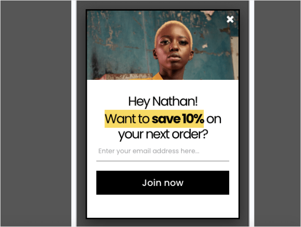
OptinMonster offers over 700 professionally designed templates. Every template in our library is responsive for different deviced. However, you can also choose from dozens of Mobile Optimized templates specifically tailored for smaller screens.
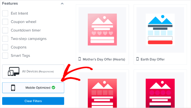
These templates save you time while ensuring your popups look polished and perform well on any device.
Additionally, OptinMonster’s templates are fully customizable, allowing you to adjust fonts, colors, images, and layouts to match your branding effortlessly. With responsive designs built in, you can rest assured your popups will look great on both phones and tablets.
3. Write Short, Impactful Copy
Mobile users tend to have limited patience for lengthy text. On smaller screens, long-winded or overly detailed copy can feel overwhelming and lead to disengagement. Instead, your copy should quickly and clearly communicate the value of your offer and prompt the user to take action.
A concise, impactful message not only holds the user’s attention but also increases the likelihood that they’ll complete the desired action, such as signing up for your email list or redeeming an offer.
For example, OptinMonster’s mobile popup template for flash sales keeps the copy short and to the point:

OptinMonster’s easy editor allows you to edit your popup text right in the visual builder:
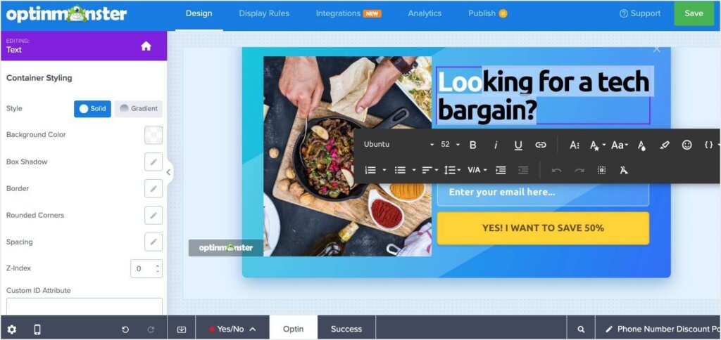
With features like inline editing, you can see exactly how your copy will appear on your popup as you work. Additionally, you can adjust:
- Font size, color, and style: Ensure your message is bold and easy to read.
- Text placement and alignment: Keep your copy clean and visually balanced.
- Real-time A/B Testing: Experiment with different messages to find the one that drives the most conversions.
- Smart Optimization: Choose from AI suggestions to improve your copy.
By simplifying your copywriting process and giving you the tools to refine your message, OptinMonster ensures your mobile popups are both engaging and effective.
4. Always Include a Close Option
Mobile users expect to have control over their browsing experience. If your popup doesn’t include an easy-to-find close option, users may feel trapped and frustrated, leading to higher bounce rates. Worse, they might leave your site entirely.
A visible close button enhances user experience (UX) by giving visitors the option to dismiss the popup if they’re not interested. It’s also vital to the SEO impact of your popup. This small design element builds trust and ensures visitors don’t feel forced into engaging with your content.
OptinMonster makes it simple to include a close button in your popups. With a single toggle, you can enable or disable the close button for any campaign. You can also customize the close button to suit your design, including:
- Placement: Users generally expect the close button to be at the top right, but OptinMonster allows you to adjust its placement.
- Size and thickness: Make sure your close button is highly visible and is easy to tap on mobile.
- Style and color: Match the button to your branding while keeping it visible.
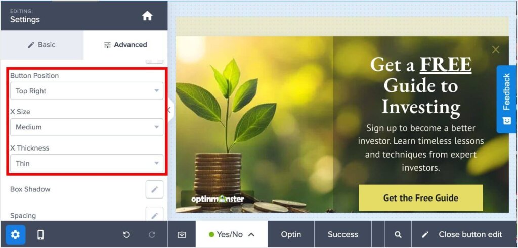
By providing these customization options, OptinMonster helps you maintain a user-friendly experience while still achieving your campaign goals.
5. Limit Form Fields to the Essentials
On mobile, every tap matters. Long or overly complicated forms that request too much information often discourage users from completing them. Mobile users, in particular, are more likely to abandon a form if they’re asked for unnecessary details.
To maximize conversions on your email signup popups, focus on collecting only the essentials. Typically, that means just an email address. This reduces friction, makes the signup process faster, and increases the likelihood of users taking action. Once you’ve captured the lead, you can always gather more information later through follow-up emails or progressive profiling.
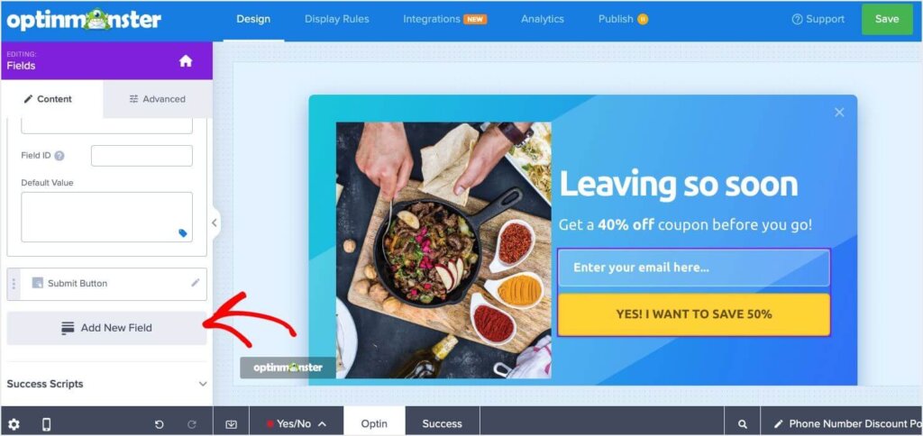
OptinMonster’s form builder gives you complete control over what information you collect. With just a few clicks, you can:
- Simplify forms: Add or remove fields to keep your form short and user-friendly.
- Focus on essentials: Limit input fields to just a name and email, or even just an email address for the fastest results.
- Enhance usability: Use dropdowns or checkboxes for additional fields when absolutely necessary, reducing typing effort for users.
These features make it easy to create streamlined forms that encourage signups while maintaining a positive user experience.
6. Make Your CTA Button Stand Out
The call-to-action (CTA) button is the centerpiece of any popup. It’s the element that guides users toward the next step, whether that’s signing up, downloading, or making a purchase.
For mobile users, a poorly designed CTA button can lead to confusion or missed opportunities. The button must be:
- Tappable: Large enough for thumbs to click without zooming in.
- Visible: A contrasting color that stands out against the popup background.
- Action-Oriented: Text that clearly communicates what users will get, such as “Subscribe Now” or “Claim Your Discount.”
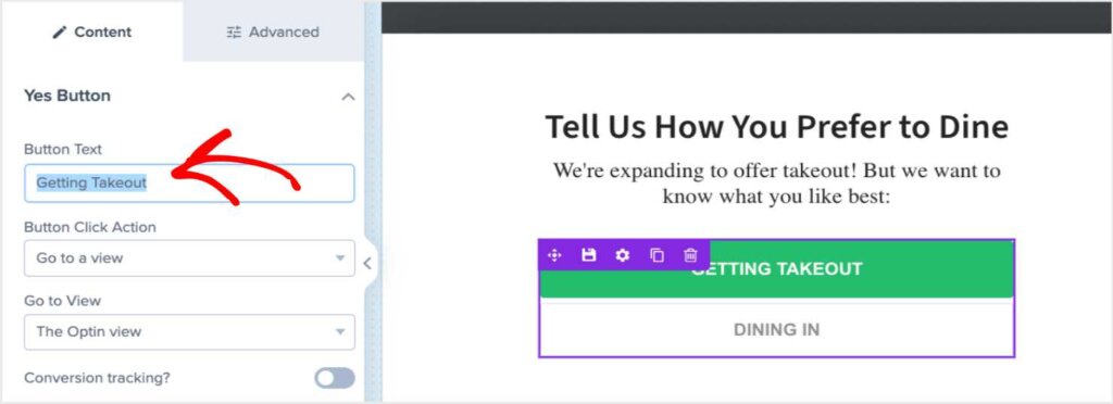
OptinMonster’s drag-and-drop builder makes it easy to customize every aspect of your CTA button, ensuring it grabs attention and drives action:
- Adjust button size: Create a button large enough to tap easily on mobile devices.
- Choose standout colors: Select high-contrast colors that match your branding and draw the eye.
- Craft compelling text: Edit the CTA text to encourage action with phrases like “Get My Coupon” or “Join the Club.”
- Optimize alignment: Position the button for maximum visibility and usability within your popup.
7. Target the Right Users at the Right Time
Even the most beautifully designed popup will fail if it’s shown to the wrong audience or at an inconvenient time. Mobile users expect content that is relevant to their needs and presented when it’s most helpful. Poorly timed popups can frustrate visitors, while precisely targeted ones increase relevance, engagement, and conversions.
For instance, showing a discount offer to users who are actively browsing your product pages makes sense. But interrupting them right as they’re landing on your homepage might feel intrusive and drive them away.
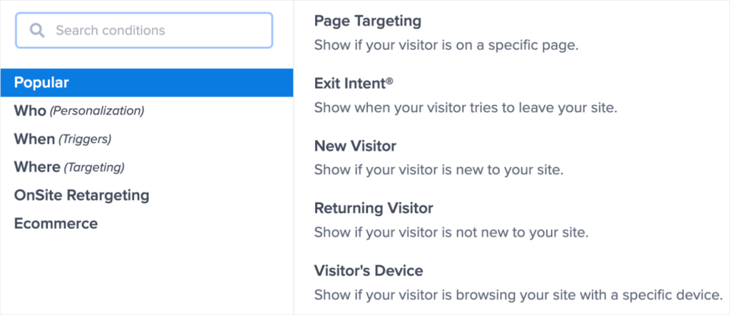
OptinMonster’s advanced targeting and triggering options ensure your popups reach the right audience at the perfect moment. Key features include:
- Behavior-Based Triggers: Display popups when users scroll a certain percentage of the page, show Exit-Intent®, or remain inactive for a specified time.
- Device Targeting: Customize campaigns to appear only for mobile users while showing desktop-optimized popups to larger screens.
- Page-Level Targeting: Show offers that are relevant to the content the visitor is viewing
- Geolocation Targeting: Deliver location-specific offers or messages based on the user’s physical location.
- Referrer Detection: Tailor popups based on where visitors came from, such as social media platforms or specific ads.
These tools allow you to craft highly relevant campaigns that connect with your audience and drive conversions. Best of all, you can customize these settings in just a few clicks in OptinMonster’s Display Rules.
8. Personalize Campaigns for Mobile Visitors
Personalization has become a cornerstone of effective marketing. Tailored messages show visitors that you understand their needs and make your offers feel more valuable. For mobile users, who already expect streamlined and relevant content, personalized popups can significantly boost engagement and lead to higher conversion rates.
For example, addressing users by name or referencing their location makes your message more engaging and encourages action.
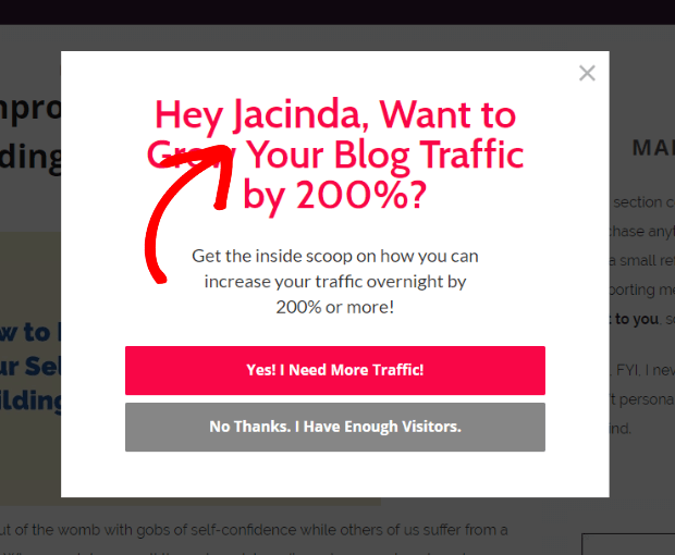
OptinMonster’s Smart Tags enable effortless personalization in your campaigns. You can:
- Insert Names or Locations: Greet users with their name or mention their location directly in the popup, such as “Welcome back, Alex!” or “Special Offer for New York Shoppers!”
- Customize Offers by Traffic Source: Display different messages for visitors from specific platforms like Facebook, Google, or email campaigns.
- Segment Audiences Automatically: Show different popups to returning users versus first-time visitors for a more tailored experience.
This level of personalization transforms generic popups into highly engaging campaigns that resonate with mobile visitors.
9. Preview and Test Across Devices
Consistency is key to providing a seamless user experience. A popup that looks perfect on one device might appear broken or awkward on another. Regular testing ensures your campaigns perform well across various screen sizes and devices, maintaining a professional and user-friendly experience for all visitors.
Without testing, you risk alienating potential leads due to poor design or functionality issues on specific devices.
OptinMonster makes testing and optimizing your campaigns across devices easy. For instance, you can preview what any campaign will look like on mobile by clicking the mobile icon at the bottom left of the campaign builder:

In addition to previewing your mobile popups, OptinMonster also lets you easily test and track their performance:
- A/B Test Your Mobile Popups: OptinMonster’s built-in split testing lets you test different versions of your campaign in just a few clicks.
- Track the Performance of Every Campaign: Monitor Conversion Analytics and Revenue Attribution
By using these OptinMonster features, you can deliver a consistently high-quality experience to all users, no matter how they access your site.
Grow Your Business With Mobile Popups
With these best practices for mobile popups, you’re ready to convert more visitors into subscribers and customers while maintaining a great user experience.
Want to learn more about popups and mobile optimization? Check out these resources:
- The 7 Best WordPress Popup Plugins: A Complete Comparison for Your Site
- 11 Types of Popups You Should Be Using (With Examples)
- eCommerce Popups That Work: How to Increase Sales and Recover Abandoned Carts
- The DIY Mobile SEO Guide: How to Be Mobile-First
- How to Increase Mobile Conversion Rate (11 Proven Methods)
OptinMonster is the best tool available for creating beautiful mobile popups and targeting them to the right people at the right time. And it’s risk-free to sign up, with our 14-day, money-back guarantee.





Add a Comment