Are you interested in some inspiring abandoned cart email examples?
And why shouldn’t you be? Research shows that the average cart abandonment rate is 70.19%, responsible for $18 billion in lost eCommerce sales annually
I’m Farjad, and as a writer who’s obsessed with optimizing marketing campaigns, abandoned cart emails are a personal favorite. They’re a goldmine for recovering lost sales and re-engaging potential customers.
In this article, we’re diving deep into some of the best abandoned cart email examples I’ve encountered recently. We’ll examine what makes them tick, analyze their effectiveness, and explore how you can improve them.
We’ll also provide you with customizable abandoned cart email templates, serving as a perfect starting point for your campaigns.
Let’s begin!
- What Are Abandoned Cart Emails?
- 14 Abandoned Cart Email Examples
- Abandoned Cart Email Templates
- Abandoned Cart Email Best Practices
- Capturing Emails During Cart Abandonment
What Are Abandoned Cart Emails?
Abandoned cart emails are marketing emails sent to customers who have added items to their online shopping cart but have not completed the purchase.
Abandoned cart emails typically include information about the items left in the cart, encouraging the customer to return to the website and complete the purchase. It may also include personalized messages, coupon codes, or incentives to entice the customer to take action.
Abandoned cart emails are a popular tactic in eCommerce business and have proven effective in increasing conversion rates and generating additional revenue.
Resource: 29 Best Email Automation Tools to Transform Your Business
Let’s look at the best abandoned cart email examples you can use to recover as many lost sales as possible.
14 Abandoned Cart Email Examples
The Selection Process: A Curator’s Eye
Sifting through dozens of abandoned cart emails, I focused on a core set of criteria:
- Attention-grabbing subject lines: The first impression matters! I looked for subject lines that were clear, concise, and sparked curiosity (think: “Did you forget something?” from Casper).
- Compelling visuals: High-quality images showcasing the abandoned items or the benefit of owning them can significantly boost engagement.
- Clear call to action (CTA): The email’s purpose is to nudge visitors towards checkout. Strong CTAs, like buttons that say “Complete your purchase” or “Treat yourself!”, are essential.
- Personalization: A touch of personalization can go a long way. Emails that address customers by name or remind them of their specific abandoned items feel more genuine and increase conversion rates.
- Urgency or scarcity: Sometimes, a gentle nudge that items might sell out or a discount with an expiration timer can create a sense of urgency and motivate customers to complete their purchase.
1. Casper: The Playful Reminder
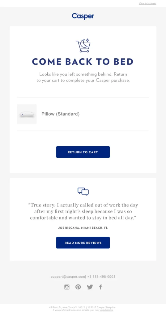
Subject Line: Did you forget something?
First impression? Delightful! This subject line is clear, concise, and uses a touch of humor to pique curiosity. It doesn’t scream “SALES!” but instead gently reminds you, “Hey, there’s something waiting for you.”
Opening the email, I was greeted by a playful headline: “COME BACK TO BED.” This playful tone continues throughout the email, making the whole experience feel warm and inviting. Casper cleverly uses social proof by showcasing positive customer reviews, adding trust and credibility.
Why it Works: This email strikes a perfect balance between friendly and persuasive. It doesn’t pressure you to buy, but instead reminds you of the comfort and relaxation a Casper mattress could bring.
My Takeaway: A little humor and a friendly tone can go a long way in abandoned cart emails. Don’t be afraid to inject some personality into your brand voice!
2. Google Wifi: The FOMO Factor
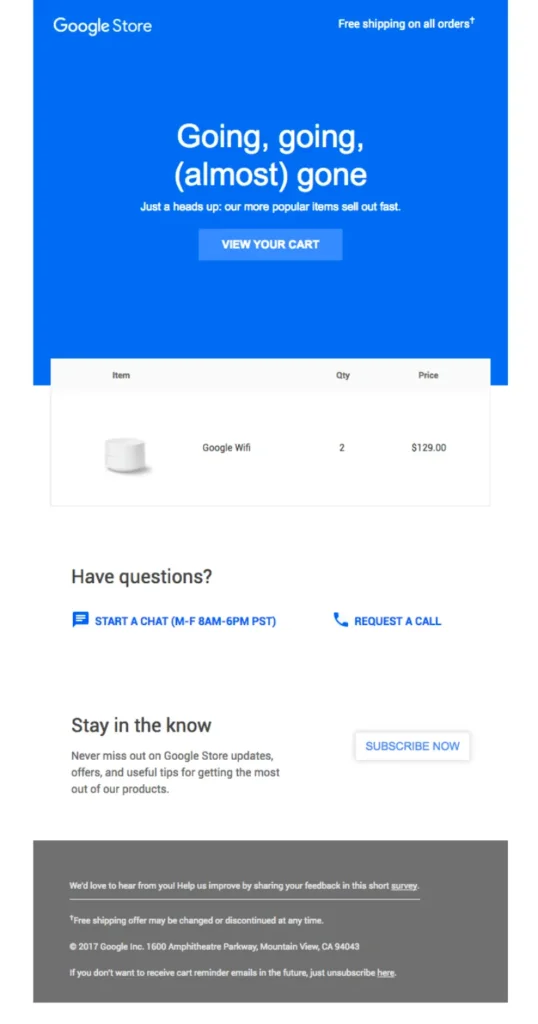
Subject Line: The Google Wifi in your cart is going fast.
This subject line takes a different approach, tapping into the fear of missing out (FOMO). It creates a sense of urgency, letting you know these popular items might not be around forever.
Opening the email, the urgency continues with a bold statement: “Going, going, (almost) gone!” The email showcases the Google Wifi product with a clear image.
Why it Works: This email leverages FOMO to nudge potential customers towards checkout. By implying limited stock, it creates a sense of scarcity and encourages a quicker decision.
My Takeaway: Scarcity tactics can be effective, but use them with caution. Too much urgency can come across as pushy.
3. Brooklinen: Reviews & Social Proof
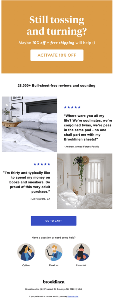
Subject Line: We noticed you left something behind!
This subject line is straightforward and informative. It lets you know exactly what the email is about without being overly salesy.
The email showcases the methods to contact customer support with prominently highlighted illustrated accents that add a lively touch to the design. What really stood out to me was the inclusion of customer reviews. Social proof is incredibly powerful, and Brooklinen uses it effectively by letting satisfied customers speak for the brand.
Why it Works: Showcasing positive reviews builds trust and reassures potential customers that they’re making a good decision.
My Takeaway: Don’t underestimate the power of social proof! Including customer testimonials or reviews can significantly boost conversions.
4. Vans: Offering Alternatives
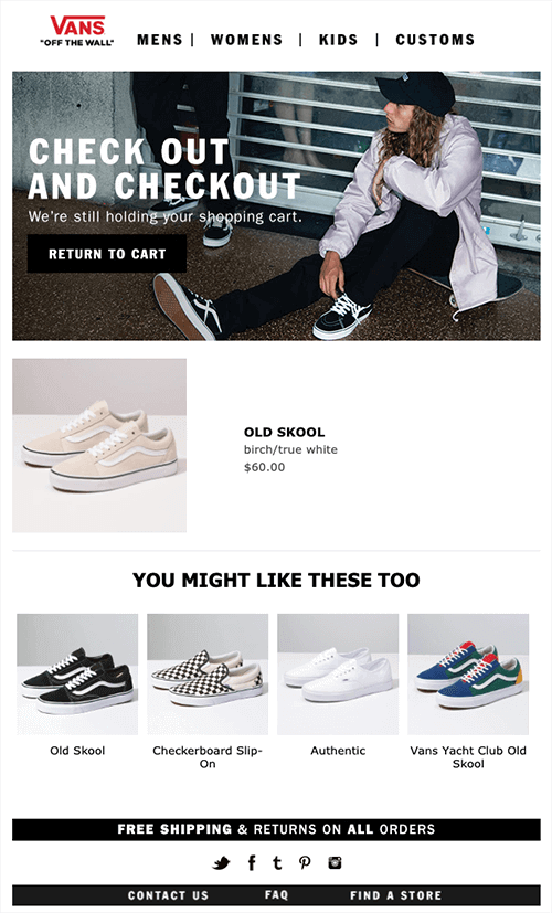
The email starts with a friendly reminder that Vans is still holding the customer’s shopping cart. This casual approach is subtle but effectively reminds the customer of their abandoned purchase without being pushy.
The email includes an image of the product that was left in the cart. This is a helpful visual cue that jogs the customer’s memory and makes the product more desirable.
Vans also includes a section called “YOU MIGHT LIKE THESE TOO,” which showcases similar products. This is a good way to entice customers to browse more and potentially add other items to their cart.
Why it Works: Opening the email, Vans showcases the abandoned items and then offers a helpful suggestion: “Still deciding? Check out some similar styles you might love!” This is a brilliant tactic! It acknowledges that sometimes people might have second thoughts, but instead of pressuring them to complete the purchase, it offers helpful alternatives to keep them engaged with the brand.
My Takeaway: Go beyond the initial abandoned cart. Consider offering related products or helpful content to keep the customer engaged.
5. Whisky Loot: Addressing Objections

Subject Line: Your cart is sobering up
Oh man, Whisky Loot gets me. Sifting through those Shopify examples, their abandoned cart email had me cracking up. “Your cart is sobering up” – that subject line is pure gold! It’s clever, unexpected, and definitely grabs your attention. No wonder their open rates are high.
Then you open the email, and the fun keeps rolling. They hit you with a question to pull you in, then launch into a hilarious list of all the amazing things you could be doing with those whiskies right now. It’s so visual, you can practically picture yourself using them in those wacky scenarios. By the end, you’re smiling (or maybe even snorting with laughter) and definitely rethinking that abandoned cart.
Whisky Loot is smart – they wrap it all up with a handy FAQ section to answer any lingering questions, then hit you with a clear call to action: “TREAT YOURSELF.” Genius!
Why it Works: Whisky Loot’s email hits all the right notes. Humor is a powerful tool for engagement, and that unexpected subject line is a guaranteed attention grabber. The lighthearted tone throughout the email makes the recipient feel comfortable and receptive. Plus, the creative list of uses for the whisky piques their interest and reminds them of the value proposition.
My Takeaway: Don’t be afraid to inject some personality into your abandoned cart emails! Humor can be a disarming and effective way to reconnect with potential customers.
Pro Tip: While humor can be a winner, it’s important to understand your audience. Make sure your jokes resonate with your target demographic and align with your brand voice.
Abandoned Cart Email Templates
Here are three abandoned cart email templates you can use as a starting point for a text based email:
Template 1
Simple Reminder Subject: You left something behind – Complete your purchase!
Hi [Customer’s Name],
We noticed that you left items in your cart, and we wanted to remind you to complete your purchase. Don’t miss out on the great products you selected! Click the link below to return to your cart and finalize your order.
[Call-to-action button: Return to Cart]
If you have any questions or need assistance, our friendly customer support team is here to help. We appreciate your consideration, and we hope to see you back soon!
Best regards, [Your Company]
Template 2
Limited-Time Offer Subject: Complete your purchase now and enjoy 10% off!
Hello [Customer’s Name],
We wanted to let you know that the items in your cart are still available, and we’re offering a special discount to encourage you to complete your order. For a limited time, enjoy 10% off your purchase. Just use the code CART10 at checkout.
[Call-to-action button: Complete Your Purchase]
If you need any assistance or have any questions, please don’t hesitate to reach out to our dedicated support team. We’re here to ensure your shopping experience is seamless.
Thank you for considering our products. We look forward to serving you!
Warm regards, [Your Company]
Template 3
Social Proof Subject: See why others love our products – Don’t miss out!
Hi [Customer’s Name],
Your cart is waiting for you, and we wanted to share some customer reviews with you. Our products have received rave reviews from happy customers just like you. Take a look and see what others are saying!
[Include 2-3 positive customer reviews or testimonials]
Ready to make these fantastic products yours? Simply click the link below to return to your cart and complete your purchase.
[Call-to-action button: Return to Cart]
If you have any questions or need further information, our customer support team is ready to assist you. We appreciate your interest in our brand, and we hope to see you back soon!
Best regards, [Your Company]
Feel free to customize these abandoned cart email templates based on your brand voice, specific products, and any additional incentives you may want to offer.
Abandoned Cart Email Best Practices
Listed below are the best practices for creating effective abandoned cart emails that provide the best customer experience.
Make it personal: Use the customer’s name and mention the items they left in the customer’s cart to make the email feel more personal.
Create a sense of urgency: Let customers know that the items in their cart might run out or offer limited-time discounts to encourage them to buy quickly.
Use clear call-to-action buttons: Make it easy for customers to return to their cart by using big buttons that stand out and lead directly to the checkout page.
Use social media: Include links to your social media accounts in the email so customers can connect with your brand and stay updated on promotions.
Offer an unsubscribe option: Give customers the choice to unsubscribe from future emails if they want to.
Send reminder emails: Consider sending a series of cart reminder emails to remind customers about their abandoned carts over time.
Show customer reviews: Include positive reviews from other customers to build trust and show the quality of your products.
Provide good customer support: Let customers know how to contact you if they have questions or need help. Being helpful can increase the chances of customers completing their purchases.
Remember to test different elements of your emails and analyze the results to see what works best for your customers.
Capturing Emails During Cart Abandonment
While we are on the topic of abandoned cart emails, it’s equally important to talk about grabbing your potential customers’ emails before they leave your site forever.
In other words, your abandoned cart email strategy is only useful if you have an email list of potential customers and leads.
And for that, there’s no better tool than OptinMonster:
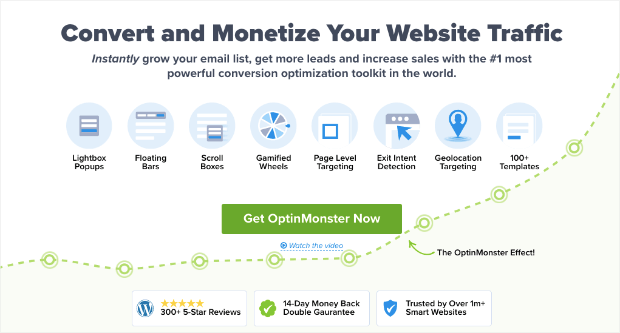
OptinMonster is the world’s #1 lead generation software, making recovering sales from abandoned carts easier. That’s because it allows you to create professional-looking and highly effective optin campaigns.
“Optin campaigns” are simply notifications that display via popup, floating bar, fullscreen welcome mat, and more.
In fact, you’re probably familiar with optin campaigns. They look something like this:
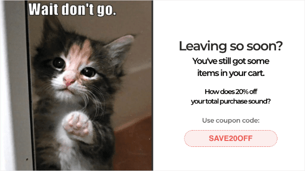
The popup example from above was specifically designed to reduce cart abandonment. Plus, it only took 5 minutes to build.
That’s because OptinMonster has over 100 pre-made templates that look stunning across all devices. And when you select the template you want (or build one from scratch), making changes to your campaign is easy.
OptinMonster has a drag-and-drop editor, which means there are zero coding or “tech skills” required to design the perfect campaign for your business:
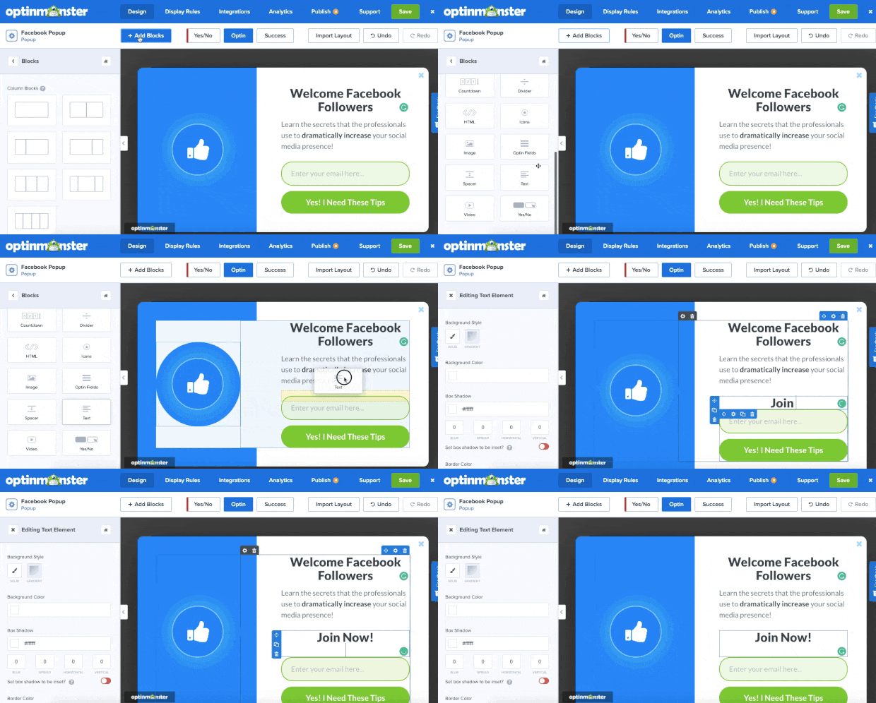
But creating the right campaign is only half the battle when you’re trying to recover abandoned carts.
You’ll also need to show these campaigns to the right people, in the right places, and at just the right time in their customer journey.
OptinMonster gives you more targeting rules and triggers to make this happen. Some of the more popular rules include:
- Exit-Intent® Technology: Engage users as they’re actively leaving your store.
- MonsterLinks™: Turn any campaign into a clickable button or anchor text.
- Page-Level Targeting: Target specific pages of your site (like checkout pages or product pages, for example).
- Geo-Location: Display campaigns based on where your visitor is physically located.
- OnSite Retargeting®: Create drip campaigns to show new offers based on how users interacted with previous messages.
And much more.
These are just a few examples of the targeting rules you can use, though there are many others. But how do these rules help you?
By targeting a specific group of your site’s visitors, you can personalize the messaging of your campaigns. This will connect more deeply with the person who sees it, ultimately leading to higher conversion rates for you.
This is how Scott Wyden recovered 21% of abandoned carts on his website.
Want to see it in action for yourself? Click below to start your 100% risk-free OptinMonster account today:
But now you may be wondering: “How would I use popups to capture emails for abandoning users?”
Let’s look at four ways you could make that happen.
1. Leveraging Exit-Intent® Technology
The first and easiest way would be to create an exit-intent popup.
This allows you to show a campaign when someone leaves their browser page on mobile and desktop devices.
Here’s how it works:
- You build a beautiful campaign
- Add a page-level targeting rule to target your user’s checkout page
- Add an exit-intent rule to the same campaign
And that’s it! You would have two rules that look something like this:
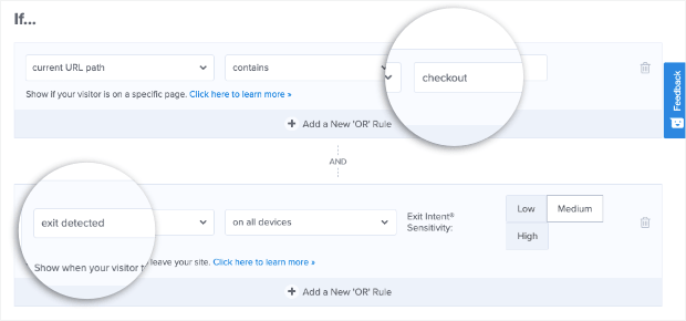
When someone tries to leave their checkout page before paying, you can re-engage them with an enticing popup.
2. Building Urgency With a Countdown Timer
Ready to take things to the next level? The last tip was a great place to start.
But you can boost the conversion rate with your exit-intent popup by adding a countdown timer to create a sense of urgency.
This is important because many people abandon their carts with the best intention of returning to pay. The problem is that a million things distract them, and they never remember to come back.
You can prevent this by adding a countdown timer to your exit-intent popup. The fact that the user sees a limited time (expiring) offer will trigger their FOMO (fear of missing out), making them more likely to take action.
This can quickly be done with OptinMonster using drag and drop:
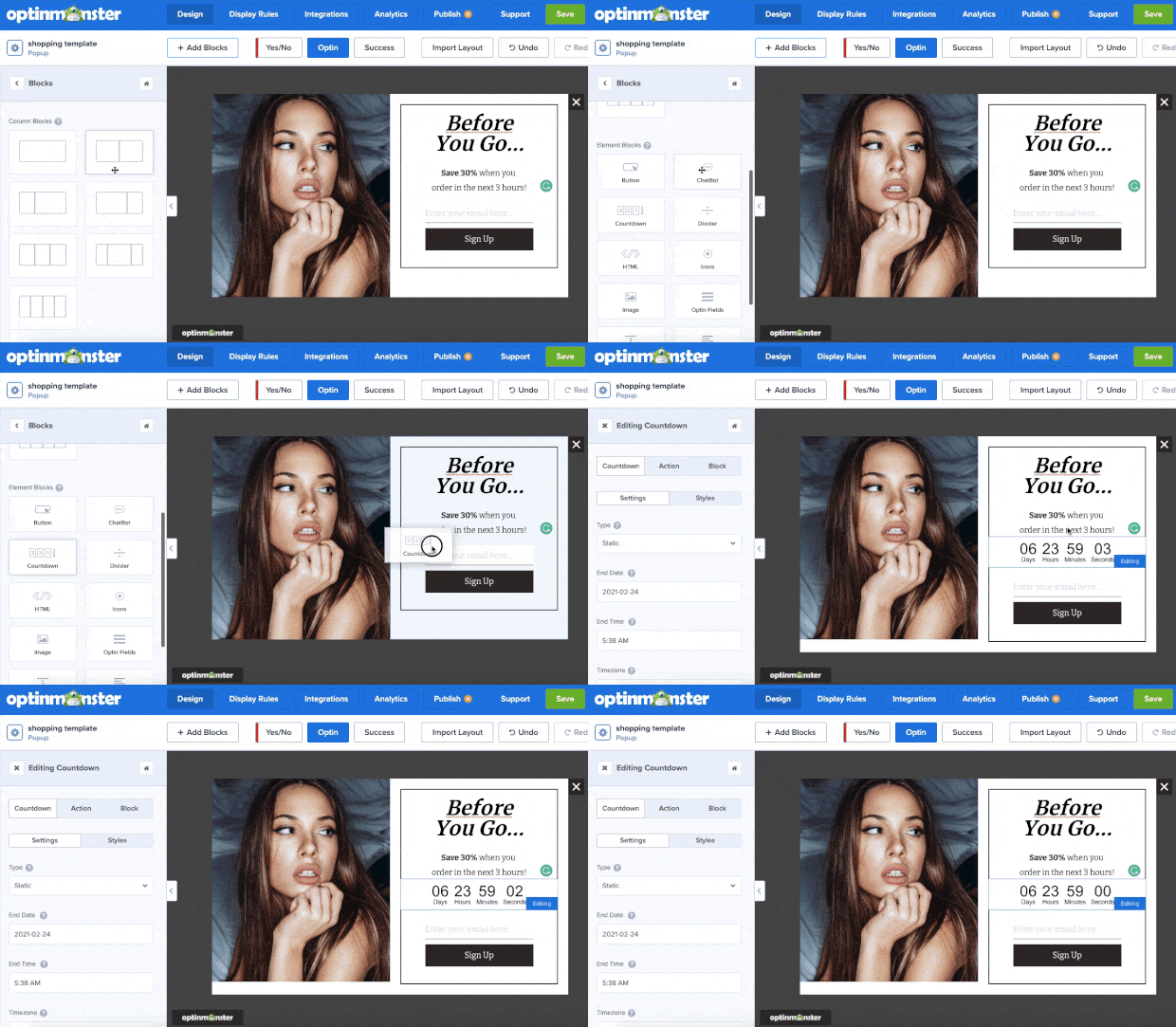
This can motivate your customers to finalize their purchase before they forget.
Check out this helpful resource to learn how to add a countdown timer to your campaigns: How to Create a Countdown Timer Popup to Skyrocket Sales.
3. Keeping Things Fun With a Gamified Popup
Another option is to use a “spin to win” discount wheel popup. This is an excellent way of adding some fun to your online store.
It’s also incredibly effective at increasing conversion rates. Here’s what these campaigns look like when you build them with OptinMonster:
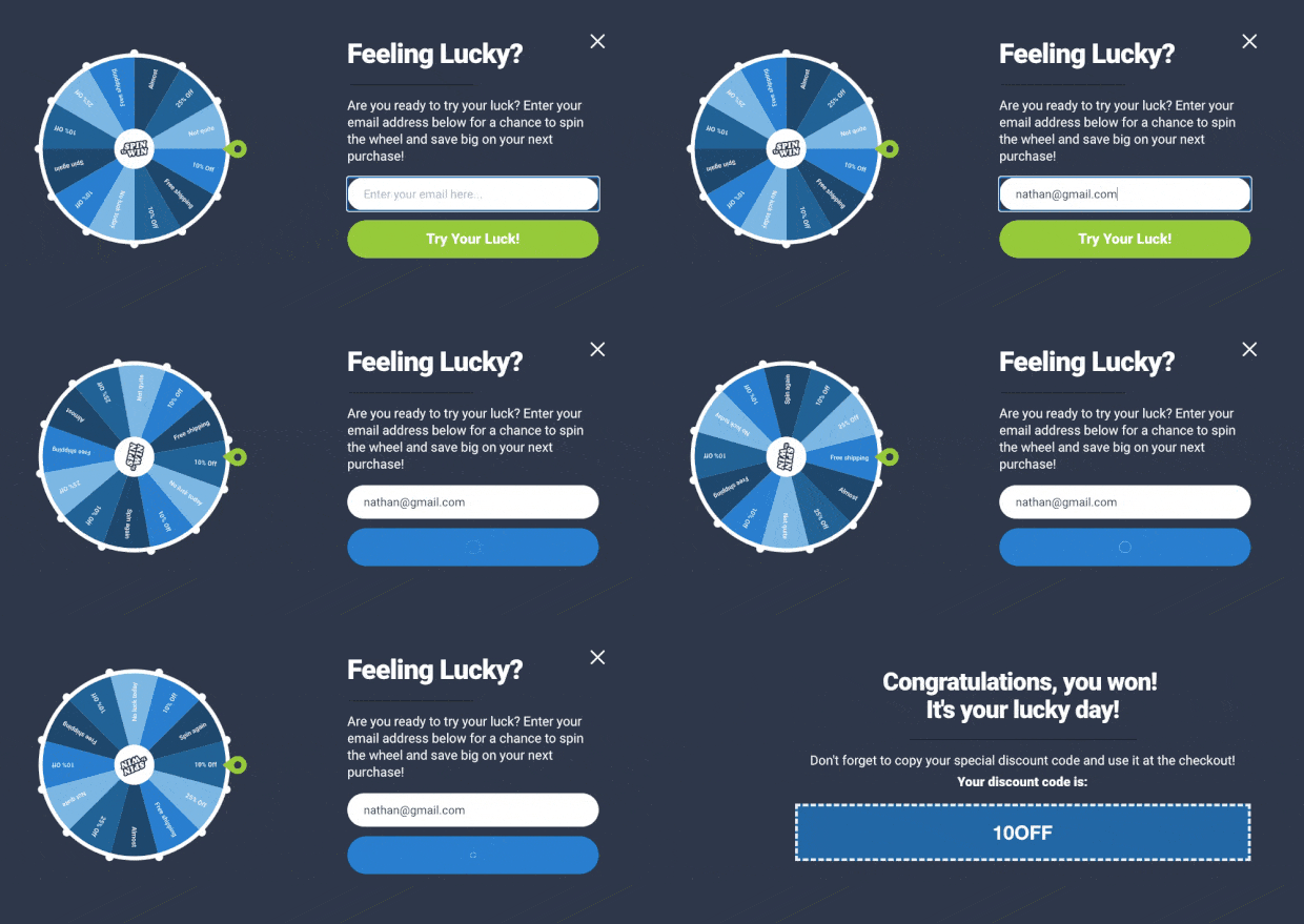
Putting this on your checkout page is an excellent way of capturing your users’ email addresses before they leave your store for good.
Want to learn how to make one of these? Try starting here: How to Create a “Spin to Win” Wheel to Drastically Boost Engagement.
4. Re-engaging Inactive Users
When customers are ready to purchase, you need everything to go smoothly. Even the slightest distraction makes people forget about their items on hold.
So as users hit their checkout page, they may wander off looking for a credit card, talking with their partner about the purchase, or do one of a million things that might steal their attention.
That’s where an inactivity sensor campaign comes in handy.
This trigger will wait until users have stopped interacting with your website or page for a specified time.
Then it shows your popup where you can offer an incentive for users to hand over their email addresses.
And this doesn’t need to be complicated. Check out this inactivity campaign by Skates.co.uk:
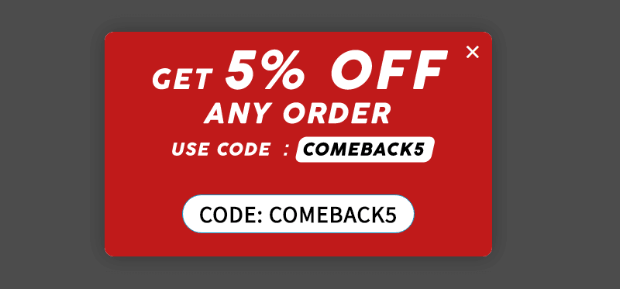
This one campaign was responsible for increasing sales by £2000 per day.
We hope you found this article helpful. If you did, you might want to check out the following resources:
- 7 Proven Ways to Reduce Shopping Cart Abandonment
- 5 Cart Abandonment Stats to Help You Win “Lost” Sales
- How to Create an Abandoned Cart Email Strategy
- 30+ Proven Ways to Use Social Proof to Increase Your Conversions (Updated)
- Unlock the Power of FOMO: 17 Clever FOMO Marketing Examples
These posts will have everything you need to recover more abandoned shopping carts and bring in higher profits to your eCommerce store.
FAQs on Abandoned Cart Emails
1. What do you say in an abandoned cart email?
In an abandoned cart email, you typically start with a friendly reminder about the items left in the cart. Highlight the benefits or features of the products to rekindle interest.
You can also include an incentive like a discount or free shipping to encourage completion of the purchase. It’s important to keep the tone helpful and customer-centric, showing concern for the customer’s needs or potential reasons for abandonment.
2. How do you write an abandonment email?
- Start with a Catchy Subject Line: Grab attention and clearly indicate the email’s purpose.
- Personalize the Message: Use the customer’s name and reference specific items in their cart.
- Be Clear and Concise: Clearly state the purpose of the email and what the customer should do next.
- Include a Call-to-Action (CTA): Direct them back to their cart with a clear CTA button or link.
- Offer Support: Provide contact information for customer support in case they have questions or issues.
- Consider Incentives: Optionally, include a special offer to encourage them to complete the purchase.
3. What is the headline for abandoned cart emails?
The headline for abandoned cart emails should be attention-grabbing and directly related to the purpose of the email.
Examples include: “Did You Forget Something?”, “Your Cart Misses You!”, or “Complete Your Purchase Today!”. The headline should create a sense of urgency or curiosity to encourage the recipient to open the email.
4. Is it legal to send abandoned cart emails?
Yes, it is generally legal to send abandoned cart emails, but it’s important to comply with email marketing laws and regulations such as the CAN-SPAM Act in the United States, GDPR in Europe, and other regional data protection laws.
These laws typically require that the recipient has provided their email address willingly (e.g., during the account creation or checkout process) and that there is an easy way for them to opt-out or unsubscribe from further emails.
Always ensure that your email practices comply with the legal requirements of your customers’ locations.





Add a Comment