Do you want to improve your marketing with A/B testing? A well-honed A/B testing strategy can skyrocket your lead generation, drive more sales, and improve conversion rates.
A/B tests let you assess different versions of a webpage, email, or marketing campaign, and then you can fully launch the version that performs the best. With thorough testing, you can be confident that every aspect of your marketing funnel is optimized to get the most clicks and conversions.
A/B tests are an essential optimization practice for any digital marketing professional. But “essential” definitely doesn’t mean “easy.”
Fortunately, this guide will help you learn to A/B test like a pro! I’m going to cover everything you need to know about A/B testing, including the definition, types, elements, and steps for this vital strategy.
Let’s get started!
- What Is A/B Testing?
- How Does an A/B Test Work?
- What Elements Can You A/B Test?
- Benefits of A/B Testing
- Best Practices for A/B Testing
- How to A/B Test An Optin Campaign
What Is A/B Testing?
A/B testing is a marketing methodology used to compare 2 versions of a web page, email, or other digital content. Each version is shown to a sample size of the target audience. The purpose is to determine which version performs the best, based on pre-determined metrics.
A/B testing is also often called split testing because the audience is split between the 2 different versions.
How Does an A/B Test Work?
When you A/B test content on your website, you create 2 versions of the same page:
- Version A
- Version B
Hence the name “A/B test.”
Version A is the page as you initially designed it. Version B is a copy of Version A, but with 1 element changed.
You’ll sometimes see Version A called the “control” or “baseline,” and Version B called the “variation”
Let’s say that your changed element is the color of your call-to-action (CTA) button. You want to test which color causes more website visitors to click your CTA.
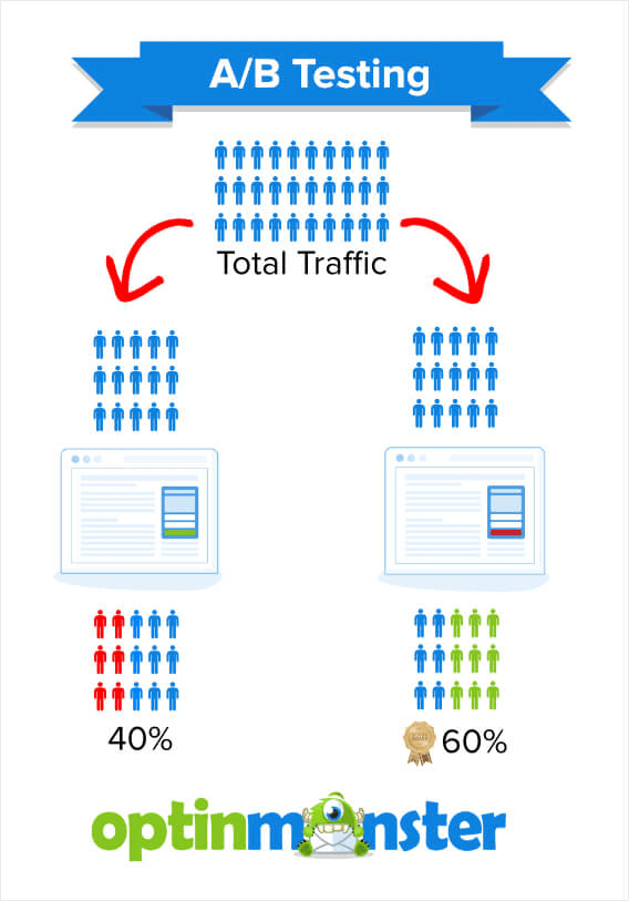
When you start your A/B test, 50% of your website visitors will see Version A, which has a green button. The other 50% will see Version B, which has a red button.
You’ll then be able to monitor how your 2 variants perform.
Let’s say that your results are as follows:
- 40% of visitors seeing Version A click the CTA button
- 60% of visitors seeing Version B click the CTA button
The CTA color in Version B is clearly more enticing to visitors, as it performed 50% better in the test. You can end your A/B test and use Version B for all visitors.
You can also use this information to A/B test that color on various pages on your website. It could help you decide to make that the primary CTA color for your brand.
Note that for email marketing, A/B split tests work a bit differently. After all, emails don’t receive organic traffic. Instead, you have to send them to your subscribers.
In an email marketing A/B test, Versions A and B are each sent to a small percentage of the list or segment you plan to target. You’ll then send the version that performs the best to your full audience.
What Elements Can You A/B Test?
What type of elements can you alter for Version B of your split tests?
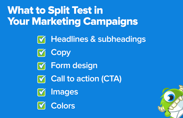
Here are some examples of what to A/B test on your website:
Let’s discuss each element a bit further:
- Headlines & subheadings: Run tests to determine which heading best captures your users’ attention. In addition to the wording, you can try different variations of fonts and sizes.
- Copy: Optimize your paragraph copy to better direct users to your CTA. For instance, you can test variations of different word lengths. Do your users prefer a detailed explanation or copy that is more concise?
- Form design: Ensure your registration, feedback, and email signup forms are designed to encourage users to complete the process. A/B testing helps you discover any frustrating elements that are causing users to abandon your form.
- Call-to-Action (CTA): Test the button color, button size, and copy on your CTAs. Which variant stands out more?
- Images: Discover which photos and graphics are more evocative and drive more action.
- Colors: Test different overall color schemes or the color of specific elements.
With all of these elements tested, you’ll be ready to make more data-driven decisions throughout your website and on your standalone landing pages.
You can A/B test all of the above elements within your email campaigns, as well. You can test variants to see which ones result in higher click-through rates.
However, you need your subscribers to open your emails in the first place. That’s why email marketing presents some additional elements to test:
- Email subject lines: Which subject line best catches your subscribers’ attention?
- Sender Names: Should you simply use your brand’s name, or should you go with something like “Angie at OptinMonster?”
- Preview/preheader text: Which extra bit of information will convince subscribers to open your email?
Testing these email elements can help you improve your email open rates, so more subscribers will see your offers, product promotions, and CTAs.
Benefits of A/B Testing
Now that you understand the A/B testing definition and the basics of how the method works, I’ll answer the most important question:
Why should you use A/B testing?
Let’s take a look at some of the top benefits.
Grow Your Email List
Email marketing is one of the most effective digital marketing strategies, with an average ROI (return on investment) of 36:1. If you want to see this kind of success, you need a strong email list full of engaged leads.
A/B tested optin campaigns let you improve the conversion rates on your email signup forms.
With OptinMonster, you can run A/B split tests with just a few clicks!
OptinMonster is the best lead generation software on the market. We help you collect email addresses and other user data through lightbox popups, floating bars, inline forms, and other onsite marketing campaigns.
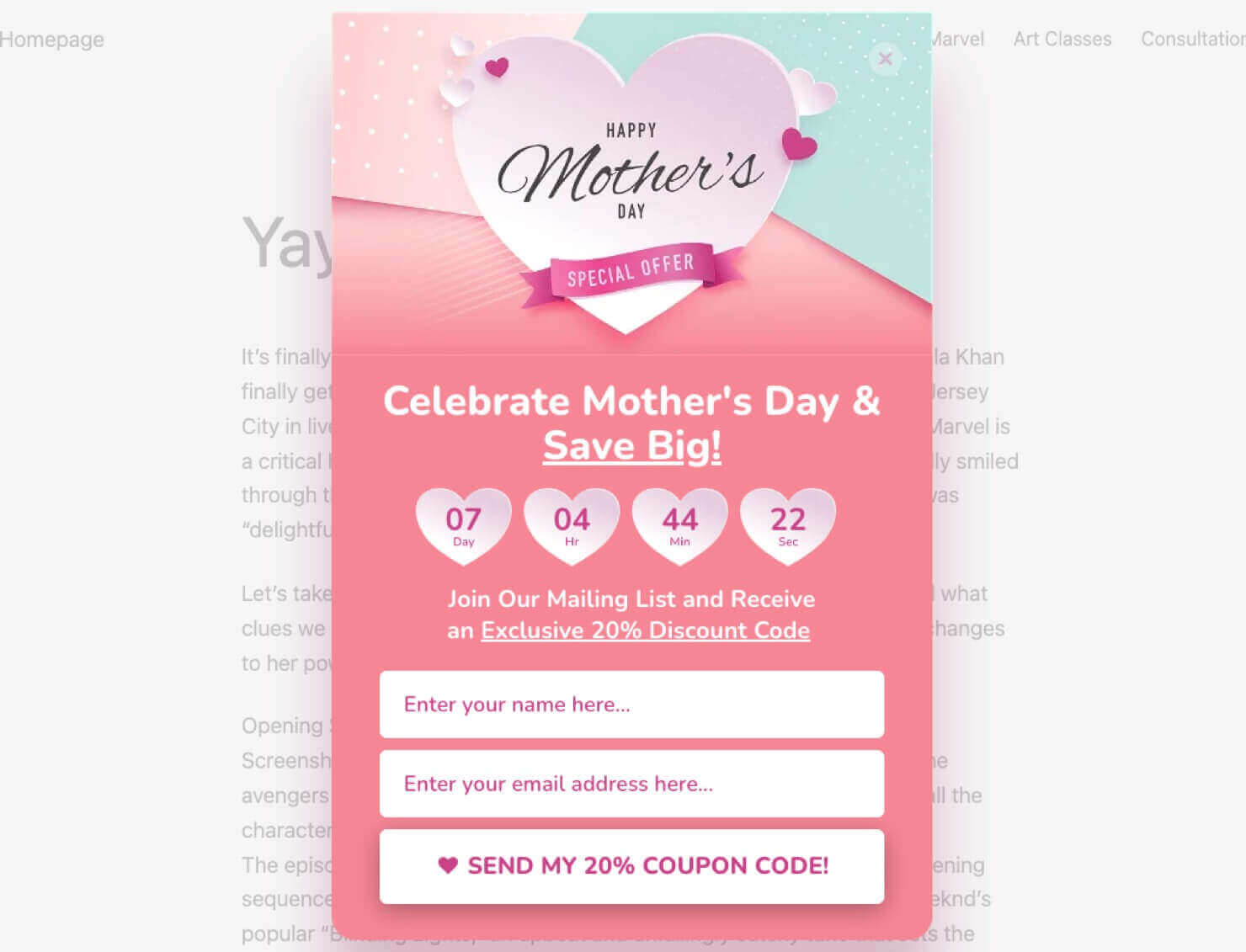
Here’s an example of one of our popup templates, designed to offer a Mother’s Day coupon in exchange for the user’s name and email address:
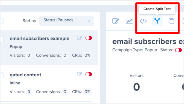
OptinMonster offers easy split testing functionality. With a single click in our dashboard, you can create a Version B of your campaign, which you can edit in our easy drag-and-drop builder.
OptinMonster will then run an A/B split test of your 2 versions, so you can see which variant persuades more visitors to sign up for your email list.
In mere minutes, you can start an experiment to test elements of your optin campaigns.
Does this type of A/B testing make a difference?
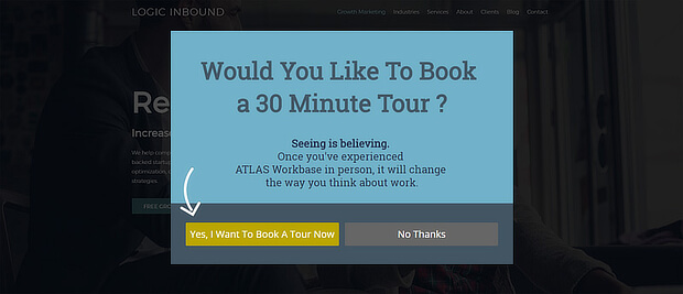
Logic Inbound, a digital marketing agency, increased conversions by 1500% by split testing their OptinMonster campaigns.
Get More Email Engagement
You worked hard to build your email list. Now you can use A/B testing to keep your subscribers engaged:
- Get more opens: Test your subject line, sender name, and preview text.
- Get more clicks: Test the images, heading, text, and CTAs in your email message. Which variants help you drive more traffic to your website or landing pages?
- Reduce unsubscribes: Engaged subscribers are less likely to opt out of your list, so testing will help this metric, too.
Drive More eCommerce Sales
A/B testing is vital to optimizing your sales flow. Are your product pages and checkout pages fully optimized to encourage purchases?
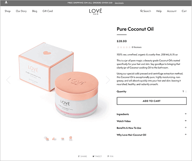
For instance, here are a few important examples of what to A/B test on your product pages:
- Product photos
- Product names and descriptions
- Featured testimonials and other social proof
- “Add to Cart” and “Buy Now” buttons
- Design and layout of product pages
- Recommended products
By optimizing these elements, you can increase your revenue and grow your business. The A/B testing process provides hard data on how to best persuade online shoppers to buy.
Related ResourceThe Ultimate eCommerce Optimization Guide: 13 Steps to Instantly Boost Revenue
Keep Visitors on Your Website Longer
Once you attract visitors to your website, your next goal is to keep them on your site long enough to read your content or make a purchase. In other words, you want to reduce your bounce rate. That’s the number of visitors who land on one of your web pages but leave without taking any action at all.
A/B tests can help you pinpoint how to keep visitors engaged. For instance, you can test the placement and visibility of your featured content and product recommendations. You can also test which related content you should feature on each page.
For instance, Olyplant used an OptinMonster popup to suggest related content to visitors who found their site through Google. This strategy helped them increase average page views per session by 157%!
Improve User Experience (UX)
A/B testing lets you improve conversion rates quickly. But it also has bigger long-term effects.
Over time, you’ll optimize each part of your website and email marketing. You’ll improve every stage of the customer journey, eliminating pain points along the way.
The result: a top-notch customer experience that will keep readers and customers coming back time and time again.
Best Practices for A/B Testing
Before you dive into your A/B testing, let’s cover some basic tips and best practices, so you can guarantee that you get useful and accurate data during your testing.
- Test the Right Items
- Pay Attention to Sample Size & Statistical Significance
- Get Your Hypothesis Right
- Schedule Your Tests Correctly
- Nail Your Test Duration
- Don’t Make Mid-Test Changes
- Test 1 Element at a Time
- Pay Attention to the Data
- Test Continuously
1. Test the Right Items
If you’re new to A/B testing, you may be be overwhelmed at all the possible pages and elements you could test.
Digital marketing expert Neil Patel suggests you optimize the pages people visit most, which are often:
- Home page
- About page
- Contact page
- Blog page
Of course, your top-visited pages can sometimes surprise you. Be sure to check your Google Analytics to discover other pages that get the most visitors, and prioritize A/B testing those pages.
Or you may want to focus on your key lead generation pages. That means optimizing optin forms on your:
- Webinar signup page
- Ebook landing page
- Lead magnet page
2. Pay Attention to Sample Size and Statistical Significance
Another best practice for A/B testing is to get the sample size right. If you don’t perform your test on enough people, you won’t get reliable results.
For instance, you might A/B test 2 versions of the form on your “Contact Us” page. You let your test run for a week, and Version A performs 20% better than Version B.
However, if each version only got 13 visitors during that time, then you actually don’t have enough data because your test sample is too small. Just 1 or 2 people filling out Version A is enough to completely sway your results.
In other words, your A/B test results wouldn’t be statistically significant.
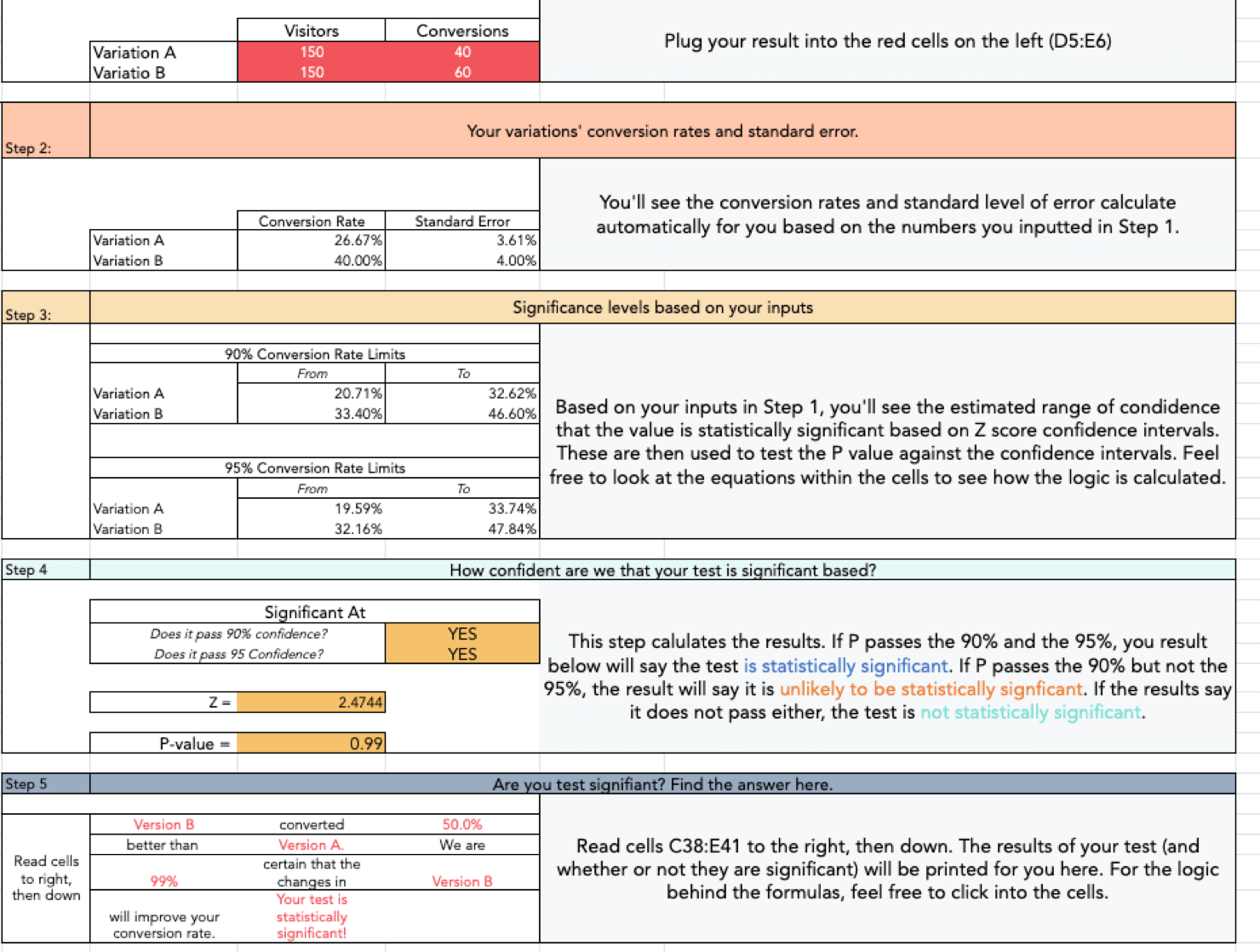
Hubspot offers a downloadable Significance Calculator, an A/B testing tool to determine whether you have statistically significant results.
Note that you must provide an email address and other optin information to download Hubspot’s Significance Calculator.
Another option is Visual Website Optimizer’s (VWO) statistical significance tool.
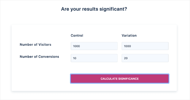
Type in the number of visitors you’ve tested for Version A (called the control) and for Version B (called the variation). Then press the Calculate Significance button:
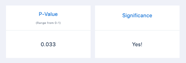
You’ll get a result that shows the P-value, which is a measure of reliability. The calculator will also tell you whether the test has statistical significance by showing Yes or No:
If you get a Yes, congrats! If you get a No, you may need to extend your test to get more data. Alternatively, you may discover that there is no significant difference between the performance of your 2 versions.
The takeaway? Don’t rush your A/B split tests. Be patient and wait until you have enough data to make a decision.
3. Get Your Hypothesis Right
A/B tests don’t just let you compare variants. They let you test hypotheses about what you think your audience will respond best to.
When you start testing anything without a hypothesis, you’re going in blind.
In split testing, a hypothesis is an idea about what you need to test, why it needs to be tested, and what changes you’ll see after you make any changes.
With this structure in place, you’ll know the scope of your test and when it succeeds or fails. Without it, your testing is nothing more than guesswork.
To form a hypothesis, use this template from Digital Marketer:
Because we observed [A] and feedback [B], we believe that changing [C] for visitors [D] will make [E] happen. We’ll know this when we see [F] and obtain [G].
Here’s an example of how you could fill this in for your email newsletter optin form:
Because we observed a poor conversion rate [A] and visitors reported that our optin form was too long [B], we believe that reducing the number of form fields [C] for all visitors [D] will increase newsletter signups [E].
We’ll know this when we see an increase in newsletter signups over a 2 week testing period [F] and get customer feedback that shows that people think the optin form is less complicated [G].
Read that example carefully (twice if you have to!) and create a hypothesis of your own with this structure.
4. Schedule Your Tests Correctly
Test scheduling is one of the most crucial A/B testing best practices.
Most online businesses have predictable peak times, as well as slower periods. For instance, testing your traffic over Black Friday and comparing it to a regular Tuesday in February probably won’t give you the most reliable data.
If you want to optimize your website for regular day-to-day traffic, make sure you run your test during a time of average traffic and user engagement. If you want to optimize your more specialized landing pages and offers, time your tests so you get the most relevant data possible.
5. Nail Your Test Duration
Test duration is another essential factor in determining the reliability of your results. As I’ve mentioned, you have to run your test for long enough to get statistically significant data.
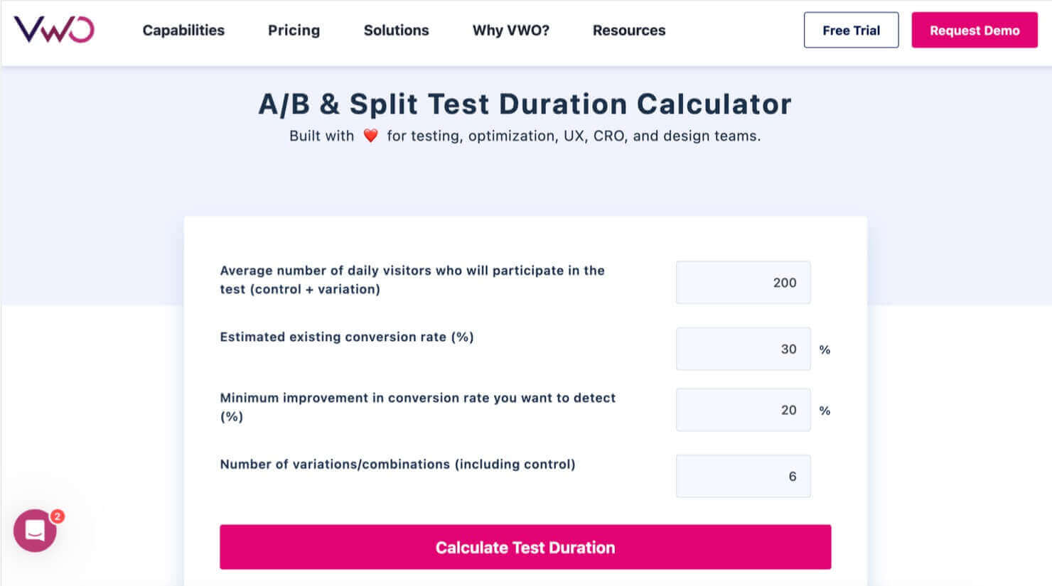
If you want an idea of how long your website A/B test needs to run, you can use this handy test duration calculator from VWO.
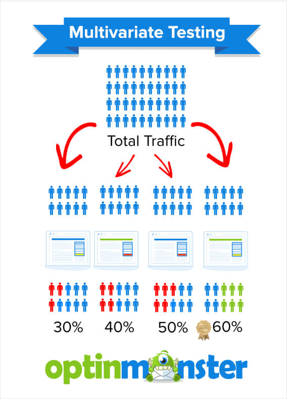
Note that VWO’s calculator asks for the number of variations you’re testing. That’s because this calculator can also be used for multivariate testing, a more complex type of test that compares more than 2 versions of a webpage.
We’ll discuss multivariate testing a bit more in tip #7.
6. Don’t Make Mid-Test Changes
It’s easy to get so excited about the results you’re seeing during a test. You may even want to rush out and implement more changes.
Don’t do it.
Your results won’t be reliable if you interrupt the test before the end of the ideal testing period. Or if you introduce new elements that weren’t part of your original hypothesis.
When you make more changes during your testing period, you’ll have no idea which change is actually responsible for any lift in conversions.
Instead, set a date to run your test and stay strong. Just sit tight, wait for the results to come in, and take action after the test has finished.
7. Test 1 Element at a Time
A golden rule of A/B testing is to test 1 element at a time.
If you’re testing an optin form for marketing, you should test for changes in the headline, image, call to action, OR number of form fields.
Again, notice the emphasis on “or” rather than “and.” It should just be 1.
This is the only way you’ll know for sure if there is ONE element that makes a difference in your lead conversions.
Here’s an example of a simple A/B test that one of our clients, the American Bird Conservancy, used to improve conversions on a popup campaign.
They tested 2 versions of the same popup. The only thing that was different was the featured image.
This version of the popup won the A/B test:
Because they tested the popup, they got an excellent conversion rate of 3.99% on this campaign.
Case StudyLearn how the American Bird Conservancy increased their lead collection by 1000% with OptinMonster!
If you test more than one element, then you need multivariate testing. We explain the difference in our guide to split testing vs. multivariate testing.
Multivariate testing is a much more complex process. You shouldn’t tackle this advanced method until you’ve mastered A/B testing.
8. Pay Attention to the Data
We’ve all got gut feelings about how our marketing will perform. However, a gut feeling doesn’t mean much if it’s not backed by data. A/B testing gives you that data to either back up your instinct or to show that you’re wrong.
Never ignore the data in favor of your gut. If you’ve followed our advice on how to create split tests, you’ll get reliable data that’ll help you to improve conversions.
9. Test Continuously
Our last tip is to always be testing something on your site or in your emails. The more elements you test over time, the more you’ll be able to optimize every aspect of your digital marketing.
Incremental changes can soon add up, as many OptinMonster customers have found. Escola EDTI used split testing to get a 500% boost in conversions:
And as we briefly mentioned earlier, Logic Inbound got a whopping 1500% conversion boost by split testing its OptinMonster marketing campaigns:
A 1500% conversion boost is no small accomplishment! And it was made possible through simple A/B testing.
How to A/B Split Test Your Optin Campaigns
Want to A/B test your own marketing campaigns so you can aim for similar results? Get started with the A/B testing tool that’s built into OptinMonster.
First, you’ll follow our instructions to create and publish your first campaign.
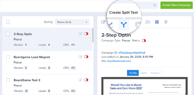
Once you have a campaign you’re happy with, you’re ready to run a split test. From the OptinMonster dashboard, click the campaign you want to work on:
Select the Create Split Test icon. It looks like an arrow that’s splitting into 2 directions.
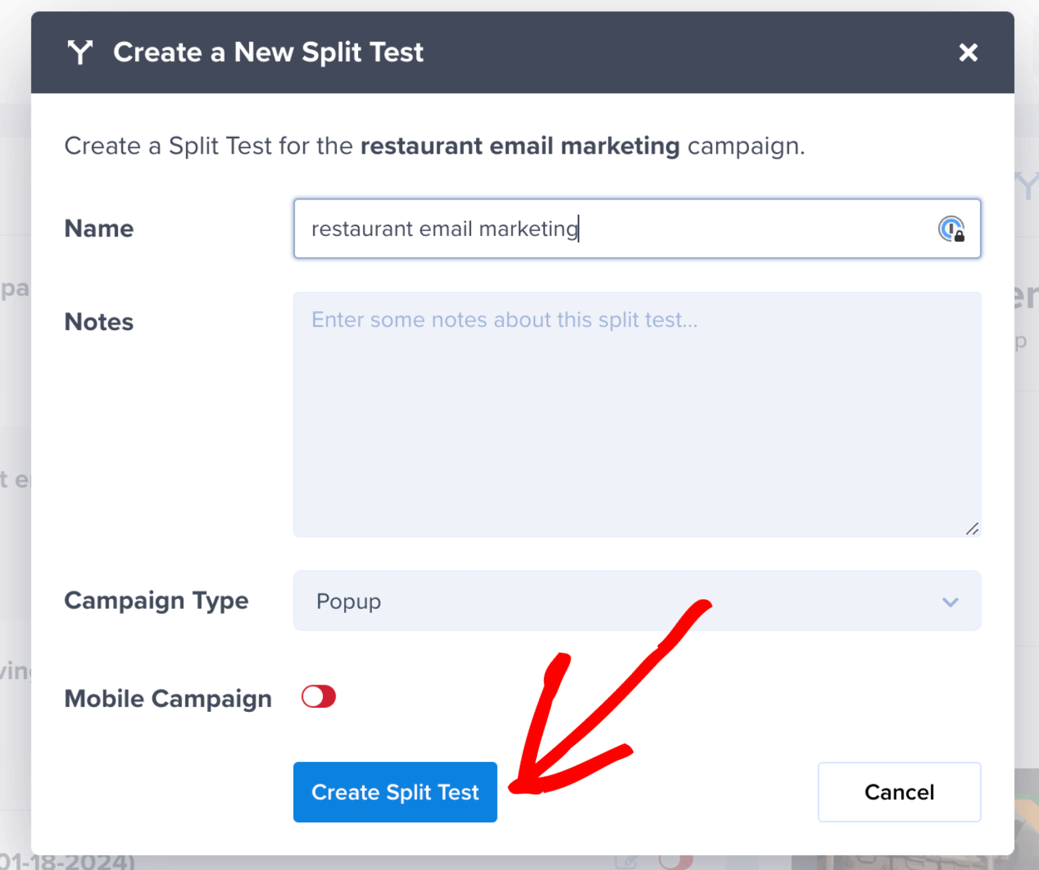
This will bring up a box where you can name your test and add some notes about the change you plan to make.
When you’ve given your campaign duplicate a name and added some notes, click Create Split Test:
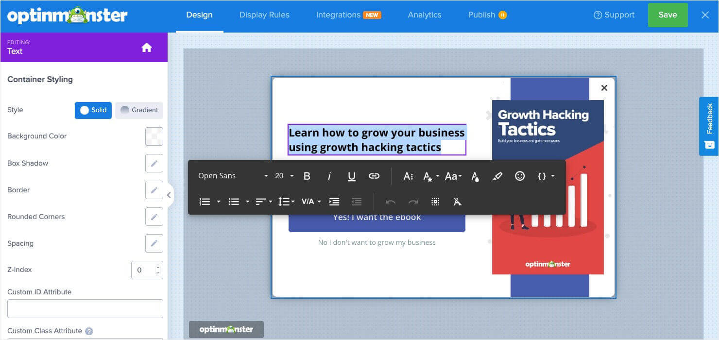
Then you’ll be in your campaign builder. Now you can make changes to your campaign with OptinMonster’s easy-to-use editing tools.
When you’re finished, save and publish the campaign as normal:
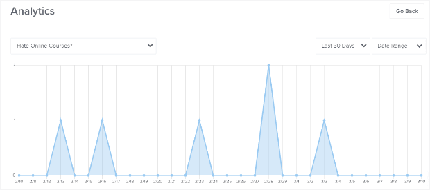
OptinMonster will automatically split your audience and collect conversion data, which you will see in the conversion analytics dashboard:
After enough time has passed for your test, you’ll be able to see which campaign converted more leads.
Then you can return to your OptinMonster dashboard and click on the campaign you A/B tested. You’ll see the original campaign and, when you scroll down, you’ll see the duplicate campaign you used for split testing.
Select Make Primary for the campaign that is getting the best results:
Here is how that looks:
And that’s it!
Now that you have an overview of A/B testing, you understand why it’s one of the best tools available for conversion rate optimization.
If you’re ready to start split testing your onsite marketing campaigns, OptinMonster makes it a breeze!
Want to A/B test more elements across your website? Google recently sunset its testing tool, Google Optimize, but there are plenty of other options available.
Check out WPBeginner’s list of 9 Best Google Optimize Alternatives (Free and Paid) to learn about the best A/B testing software options.
With the right software and the information in this guide, you’ll be ready to start improving every aspect of your digital marketing.










Add a Comment