
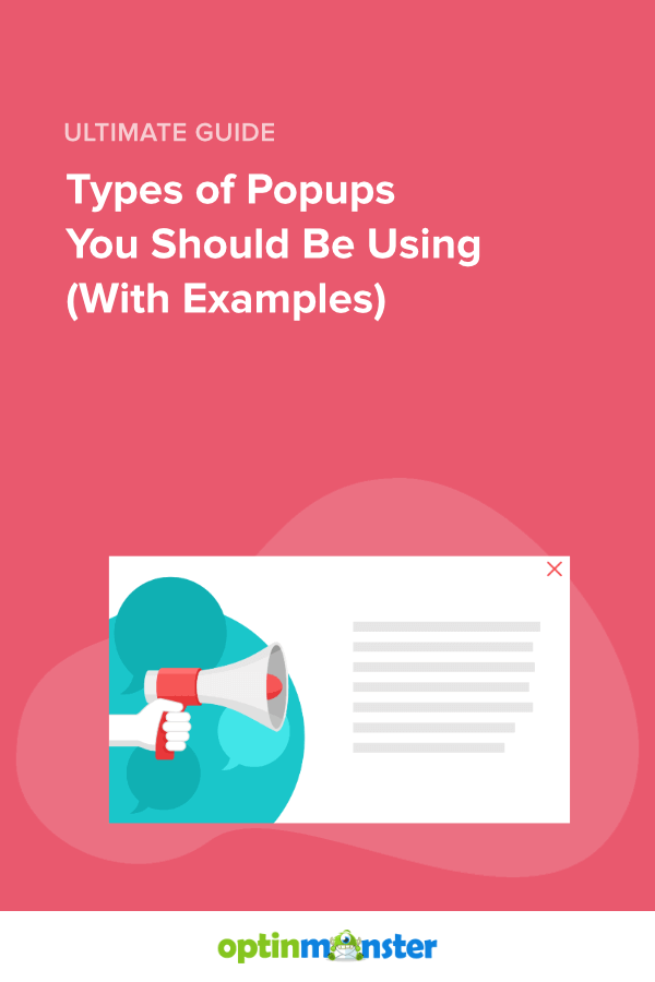
11 Types of Popups You Should Be Using (With Examples)
Last updated on
by

The right types of popups can transform how you engage your website visitors. For example, Shockbyte used OptinMonster popups to double their sales conversions and grow their business 10x.
Whether you’re looking to grow your email list or boost sales, the right type of popup can be pivotal in reaching your goals.
If you’re new to popups and want a quick overview, check out our beginner’s guide to website popups. It covers everything you need to know to get started.
In this article, I’ll explore 11 types of popups that deliver real results. I’ll also cover how each popup format works and provide actionable tips for using them on your site. Along the way, you’ll see 15+ website popup examples, so you can get inspiration for your own strategy.
We Know a Good Popup When We See One
Here at OptinMonster, our entire business is website popups. We’ve spent over a decade helping businesses generate more leads and make more sales.
Our software lets you create lightbox popups, fullscreen mats, floating bars, and more. And with our hundreds of pre-made templates, you can have your popup designs ready in mere minutes.
With all this experience, we know a good popup when we see one. And we can explain why they succeed.
What Are the Types of Popups?
The types of popups can be categorized based on how they work or based on what they aim to achieve. Here’s how I’m breaking them down in this post:
- Types of Popups by Function: These popups are defined by their design and how they appear on your site, such as lightbox popups, slide-ins, or fullscreen overlays. They focus on the user’s experience and interaction with the popup itself.
- Types of Popups by Goal: These popups are categorized by the specific marketing objectives they help you achieve, like growing your email list, recovering abandoned carts, or promoting limited-time offers.
Understanding these categories will help you choose the perfect popup type for your website. Let’s start with popups by function.
Types of Popups by Function
In this section, I’ll explore the 5 most popular types of popups categorized by how they function on your site. These are tried-and-true formats that can work across industries and website types.
1. Lightbox Popups
Lightbox popups are centered overlays that dim the background, drawing the visitor’s full attention to your message. These popups are excellent for capturing leads or promoting an offer.
Lightbox Popup Example

OptinMonster customer Nick Gray used this popup to build his email list and promote his book. This lightbox popup converted a fantastic 10.59% of visitors! Overall, OptinMonster helped Gray increase his monthly email subscribers by 600%. Read the full Nick Gray case study.
How to Use Lightbox Popups Effectively
- Keep It Simple: Highlight one message, such as a discount or a lead magnet, and include a clear CTA.
- Target Smartly: Use OptinMonster’s advanced targeting rules to show relevant offers to visitors. For example, Page-Level Targeting lets you show popups based on which webpage your visitor is viewing.
- A/B Test for Success: Experiment with different headlines, colors, and CTAs using OptinMonster’s built-in split testing. Find out what resonates with your audience and optimize every aspect of your popup.
2. Slide-In Scroll Box Popups
Slide-in Scroll Box popups enter from the side or bottom corner of the page, offering a subtler alternative to lightbox popups. They’re ideal for maintaining engagement without fully interrupting the visitor.
Slide-In Popup Example

Here’s an example of a slide-in popup we’ve used here on OptinMonster’s website. This campaign encourages blog readers to sign up for our weekly live webinar. As you can see, the popup remains on the side of the page and doesn’t prevent the visitor from reading the blog content.
How to Use Slide-In Popups Effectively
- Time It Right: Trigger the popup after the user scrolls a certain percentage of the page with OptinMonster’s Scroll Trigger feature.
- Add Context: Use these popups to suggest related blog posts or promote signups for a webinar based on the user’s behavior.
- Personalize Content: Combine slide-in popups with OptinMonster’s Page-Level Targeting to make them hyper-relevant to the visitor’s interests.
3. Fullscreen Popups
Fullscreen mat popups take over the entire screen, making them impossible to ignore. They’re a powerful option for promoting major campaigns or high-value offers.
Fullscreen Popup Example

Here’s an example of a fullscreen welcome message that I created using one of OptinMonster’s 700+ premade templates. I started with the fullscreen version of our Tech Discount template and customized it in our easy drag-and-drop builder. OptinMonster’s robust display rules let you target campains like this one specifically to first-time visitors. This fullscreen popup welcomes new visitors and catches their attention with an enticing offer.
How to Use Fullscreen Popups Effectively
- Focus on High-Value Offers: Reserve fullscreen popups for important messages like seasonal discounts, limited-time sales, or free resource downloads.
- Include a Clear Exit Option: Avoid frustrating users by making the close button highly visible.
- Optimize for Mobile: Use OptinMonster’s mobile-responsive and mobile-optimized templates to ensure fullscreen popups display beautifully on all devices.
4. Gamified Popups
Gamified popups, like spin-to-win wheels, add an interactive element to engage users and increase conversions. These popups combine fun with functionality.
Gamified Popup Example

This OptinMonster template asks visitors to enter an email address to spin a coupon wheel. OptinMonster offers dozens of gamified templates, and you can also add a coupon wheel to any campaign in our drap-and-drop builder.
How to Use Gamified Popups Effectively
- Offer Meaningful Rewards: Use prizes like discounts or free trials to entice users to spin the wheel.
- Leverage OptinMonster’s Gamified Templates: Quickly design an engaging campaign without needing a designer.
- Customize your prize odds: OptinMonster lets you decide the odds for landing on each prize.
5. Exit-Intent® Popups
The types of popups above are based on what they look like. This popup type is based on when and how it appears. Exit popups display when visitors are about to leave your website. They give you one final opportunity to engage the user before they go.
OptinMonster’s powerful Exit-Intent® technology uses mouse movements and mobile scroll to detect when visitors are trying to leave.
Exit Popup Example

This exit popup is from Shockbyte, a game server provider. This simple campaign converted 13.73% of abandoning visitors into email subscribers! Shockbyte used this and other OptinMonster popups to over double their sales. Read the full Shockbyte case study.
How to Use Exit Popups Effectively
- Offer Discounts: Encourage new visitors to make their first purchases with a coupon code.
- Promote Lead Magnets: Use exit popups to offer downloadable resources, and capture email addresses before users navigate away.
- Target cart and checkout pages: Reduce cart abandonment with exit popups promoting special offers. Convince shoppers to complete their purchases!
Types of Popups by Goal
Different popups can help you achieve specific marketing objectives. Below, I’ll explore key popup types categorized by their goals, and I’ll share actionable tips for using them effectively.
- Lead Generation Popups
- Cart Abandonment Popups
- Sales Conversion Popups
- Bounce Rate Reduction Popups
- Customer Feedback Popups
- Content-Gating Popups
6. Lead Generation Popups
Lead generation popups are designed to collect visitor information, such as email addresses. They often include a lead magnet, which is an offer something valuable like a free resource or exclusive content in exchange for an email address. They can also simply promote the value of the brand’s email newsletter.
Here are 2 examples of successful lead generation popups:
Lead Generation Popup Example 1: American Bird Conservancy‘s Pledge Popup

The American Bird Conservancy (ABC) used OptinMonster to improve their lead generation by 1,000%. The targeted Yes/No popup was a big part of that growth.
ABC has a section on their website dedicated to educating people about the importance of keeping their pet cats indoors. This popup only showed up for visitors who had been reading those pages. Visitors who clicked the “I Want to Protect Cats & Birds!” CTA button were redirected to a landing page. There, they could sign a pledge to keep their cats indoors.

To take the pledge, each user enters their name, physical address, email address, and phone number. By collecting this information, ABC creates a strong new lead. And they have all the data they need to add this lead to the proper segmented lists. Read the full American Bird Conservancy case study.
Lead Generation Popup Example 2: OptinMonster’s Lead Magnet Popup
![OptinMonster fullscreen website popup that says "How to Run a Successful Email Marketing Campaign [Cheatsheet] Create high-converting email campaigns EVERY time." Fields ask for name and email address. CTA button reads "Give Me the Cheatsheet!"](https://cdn.optinmonster.com/wp-content/uploads/2020/07/optinmonster-fullscreen-lead-magnet-popup-example-.png "optinmonster-fullscreen-lead-magnet-popup-example - OptinMonster")
Here’s one of OptinMonster’s own popups where we offer an in-depth PDF guide in exchange for an email optin. In fact, this popup is part of a strategy we use throughout our site, specifically our blog:
- We create long-form cheatsheets, checklists, and ebooks related to important topics related to our product.
- We offer these lead magnets in popups on our blog posts related to that topic.
Users reading any of our articles about email marketing have already shown that they want to learn more about the topic. By offering them a related lead magnet, we move those visitors further through our sales funnel.
Tips for Lead Generation Popups
- Offer Value: Provide an incentive, like a checklist or an ebook, that aligns with your audience’s interests.
- Target Specifically: Use OptinMonster’s Page-Level Targeting to match popups with the content visitors are engaging with.
- Make it Easy: Use a simple form that doesn’t overwhelm users with too many fields.
7. Cart Abandonment Popups
Did you know that over 70% of all online shopping carts are abandoned? Popups are one of the best ways to win back some of those shoppers. Cart abandonment popups appear when users attempt to leave a site after adding items to their cart. They aim to recover lost sales by addressing user hesitation. Usually, cart abandonment popups use Exit-Intent® technology to catch shoppers before they leave your site.
Cart Abandonment Popup Example 1: HelloFresh‘s “Plan in Your Cart” Popup

The meal delivery service HelloFresh uses exit popups to stop cart abandonment. This popup is triggered when these 2 actions happen:
- A user has customized their own meal plan
- That user attempts to leave the HelloFresh website without making a purchase
HelloFresh knows that exit popups are one of the best ways to recover abandoned carts. OptinMonster integrates with platforms such as Shopify, WooCommerce, and BigCommerce, so you can precisely target your eCommerce popups.
Cart Abandonment Popup Example 2: OptinMonster’s “Complete Your Checkout” Popup

OptinMonster specializes in helping businesses create effective popups, so we definitely put that expertise to good use on our own website. Let’s look at how this cart abandonment popup works:
A website visitor has browsed our pricing page and selected a plan they’re interested in. If they start to leave the page without finishing their purchase, they’ll see this popup, offering a 20% discount.
Exit-Intent® is included in OptinMonster’s Pro and Growth Plans, so sign up today!
Tips for Cart Abandonment Popups
- Highlight Benefits: Reinforce what makes your product or service valuable.
- Offer Incentives: Use discounts or free shipping to reduce purchase friction.
- Integrate with your eCommerce platform: OptinMonster integrates with Shopify, WooCommerce, and BigCommerce for precise targeting.
8. Sales Conversion Popups
Cart abandonment popups are extremely important, but that’s not the only scenario when you can use a popup to encourage website visitors to buy right now. Sales conversion popups are designed to drive purchases by offering discounts, highlighting urgency, or nudging users to go ahead and make a purchase today.
Sales Conversions Popup Example 1: ShotKit’s Coupon Code Popup

Many popups require users to enter an email address in order to receive a coupon code. However, if your primary goal is to drive immediate sales, you can offer the code right in the popup, without any optin requirement. You can create an OptinMonstre popup like this one from Shotkit. It not only provide the coupon code, but it also includes a button to apply the code. Read the full Shotkit case study.
Sales Conversion Popup Example 2: Countdown Timers from OptinMonster

Here’s an example of an OptinMonster template for a sales conversion popup. It includes a Countdown Timer to create urgency and encourage visitors to act now. Over 150 OptinMonster templates include countdown timers. Plus, you can use our drag-and-drop builder to easily add a countdown timer to any campaign:

Countdown timers can be a game-changer for your conversion rates. For example, Cracku used them to increase their conversions by 300%! Read the full Cracku case study.
Tips for Sales Conversion Popups
- Create Urgency: Use countdown timers or limited-time discounts to prompt immediate action.
- Use Exit-Intent®: Trigger popups when users are about to leave, ensuring you don’t interrupt their browsing.
- Personalize Offers: Tailor discounts or messages based on where users are in the sales funnel.
9. Bounce Rate Reduction Popups
This type of popup focuses on keeping visitors on your site for longer. These popups help you reduce your bounce rate, or the percentage of visitors who leave your site before engaging with any links or offers. They often include links to related content or products and are targeted based on what the visitor has shown interest in.
Bounce Rate Popup Example: Olyplant‘s Popup for Google Users

Olyplant is a Greek company that sells organic plants. They wanted to reduce their bounce rate for visitors who found their strawberry tutorial via Google search. This eye-catching popup from them reads:
Do you love strawberries?
Discover all the strawberry varieties that produce and cultivate your own now …
Yes, I want to try it!
No, I do not eat strawberries.
This popup linked to their archive of posts related to strawberries.
Olyplant used 3 OptinMonster Display Rules to determine who would see this popup and when:
- Page-Level Targeting: This popup only displayed on their tutorial on planting strawberries
- Referrer Detection: Only visitors who found the page through Google search saw this message
- Scroll Distance: The popup displayed when a visitor had scrolled through 50% of the page
Olyplant chose these targeting and triggering settings with 1 goal in mind: to keep their organic traffic on the site for longer.
Often, when a visitor finds one of your web pages via Google search, they scan that page only and leave your site without taking any action. Olyplant turned that around with this popup. A whopping 17% of readers clicked the YES button on this campaign, and they viewed an average of 5.08 pages per session. That gave Olyplant more opportunities to convert those visitors into customers.
Tips for Bounce Rate Reduction Popups
- Engage with Questions: Use attention-grabbing prompts like “Do you love [topic]?” to pique curiosity.
- Use Scroll or Timed Triggers: Display popups when users have shown a high level of engagement.
- Promote Related Content: Link to other pages, articles, or products to keep users engaged with your site.
10. Customer Feedback Popups
Customer feedback popups help your business gather insights from visitors and shoppers. You can then use that feedback to improve user experience, uncover issues, or understand why users abandon certain actions, such as completing checkout. To learn more about why this is so important, check out our guide: How to Collect Customer Feedback on Your Site (7 Tips).
Customer Feedback Popup Example 1: Kennedy Blue‘s Improvement Survey

Kennedy Blue is an online retailer of bridesmaid dresses. They used this OptinMonster exit popup to ask their website visitors to complete a feedback survey. The popup converted 7% of abandoning shoppers on their shopping cart page. With this survey, Kennedy Blue got vital feedback from these users, who could explain why they changed their minds about purchasing.
Learn how Kennedy Blue increased their sales by 50% with OptinMonster
Customer Feedback Popup Example 2: Feedback Template from OptinMonster

The Kennedy Blue popup includes a link to a survey webpage. However, you can also embed survey fields directly in your OptinMonster campaigns. For example, the template above asks visitors to type up a quick survey response. You can include a wide variety of field types, including checkboxes, radio buttons, and dropdown menus.
Tips for Customer Feedback Popups
- Keep it Brief: Limit feedback requests to a few easy-to-answer questions.
- Trigger Thoughtfully: Display feedback popups after users browse for a set amount of time or abandon a cart.
- Make it Worthwhile: Offer small rewards, like coupons, for completing surveys.
11. Content-Gating Popups
Content-gating popups require visitors to perform a specific action before they can access specific content. Usually, visitors have to enter an email address or create an account in order to view the material. This strategy is effective for generating leads and building a dedicated audience. Learn more about this process in our guide to gated content.
Content-Gating Popup Example: Storyly’s Gated Demo Video

Storyly uses this content-gating popup to lock access to their quick demo video. Visitors must enter their email address to watch the video, and they have the option of requesting a call with a sales rep. This popup has a phenomenal 14.57% conversion rate. Overall, Storyly has used OptinMonster to grow their email list by 45%. Read the full Storyly case study.
Create the Best Popups for YOUR Website!
At the end of the day, popups are one of the most powerful tools in your marketing arsenal. And as we’ve seen, there is no one-size-fits-all approach. Each type of popup has its own uses, so experiment to see which ones work best for your audience.
We encourage you to mix and match the goals, targets, and triggers we covered here. You should also use A/B testing to help you perfectly hone your popup campaigns.
With OptinMonster, we give you the freedom to choose what works best for your business at a price you can afford.
Want to learn even more about website popups? Here are a few resources to check out:
- How to Create a Lightbox Popup to Grow Your List
- Email Popups That Convert: Creative Ideas to Grow Your Email List Fast
- Popups That Work: How to Increase Sales and Recover Abandoned Carts
- Mobile Popups Demystified: Best Practices for a Better User Experience
Want to get started? Sign up for OptinMonster today, risk-free with our 14-day money-back guarantee!
Disclosure: Our content is reader-supported. This means if you click on some of our links, then we may earn a commission. We only recommend products that we believe will add value to our readers.
4 responses to “11 Types of Popups You Should Be Using (With Examples)”
-

People hate popups because the people who do them do not put nearly enough thought into making them like has been given in this article. For the most part, there shouldn’t be any reason for people to actually have to hate yours with the ideas given to you here.
-

Hey Corey, Thanks for the comment 🙂 Totally agree! Many people could easily increase conversions by taking just a few minutes to create the right popup for their audience and site’s content. Thanks again for reading!
-
-
Hi,
Thanks for sharing different types of popups to increase the sale. -
Hey Nathan,
Nice article indeed. As a general reader, I also disliked pop-ups while browsing any websites. It’s really irritating showing up again & again.But while doing my research, I found that it’s not as bad as we thought before. Actually it can drive more conversions & leads if implemented in the right way. And I have to admit that You have put all the interesting things all together here. Surely I will add some information to my article from this one.
Thanks a lot
Cheers😉


-01 - OptinMonster")


Add a Comment