Do you want to learn how to increase conversion rate Shopify?
Yes, boosting traffic to your Shopify site can generate more sales. Even a leaky funnel is going to move a little water, right?
But what if we told you that you can make more sales just from your current traffic using a few Shopify conversion rate optimization tips?
Instead of spending your time and money driving more and more traffic to your eCommerce site, take the time to focus on increasing your Shopify stores conversion rate.
Not only will you increase conversions, but traffic will increase naturally as a result. And, you’ll be much more likely to see your Shopify average conversion rate skyrocket when you really drive traffic in.
In this article, we’re going to tell you everything you need to know about Shopify conversion rate optimization (CRO) and the techniques that will make it work.
Let’s get started.
The Secret to Shopify Conversion Rate Optimization
Everyone asks how to increase Shopify conversion rate and expects there to be some sort of magic pill.
Unfortunately, there isn’t. There’s no single growth hack that is going to turn your Shopify conversion rate report into something you want to frame and hang on the wall in your bathroom.
The key to Shopify conversion rate optimization is to use a process. It’s not sexy or flashy, but it is repeatable and scalable. And, you don’t even have to come up with the process on your own; there’s already a tried and true one out there that works beautifully.
Step 1. Set Your Conversion Rate Goals
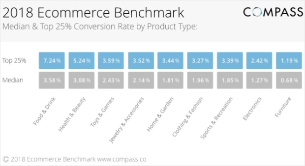
Find out what top eCommerce stores in your market are doing and set a tough, but realistic goal based on that.
You can use a robust tool like MonsterInsights to make tracking conversions easy once you’ve set your goal.
Step 2. Brainstorm and Prioritize
If you have a team, you should get them involved in brainstorming too. Come up with 30 or so ideas that could increase your conversion rate and categorize them into ideas that are already working for you, ideas that will likely work, or ideas that are possible, but not probable.
Keep reading for ideas about what to optimize, below. And, be sure to check out this post about 20 things that could be keeping your conversion rate low.
Step 3. Hypothesize and Test
With your list of what will likely work in hand, get to testing. Your goal is to test as many ideas as possible as cheaply as possible.
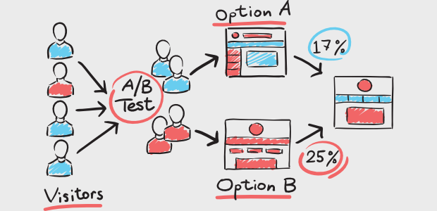
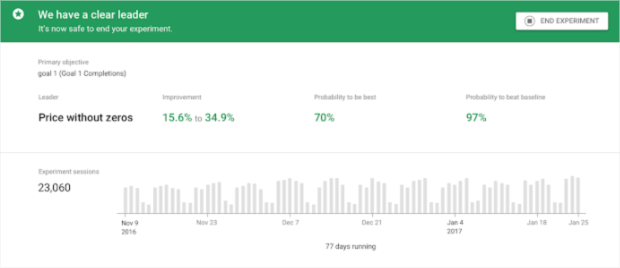
Google Optimize is a great option if you’re just getting started. It works closely with Google Analytics and if you’re using MonsterInsights to track conversions then you’re already using that. Here’s an example of the insights you can get from A/B testing with Google Optimize:
Step 4. Analyze, Learn, and Implement
Chances are, a lot of your ideas won’t work. That’s cool. Failure teaches us to be better. Just analyze your results, summarize what you learned, implement your findings, and create a new test. Wash, rinse, repeat.
Step 5. Re-evaluate
Take time every week to debrief. Are your conversion rates improving? What did you implement that week? Is there something you want to tweak and test again?
Now that you have a process, let’s talk about techniques.
Related ContentConversion Rate Optimization Statistics You Need to Know
5 Techniques that Work for Shopify Conversion Rate Optimization
The techniques we’re going to share with you are a great starting point for the testing you’ll do in Step 3 of the process that we just outlined.
Don’t skip the testing. Not all eCommerce sites are the same which means not all of them are going to use the same ideas to reach their target audience.
And thank goodness for that! The Internet would be a very boring place if every website looked exactly the same.
Let’s get into this list, shall we?
1. Optimizing Your Store for Conversion
The design of your site is very important to the overall success of your Shopify store. This includes everything from the general web design elements like fonts, colors, and navigation to things like images and videos, the checkout process, and how you use customer reviews and other social proof.
The general web design is best left to you. Just make it pretty. There are a ton of themes available that you can use as-is or customize to truly make your own. Go wild. And, if you’ve got a web developer in your back pocket, put them to work.
What we’re going to focus on here is what goes on your pages and how they flow.
Navigation
To start, you need a header to keep everything in. Your header should always have a few basic things:
- Branding that identifies your company
- Navigation… see below for details
- A call to action that could include info about sales or specials (you can also drop this if it doesn’t work for you)
- Search functionality so visitors can find things quickly
- Shopping cart access so visitors can get to their cart and checkout easily
You can include other things too, just don’t let it get too cluttered or it will be too hard to use and your visitors will get frustrated and leave.
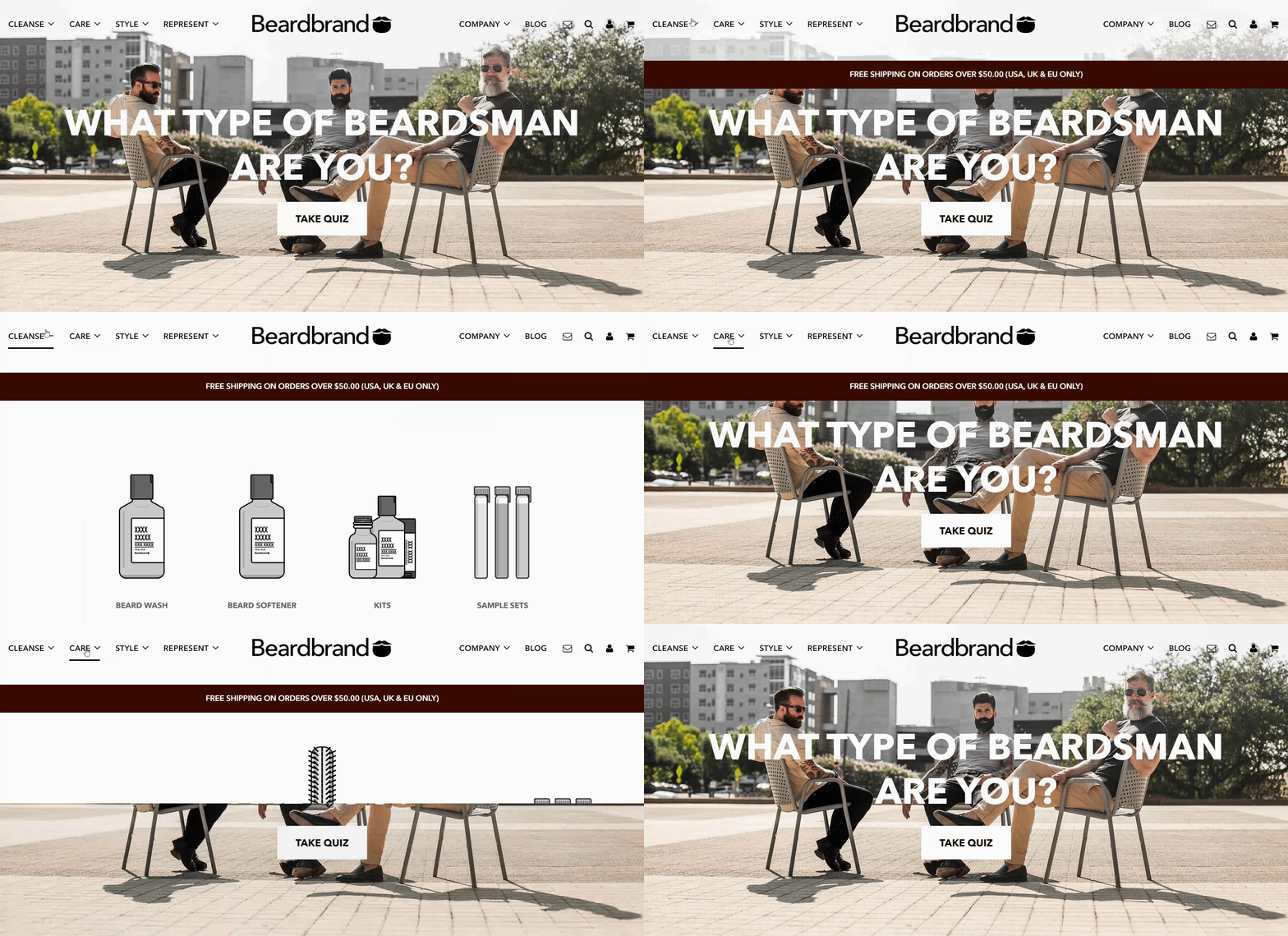
Take a look at how nicely this header from Beardbrand is set up. It sits along the top of the window and doesn’t detract from the rest of the page, but is there and ready for use.
Okay, let’s talk about navigation.
Think of navigation as the family tree of your Shopify site. Main level navigation links for things like product categories or store locations are going to be the moms and dads and they should always be displayed.
Next, you have your children. These are the things that go inside your main navigation links. So, a more specific breakdown of products probably.
Beardbrand does this in a pretty cool way by bringing down an entire little box with drawings of the children links.
This makes it really easy to find what you need on this site, or just have fun browsing around. Once you find something you like, you click it and take a closer look at its product page. Let’s do that now.
Product Pages
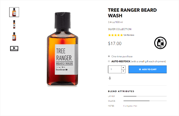
Right away you can tell that Beardbrand takes pride in their product. They feature simple and gorgeous product images, how-to videos, and the overall rating from product reviews. There are also product details and the Add to Cart button is set apart by a different color and prominently displayed.
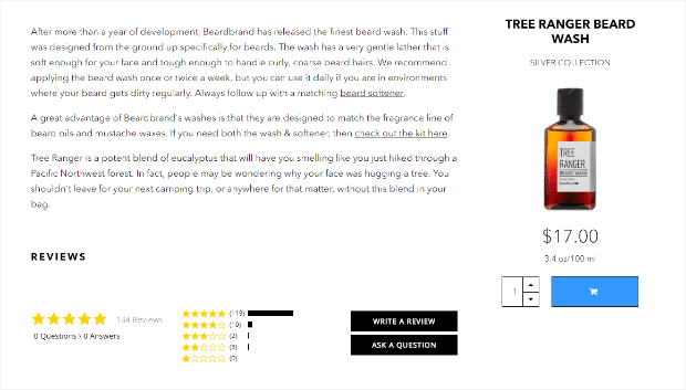
When you scroll down a little more, you’re greeted with a lengthy product description and a side view display that not only contains a lot of the information above but also still lets you add the product to your cart.
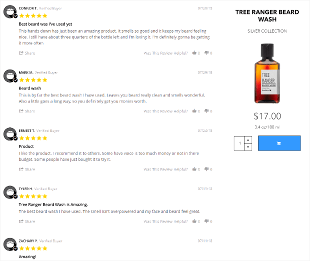
One more quick scroll down the page brings you to the written portion of the product reviews. Product reviews are just one type of social proof you can use to increase your conversions and they’re well-received. People tend to trust reviews even when they come from strangers rather than family and friends.
For more ways to make your product pages into high-converting eCommerce powerhouses, have a look at this post of 18 awesome tips.
Pro TipIncrease conversions with a pre-sell page!
3. Call to Action
We’ve talked a little bit about calls to action already, but they deserve their own section.
As an eCommerce store, you’ve probably been laser-focused on a call of action revolving around buying: add to cart or checkout. There’s nothing wrong with that, it’s the ultimate goal, after all. You want visitors to become customers and customers to become repeat customers. And to tell their friends.
There are only so many ways you can push that single call to action before you get burnt out on seeing a low sales conversion rate week after week. And, let’s face it, the people who leave your site without converting probably aren’t coming back.
Unless you give them a reason to come back, that is. And that’s where micro conversions come into the picture.
Micro conversions are just smaller actions that visitors can take to show that they’re interested in what you’re offering. These are things like signing up for your email list, social or email sharing of your products or content, creating an account on your site, adding to wishlists or registries, and downloading content from your site, just to name a few.
The clothing company Ugmonk randomly offers 35 royalty-free images from the owner’s trip to Iceland if you enter your email address.
We admit it, we gave up an email address. It’s a great micro conversion, and it totally worked on us. The images are stunning:
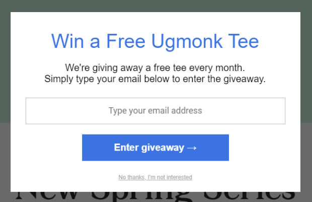
Before we could get out of there we were hit with an exit-intent popup telling us that they give a t-shirt away every month.
Yes, we also signed up for that. We’re suckers for a well-timed popup. You can create your own exit-intent offers; we’ll talk more about that in Step 5.
Sometimes smaller conversions like these can lead to visitors becoming customers. Be creative with your calls to action and think about other items of value you might be able to provide to your visitors for free (or for the low, low price of their contact information). Creating the perfect call to action can be tricky, but with our tips, you’ll be a master in no time.
We can even tell you which color button converts the best.
4. Improving the Shopping Experience
Everything that goes into creating your online storefront is about the shopping experience, but a terrible checkout process or surprise costs can stop a sale in its tracks.
To improve the shopping experience exponentially, make sure you spend time creating a checkout process with your customers in mind.
Smooth & Easy Checkout
Your checkout page form should be as short and simple as possible. This is not the time to find out the shopper’s favorite color unless you need it to send them a free gift. And, if that’s the case, tell them that you need it because you’re sending them a free gift. Better yet, just take a gamble on the color and don’t ask them.
At the very beginning of your form, get the shopper’s email address. If they decide to abandon their cart you’ll at least have their email address to reach out to them about it and maybe even recover the sale!
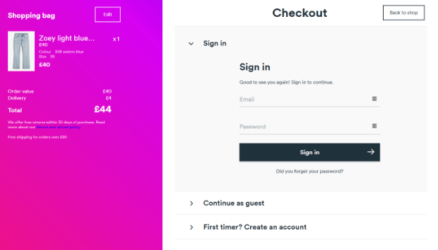
Let’s take a look at a great example of checkout design from Monki.com:
Monki.com offers shoppers a warm greeting with the chance to sign in, create an account, or continue as a guest. On the left side of the screen, there’s a beautiful summary cart. Everything is big and easy to see.
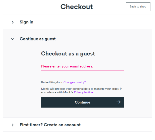
When you click Continue as guest you are presented with a screen requiring an email address before you continue.
Want more information on checkout page optimization? Here are 22 of the best ways to keep customers moving.
Up Front Shipping Costs
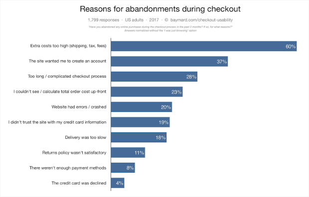
Another way to improve the shopping experience is to address some of the things that cause them to walk away from online stores. Shipping is a huge sticking point for many shoppers.
Fortunately, this is a really easy issue to solve. So easy that we don’t really understand how it continues to be a problem.
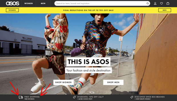
The solution? Either be 100% transparent with your shipping costs or, if you can swing it, offer free shipping.
5. Avoid or Recover Abandoned Carts
Abandoned carts are going to happen and probably a lot. They’re a natural part of eCommerce and, while you can address some of the problems, like shipping, there are some that are out of your control.
That doesn’t mean that you just sit back and let things happen, though. Every step we’ve taken throughout this article so far has been taken with reducing abandoned carts in mind. But what happens when you’ve increased engagement and gotten a few micro conversions, but the shopper still heads for the exits?
Exit-Intent Popups
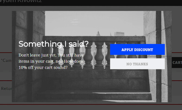
Remember the exit-intent popup that Ugmonk caught us with earlier? You can also add those to your shopping cart and checkout pages to catch shoppers as they’re abandoning.
You can create a download like this one that converts 21.06% of visitors for Scott Wyden Imagery:
Exit-intent popups are a great way to reach out one last time before a shopper officially abandons their cart. Here’s how you can create your own Shopify email popup.
BONUS TIP #6. Abandoned Cart Recovery
You’ve brainstormed, a/b tested, and implemented. Your site it 100% optimized. You make adjustments to content, images, product descriptions, and anything else that may come to your attention on a weekly basis, but you still have shoppers abandoning carts. You know that you could get some of those to convert if you could just get them to come back to your store.
What you need now is an abandoned cart recovery strategy.
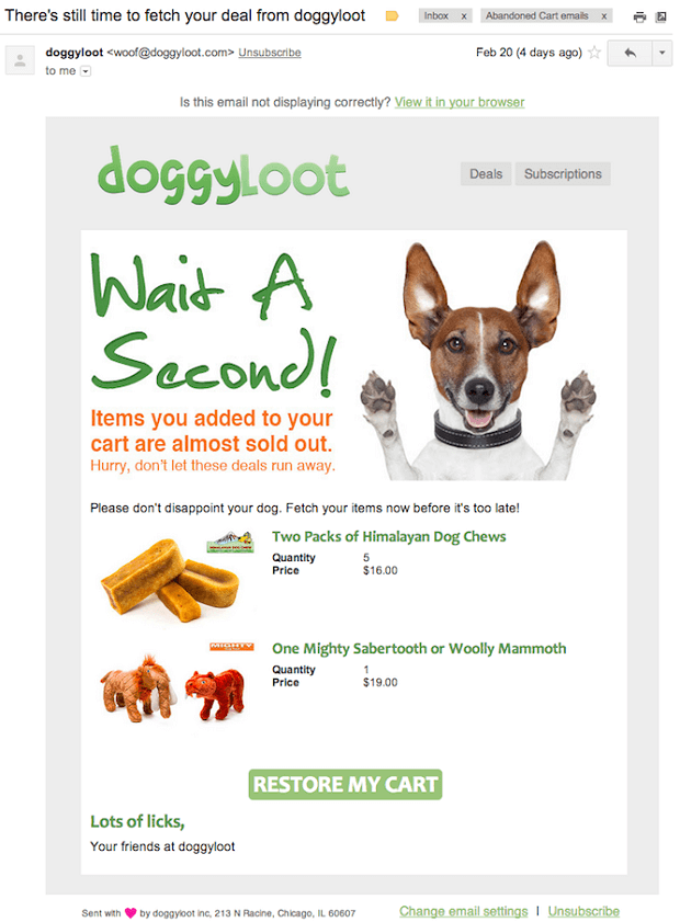
If you’ve set up your checkout form to get email addresses, or have gotten email addresses through micro conversions along the way, then you have what you need to reach out to abandoning shoppers. Just go for it!
You can really let your brand shine in these emails while also letting shoppers know that you miss them.
That’s it! Now you know how to increase Shopify conversion rate and 6 awesome techniques that are going to boost your conversions and your revenues.
Are you looking for more ways to make your eCommerce dreams come true? Check out our amazing tutorials. If you want a deeper look at eCommerce optimization, be sure to take a look at our ultimate guide.
If you’re not sure that Shopify is right for you, take a look at our picks for the best Shopify alternatives!
Not using OptinMonster yet? What are you waiting for? Join us today and see what an exit-intent offer can do for YOUR checkout page conversions.











Add a Comment