Is your email newsletter design helping or hurting your business?
The design of your email campaigns communicates the tone of your brand, and it can determine whether your subscribers convert into customers.
I share my best tips for designing an email newsletter in this article. When you follow these tips, you will design newsletters that get your customers to engage and click quickly.
I will also share four of my favorite email newsletter design examples and my analyses of why they are the best.
- Elements of Email Newsletter Design
- How to Design an Email Newsletter
- Email Newsletter Design Examples
Elements of Email Newsletter Design
Email newsletter design includes everything that goes into creating an email newsletter or promotional email. This generally includes:
- Subject lines and sender names
- Branded header
- Headings and subheadings
- Branding and colors
- Fonts and images
- Formatting
- Calls-to-Action
- Email footer
These are all aspects of building an engaging newsletter design template, but that’s not where it ends. Your newsletter design also includes things that you can’t see, like the goal of the newsletter.
That’s right, your newsletter design depends on the goal you’re trying to accomplish. For example, if you’re putting together your weekly newsletter your goal may be to educate your readers. This newsletter design might look a lot different from an email with the goal of boosting sales.
The newsletter design tips that follow can be used to create a killer email newsletter, no matter the goal. So, let’s jump in!
Resource: 5 Best WordPress Newsletter Plugins in 2023 for More Engagement
How to Design an Email Newsletter
Want to learn how to create a newsletter with a design that will impress your subscribers? These tips will help you get started.
1. Write a Great Subject Line
Subject lines have the power to make or break your email marketing campaigns. They help convince subscribers to open your emails in the first place. Only then can you get them to click your links or buy your products.
Here are some things you can do to make sure your subject lines are clickable:
Make subject lines mobile-friendly
Exact numbers vary by study, but about half of all emails are opened on mobile devices. Most mobile email apps display between 50 and 70 characters for the subject line.
Keep subject lines original
Subscribers get bored easily. Use a variety of subject lines to keep their interest.
Use emojis
Using emojis in your subject line can help draw the eye as users are checking their inboxes. However, don’t overdo it. You probably should only include 1 emoji in your subject line. And don’t use them unless they make sense to.
Related ContentEmail Subject Line Statistics To Help You Maximize Your Open Rates
2. Choose the Best Sender Name
If you get an email from someone you’ve never heard of, do you open it or just delete it automatically?
42% of users say that the sender name is the first thing they look at when deciding whether to open an email.
If a user has signed up for your email list, then your brand name should make it clear who the email is from.
Or, take the personal approach and include the name of a real person.
For our email newsletter at OptinMonster, the sender name is “Angie at OptinMonster.” Angie is OptinMonster’s General Manager.
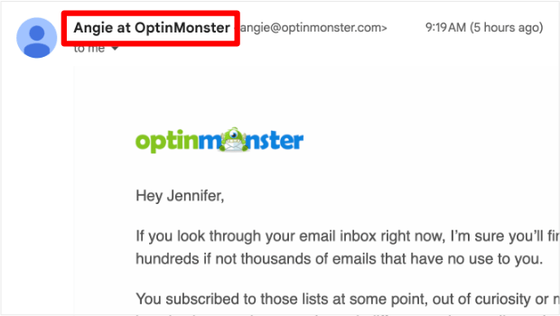
Using a person’s name makes your emails feel more personal and can increase open rates by 50%.
Plus, when you use a real email address rather than a “no-reply” address, subscribers can respond to your email, which is good for sender reputation and future email deliverability.
3. Use the Right Email Template
Most email marketing services, including Constant Contact and Brevo (formerly Sendinblue), offer a wide variety of newsletter templates, which you can customize with a drag-and-drop builder.
Here are some examples of newsletter templates available from Constant Contact:
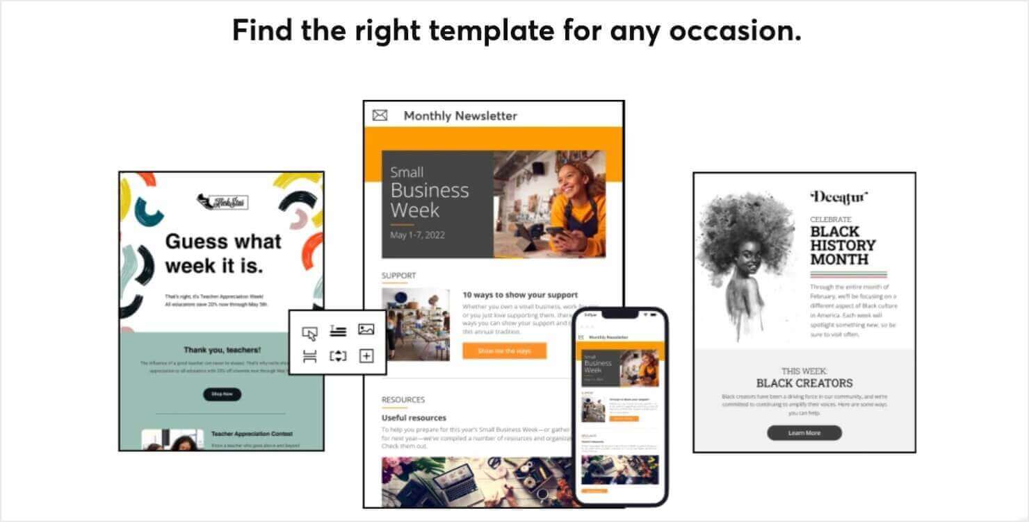
These templates are also responsive, meaning that they’ll look great on mobile and desktop.
To create a newsletter, you should find the template that best fits your brand’s visual style and the content you want to include. Keep in mind that you’ll be able to customize all the colors, fonts, and images to suit your brand.
7+ Best Email Service Providers for Small Businesses
4. Brand Your Emails
Ideally, your email newsletter is going to look like it’s part of your brand. In other words, you’ll include your logo, along with other imagery you use on your website and social media. That’ll help recipients recognize you, which boosts trust and engagement.
For subscribers, consistency is key, so don’t switch email newsletter design templates randomly. That’s because your newsletter design is part of your branding.
Instead, use the same template for the same type of email. That way, your subscribers know what to expect, can become familiar with it, and even look forward to it.
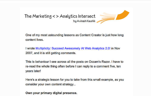
Here are a couple of examples of branded email newsletter design. Analytics expert Avinash Kaushik keeps it simple with a single column template and a header that includes his name and the name of the newsletter:
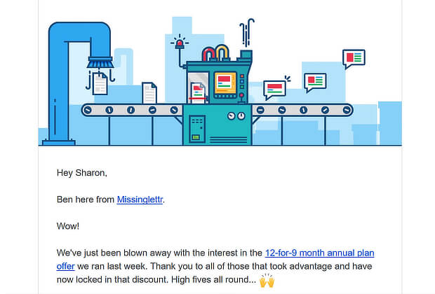
And Missinglettr uses its home page graphic as a header image:
5. Use Web-Safe Fonts (and Not Too Many!)
One thing to pay attention to with email newsletter design is typography. The fonts you choose can have a huge impact on how your newsletter’s perceived.
First, since email newsletters display differently on different email clients and web browsers, your best bet for a consistent look is to stick to web-safe fonts. You still have plenty to choose from, and there’s a list here to help you get started.
Second, don’t use too many different fonts: less is more. You need headline and body text fonts, and possibly one more for occasional contrast.
Some people use regular and bold versions of the same fonts for body text and headlines, while others use different fonts. Whatever you choose, keep it simple and opt for readability over trying to make your newsletter look fancy.
At all costs, you want to avoid having your email newsletter look cluttered and uncoordinated. For example, Ideo U uses just two main fonts in its monthly email newsletter:
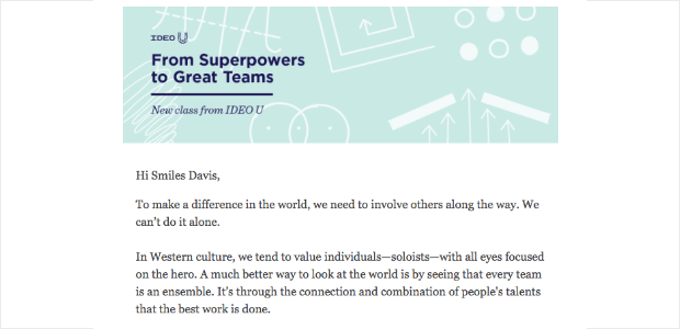
Third, if you already use certain fonts as part of your branding, keep it consistent and use those same fonts in your email newsletter. This’ll help with brand recognition.
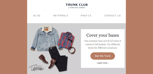
Here’s an example from Trunk Club. Since they’re a Nordstrom company, they use the Nordstrom font in their header.
6. Pay Attention to Images
Eye-catching photos and graphics are expected for many email newsletters. However, here are a few points to think about:
- Avoid background images most of the time, as they often make it more difficult to scan text at a glance.
- Ensure that your email looks good and works without images. Use alt text to describe any images you use so that even with images disabled, it will still make sense.
- Avoid hiding key information in images. As we’ll see later, that’s an email accessibility no-no.
Here’s a good example from Affinity Designer. At the top of the email, there’s an image with a 25% discount sticker, but that information is repeated in the text so even those who don’t see the image know what’s on offer:
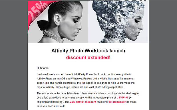
However, images can help readers to connect with the content of your email and can keep their attention focused on the right area. So if you are using images, make sure you choose attractive images that are crisp and clear.
If you need images for your email newsletter, start with the free images sites in our roundup.
7. Set the Mood With Color
Color’s an important aspect of any email newsletter design. That’s because color:
- Helps with brand recognition
- Is aesthetically pleasing
- Draws attention to your calls to action (CTAs)
Though you’ll want to be true to your brand color scheme, you can use other colors to set the mood. So, while your logo will stay the same, you might use seasonal images within the body of your newsletter. This can help your subscribers buy into the emotions associated with particular colors.
To choose the right colors for your newsletter, you can use tools like Coolors to select contrasting or complementary colors that make your email newsletter design pop.
Here are a couple of examples. Digicel keeps it simple by using its brand colors:
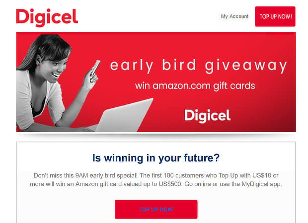
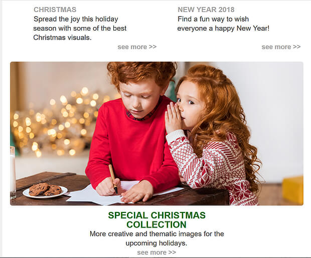
DepositPhotos uses Christmas colors of red and green in photos and text to evoke that holiday feeling:
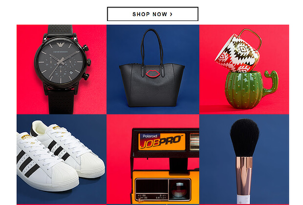
ASOS uses contrasting boxes to highlight items on sale:
8. Keep Text Short
When you’ve got website visitors, your goal is usually to keep them on the site and engaged with your content. With an email newsletter, it’s the opposite. Your ultimate goal is to get them out of their inboxes and onto your site or landing page.
That’s why it pays to keep text short.
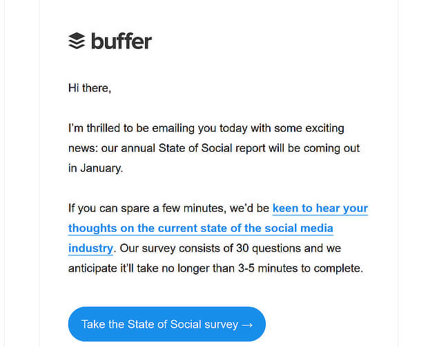
How short? Constant Contact says that emails that are about 200 words long have the best click-through rate. Here’s an ultra-short example from Buffer:
But, as we always say, the best way to find out what works for your audience is to test your email with your audience. We’ll talk more about testing in a minute.
Even with shorter text, there are a few tips you can use to make your copy more effective. If you want to make people click through, you have to:
- Lead with a great headline.
- Keep your body text in short paragraphs
- Use your text to direct people to your CTA
- Share your best content
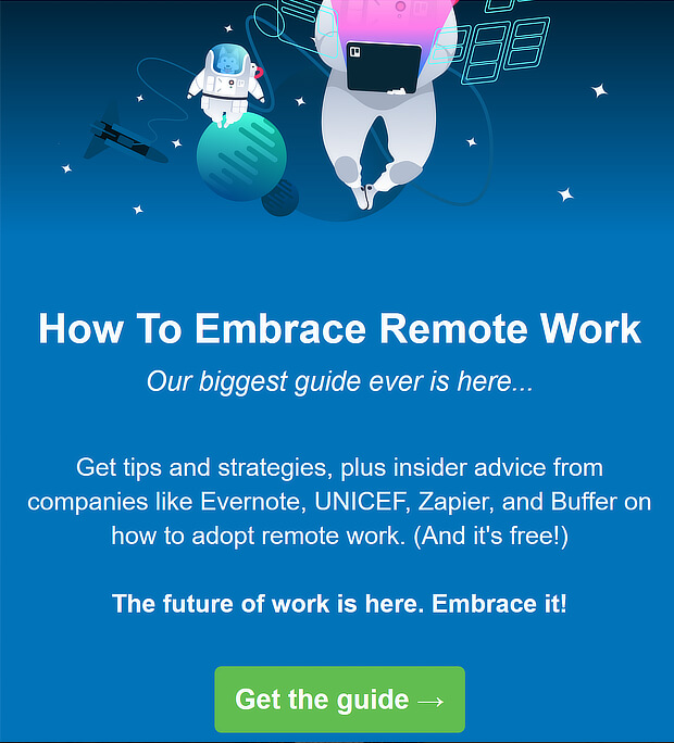
Here’s an example from Trello, which includes a background matching the brand colors, a short introduction and the call to action:
9. Make It Scannable
Even with short emails, recipients may not read all of the text. That’s why it’s important to make them scannable.
The way you structure your email newsletter will help with this:
- Bold headings, bulleted lists, and white space make it easy for readers to quickly take in your email copy.
- Since images draw the gaze, place them where you want your subscribers to look
- Structure your email content in clear sections to prevent any visual confusion.
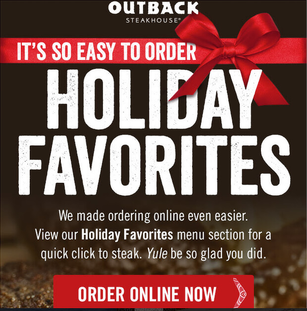
For example, this Outback Steakhouse email is divided into three sections. The first shows the most important part of the email, which is a new holiday favorites menu:
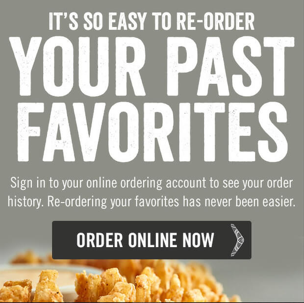
The second section lets subscribers see past favorites, with another call to action:
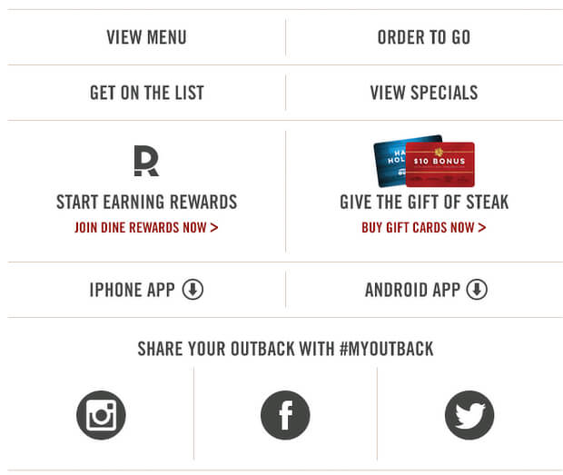
The last section includes links to important areas of the site, including the full menu.
10. Make Your Emails Accessible
As our article on email accessibility says, millions of people worldwide have visual and hearing impairments and other disabilities. It’s a legal requirement in many places, and good practice anyway, to make sure people with disabilities can easily access your communications.
If you’re building accessibility into email design templates, consider:
- Using accessible fonts at a large size
- Avoiding walls of text
- Using alt text for all images, so subscribers with disabilities will know what the image show
- Paying attention to formatting
The truth is, well-designed emails are accessible emails, so don’t neglect this part of your email newsletter design.
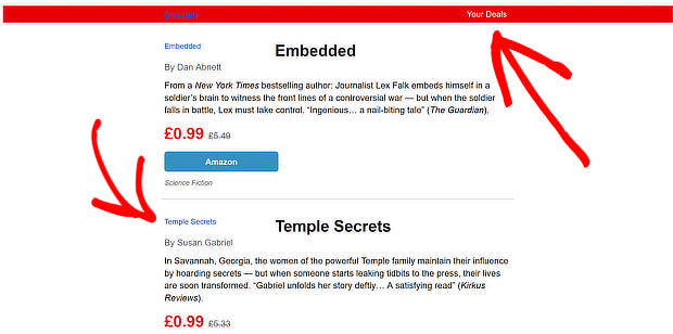
Here’s an example from BookBub. Even with images disabled, you can still get the main information:
11. Consider a Text-Only Email Newsletter Design
While images and stunning formatting make for beautiful newsletters, sometimes simple text does the trick.
In fact, our own email newsletters look like this:
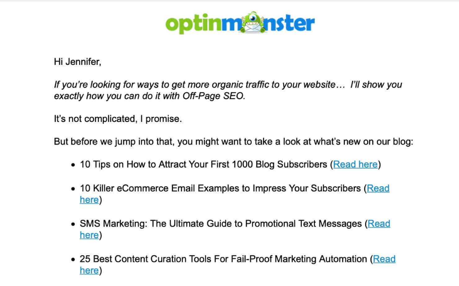
This type of plain text email focuses on message over style. And depending on your industry, you might be surprised at how successful these types of emails can be.
In fact, Litmus did an A/B test that showed their plain text email saw more conversions than a similar email that used images and CTA buttons.
Text-only emails aren’t right for every business. If you’re an eCommerce retailer selling physical products, then you’re going to need to include photos of your products.
But for some businesses, such publisher, SaaS, or agencies, it’s worthwhile to experiment with text emails with hyperlinked text for your CTAs.
12. Nail the CTA Design
In the end, the success of your email newsletter design will come down to whether it wins the clicks. The call to action (CTA) is a critical part of getting subscribers to engage.
A well-designed call to action:
- Is visible and actionable
- May appear in different formats, such as a link and a button
- Will be included multiple times in an email, most likely 3
Here’s an example from DigitalMarketer, where they include the CTA as both a button and a link:
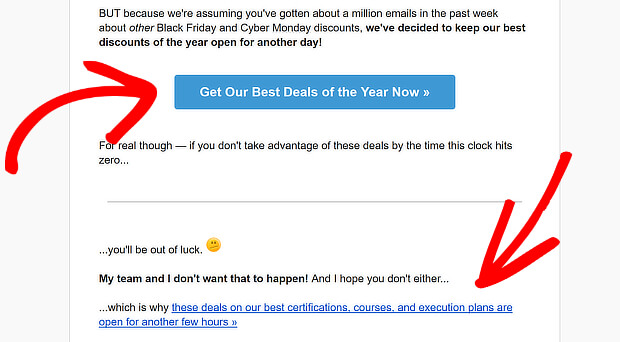
To learn more about getting your CTA right, read our guide to creating the perfect call to action.
Color’s also important when creating call to action (CTA) buttons. You want your button to really stand out so users know where to click. You’ll have to experiment to see which CTA color works best for your subscribers.
13. Test Your Email
Our last tip is to test your email. There are 2 ways to test your email newsletters:
- Send a test email to yourself, so you can see exactly how your newsletter looks on desktop and mobile.
- Use A/B testing to find which subject lines and other email elements see the highest open rates and click rates.
Both test emails and A/B tests are available through most email marketing services.
With these tips, you’re now ready to start designing newsletters that will get your email subscribers reading, clicking, and buying.
Email Newsletter Design Examples
1. The Hustle
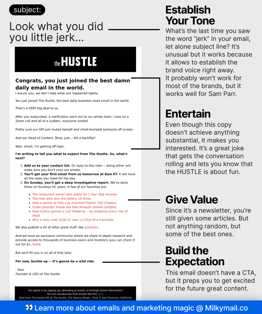
This daily business and tech newsletter is known for its concise, informative content and humorous tone. Their emails are a great example of how to balance information with entertainment. The design is clean and mobile-friendly, with bold headlines and clear calls to action.
Why it’s great: Short, scannable content, engaging tone, and a well-designed layout for mobile users.
2. Apartment Therapy
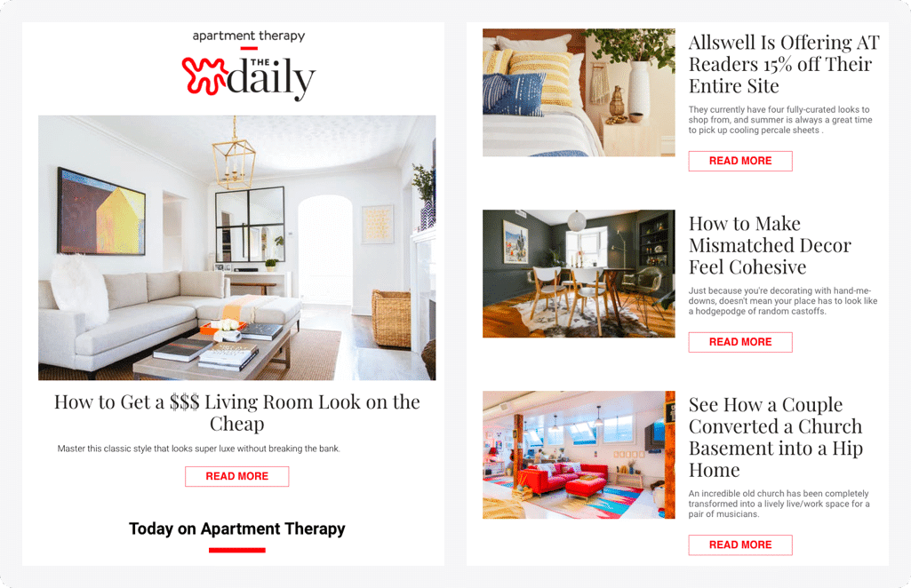
This home and lifestyle newsletter features beautiful visuals and inspiring content. Their emails are a masterclass in using imagery to capture attention and evoke emotion. They also excel at segmenting their audience and sending targeted content that resonates with specific interests.
Why it’s great: Stunning visuals, targeted content, and a clean, easy-to-read layout.
3. Moz Top 10
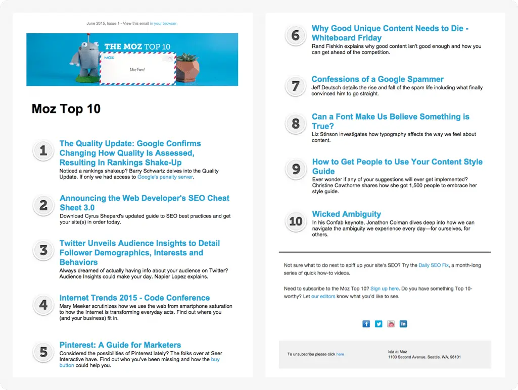
This bi-weekly newsletter from the SEO experts at Moz is a great example of a content curation newsletter. It features a concise list of the top 10 marketing articles of the week, with short summaries and links to the full content.
Why it’s great: Actionable content, time-saving format, and a design that prioritizes readability.
4. Fizzle
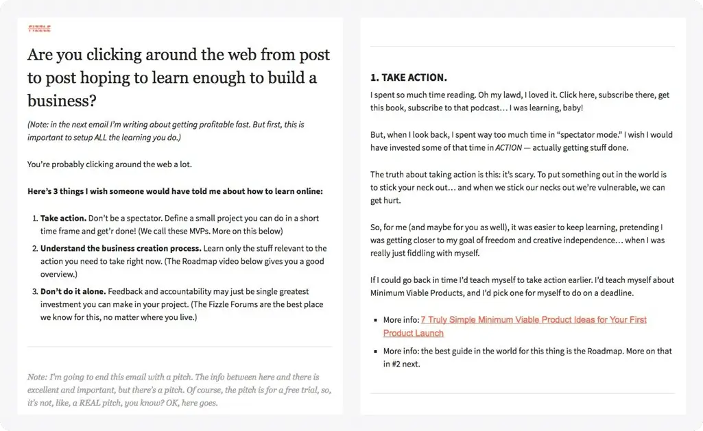
This marketing course newsletter is known for its long-form, in-depth content. Their emails are packed with valuable insights and actionable advice, but they’re still visually appealing and easy to read.
Why it’s great: Huge variety of email newsletter examples, searchable by industry and design element, and in-depth analysis of what makes each email effective.
These are just a few examples, and the best email newsletter design for you will depend on your specific goals and audience. But by following these examples, you can create newsletters that are informative, engaging, and visually appealing.
Want to learn more about optimizing your emails? Check out these resources:
- Email Marketing: The #1 Ridiculously Easy Way to Grow Your Business
- How to Create an Email Campaign (Step-by-Step Guide + Examples)
- How to Increase Email Open Rate (With 10 Proven Tips!)
- How to Grow Your Email List: 23 Proven and Simple Ways
- How to Create a Newsletter Popup (in 5 Easy Steps)
- 29 Awesome Newsletter Ideas That Will Keep Subscribers Engaged
And if you want a great subscriber list for your email newsletter, OptinMonster is the best software available!
You can use our targeted popups, floating bars, and other onsite campaigns to convert your website visitors into email subscribers.





Add a Comment