Are you looking for ways to make your email marketing campaigns more effective? As a small business owner, it can be tough to stand out in crowded inboxes. In my 15 years working in email marketing, I’ve found that the best way to improve your email strategy is to examine email marketing examples from successful brands.
In this article, I’ll share 5 important email elements and analyze 10 examples of great email marketing campaigns. These emails caught my attention when they landed in my inbox and impressed me with how they appealed to their audience. By studying what works for successful brands, you’ll learn actionable tips to improve your email marketing, engage your audience, and ultimately grow your business.
The 1st Step to Effective Email Marketing? A Great Email List!
OptinMonster is the best way to convert website visitors into email subscribers. Our popups, floating bars, and other onsite campaigns let you show your best offers to the right people at just the right time.
5 Elements of the Best Email Marketing Campaigns
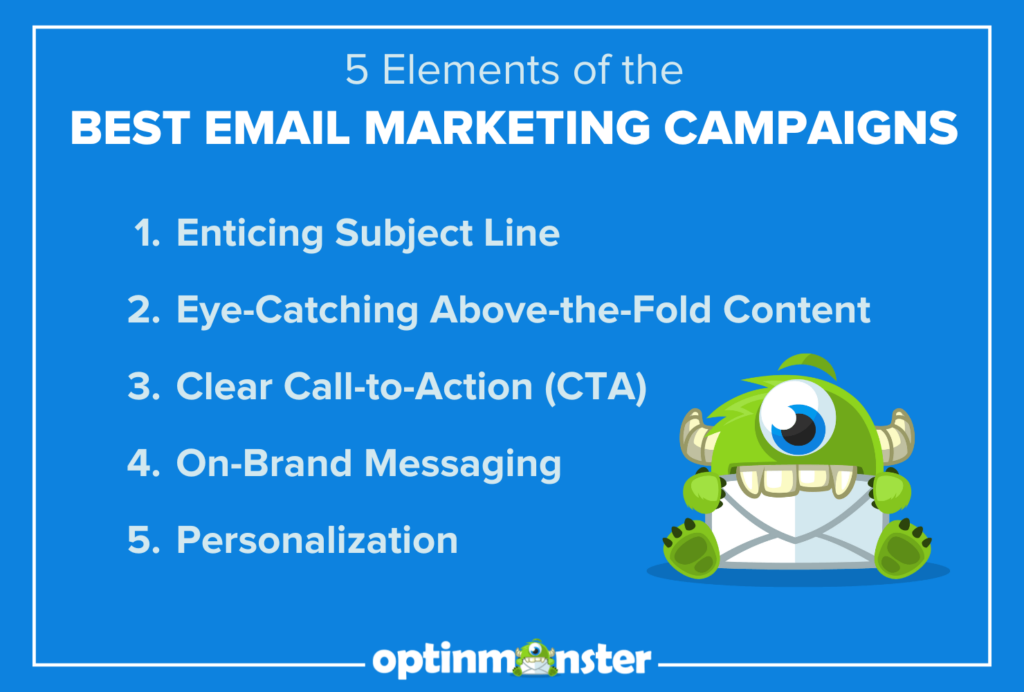
What elements do great email campaigns share? Depending on the goal of your email, the exact content and format can vary widely. However, most great email marketing campaigns include the following basic elements:
1. Enticing Subject Line
You could create an absolutely stellar email campaign, and it wouldn’t matter if your subscribers don’t open it. Your subject line needs to grab attention immediately, often through curiosity, urgency, or a special offer.
2. Eye-Catching Above-the-Fold Content
“Above-the-fold” refers to the content that users see before they scroll. In other words, it’s the content at the very top of your email. The best email campaigns include an engaging image or headline that hooks the reader right away.
3. Clear Call-to-Action (CTA)
Every successful email marketing campaign includes a clear and compelling call-to-action (CTA) to get your subscribers to click. The CTA could be to shop, register for an event, or read a piece of content. Most email campaigns should have 1 primary CTA that is the main focus of the email.
4. On-Brand Messaging
Consistency is vital, not only for your email campaigns but for your overall marketing strategy. The tone, style, and design of your emails should always reflect your brand’s identity. Your brand identity will inform many aspects of your campaigns, from color schemes to the amount of humor you include.
5. Personalization
If you want to form strong connections with your subscribers, your emails need to feel personal. There are many possible ways to personallize your email campaigns, such as:
- Including the subscriber’s first name in the subject line or email greeting
- Segmenting your email list to send relevant offers and messages
- Including product recommendations based on past purchases
- Using a person’s name as the sender name, or formatting your email as a letter from a specific person
- Writing in a casual, friendly tone that feels like one person talking to another
These personalization tactics can help your email campaigns stand out and get more engagement. That translates to more traffic and sales!
10 Effective Email Marketing Examples (& Why They Work)
Below, I’m sharing 10 of the best email marketing campaigns that have caught my eye recently. For each email campaign example, I’ll discuss some of the elements it uses and explain why it’s so effective. Then, you’ll be able to apply some of these tactics to your own email strategy!
1. Chewy: Countdown to Halloween
I got this Halloween-themed email from the pet supply company Chewy:
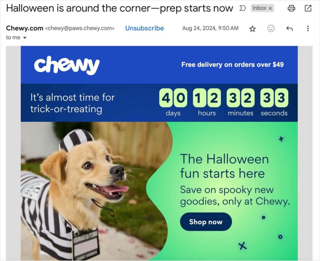
This email campaign’s goal is to encourage customers to purchase fun Halloween products for their pets. There’s even a countdown timer at the top to create a sense of urgency.
Countdown timers can be an incredibly effective way to boost conversions. The education website Cracku used OptinMonster’s countdown timers to increase conversions by 300%!
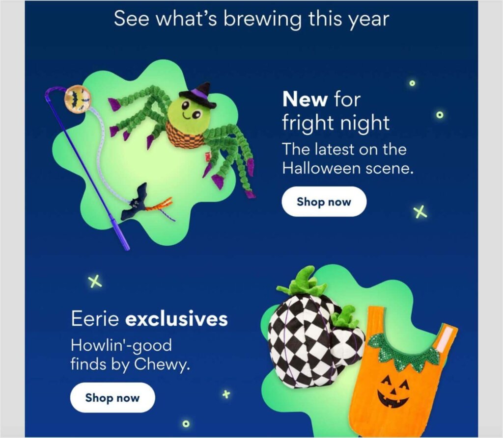
As I scrolled below the fold, I saw examples of some of the spooky pet products I could shop for:
At the bottom of the email, there was a “Top picks for you” section, full of personalized product recommendations. These were all items that I had purchased from Chewy before.

Why I Love This Email Marketing Example:
- This email nails its above-the-fold content. As soon as I opened the email, I saw an adorable photo of a dog wearing a costume. I also saw a prominent “Shop Now” CTA button.
- Repeated CTAs throughout the email give me plenty of chances to engage.
- The personalized product suggestions remind customers of items they might need to reorder.
- Chewy’s email is optimized for urgency. In addition to the countdown timer, the subject line reminds subscribers that “Halloween is around the corner–prep starts now.”
2. Blenko Glass Company: Last Chance Email
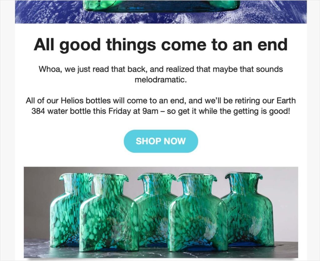
This email from Blenko Glass Co. caught my eye with its tongue-in-cheek subject line:
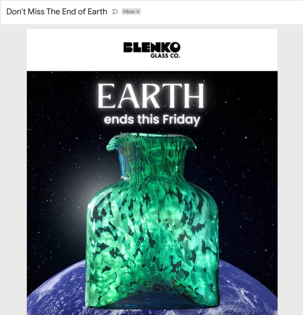
The glass maker was creating a series of limited-time pieces based on the planets. This excellent email campaign reminded subscibers to order the Earth-themed piece before it was discontinued.
The beautiful above-the-fold photo encouraged me to scroll further. There, I learned the deadline for ordering and saw a “Shop Now” CTA.
What I Love About This Email Campaign Example:
- The unusual subject line sparks curiosity, which can increase email open rates.
- Beautiful product photos encourage subscribers to buy before it’s too late. It worked on me!
- This email has a singular purpose and CTA. There are no other links to distract from the primary goal.
3. LocaliQ: Webinar Email Campaign
Webinars can be a powerful way to reach your target audience. Here’s an example of email marketing that promotes a webinar:
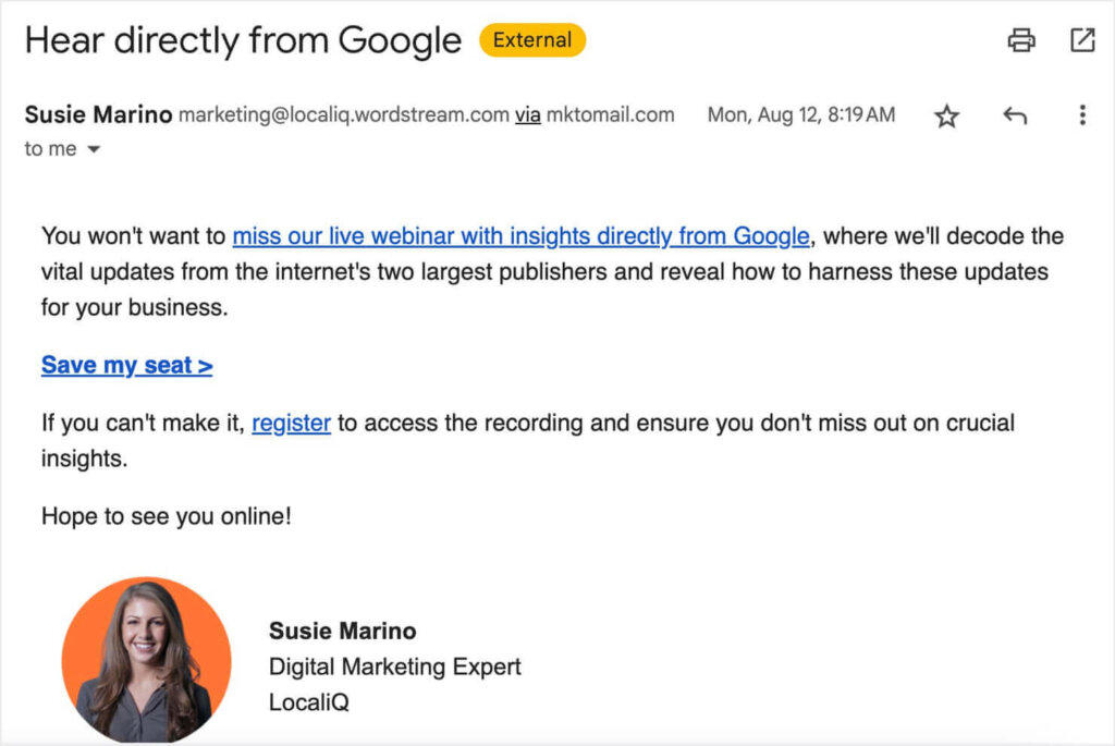
The email explains the topic and benefits of the upcoming webinar. At the bottom of the message, there’s a link to be removed from this particular webinar’s promotions:

Why I Love This Email Marketing Example:
- This email campaign is simple and straightforward. It has one goal and doesn’t bother with any bells and whistles.
- The email comes from a specific person. The sender name is “Susie Marino,” who is LocaliQ’s webinar host. All of their webinar emails come from Marino, and they’re all written as a personal message from her, complete with a headshot. This tactic makes the emails and webinars feel more personal.
- LocaliQ gives subscribers options by informing them that the recording will be available for registrants who can’t attend live.
- LocaliQ gives subscribers control of their inbox by letting them adjust their subscription settings to only get the emails they’re intereted in.
4. Habitat for Humanity: Nonproft Fundraising Email Campaign
During the last days of 2023, I received this email from the nonprofit Habitat for Humanity. It focused on their year-end fundraising challenge:
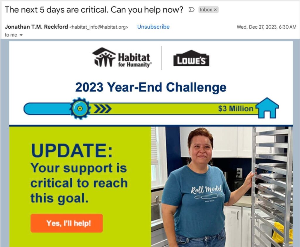
At the top of the email, there’s a progress bar showing how much they still need to raise to reach their $3 million goal.
Level Up Your Fundraising With Our Guide:
Fundraising Thermometers & Progress Bars: Get More Donations Fast!
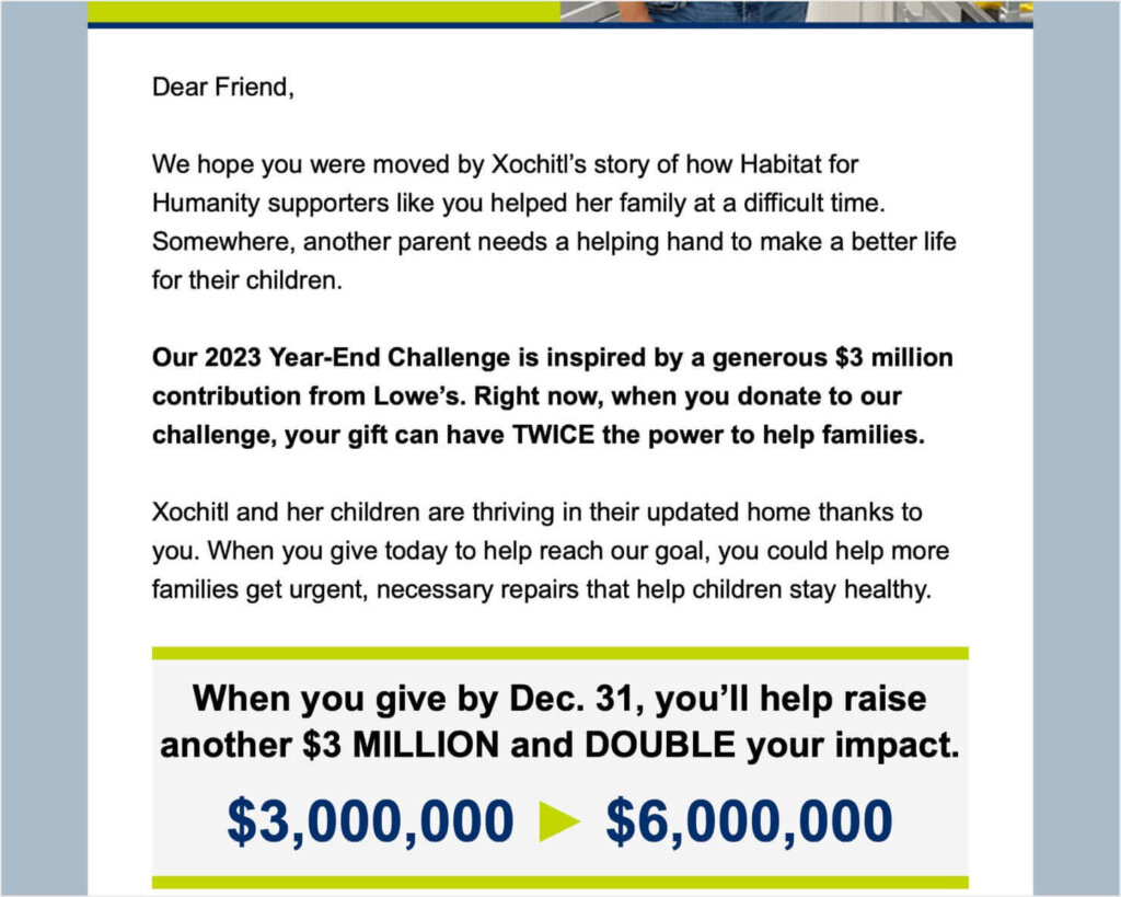
The email features a photo and story of a family that Habitat has helped. It also informs subscribres that their donations through December 31 will be matched.
Why I Love This Email Marketing Example:
- This email is optimized to get subscribers to act now. The subject line says “The next 5 days are critical,” and the progress bar encourages users to help fill the gap before the deadline.
- The photo and personal story illustrate the very real impact that donations have on people’s lives.
- Habitat uses a large graphic to drive home the impact of donating during the matching period.
5. OptinMonster: New Feature Announcement
Next, I’m sharing an example of an email marketing campaign that we sent here at OptinMonster. In this email, we notified our customers of 3 new templates we had just added. These were in addition to the 700+ templates we already offer.
We also reminded subscribers that we have over 50 templates for their upcoming Black Friday and Cyber Monday sales.
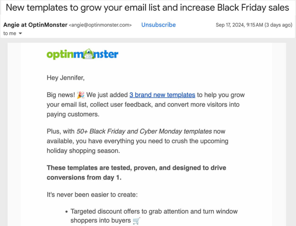
As you can see, we use a simple text-based format for our marketing emails. Each email is written like a letter from Angie, our General Manager, to the subscriber.
At the bottom of the email, there’s a repeated, larger CTA to try the new templates:
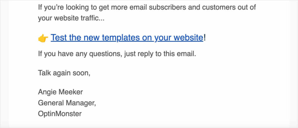
Why I Love This Emai Marketing Campaign:
- The sender name, “Angie at OptinMonster,” combines personal connection with brand recognition.
- The email greeting is personalized with the subscriber’s first name.
- This email campaign is optimized for customer retention. Emails like this show our customeres that we’re continually adding value to our product.
Turn Your Website Visitors Into Subscribers & Customers
6. Shopify Blog: Weekly Content Newsletter
Do you send out email newsletters with your latest blog content? Then you can take inspiration from Shopify’s weekly “Talking Shop” newsletter:
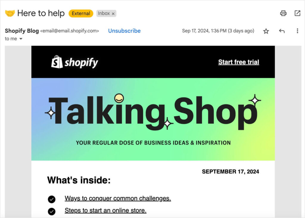
Each week’s email starts with a branded newsletter header and a table of contents, which lists the blog posts included in the email.
As I scrolled down, I saw more details about each of the posts, along with links to the full posts.
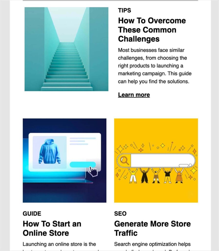
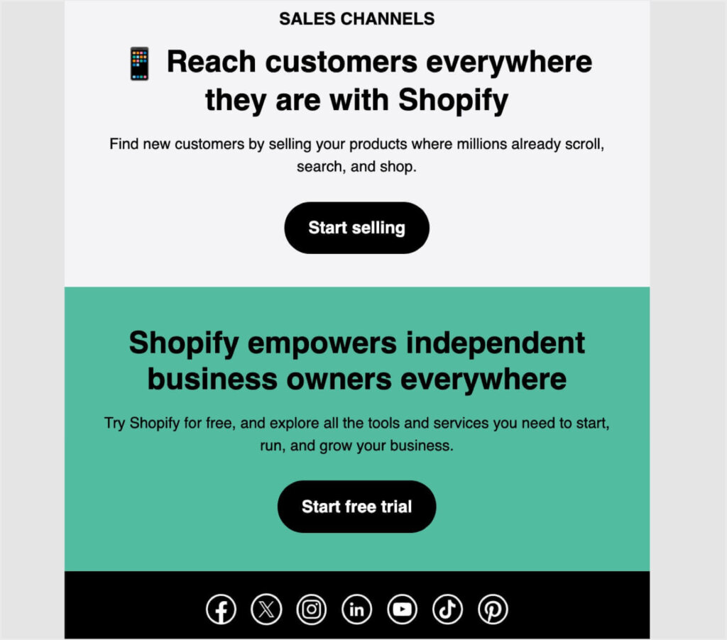
Even though this email is focused on sharing content, Shopify still includes CTAs to move subscribers through their sales funnel:
Why I Love This Email Marketing Example:
- By including a table of contents above-the-fold, Shopify provides a summary of the email and encourages readers to scroll down for more details. Alternatively, they can just click the blog links right there at the top.
- This email newsletter has valuable information for any online business owner, regardless of whether they already use Shopify. That helps the company reach a broader audience.
- The CTAs at the bottom help nurture this broader audience through Shopify’s sales funnel.
7. Starbucks: Win-Back Email Campaign
I received this email from Starbucks when I hadn’t bought a drink from them in a long time:
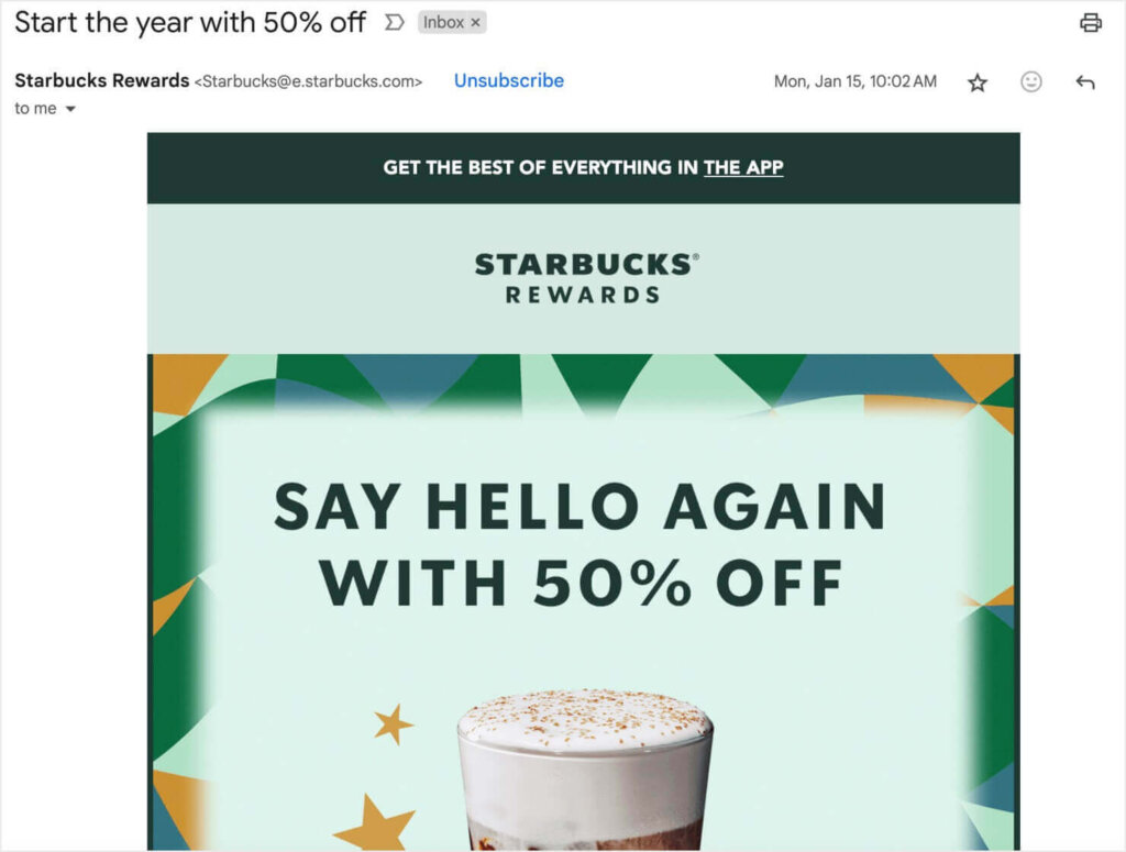
This is an example of a win-back email, which focuses on retaining lapsed customers or subscribers.
Stop Losing Customers!
Check out our guide to effective win-back emails.
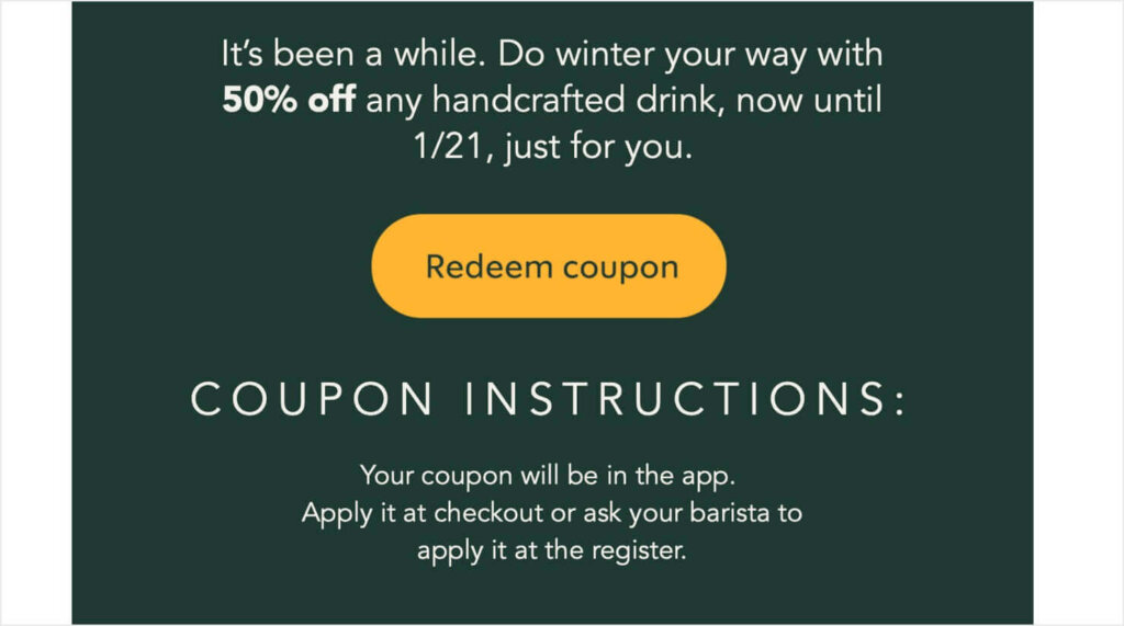
As I scrolled down, Starbucks encouraged me to come back with a 50% off coupon. There was a CTA button to redeem the coupon, along with instructions on how to use it.
Why I Love This Email Campaign Example:
- The enticing photo of a tasty drink reminds customers what they’ve been missing.
- A deep discount of 50% is a strong incentive to win back a lapsed customer.
- Starbucks includes the discount amount right in the subject line, ensuring that lots of customers will click.
- It includes smart messaging about doing “winter your way.” That focus evokes the feeling of enjoying a hot drink on a cold day.
8. SurveyMonkey: Welcome Email Campaign
Welcome emails are absolutely essential for any email marketing strategy. They set the tone for your relationship with the subscriber, and they usually provide important first steps.
This email campaign example from SurveyMonkey welcomes new users who have just signed up for an account. In my case, I received this email after registering for their free account.
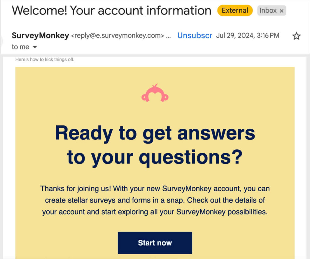
The “Start Now” CTA button links to SurveyMonkey’s sign-in page, allowing the new user to quickly access their account.
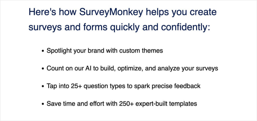
Below the fold, SurveyMonkey lists some of their most important features. This tactic is a great way to encourage new subscribers to start using the product.
Why I Love This Email Marketing Example:
- This welcome email reminds new users why they signed up: “to get answers to your questions.”
- People often sign up for free accounts and then never use the service. This email encourages new subscribers to log in and start making surveys.
- SurveyMonkey demonstrates their product’s value by listing some of their best features.
9. Cheekwood Estate & Gardens: Seasonal Membership Promotion Email
The Cheekwood Estate & Gardens in Nashville, TN transforms its grounds into a Pumpkin Village every fall. Cheekwood took advantage of this popular event by offering a discount on their annual memberships, which they promoted in this email campaign example:
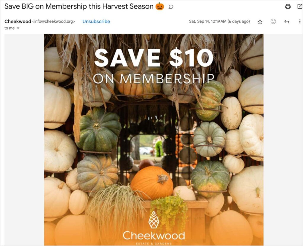
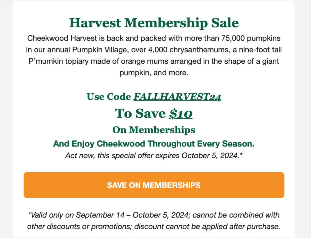
Below this beautiful photo, Cheekwood gives details about their promotion. They also remind subscribers that their fall decorations include 75,000 pumpkins and over 4,000 chrysanthemums.
What I Love About This Email Marketing Example:
- Cheekwood makes smart use of the jack-o-lantern emoji in the subject line. They’re known for their huge fall pumpkin displays, and the emoji ties in to that association.
- The large above-the-fold photo gives a glimpse of what visitors will see in their Pumpkin Village.
- This email effectively nurtures subscribers. These subscribers were interested enough in Cheekwood to sign up for emails. They may have even visited before. This email encourages them to take the next step of becoming members.
10. Instacart: Seasonal Product Promotion
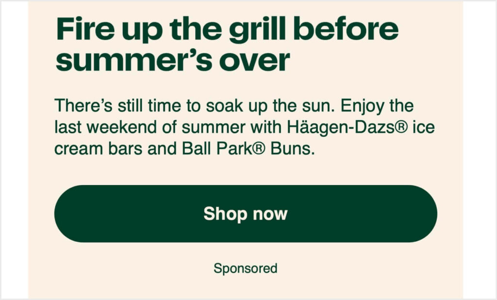
This email campaign from Instacart features a sponsored brand promotion, with special deals on Ball Park™ hot dog buns and Häagen-Dazs® ice cream.
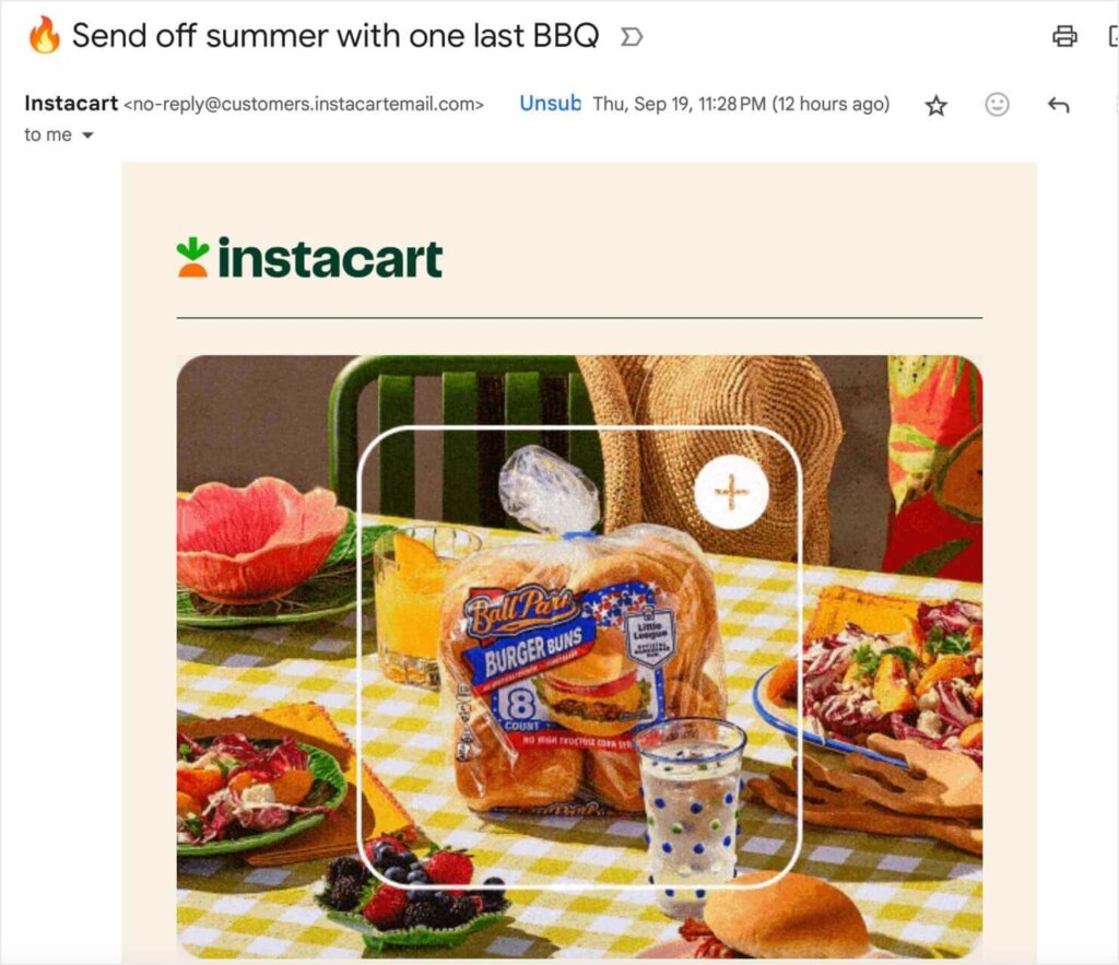
The email has strong messaging: Summer is almost over, so you should enjoy one more cookout before the weather changes.
After that, there’s a simple CTA to shop the sponsored products:
Why I Love This Email Marketing Example:
- This email uses the power of FOMO (the fear of missing out) by encouraging customers to enjoy “one last BBQ.”
- Instacart follows legal and ethical guidelines by informing subscribers that this email campaign is a sponsored ad.
- This email effectively focuses on its single goal: to get subscribers to shop the sponsored product.
Use These Email Marketing Examples to Supercharge Your Strategy
When you apply the elements and tactics used in these examples, you can start creating email marketing campaigns that connect with subscribers, drive sales, and build brand loyalty.
Want to learn more tips for crafting top-notch email campaigns? Check out these resources:
- How to Create an Email Campaign (Step-by-Step Guide + Examples)
- Email Marketing That Sells: 17 Simple Ways to Writer Better Marketing Emails
- Email Newsletter Design: Tips to Boost Clicks and Conversions
- 10 Killer eCommerce Email Examples to Impress Your Subscribers
Email marketing allows you to connect with customers regardless of where they are. But first, you have to get them to sign up for your emali list.
That’s where OptinMonster comes in.
With OptinMonster, you can grow your email list with our with exit-intent popups, floating bars, scroll box campaigns, and more.
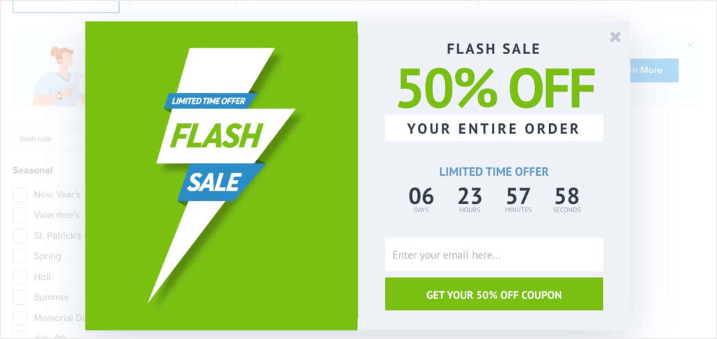
Once you’ve started building your email list with OptinMonster, the email marketing examples above can help you learn how to keep those subscribers engaged and buying.
BONUS: Done-For-You Campaign Setup ($297 value)
Our conversion experts will design 1 free campaign for you to get maximum results – absolutely FREE!






Add a Comment