Are you running out of ideas on how to increase those year-end donations?
As you already know, budgets are one of the most challenging aspects of running a nonprofit. But, with the holiday season, people are already in a giving mood.
One of the best ways to capitalize on visitors’ festive spirits and get those vital, year-end donations is by using popups.
In this post, we share 7 easy tips on how to use popups to boost year-end donations. Let’s get started.
Did you knowOptinMonster offers 20% off for our nonprofit friends—just use NP20OFF at checkout!
Tip #1: Show Popups at the Right Time
Did you know that 70% of people who visit your website will never return? A pretty sobering statistic, isn’t it?
Don’t let your marketing efforts go to waste! With Exit-Intent® you can convert abandoning visitors into year-end donations. Exit-intent triggers your popup to show when a visitor is about to leave your site, giving you one more chance to make your ask.
You can easily set up exit-intent with OptinMonster’s display rules using the “exit detected” rule.
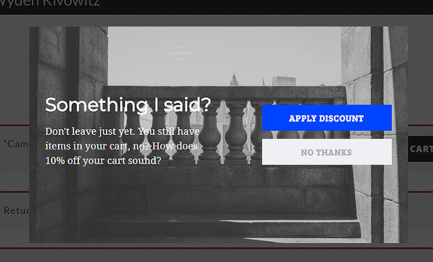
Let’s take a look at this exit-intent popup from Scott Wyden Imagery to see exit intent in action.
Scott Wyden Imagery uses exit intent to reduce cart abandonment, so they’re offering a discount to convince their visitors to make a purchase instead of leaving empty-handed.
FYI, this optin converts 21.06% of abandoned carts. And you can use this same functionality to get more donations from visitors exiting your site. But, make sure you give them time to get to know you a bit first.
Have you ever just opened a website and one second later—BOOM!—a popup appears asking you to join the site’s email list? You haven’t even had a chance to learn anything about them, so why would you join, right?
That’s a perfect example of bad timing. To avoid this, you can use OptinMonster’s time display control to set time delays for your campaigns. It’s important to give visitors a chance to learn about what you do and why you do it before showing them a popup asking for money.
For more cool ways to use exit intent, check out these exit popup hacks. Or, have a look at our OptinMonster exit-intent optin gallery for more inspiration.
Tip #2: Show Popups to the Right People
We all know that the better you know your customers, the better your results. Which is why it makes sense to create different campaigns for the different types of customers that you have. It’s the same for nonprofits. Your customers just happen to be called “donors” instead.
You can use page-level targeting to create custom popups on your nonprofit site that show the right campaigns to the right people. That way, you can show specific campaigns to visitors depending on the content they’re viewing.
For example, let’s say you’d like to ask for a donation after your visitor gets a chance to read more about your organization. Instead of adding the donation popup on the homepage, you can target the “About Us” page of your website instead.
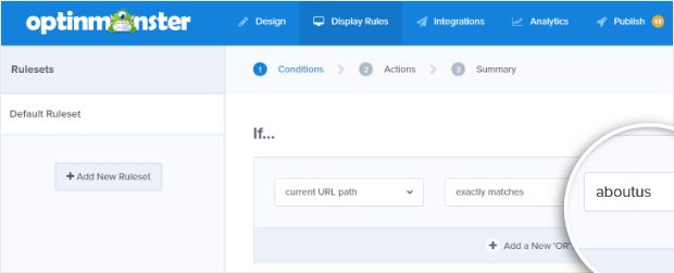
You can easily do this by adding a display rule. All you have to do is select the “current URL path,” “exactly matches,” and then the slug of your “About Us” page.
See our example below.
Tip #3: Make Getting Out of the Popup Easy
Is anything more frustrating than getting trapped in a popup while you’re browsing a website? There’s no way of opting out, no close button, and you can’t get out by clicking anywhere else! ?
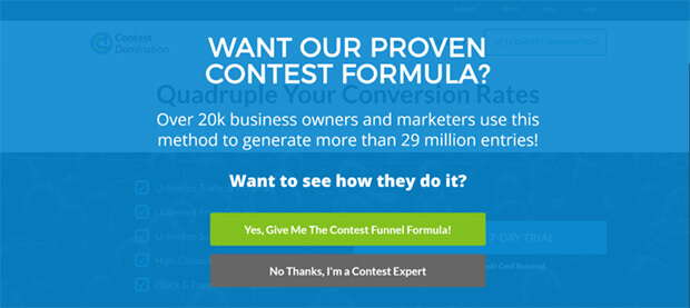
Instead of stressing out your visitors, make getting out of popups easy. Give your visitor the option of saying “No, thanks” like this example below:
In this fullscreen optin, the visitor is asked if they’d like to see the proven contest formula. Instead of forcing the visitor to say “yes,” the optin offers a “No thanks” option. Visitors are less likely to get frustrated and be left with a bad feeling about your site or organization if they’re given a choice to opt out.
But how do you get visitors to say “yes?” How do you get them more interested in what you have to offer?
Easy, just take some of it away. Enter, gated content. ?
If you’re unfamiliar with the term, gated content is online content (like articles, videos, top 10 lists, etc.) that you have to fill out a form to get access to.
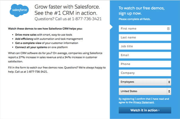
The form may ask you for your email address or phone number in exchange for an article or video demo.
Here’s an example from Salesforce:
There are pros and cons to gating content, but done correctly, it can make your content more appealing.
Nonprofits can use gated content to share their expertise on things related to the organization’s mission. The American Heart Association, for instance, could require visitors to sign up for access to certain educational blog posts.
Or, you could create a paywall to share extra exclusive content with paying subscribers at a small fee. This will help you raise even more money for your nonprofit organization.
Tip #4: Focus on Popup Design
Nearly 75% of visitors get frustrated when their experience isn’t personalized. But the good news is that it’s easy to personalize your popups to make visitors feel special.
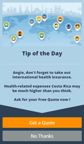
A great approach is to include your visitor’s name in the popup. It feels great when someone remembers who you are, but it feels even better when they call you by name. Your visitors will feel this way too.
Once you have personalization covered, there’s the matter of design.
About 46% of people say that a website’s design is the top criteria for deciding a company’s credibility. And 38% of people will leave your website if it’s unattractive. That’s a lot of potential leads lost!
For some design inspiration, check out this list of web design principles to make your website look amazing!
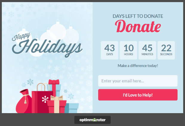
Take time to design your popup and write tailored copy for your year-end appeal. Try using our eye-catching holiday-themed design for your year-end fundraising campaign. Check it out below:
Get started with OptinMonster’s drag and drop builder to create a completely customized campaign for your year-end fundraising goals.
Once you’ve designed a beautiful popup, what else do you need?
A great headline, of course!
Why? Because a great headline grabs visitors’ attention, makes them want to learn more, and ultimately converts leads. Since you really only have about 2-3 seconds to hook a visitor, make sure your headline is eye-catching.
Tip #5: Make Sure Your Popup is Mobile Ready
Making sure that your popup is mobile-ready should be a key part of your nonprofit marketing strategy.
By 2019, an estimated 4.68 billion people will be using mobile phones. With this staggering number, you definitely don’t want to risk losing donors because your popup didn’t display correctly.
Not all popups will work as expected on mobile devices. An exit-intent popup, for instance, probably isn’t a great mobile option since there’s no mouse to determine when a visitor is about to leave your site.
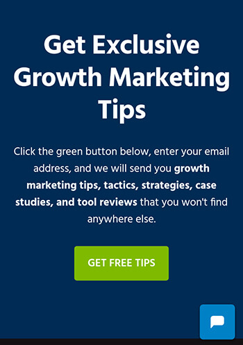
To reach more mobile users, try our fullscreen welcome mat template.
This template has proven to increase conversions by as much as 80%! Use this opportunity to showcase your year-end fundraiser.
But what about times when your visitor gets distracted by a new app or notification? Or when they leave your site in the background and forget about it?
For that, you can use display rules to set up something like exit-intent, but for mobile users. Our InactivitySensor™ display rule lets you target users that have been inactive for a while. So it’s like exit-intent, but for mobile. You can easily engage mobile visitors and win back their attention so you can get more subscribers and more funding.
Tip #6: Split Test Your Popup
How do you know if your popups are working as well as they could be?
If you don’t split test, you could be missing out on donations without even knowing it.
OptinMonster’s A/B split testing feature is an effective tool to see if your popups are working the way you want them to. It can also tell you which one works better.
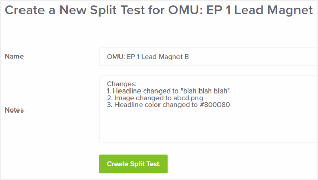
For example, you can create a split-test, and change an element like a photo or text. Just be sure to make a note of what you changed for tracking purposes.
Split testing is important because it lets you collect data. Then, using data analytics, you can tell which popup helps people take action, and which doesn’t.
You can use this data to make smart nonprofit marketing decisions and as a part of your year-end giving strategies.
Tip #7: Track Your Popup’s Success
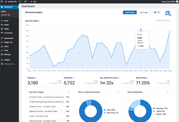
After creating your popups, you’ll want to keep track of how they’re performing. We recommend using Google Analytics with MonsterInsights to track your success.
But wait, aren’t they the same thing? Nope!
Google Analytics is a free web analytics service from Google that tracks all of your website traffic. This data provides you with useful information about your website visitors.
MonsterInsights makes it easy to connect Google Analytics to your WordPress site with a simple plugin. It’s available on the lefthand menu and also displayed right on your WordPress admin page, giving you a report of your data at a glance.
There you have it! You’ve just learned 7 easy tips to boost your nonprofit’s year-end fundraising. With these tips, you can craft one of the best end-of-year fundraising campaigns ever. Need some more inspiration on how to use popups on a nonprofit website? Here are 9 unique popup ideas to check out.
Want to show off your fundraising success? You can do that with this awesome fundraising progress bar tutorial. And, if you aren’t sending a nonprofit newsletter, get on that! Email marketing is a great way to keep your mission in front of interested people.
And don’t forget about social proof! You can use TrustPulse to show off real-time donation activity and get an instant lift in conversions of up to 15%.








Add a Comment