Running an online store comes with constant challenges, such as driving traffic, converting visitors, and increasing sales. The good news? You don’t have to figure it out alone.
In this post, I’m sharing real-world eCommerce case studies from businesses that have successfully grown their revenue, built loyal customer bases, and optimized their marketing strategies.
Each case study highlights:
- The challenge the business faced
- The strategy they used to overcome it
- The results they achieved
- Key takeaways you can apply to your own store
These insights come from proven eCommerce brands. The tips here aren’t based on theory, but on tested strategies that work. Whether you’re struggling with abandoned carts, low email signups, or customer engagement, you’ll find practical ideas you can implement right away.
- Podbike: Boosting Pre-Orders with Geolocation Targeting
- Human Food Bar: Growing an Email List Before Launch
- DateID: Increasing Conversions with Interactive Quizzes
- Kennedy Blue: Overcoming Price Objections to Increase Sales
- AutoAnything: Increasing Revenue with High-Impact Optins
- Cosmetic Capital: Driving Conversions with Countdown Timers
- Crossrope: Reducing Cart Abandonment with Exit-Intent® Popups
- Kinobody: Boosting Email Signups with Embedded Optins
- Libratone: Scaling Lead Generation with Personalized Campaigns
- KnivesShipFree: Using Giveaways to Drive Sales and Email Signups
- Urban Southern: Turning Website Visitors into Paying Customers
11 eCommerce Case Studies
1. Podbike: Boosting Pre-Orders with Geolocation Targeting
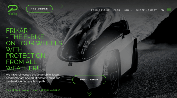
Podbike is a German company revolutionizing urban commuting with its innovative velomobile, Frikar®. Designed as a sustainable alternative to cars, Frikar® aims to make cycling more practical for daily errands and commuting.
The Challenge
Despite its unique product, Podbike struggled to generate enough signups and pre-orders through its online store. They needed a way to engage potential customers more effectively and encourage them to take action.
The Strategy
Podbike implemented targeted opt-in campaigns using floating bars and lightbox popups. For example, they used this popup to promote their test-driving events:
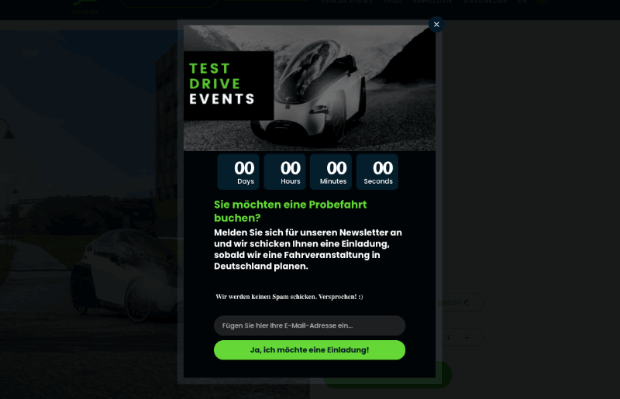
PodBike used OptinMonster’s Geolocation targeting to display the popups to website visitors who lived in the area of their test-driving events. They were also able to personalize the popups to specifically promote the event that was happening in each visitor’s region.
In short, PodBike didn’t just show the same offers and messages to everyone. OptinMonster’s robust targeting rules let them capture each visitor’s attention with a relevant popup.
The Results
- Conversion rates increased from 4.46% to 13.3%
- Total conversion rate reached 18.22%
Key Takeaway
Personalization drives higher conversions. Podbike’s success highlights the power of segmenting your audience and tailoring offers based on location, behavior, and interests.
Check out the full Podbike case study here!
2. Human Food Bar: Growing an Email List Before Launch
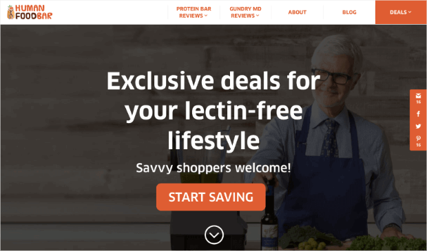
Human Food Bar is a niche blog dedicated to reviewing energy and nutrition bars. Although they didn’t sell products at the time, they planned to launch their own branded energy bars and needed an audience ready to buy.
The Challenge
Since Human Food Bar wasn’t yet selling physical products, they faced the challenge of preparing for a successful product launch. They needed to build an engaged email list in advance to ensure immediate sales once their bars hit the market.
The Strategy
Human Food Bar used targeted popups to encourage visitors to subscribe. They offered valuable content, exclusive updates, and special to attract subscribers who were already interested in energy bars. In doing so, they created a highly qualified email list of potential customers.
While Human Food Bar didn’t offer physical nutritional products yet, they offered a discount for a affiliate partner that did:
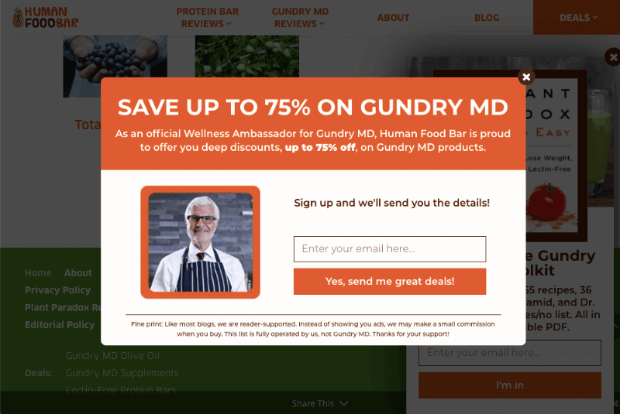
Not only did Human Food Bar see lots of growth in their email list, but they even saw affiliate sales skyrocket.
While your eCommerce store might not have an affiliate strategy yet, it’s nice to know that you always have the option to start.
The Results
- 1,800+ new email subscribers per month
- $17,000 in average monthly affiliate sales
- 35% increase in web retention rate
Key Takeaway
Start growing your email list as early as possible. Even if you’re not selling yet, having a built-in audience gives you a massive advantage when you launch your product.
Check out the full Human Food Bar case study today!
3. DateID: Increasing Conversions with Interactive Quizzes
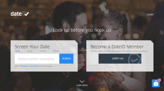
DateID is an online service that provides background checks for online dating, helping users verify their matches before meeting in person. As the demand for safer online dating grew, DateID sought to improve conversions and attract more paying customers.
The Challenge
DateID had two primary goals: grow their email list and convert free users into paying customers. While they had a steady stream of visitors, many users weren’t taking the next step—either signing up for free or upgrading to a premium plan.
The Strategy
DateID implemented two key strategies:
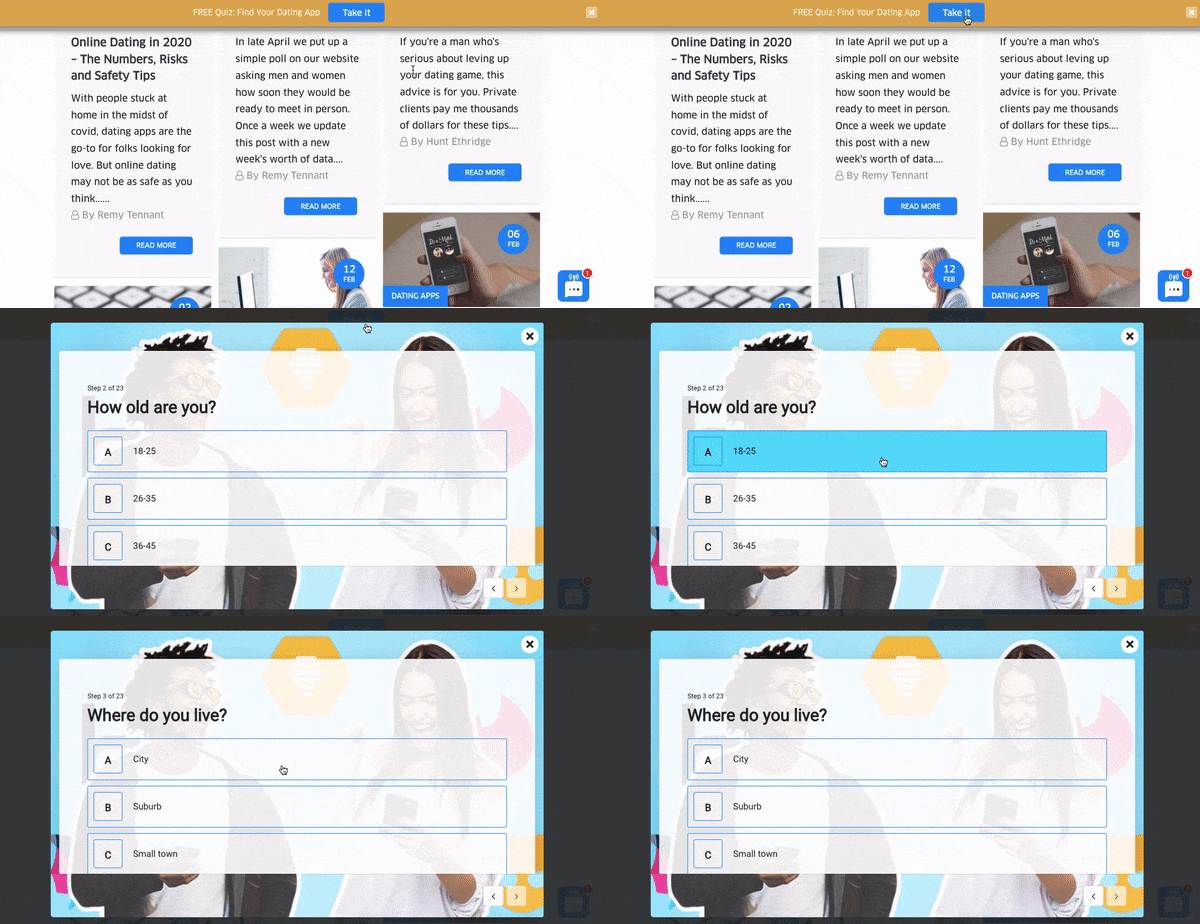
1. An interactive quiz triggered by a MonsterLink™. This let users click to start the quiz and engage with the content before providing their email.
2. A floating bar campaign that targeted free subscribers with an exclusive offer to upgrade to a paid plan.
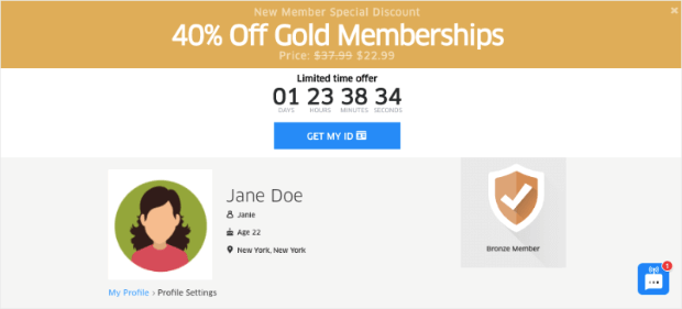
This small campaign was able to convert more of DateID’s free subscribers into premium (and paying) customers.
The Results
- 175% increase in email list growth
- 162.5% more freemium subscribers
- 75% increase in sales conversion rates
Key Takeaway
Engagement-first strategies drive conversions. Using interactive elements like quizzes and targeted offers keeps users engaged and makes them more likely to convert.
Check out the full DateID case study today!
4. Kennedy Blue: Overcoming Price Objections to Increase Sales
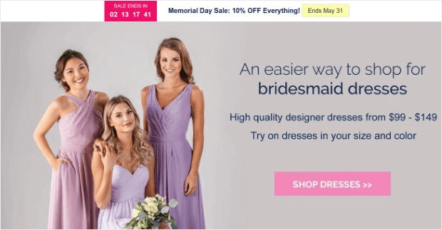
is an online bridal retailer offering high-quality wedding dresses at affordable prices. Their try-at-home model allows brides to order dresses, try them on, and make alterations as needed before committing to a purchase.
The Challenge
Despite offering an innovative and cost-effective solution, Kennedy Blue faced a common obstacle in the bridal industry—price objections. Many visitors assumed wedding dresses would be too expensive and abandoned the site before exploring their options. Additionally, they needed to grow their email list to nurture potential customers.
The Strategy
Kennedy Blue tackled these challenges with a 2-part strategy:
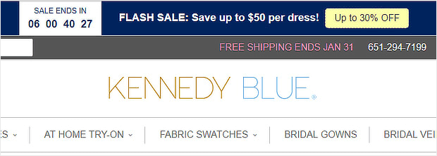
1. Floating bar campaigns offering up to 30% off, directly addressing price concerns and encouraging visitors to take action.
2. Two-step opt-in popups that first asked a simple yes/no question before requesting an email address, increasing engagement and list growth.
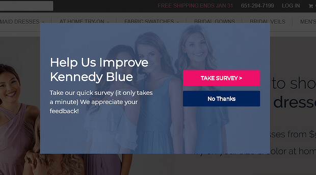
Campaigns like this one are a great way to get your users more engaged with your optin forms.
Why? Because rather than immediately asking your users for personal information like name and email address, you simply as a Yes or No question:
When your users click Yes, they’ll be more likely to complete the transaction because they’ve already started the process.
The survey in this popup also helped them discover any problems their shoppers were facing, so they could proactively address them.
The Results
- 7% of abandoned shoppers recovered
- 2.56% of targeted subscribers added to their list
- 50% increase in sales
Key Takeaway
Remove friction in the buying process. Addressing price objections early and using engaging opt-ins can significantly boost conversions and sales.
Check out Kennedy Blue’s full eCommerce case study here!
5. AutoAnything: Increasing Revenue with High-Impact Optins
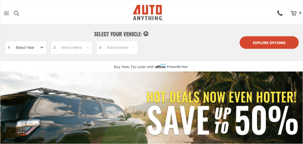
is a leading online retailer specializing in aftermarket automotive parts. Known for its competitive pricing and wide product selection, the company wanted to improve customer engagement and maximize revenue from its website traffic.
The Challenge
AutoAnything had a loyal customer base, but they needed a more effective way to capture email subscribers and increase sales from their existing traffic. While they initially focused on list building, they saw an opportunity to drive direct revenue growth using targeted opt-in campaigns.
The Strategy
AutoAnything launched high-impact lightbox popups to encourage visitors to join their email list. After seeing strong results, they expanded their strategy to:
- Create sales-focused opt-ins that promoted exclusive offers.
- Experiment with different messaging and design variations to maximize conversions.
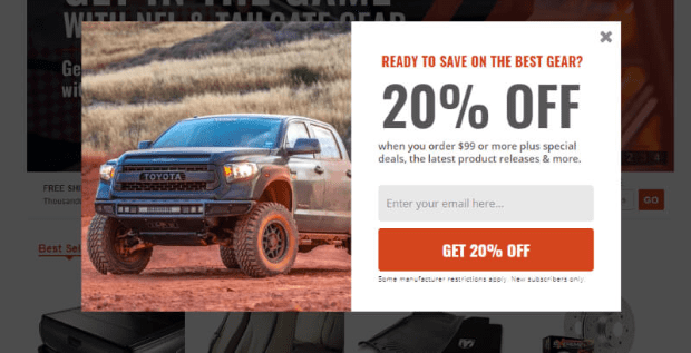
Campaigns like the one above take only minutes to create, but pay off in a BIG way.
Results
- Increase daily optins by 2.5%
- Increase email revenue by 20%+
Key Takeaway
Look for creative ways to grow your business and be open to testing those ideas. While AutoAnything hadn’t planned on using popups to grow their revenue, they saw a 20% boost in online profits when they did.
Read AutoAnything’s full case study here!
6. Cosmetic Capital: Driving Conversions with Countdown Timers
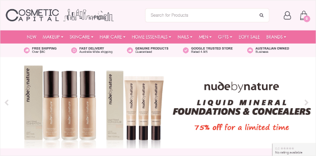
is an online beauty retailer offering affordable makeup and skincare products. To increase revenue, they focused on improving email list growth and optimizing their promotional campaigns.
The Challenge
Cosmetic Capital wanted to grow their email list while also driving more immediate sales from website visitors. They needed a way to encourage shoppers to take action before leaving the site.
The Strategy
To achieve their goals, they used a two-part strategy:
- Yes/No lightbox popups to collect email subscribers and build long-term customer relationships.
- Floating bars with countdown timers to create urgency and encourage faster purchasing decisions.
By adding a countdown to their free shipping offer, Cosmetic Capital encouraged visitors to enter their email and make a purchase without delay.

As a result, they built more urgency around their sales and saw profits soar. For more information, check out this helpful post: How to Use Countdown Timers to Make More Sales Today.
The Results
- 300% increase in leads
- 18,000+ new leads captured
Key Takeaway
Urgency is a powerful motivator. Countdown timers and time-sensitive offers encourage visitors to take action immediately, leading to higher conversions.
Check out Cosmetic Capital’s full case study here!
7. Crossrope: Reducing Cart Abandonment With Exit Popups
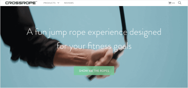
is a fitness brand that specializes in weighted jump ropes and fun, high-intensity workout routines. While they had a strong product, they struggled with visitors leaving their website without completing a purchase.
The Challenge
Crossrope noticed a high number of abandoned visitors: shoppers who browsed their products but left before making a purchase. To improve conversions, they needed a way to recover lost sales and keep potential customers engaged.
The Strategy
Crossrope implemented Exit-Intent® popups, targeting visitors who were about to leave the site with relevant offers and incentives. This strategy allowed them to:
- Capture abandoning visitors before they exited.
- Provide compelling messaging to encourage immediate action.
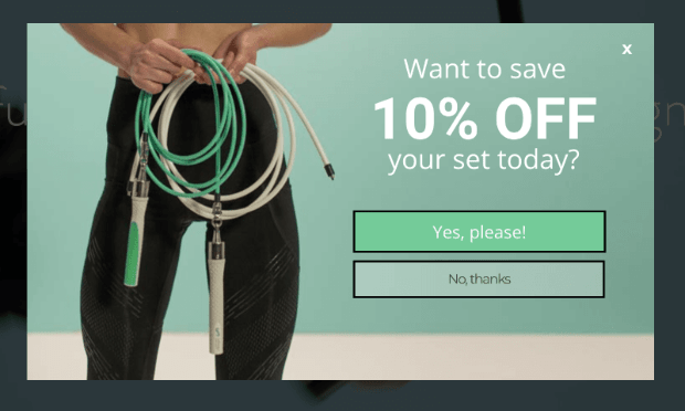
As a result, this eCommerce store was able to recover their abandoning visitors and convert them into happy, loyal, and paying customers.
The Results
- 13.71% of abandoning visitors converted
- 7.65% of abandoned shoppers recovered
- 900%+ email list growth
Key Takeaway
Don’t let potential customers slip away. Look for holes in your sales and marketing funnels. If you get lots of traffic and pageviews on your checkout page but not many sales, then you might have a similar issue.
OptinMonster’s Exit-Intent® Technology is the perfect tool to combat cart or site abandonment.
Check out Crossrope’s full case study here!
8. Kinobody: Boosting Email Signups with Embedded Optins
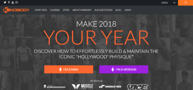
Kinobody is a fitness company that helps people achieve their ideal physique through structured workout and nutrition programs. While they attracted a high volume of website visitors, many left without taking any action.
The Challenge
Kinobody needed to increase engagement and email signups but found that traditional popups weren’t the best fit for their audience. They wanted a solution that felt more natural within their content while still driving conversions.
The Strategy
Instead of using standard popups, Kinobody implemented MonsterLinks™, which allowed visitors to trigger opt-in forms by clicking embedded links in:
- Blog posts
- Email campaigns
- Other key content areas
By making the signup process more user-initiated, they improved engagement while reducing friction.
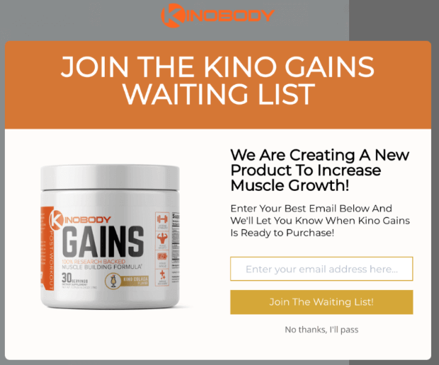
By making the signup process more user-initiated, they improved engagement while reducing friction.
The Results
- 39% of people added to Kinobody’s waiting list
- 7.01% of abandoned visitors converted
- 47% – 73% of visitors segmented
Key Takeaway
Make opt-ins feel like a natural part of the user experience. Embedded sign-up triggers, like MonsterLinks™, allow visitors to engage on their own terms, increasing conversions without disrupting their browsing.
Check out the full Kinobody case study here!
9. Libratone: Scaling Lead Generation with Personalized Campaigns
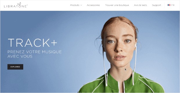
Libratone is a French audio company known for its premium wireless speakers. While their products were well-received, they needed to generate more leads and improve conversion rates on their website.
The Challenge
Libratone initially relied on a single popup to collect leads but found that a one-size-fits-all approach wasn’t effective. They needed a more targeted strategy to capture high-quality leads at scale.
The Strategy
To improve results, Libratone shifted to a multi-campaign strategy that included:
- Personalized opt-in campaigns tailored to different audience segments.
- A mix of popups, slide-in boxes, and floating bars to engage visitors at various touchpoints.
By using more diverse and targeted campaigns, they improved engagement and lead quality.
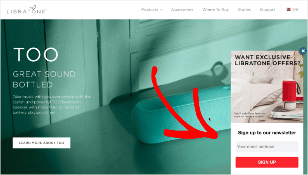
This gave them more options to reach the right visitors, in the right places, and with the right offers. In the end, this led to more leads and sales in less time.
The Results
- 81 personalized optin campaigns created
- 400% list growth
- 3.8% abandoning visitors recovered
Key Takeaway
A single popup isn’t enough. By tailoring opt-in campaigns to different segments and using multiple campaign types, Libratone dramatically increased conversions and lead generation.
Check out Kinobody’s full case study today!
10. KnivesShipFree.com: Using Giveaways to Drive Sales and Email Signups
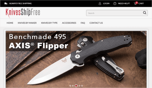
KnivesShipFree is an eCommerce store specializing in high-quality knives. While they had strong website traffic, they needed a way to convert more visitors into customers and build a long-term relationship with them.
The Challenge
KnivesShipFree wanted to increase sales and grow their email list but needed an incentive strong enough to encourage signups. They looked for a strategy that would provide immediate value while nurturing potential customers for future purchases.
The Strategy
They launched an online giveaway and used lightbox popups to promote it across their website. This approach helped them:
- Capture emails from visitors who might not have purchased right away.
- Create excitement and engagement around their brand.
- Convert giveaway participants into paying customers.
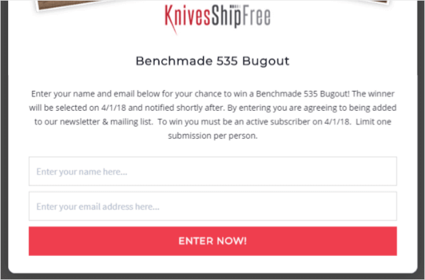
Not only did this rapidly grow their email list, but it led to a BIG increase in sales. For more information, check out this detailed post: How to Run an Online Contest.
The Results
- 5,000+ emails added
- $10,118.20 revenue made at launch
- $4,373.04 from first-time sales
Key Takeaway
Giveaways are a powerful lead generation tool. By running contests, you can rapidly grow your email list while driving immediate and future sales.
Otherwise, check out the entire KnivesShipFree case study!
11. Urban Southern: Turning Website Visitors into Paying Customers
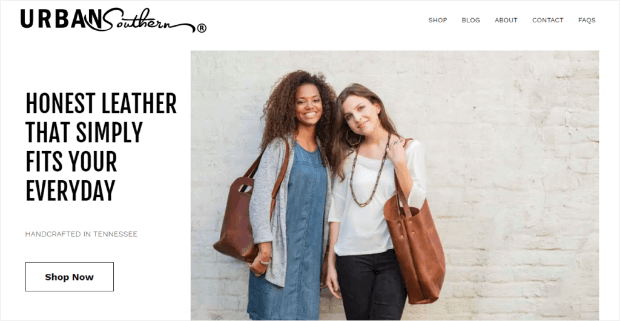
Urban Southern is an eCommerce store specializing in handcrafted leather handbags. While they had a strong social media presence, their website wasn’t converting enough visitors into customers.
The Challenge
Urban Southern had a large social media following, but followers weren’t translating into sales. Their email list was also small, limiting their ability to nurture leads and build long-term customer relationships.
The Strategy
They implemented on-site opt-in campaigns to capture email addresses from website visitors, offering a small 10% discount in exchange for signups. This strategy helped them:
- Convert social media traffic into email subscribers.
- Build a list of engaged shoppers who were interested in their products.
- Use email marketing to drive repeat sales.
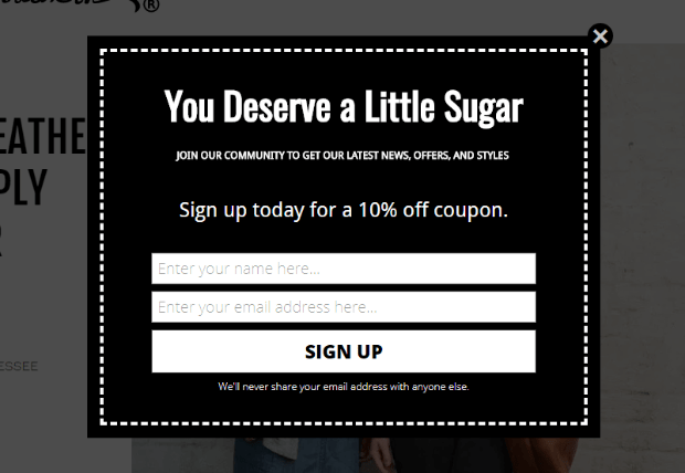
The discount is small (10% off), but the impact was HUGE.
The Results
- 2,150% list growth
- 8,600 new leads added
- 400% growth in sales
Key Takeaway
Social media followers don’t always convert. You still need to build an email list. Urban Southern’s success shows that email marketing is a more reliable way to turn website visitors into paying customers.
Check out UrbanSouthern’s full case study today!
See Results Like These For Your eCommerce Store
Do you want to see the same success as these eCommerce case studies? Sign up for OptinMonster today, risk-free with the 14-day money-back guarantee.
BONUS: Done-For-You Campaign Setup ($297 value)
Our conversion experts will design 1 free campaign for you to get maximum results – absolutely FREE!
Related Resources





Add a Comment