Ever felt like you’re pouring your heart and soul into your website, but visitors just aren’t sticking around? A high bounce rate might be the culprit.
In this guide, we’ll break down what bounce rate is and why it matters. We’ll also equip you with actionable strategies to keep visitors engaged and lower that bounce rate.
Plus, we’ll show you exactly where to find bounce rate in the new world of Google Analytics 4 (GA4). Let’s get those visitors sticking around and exploring all your website has to offer!
Table of Contents
- What is Bounce Rate?
- What is a Good Bounce Rate?
- How to Find Bounce Rate on Google Analytics
- Why Do People Bounce?
- How to Reduce Bounce Rate
What is Bounce Rate?
A bounce is when a visitor lands on your website, checks out a single page, and then disappears. In Google Analytics terms, a bounce is a visit where someone only triggers one request to the system. This basically means they viewed one page and didn’t click anything else or navigate further before leaving.
A bounce rate is the percentage of visitors who check out a single page and then leave, without clicking anything or exploring further. These quick visits are counted as sessions lasting zero seconds because there’s no additional activity for Google Analytics to track.
Bounce rate is a key metric for understanding your website’s effectiveness, and here’s why:
- Conversions: High bounce rates often mean missed opportunities. When visitors leave after just one page, they’re not converting into leads or sales. By lowering your bounce rate, you can increase conversions and get more value from your website traffic.
- Search Engine Love (Maybe): While the exact impact is debated, some studies suggest search engines like Google might favor websites with lower bounce rates. This means bounce rate could be an SEO ranking factor and better bounce rate could potentially boost your search ranking.
- Website Health Check: A high bounce rate can be a red flag for issues with your website. It might indicate confusing content, poor user experience, or unclear calls to action. By analyzing bounce rate, you can identify areas for improvement and make your website more engaging for visitors.
Does a high bounce rate mean trouble? Not always!
Bounce rate matters when your website thrives on visitors exploring multiple pages. Think news sites with in-depth articles or eCommerce stores with product categories. If people are bouncing from your homepage, it might indicate that you are missing the mark.
Bounce rate is less concerning when your website is designed for single-page engagement. This applies to blogs with self-contained articles or landing pages with clear calls to action. In these cases, a high bounce rate is simply visitors finding what they need quickly.
What is a Good Bounce Rate?
You may be wondering what a good bounce rate is, which is a valid question. Here’s a baseline to start:
- 26-40% is optimal
- 40-70% is average
- 70-90% is poor
- 90%+ is very poor
- 80%+ is very bad
Don’t get too excited if your bounce rate is lower than 20%. This is likely because of an error like duplicate analytics code, incorrect implementation of events tracking, or third-party addons such as live chat plugins.
While the above metrics are good starting points, bounce rate varies across industries, your content type, and even the device used. These bounce rate patterns give us a clue about why visitors bounce and what, if anything, to do about it.
Average Bounce Rate by Industry & Website Type
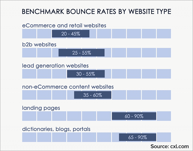
Take a look at the chart below to see an average bounce rate by industry:
Retail and eCommerce sites have the lowest bounce rates because there are so many webpages on a typical shopping site. Most shoppers will visit one page, then see another product that interests them and click there. Or they’ll purchase that item, which will take them to the checkout page. There’s a clear pathway for visitors to follow.
On the other hand, landing pages, dictionaries, portals, and blogs typically have much higher bounce rates. But this doesn’t mean all these websites aren’t converting. It just means that they serve a specific purpose that is usually filled in a single page.
Someone looking for the definition of a word will leave as soon as they’ve found that definition. Portal websites, by definition, link to content on other sites, so visitors likely only spend one session on the portal itself. And landing pages are often specifically designed without navigation or internal links so that visitors don’t get distracted from the one desired conversion event.
Average Bounce Rate by Channel
Next, let’s look at the average bounce rate by channel or traffic source:
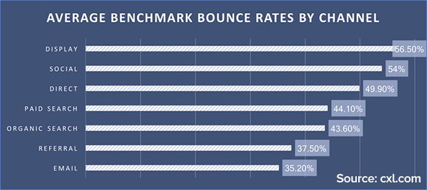
As you can see, display and social have the highest bounce rates. That’s because visitors from those channels are likely to just be clicking casually on a banner ad or social media link, and then leaving to get back to their originally intended action.
On the other hand, referral and email tend to have the lowest bounce rates. Visitors coming in through a link from a similar website are more likely to already be interested in your content. Email subscribers are even more invested in your business, since they opted into your email list. As you’re thinking about how to reduce the bounce rate on your site, make sure to look at which channels bring in most of your traffic.
Average Bounce Rate by Device
Finally, another factor that affects bounce rate is device. Unfortunately, you don’t have any control over what devices your visitors are using, but you can still use this data to improve bounce rate.
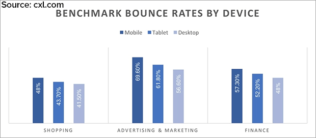
As you can see, mobile users have a higher bounce rate across all industries. This makes sense, since people browse on their phones while waiting in line, riding the bus, and doing other things that might pull their attention away at any time. If you get a lot of mobile users, your bounce rate may appear higher than a site with mostly desktop users. This is just good to keep in mind as you work to reduce your bounce rate.
So the definition of a good bounce rate is complicated. Perhaps more important than comparing your bounce rate to other websites is monitoring your own bounce rate over time. If you have a content-heavy site like a blog, your bounce rate may always be higher than your neighbor’s eCommerce site. That’s okay! Bounce rate is not the only metric of how well your site is converting, and it’s definitely not the most important one.
How to Find Bounce Rate on Google Analytics (GA4)
GA4 redefines bounce rate by focusing on engagement. It considers a variety of factors beyond mere page interaction.
A session in GA4 is considered engaged if it:
- Lasts longer than 10 seconds,
- Triggers a conversion event,
- Generates at least two page views or screen views.
In GA4, the bounce rate is essentially the inverse of the engagement rate. A lower bounce rate in GA4 indicates higher engagement, meaning more sessions meet the engagement criteria.
This approach provides a more comprehensive understanding of how users interact with a site. It acknowledges that engagement can take many forms, not just clicking through to another page.
Here’s how to find bounce rate on Google Analytics 4 (GA4):
Step 1: Navigate to Engagement » Pages and screens
Step 2: Click the pencil icon in the upper right of your screen; a sidebar will open
Step 3: Click on Metrics
Step 4: Click on the bottom Add metric option, then type “bounce” to find and select Bounce rate
Step 5: Once it’s been selected, you’ll see Bounce rate added to the list of Metrics. Click Apply.
Step 6: Click the Save button. A dropdown will appear – choose Save changes to current report.
Step 7: A popup will appear asking if you’re sure you want to save your changes. Click Save
Why Do People Bounce?
Website visitors bounce for a variety of reasons, but some of the most common reasons are:
- Unrelevant Content: If the content on your page doesn’t match what the visitor was searching for, they’ll likely bounce to find a better fit.
- Poor User Experience (UX): A confusing or cluttered website layout, slow loading times, or difficult navigation can frustrate visitors and lead them to bounce.
- Mobile Unfriendliness: In today’s mobile-first world, a website that’s not optimized for smartphones and tablets will quickly lose visitors.
- Technical Issues: Broken links, error messages, or website crashes will send visitors scrambling for the exit button.
- Misleading Headlines and Descriptions: If your page title and meta description don’t accurately reflect the content, visitors might feel deceived and bounce.
- Slow Page Speed: People are impatient! If your website takes too long to load, visitors will likely bounce before they even see your content.
- Hidden Costs or Unexpected Information: If visitors discover surprise charges or unexpected requirements after clicking through, they might bounce out of frustration.
How to Reduce Bounce Rate
- Suggest Other Content
- Show Targeted Content to Engaged Users
- Give Users Something Else to Do
- Display External Media Onsite
- Optimize Content for Search Intent
- Improve Your Site Speed
- Optimize Your Site for Mobile Users
- Make Your Text Readable
- Split Test Headlines and Page Design
- Help Visitors Find Their Way
- Match CTA to Intent
- Optimize Call to Action Placement
1. Suggest Other Content
Perhaps the content on a particular webpage really wasn’t what the visitor was looking for. Rather than just shrug your shoulders and let them go, you can use OptinMonster’s signature Exit-Intent® Technology to help them find what they need before they leave your site.
You can use a related post plugin to suggest other posts that might be more helpful. And because WordPress shortcodes work beautifully in OptinMonster, you could even create an exit intent popup showing related posts.

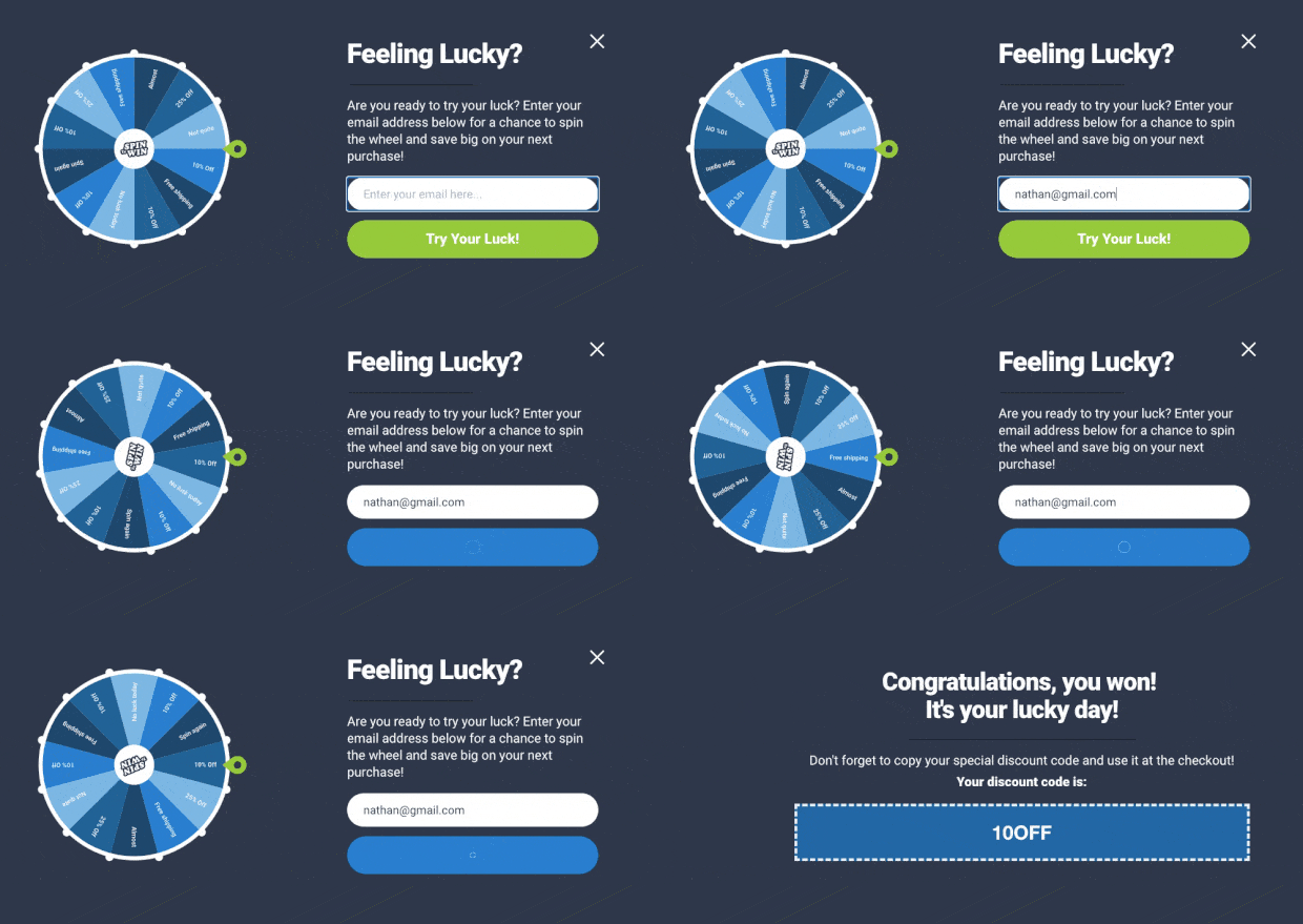
You can also use exit popups to offer a content upgrade, discount, or free shipping code. OptinMonster’s gamified campaigns are a great way to recapture wandering attention.
2. Show Targeted Content to Engaged Users
Remember, not all bounces are bad. A user may read your article, find exactly what they wanted, and then leave. This is normal and very common for blog posts and resource sections.
But that doesn’t help your bounce rate or conversions. In this case, you want to show these users with the most relevant offer.
For example, if a user lands on a blog post about cooking, then your offer should be a recipe book instead of fashion items.
Using OptinMonster’s page-level targeting, you can show visitors customized offers based on the pages they visit, traffic source, and more. You can even specify that a campaign only displays to visitors who have scrolled a certain distance down the page or spent a specified amount of time on the page.
Showing targeted content will help you reduce your website’s bounce rate, boost engagement, and conversions.
3. Give Users Something Else to Do
Every page on your website should have a clear call to action (CTA).
Some CTAs include purchasing a digital or physical product, opt into your email list, share your article, or fill out a contact form.
OptinMonster can serve all kinds of CTA campaigns to precisely targeted audiences.
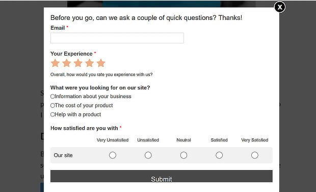
For example, you could use WPForms to create a survey that displays right before visitors exit.
4. Display External Media Onsite
Many businesses embed feeds of their own social media or video content as a way to show the latest updates.
But this can unintentionally create too many opportunities for visitors to bounce. They might see an interesting image from your Instagram feed and click on it. If this was the only page on your site they visited, this counts as a bounce even though they’re going to your social media.
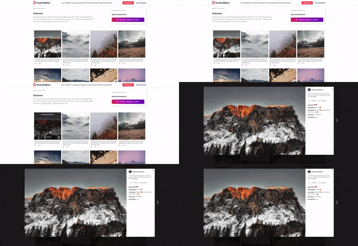
You can use Smash Balloon plugins to build beautiful social media feeds right on your site. With Smash Balloon, visitors can click on an image or video to see the caption, description, and comments, all without leaving your site.
5. Optimize Content for Search Intent
Another major cause of bouncing is from search engine result pages (SERPs). When a visitor clicks on a search result, they’re looking for something specific. If they don’t find the answer or solution quickly, they’ll bounce.
MonsterInsights can help you understand what visitors are searching for.
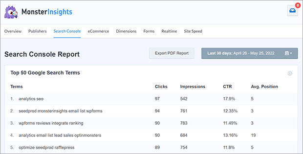
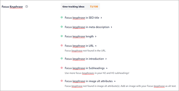
Then you can use a premium SEO plugin like AIOSEO to optimize your content for the most-searched keywords.
6. Improve Your Site Speed
One of the easiest ways to improve bounce rate is to improve your site speed.
Users are in a hurry and decide whether to stay on a site within the first few seconds. If your site doesn’t load quickly, they might assume it’s broken, or simply run out of patience and leave.
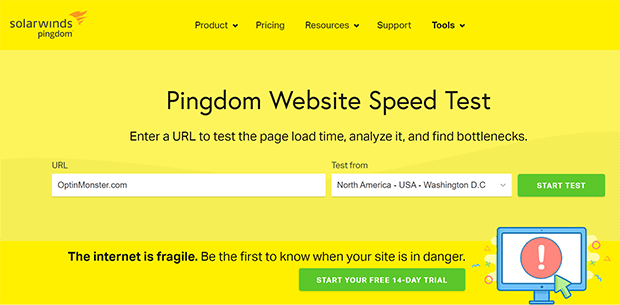
You can measure your site speed with tools like Pingdom and Google Page Speed. These tools also give you recommendations for boosting your site speed.
To speed up your site, you should optimize your images, use a Content Delivery Network (CDN), add better caching, and consider switching to a faster hosting provider like Bluehost.
One of the quickest and easiest ways to keep your website speedy is by using a CDN. Find the right one for you on our list of the best CDN providers to speed up your website.
7. Optimize Your Site for Mobile Users
Many users are browsing on mobile devices while on the go. If they see a full desktop site squashed into a tiny screen, they won’t stick around trying to figure out a way to access your site.
Make sure your site is easy to use on a smartphone. Consider creating mobile-only landing pages or using click-to-call and click-to-scroll buttons to make the mobile user experience better. You can read other best practices for mobile landing pages here.
8. Make Your Text Readable
While images and video capture the attention, most of the important information on a website is still communicated with text. Don’t pay so much attention to pretty visuals and fancy design that you ignore basic readability.
For example, this site looks nice but is very difficult to read. The navigation links are low contrast and lightweight. There is even a banner that says the site is best viewed on desktop, and that banner itself is low contrast and hard to read. This all creates a poor user experience, especially for mobile users!

You need to make sure that the text on your website is easily readable on all devices. It shouldn’t be too small or else users will have to squint or zoom in to read it. Use font sizes that are large enough on smaller screens.
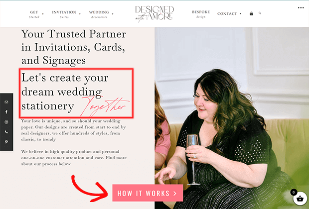
Choose fonts that are clear and easy to read. Cursive or handwritten accent fonts are fine when used sparingly. Use contrasting colors and enough line spacing, font weight, padding, and margin for the text to be clearly readable. This example does a good job balancing high contrast body fonts with accent fonts, and also uses a high contrast button call to action.
Another important point to consider is the language and style you choose to use on your website. Use easy-to-understand language in a normal conversational tone.
9. Split Test Headlines and Page Design
It’s possible that your content does match the visitor’s intent, but the headline or call-to-action doesn’t make that clear.
That’s why A/B testing different elements on your site is important. A/B split testing is when you create 2 versions of the same page with different headlines, copy, imagery, social proof, or CTAs. Then you see which version performs better.
You can also create different landing pages targeting different audiences, regions, or keywords. If you are serving an international audience, then you can detect a user’s location and show them a localized landing page. Showing users content in their own language, currency, and cultural background greatly improves user experience and can help improve page bounce rate.
10. Help Visitors Find Their Way
Your webpage may actually be exactly what your visitor is looking for, but if they have to scroll 80% of the way down the page to find it, chances are they’ll bounce.
Make sure your content answers the question or gets to the point quickly. If your blog post or webpage has multiple sections, consider adding a table of contents or button that jumps to the most interesting part.
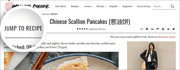
For example, many recipe blogs include a long explanation of the recipe development process along with step by step photos. Some visitors may find that content interesting, but many just want the recipe to cook from. Recipe bloggers often place a Jump to Recipe button on all their posts. This lets the visitor who needs something to cook right now find the most helpful part of the post.
11. Match CTA to Intent
You always want make sure that your CTAs are clear and that they match the intent of the visitor.
User intent can fall into 4 categories:
- Informational: they want a specific answer or general information
- Navigational: they’re looking for a specific website or webpage
- Commercial: they’re investigating products or brands with future intent to purchase
- Transactional: they’re intending to purchase or complete an action
A user wondering how to clean sneakers is unlikely to appreciate an intrusive popup selling new shoes. Instead, perhaps at the end of your sneaker-cleaning tutorial, you could link to your post reviewing a brand of machine-washable sneakers. On the other hand, someone searching for that same review might be interested in your affiliate coupon for that brand. It all comes back to understanding your visitor’s intention and making sure all your content aligns with that intent.
12. Optimize Call to Action Placement
Most users decide whether or not they like a website in the first couple of seconds. So the content in the very first part of your webpage is important. You can optimize this area to immediately describe what you are selling and include a prominently visible call to action.
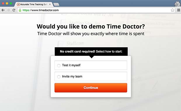
Make your call to action clear and honest. Misleading users will create a bad user experience which is the number one reason for high bounce rate and low conversions.
There you have it, our favorite ways to reduce website’s bounce rate. When you match your content with the visitor’s intent, you can keep your visitors happy and your bounce rate low.
If you’re looking for other ways to capture more traffic and boost your conversions, check out this article on how to Create a Promotional Strategy for Higher Conversions.
What are you waiting for? Start increasing pageviews with OptinMonster.
More on Conversion Rate Optimization:





Add a Comment