Do you want to improve website conversion rate without interrupting the visitor’s user experience (UX)?
In most cases, popups are a great way to increase sign-ups and improve your email opt-in rates. When you use them wisely, popups can convert at an average of 3.80%.
But when popups come in the way of people’s UX, they get annoyed and ignore them. HubSpot ran a survey in 2021 in which 58% of respondents said they found popup ads to negatively impact their UX.
If you’re looking for another way to get your website visitor’s attention, a website notification bar offers an equally good solution.
That’s why, in this post, we’re going to explain what a website notification bar is and show you how to create an eye-catching website notification bar with OptinMonster.
We’ll also look at 5 great examples of notification bars from popular brands.
Let’s get started.
What Is a Website Notification Bar?
A website notification bar is a small banner that sits on the top or bottom of the page. It’s also known as a hello bar, floating bar, sticky bar, welcome bar, website alert banner, or announcement bar.
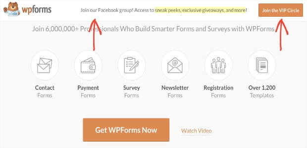
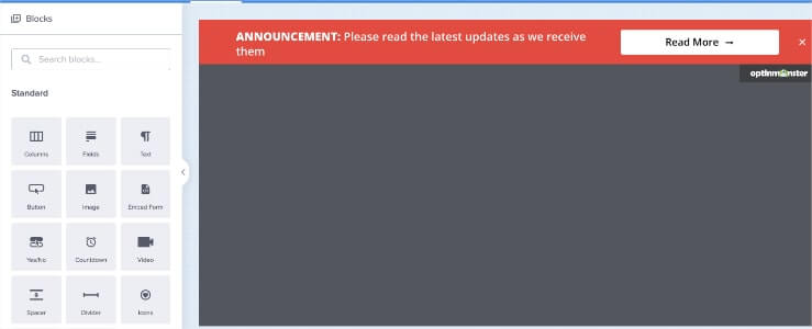
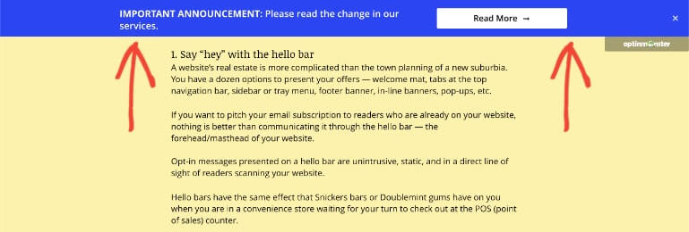
You’ve probably seen plenty of these before. They look something like this:
A notification bar on a website is used to attract visitor’s attention to an important piece of information or redirect them to a specific page. Unlike annoying popup ads, notification bars don’t get in the way of the website’s content.
That means your website visitors don’t feel the need to close it, as is the case with most popups.
You can set up the notification bar on a website to be subtle and attractive at the same time. This allows you to offer a seamless UX while increasing your chances of improving website conversion.
There are several use cases for you to display a website notification bar on a website:
- Growing your email list
- Sharing a new promotional offer
- Creating urgency with a countdown timer
- Broadcasting alert messages during emergencies
- Letting visitors know about upcoming events, e.g., webinars
- Announcing changes in your business hours or shipping information
And much more.
Today, we’ll cover how to create a website notification bar with OptinMonster to communicate service changes to customers.
Let’s get started.
How to Create a Website Notification Bar
Creating a website notification bar with OptinMonster is easier than you think. Let’s go over it step by step.
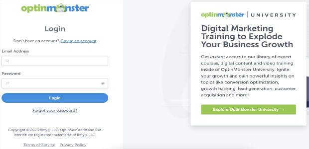
Step 1: Log in to Your OptinMonster Account
Don’t have an OptinMonster account? Sign up today with a no-risk money back guarantee.
Step 2: Create a Campaign
In the top right-hand side of the dashboard, click Create New Campaign.
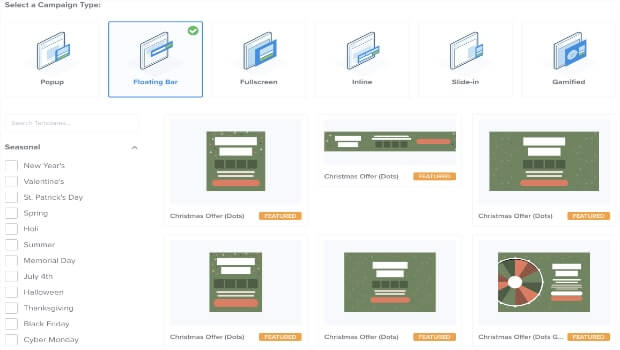
Step 3: Choose Campaign Type
For this tutorial, we’ll go with the Floating Bar.
Step 4: Select the Right Campaign Template
Here’s the cool thing: OptinMonster has over 100 ready-to-use templates that you can use to save time when creating a website alert bar. Because we have so many options, you’re likely to find one that already matches the look you’re going for.
But if you want to create an original website notification bar design, that’s ok.
You can build a unique website notification bar from scratch and customize it exactly how you’d like with our blank template, Canvas. Search for Canvas in the search bar, and you’ll see the available templates in the results.
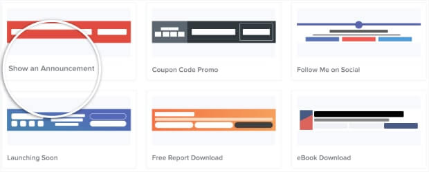
To keep things easy, we’ll choose the Show an Announcement template for this tutorial.
The reason we’re using this template is that it has a bright red color that grabs the visitor’s attention right away.
The choice of color you use in a call-to-action (CTA) button, a popup, or a notification bar makes a difference in conversion rates.
In a survey run by Top Design Firms among 500 people, 39% of them said that color is the most important visual element of a business’s website.
But if you want to change the default color from red to something else, that’s ok too. We’ll show you how you can change the color to match your professional or personal brand’s particular style in step #7.
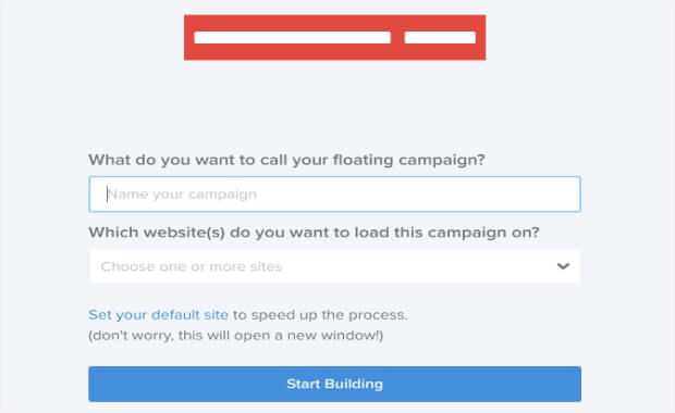
But before that, give the campaign a name. You can also assign the campaign to an existing website or add a new website for the campaign to appear on. Or, you can wait until you’re ready to publish the campaign to complete this step.
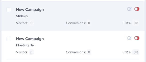
If you don’t give the campaign a name, it’ll appear as New Campaign under the Campaigns tab.
In any case, click on Start Building to start editing the campaign.
With this, your website notification banner template is ready to be edited in the OptinMonster editor. You can now tweak it to your preference.
Step 5: Choose Where You Want the Campaign to Appear
The first thing that we’ll do to our template is to change the position and make it rest at the top of the page.
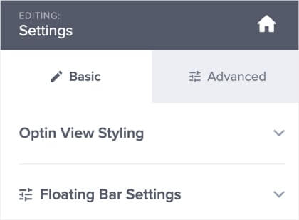
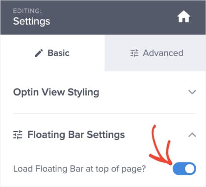
To do that, click on the black area in the editor to get the Floating Bar Settings to appear on the left-hand menu.
By default, the Load Floating Bar at top of page functionality will be turned on.
We recommend you leave it as it is since the top of the page is an ideal place for website visitors to notice the website alert banner.
If you want to change it, toggle the switch to make the floating bar appear at the bottom of a page.
Step 6: Edit Campaign Copy
With OptinMonster’s easy-to-use campaign editor, editing the campaign’s text is super simple.
Click inside the text area that you want to change and edit the copy to match it with the important update you’re sharing.
You can also double-click the text area to change the size, color, font, and formatting of the text copy.
Announcing a change in services is usually a straightforward communication. But if you’re creating a notification bar on a website to get more click-throughs, make sure to write headlines that grab people’s attention.
The same applies to writing copy to improve engagement and conversion using one of the stellar copywriting formulas. As an aside, here’s a list of over 700 power words that you can use to make the copy more persuasive.
Back to our announcement bar, it’s time to change the button.
Step 7: Edit the CTA Button
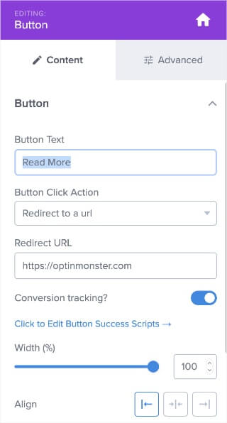
If you’re redirecting visitors to landing pages or a separate site to review the service updates in more detail, the simple default text Read More will work fine.
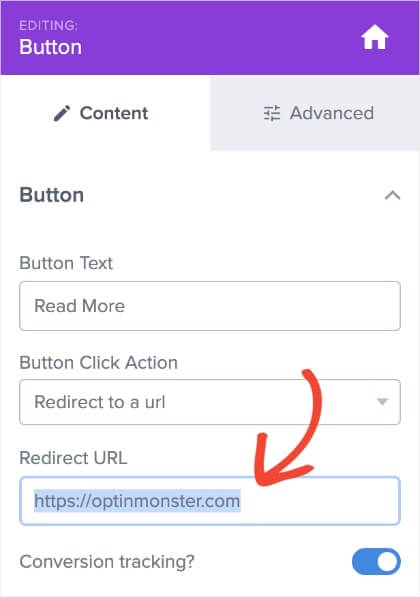
If you do want to change other aspects of the button, click the button element in the editor. On the left-hand menu, you can now change the CTA button design to your liking.
By default, the Button Click Action is set to redirect visitors to another web page.
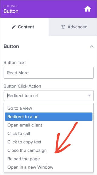
If you wish the click action to perform a different action, click on the dropdown under the Button Click Action. Choose the action you want the button to take when visitors click on it.
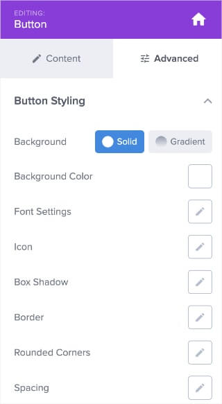
In the Advanced tab, you can change the appearance of the website notification bar button, such as its:
- Color
- Text
- Width
- Alignment
- Icon
- Border
- Shadow
- Spacing
And much more.
Next, we’ll cover how to change the background color of the notification bar.
Step 8: Change Background Color
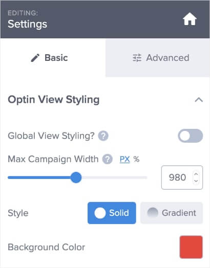
To change the background color scheme of the announcement bar, click on the black area outside the floating bar.
Under the Basic tab on the left-hand menu, click to expand the Optin View Styling option.
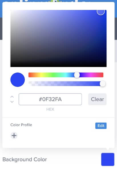
Click on the red square next to the Background Color option and choose a color that matches your brand or message.
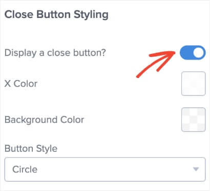
At this point, you can also customize the close button appearance or disable it completely. Scroll further down the Optin View Settings and toggle the Display a close button option.
For now, we’ll leave the close button as it is – turned on.
You now have a notification bar that you can publish on a website to make an important announcement regarding changes in your services.
Step 9: Change Display Rules
There’s one more minor change to help you better target your customers. Head over to the Display Rules at the top of the page and click on the Edit button:
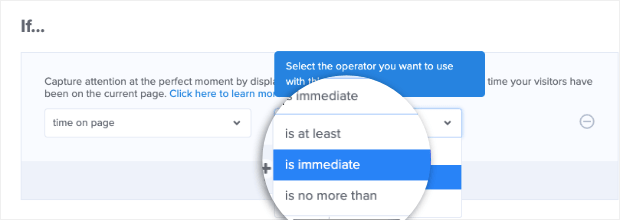
By default, the campaign’s time on page and is at least conditions are set to 5 seconds.
Change the is at least settings to is immediate.
There’s a reason for making this change. For an important service announcement notification bar like we’ve designed today, it should appear to all visitors the moment they land on your site.
Step 10: Save Campaign
Hit Save on the top-right corner of the editor to save the edits you’ve made so far.
Step 11: Publish the Campaign
Once you’re sure about all aspects of the alert notification bar, you can now publish it on your website.
To do this, go to the Publish tab on the top menu. Since it’s a work-in-progress campaign, you’ll notice the Publish tab’s icon in pause mode by default.
Select an existing website or add a new one under the Websites section.
If you haven’t added any websites to OptinMonster yet, learn more about how to connect your website.
If you already have a website, you can use the Preview functionality to test how the notification bar appears on your website before you publish it.
Next, go to the Publish tab under the Publish Status section.
You’ll see that the icon in the main Publish tab at the top will change from the pause symbol to a green checkmark.
If you want to unpublish the notification bar campaign to make new changes to it, click on the Draft tab to pause the campaign.
And there you have it. You have a fully functional Floating Bar website notification bar to give visitors the latest updates regarding your service changes.
That’s that for a demo notification bar. If you’re looking for inspiration to create website alert banners or wondering about their common use cases, check out these 5 website notification bar examples below.
5 Successful Examples of Website Notification Bars Used by Popular Brands
If you’re not using a website notification bar yet, you really should. Take a look at how these brands are using website alert bars examples to grab their visitor’s attention.
1. Udemy
Udemy is a leading online learning platform with over 62 million students, 70K instructors, and 210K courses in over 75 languages on its platform.
Since its founding in 2010, Udemy has experimented with a lot of growth hacking techniques to come up with a solid marketing strategy that works for it.
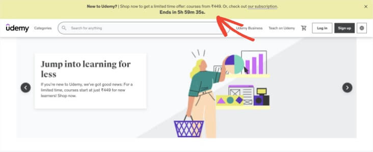
Among many of its marketing campaigns, Udemy prominently displays a website notification bar on the top of its homepage. The campaign appears to first-time website visitors.
Notice the countdown timer copy at the end of the notification bar. It’s a great match for the limited-time discount they are offering through this campaign. Countdown timers evoke a sense of scarcity and fear of missing out (FOMO) in visitors and lead to higher conversion.
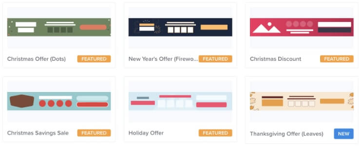
In OptinMonster, you can create a website notification banner with a built-in countdown timer. You can choose templates such as Holiday Offer, Christmas Offer, or New Year Offer from the templates library as discussed in step #4.
2. WPBeginner
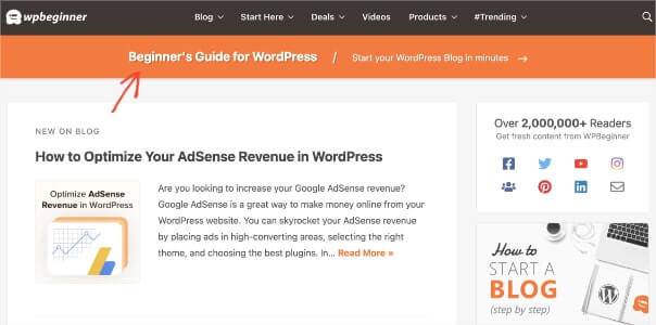
WPBeginner has one of the best uses for the website notification bar. It uses the website notification banner to entice newbie WordPress users to start their own blog site.
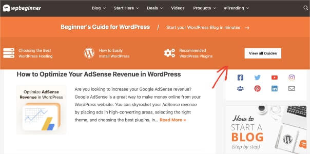
But in place of a CTA button, WPBeginner makes clever use of just the arrow icon on the notification banner. When a visitor clicks on the arrow, or anywhere else on the banner, it doesn’t redirect them to a new page.
Instead, the notification banner expands to reveal 4 more CTAs to cater to the visitor’s intent. They’re redirected to a specific page depending on which CTA they click on.
This is a great way to personalize a website notification bar to be helpful to the visitors. Including high-intent CTAs ensures improved conversions. An expandable website notification banner also makes a website’s UX more interactive.
3. Spotify
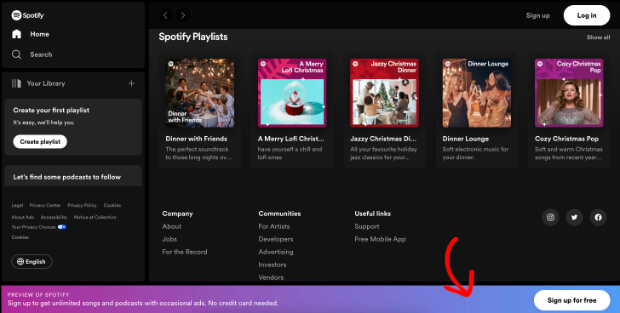
When most people hear the term website notification bar, they think the campaign must be at the top of the webpage. But Spotify positions its floating bar at the bottom.
There are a few good reasons for brands to place the notification bar in the footer deliberately:
- To avoid cluttering the website’s hero or header section with multiple CTAs and elements. Too many options lead to choice paralysis in visitors, and they end up taking no action.
- To avoid creating a confusing UX on a website if it already has a sticky navigation bar. Spotify’s homepage already has a sticky navbar with the search box, sign-up, and login CTAs on it.
- To make the notification bar subtler than placing it at the top of the page. By norm, the top of the page is in visitor’s direct line of sight. Our eyes are quickly drawn to things at the top. But if you want visitors to find the notification bar after going through the website content, it’s best to place it towards the end.
- To make use of the website real estate, which is usually emptier towards the bottom of the page. This helps you distribute the content across the website evenly and not overwhelm the visitors.
Unlike the website notification banner that we created for the tutorial, Spotify doesn’t include a close button in its website notification banner. That means the banner will keep displaying until the user signs up or exits the tab.
Notice Spotify’s another marketing genius at play here. With persuasive offers like unlimited songs and podcasts, limited ads, and no credit card requirement, most music lovers are likely to sign up with Spotify. More so, because it’s free.
After people sign up for a free account, Spotify uses email marketing to market customers about their premium features and convert them into paid users.
4. Basecamp
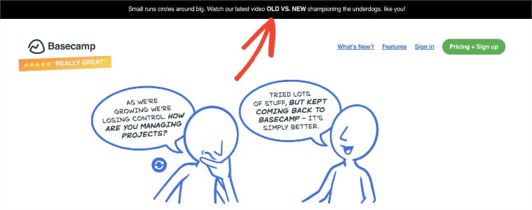
Basecamp is a leading project management and online collaboration software. Their website uses a notification banner on their homepage to redirect site visitors to a specific campaign page.
Instead of having a dedicated CTA or an icon, Basecamp’s entire notification bar is clickable. This is different than how most other brands leverage a notification bar, but it works!
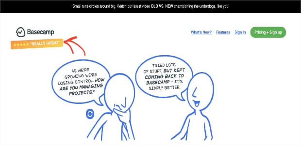
If you look closely at Basecamp’s homepage, you’ll notice that they also show 5-star reviews from customers on the top-left of the page. This is an excellent use of social proof on a landing page optimized for conversion.
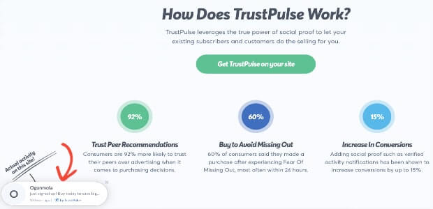
According to TrustPulse, 91% of millennials trust reviews from other users as much as referrals from their friends and family.
TrustPulse is a powerful social proof app built for bloggers, marketing agencies, and eCommerce websites. You can use TrustPulse to leverage social proof in your marketing campaigns. It helps you trigger real-time notifications on your site when visitors take specific actions such as:
- Registering for a webinar
- Signing up for your newsletters
- Buying a new product from your online store
- Leaving a review on 3rd-party sites like Google My Business or Yelp
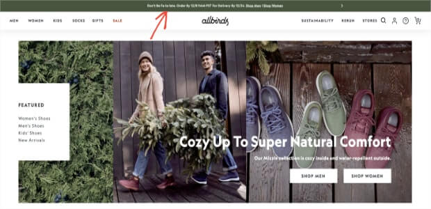
5. Allbirds
Allbirds is one of the highest-grossing eCommerce websites on Shopify. Allbirds manufactures direct-to-consumer (D2C) shoes and clothing products sourced from sustainable materials and designed for utmost comfort.
Allbirds offers discounts on its website almost all year round. The brand makes great use of site-wide notification bars to announce the launch of new features or discount offers on their products.
Right now, Allbirds is offering a 30% discount on all products across its site with a coupon code. Coupon marketing is yet another good tool to generate leads and drive more sales to your online store.
When CouponFollow surveyed over 1,300 Americans on the latest shopping trends, 96% of buyers stated that they looked for promo codes before moving to the checkout page.
If you want inspiration on how to use coupons in your marketing, check out these real-world discount code ideas backed with examples.
Should You Display Website Notification Bars at the Top or Bottom?
Floating bar campaigns can be placed on the top or bottom of your browser if you’re using them for promotional purposes.
As we saw earlier, Spotify keeps its floating bar at the bottom of the page.
How do you know which position is more effective for your site? We recommend you run an A/B split test and try out both.
You can then decide which campaign to keep based on its higher click-through rate (CTR).
A Few Final Thoughts on Website Notification Bars
While floating website notification bars are an excellent way to inform customers about service changes, they shouldn’t be the only campaigns you have on your site.
The best strategy is to have multiple campaigns working together. So you can start with something like we created today in the tutorial:
You can also experiment with a Content Locker or grow your email list with Lightbox Popup.
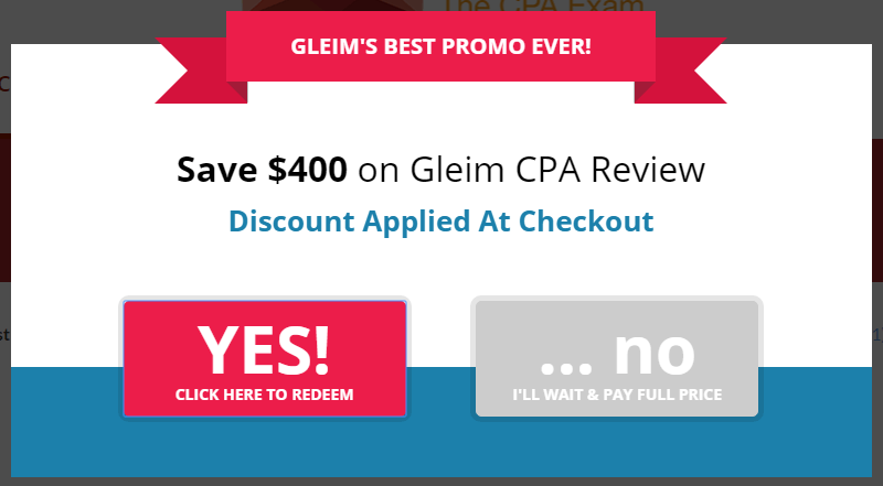
Crush Empire, for example, converts between 12% and 25% of its website visitors using lightbox optins.
Notice that they offer a yes/no form in their campaign, which is another great lead generation technique to boost traffic and grow your email list.
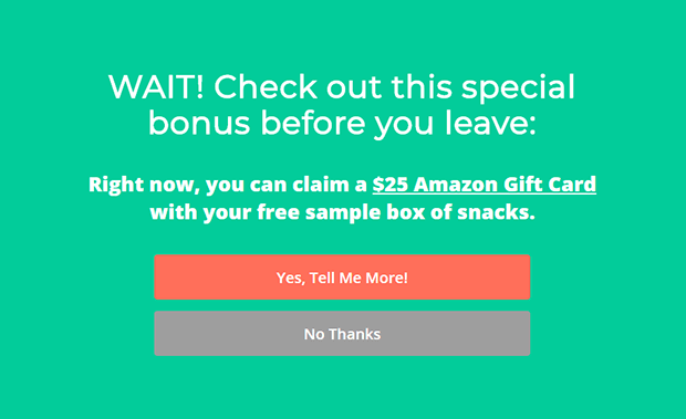
SnackNation is another brand that leverages OptinMonster’s lightbox optin and yes/no form to generate 1200 segmented leads every week.
The company has also been able to reduce cart abandonment with OptinMonster’s Exit Intent® technology.
The point is that you shouldn’t limit yourself to only one type of campaign. Use a website notification bar with other optin campaigns to get the highest conversion rates possible.
Are you ready to add a website notification bar to your site? If you want to make the most of notification bars on your websites, you might be interested in these posts as well:
- How to Add a WooCommerce Announcement Bar to Boost Sales
- How to Create a WordPress Notification Bar in Minutes
- 9 Best WordPress Notification Bar Plugins
These posts will help you further understand how floating bars can help you drive sales and how to install them.
If you’re serious about driving more traffic to your site and increasing conversions, you need a conversion optimization kit. Treat yourself to the best in the business.
Join OptinMonster today and watch your conversion explode!













Add a Comment