Website popups are powerful tools for engaging visitors and boosting conversions. However, if not implemented thoughtfully, they can negatively impact your site’s search engine rankings. That’s why it’s important to apply popup SEO practices, so you can drive traffic to your site and convert visitors with engaging popups.
Here at OptinMonster, we’re the experts at popups. For over 10 years, we’ve helped businesses of all sizes turn their website visitors into subscribers and customers. We know what makes a great popup, and we understand how to make popups work for your site’s SEO.
In this guide, I’ll explore effective strategies to optimize popups for SEO, so you can enhance user experience without compromising your site’s visibility.
Understanding the Impact of Popups on SEO
Search engines like Google place a high value on user experience, making it a key factor in determining search rankings. Popups, when used inappropriately, can disrupt user experience by obstructing content or making navigation cumbersome. This is especially problematic on mobile devices, where limited screen space magnifies the issue. Google’s algorithm penalizes websites that use intrusive interstitials, which can lead to lower search rankings and reduced visibility.
What Are Intrusive Interstitials?
Intrusive interstitials are popups or overlays that appear on a webpage and make it difficult for users to access the main content. Examples include:
- Full-Screen Popups: These cover the entire screen and force users to interact before they can view the content.
- Entry Popups: These appear immediately upon landing on a page, interrupting the user’s journey before they’ve had a chance to engage.
- Hard-to-Close Popups: Popups with tiny or hidden close buttons. These make it frustrating for users to dismiss them.
Google’s Stance on Popups
Google’s Mobile Interstitial Penalty, introduced in 2017, explicitly targets websites that deploy intrusive interstitials, especially on mobile devices. According to Google’s guidelines, acceptable interstitials include those used for legal obligations like cookie consent, login dialogs for gated content, and banners that use reasonable screen space. Non-compliance can result in significant drops in organic search rankings, as Google prioritizes sites that allow easy access to their content.
The User Experience Connection
Beyond SEO penalties, intrusive popups can lead to high bounce rates. If visitors are annoyed by a popup and leave your site, search engines may interpret this as a sign of poor content quality or relevance. This can harm your site’s reputation with search algorithms and affect your overall rankings.
By understanding the implications of intrusive interstitials and adopting user-friendly popup practices, you can engage your audience without risking SEO penalties.
Best Practices for SEO-Friendly Popups
Do these issues mean that you shouldn’t use popups? Not at all! The benefits of well-designed popups are undeniable. Here are a few examples of popup success stories:
- Storyly increased conversions by 80% with OptinMonster popups
- Nick Gray increased his monthly subscriber count by 600%
- Shockbyte more than doubled their sales conversion rate
The key is to use popups in a way that complements user experience, so you can maintain your SEO performance. By focusing on timing, triggers, size, and placement, you can create popups that engage users without negatively impacting your rankings. Here’s how to get it right, and how OptinMonster can make it easy.
1. Timing and Triggers
One of the biggest mistakes website owners make is showing a popup the moment a page loads. This interrupts the user before they have a chance to explore the content, leading to frustration and potentially higher bounce rates. Instead, you should rely on behavior-based triggers to display popups at the most strategic moments.
Examples of Effective Triggers:
- Exit Popups: Detect when a user is about to leave your site and display a popup to keep them engaged. You can use exit popups to offer a discount or a free resource.
- Time Delay: Show a popup after a user has been on the page for a set amount of time, ensuring they’ve had a chance to consume your content first.
- Scroll Percentage: Trigger a popup when a visitor has scrolled down a specific portion of the page, indicating interest in your content.

OptinMonster’s advanced targeting rules and behavior automation make implementing these triggers simple. In just a few clicks, you can use our Exit-Intent® technology, Timed Display Control, and Scroll Trigger to precisely control when your popups display. With these tools, you can boost engagement without compromising user experience or SEO. These robust display rules are why OptinMonster is the best popup tool available.
2. Size and Placement
The size and positioning of a popup play a significant role in how it impacts the user experience as well as your search rankings. Google’s guidelines suggest avoiding large interstitials that dominate the screen, especially on mobile devices. Instead, popups should be discreet and non-intrusive, allowing users to continue accessing the main content.
Best Practices for Size and Placement:
- Responsive Design: Ensure popups scale appropriately for different screen sizes. On mobile, use banners or slide-ins that occupy minimal space instead of full-screen overlays.
- Percentage-Based Size: Keep popups small by using no more than 15% of the screen real estate.
- Strategic Placement: Position popups in areas that don’t block the content, such as the bottom corner of the screen or as a subtle banner at the top.
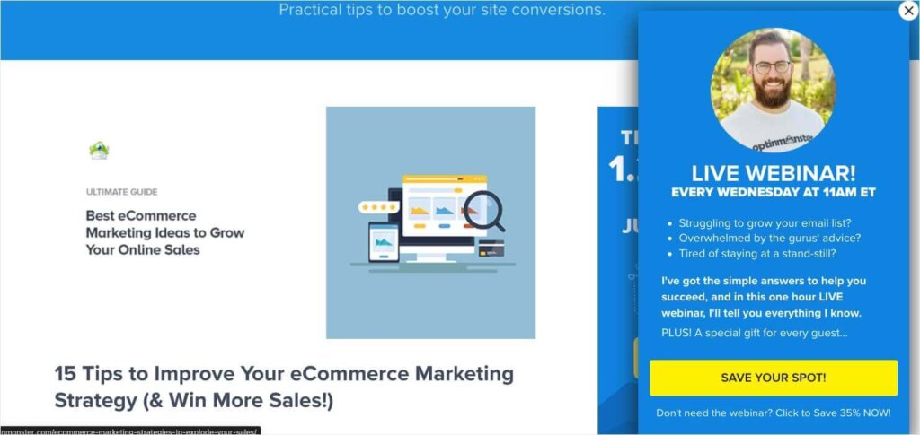
With OptinMonster’s customizable templates, you can design popups that are both visually appealing and SEO-friendly. Above, you can see an example of one of our Slide-In Scroll Boxes, which capture attention without blocking the screen. Our Floating Bars are another great option to prevent disruption. You can also control the size and placement of popups to ensure they comply with Google’s guidelines while remaining highly effective.
3. Mobile Optimization
Mobile users account for a significant portion of web traffic, so optimizing your popups for smaller screens is essential. A poorly designed mobile popup can frustrate users and lead to penalties from Google.
Best Practices for Mobile Popups:
- Use Non-Intrusive Formats: For mobile users, consider replacing full-screen popups with slide-ins or floating bars. These formats allow users to access content while engaging with your message.
- Responsive Design: Ensure popups adjust dynamically to fit different screen sizes and orientations. This prevents elements from being cut off or obstructing essential content.
- Quick Loading: Mobile users expect fast-loading pages. Reduce the size of images and avoid unnecessary scripts in popups to maintain site speed.
All of OptinMonster’s 700+ templates are mobile-responsive, meaning they’ll look great on any device. Additionally, OptinMonster offers dozens of mobile-specific templates designed to maximize user experience on small screens. You can use our Device-Based Targeting to show different popups to your mobile users than to those on desktop.
Master Your Mobile Popups
Convert more mobile users with popups optimized for mobile devices!
Learn how in our guide to mobile popup best practices.
4. Clear and Easy Dismissal
Popups should always include a visible and accessible way for users to close them. Difficult-to-dismiss popups not only irritate visitors but can also lead to higher bounce rates, signaling to search engines that your page offers a poor user experience.
Best Practices for Dismissal:
- Clear Close Buttons: Include a large, easy-to-tap “X” or “Close” button. Avoid hiding it or blending it into the popup design.
- Keyboard Accessibility: Allow users to dismiss popups using the “Esc” key for desktop experiences, ensuring inclusivity for all users.
- Time-Out Option: For certain popups, consider setting a time limit after which the popup disappears automatically, minimizing disruption.

OptinMonster ensures all campaigns include clear dismissal options, making them user-friendly and compliant with SEO best practices. The drag-and-drop editor allows you to customize the size, color, and position of close buttons for maximum visibility.
5. Content Relevance
Popups are most effective, and least disruptive, when they provide users with content directly related to their interests or actions on your site. Irrelevant popups can annoy visitors and result in higher bounce rates, signaling search engines that your content may not meet user expectations.
Best Practices for Relevant Content:
- Match Page Context: Align the popup message with the content of the page. For example, if the page is about blogging tools, your popup could offer a free eBook on increasing blog traffic.
- Audience Segmentation: Use behavior and demographics to target users with offers they’re likely to find valuable.
- Timing is Key: Deliver popups when they make sense in the user journey, such as offering a discount on a product page or promoting a newsletter after a user reads a blog post.
![optinmonster-fullscreen-lead-magnet-popup-example - OptinMonster OptinMonster fullscreen website popup that says "How to Run a Successful Email Marketing Campaign [Cheatsheet] Create high-converting email campaigns EVERY time." Fields ask for name and email address. CTA button reads "Give Me the Cheatsheet!"](https://cdn.optinmonster.com/wp-content/uploads/2020/07/optinmonster-fullscreen-lead-magnet-popup-example--1024x485.png)
OptinMonster’s advanced targeting features let you deliver hyper-relevant popups. You can use Page-Level Targeting to show popups based on the content your visitor is viewing. For example, we display the popup above on specific blog posts related to email marketing. That way, we’re targeting the users who are most likely to be interested in this lead magnet.
You can also target your popups based on the visitor’s geographic location, referral source, or even their past behavior on your site. With OptinMonster, you can avoid frustrating visitors with irrelevant popups. Instead, you can show them the offers and messages that they actually want to know about.
By keeping your popups relevant, accessible, and optimized for mobile, you can create campaigns that boost engagement without compromising SEO performance.
Unlock the Power of Popups Without Hurting Your SEO
Optimizing popups for SEO is all about finding the sweet spot between user experience and effective engagement. By following the best practices outlined in this guide, you can create popups that enhance your website’s performance without jeopardizing your rankings.
OptinMonster makes it easy to achieve this balance. With features like Exit-Intent® technology, mobile-friendly templates, advanced targeting options, and intuitive design tools, you can build SEO-friendly popups that convert visitors into customers while staying compliant with search engine guidelines.
Ready to take your popups to the next level? Get started with OptinMonster today and see how our platform can help you grow your business without sacrificing SEO performance!
Learn more about popups:






Add a Comment