Do you ever feel like you’re struggling to get your audience’s attention, even with popup campaigns?
Then you need to try using popup animation effects. Adding a small visual or audio component to your popup campaigns can instantly grab your reader’s attention.
So, today, we’re going to teach you the secret to using these popup animations. We’ll cover:
- What popup animation effects are
- 5 scenarios in which you should be using popup animation effects
- How to create animated popups using OptinMonster
Here’s an example of the popup we built for today’s campaign in under 5 minutes:
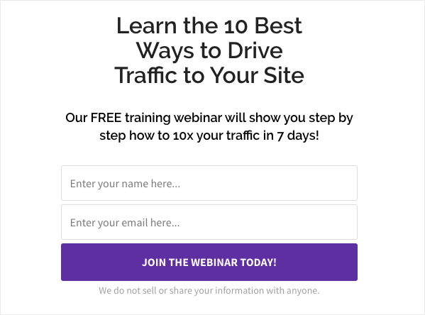
We’ll be adding some animation effects to this popup to make it really stand out.
If you read through this entire article, we promise you’ll never struggle to get your reader’s attention again.
What Are Popup Animation Effects?
Popup animation effects are either visual or sound cues added to your popup campaigns to catch your reader’s eye.
They are insanely valuable tools when used right. Why? Because animations are a pattern interrupt.
When people browse websites, they create certain habits or patterns. After a while, they become accustomed to common elements they see on the web. Then, as they see these common elements more frequently, they pay less attention to them.
Here’s a great example:
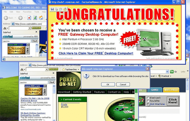
When’s the last time you streamed a T.V. or a movie from a less-than-reputable site? While doing so, you probably got bombarded with popups, new browser windows opening, and push notifications all over your screen:
So when you went back to that site, you trained yourself to simply close the popups or notifications without giving them a second glance.
In other words, you’ve created an online pattern for yourself.
The problem for you as a marketer is breaking through the patterns your readers have created for themselves. That’s where popup animation effects come into play.
By adding a small twist to your popup campaigns, you’re pulling off a classic sales technique called a “pattern interrupt.”
When your audience sees a popup with animation or sound effects, they’re more likely to stop because it’s a new experience. They need more time to process how to respond and, consequently, they end up viewing the campaign longer.
When you combine a strong, catchy headline with popup animation effects, you’re guaranteed to keep your reader’s attention for longer.
This leaves the big question: If popup animation effects are so awesome (which they are), why don’t more companies or blogs use them?
Because most popup animation effects require knowledge of CSS or HTML to create.
Unless you’re using a product like OptinMonster.
To add CSS popup animation effects, you need to be somewhat familiar with coding.
But with OptinMonster, you can add MonsterEffects™ or sound effects to all of your popup campaigns without any coding knowledge. And we give you tons of options to choose from, including:
- Bounce
- Flash
- Shake
- Pulse
- Swing
And more. In fact, we have over 20 different popup animation effects to choose from.
It’s always been OptinMonster’s goal to help small to medium-sized businesses thrive even if they can’t hire a team of developers. As such, we made creating popup animation effects incredibly simple.
This allows content creators and marketers to focus on what they’re good at without getting sidetracked by a bunch of technical hurdles.
Already interested in using our MonsterEffects to increase your conversions? Sign up for OptinMonster today risk-free and start your journey to getting more traffic, email subscribers, and sales.
And while popup animation effects are great at getting your reader’s attention, they’re particularly valuable in 5 situations.
Let’s look at when you should be using popup animation effects for your site’s offers.
When Should You Animate a Popup?
One of our customers’ biggest fears is that popup campaigns will be off-putting for their site’s visitors. This fear also extends to adding popup animation effects.
But nothing could be further from the truth.
Consumers don’t mind popups. In fact, it’s quite the opposite.
Many online shoppers love to see deals that are relevant to them and enhance their user experience (UX). The trick is knowing the right context to add these campaigns for your visitors.
So here are 5 situations in which you’d want to use popup animation effects to better serve your customers.
1. Re-Engage Inactive Users
With OptinMonster, you probably already know that you can trigger your popup campaigns for inactive users with our InactivitySensor™.
So if people stop scrolling through or interacting with the content on your page, a popup will display to get their attention back.
There’s just one problem: if they’re not engaged with the screen, they won’t see the popup!
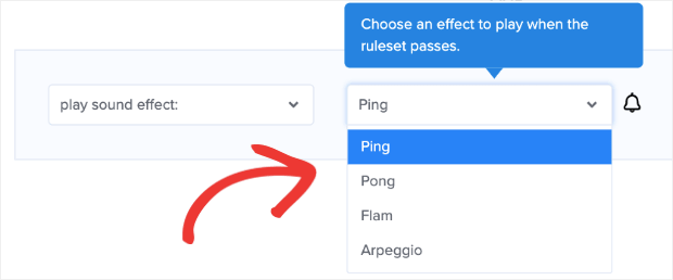
To fix this, you can add OptinMonster’s popup animation effects in the form of sound. We have 4 different sound effects to choose from:
- Ping
- Pong
- Flam
- Arpeggio
These small sound cues will trigger your audience to come back to their browser. When they do, they’ll return to your content and see your popup display.
2. Stop People From Leaving Your Site
Another excellent strategy for using popup animation effects is combining it with our Exit-Intent® technology:
Exit-Intent® stops people from leaving your website if they’re trying to close the browser or hit their back page button. And this technology alone is impressively effective.
This is the exact method ShockByte used to more than double their sales conversions and 10x their business.
You can do the same with even better results by adding an animated popup effect.
Remember, your customers may have developed certain habits while reading your content. You need to harness the power of pattern interrupts to fully get their attention.
When someone is leaving your page because they think they’ve gotten everything they need, it’s your job to show them you still have way more value to offer.
Popup animation effects are the perfect tool to catch your reader’s attention and show them what you got!
3. Highlight a Particularly Special Promotion
When you’re running a special promotion like a seasonal sale or a flash sale, you’ll want to draw special attention to it.
If you typically use different types of popups on your site to grow your email list or boost sales, then some of your more frequent customers may be accustomed to it.
They might even think that your popup is targeted to new customers, so it isn’t relevant to them. Thus, they close the window without paying attention to it.
Using popup animation effects is perfect for showing both loyal and new customers alike that you want to show them an extra special offer.
For this, you can use the visually appealing MonsterEffects™ for your campaign because the user’s behavior is neither inactive or attempting to leave your screen. They’re likely reading content on your site and simply need an extra nudge to get their full attention.
And animated popup effects are exactly the tool you need for that extra nudge.
4. Stand out on Busy Pages With Lots of Ads
While we never recommend loading your site or blog with tons of ads, the reality is that sometimes ads are necessary to keep your site running.
When you’re first starting out, creating ad spaces on your blog can be a crucial source of revenue as your building a solid strategy to monetize your content.
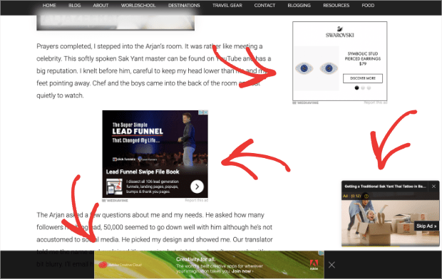
If that’s the case, you may find that your site is looking a little bit… busy. Check out the number of ads in this one blog post:
This is a problem because these ads often create noise that distracts from your site’s offers. So if you want to grow your email list on a site that’s loaded with ads, you can expect your readers to close popups before even seeing the optin form.
Again, your site’s web design has trained them to develop certain patterns that need to be interrupted.
This is where your popup animation effects come in handy.
They’ll separate your popup campaign from the rest of the noise on your site caused by ads. It’s a not-so-subtle way of letting your audience know that this particular campaign is unique and worth paying attention to.
5. New Lead Magnets
Here at OptinMonster, we believe that email marketing is your best bet for growing a business. And one of the best strategies for building your email list is using a lead magnet.
But not all lead magnets are created equally.
So if you’ve invested a lot of time and money creating a special lead magnet like a mini-course or a 10,000-word ebook, then you owe it to yourself to promote that resource as heavily as possible.
Popup animation effects can let your site’s visitors know that you have something extraordinary for them. When used correctly with a killer value proposition, they can draw more interest to your popup campaign and boost conversion rates.
Once you have your readers’ attention, you let your lead magnet do the rest.
Sounds awesome, right?
But here’s the big question: how do you create a popup with animated effects, especially if you don’t know any code?
Sit tight, because that’s what we’ll look at next.
How to Create Popup Animation Effects
As we already mentioned, adding animation effects to your popup couldn’t be easier when you use OptinMonster. With one small change to your display rules, you can add MonsterEffects or a sound effect to any campaign on your website.
And if you use them according to the 5 scenarios we listed above, then we promise you’ll see more engagement from your popup campaigns.
So let’s get started and look at how to create popup animation effects with OptinMonster.
Step 1: Create Your Popup
The first thing you need to do is sign up for OptinMonster. You can use OptinMonster risk-free for 14 days to test out the software.
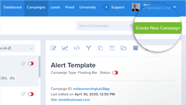
After you’ve signed up, you’ll be ready to create your popup. In your dashboard, click Create New Campaign:
Then select your campaign type. For today’s tutorial, we’ll choose Popup:
And now, you can choose your template.
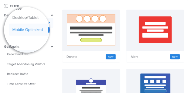
OptinMonster has over 50 pre-built templates that work great on all devices. You can even filter your template options to create a mobile-optimized popup if most of your users visit from their phones:
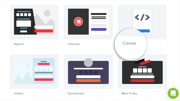
If you’re looking for a totally custom template, then you can simply use our Canvas design:
This lets you build a popup from scratch. But don’t worry, you don’t need any coding skills. Our drag and drop editor will do all the work for you!
For today’s tutorial, we’ll use the Basic template for our animated popup:
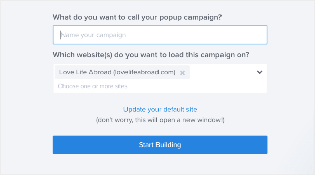
Then, you will name your campaign (to keep organized), assign it to your website, and click Start Building:
Step 2: Design Your Popup
We won’t get into much detail on how to customize your campaign in this post. But rest assured that designing your campaign with OptinMonster couldn’t be easier.
And if you’ve never built a popup campaign with OptinMonster, you may want to check out the following resource: How to Create Your First Optin Campaign With OptinMonster.
All you need to know for this tutorial, though, is that our campaigns are built with “blocks.” These blocks are the different parts of your popup campaign that your visitor will see.
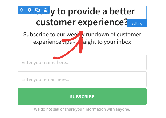
In this template, there are 2 types of blocks. There’s a text block:
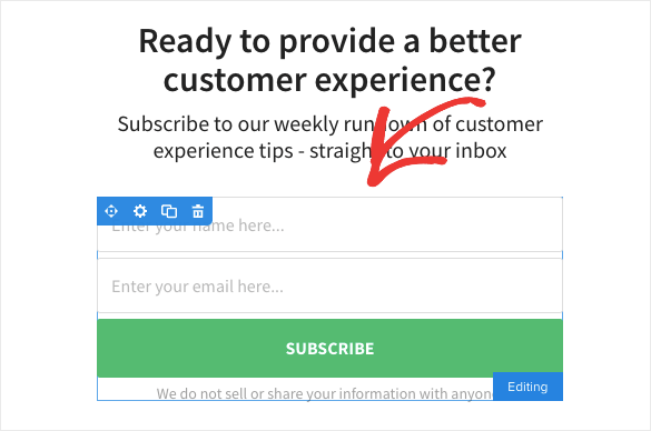
And an optin block where users can sign up with their name and email address:
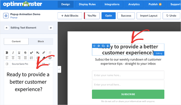
To change these, all you need to do is click on the block you want to edit. This pulls up the editing tools in the left menu.
So if you wanted to change the text, for example, you’d simply click on the text block in your editor. Then the editing tools would show up on the left-hand side:
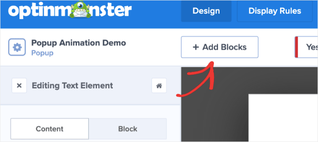
Plus, you can add new blocks if you want to. Just click the + Add Blocks button in the top menu of your editor:
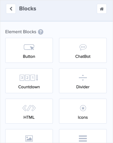
This will pull up different block options you can add to your popup campaign including:
- Button
- ChatBot
- Countdown Timer
- Divider
- Image
- Video
And much more.
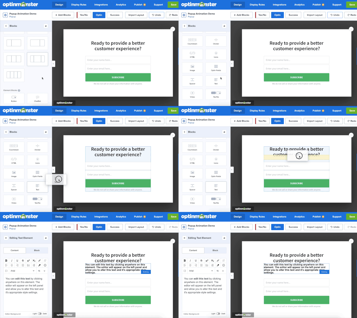
Then you can drag and drop the block you want into your popup campaign:
Here’s the popup campaign we built for today’s demo:

It’s simple, to the point, and took less than 5 minutes to build!
Step 3: Give Your Popup Animation Effects
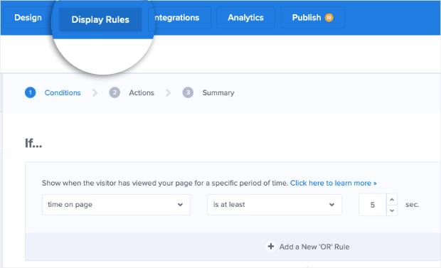
Once you’ve designed your popup campaign, head over to display rules in the top menu of your editor:
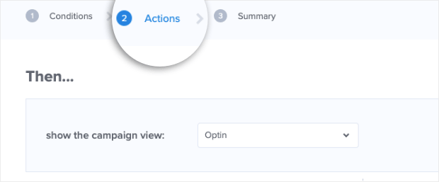
Click on Actions in your display rules menu:
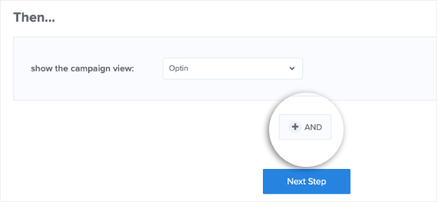
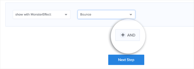
Then click the AND button to add your popup animation effects:
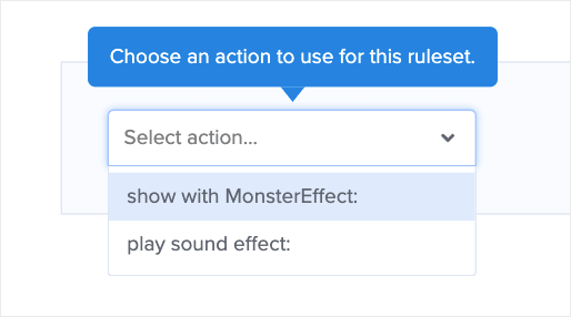
Now you can select between 2 choices:
- Show with MonsterEffect™
- Play sound effect
Let’s choose MonsterEffects. And if you want both MonsterEffects and a sound effect, no worries. We can add sound in just a minute.
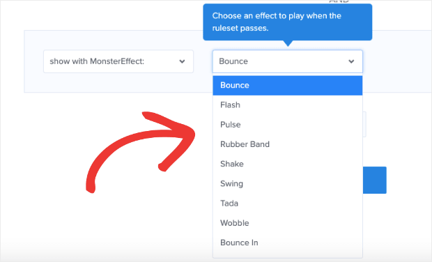
Select 1 of our 24 pre-built popup animation effects from the corresponding list:
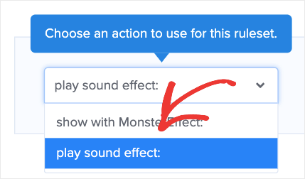
Now if you want to add sound to your popup, simply click the And button:
Then select play sound effect:
And choose the sound effect you would like from the dropdown list in the next field:
That’s it! Well, one more small thing: don’t forget to hit Save. 😉
You now have an animated popup campaign that you created with just a few clicks.
No CSS. No HTML. Just an attention-grabbing popup to boost conversions in seconds.
One reason for using popups is to grow your email list. If you’re trying to level-up your email marketing strategy, you’ll want to check out the following articles:
These resources will have everything you need to grow and monetize your contact list. And for more information on OptinMonster, check out this post: How Does OptinMonster Work: 8 Benefits (+ 12 Case Studies).
Ready to get started? Sign up for OptinMonster today, risk-free with our unconditional 14-day money-back guarantee. We promise you’ll be glad you did!









Add a Comment