Are you wondering how to increase your website’s average time on page?
A higher average time on page can help your site rank higher on the search engine results page (SERP). It also gives you more time to encourage your website visitors to subscribe, purchase, or take another action on your website.
In this article, I’ll show you what average time on page is, why it matters, and 10 easy ways to increase it.
Here’s everything I’ll cover in today’s post:
- What Is Average Time on Page?
- Why Does Average Time on Page Matter?
- Average Time on Page in Google Analytics
- What Is a Good Average Time on Page?
- How To Increase Average Time on Page?
What Is Average Time on Page?
Average time on page is the average amount of time a site visitor spends on any one page on your website.
If most people who land on your eCommerce website spend about 2 minutes on your homepage, your homepage’s average time on page is likely close to 2 minutes.
To calculate the average time on page, you divide the total amount of time spent on the page by the number of non-exit pageviews.
For example, let’s say in a given month, 2,000 pageviews spent 500 minutes on a landing page. 500 of those pageviews were page exits or bounces, so we exclude those. The average time on page would therefore be:
500 minutes / (2,000 pageviews – 500 page exits or bounces) = 500/1500 = 0.33 minutes or 20 seconds
Here’s what the average time on page looks like in the Google Analytics dashboard:
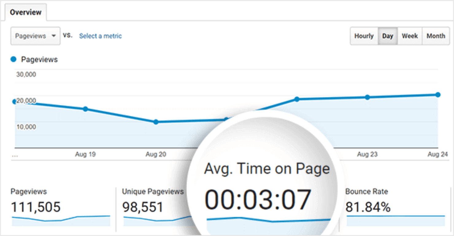
I’ll show you how to access or measure your website’s average time on page in Google Analytics in the next section.
For now, remember that the average time on page does not take into account exits or bounces.
Page exits are when the user goes to a different website after viewing a landing page or other product pages on the same website. That last page is counted as an exit page in Google Analytics.
Bounces are single-page sessions where the user visits the page but then clicks back to the search results without going anywhere else on the website.
This definition will be important later when we think about how to increase the average time on page. But first, let’s discuss why average time on page is important.
Why Does Average Time on Page Matter?
Average time on page is a measure of your website’s usability and how well visitors engage with your content.
It’s not enough to just get tons of traffic on your website. You need visitors to actually read what’s on your website, click links, subscribe to your email list, purchase products, and engage in other ways.
Because it’s a measure of user engagement, average time on page may contribute to search ranking.
Search engines tend to prioritize high-quality websites, and one indicator of that is how long visitors spend on various pages. If most visitors are leaving a page almost immediately, that may be a sign of poor user experience and low content quality.
As you work to increase your average time on page, chances are your user experience will improve. And as your user experience gets better, your conversion rate may also rise.
Average Time On Page in Google Analytics
If you have been following the news, Google will soon shut down Universal Analytics. In its place, Google is encouraging users to start using Google Analytics 4 (GA4).
However, if you have been using Universal Analytics to measure your website performance, you might not be familiar with the new metrics that GA4 uses to track your website.
But don’t worry, I’ll explain them in detail for you to understand these metrics.
To find your average time on page in GA4, go to Google Analytics.
In GA4, the average time on page is called the average engagement time.
To find it, click on Reports» Engagement » Pages and Screens. Scroll to see a report of your page engagement metrics, including average engagement time.
In Google Analytics, you can search for a specific page’s engagement metrics from the Pages report.
In the past, Universal Analytics had a few metrics that were related to average time on page. Since Universal Analytics will no longer be in use, I’ll explain the differences between the metrics that the tool used to avoid any confusion.
Average Time on Page vs Average Session Duration
In the Audience Overview screen of Universal Analytics, you’ll see another metric called the Average Session Duration.
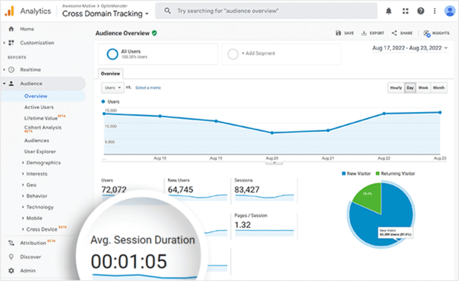
While this may sound very similar to the average time on page, it’s actually quite different.
The average session duration measures how long visitors spend on your website as a whole, including multiple pages. Average time on page measures time spent on a specific page.
Another important difference is that the average session duration does not ignore exits and bounces. So bounces and exits often contribute very low-duration sessions to the overall average.
Because of this, the average time on page is often greater than the average session duration.
Average Time on Page vs Bounce Rate
You’ll also see something called bounce rate on the Behavior report in Universal Analytics. GA4 does not have this metric.
Bounce rate is the percentage of users who click directly back to the search results after viewing a page.
For the most part, all pages with a higher average time on page tend to have a lower bounce rate. But this is not always the case.
A user might spend 2 hours reading a page from start to finish, leaving comments, and actively engaging with the page. If they click back to the search results after all that, however, it’s still counted as a bounce.
That’s why you don’t need to panic if you see a high bounce rate or low average time on page in isolation. What matters is the big picture of all these page metrics put together.
What Is a Good Average Time on Page?
A good average time on page varies by industry. But generally 50-60 seconds is considered good.
Rather than comparing yourself to competitors or random brands you see on social media, focus on what’s normal for your business.
When you have a good understanding of typical visitor behavior on your website, you can make the changes necessary to increase the average time on page.
The average time on a page is influenced by a combination of factors related to both your website and your visitors. Here’s a breakdown of the key influences:
- Relevance: Content that directly addresses user intent and offers value keeps them engaged for longer.
- Comprehensiveness: Lengthy, in-depth articles naturally hold user attention longer compared to short snippets.
- Readability: Easy-to-read content with proper formatting and visuals encourages users to stay on the page.
- Page loading speed: Slow loading times lead to frustration and prompt users to bounce off the page.
- Navigation: Clear and intuitive navigation allows users to find the information they need quickly and keeps them engaged on the site.
- Visual appeal: A well-designed website with engaging visuals is more aesthetically pleasing and holds user attention.
I’ll cover some of these factors in more detail later. Next, let’s go over the actual strategies to improve the average time on page.
How To Increase the Average Time on Page?
Simply driving up the number of sessions or pageviews is not always enough to increase your average time on page. The traffic needs to be high quality and visitors need to engage with your pages.
Remember how the average time on page is calculated:
Total time spent on page / (Total pageviews – Page exits or bounces)
Based on this formula, there are 3 ways to increase the average time on a page benchmark:
- Increase time spent on page
- Reduce bounce rate
- Reduce exit rate
Now let’s look at some specific strategies that will help you achieve these 3 and increase average page engagement time.
- Create Good Content
- Use Exit-Intent Popups
- Optimize Page Navigation
- Embed Videos
- Run a Comment Contest
- Add a Quiz
- Use Gated Content
- Add a Chatbot or Live Chat Popup
- Improve Page Load Time
- Optimize Your Site For Mobile
1. Create Good Content
Good, informative, and well-written content is engaging. It grabs the reader’s attention and keeps them interested. When users are engaged, they are more likely to spend more time reading and exploring the content.
All the tech and design-based tricks in the world can’t rescue your user engagement from bad content.
If your site content is hard to read or doesn’t deliver what you promised, no one will want to stay on your site. Fortunately, a few best practices can help.
- Tell readers exactly what they’re going to get in the first few sentences of your content. Get to the point quickly to catch their attention. You can go into more detail later.
- Create actionable, in-depth content, not just fluff. Make sure to include calls-to-action (CTAs) in your content as well.
- Break down your content into digestible chunks with clear headings, subheadings, and bullet points. Make it easier for users to skim and find the information they need, encouraging them to delve deeper.
- Go beyond static text and images. Embed quizzes, polls, or surveys directly related to your content. This keeps visitors engaged in actively participating in the topic.
- Weave first-person narratives or anecdotes into your content to illustrate your points. Stories are inherently engaging and can hold users’ attention for longer stretches.
- Aim for a Flesch-Kincaid reading ease score in the 60s to 70s range. This ensures your content is clear and understandable for a broad audience.
- Use relevant keywords throughout your content, but naturally. Don’t stuff keywords as this can hurt readability. Using the right keywords helps you attract the right people to your page, deliver valuable content, and increase the average time on page.
To audit your content quality from the search engine optimization (SEO) point of view, you can use All in One SEO (AIOSEO) to check your content readability right in WordPress:
2. Use Exit-Intent Popups
Exit-intent popups are another great way to keep visitors on your individual pages longer.
But wait, popups are annoying, right?
Only if they appear right when visitors get to a page before they have even had a chance to read anything.
Not really. Popups can actually improve your conversions if they appear for the right people at the right time and on the right page.
Take, for example, exit-intent popups. If you trigger them when visitors are about to leave, you get an important opportunity to improve the user experience (UX).
Exit intent popups with a relevant and enticing offer can recapture abandoning visitors and turn them into subscribers or customers.
You can use exit intent popups to offer content or product suggestions based on how quickly they leave the page.
For instance, people who try to leave immediately may not have found what they were looking for. So you can direct them to content that may be more helpful.
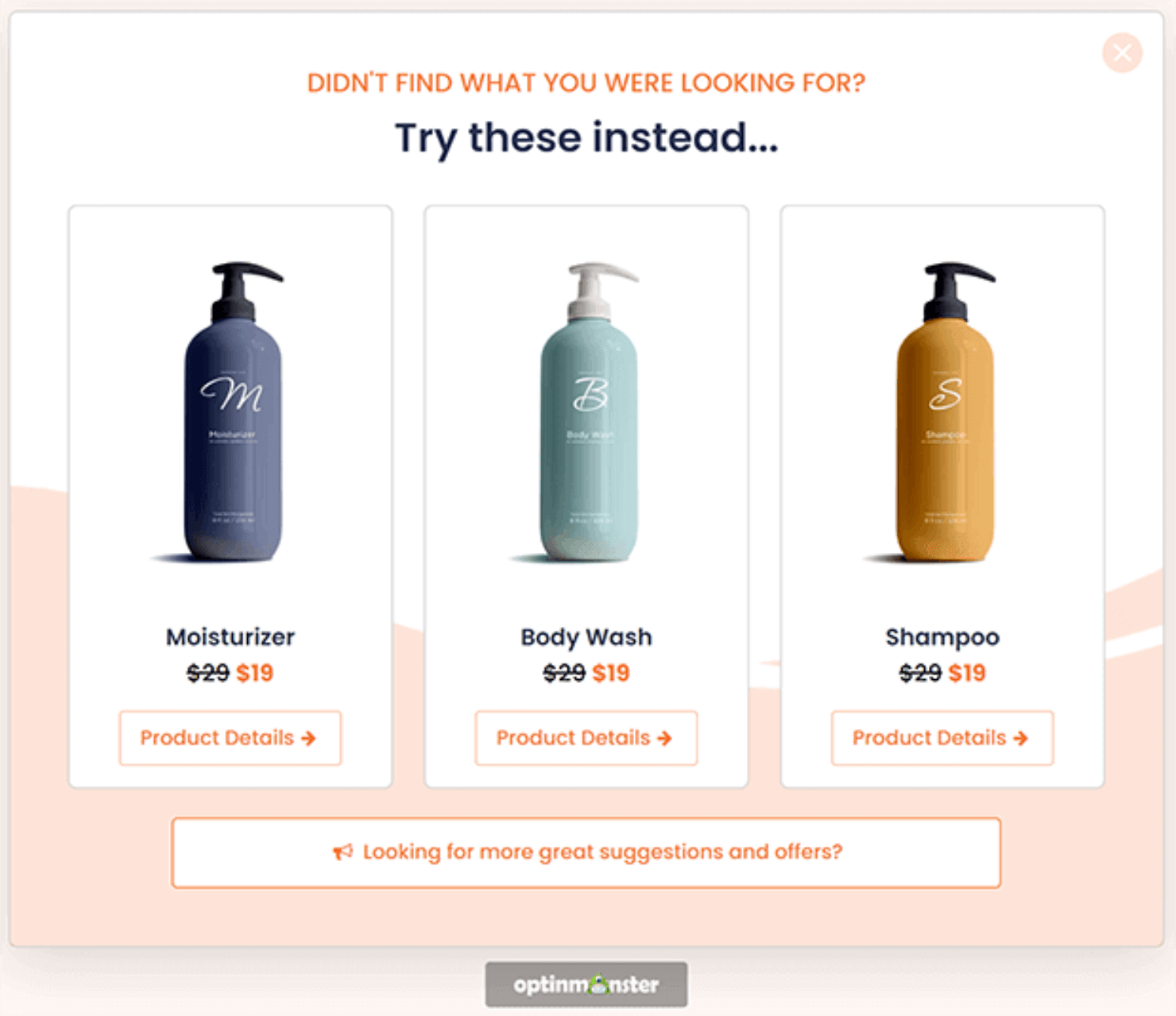
On the other hand, visitors who spend a few minutes reading a page may be eager for related content. For them, you can create a popup that they might prefer.
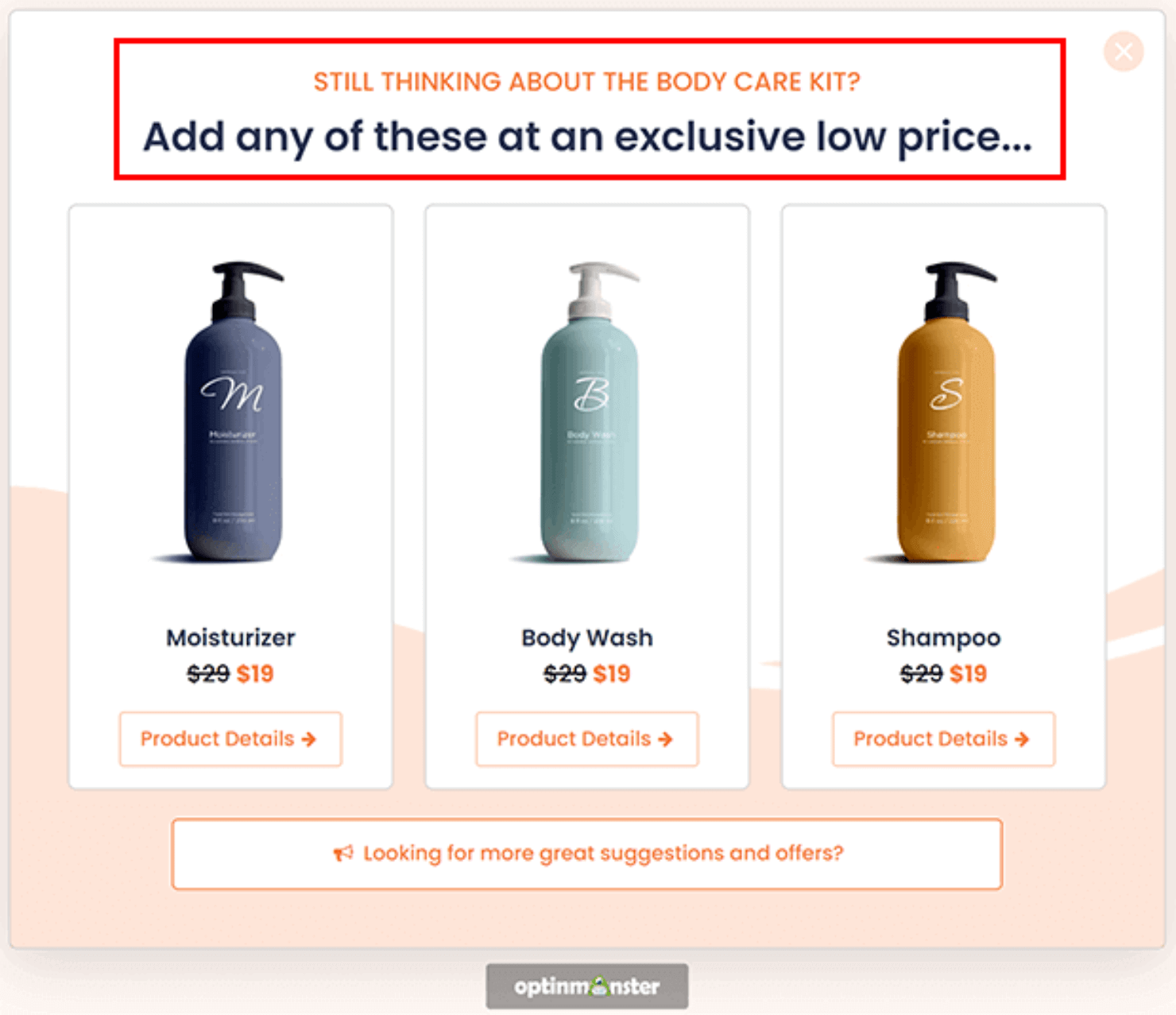
You can also offer discount codes, free shipping, or other incentives at checkout to win back eCommerce buyers who are about to leave without purchasing.
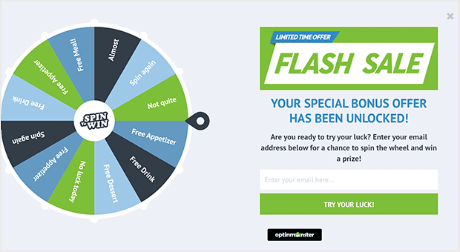
And the easiest way to create these exit-intent popups is with OptinMonster.
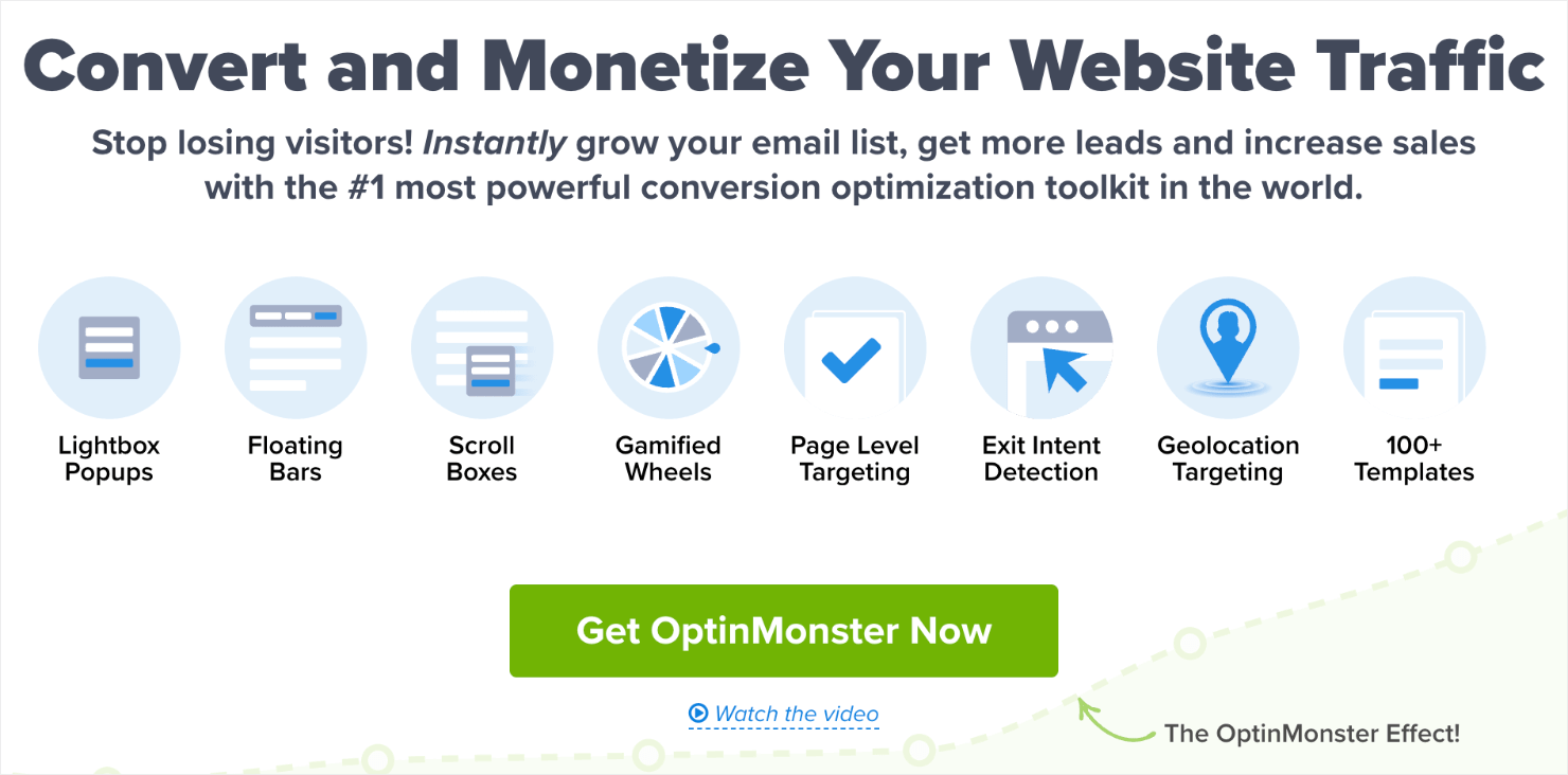
OptinMonster is the best popup builder for re-engaging visitors throughout your website.
Its signature Exit-IntentTM Technology uses precise targeting rules to show the right message to the right visitor at the right time.
OptinMonster also features a super intuitive drag-and-drop builder that anyone can use to create a popup campaign from scratch.
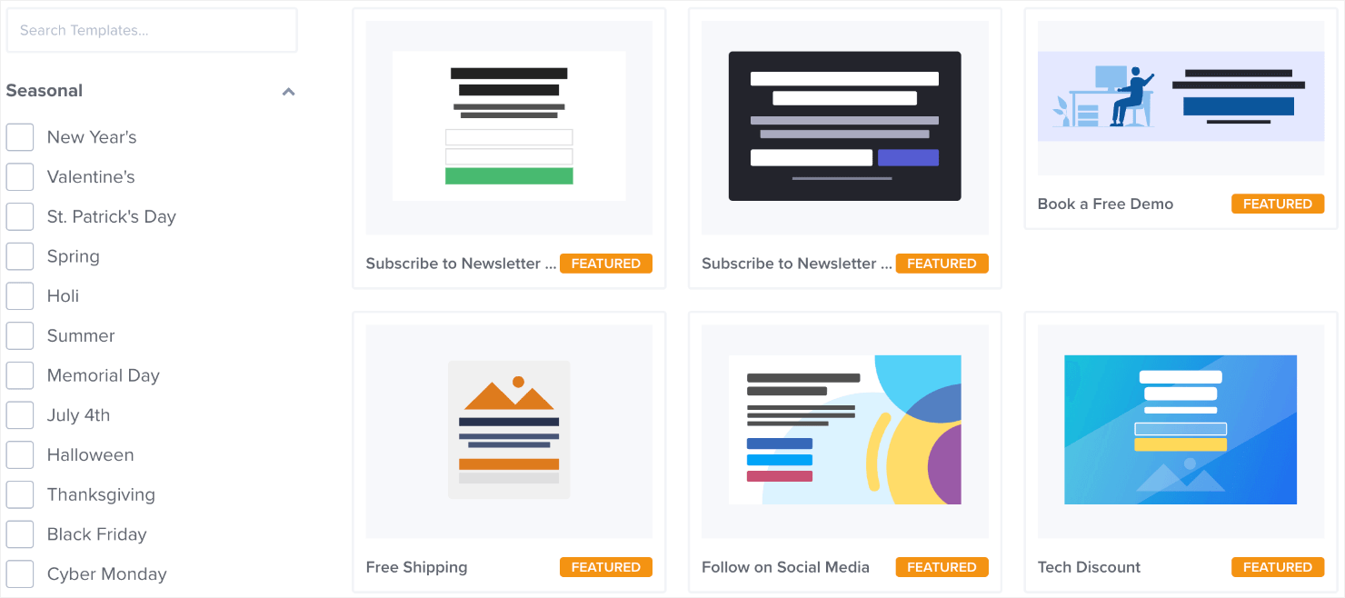
You can choose from its 100+ templates to create an exit intent popup or customize a template to match your brand style:
If you’re curious, you can see how Flywheel increased engagement and conversions with OptinMonster.
Get Started With OptinMonster Today!
BONUS: Done-For-You Campaign Setup ($297 value)Our conversion experts will design 1 free campaign for you to get maximum results – absolutely FREE! Click here to get started →
3. Optimize Page Navigation
One easy way to increase time on page and decrease bounces and exits is to make your pages easy to navigate.
Adding a table of contents (TOC) near the beginning of a page can provide structure and direction for readers.
You might have noticed this blog has a table of contents towards the beginning. If you check out other blogs in OptinMonster, you’ll see almost all blogs open with a table of contents.
That’s because we, at OptinMonster, understand the value of a TOC from the UX point of view and how it can impact the search engine rankings.
Many visitors see a huge wall of text and feel overwhelmed or discouraged trying to find what they need. Adding a table of contents can help them navigate instead of leaving the page.
You can also increase your page session duration by adding internal links to other pages on your site throughout your content.
To keep these links from decreasing your average time on page, just make sure you don’t have too many unnecessary links peppered throughout the post. Only add links where it matters or where they provide more depth and context.
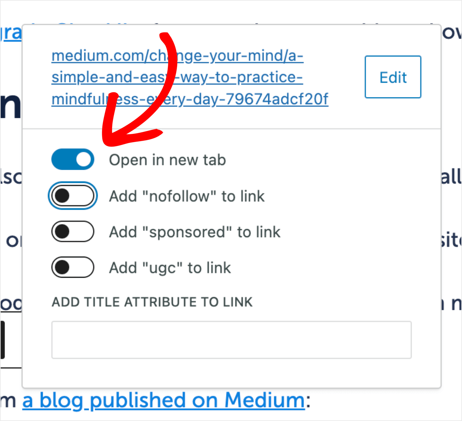
For external backlinks, set these to open in a new tab or window. That way the user won’t leave your page by default if they click on a link to another website.
4. Embed Videos
Videos are a great way to build engagement and improve the average time on page because it takes time for people to finish watching videos.
Good videos are inherently captivating. They break up text-heavy content and cater to visual learners, keeping users engaged for longer stretches.
Videos also allow you to tell stories, showcase processes, or demonstrate concepts in a way that static text can’t. This makes your content deeper and more interesting.
Recent research done in the field of video marketing states that 82% of customers are convinced to buy a product or service by watching a video.
Ideally, you should add your own video content. But you can also embed videos made by others as long as the videos are relevant to your page.
With a plugin like Smash Balloon, it’s easy to add a YouTube feed or embed standalone videos anywhere on your WordPress site:
Here’s a short video that tells you how you can use Smash Balloon to create a beautiful YouTube feed using Smash Balloon’s YouTube feed:
5. Run a Comment Contest
Contests are fun and super engaging. With contests, you can gamify the user experience to make people spend more time on your page. Here’s how:
Let’s say you announce a comment contest where people have to leave a blog comment at the end of an article for a chance to win the contest.
But to leave a comment (and to enter the contest), readers will first need to read the post:

It’s a clever way to improve your average time on page while incentivizing your readers to read your content.
RafflePress makes it easy to track and confirm comment entries in WordPress. You can then pick the winner with a click of a button:

6. Add a Quiz
Just like online contests, quizzes are another interactive element you can use to boost engagement and even generate leads.
Thanks to the Zeigarnik effect, most people will want to finish a quiz once they start.
You can create lead generation quizzes with tools like Interact or Typeform, then embed your quiz in an OptinMonster campaign.
Here’s an example. GoPro uses an online quiz on its website to understand how its customers plan to use its product. Once the quiz is over, GoPro requires people to sign up with their email addresses to see the results:
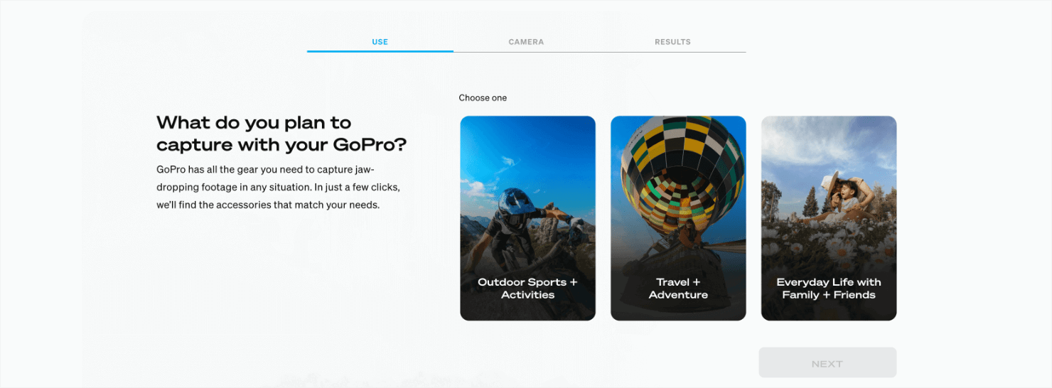
If you can create quizzes that offer personalized feedback or results based on the users’ choices, it’ll motivate them to complete the quiz. Furthermore, you can also lead them to other content pieces on your site related to their outcome.
And the best part? Well-designed quizzes have a virality quotient in them. People who take them are likely to share it with their friends on social media networks, inviting more website traffic and more users interested in taking the quiz.
This, naturally, will help you attract more people to your site and improve your average time on page.
7. Use Gated Content
Gated content is a type of content piece that you can offer to your website visitors. The use of gated content requires people to share their email addresses in exchange for the content piece.
Gated content comes in various formats like ebooks, white papers, reports, webinars, or exclusive videos.
Here’s an example of a gated content piece that we use at OptinMonster:
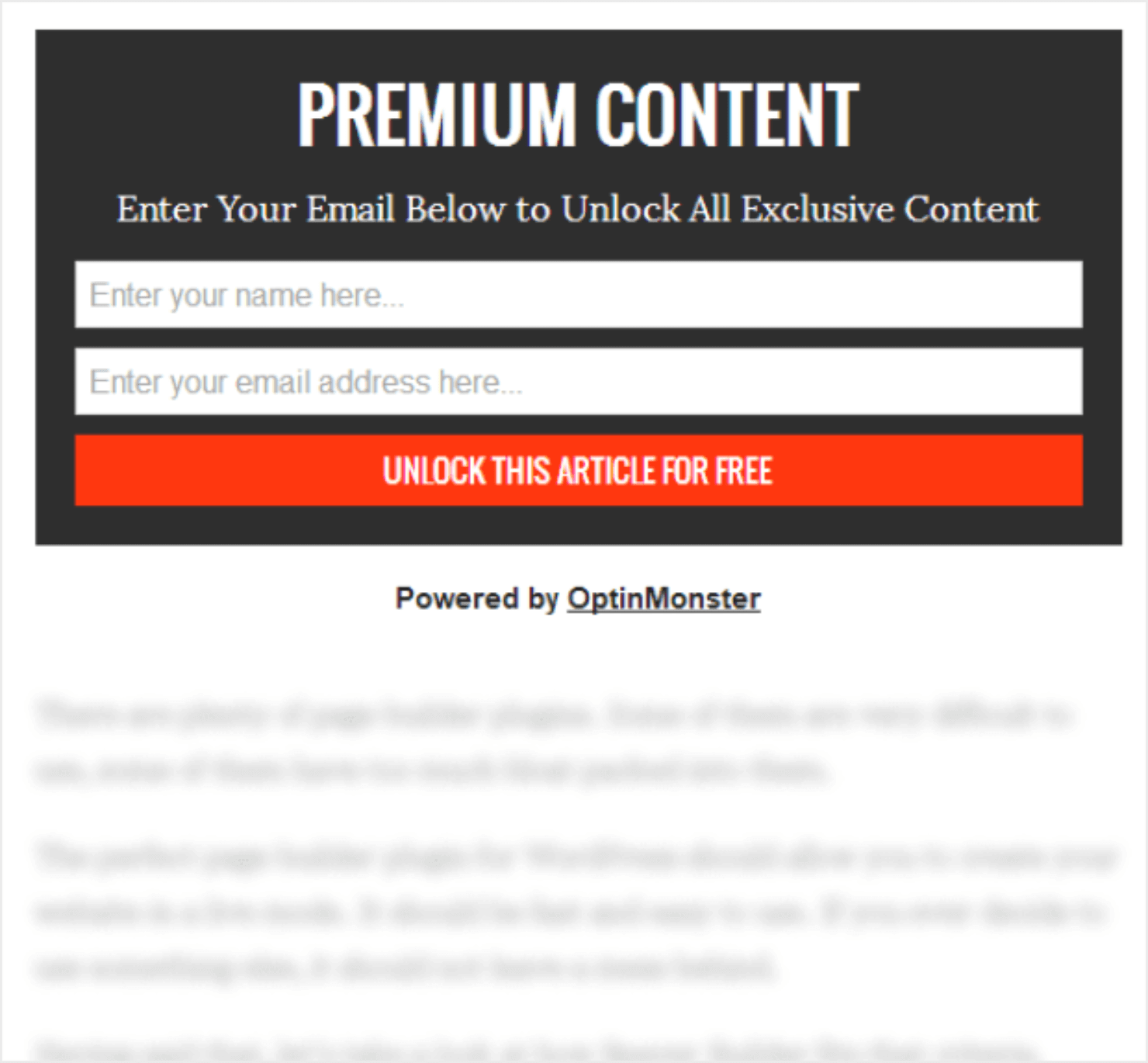
It might seem counter-intuitive to use gated content to increase the average time on page because it restricts access to the full content.
However, there are ways gated content can achieve this if you use them strategically:
- Highlight Value: Provide compelling previews or summaries of the gated content. This builds curiosity and entices users to invest their information for the full value.
- Focus on Benefits: Clearly communicate the benefits users will gain by accessing the gated content. This could be exclusive insights, in-depth analysis, or valuable resources.
- Deliver on Promises: The gated content itself should deliver on the promised value proposition. High-quality, engaging content justifies the user’s information and keeps them engaged for longer durations.
- Focus on Problem-Solving: Frame the preview to highlight a common pain point your target audience faces. Then, position the gated content as the solution with specific benefits it offers (e.g., “How To Increase Blog Traffic: 25 Proven Strategies“).
- Complementary Content: Consider offering ungated content alongside the gated piece, such as a short blog, outline, or testimonial video. This gives users a taste of your expertise and entices them to access the full-length gated content.
Plus it’s a great way to build your email list with interested leads. Learn more with our ultimate guide to gated content marketing.
8. Add a Chatbot or Live Chat Popup
Chatbots and live chat are the perfect ways to keep visitors on your page because you are helping them make a decision that will benefit them.
You can use chatbots or live chat services to answer presale and support questions, recommend products or services, and resolve any problems quickly.
OptinMonster comes with a chatbot block built in, and you can also create a floating live chat popup with OptinMonster:

Here are some ways to use a chatbot to increase the average time on a page:
- Proactive Support and Assistance: Train the chatbot to offer proactive support or assistance to users throughout their browsing journey. For instance, it can suggest relevant content, offer help with finding specific information, or provide a friendly presence.
- Go Beyond Simple FAQs: Instead of just answering the most frequently asked questions (FAQs), train your chatbot to have engaging conversations. It can ask follow-up questions, provide interesting facts related to the topic, or even offer lighthearted banter. This keeps users interacting with the chatbot for longer.
- Personalized Recommendations: Based on user queries or browsing history, the chatbot can recommend relevant content, products, or other blogs on your site. This personal touch encourages users to explore further and discover new content pieces.
- Interactive Tutorials and Guides: You can use the chatbots to deliver interactive tutorials or guides on specific topics. This can break down complex information into smaller, more manageable steps, keeping users engaged as they learn.
- Gamification Elements: Integrate gamification elements like quizzes, polls, or challenges within the chatbot interaction. This adds a fun layer to the user experience and motivates them to spend more time engaging with the chatbot.
9. Improve Page Load Time
If you want to boost engagement, figuring out your page load times is a crucial first step. Freelancers and business owners, and everyone in between, should know just how big of an impact speed can have on the average user experience and their overall marketing strategy.
Poor loading times can affect how people find and interact with your website. When a site takes too long to load, there’s a very good chance visitors will leave without taking action.
Alternatively, fast-loading pages means more opportunities to connect with your audience and boost conversions.
So it makes sense that decreasing load time will reduce your bounce rate and increase your average time on page.
Most leading eCommerce websites have some of the best and fastest page loading times. Take, for example, Gymshark:
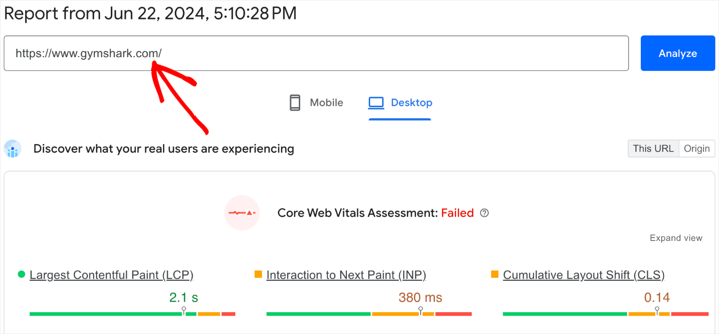
Want to check your site’s loading speed? Here are some free websites you can use to test your website’s page loading time:
If you’re using WordPress, check out this ultimate guide to improving load time.
10. Optimize Your Site For Mobile
Statistics show that 60% of web traffic now comes from mobile devices like smartphones and tablets. That means a significant majority of visitors will likely bounce off your site if it’s not optimized for these devices.
That’s why it’s important to make sure that your site is mobile-friendly.
Optimizing for mobile means your website is easy to navigate, read, and interact with on smaller screens. This creates a smooth and enjoyable browsing experience for users who will want to stay on your site longer.
A positive user experience on mobile usually leads to better engagement metrics, such as lower bounce rates and longer average session duration.
Search engines like Google consider these metrics when ranking websites, which gives your site an SEO edge.
We’ve got a complete guide to mobile SEO that you can use to get started.
If you want to check your website’s mobile-friendliness, here are 2 free websites that you can use:
- Google Lighthouse: This is an open-source tool from Google itself. Simply download its Chrome extension and analyze any website you want to test to generate audit reports.
- Mobile Friendly Tester by BrowserStack: This tool allows you to see how your website looks on different mobile devices and browsers. It also offers a free plan with limited testing options.
- Small SEO Tools: This free online tool lets you check your website’s mobile responsiveness for free. It provides a basic report on mobile-friendliness and highlights potential issues.
- Responsive Design Checker: This tool allows you to resize your browser window to see how your website adapts to different screen sizes. It’ll give you a general idea of its mobile-friendliness.
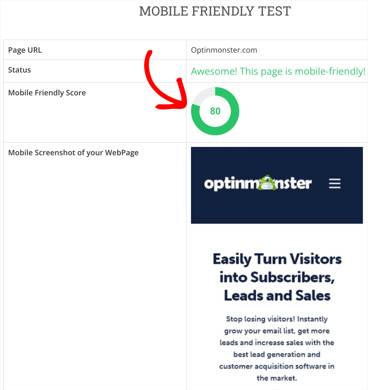
Here’s a look at how well OptinMonster’s website fares when I entered its URL address into the Small SEO Tools’ mobile-friendly test:
Ready To Apply These Tips To Your Site?
Those were some of the best and easiest strategies that you can use to boost your website’s average time on page.
By implementing these ideas and continually refining your approach, you can create a website that not only captures user attention but also offers a delightful user experience.
And if you liked this article, you might also be interested in the following resources:
- 45 Best Digital Marketing Tools To Boost Your Business
- Ultimate eCommerce Optimization Guide: 13 Tips to Boost Sales
- SEO Beginner’s Guide: Learn the Basics + Top Tips for 2024
- SEO Ranking Factors: Unveiling 10 Powerful Factors for 2024
- 12 Tips to Reduce Bounce Rate and Boost Your Conversions
Ready to keep users on your site longer? Get started with OptinMonster today!





Add a Comment