TL;DR: How to Create a Webinar Landing Page (Using SeedProd)
1. Download and Activate SeedProd: Install the #1 WordPress landing page builder to access pre-built templates.
2. Select a Webinar Template: Choose from SeedProd’s professionally designed webinar landing page templates.
3. Customize Your Page: Use the drag-and-drop editor to add videos, testimonials, and email capture forms.
4. Connect Your Email Service: Integrate with your email marketing tool to automate registrations and reminders.
5. Publish and Share: Launch your landing page and start driving webinar sign-ups!
Ready to get started? Let’s dive into the full guide!
Do you want to learn how to create a webinar landing page that converts, but you’re not sure where to start?
Creating a dedicated landing page for your webinar can help you get more participants and build excitement with your target audience.
But if you’re not a professional web designer or coder, putting together a landing page can be a tedious and time-consuming process.
That’s why, today, we’re going to teach you how to create a professional webinar landing page in under 10 minutes.
Then, we’ll share 9 examples of webinar landing pages that you can use for inspiration to get started with your own.
First, though, let’s clarify how you’d benefit from building a webinar landing page.
Do You Really Need a Webinar Landing Page?
Creating a webinar can be a great addition to any sales funnel. It allows you to reach large audiences so you can maximize your selling potential.
And even people who don’t end up making a purchase will still remain on your email list.
But like most new marketers or small business owners, you probably don’t have loads of extra time.
Between selecting the right webinar software, writing your webinar outline, and actually presenting your content, you might be wondering, “Is creating a landing page really essential?”
In short, yes.
That’s because building a landing page offers several advantages for increasing registrations for your webinar.
Here are some of the beneficial opportunities you’ll have to boost conversions by building a webinar landing page:
- Build trust in your brand by adding reviews, testimonials, or other forms of social proof
- Add videos to your landing page to give a “teaser” for your webinar
- Insert custom registration forms to gather more data about your target audience
- Go into more detail about how your webinar will help your site’s visitors
- Capture emails before the webinar to send out timely reminders
All of these opportunities (and more) serve one purpose: getting you higher attendance rates for your webinar.
And in the end, this translates to more sales for your business.
So now that we know why you would want to build a webinar landing page in the first place, let’s look at how to create one in under 10 minutes.
How to Create a Webinar Landing Page
For this tutorial, we’ll be using SeedProd:
SeedProd is the #1 landing page builder plugin for WordPress. It allows anyone to create stunning and professional landing pages in a matter of minutes.
With SeedProd, you can build landing pages for all of your marketing goals, such as:
- Sales pages
- Coming soon pages
- Optin-in pages
- Maintenance pages
And, of course, webinar landing pages.
These landing pages come with pre-built templates that save you time, energy, and headaches in the campaign design process.
Plus, with SeedProd’s drag and drop editor, customizing your landing page couldn’t be easier. You can quickly add new features and functionality to your website, even if you don’t have any coding or technical experience.
Ready to see it in action for yourself? Get started with SeedProd today!
Step 1) Download and Activate SeedProd
The first thing you need to do is download and activate the SeedProd plugin. For that, you’ll need to sign up for a SeedProd account.
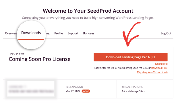
Once you’ve signed up, go to the Downloads tab and click the Download plugin button:
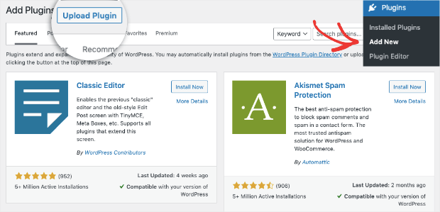
Go back to your WordPress dashboard. Click Plugins » Add New. Then click Upload Plugin:
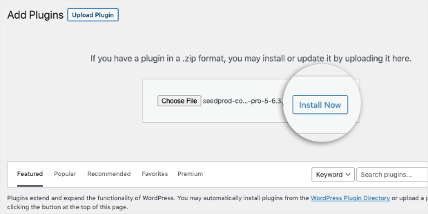
Select the SeedProd plugin file from your desktop, and click Install Now:
Once the plugin downloads and installs, click Activate Plugin:
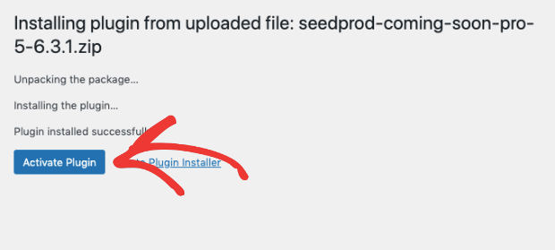
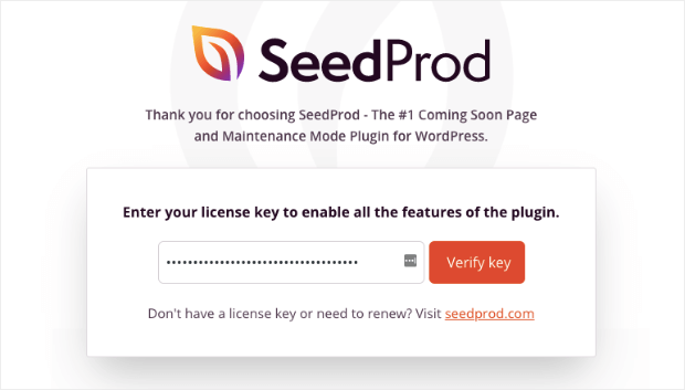
You’ll be redirected to a page where your SeedProd license key will need to be verified.
Your SeedProd license key will automatically be filled with your plugin download. All you need to do is click Verify Key:
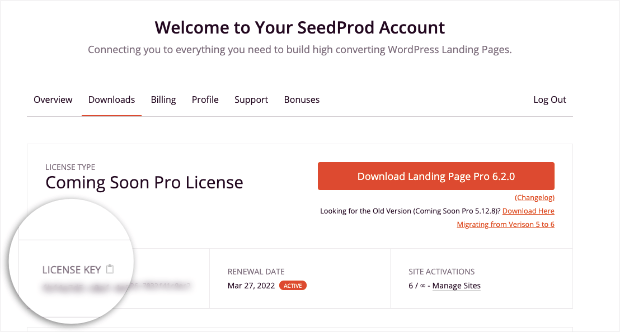
If your key doesn’t automatically fill, you can always find it under the Downloads tab in your SeedProd account:
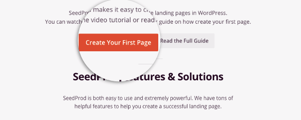
When you’ve validated your key, you’ll simply need to scroll down and click Create Your First Page:
Now you’re ready to select your webinar landing page template.
Step 2) Select Your Webinar Landing Page Template
If you’re using the free SeedProd plugin for WordPress, you’ll still have pre-built templates to choose from, but your options will be limited.
To help with that, you can simply enter your email address at the top to unlock 10 new templates:
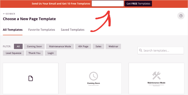
But if you’re using a paid plan, you’ll have loads of template options to choose from. You can also filter out the best options for a webinar by clicking the Webinar tab:
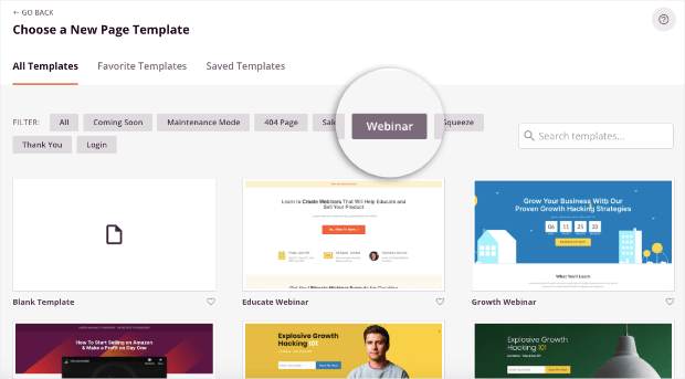
Now you can choose from any of the pre-built webinar landing page templates. Today, we’ll go with the Profit Webinar template:
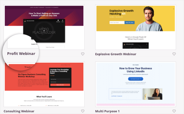
Though we’ll use that specific template for this tutorial, feel free to browse through the other options until you find the perfect template for your unique brand.
Then you’ll need to give your landing page a name. This will also automatically generate the page’s URL slug:
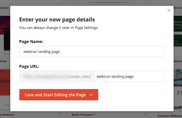
Click Save and Start Editing the Page.
Now you’re ready to customize your webinar landing page to get the highest conversions possible.
Step 3) Customize Your Landing Page
One of the best parts about SeedProd is how easy it is to customize landing pages.
First, you can select the gear wheel at the bottom of your left-hand side editing menu. This will allow you to change global settings about your landing page, such as:
- Fonts
- Colors
- Background
- Custom CSS
- And much more…
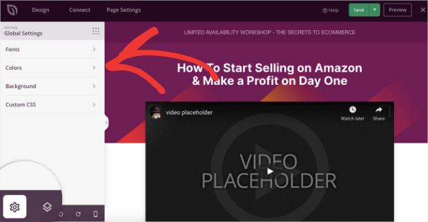
That way, if you want to change the font for all of your text, for example, you can do so in one place.
To edit other elements of your webinar landing page, simply click on the block you want to modify. This will pull up the editing tools on the left-hand side.
You will want to change the video placeholder, for example. To do so, click on the video block in your SeedProd editor and make the necessary changes in the menu on the left:
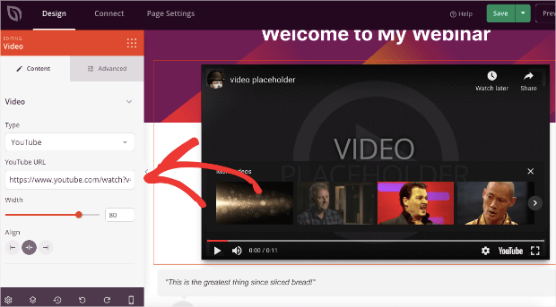
Otherwise, you can add features with a drag and a drop. That’s because SeedProd comes with features in the form of “blocks.”
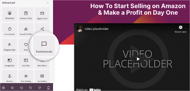
To add a new feature, simply drop the block where you’d like it to be on your landing page. If we wanted to add a testimonial, for example, we could find the Testimonial block in the left-hand side menu:
Then you would drag that block into place. For today, we’ll put it directly under the video teaser:
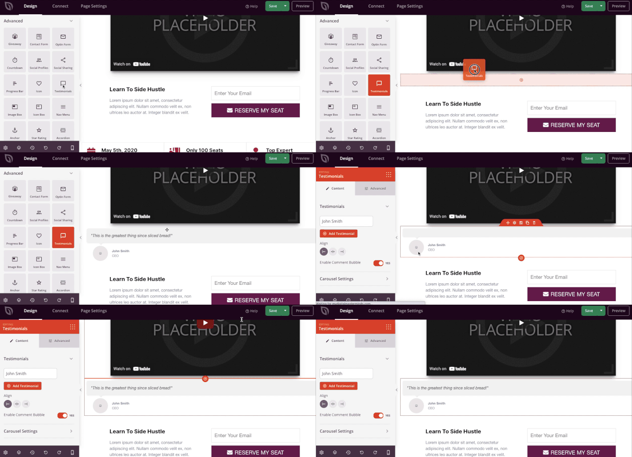
Once you’ve added a new block, customizing it can be easily done from the left-hand side menu.
If you want to change any of your page’s text, you can do so as well. SeedProd has an inline editor that allows you to write directly on the webpage in the editor.
Then, in the left-hand side menu, you can adjust settings like the font family, font size, font color, and so on.
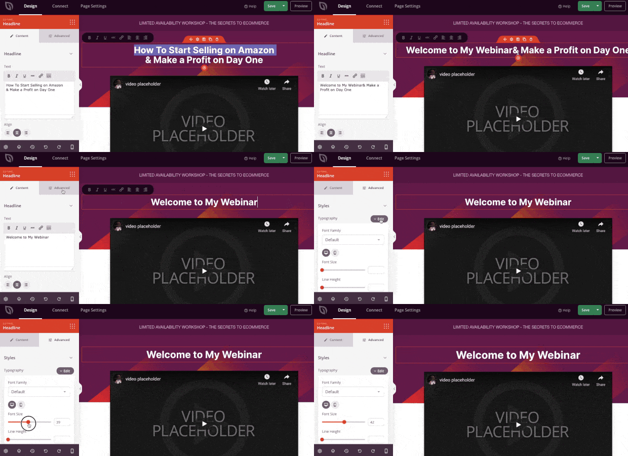
Finally, you may be wondering what will happen when people actually register for the webinar?
SeedProd allows you to integrate with the most popular email service providers (ESP) on the market.
That means your new leads can be sent directly to your automated email series with reminders and updates about your webinar.
To connect your webinar landing page to your ESP, click Connect at the top of your dashboard:
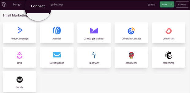
You can also use the Zapier integration to connect with thousands of other 3rd-party marketing tools. That makes SeedProd a super flexible addition to any marketing stack.
And that’s it! With these tips, you’ll be able to design the perfect webinar landing page in a matter of minutes.
Before heading over to our list of examples, though, let’s move to an optional step: recovering abandoning visitors from your webinar landing page.
Step 4) Recover Abandoning Visitors (Optional)
We always recommend having a way to capture your visitor’s email address as they’re actively leaving your site.
That’s because most people who leave your website won’t ever come back.
To do this, there’s simply no better tool than OptinMonster:
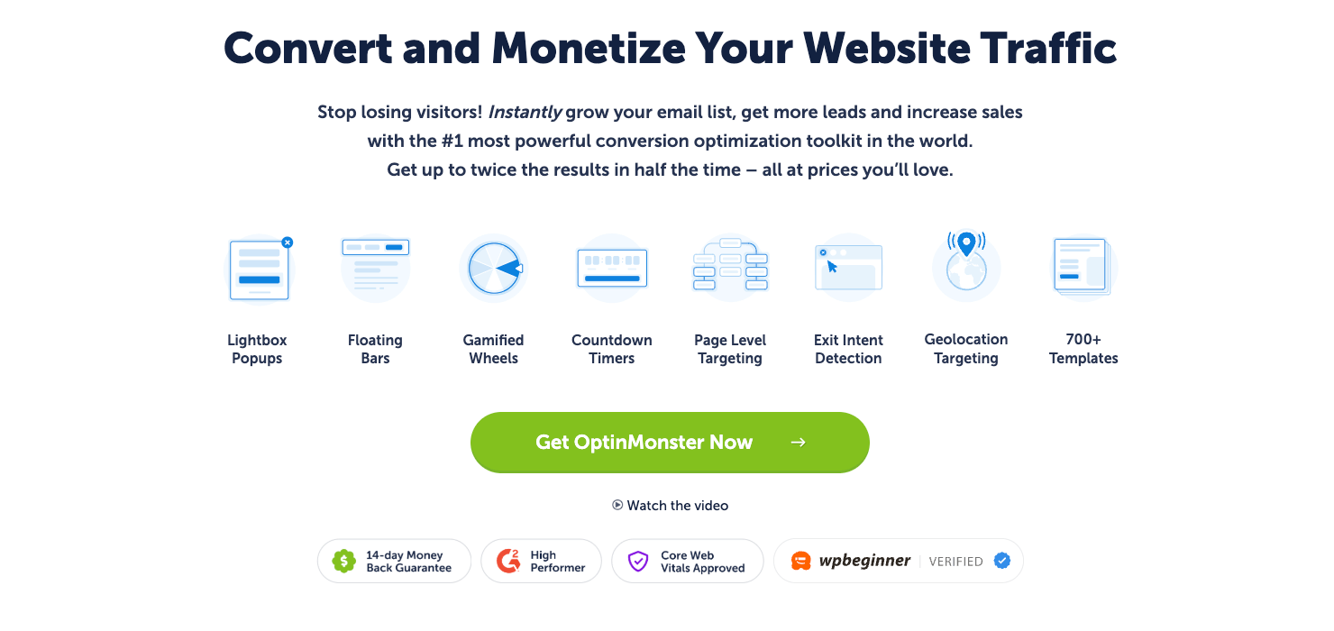
OptinMonster is a premium WordPress plugin that will help you grow your list, boost conversions, and get more participants to your webinar.
OptinMonster makes it easy to create “optin campaigns.” These are things you’re already familiar with, like popups, floating bars, fullscreen campaigns, and more.
And like SeedProd, OptinMonster comes with tons of pre-built templates that help you build the perfect campaign to recover abandoning visitors from your landing page:
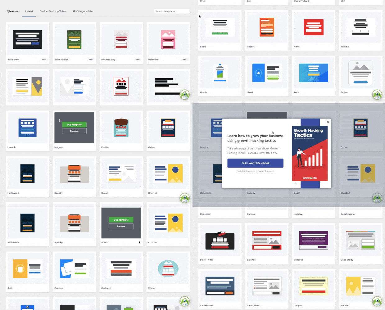
Once you’re inside your editor, things stay just as simple, regardless of your technical experience.
That’s because OptinMonster also has an inline text editor and drag and drop builder to help you create professional campaigns in a matter of minutes.
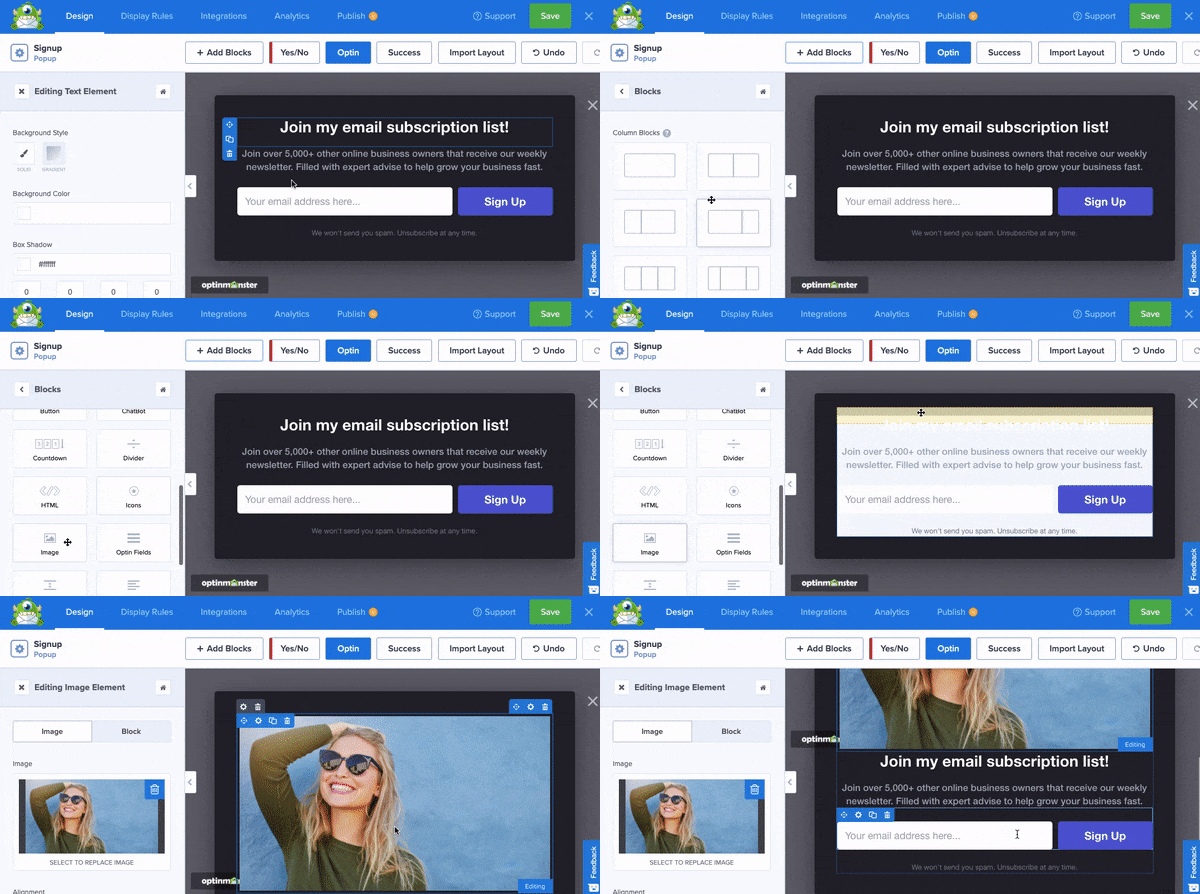
But you may be wondering, “How will this help me capture abandoning visitors from my webinar landing page?”
With OptinMonster’s powerful Exit-Intent® Technology, you can create a trigger for your popup campaign to appear to visitors as they’re leaving your site.
This is important because it’s the last chance you’ll have to engage with your visitor before they leave for good.
That means your exit-intent popup can make or break the difference between capturing a new lead and leaving tons of lost sales on the table.
Still not sure if an exit-intent popup works? Just check out this post on how Fastrack recovers 53% of its abandoning visitors with an exit-intent popup.
Or you might want to check out this success story on how ChinaImportal increased webinar registrations by 18% for even more ideas to boost conversions.
And the good news is that configuring your exit-intent rule couldn’t be easier. Everything can be done by selecting options from a drop-down menu in your OptinMonster Display Rules.
These options allow you to select the device and sensitivity level of your Exit Intent® trigger:
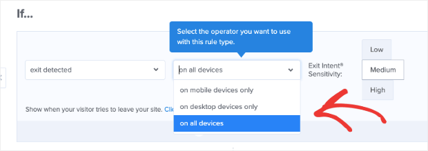
This lets anyone create high-converting exit-intent popups and doesn’t require any coding skills.
That way, when users leave your webinar landing page, you’ll get one last chance to capture their email and nurture the lead through email marketing best practices.
Ready to try it for yourself? Click below to get started with your 100% risk-free OptinMonster account today:
Now that we’ve seen how to build the perfect webinar landing page, let’s take a quick look at 9 landing page examples to inspire you.
9 Webinar Landing Page Examples
The first 5 examples from today’s list will consist of templates from SeedProd. These are ready to go out-of-the-box and only require minor modifications.
Then, we’ll share 4 real-world examples, too.
Beneath each example, we’ll also share a small list of things we liked and note any areas that could be improved.
Let’s dive in!
1) Strategy Webinar
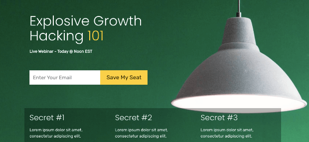
This is a great webinar template for people just starting out who want something simple. You can use SeedProd to add a video teaser or explain the content in the Secret blocks (you’ll see secrets #1, 2, and 3 in the image above).
What We Like:
- Simple layout
- Email capture form is at the forefront
- Title and headline make the content clear
- Showcases the benefits of the webinar (further down the page)
What We’d Improve: This landing page would be much better if it included a short video about the webinar.
2) Explosive Growth Webinar
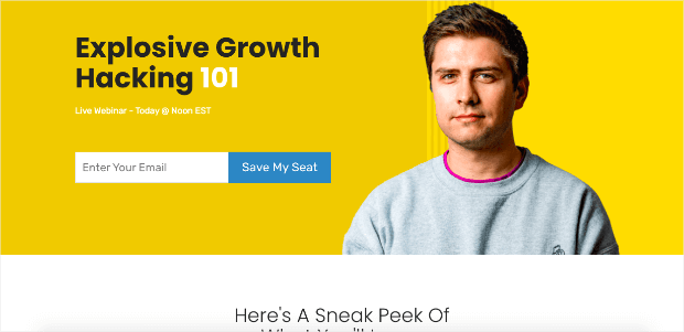
This is the perfect webinar landing page template for consultants or solopreneurs. You can boost credibility by adding your photo to the header image.
Later down the page, there is a small sneak peek of the webinar itself in video format.
This is a great way to engage and “hook” users into signing up.
What We Like:
- Large image grabs attention
- Email capture form is at the forefront
- Sneak peek will show off the content of the webinar
- Loads of room for social proof like client testimonials
What We’d Improve: As mentioned above, this template has lots of space that could be used for social proof. Adding a few customer testimonials would definitely increase conversions for this landing page template.
3) Growth Webinar

Here is another great option for consultants or small businesses looking to attract clients. This is a simple but well-designed webinar landing page template built to get you more participants.
What We Like:
- Colorful background
- Countdown timer adds a sense of urgency
- Clear call to action (CTA)
- Further down the page has a video teaser, social proof, and an outline of the webinar’s benefits
What We’d Improve: This landing page has everything needed out of the box.
4) Travel Webinar
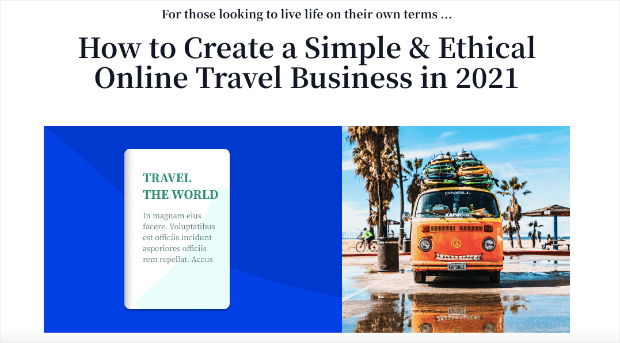
Here’s a simple layout for people in the travel business. Whether you’re selling guides, books, or private consultations, this is a great webinar landing page to start out with.
What We Like:
- Images grab attention right away
- Social proof is added further down the page
- CTA is clear
What We’d Improve: This webinar landing page template will give you a headstart but could definitely benefit from a video teaser and a few client testimonials.
5) Fashion Webinar

This webinar landing page is geared to people in the fashion industry. It’s a stylish and sleek template that can quickly connect you with your target audience.
What We Like:
- Social media buttons are readily available
- Stylish layout
- Lots of colorful imagery used as you scroll down the page
- Loaded with customer reviews/testimonials
What We’d Improve: Again, this landing page is lacking a video teaser that would really draw people in.
6) Pat Flynn
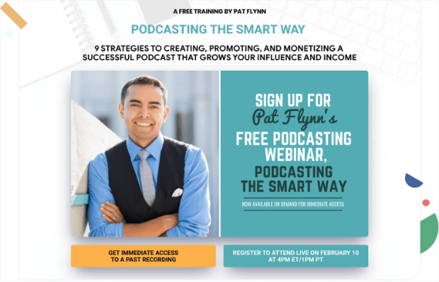
Pat Flynn teaches people how to manage and monetize their podcast. He offers a webinar as a way to bring in new clients.
What We Like:
- Uses a personal photo to boost credibility
- The design is clean and well-organized
- Gives multiple CTAs to give users the options to see past recordings of the webinar
What We’d Improve: The heading of this landing page could be improved to make it more clear that this is a webinar about podcasting (and not a podcast page itself).
7) Clients on Demand

Clients on Demand is a high-ticket sales course designed to help businesses or entrepreneurs sell training courses in the $3,000 – $10,000 range. They use webinars as one of their main strategies for attracting new leads.
What We Like:
- Simple layout
- Clear and large CTA
- Countdown timer and header work to build a sense of urgency
What We’d Improve: A video teaser would really help this landing page hook visitors.
8) Lyft
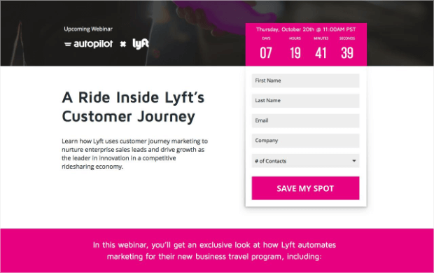
One of the ways that Lyft recruits new drivers is through an educational webinar. It’s how they teach prospects about the benefits of driving for their company and how they grow their community of employees.
What We Like:
- Countdown timer builds urgency
- Email capture form is at the forefront
- Title and headline make it clear what the webinar will be about
What We’d Improve: Other than a small video teaser, this is an excellent example of how you can format your landing page.
9) Amy Porterfield

Amy Porterfield is an online marketing coach. She helps small businesses and entrepreneurs connect with their target audience. Webinars are one of the ways that she promotes her training courses.
What We Like:
- She uses a personal photo to boost credibility
- Title is clear and to the point
- CTA stands out and is well-positioned on the page
What We’d Improve: Overall, this is an excellent landing page that would be great for consultants or solopreneurs to use.
And that’s it! These have been 9 webinar landing page examples that you can use for inspiration.
We hope you enjoyed this tutorial. If you did, then you should definitely check out the following resources:
- Webinar Marketing 101: How to Sell Anything With Webinars
- 8 Webinar Tools to Boost Attendance and Sales
- 12 Ideas for How to Market Your Online Course
These articles will have everything you need to drive more revenue for your business with high-converting webinars.





Add a Comment