Is your holiday marketing getting a little stale? Never fear! We’ve got some great holiday marketing design examples you can use to inspire your own marketing campaigns.
Your holiday marketing design can make a big difference in whether your holiday sales sink or soar. But sometimes creating the perfect design is harder than catching Santa sneaking down the chimney.

Here’s some inspiration from the “merriest and brightest” holiday campaigns we’ve found to turn your holiday marketing from Grinch to gold!
Holiday Marketing Design Examples
We’re including images, social media, email, video ad examples, and holiday optin designs. We’ve included a table of contents so you can skip to the specific type of holiday marketing design you’re interested in.
- Image Holiday Marketing Design Examples
- Social Media Holiday Ads
- Email Marketing Holiday Examples
- Video Ads
- Holiday Optin Designs
Single Image Holiday Marketing Design Examples
In this section, we showcase holiday marketing designs that are meant for landing pages, print ads, or anywhere you can use a single image.
1. The Art of Shaving
Why We Love It:
For starters, the design is elegant, which is not something you’d expect from a shaving company. The ribbon creates a visually appealing design that brings to mind Santa’s beard with its shape. Plus, the product is front and center.
2. Dollar Shave Club
Why We Love It:
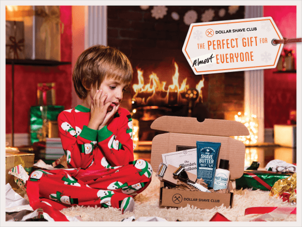
Who knew that shaving companies were so great at marketing?
Dollar Shave Club sticks to their brand personality with a series of holiday marketing designs like the one above. Notice the little joke on the gift-tag: “The perfect gift for almost everyone.” And, despite the humor throughout the image, Dollar Shave Club still manages to feature their product.
Pro Tip:They use a technique called “directing the eye” to get viewers to look at their product. Learn more about this and other lead generation and conversion optimizing tips in our monster lead generation article!
3. IKEA
Why We Love It:
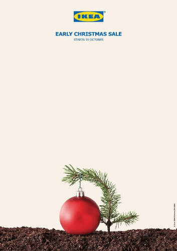
The simplistic design that IKEA uses here is entirely in line with their brand. Since this is an early Christmas sale, using a tiny sprig of evergreen instead of the typical giant tree shows that they’re a fun company.
4. FedEx
Why We Love It:
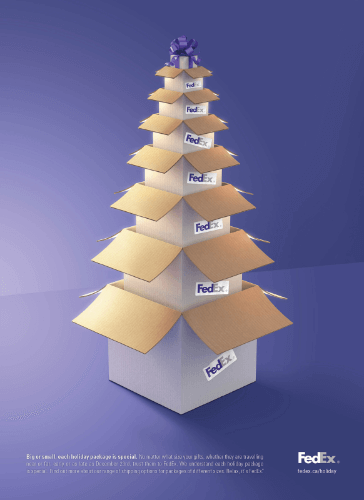
If you think there’s no way to feature your product naturally in a holiday marketing design, just take a look at how FedEx does it. Sometimes you need to think outside the box (pun intended) to find just the right way to show off your goods.
5. HotelTonight
Why We Love It:
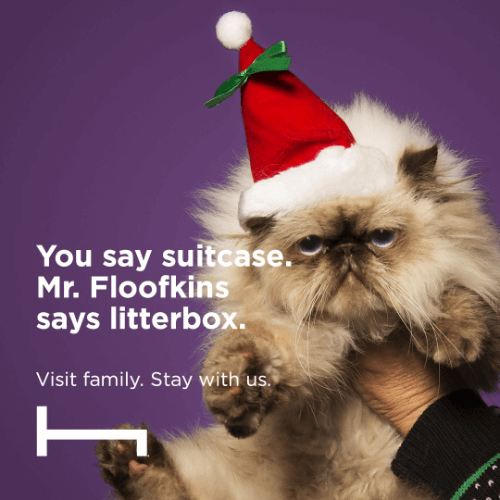
HotelTonight’s “visit, don’t stay” campaign series is inspired. It plays on the emotions we all feel when faced with going home for the holidays. You know, those “I love you, but moved away for a reason” feelings?
6. KitKat
Why We Love It:
KitKat uses the ultimate Santa symbol (his beard) in an unexpected way. The image grabs attention, while the subtle “have a break” reminds viewers of KitKat’s jingle… and probably gets it stuck in their heads for days.
7. Macy’s
Why We Love It:
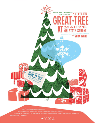
This holiday marketing design is fun and reminds us of a Christmas card. That makes it just about the perfect invitation to visit the annual Great Tree.
8. McDonald’s
Why We Love It:
McDonald’s uses one of their products in a unique way, capturing the attention of viewers. Since this is McDonald’s, there’s only a subtle logo placement needed. However, lesser-known brands could easily use a design like this and add their logo or company name without losing the feeling of the design.
9. Papyrus
Why We Love It:
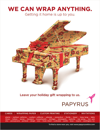
Papyrus highlights two great things here that are sure to bring visitors to their brick-and-mortar stores:
- They’re the place to go for gorgeous wrapping paper.
- They’re offering gift-wrapping services at their stores.
10. Starbucks
Why We Love It:
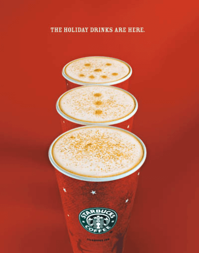
Starbucks is brilliant at marketing. This design shows off their holiday drinks in a delightfully fun and unexpected way.
Social Media Holiday Ads
Social media is an often overlooked piece of marketing strategy. That’s unfortunate since it’s such a great way to engage with potential customers. Here are some great social media holiday designs.
11. Absolut
Why We Love It:
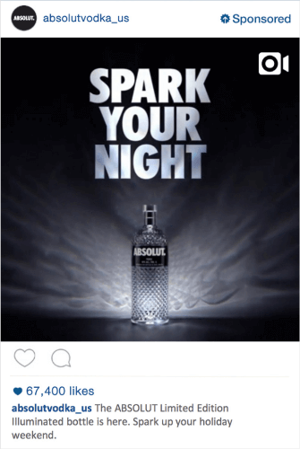
Absolut has product placement down. Their ads always prominently feature a gorgeous bottle, displayed creatively.
12. Cadbury
Why We Love It:
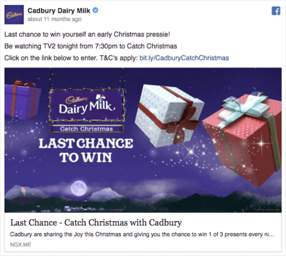
This holiday marketing design from Cadbury is magical. It’s got fairy dust and presents flying around… you don’t get much more magical than that. While they aren’t showing off their product, their logo is prominently displayed in a way that fits in with the rest of the imagery. Plus, Christmas lights!
13. Dell
Why We Love It:
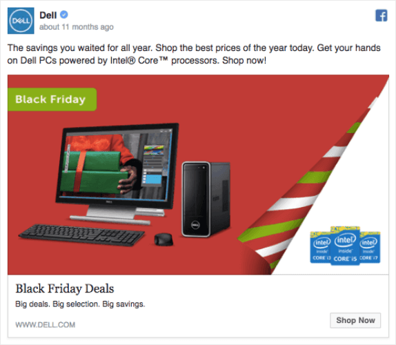
This Facebook ad from Dell is simple and lovely, right down to the copy: “Big deals. Big selection. Big savings.” The folded-over edge of the background makes it feel like you’re seeing the inside of a gift, and you got a computer!
14. Glade
Why We Love It:
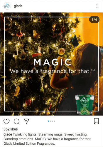
Glade’s image in this Instagram ad is pretty basic: cute child standing at a Christmas tree. However, the copy is brilliant. It invokes all of the feelings and tastes of the season and uses FOMO (in the form of urgency) to inspire action.
15. Lululemon
Why We Love It:
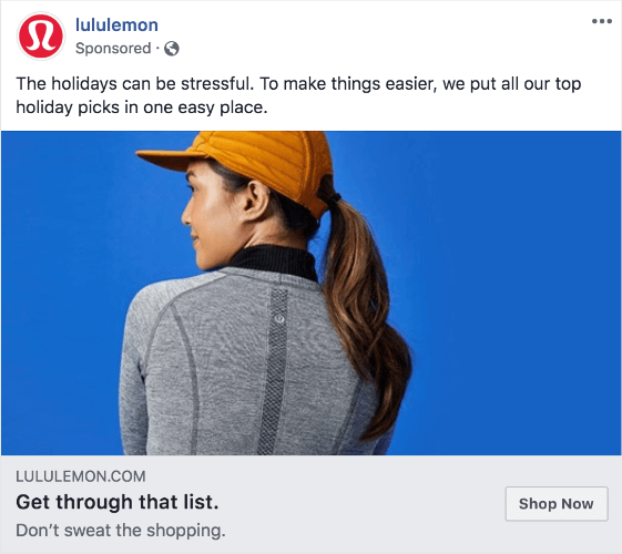
Lululemon forgoes the feel-good imagery and copy for productivity. They know their target audience is the “get things done” crowd.
Related ContentHow to Create a Concrete Buyer Persona (with Templates & Examples)
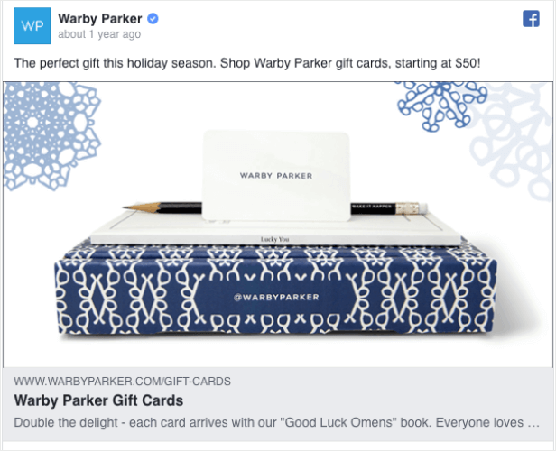
16. Warby Parker
Why We Love It:
Warby Parker uses a simple, holiday-neutral winter design for this Facebook ad. Plus, they’re increasing the value for the customer by including a gift with purchase.
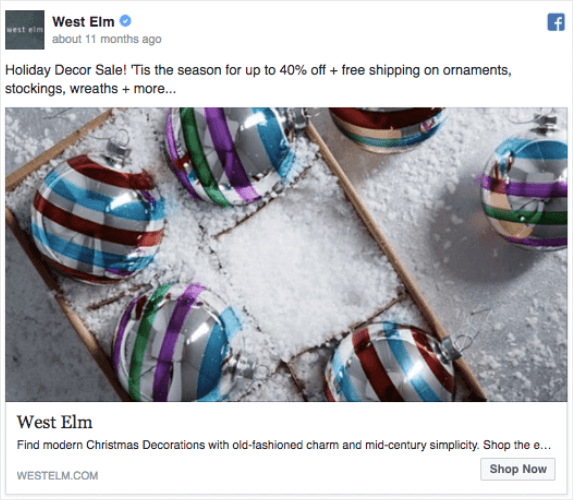
17. West Elm
Why We Love It:
This holiday marketing design showcases West Elm’s products and announces their big holiday sale. Plus, the copy stirs feelings of longing for simpler times, implying that you can find them at West Elm.
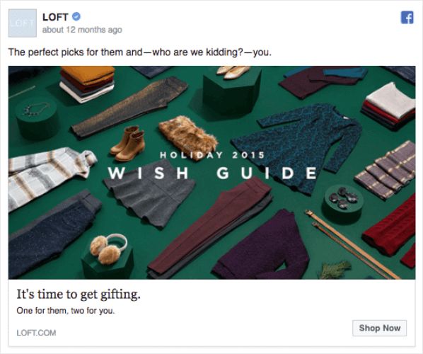
18. Loft
Why We Love It:
We love the imagery in this Facebook ad from Loft. They showcase their products against a Christmas green backdrop from a slightly overhead angle, giving the image tons of interest. The copy is also fun… who wants to shop for everyone else without getting a little something for yourself, right?
Email Marketing Holiday Examples
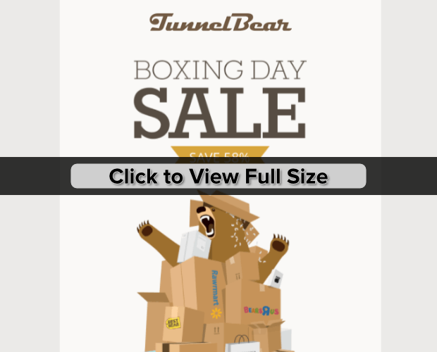
19. TunnelBear
Why We Love It:
This holiday email from TunnelBear pokes fun at the concept of Boxing Day, but in the best way. Yes, having the adorable bear breaking out of the boxes is a great touch, but this is something that could easily be adapted using your own mascot, logo, or products.
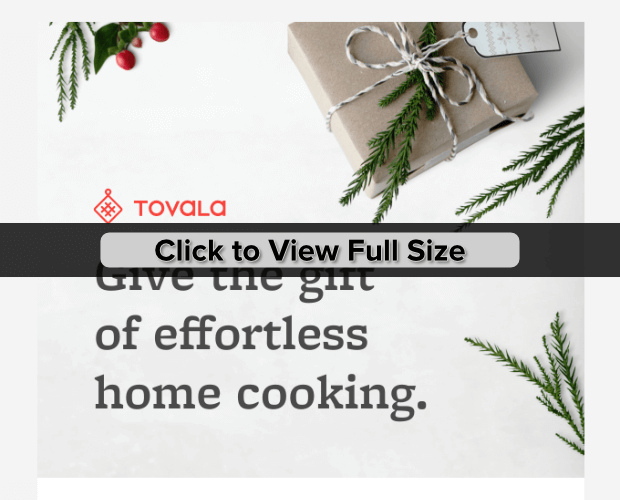
20. Tovala
Why We Love It:
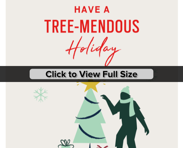
Tovala hits us on an emotional level, offering something “effortless” in the midst of the hustle and bustle of a busy holiday season. Plus, the design is simple and beautiful.
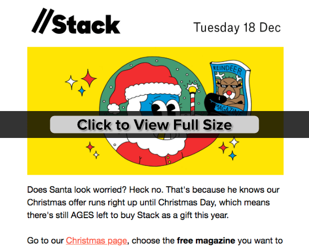
21. Stack
Why We Love It:
In this holiday email, Stack stays true to its brand with both images and copy. The email copy provides a lot of great information without being boring.
22. Rifle Paper Co.
Why We Love It:
If you don’t work in the fitness industry, you may overlook the opportunities offered by new year marketing. This email by Rifle Paper Co. shows off a large, celebratory image and minimal copy, focusing on the 15% discount offer.
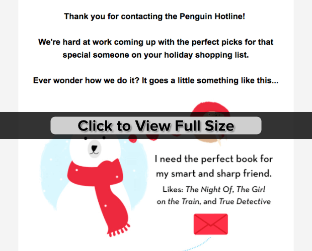
23. Penguin Random House
Why We Love It:
Penguin Random House uses a storyboard to show readers how they can help them find the perfect gift. The email design is painfully cute, with images of real books added to the cartoon images to show off their products.
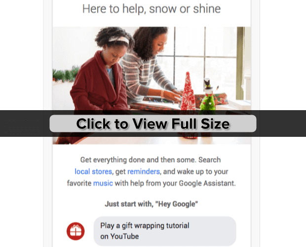
24. Google Home
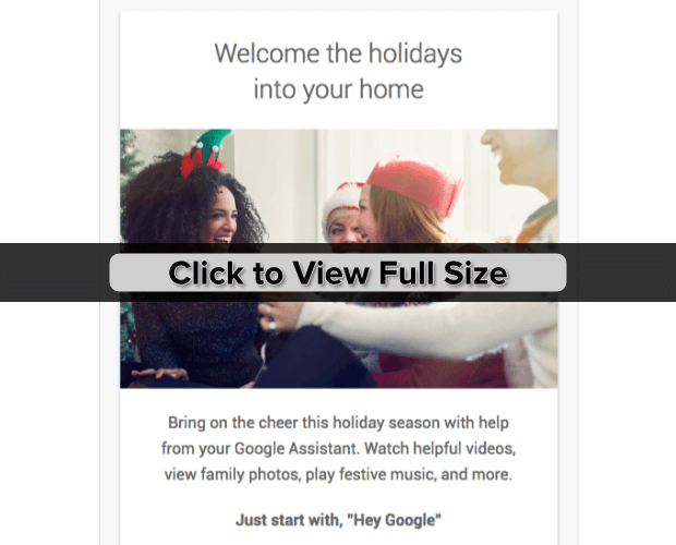
Why We Love It:
Google Home wants to do everything for you this holiday season. The email is long but doesn’t try to sell you something until it’s told you all about how the products can make your life so much easier. And, who doesn’t want life to be easier during the holidays?
25. Google Home (yes, again).
Why We Love It:
Once again, Google Home sends a really long email. This email, though, doesn’t try selling anything until the very end. The bulk of the email is spent showing you how much fun it is to have Google Home in your life.
26. Fossil
Why We Love It:
This holiday marketing design from Fossil has a little of everything. They start with a fun image and pun that are about as on-brand as it gets. Then, they give you early access to the holiday sale, a quick gift guide, and more services you can use.
27. Felix Gray
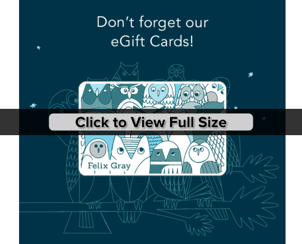
Why We Love It:
Felix Gray ditches the typical holiday marketing designs and goes their own way. Using their copy, though, they appeal to last-minute shoppers and the people who already know what they want.
28. Barebones
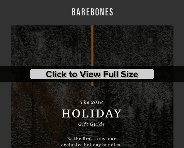
Why We Love It:
Holiday gift guides are a great marketing idea. Barebones is able to highlight their products in a stunning way and don’t have to use much copy to do it. The products basically sell themselves.
If you decide to create your own gift guide, keep your images consistent and make sure they’re high quality.
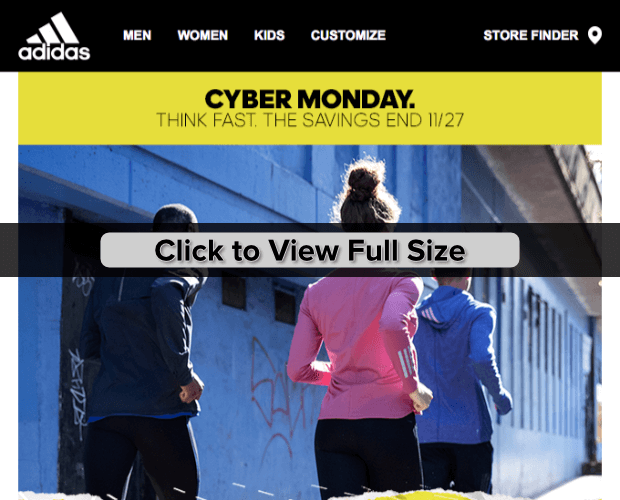
29. Adidas
Why We Love It:
Adidas knows that they don’t need holiday feelings to sell their products. So they don’t use any. The only way you know that this holiday marketing design is related to the holidays is because they tell you it’s a Cyber Monday sale.
Video Ads
We get it. Video ads seem like a lot of work. But they don’t have to be! You can create high-quality video marketing with very little equipment (you may even be able to use just your smartphone!). Here are some of our favorite holiday marketing video ads to inspire you to create your own.
30. Kristen & Dax: Home for the Holidays (Samsung)
Why We Love It:
After watching this video for Samsung, we’re left with the warm fuzzies we get from watching Kristen Bell and Dax Shepard enjoy decorating for the holidays together. And we hardly noticed that we were being advertised to because every piece of technology fit right in with the story.
31. Anna Kendrick: The Waiting Game (Kate Spade)
Why We Love It:
The products and brand placement seamlessly weave into the story.
32. Santa’s Workshop: Air New Zealand Christmas Surprise
Why We Love It:
Air New Zealand’s name is prominently displayed throughout the ad. They even have Santa flying Air New Zealand at the end, which is a nice touch.
While the production value on this video is a bit outside of what small businesses could do, you could easily find a way to have the Santa figure use your products. And, who doesn’t trust Santa?
33. Love Is a Gift
Why We Love It:
Okay, so this one isn’t really an ad for anything. But, we had to include it because it’s just as poignant and beautiful as the other video ads we’ve included. And, guess what? It cost the creator, British filmmaker Phil Beastall, maybe $65 to create.
No matter your budget, you can create share-worthy video ads!
Holiday Optin Designs
We couldn’t write an article about holiday marketing design without sharing the easiest and quickest way to create holiday marketing campaigns! OptinMonster lets you create landing pages, popups, inline campaigns, and so much more. Here are a few of the cool ways you can use OptinMonster to give your holiday marketing a boost.
Templates
These optin campaigns are ready to go without any design customization. Just update the text to match your offer and you’re set.
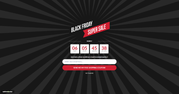
34. Black Friday
Our Black Friday template is available for all campaign types: popup, fullscreen (pictured), slide-in, floating bar, and inline.
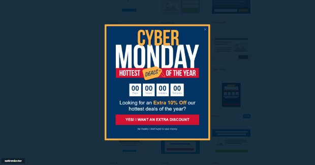
35. Cyber
The Cyber template comes in all campaign types. The popup campaign is feature above.
36. Festive
Festive is another template that’s available in all campaign types. Fullscreen is shown above.
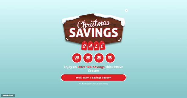
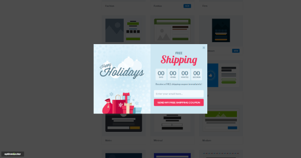
37. Holiday
The Holiday template is available for all campaign types. The popup campaign is shown above.
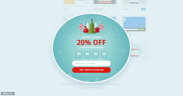
38. Winter
Our Winter template is shown above. It’s available as a popup campaign.
Custom OptinMonster Holiday Marketing Design Examples
In this section, we share a few OptinMonster holiday marketing design examples that we created specifically for this article, just so you can see how versatile OptinMonster is. Plus, we’ve included how long it took to create.
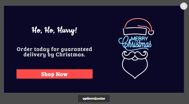
39. Ho, Ho, Hurry
Time to Create: 5 minutes, including the time it took to find the image.
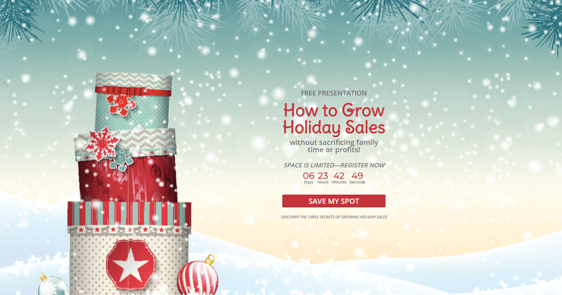
40. Holiday Webinar Notice
Time to Create: 10 minutes.
That’s a wrap! ? If that doesn’t get your creative juices flowing, well, perhaps hand the holiday marketing off to someone else, would you? ?
Want more holiday marketing help? Check out these awesome holiday guides:
- How to Optimize Your Site for a Successful Holiday eCommerce Season
- 13 Excellent Holiday Email Marketing Tips to Use This Year
- How to Create a Social Media Holiday Strategy in 5 Easy Steps
- Last-Minute Holiday Marketing Guide for a Successful eCommerce Season
- Ultimate Guide to Black Friday & Cyber Monday Marketing [+ Calendar!]











Add a Comment