Do you want a website that not only looks great but also drives sales and revenue?
Conversion-focused web design uses time-tested design principles and tricks to persuade users to take action on your site.
By using psychological triggers, minimizing distractions, and optimizing for user experience, you can drive conversions and sales.
In this post, we’re going to cover everything you need to know about conversion-focused web design. Here’s a table of contents to navigate to the section that interests you the most:
- What is Conversion-Focused Web Design
- Why is Conversion-Focused Web Design Important?
- 6 Web Design Tips to Improve Conversions
- Web Design Tools to Optimize Conversions
Ready? Let’s dive right into it!
What is Conversion-Focused Web Design?
A conversion is an action taken by your website visitor in response to your call to action (CTA).
And a call to action could be to make a purchase, sign up or subscribe to a newsletter, watch a video, or any other action you want your visitors to take.
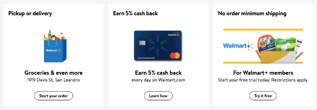
For example, on Walmart’s homepage, you’ll see plenty of calls to action to ‘start your order’, ‘learn how’, and ‘try it free’.
All of these buttons are inviting the user to do something. And when users take the action, it’s counted as a conversion.
When adopting conversion-based web design, calls to action become the core principle. The rest of your web design will focus on getting the user to respond to the call to action. This includes the layout, color, text, and images on your site.
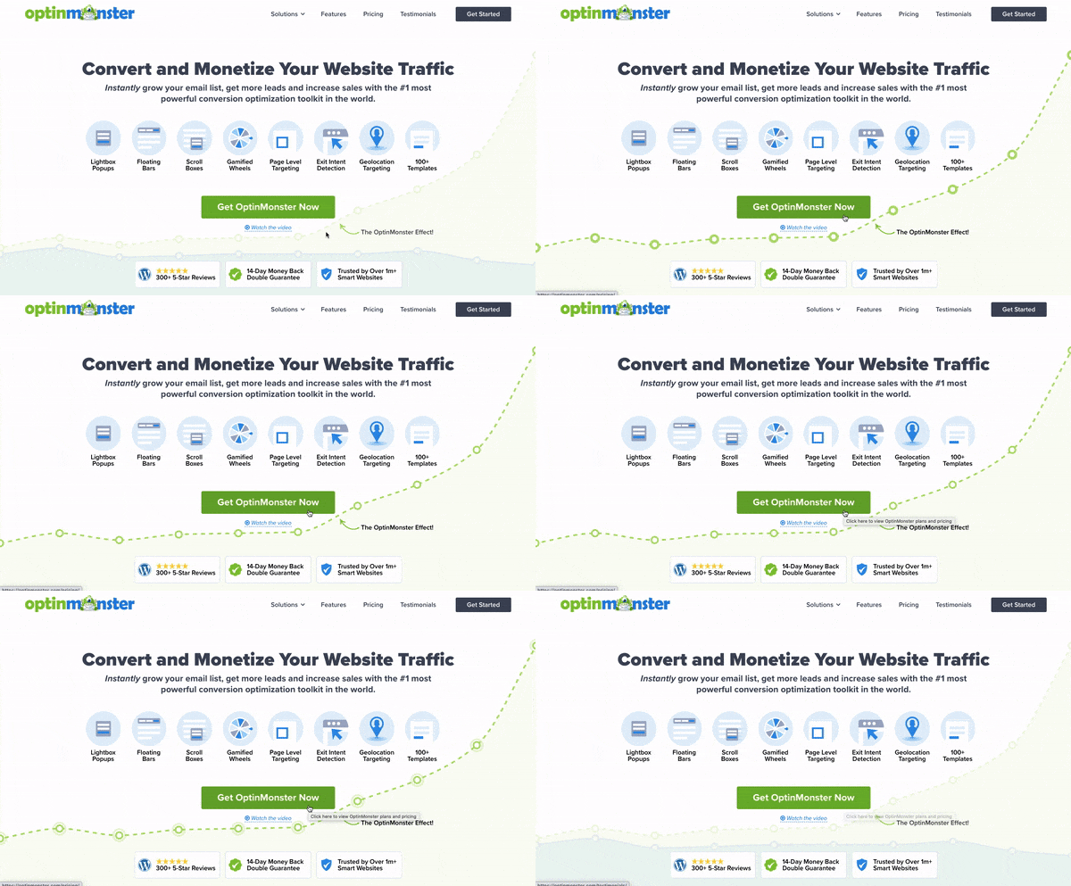
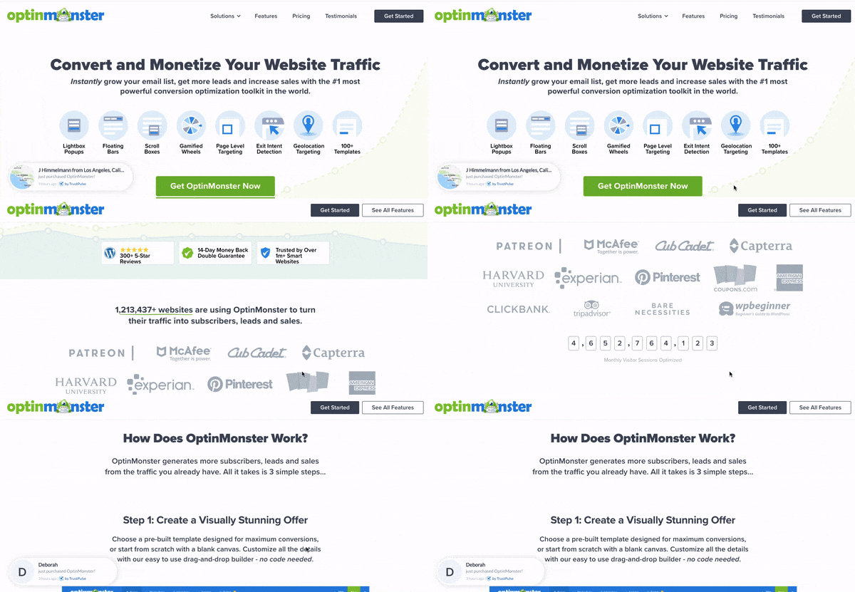
Take a look at our own OptinMonster homepage as an example.
The “OptinMonster effect” is subtly displayed in the background to show how our tool can help you increase conversions. And it’s highlighted as soon as the user hovers over the ‘Get OptinMonster Now’ button.
You’ll also notice a color palette of blues and greens which are the best colors for web design. Green improves readability and stands out, making it a great option for the call to action button.
We also have a simple and clean design with web copy that’s focused on adding value by displaying OptinMonster’s features and benefits.
Want to try OptinMonster 100% risk-free? Just click below to get started:
We’ll reveal more design conversion tips and tricks in this guide. First, let’s take a look at why conversion-focused web design is so important and how it helps your business.
This will help you understand better how to go about designing and updating your website.
Why is Conversion-Focused Web Design Important?
Many website owners set out to create an amazing-looking website. The catch here is that what looks great to you may not look great to someone else.
Everyone has their own tastes and preferences.
Instead, design experts have studied what works with the public in general. The findings rely on irrefutable data and scientific explanations as to why people respond a certain way to a color or a specific layout.
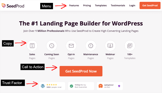
For instance, you’ll notice that most websites follow the same layout:
There’s a navigational menu on the top, followed by the copy, and a call to action right in front. And most websites also include trust badges or anything that’s relevant to their site.
Why do the majority of websites and readymade web design templates follow the same pattern?
It’s to keep things simple for the user.
People are familiar with this layout, and it’s easy for them to find what they’re looking for.
If you try to reinvent the wheel and place everything in different corners of your site, this will lead to customers searching longer to get what they want.
And chances are they’ll leave your site before they do.
So clearly, design matters. When creating or updating your site, it’s so important to consider what every element is designed to do.
Once you adopt a conversion-first approach, you’ll never go back. With the right design, your website will promote itself and get better conversion rates and sales.
Now let’s look at the ways to improve your website conversion, along with some great examples for each tip.
6 Web Design Tips to Improve Conversions
Today, we’re going to focus on 6 core conversion-optimized design tips. These steps will help you set up a website that influences visitors to take action and improve conversions on your site.
For each of these tips, we’ll use examples of SaaS companies you may already know as a way to understand how to implement the same tactics on your own website.
Tip #1: Keep Important Elements Above the Fold
The first way to improve your website conversion is by keeping important elements above the fold.
Above the fold is the content that appears on the screen when a page first loads. “Below the fold” appears after a person starts scrolling.
Of course, the fold will depend on the device you’re using as well as the dimensions of your screen.
This means that the fold is different for a smartphone screen, a laptop screen, and a tablet screen.
Let’s make this concept a bit clearer using Ahrefs as an example.
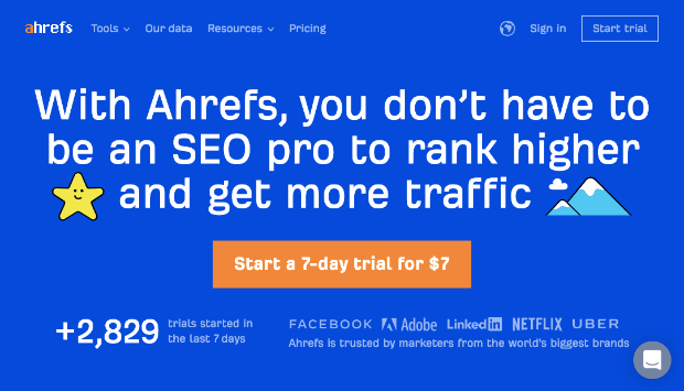
Ahrefs is a tool for SEO and content marketing professionals. Here’s what Ahrefs homepage looks like on desktop:
What you see in the screenshot above is what we call above the fold. You can see that they have a crisp web copy and a call to action, backed by social proof at the bottom.
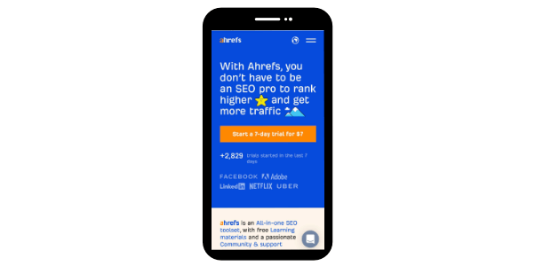
Here’s what Ahrefs looks like on mobile:
Once again, we can see that the important elements on Ahrefs’ homepage are displayed properly without having to scroll down the page.
Always keep in mind that your website’s important elements should be displayed above the fold, and this should happen across all different devices and screen sizes.
What are these “important elements” though?
First, we have the tool’s unique value proposition (UVP).
With this headline, the tool makes it super clear as to what users can expect from Ahrefs.
Then, we have a vibrant call to action button. Notice how the bright colors contrast with each other but are still pleasing to the eye.
The call to action button here explains what the user can gain from Ahrefs (7-day trial) as well as what the user has to provide in return to receive it ($7).
Next, we have a strong social proof signal, as visitors can see the number of users that have joined Ahrefs’ trial in the last 7 days.
This is followed by the logos of companies like Netflix, Facebook, and Adobe, all of which use Ahrefs as part of their marketing strategy.
In this screen, Ahrefs has explained how their tool benefits you, called you to take action, and shown you social proof so you know you can trust them.
Below the fold, Ahrefs explains more about its features and shows you a mockup of its dashboard.
We can see from this example how nicely Ahrefs has managed to include the most important information above the fold.
Tip #2: Be Consistent With Your Messaging
The second way to improve your website conversion through design is by being consistent with your messaging.
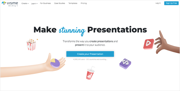
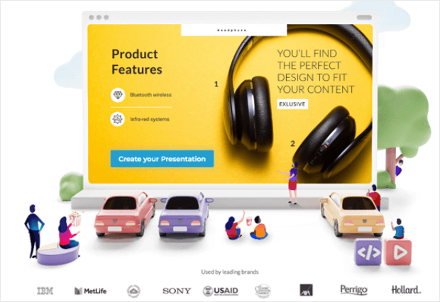
To explain this better, we’ll use the presentation software page on Visme’s website as an example.
The design and copy of the page focuses on “presentation design”.
The headline of the page reads “Make stunning Presentations” and the CTA button reads “Create your Presentation”. Similar keywords are peppered through the text as well.
How does this help in conversions?
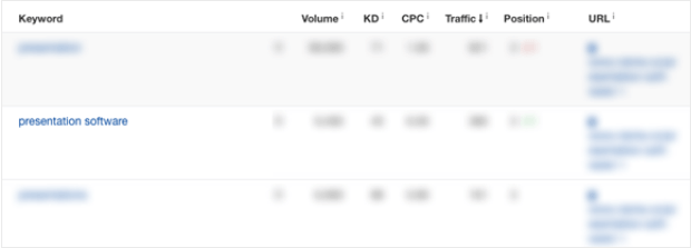
When we analyzed this page, we found that one of the main keywords this page ranks for organically is “presentation software”.
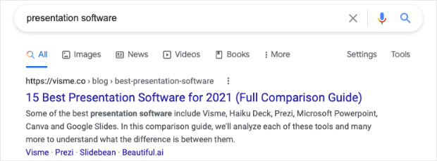
This means that search engines value this page when people search for “presentation software”. In fact, when we did a Google search, it was the first result that showed up.
This automatically drives more traffic to your site. And what’s better is that you’ll get free organic traffic that’s looking for exactly what you have to offer.
That means they’ll be more likely to convert.
Taking this a step further (and scrolling down the page a bit), we can see how various design elements present the value of the product and support the main topic of the page, which is presentation design.
By combining copy and design elements such as those mentioned above, you can be consistent with your messaging and get traffic that’s ready to convert.
Tip #3: Make Use of White Space
While we’d love to make use of every inch of our website, it’s important to leave some breathing room.
In design, this is called white space and it plays a much bigger role than you can imagine.
White space removes distractions and draws focus to what’s important so you can increase conversions. Plus, it improves user experience (UX) by making it easy for the user to know where they’re supposed to look.
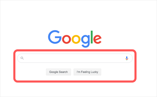
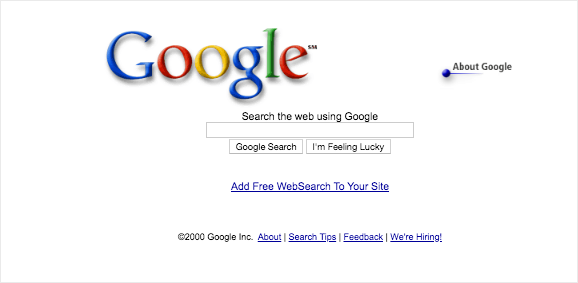
There isn’t a better example here than Google’s own homepage.
Google receives over 40,000 searches per second, and this number is continuously growing as more people use the search engine.
But why is it that with so much interest around its main product (the search engine), Google keeps such a simple design with just one main call to action?
On top of that, taking a look at what the search engine looked like back in 2000, we can see that few things actually changed in terms of the design of the page.
The new design works better because it draws focus on the single most important element on the page:
The search button.
And the white space on the page serves that exact purpose.
By taking a conversion-first approach, Google has kept the page simple to draw attention to what’s most important to its users and its website, which is conducting a search.
White space can be a great way for you to increase conversions by getting users to focus on elements that matter. Just make sure to use it wisely.
Tip #4: Make Your Calls to Action Stand Out
Our next tip in making your website conversion focussed is to highlight your call to action (CTA).
If your CTA is vague and unclear, your visitors won’t pay attention to it. They’ll be less likely to take action.
Instead, you need to get straight to the point and highlight it so that it stands out from the rest of the page. There are 3 ways to do this:
- Choose the right color
- Make your CTA bigger than the rest of your content
- Use effective action words
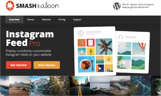
A great example here comes from Smash Balloon’s Instagram Feed page.
There are 2 clear CTAs that prompt the user to Get Started or View Demos.
This CTA is well-balanced meaning it blends in with the page but still stands out from the rest of the elements.
With the right use of color, your attention is automatically drawn to the CTAs.
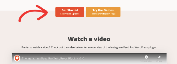
The same CTAs are repeated as you scroll down the page.
With this example, it’s also worth noting that the use of white space makes the CTAs truly stand out.
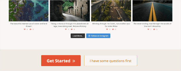
The same logic is followed across different parts of the website, such as the demo page. See how nicely the CTA stands out?
A strong and highlighted CTA can definitely draw the user’s attention and get better results.
Tip #5: Focus on User Experience (UX)
When a user has a pleasant experience on your site, they’re more likely to come back. They may even tell their friends about it!
But user experience plays a much bigger role in web design. Search engines like Google place the most importance on user experience.
There are 4 major factors that play into UX:
1. Staying Relevant
Your content should match what you offer. If your content is all about organic products but you’re selling non-organic products, users will be misled. They won’t find what they’re actually looking for which leads to bad UX.
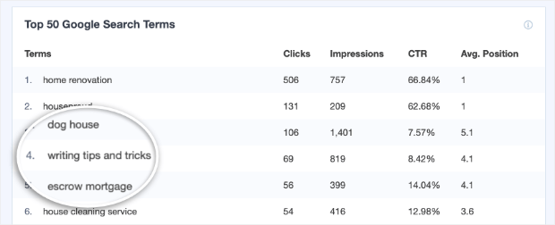
Take this home renovation company for example. They’re ranking for keywords that are irrelevant to what they do:
As we said earlier, make sure your web copy is consistent and that you write content that’s true to what you have to offer.
2. Being Accessible
Your website should be easy to navigate. As we mentioned earlier, it’s important the users be able to find what they’re looking for.
If they have to go on a treasure hunt just to find a ‘sign up’ button, they’ll most likely leave before that happens.
3. Optimizing for Speed
Users expect a website to load in 3 seconds or less. That’s a really short span of time. The key to making this possible is using optimized images and minimalistic design.
Stay clear of loading your website with large media files. Added to that, you can also use a caching plugin like WP Rocket to speed things up instantly.
4. Presenting Offers
How many times have you visited a website that bombarded you with popups?
Too many offers and lead generation campaigns can put off users and they won’t take you up on any of them.
Instead, you should target your offers and display them based on their interests and actions on your site.
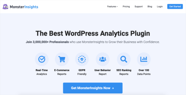
We’ll show you how to do this in the next section. For now, let’s look at an example of a website that has a great user experience: MonsterInsights.
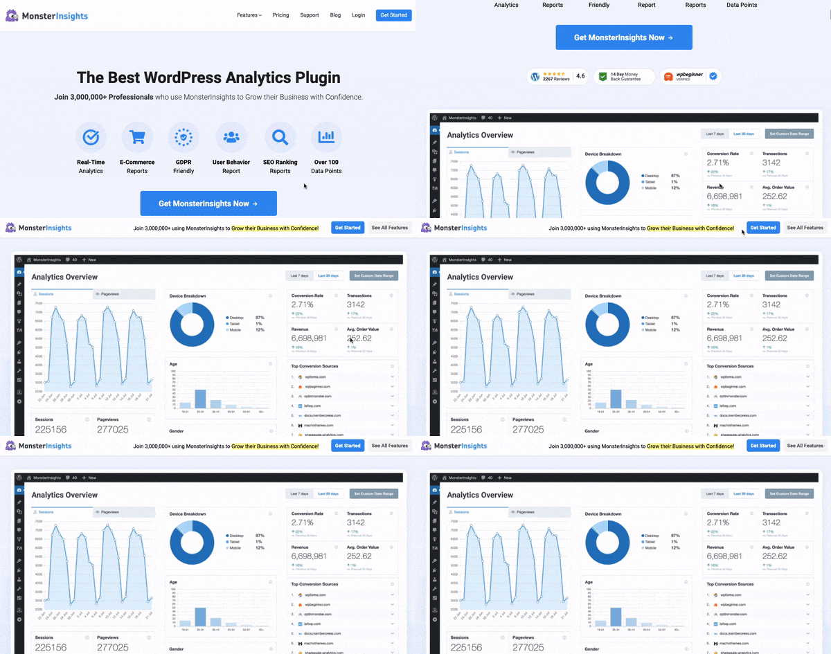
MonsterInsights has a user-friendly layout with CTAs that stand out. Added to that, when you scroll down the page, you’ll see a sample of their dashboard along with all the features they offer.
Now what’s really interesting is that a CTA banner appears at the top of the page only when you scroll below the fold.
It’s non-intrusive and doesn’t disrupt the browser experience. At the same time, it gives users an option to get started at any time as they browse the page.
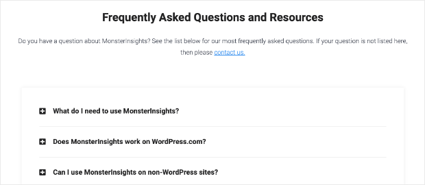
When you scroll further, you’ll find a neat FAQs section. That way, users can easily find answers to common questions.
And finally, MonsterInsights has added links in a creative layout to helpful articles.
The entire page is easy to navigate so users get all the information they need. This helps remove any sales objections and makes users more comfortable with taking action on the site.
When you optimize for user experience, your visitors will be happy, search engines will value your site more, and you’ll drive more revenue!
Tip #6: Use a Minimalistic Design
Using a minimalistic design is one of the main characteristics of conversion-focused web design.
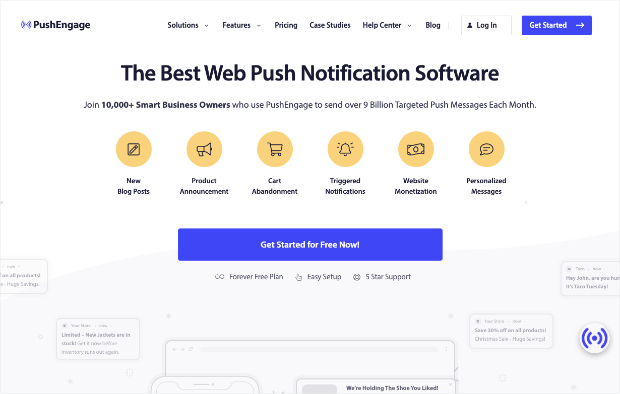
But what does that actually look like? Check out how PushEngage does this.
PushEngage is the best web push notification tool in the market. On their homepage, you can see push notifications subtly added into the background.
It shows the user what the product does but in a minimalistic way.
Their design uses just 2 main colors: yellow and blue to draw attention to the features and the CTA. Aside from that, the page is pretty much black and white.
It’s simple, straightforward, and definitely optimized for conversions.
So there you have it!
You now have a better understanding of conversion-focused web design.
Next, we want to show you a few tools that you can use to optimize your web design.
Web Design Tools to Optimize Conversions
Not too long ago, you needed design skills and coding knowledge to build a decent-looking website.
But all that changed when developers created tools that make website building so much easier so anyone can build a website.
Plus, they’re created and backed by experts that know all about conversion optimization. So not only are they easy to use, but they also give you access to conversion-focused features.
1. SeedProd
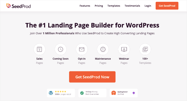
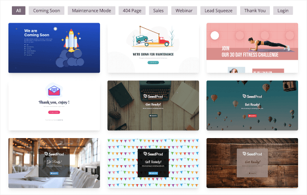
SeedProd is the best landing page builder for WordPress. It comes with 150+ conversion-optimized templates so you can just pick a template and design your page in minutes.
You’ll find templates to build landing, sales, webinars, and even coming soon pages. Added to that, you can customize these templates easily using the drag and drop builder.
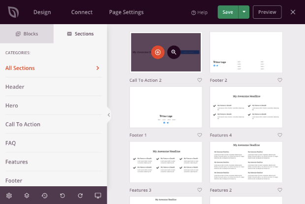
If you don’t want to use a template, it also lets you create pages from scratch. And the best part is it has prebuilt sections. So you can build an optimized page faster and still get a unique design.
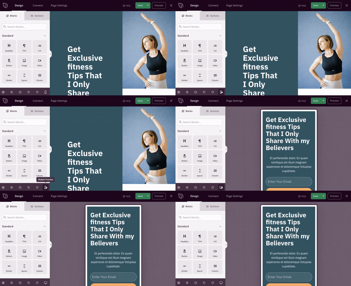
Every SeedProd template is responsive and mobile-friendly which means your site will look good on all devices. You won’t have to manually alter elements.
There’s an option to see a preview of what your page looks like on mobile. You can make changes here if you’d like to suit mobile devices better.
Aside from these features, here’s where SeedProd can really help you optimize for conversions:
- Add optin forms to pages to collect contact info
- Track and manage subscribers
- Premium integrations with popular email marketing services like MailChimp, ActiveCampaign, ConvertKit, and Constant Contact.
- Enable coming soon and maintenance mode at the click of a button
- Built-in spam protection to block bots and fraud conversions
- Bloat-free pages which means they’ll load faster
Learn more about this conversion-optimization page builder in our SeedProd review
SeedProd has a basic version available for free. Its paid plans start at $39.50 per year with a 14-day money-back guarantee.
Build a high-converting website with SeedProd!
2. OptinMonster
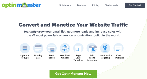
OptinMonster is the best conversion optimization tool on the market.
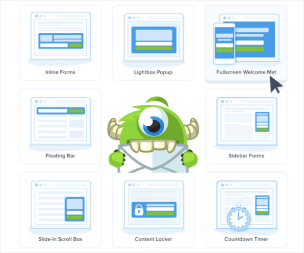
You can use it to design different kinds of marketing campaigns on your site to boost conversions. It lets you build popups, floating bars, slide-ins, inline forms, gamified wheels, and much more.
OptinMonster has powerful audience segmentation and targeting rules making it the #1 conversion tool in the world.
With these rules, you can display campaigns according to what a visitor is doing or interested in. This means they’ll be more likely to respond to your offer.
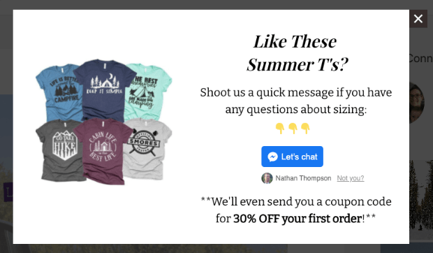
For instance, you can target product pages and offer discounts based on what the shopper is viewing.
This gives them an incentive to buy the product. It’s how Flywheel increased engagement 660% using page level targeting.
It also lets them know that you’re there to help them with sizing. So right away, you’ve removed their worry of buying the wrong size and wasting time and money.
Using this feature, KennedyBlue was able to increase sales 50% by overcoming sales objections with popups.
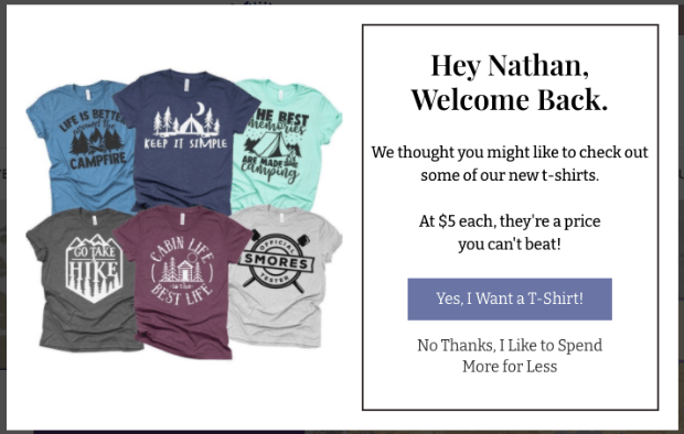
OptinMonster even detects whether a user is a new visitor or a returning one. You can display campaigns according to how they’ve interacted with your site before.
See how just tailoring the copy can make the offer more relevant to the user?
Next, you can use Exit-Intent® to target customers who are leaving your site.
This way, you can show them an offer to give them one last chance to convert before they leave your site.
Exit-Intent® popups are so powerful in recovering abandoning visitors. In fact, ShockByte more than doubled their sales with this Exit-Intent® popup.
OptinMonster has tons of targeting options to maximize your conversions. You can target visitors based on:
- location
- device
- scroll depth
- previous interaction with site
- previous interaction with OptinMonster campaign
- interest in products or pages
You can even get campaigns to open on click. Plus, there are many other targeting rules available to you.
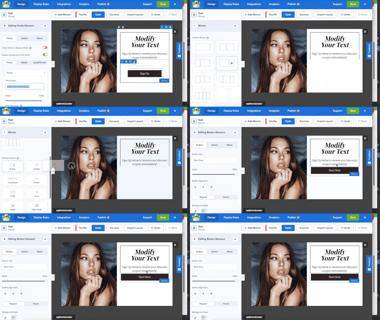
And setting up your optin campaigns couldn’t be easier!
You can choose from 9 different campaign types and 50+ templates, or start building from scratch. It also comes with a drag and drop builder to easily customize your designs.
OptinMonster works with any website and can be used by bloggers, businesses, eCommerce stores – just about anyone on the internet with a website!
Here are the highlights of our OptinMonster tool that are designed to optimize conversions:
- Display countdown timers to add a sense of urgency
- Schedule campaigns to reach visitors at the best time
- Add Yes/No forms
- Use eCommerce specific options
- Integrate with popular email marketing services
- Track performance with data and analytics
- A/B test campaigns to optimize results
With OptinMonster, you can increase page views, recover abandoning visitors, and grow your email list.
When you combine SeedProd with OptinMonster, you’ll have everything you need to get the most conversions from your site. You’ll be able to skyrocket leads, sales, and conversions in no time!
And that brings us to the end of this guide. We hope you found this post helpful!
If you want to take your website conversions a step further, you’ll find these resources interesting:
- 10 Proven Tips to Create Blog Posts That Convert Like Crazy
- 60 A/B Testing Examples to Get You More Conversions
- How to Write a Sales Page That Actually Converts
These posts are packed with more tips, tricks, and detailed steps to boost conversions on your site.
Want to get skyrocket conversions right away? Sign up for your risk-free OptinMonster account today!











Add a Comment