Do you want to improve your email optin forms? Using well-designed optin forms is crucial to successfully grow your email list. In this guide, we’ll share 13 optin design mistakes that even the pros make (and how to design optin forms that convert).
Before we dive into the optin design mistakes and how to avoid them, let’s briefly cover the basics of good optin design.
What is Good Optin Design?
Here at OptinMonster, we are committed to helping you increase your conversions so that you can get more customers for your business. In other words, we aren’t concerned with helping you to design optin forms that look “pretty”, but don’t convert.
That being said, using good design principles is really important for your conversion rates. Contrary to what some marketers say in the defense of “bad” or “ugly” design, high-quality design does tend to convert better.
Why? Derrick Weiss of IMPACT Branding & Design puts it simply:
“Design is just visual communication. When you have something of value, you want people to take action and convert to obtain that value. If your communication is poor, your audience won’t understand the value, and won’t convert.”
Optin design encompasses all of the visual elements which communicate the value of your free offer (or lead magnet), and good optin design communicates that value effectively so that it converts.
OK, now that you understand the purpose and importance of good optin design, let’s take a look at the 13 mistakes that we commonly see even the pros making…
1. Not Using Multiple Optin Types
When it comes to designing your optin form, you’ll first need to decide which optin type to use. There are many different types to choose from, for example:
With all of these different optin types, which one should you choose?
Well, if you are only using one or two optin types, you simply won’t be able to capture as many subscribers as you could be. So the best way is to use a variety of different optin types on your site.
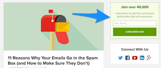
For example, you could have an optin at the top of your sidebar above the fold, where anyone who visits your blog can see it right away.
You can also have an optin form that slides in after someone has scrolled down to read your post.
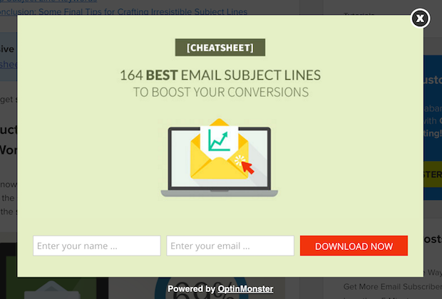
Then, you can have a lightbox that pops up when the user clicks on a link within your blog post.
These examples are just the tip of the iceberg. For a complete guide to the different optin types, check out 14 High Converting Places to Add Email Signup Forms to Build Your List.
2. Ignoring Abandoning Visitors
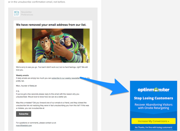
Another common mistake that we see is not displaying your optin form to abandoning visitors with an exit-intent popup.
Unfortunately, over 70% of visitors who abandon your website will never return.
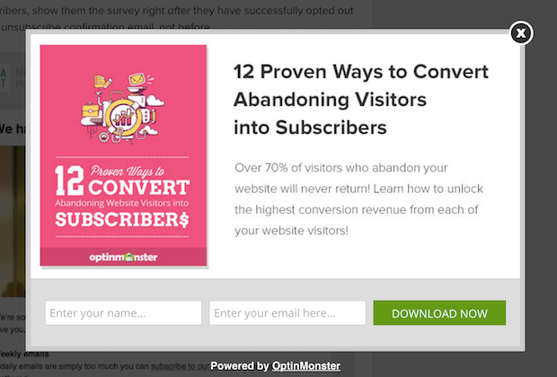
That’s why every website should have an optin form that appears when the user is about to leave the website. Here is what ours looks like.
This is your last chance to ask visitors to opt into your email list before they leave your site forever, so don’t miss this opportunity.
For a complete guide to exit popups, check out 40 Exit Popup Hacks That Will Grow Your Subscribers and Revenue.
3. Not Allowing Users to Initiate
When designing optin forms, most people show the form fields right away. However, it can be even more effective to allow the user to initiate the process before they see the form fields.
That’s because of something known as the Zeigarnik effect: users are far more likely to complete a task once they have initially started the process.
Particularly in combination with content upgrades, you should be using a 2-step optin form design for the highest conversions.
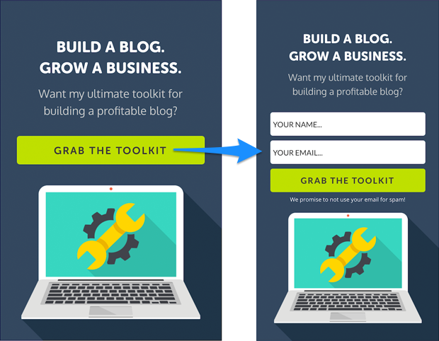
A 2-step optin form leverages the Zeigarnik effect by asking the user whether they are interested in your offer before you give them the ability to enter their email address.
Here’s an example of a 2-step optin form that I built using OptinMonster’s YES/NO buttons feature.
These 2-step optins convert so well that some of our customers are switching most of their optins to 2-step.
4. Not Using Personalization
What information do you have about your website visitors? Are you using that information to personalize your optin forms?
The average website conversion rate is 2%, but you can have a 42% higher conversion rate simply by using personalization.
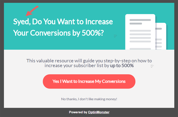
For example, if you know your visitor’s name, why not address them by their name, like this?
If you are an OptinMonster user, you can accomplish this using our Dynamic Text Replacement API.
But addressing your visitors by name is only one way that you can personalize your optins. You can also show specific optins based on:
- The page your user is visiting
- How many pages they have viewed
- The device they are using
- Their geographic location
- Their date and time
- Who referred them to you
- What optins they’ve previously interacted with
- Specific cookies they have in their browser
- A URL specific anchor tag
- …the possibilities go on and on!
To accomplish any of these methods of personalization, you can use OptinMonster’s intuitive Display Rules Engine.
5. Too Many Form Fields
The less information you ask for in your optin form, the better. That’s because the more information you ask for, the less likely someone is to follow through with their subscription.
Unfortunately, even some professional marketers don’t get this right and use too many form fields in their optin.
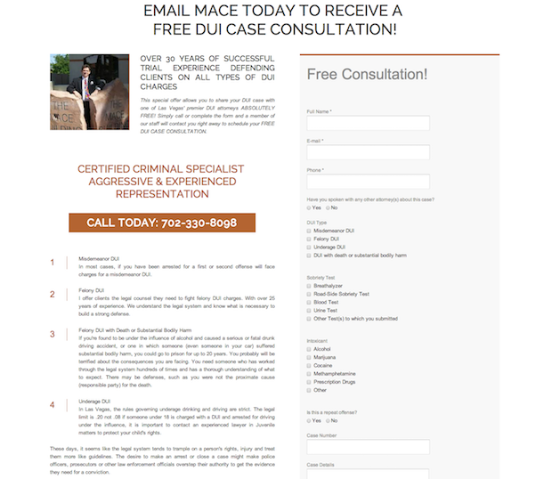
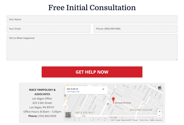
Here’s an example of an optin form with too many form fields (from Mace Yampolsky).
The temptation to ask for a lot of information is particularly great if you are offering a free quote or consultation. However, you can still acquire this information from your leads after they have initially opted in with their email address. This way, you don’t risk losing that lead altogether.
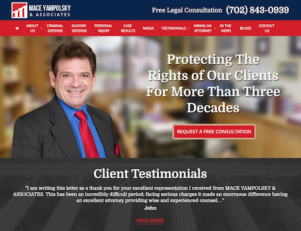
Fortunately, the business owner from the above example had his site re-designed, and his optin form paired down to just a few simple form fields. Here’s what it looks like now.
When you click on the red “Request a Free Consultation” button, you’ll be taken to a page with the actual optin form, as shown below.
See how much less overwhelming this optin is for the user?
6. Weak Call-to-Action (CTA)
“For your CTAs to work, two things need to happen. First, visitors need to be able to spot them without any effort. Second, visitors must instantly know what they do.” –Tim Ash, SiteTuners
What is the call-to-action on your optin form? Is it to “subscribe” or “sign up for updates”? Having one optin form with this type of CTA is alright, but only if you are using it together with other optins that have a stronger offer.
Think about it from your user’s point of view: how excited are they to sign up for your email list just to get updates?
Now, some of your audience will be excited to get updates from you, but they only make up a small percentage of your overall website visitors. To attract the most people to your email list, you’ll need to create an irresistible lead magnet, or “opt-in bribe”. This is something valuable that you give away for free in exchange for the visitor’s email address.
But your offer can’t be just any lead magnet. It needs to be an offer that your ideal customers simply can’t resist. To ensure that is the case, your lead magnet should:
- Solve a real problem – if your lead magnet doesn’t solve a real problem that your customer avatar has, or if it doesn’t give them something they really want, it won’t work at all.
- Promise one quick win – your lead magnet should promise (and deliver) one quick win for your avatar. In other words, it should help them to easily achieve something.
- Be super specific – don’t create a lead magnet about something general. The more specific you are about the benefit of your lead magnet, the better it will convert leads.
- Be quick to digest – PDF checklists tend to convert really well because they are so quick and easy to digest. eBooks or lengthy reports may make your prospects feel overwhelmed.
- Be high value – your lead magnet should have both high perceived value and high actual value.
- Be instantly accessible – your lead magnet will work best if it is something that can be delivered right away. People love instant gratification.
- Demonstrate your expertise or unique value proposition – when someone consumes your lead magnet, it should demonstrate your expertise or your unique value proposition. This helps turn leads into customers down the road.
Once you have created a lead magnet that follows the above criteria, you’ll have a very strong CTA for your optin form.
For more information and tons of great lead magnet ideas, check out 69 Highly Effective Lead Magnet Ideas to Grow Your Email List.
7. Missing an Optimal Image
Most optin forms can benefit from an appropriate image. However, many optin designs fail to use images effectively.
To ensure that your image works with your optin design, it should:
- Be relevant to the offer – if your image is completely unrelated to your offer, there will be a jarring disconnect.
- Trigger the desired emotion – not only should the subject of your image be aligned with your offer, but it should also trigger the desired emotion of your target customer.
- Draw the eye towards the optin – particularly if your image includes a person, their line of sight should be towards the optin form, not away.
- Be high quality – your images should look professional if you want visitors to trust you (just beware of cheesy stock photos that your audience won’t believe).
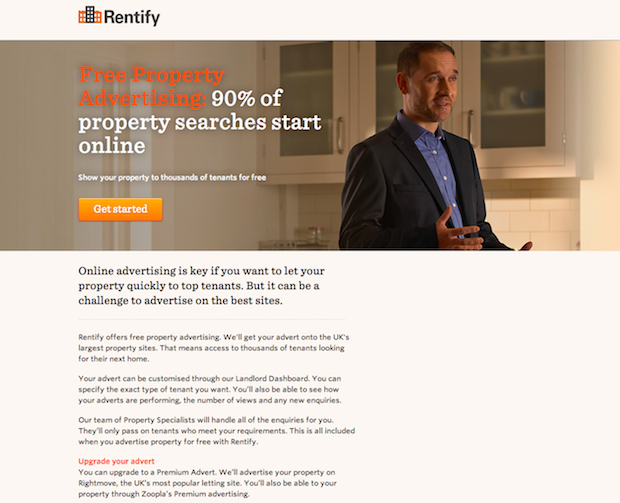
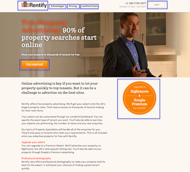
Here’s an example of a less-than-ideal image from Rentify.
As you can see, this image looks professional, however, the man in the image is looking away from the optin form. This would be very easily fixed by simply flipping the image horizontally.
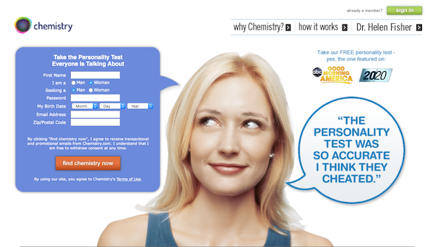
A better example is this image from Chemistry.com.
The line of sight leads right towards the optin form, and the woman has a cheeky expression on her face that evokes an appropriate emotion for a matchmaking business.
8. Too Much Text
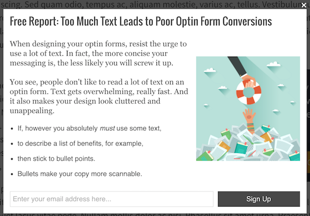
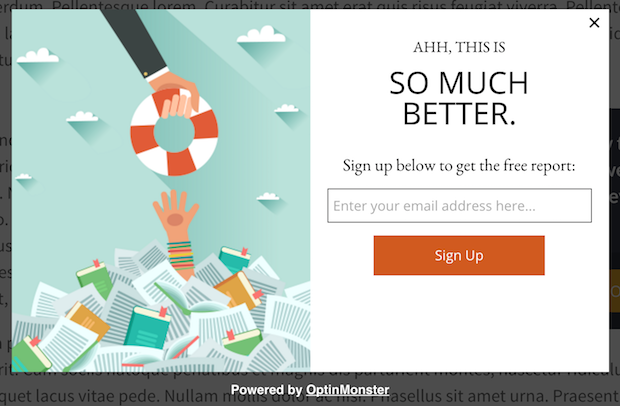
When designing your optin forms, resist the urge to use a lot of text. In fact, the more concise your messaging is, the less likely you will screw it up.
You see, people don’t like to read a lot of text on an optin form. Text gets overwhelming, really fast. It also makes your design look cluttered and unappealing.
If you must use some extra text to describe a list of benefits, for example, then stick to bullet points. Bullets make your copy more scannable.
9. Unclear Copy
When writing your copy, make sure that it is perfectly clear at a glance what the user will get when they opt-in.
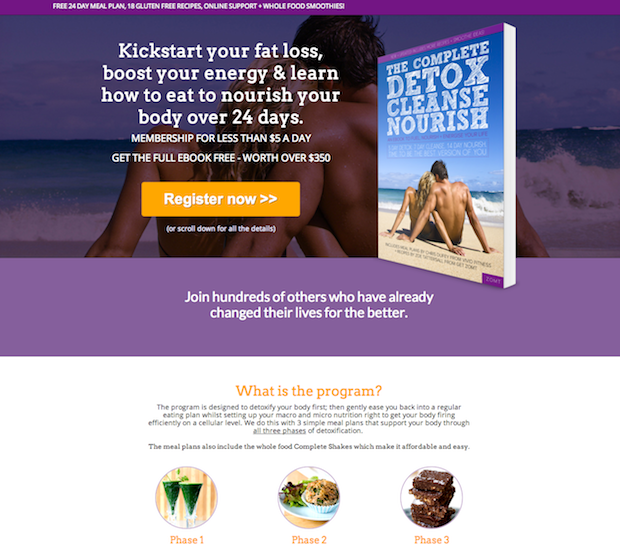
Take a look at this example from Detox Cleanse Nourish.
This optin design doesn’t look bad at all from a visual perspective, but at first glance, it is difficult to determine what the offer is exactly. The image shows a book, but the CTA button says, “Register now”. Why would you have to “register” to receive a book?
Proceeding to the main headline, I am getting even more confused. “Kickstart your fat loss, boost your energy & learn how to eat to nourish your body over 24 days.” While those sound like pretty good benefits, I’m not exactly sure what that is. Is it a challenge of some kind? Why is there still no mention of the book?
Finally, reading the subhead makes it clear that I would be getting access to a membership site, plus the ebook. The trouble is, it took me way too long to figure that out, and most people simply won’t continue to look at your optin unless it is clear to them at a glance.
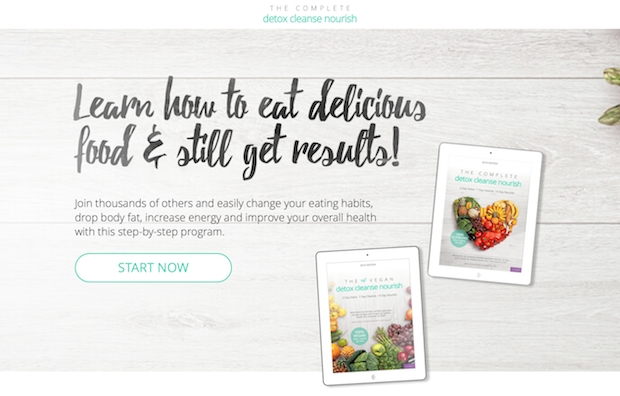
Later, Detox Cleanse Nourish re-designed this optin page and tightened up their copy. Let’s take a look at the current iteration.
As you can see, the copy is much more clear and concise. “Learn how to eat delicious food & still get results” is a much more focused CTA than what they had previously. The button now reads “Start Now”, which sounds a lot more compelling (and less confusing) than “Register now”.
However, to make this optin perfectly clear, I would add a small pre-headline right above the main headline that explains precisely what the offer is (e.g. “Free Membership” or “Free eBook”).
For more tips to write your optin copy, check out our 63-Point Checklist for Creating the Ultimate Optin Form (with Examples).
10. Poor Color Palette
“Strategically placed elements and thoughtful color solutions transform your message from plain text to a visual road map. Thoughtful color selection, in combination with cleverly positioned elements, can tell the user what is interactive, important, and where to go instantly. It helps clarify the user journey and, overall, improve the experience.” –Amir Hamdi, Litmus
When choosing the colors for your optin, there are two basic aspects to take into consideration. If you don’t have these two things, your colors will work against your optin.
- Color Harmony
- Color Contrast
Color Harmony
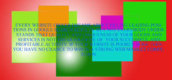
Firstly, if your colors clash with one another, it will make your optin look unappealing and unprofessional.
That’s why it’s important to keep color harmony in mind when creating your color palette.
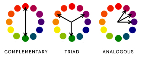
Color harmony is using specific rules the combine colors in a way that appears harmonious and pleasing to the eye. These rules–such as complementary, triad and analogous–use the color wheel to determine which colors will go well together.
Thankfully, there are some great tools that can help you to create beautiful, harmonious color schemes, even if you aren’t a designer. Here are some I recommend:
- Adobe Color CC – helps you design color schemes based on analogous, triad, complementary, monochromatic, compound, and more color rules.
- Coolors – a color scheme generator that allows you to create, save and share perfect palettes in seconds/
- COlOURlovers – color palette inspiration from other designers.
Color Contrast
“Colors have definite actions/moods associated with them, but what most people don’t realize is it’s more about the contrast of the color than the color itself. If you can make the most important aspects of your site, for example, your CTA button, stand out from the page, it gives it more visual importance and makes it more likely to attract clicks.” –Donny Wilson, Vital Design
Along with a harmonious color scheme, effective use of contrast is crucial for high conversions on your call-to-action.
Back to our Rentify example from earlier, note how many elements on the optin page have the same orange color.
Because there is so much orange, the “Get started” button gets lost on the page.
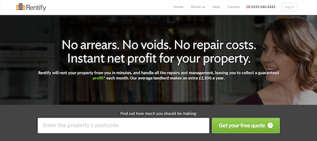
However, if you look at Rentify’s current optin page, you’ll see good use of color contrast.
Now, the CTA button is in a bright green, which contrasts nicely against the dark gray background.
For more info on colors and your calls-to-action, check out Which Color Button Converts Best? Here’s What Research Shows.
11. Bad Typography
“Typography can help you create a visual hierarchy by making the more important elements stand out through size, color, or style.” –Ankit Oberoi, AdPushup
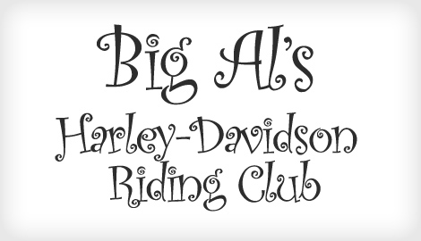
There are thousands of fonts to choose from for your optin, but unfortunately, many of them are bad fonts, and extremely overused.
Here are some fonts that you should avoid using for your optin designs at all costs…
- Brush Script
- Papyrus
- Gill Sans
- Ransom Note
- Trajan
- Comic Sans
- Franklin Gothic
- Bradley Hand
- Courier
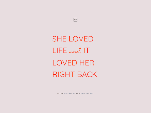
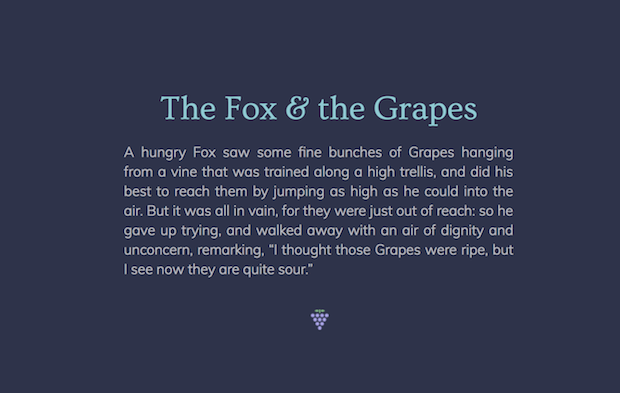
Another common mistake is combining too many different fonts or fonts that don’t pair well together. Instead, look to professional designers for typography inspiration.
100 Days of Fonts has 100 different ideas for font pairing that you can use for your optins.
The Google Web Fonts Typographic Project is another great site for inspiration, using only fonts that are freely available from Google Fonts.
12. Not Optimizing for Mobile
Especially with Google’s new mobile-friendly rules for popups, it is imperative that you optimize your optin forms for mobile devices.
If you are an OptinMonster user, lightbox optins are desktop only by default. You can also create mobile-optimized optin forms, and set them to be displayed in compliance with Google’s rules.
For example, using our Display Rules Engine, you can set your mobile popups to appear only after the second page view, only after the user scrolls down 80% of the page, or only to visitors who are not coming to your page from Google.
For more mobile-friendly optin recommendations, check out our post on The New Google Mobile-Friendly Rules for Popups.
13. Not A/B Testing
Even after following all of the recommendations listed above for designing your optin forms, you should still be making data-driven decisions. Rather than simply guessing that something might work, you should split-test your optin forms to see what really works for your website and your audience.
You can see just how easy it is to create split tests with OptinMonster by watching the video below.
That’s it! We shared 13 optin design mistakes that even the pros make.
Now it’s your turn. Are you making any of these mistakes? If so, follow our recommendations above and you’ll be well on your way to a beautiful optin design that converts more email subscribers and customers.
Need an easy to use optin design builder? How about tons of professionally designed templates that are proven to increase conversions? Get started with OptinMonster today to build high-quality optin forms that convert.












Add a Comment