Do you want to start using multi-step popups to increase conversions, but not sure how to begin?
When many people think of using popups on their website, they tend to think of the traditional kind we see every day:
A one-page optin form where users either provide their email address or they don’t.
But you can quickly increase conversions on your website by creating a multi-step popup that gets users to take action.
In this article, we’re going to show you 2 methods for adding a multi-step popup to increase conversions. We’ll demonstrate this with the use of:
Before we do, though, let’s get clear on what a multi-step popup is and why it’s so effective.
What Is a Multi-Step Popup?
A multi-step popup is a popup campaign that has 2-3 steps involved rather than just one. In a traditional popup campaign, your user lands on a page and sees a message appear on top of the content.
It usually asks them for their email address or to be redirected to a different page.
But a multi-step popup has different phases:
- Get your users to click a link or button
- Have them follow your call to action
- Display a thank you message (depending on your popup’s goal)
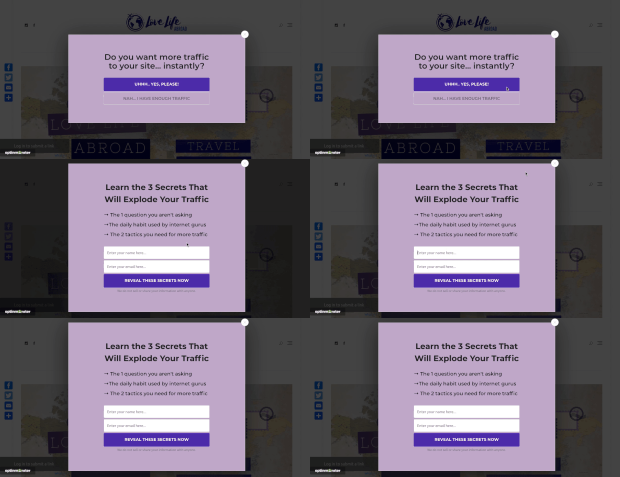
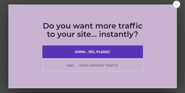
Here’s a demonstration of what a multi-step popup looks like:
The image above is an example of a Yes/No multi-step popup. But keep in mind that it’s only one of the methods we’ll cover today. We’ll also show you how to create a multi-step popup with a clickable MonsterLink™.
Now, you may be wondering, “Isn’t adding a multi-step popup going to hurt my conversions? Isn’t it better to have as few steps as possible?”
Actually, the opposite is true in this case.
There’s a psychological phenomenon known as the Zeigarnik effect, which shows that people are more likely to finish the processes they’ve started.
Smart marketers use multi-step popups to get users to begin the optin process with a single click. This is much less intimidating to your site’s visitors than immediately handing over contact information.
By getting your users to click a link or a button before showing your call to action, you’ll increase your odds of getting more conversions. Plus, multi-step popups are ridiculously easy to make.
Let’s check out how you can build one in under 5 minutes.
How to Create a Multi-Step Popup: 2 Methods
Before we begin, we should note that we understand not everyone learns in the same way. For that reason, check out this video tutorial if you’re more of a visual learner:
In this tutorial, we’ll cover 2 methods for adding multi-step popups to your site to boost conversions:
But before we begin, you’ll need one thing for this tutorial: an OptinMonster account.
OptinMonster helps you get more conversions in less time and with no headaches. Plus, with our 14-day money-back guarantee, you can test out the software with zero risk.
Sign up for OptinMonster today!
Ready? Let’s get started.
Method 1: Using MonsterLinks™
The first method of our multi-step popup will be using a MonsterLink™, which is an embeddable link that you can add to any text or button.
When users click this link, your popup campaign will appear. Thanks to the Zeigarnik effect, users will be more likely to opt into your offer because they already kicked off the process.
Plus, most users who click on your campaign’s link will have a heightened interest in the content.
At any rate, you can expect higher conversions from multi-step popups that use MonsterLinks™. Here’s how you make them:
Step 1: Create Your Popup
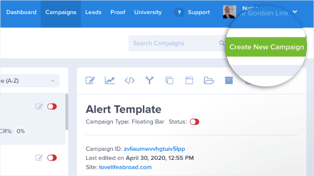
Once you’re in your OptinMonster dashboard, click Create New Campaign in the top right corner:
Now it’s time to select your campaign type. For today’s tutorial, we’ll go with a Popup campaign:
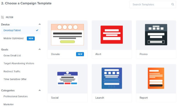
Then you’ll need to select a template:
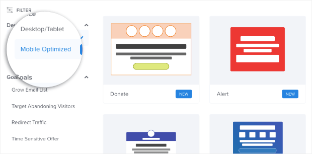
OptinMonster has over 50 pre-built templates that work great across all devices. And if most of your traffic comes from their smartphones, you can even filter your template options to be mobile optimized:
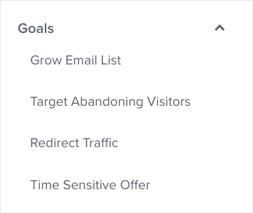
You can also filter your templates depending on the goal of your multi-step popup:
This is an excellent filter because it helps you decide which template would work best for the specific campaign you’re creating.
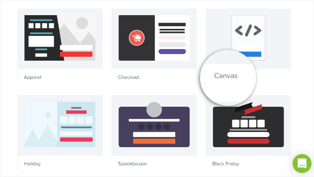
And if you want to create a multi-step popup that’s 100% unique to your brand, you can use our Canvas template:
The canvas template allows you to create a pop up from scratch. And thanks to our drag and drop editor, there are no coding skills required.
Today, we’ll use the Basic template:
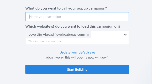
Then, you simply need to name your popup campaign to stay organized, assign it to your website, and click Start Building:
Step 2: Design Your Popup
Now your template will be in the OptinMonster editor. We won’t get into too much detail today about how to design your multi-step popup.
That’s because there are too many customization options to cover in a single post. But if this is your first time building a campaign with OptinMonster, don’t worry.
You can check out this resource on how to create and design your first campaign with OptinMonster.
What you need to know for today’s tutorial is that you can quickly and easily modify any part of your multi-step popup campaign.
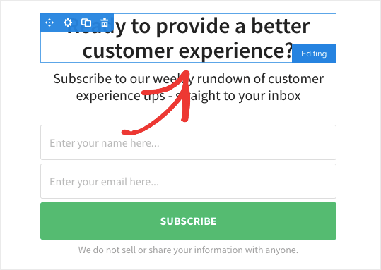
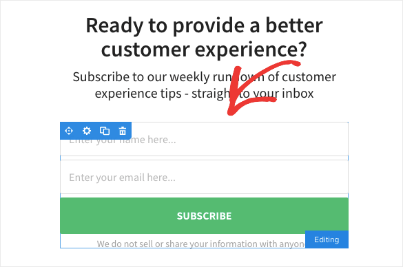
All of our campaigns are broken down into different elements that we call “blocks.” If you want to modify any of these blocks, all you need to do is click on them in your editor.
So, for example, the Basic template has a text block:
And it has an optin block:
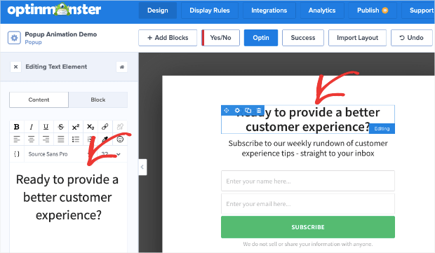
To modify any part of your multi-step popup, just click on the block in your editor. That will pull up the editing tools on the left-hand side:
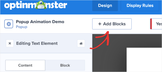
Plus, if you want to add a new block, that’s easy. Just click + Add Block at the top of your editing menu:
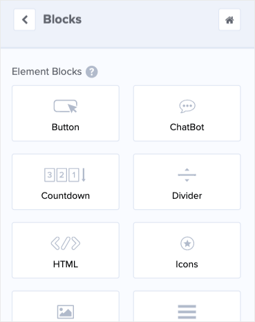
If you scroll down in the left-hand side menu, you’ll see the different block options that you can add to your multi-step popup. These blocks include,
- Button
- ChatBot
- Countdown Timer
- Divider
- Image
- Video
And more.
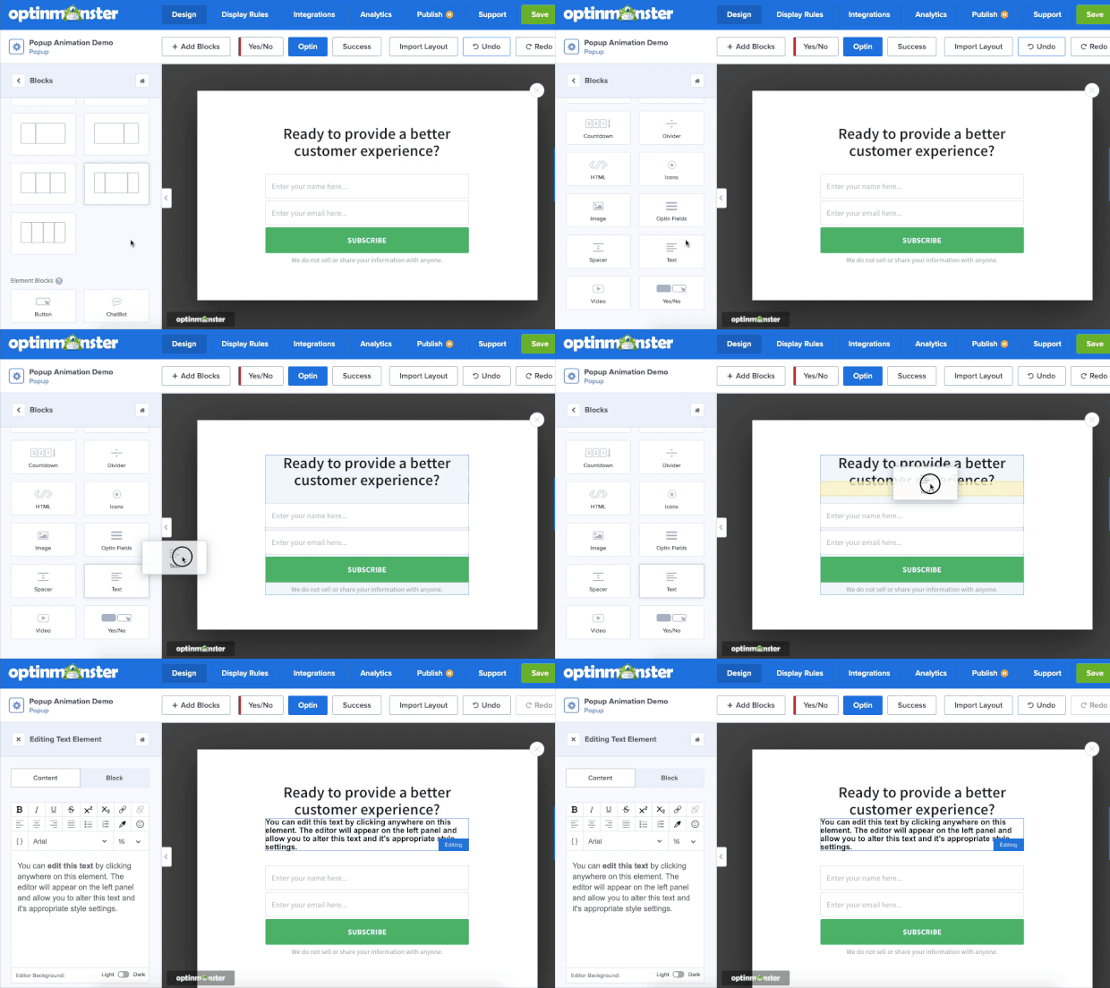
You can add the new block with a drag and a drop:
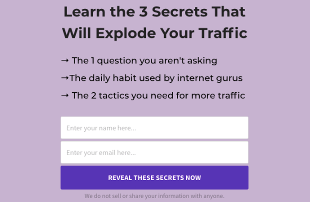
Again, customizing your multi-step popup couldn’t be easier with OptinMonster. Here’s an example of the multi-step popup we built specifically for this tutorial:
And the best part is that this popup took us less than 5 minutes to create.
Keep in mind that you may need to customize your Success page depending on the goal of your campaign:
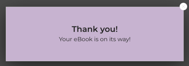
If you’re growing your email list, for example, you’ll want to modify your Success page with a small “Thank You” message after users sign up:
If you’re redirecting users to another URL, then you won’t need to display your Success page at all. You’ll need to decide if you should customize a Success page depending on your goals.
Once you designed a popup campaign that you’re happy with, it’s time to set the display rules.
Step 3: Add Your MonsterLink™
For this first method of creating a multi-step popup campaign, we’re going to be using a MonsterLink™. When a user clicks on your MonsterLink™, your popup will appear.
And as we discussed earlier, people will be more likely to finish opting into your campaign once they’ve started with that first single click.
At the top of your editor, click Display Rules:
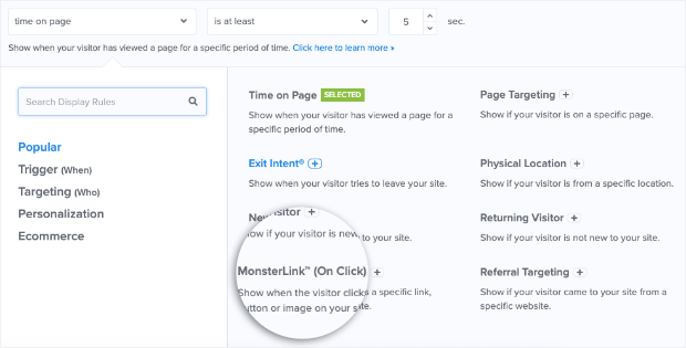
By default, your first display rule will be Time on page, but you’ll see a drop-down menu below with different options for display rules that you can add. Look for MonsterLink™ (On Click):
Now you simply need to click Copy MonsterLink™ Code:
And that’s it! Your MonsterLink™ will be copied to your clipboard, and you can embed it wherever you would like.
Keep in mind that your MonsterLink™ is currently copied in an HTML form. That means it looks like this if you paste it as-is:
<a href=”https://app.monstercampaigns.com/c/zme20kceu2n31jdtbmkb/” target=”_blank”>Click Me!</a>
But many times, you’ll simply want the link and won’t need the HTML embed code. For that, select the URL in between the quotations marks (starting with “https://”) from the HTML code above.
In this example, we would get the following link:
https://app.monstercampaigns.com/c/zme20kceu2n31jdtbmkb/
Now you have an embeddable link that you can put over any anchor text. When a user clicks on this link, your popup campaign will appear.
As a result, you can expect higher conversions for 2 reasons:
- People who click the link will have a higher interest in the content of your popup
- Thanks to the Zeigarnik effect, people will be more likely to finish opting in because they’ve already started the process
All that’s left is to Save and Publish your campaign. 😉
Now let’s take a look at the second method for creating a multi-step campaign.
Method 2: Using a Yes/No Campaign
For this multi-step popup, we’ll create a Yes/No campaign. Rather than asking your visitors to take action right away, a Yes/No campaign presents them with a simple “yes or no” question.
The goal is to get them to click Yes.
Once they do, they’ll be taken to your optin form or redirected to another URL. But just like we saw with the MonsterLink™, they’ll be more likely to opt into your offer because they’ve already started the process.
This is the same method InternetSuccessGids used to grow their email list by 250% and convert 24% of abandoning visitors.
Step 1: Create Your Multi-Step Popup
For this method, creating your multi-step popup works exactly the same way as it did earlier in the tutorial. You need to:
- Create a new campaign from your dashboard
- Select Popup as your campaign type
- Choose one of OptinMonster’s 50+ pre-built templates
- Name your campaign and assign it to your website
- Click Start Building
If you need a refresher, click here to jump back to these steps from earlier in this tutorial.
Step 2: Add Your Yes/No Button
This is where our new multi-step campaign becomes unique. At the top of your editor, click the Yes/No option:
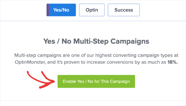
Then click Enable Yes/No for This Campaign:
This will create a new page in your popup campaign:
You’ll notice that your Yes/No popup starts with a basic “yes or no” question.
Remember, the goal is to get users to begin opting into your offer with 1 click. If you can get them to click once, then you’ll increase your odds of getting them to take the action you want them to.
You can modify your campaign in the same way as we saw earlier in this tutorial. If you need a quick reminder on how, you can click here to jump back to the campaign design section in this post.
What you need to know for your Yes/No campaign customization, though, is how to modify your Yes and No buttons.
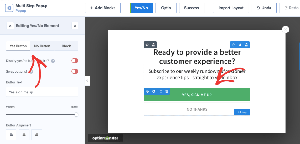
Just like any other block in your popup campaign, just click on the Yes button to pull up the editing tools on the left-hand side:
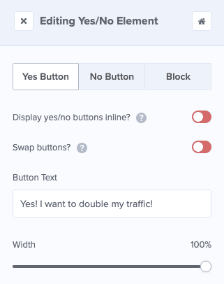
Now you can modify 3 things:
- Yes button
- No button
- Block
Simply click on whichever part of your Yes/No block you would like to edit to bring up the editing tools.
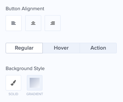
If you scroll down, you’ll also see that you can edit 3 things for both your Yes and your No buttons:
- Regular: The appearance of your button in the campaign (color, text, border, and so on)
- Hover: How your button looks when the users’ cursor hovers over the button (color, text, and so on)
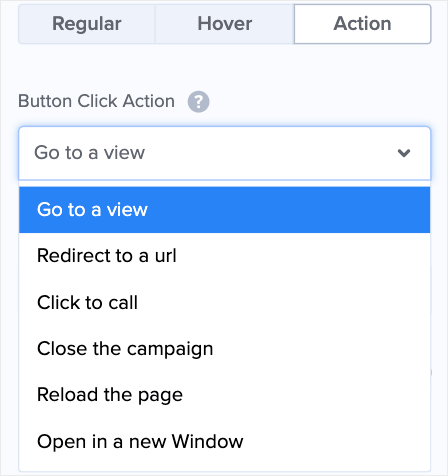
- Action: What happens when the user clicks on the button
That last one is particularly important. Make sure that you’re selecting the right Action for your Yes and No buttons. The drop-down menu gives you many different action options, including:
- Go to a view (the Optin or Success page)
- Redirect to a URL
- Click to call
- Close campaign
And more.
You’ll need to decide which action you want to use for both your Yes and No buttons, depending on the goal of your campaign.
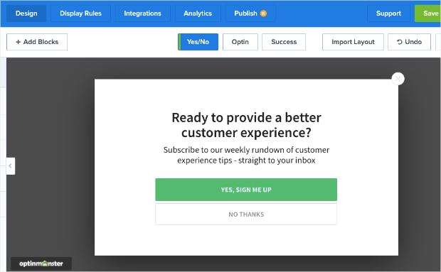
But making these modifications couldn’t be easier. Here’s a look at the Yes/No multi-step popup campaign we built for this tutorial:
And here’s another look of what happens when a user clicks the Yes option and is taken to the optin form:
Again, it took us less than 5 minutes to build, but it will go a long way in boosting conversions.
Step 3: Set Your Display Rules
At the top of your editor, click Display Rules:
By default, your display rules are set for 2 conditions:
- Time on page is at least 5 seconds
- Shows on every page of your site
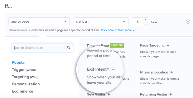
You can easily change these depending on which display rules would work best for your campaign. A popular choice is using our Exit-Intent® technology, which displays your multi-step popup when a user tries to leave your site.
Exit-intent popups are actually how the fitness company Crossrope exploded their email list by over 900%.
To change your display rules, simply click on the condition you want to modify. This will pull up your display options. For this example, we’ll click on Exit-Intent®:
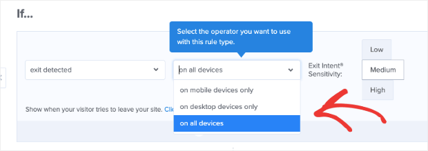
You can then choose which devices you’d like to use your exit-intent rule for:
- Desktop only
- Mobile only
- Both
The great thing is that exit-intent popups used to be limited to desktop devices. But not anymore! You can now build exit-intent popups for mobile traffic, too.
Check out this post on how to create mobile exit-intent popups that convert.
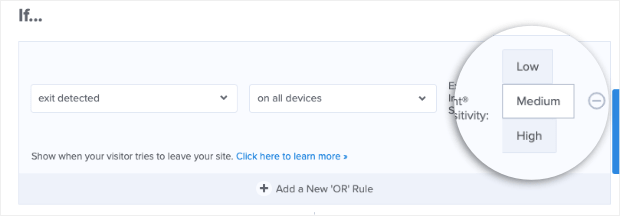
Finally, choose the sensitivity level for your exit-intent campaign (Low, Medium, or High):
Now you have an exit-intent popup to recover visitors who are leaving your website.
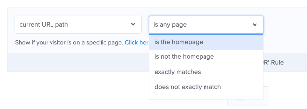
You can also choose which pages you want to show your multi-step popup on. For that, go to your second display rule, which is current URL path:
You can change the settings from is any page to a variety of options, including:
- Just the homepage
- Is not the homepage
- Exactly matches
- Does not exactly match
- Contains
And more.
Then enter the URL for which pages you want to include or exclude. So if we wanted to show the multi-step popup specifically on one page, for example, we’d set the following rule:
That shows current URL path + exactly matches + URL of the page.
It’s that simple.
These are just some of the display rules you can choose for your multi-step popup. With OptinMonster, you can choose exactly where, when, and to whom you want to show your multi-step popup.
That way, you get the most conversions in the least amount of time.
When you’re finished with your display rules, all that’s left is to Save and Publish your new campaign.
And if you’re using either method to create a multi-step popup to grow your email list, you’ll want to integrate OptinMonster with your email service provider.
If you need help, check out this article on how to connect your email service provider with your OptinMonster account.
Once your email list has grown, you may need some help monetizing it. For that, we recommend the following resources:
- Email Marketing Made Simple: A Beginner’s Guide
- How to Run a Successful Email Marketing Campaign (Step by Step)
- 17 Tips for Writing Email Copy That Converts
Those resources will have everything you need to create awesome email campaigns that boost sales!
For more information on OptinMonster, check out this post: How Does OptinMonster Work: 8 Benefits (+ 12 Case Studies).
Ready to get started boosting your conversions? Sign up for OptinMonster today, risk-free with our 14-day money-back guarantee.












Add a Comment