Have you recently changed your business hours? Want to know what’s the best way to inform your customers about it?
One of the best ways to announce the notice to change working hours to your customers is through a popup on your website. This way, they will learn about the change in your business hours before they browse your website.
In this post, I’ll show you how to create a website popup announcing the change in your working hours. I’ll also show you how you can use the popup to improve your email signups.
But before that, let’s first understand why it’s important for you to create this popup.
Why Should You Announce the Change in Operating Hours?
How to Create a ‘Notice to Change Working Hours’ Popup
Why Should You Announce the Change in Operating Hours?
Giving your customers advance notice about the changes in your business hours is important. This helps you set the right expectations and establishes you as a brand that cares about its customers.
If you have a physical store, the last thing you want is for people to stand outside your store waiting for it to open. Or, for customers to contact you online outside of your business hours.
OptinMonster helps you avoid such embarrassing situations with popups that get people’s undivided attention. And for that, I’ll choose the Fullscreen popup campaign.
But why choose Fullscreen popups?
People might ignore other campaign types such as lightbox popups or floating bars since they cover a small area on your site. But it’s very hard for site visitors to ignore Fullscreen popups.
That’s because Fullscreen popups or Welcome Mats occupy the entire webpage, almost like a landing page.
A Fullscreen popup is an ideal choice for you to:
- Present a targeted offer or coupon.
- Showcase new products and services.
- Point visitors to your social media page.
- Let visitors know what to expect from the site.
- Get new subscribers by highlighting your best content.
- Collect email subscribers as part of a pre-launch phase.
Fullscreen mats are also proven to increase conversions by as much as 80%. Next, let’s go over the step-by-step process to create the Fullscreen popup.
How to Create a ‘Notice to Change Working Hours’ Popup
Let’s go through the step-by-step process on how to create a ‘notice to change working hours’ popup.
- Step 1: Create Your Campaign
- Step 2: Design Your Popup Campaign
- Step 3: Turn the Campaign into a Yes/No Optin
- Step 4: Change Your Optin View Copy
- Step 5: Change the Success View Copy
- Step 6: Set Your Display Rules
- Step 7: Set Up your Email Integration
- Step 8: Save and Publish the Campaign
Step 1: Create Your Campaign
First, log in to your OptinMonster account. Once you’re in the campaign dashboard, click Create New Campaign in the upper right corner:

Here, you’ll have to choose your campaign type. I’ll use a Fullscreen campaign because it’s the most suitable campaign for our use case:

Then it’s time to choose a template.
OptinMonster has over 100 ready-to-use templates you can choose from. That means you’re likely to find one that matches your brand’s style.
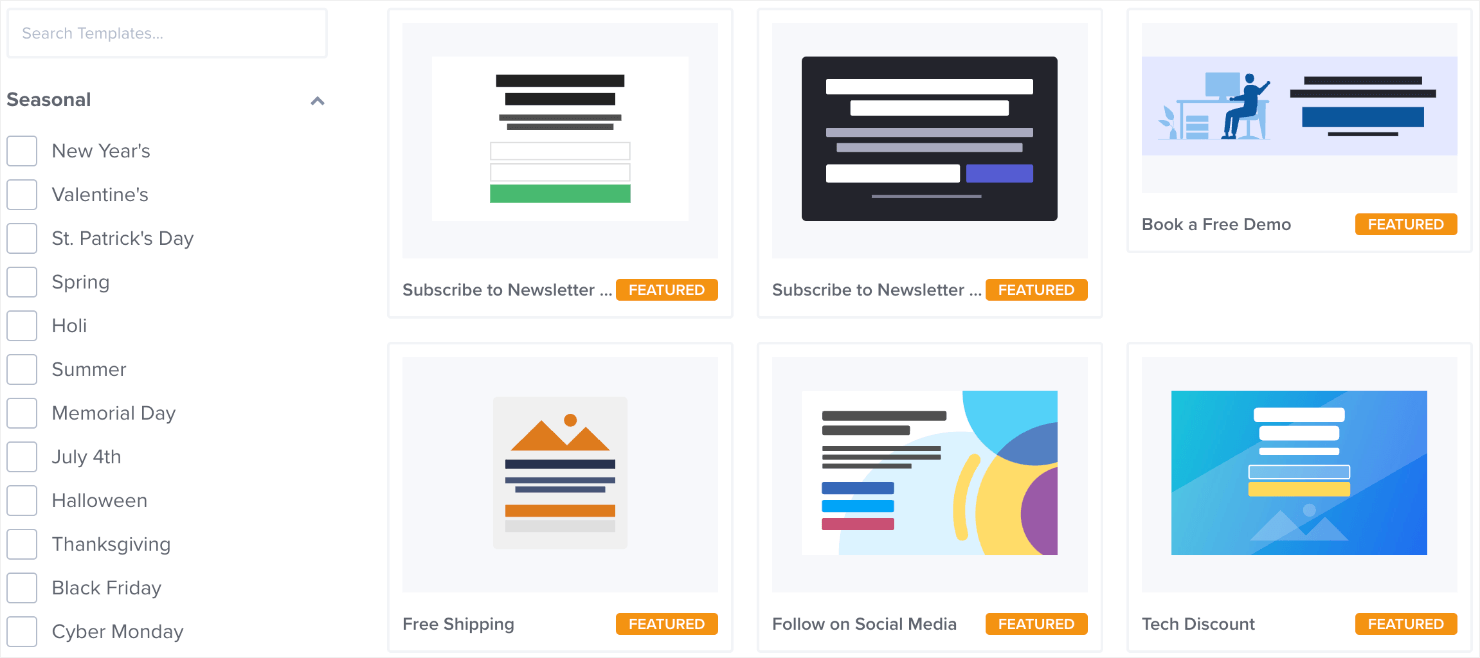
For today’s tutorial, I’ll choose the Free Report Download template:

This is a great template for announcing your business hour schedule changes for 2 reasons:
- It doesn’t include any images or other visual distractions.
- It has a bold background color that grabs people’s attention.
These are good design principles to follow, especially given this campaign’s goals.
Once you’ve selected the template, name your campaign and assign it to a website:
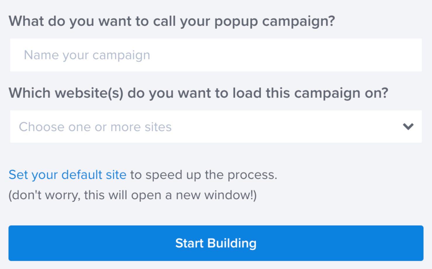
Now, you can edit the appearance of your notice to change the working hours popup in OptinMonster’s campaign editor.
Step 2: Design Your Popup Campaign
This is how the template will look in your campaign editor:
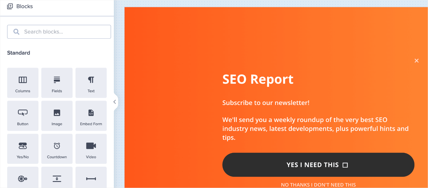
I’ll start by modifying the color. While the bold orange is great for grabbing visitor’s attention, it may not match your brand.
To change this, click anywhere on the background and go to the editing tools that appear on the left-hand side of the editor:
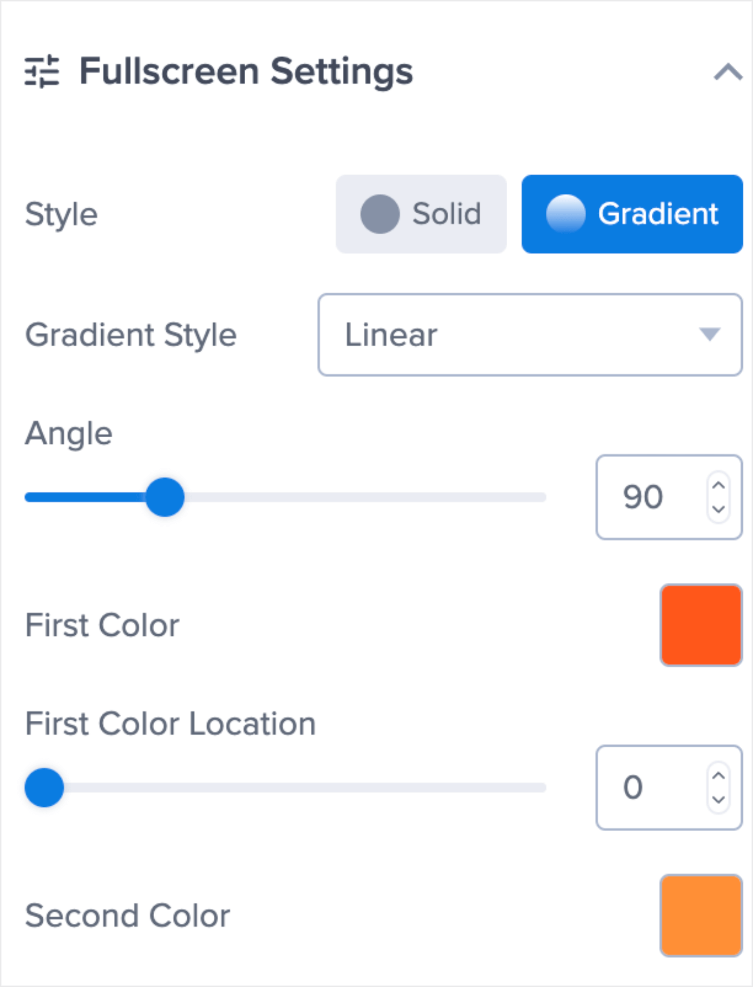
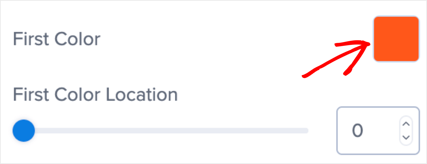
Click on the square icon next to the First Color and select the color you’d like from the color palette:
I’ll go with a dark shade of blue. But as you can see in the image below, the blue color doesn’t quite match the orange color on the right:
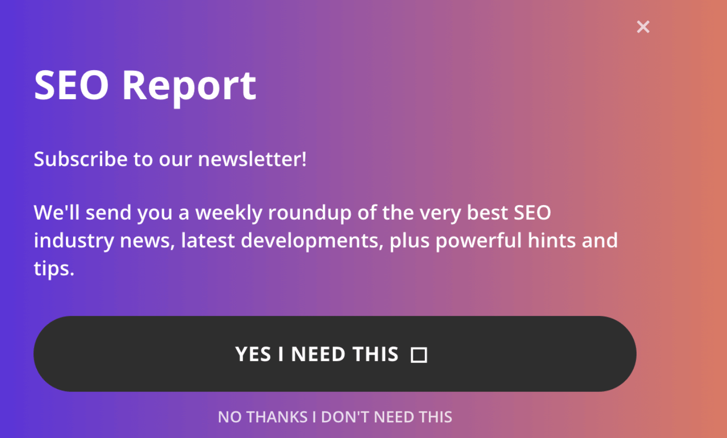
I’ll go ahead and change the second color to make sure the gradient colors in the background complement each other.
To do so, click the square icon next to the Second Color:
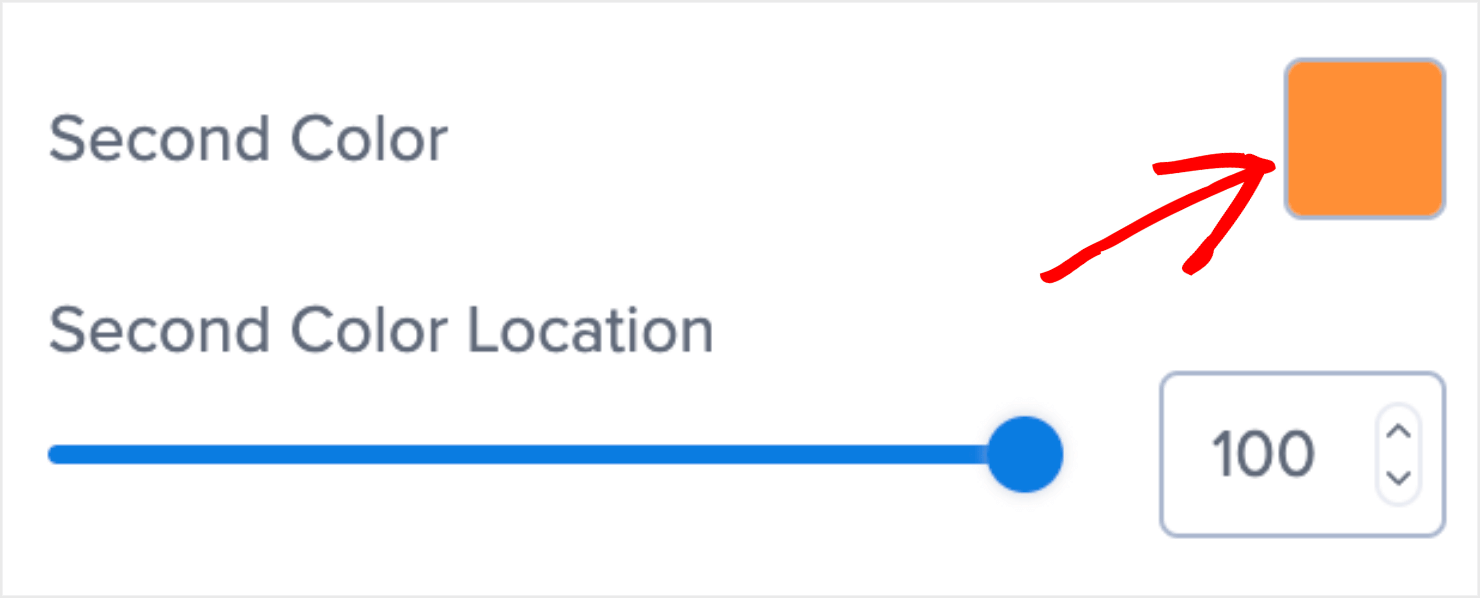
Select a suitable color (I’ll choose a lighter blue shade) from the color palette like you did earlier. You now have a popup with a much better-looking background color:

With this, you’ve customized the popup’s background color.
Now we need to change the text to customize your message. For that, click on the text block in the campaign editor and edit the text directly in the editor:
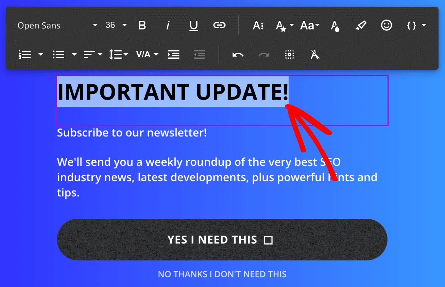
It’s important to make your popup copy and headline attention-grabbing. But since this is a straightforward notice of change in work schedule announcement, I’ll keep the copy simple.
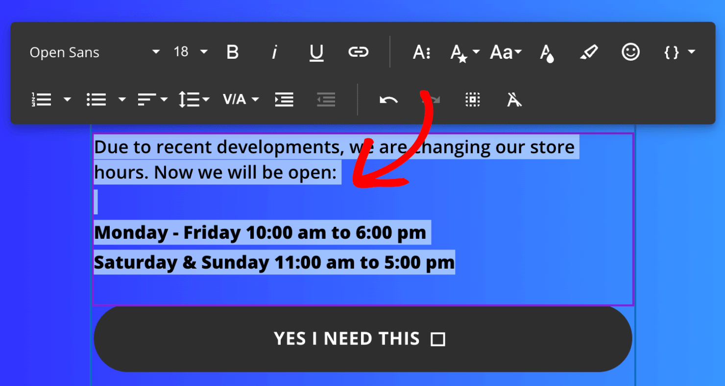
Remember that people don’t read every word you write.
So be sure to make your new shift hours stand out in the popup. I did this by adding enough space between the notice hours and the text that came before it.
I also formatted the new store hours in bold letters.
Next, it’s time to make the popup optimal for email sign-ups.
Step 3: Turn the Campaign into a Yes/No Optin
Like we discussed earlier, we want to use this popup as an optin campaign to grow your email list.
To do so, you need to change your campaign type by enabling the Yes/No feature in the template.
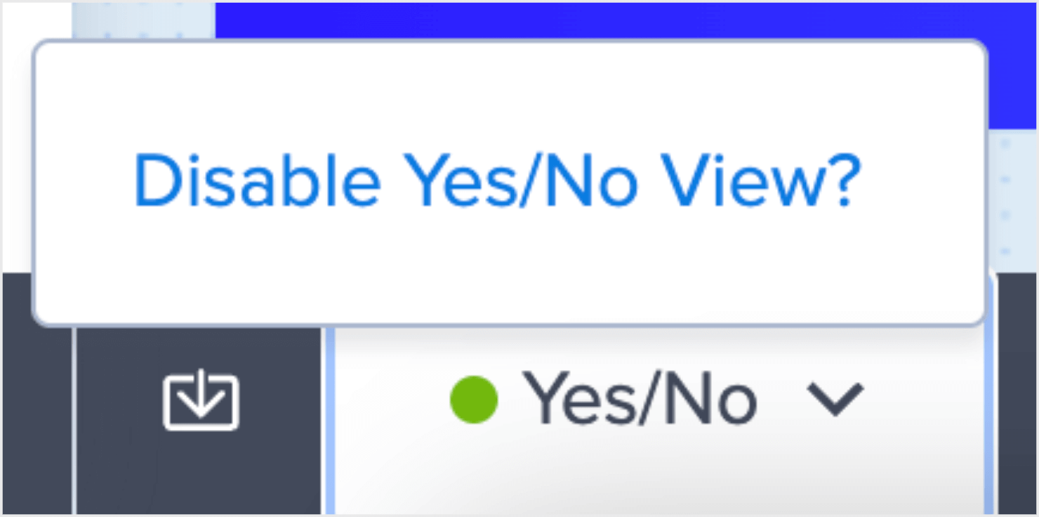
Luckily, you don’t have to do much here. By default, the template that you chose is already a Yes/No campaign. You can validate this by looking at the menu at the bottom of your editor.

As you can see, the Yes/No optin is already enabled in OptinMonster. Therefore, there’s no action needed in this step.
Just as an aside: If you don’t want your campaign to be a Yes/No optin, you can click on the down icon next to the Yes/No option to disable it.
Since the template is already a Yes/No optin, your campaign is ready. All you need to do now is change the form’s button text to match the campaign’s goals.
Click on the Yes button element in your editor. You’ll see the editing tools appear on the left-hand side menu:
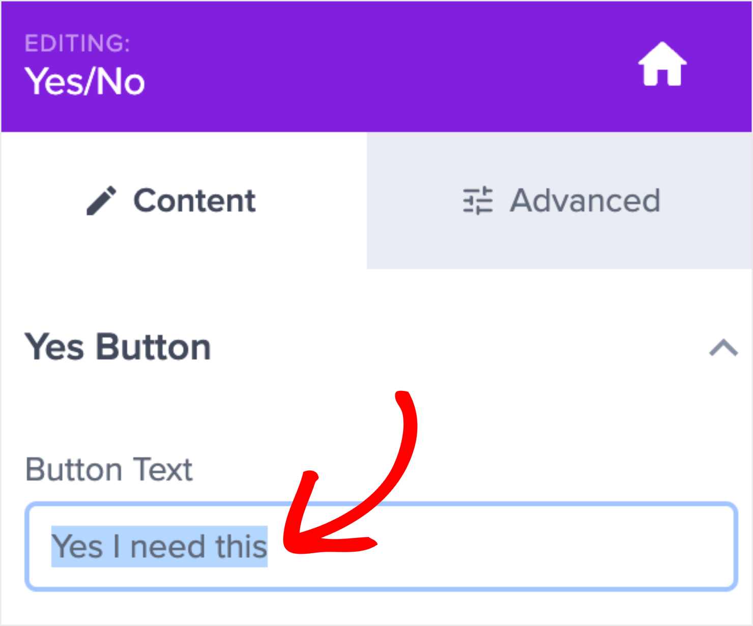
Change the text to your liking. The text you choose is up to you, but try to do something that builds some curiosity.
I edited the text to say, “Wait… how will this change affect me?” to make visitors want to know more.
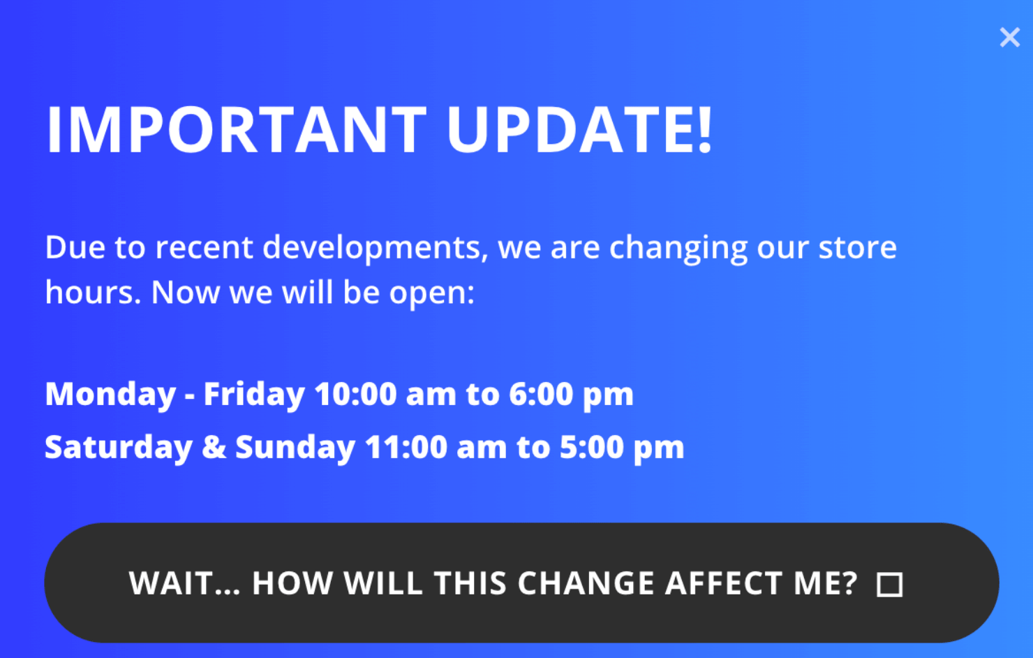
You can also use the left-hand side editor to change the icon or remove it altogether.
Note: The square symbol is actually an arrow icon that will appear once you publish the campaign live.
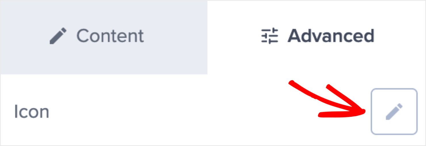
To change or delete the icon, go to the Advanced tab at the top of the menu and click on the pencil symbol next to the Icon option.
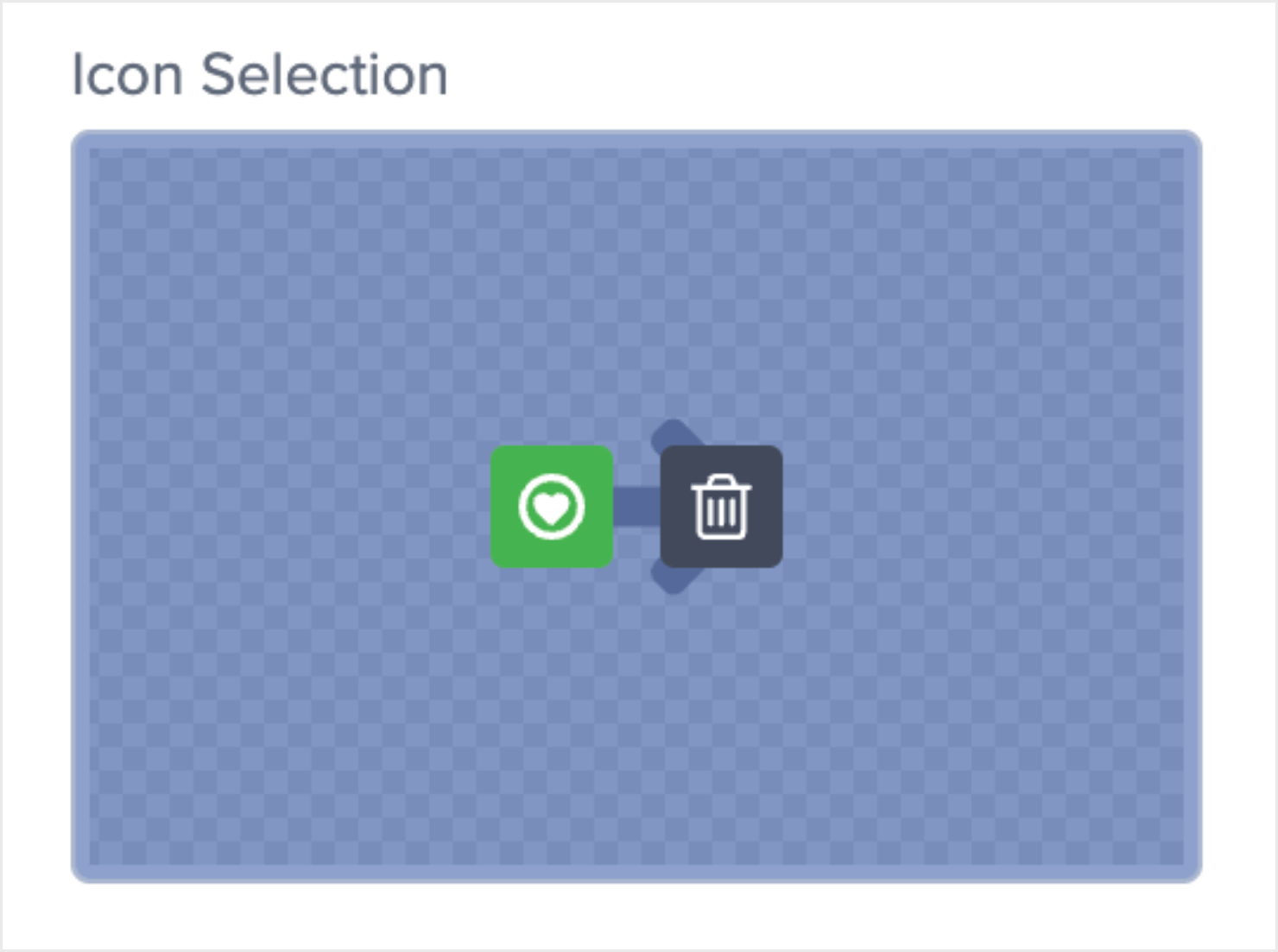
Hover over the Icon Selection. Click on the green heart symbol to choose another icon or click the trash can symbol to delete the existing icon.
Next, you’ll want to change your No button text to something more positive. Click the No button element to change the text in the left-hand side editor.
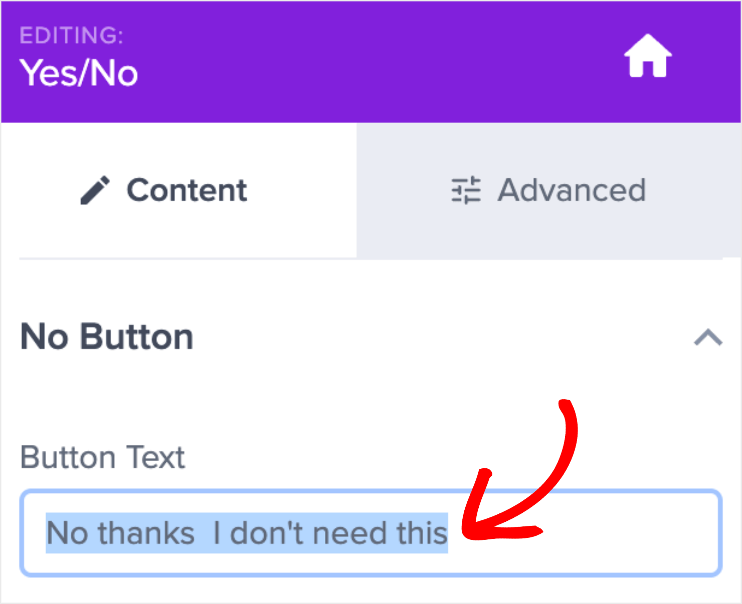
This is what I added in the No button text:
Remember, your site’s visitors aren’t declining anything when they click on the No option.
They are getting information about the new hours of work operations, no matter what. I replaced the default text to something more positive than the default copy.
Ok, now for the real question: What will these buttons do when people click on them? Or, more precisely, what would you want the buttons to do?
For this tutorial, both the buttons’ default settings do exactly what you want them to.
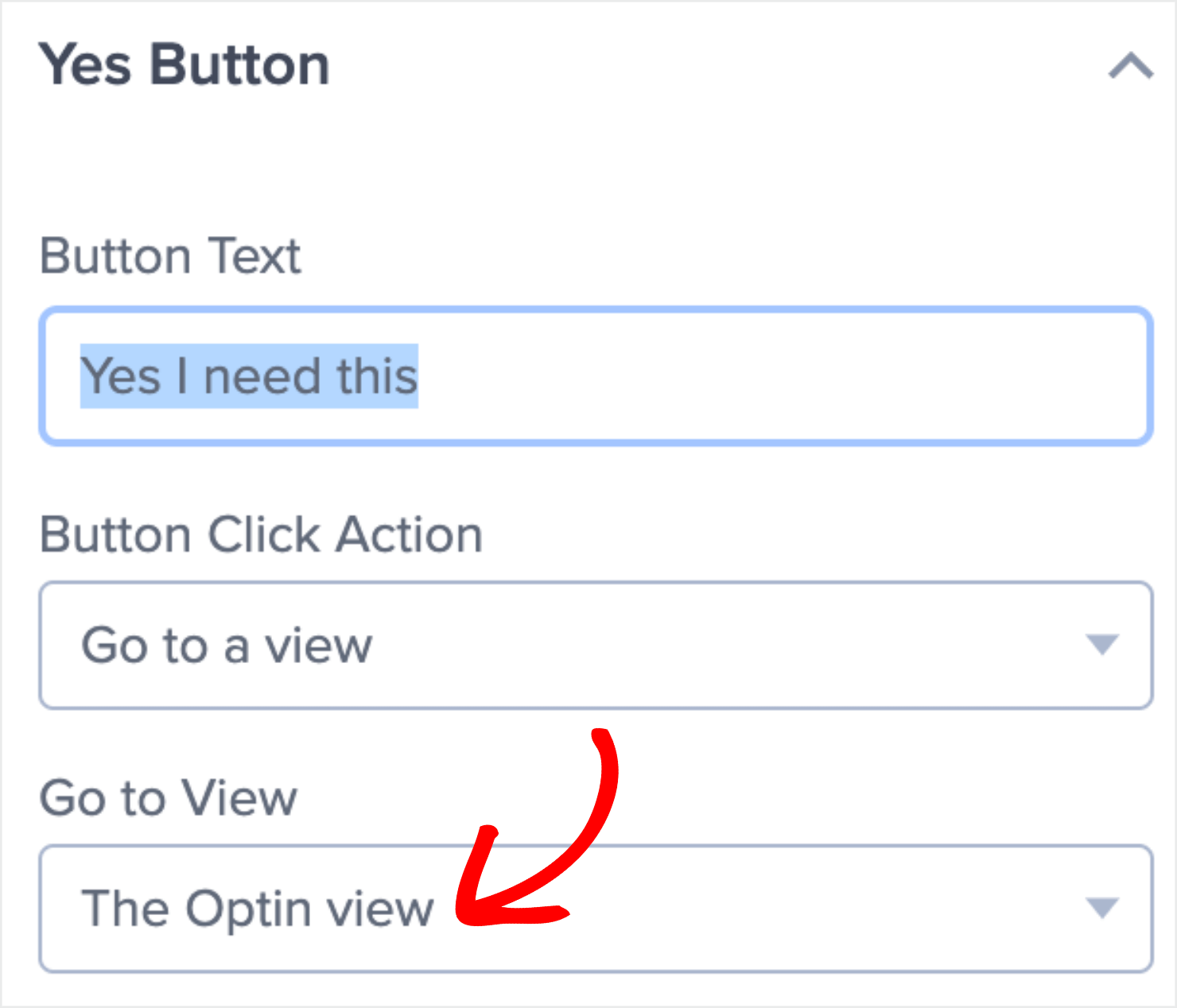
When visitors click Yes, they will be taken to your Optin form.
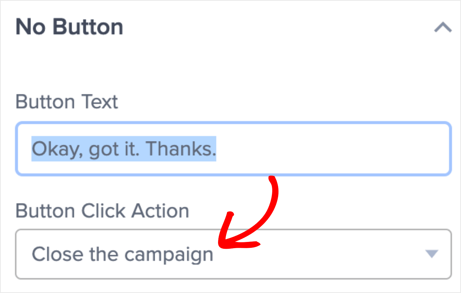
If they click the No option, the campaign will simply close.
This means that you now need to customize your Optin form’s copy. That’s where they enter their names and email addresses.
Step 4: Change Your Optin View Copy
Click on the Optin button at the bottom of your editor:

This is how your Optin view looks in the editor:
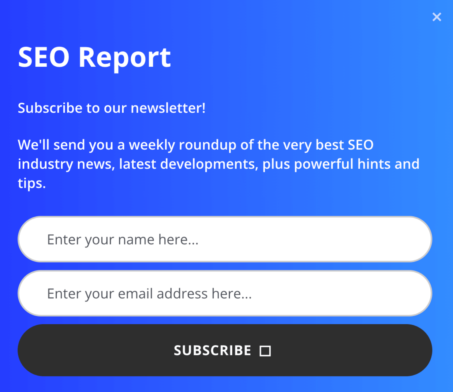
You can now customize the copy in this view to match your campaign’s intention. This is similar to how you changed the copy for the Yes/No view earlier.
Click on the text element that you want to change, and edit the copy directly in the editor:
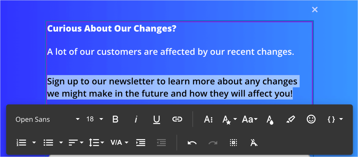
You can also change or delete the icon in the Subscribe button area like we did earlier.
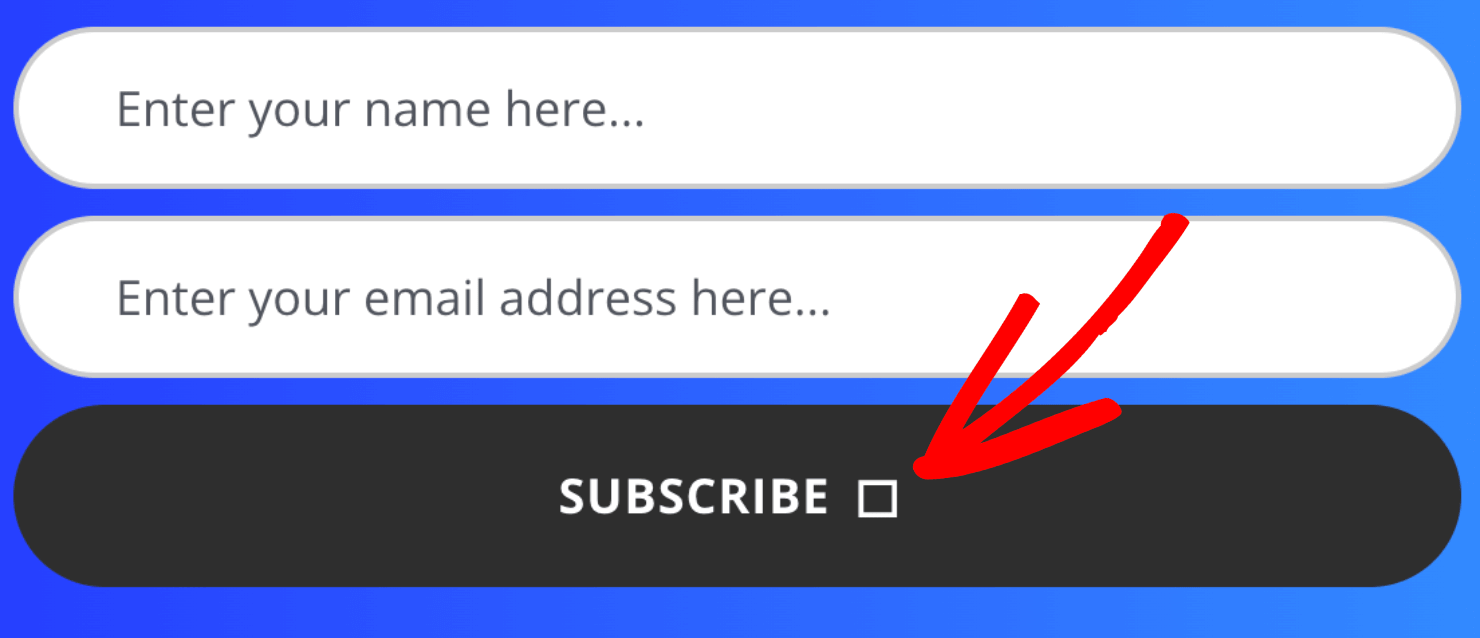
Click on the button element. Then go to the Advanced tab and click on the pencil symbol next to the Icon option to either change or delete the icon:

If you have the right copy that piques people’s interest, they are likely to click Subscribe. That’s because you’re using the powerful 2-step optin Yes/No campaign.
2-step optins use a psychological technique called the Zeigarnik effect that makes people more likely to complete a task that they started.
By getting your visitors to click your Yes option from the Yes/No form, you increase the odds that they’ll go all the way through the subscription process.
Now all that’s left to change is your Success view. This is where you acknowledge customers once they subscribe to your email optin.
Step 5: Change the Success View Copy
Click on the Success option at the bottom of your editor:

Click on the text element to change the copy directly in the editor:
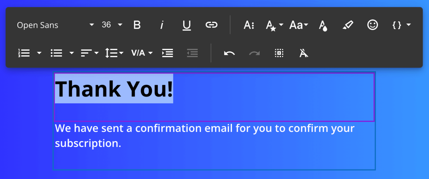
You now have a Fullscreen campaign that serves 2 purposes:
- Informs your audience about a crucial change in your company
- Grows your email list
Next, it’s time to set a few display rules. This step lets you control when and where your popup appears on the site.
Step 6: Set Your Display Rules
If you don’t change any settings, OptinMonster’s default campaigns will:
- Show the popup to a visitor 5 seconds after they land on your website.
- Show it to visitors on every page of your website.
These settings are almost perfect for our campaign.
But since this is an announcement about notice to change in working hours, I highly recommend showing this Fullscreen campaign immediately to all your visitors. That way, no one misses out on the information.
To change this default setting, click on the Display Rules tab at the top of your screen:

To make the popup appear immediately to visitors, click on is at least option in the second dropdown and select is immediate.
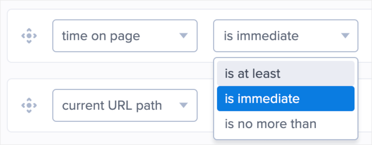
The second rule is set to display the announcement on all of your site’s pages, which I recommend keeping as it is.

We’re almost done.
Next, I’ll show you how to integrate this campaign with your email service provider. That way, you can collect all those new leads you’ll get.
Step 7: Set Up your Email Integration
Click on Integrations at the top of the screen.

Search for your email service provider (ESP), or scroll through the page to find it manually:
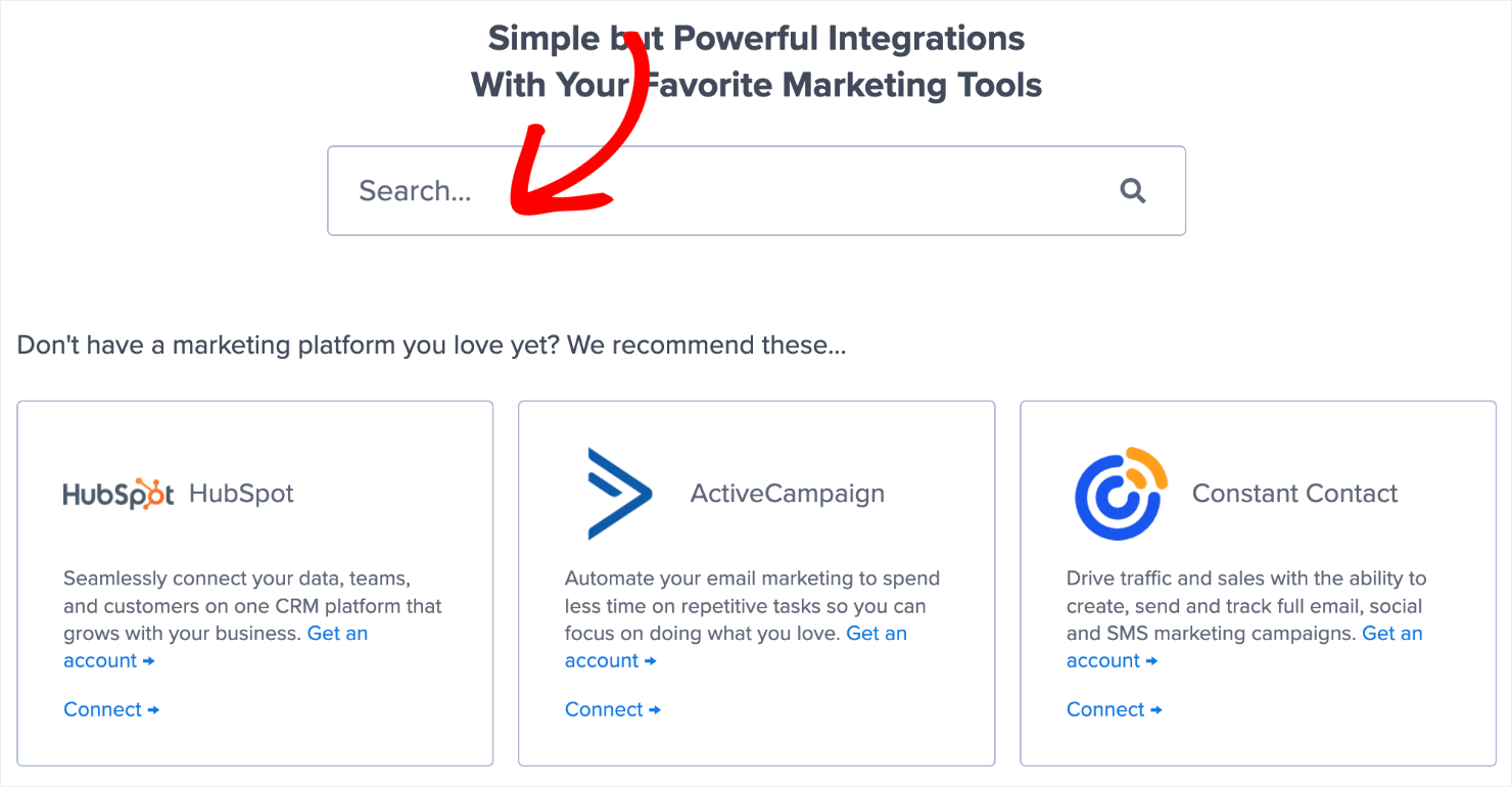
From there on, the exact steps to connect OptinMonster with your ESP depend on which email marketing automation software you’re using. The steps mostly involve copy-pasting your email account’s API key.
For detailed instructions, read our detailed guide on how to connect your email service provider with OptinMonster.
Pro-tip: Don’t see your ESP listed? Get started with Monster Leads. Monster Leads is OptinMonster’s internal lead storage tool. It lets you store your lead data, export it, and send individual emails from your existing email client.
Step 8: Save and Publish the Campaign
We have come to the last step of making your campaign live: saving and publishing it.
Click on the Save button at the top-right of your screen. This ensures that you don’t lose the changes you’ve made so far.

Next, go to the Publish tab.

Click on the Publish option under Publish Status.

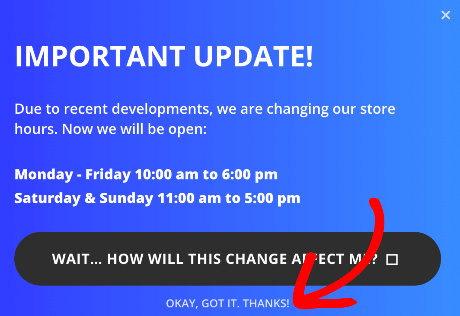
And that’s it. Here’s how the popup campaign will appear on your website.
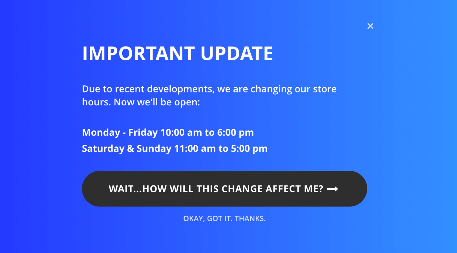
The campaign covers the full screen so that it’s almost impossible for your site visitors to see the changes in. the new business hours announcement.
They can, however, click on the cross icon on the top-right to close the campaign and go back to browsing the website.
Ready to Create the ‘Change in Operating Hours’ Popup?
The best part about the campaign that we created today is that it’ll also help you grow your email list.
This will help you strengthen your email marketing strategy. If you want visitors to see other calls-to-action (CTAs), such as liking your Facebook page or following your brand on Twitter (now X.com), you can do that too.
Here are 2 resources to help you achieve that:
- Step-By-Step Tutorial to Create a ‘Like Us On Facebook’ Popup
- How to Create a Custom ‘Follow Us On Twitter’ Popup to Get More Followers
Want to create your change in business hours popup? Join OptinMonster today. It’ll take your less than 10 minutes to publish the campaign like the one we covered today.





Add a Comment