Are you looking for a few popup survey examples to get inspiration for your own website?
Understanding what your customers want is the key to long-term growth. And while you can learn a lot about your target audience by doing some basic market research, the most effective method is to go straight to the source.
By that, we mean gathering feedback through customer surveys.
That’s why, in today’s post, we’re going to show you a few popup survey examples that you can use to engage customers.
That way, you’ll get more feedback to help you create content, offers, and products that your audience will LOVE.
Before we get started, though, let’s get clear on what a popup survey is.
What Is a Popup Survey?
A popup survey is just what it sounds like: a popup with an embedded survey inside.
This popup can appear as a small slide-in scroll box, a lightbox popup, or it can cover the entire screen.
But regardless of how it appears, its purpose remains the same. The goal is to learn more about your audience’s feelings and attitudes about a particular part of their customer journey.
These survey forms are crucial for understanding your customers. It’s like having the ability to tap directly into your buyer persona’s desires AND pain points.
Here are 3 major advantages of using popup surveys to gather feedback:
- Boost UX: Build funnels and content that enhance the user’s experience with your website.
- Rely on Data: Create data-driven strategies rather than “going with your gut.”
- Increase Revenue: Promote offers, discounts, and sales that you know your audience will LOVE (and see the sales pour in as a result)
These are just a few of the reasons why you should consider using popup surveys for your business, though there are many others.
But now the question remains, “How do you create popup surveys that don’t annoy your site’s visitors?”
Let’s turn our attention to 7 popup survey examples you can learn from.
Then, at the end of this post, we’ll share the easiest way to make a popup survey for your site.
7 Popup Survey Examples
1. Kinobody
Kinobody is a company that’s passionate about adding fitness to your everyday lifestyle.
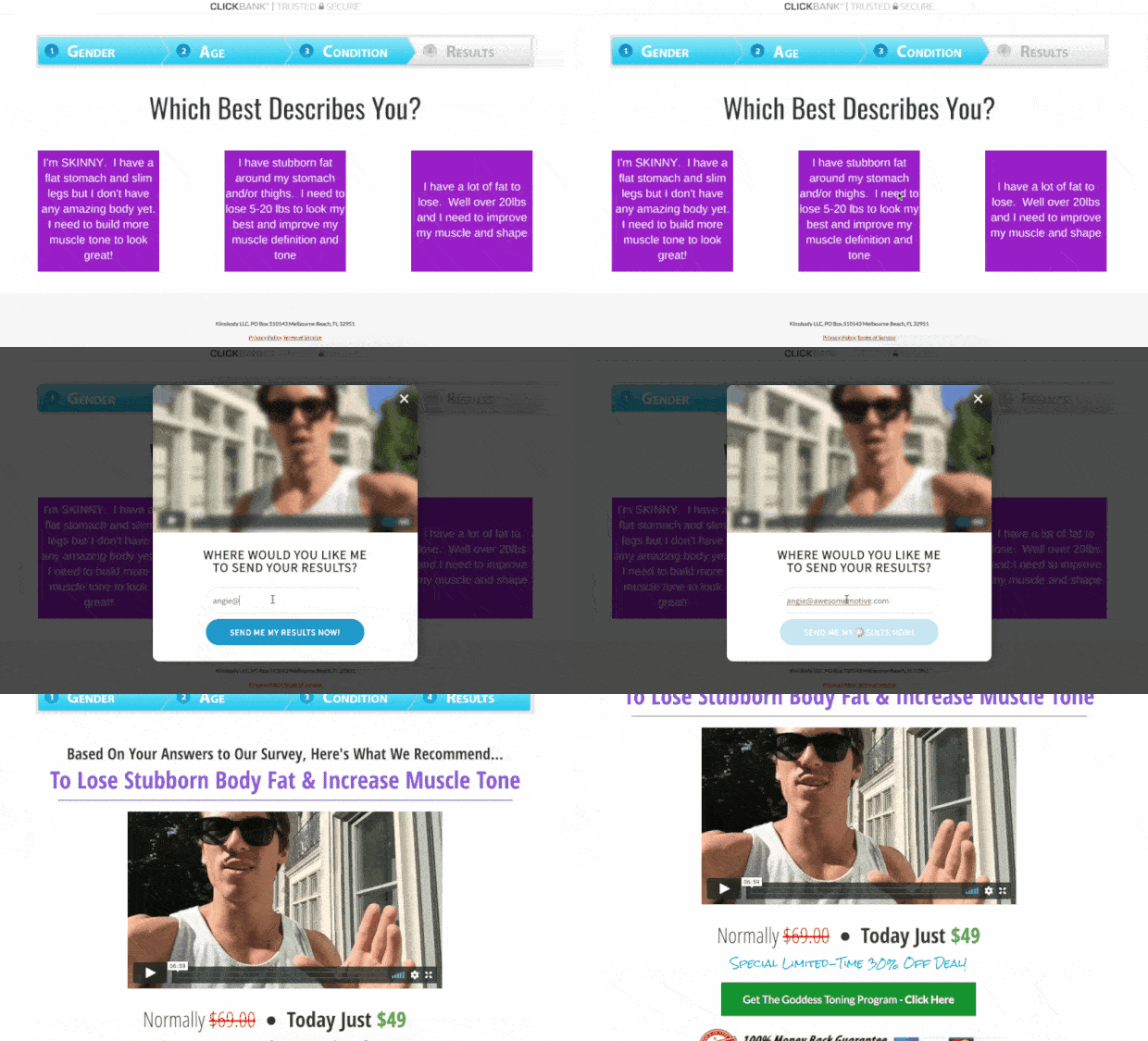
And one of their most successful campaigns was a short survey. When users clicked a button, they’d get a survey popup with a simple question about their current weight.
Then users could enter their email addresses to get the results.
This strategy not only helped Kinoby learn more about their target audience, but it also recovered 7%+ of visitors abandoning their site.
Check out this resource to read the full Kinobody story right now.
What They Got Right
The survey is simple and doesn’t ask too much from the person filling it out. Instead, there’s one question about the user’s weight with 3 possible answers.
Once the user selects an answer and gives their email address, they immediately get their results.
What We’d Change
Not sure that we’d change anything about this survey popup example. It got great results and converted lots of abandoning visitors into new leads.
2. Kennedy Blue
Kennedy Blue revolutionized the wedding market. They did so by creating stunning and beautiful wedding dresses at affordable prices.
Plus, they let customers order online to save them time, energy, and money throughout the wedding process.
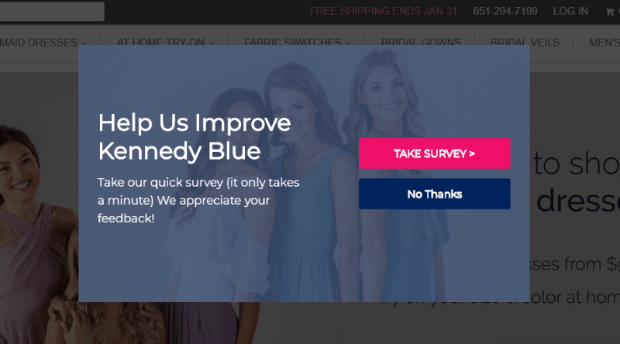
And to make sure they’re delivering the best possible service to their clients, they aren’t shy about asking for feedback.
While this isn’t the only popup Kennedy Blue uses, they’re clearly gathering the right kind of data.
Because once they started optimizing their sites with popups like the ones above, they saw HUGE results like:
- 7% abandoned customers recovered
- 2.56% of targeted subscribers added to their list
- 50% increase in sales
You can read the entire Kennedy Blue success story here.
3. Reebok
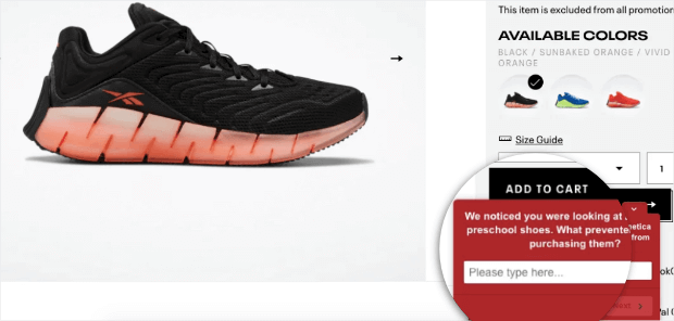
In this survey popup example, Reebok uses a non-intrusive slide-in scroll box to promote their survey.
The goal is to reduce cart abandonment and have visitors second guess why they’re hesitant to complete their purchase.
By learning what people are feeling at this critical moment in the customer journey, Reebok can make changes to their checkout flow for higher conversions.
What They Got Right
Reebok does a great job and timing with this popup. They also don’t ask too many questions, which could discourage users from taking the survey.
What We’d Change
The wording on this popup can be discouraging. The question asks, “What prevented you from purchasing this item?”
The problem is that the user is still on the product page. That means this note is already assuming the customer will abandon their cart.
A better message would be something like, “What makes you hesitant to complete your purchase today?”
4. ContentFly
ContentFly is a content fulfillment service. Customers use this company to create white-label content for their (or their client’s) website.
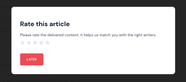
When articles are complete, users can quickly rate the article.
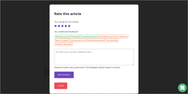
And when they select a rating from the 5-star scale, the survey gets expanded for more in-depth feedback:
This gets users to begin filling out the survey with a simple rating. This tactic is a great way of boosting your survey completion rates.
What They Got Right
Again, we love that they start with a simple question before expanding the entire survey form.
This is similar to why 2-step optin forms are so persuasive: when you can get users to begin filling out your form or answering a basic question, they’re more likely to finish the entire process.
What We’d Change
The form would probably benefit from a redesign. There are clickable ‘tags’ for faster feedback submission, but a multiple-choice menu would likely look more appealing to users.
Plus, the empty feedback field box is fairly large and takes up a lot of space on the popup form.
5. Survicate
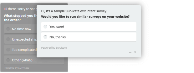
Survicate is an online software to, ironically, add survey popups to your website. Plus, they practice what they preach, as you can see from the survey popup example above.
This small questionnaire ropes the visitor in. If the user clicks the Yes option, they’ll be redirected to a landing page about Survicate’s product.
What They Got Right
They kept the survey totally stripped down and as minimal as it can be. This is a guaranteed way of getting more people to fill out your survey forms.
What We’d Change
We’d likely change the look of this survey to be more appealing. As it is, it looks a bit boring and might not be exciting enough to grab your visitor’s attention.
6. Copyhackers
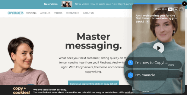
Copyhackers is an online educational resource for aspiring copywriters. And they have an interesting customer survey right when you land on the website.
But rather than finding out how you feel about their product, this survey is to help your user experience.
People answer a few basic questions (like if they’re new or returning visitors, if they’re current or aspiring copywriters, and so on).
Then the responses will guide people to the right section of the website.
What They Got Right
This is one of the most creative uses of a survey popup. It’s non-intrusive, doesn’t appear until users click the slide-in scroll box, and genuinely makes navigating the site easier.
What We’d Change
We think that they absolutely nailed it. The goal is to improve UX, and this survey popup example does just that.
7. Fundera
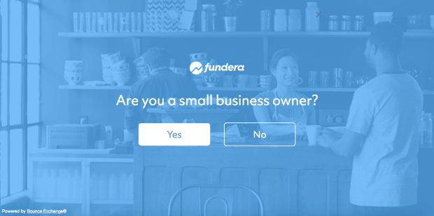
Fundera is a company that attempts to match small business owners up with the right loan for them.
It compares the prices and features of different loan options on the market. And much like we saw with Copyhackers, this company learns as much about the user as early as possible.
That way, they can personalize the user experience and get higher conversions from their website.
In the example above, users are asked if they’re small business owners. If you click Yes, you’ll be redirected to a page more tailored to what you’re (most likely) looking for.
What They Got Right
This is a great-looking popup that takes things one step at a time. That means more users are likely to engage with the popup and become new leads for Fundera.
What We’d Change
This popup example is so simple that it’d be hard to change much of anything. The goal is to improve the UX by making the site more navigable, and this survey plays its part in that process.
Now that we’ve seen a few popup survey examples, let’s talk about the easiest way to add them to your website.
How to Make a Survey Popup
While there are lots of tools that you can use to add survey popups to your website, nothing competes with OptinMonster:
OptinMonster is hands down the best lead generation software on the market. And it’s your best solution for quickly (and easily) using survey popups to better understand your customer.
That’s because OptinMonster gives you all the tools you need to create stunning popups in minutes, even if you have ZERO coding or technical experience.
How does it work? Let’s look briefly at each step…
First, OptinMonster allows you to create multiple types of popups for your survey form. This can include:
- Lightbox
- Slide-in scroll boxes
- Fullscreen welcome mats
- Floatings bars
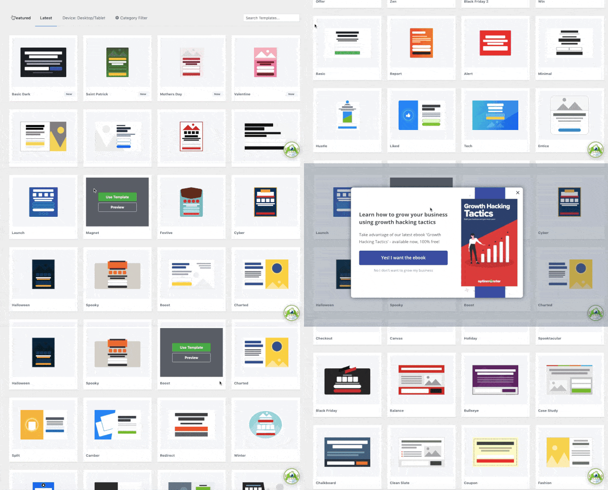
Each of these campaign types can be used to display your survey form. And once you determine the right type of popup for your marketing goals, you can select from 50+ pre-made templates:
These templates are designed to save you tons of time and energy while building new survey popups.
From there, you’ll need to design your survey form.
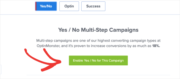
You can do that by quickly enabling the 2-Step Optin feature:
This lets you prompt users with a 1 question, Yes or No style survey. Then you can trigger an action based on the user’s response.
But for more in-depth customer feedback, you might want something even more custom.
That’s why we recommend embedding a form from a 3rd-party tool like WPForms.
This lets you build a totally custom form and present it to the right people, in the right places, and at just the right time in the customer journey.
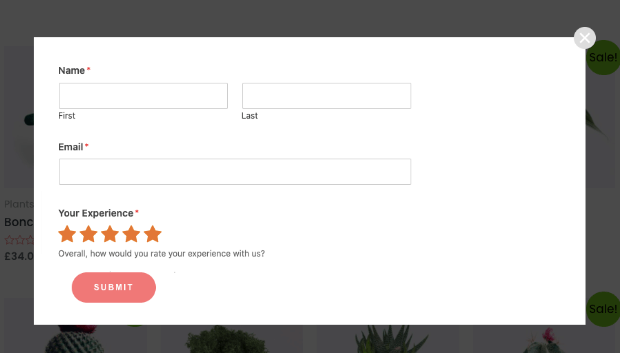
Here’s an example of an OptinMonster popup with a WPForms survey embedded inside:
This not only allows users to rate their experience but also captures email addresses and grows your contact list.
Plus, if you’re using a tool like WPForms, you can add custom fields to your survey form to learn more about what your audience likes or dislikes about your products.
Learn more by reading this helpful resource: How to Create an Exit Website Survey (the Easy Way).
Finally, you’ll want to use a tool like OptinMonster because of its advanced targeting rules. These allow you to highlight your survey popup at the right time in your customer’s journey.
Some of the most popular targeting rules include:
- Exit-Intent® Technology: Recover abandoning visitors as they’re actively leaving your website.
- OnSite® Retargeting: Display fresh survey forms to returning visitors for more follow-up feedback.
- Page-Level Targeting: Customize your surveys based on the content your visitors are currently browsing.
Again, these are just a few of the targeting options you have with OptinMonster, though there are many others.
These are the same kinds of rules that helped companies like Human Food Bar get over 1800 new emails each month and generate $17,000 in sales from affiliate products.
Want to see it in action for yourself? Click below to start your 100% risk-free OptinMonster account today:
Another excellent way you can add survey popups to your website is by using UserFeedback.
Using this powerful plugin, you can add user-friendly popup surveys anywhere on your site to understand what your visitors really think. It is super easy to use and comes with a handy setup wizard to get started in a matter of minutes.
Some of the popular features of UserFeedback include:
- Smart targeting
- Easy installation
- Conditional survey questions
- Unlimited questions and surveys
- Pre-built templates
- Integrates seamlessly with MonsterInsights and Google Analytics
- Simple reporting
And that’s all for today!
These have been 7 of the best survey popup examples on the web.
We hope you enjoyed this post and, if you did, be sure to check out the following:
- 9 Unique Popup Forms You Can Use to Boost Engagement
- 25 Email Popup Examples to Explode Your List
- 9 Best Online Survey Tools for Small Businesses
These posts will have even more information on how you can get more valuable customer feedback with survey popups.





Add a Comment