It’s a noisy world out there, and marketers have to constantly work to get their messages noticed. It’s an even bigger challenge to create content that truly connects with your target audience. In this article, I’ll discuss the art of visual storytelling and show how you can use visual narratives to increase engagement and win more leads with your content marketing.
I’ve worked in digital marketing for over 15 years, and I’ve learned an important lesson: the words I write don’t matter if I can’t convince the audience to read them. Strong, evocative visuals are your best tools for catching users’ attention. And when you weave those images into a compelling narrative, you can build a strong foundation for a lasting relationship with your brand.
- What Is Visual Storytelling?
- 8 Visual Storytelling Elements (& Their Benefits)
- 5 Visual Storytelling Examples
- 6 Tips for Visual Storytellers
What Is Visual Storytelling?
Visual storytelling is the art of using photos, graphics, videos, and other visual elements to convey a narrative and connect with an audience. By integrating visual media into your marketing content, you can communicate messages more quickly and effectively.
Visual storytelling captures attention, evokes emotions, and enhances engagement. It helps you express complex ideas more simply and memorably. Audiences are constantly bombarded with content, and you can use visual narratives to stand out and ensure your story resonates with users.
8 Visual Storytelling Elements (& Their Benefits)
“Visual” is a broad term, so let’s look at some of the specific elements, types, and methods of visual storytelling. Each elements can tell a story on its own. However, they’re often combined to create an engaging, multi-faceted visual narrative.
1. Photos (Preferably of People)
Photos of people can evoke strong emotions and create a personal connection with your audience. For example, this email campaign from Habitat for Humanity features a photo of a new Habitat homeowner:
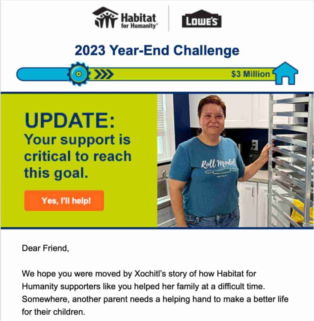
Habitat wanted subscribers to click the “Yes, I’ll help!” call-to-action (CTA). The photo of a real-life beneficiary encourages subscribers to act.
In fact, one A/B test showed that using a photo of a person can increase conversion rates by more than 95%.
2. Graphics and Illustrations
You can still create visual narratives even if you don’t have good photos to use. Graphics and illustrations can be very effective in adding interest, breaking up text, and creating meaning.
Here are a few examples of graphics that are useful in visual storytelling:
- Iconography: Simple, recognizable symbols used to represent complex ideas quickly and clearly.
- Maps: Often used to show locations, distribution, or the reach of a brand.
- Custom Illustrations: Unique drawings or designs that represent specific ideas. They add a personalized touch to storytelling.
- Pull quote graphics: Images that highlight important quotes in your narrative.
3. Animations
Animations can simplify complex concepts and make your story more engaging and eye-catching. For example, we added animation to this video about the benefits of website popups:
The video starts by acknowledging that poorly designed popups can be very annoying. At the 12-second mark, we illustrate that point with an animation of a bunch of popups blocking the video. The animation shows what we’re talking about much more effectively than just explaining it with words. Plus, it makes the video livelier and more dynamic.
4. Visual Timelines
Visual timelines are great methods for showcasing your brand’s history or progression. They organize information chronologically, making it easier for your audience to follow and understand the story. Timelines can be particularly effective in demonstrating growth or change over time.
When you simply list accomplishments or events in paragraph form, you end up with a wall of text that’s unengaging and intimidating. A timeline lets you present the same information in a more appealing and digestible way.
5. Scrollytelling
Scrollytelling is an interactive visual storytelling technique, where information is revealed dynamically as the user scrolls. Scrollytelling can include any and all of the other visual elements I’m listing here.
In a Scrollytelling narrative, the reader’s scrolling triggers animations, transitions, and changes in content presentation. As users scroll down the page, new elements appear, move, or change, guiding them through the story in a visually compelling way.
Chartipedia’s “Deedive into the Venezuela Refugee Crisis” is a great example of effective Scrollytelling.
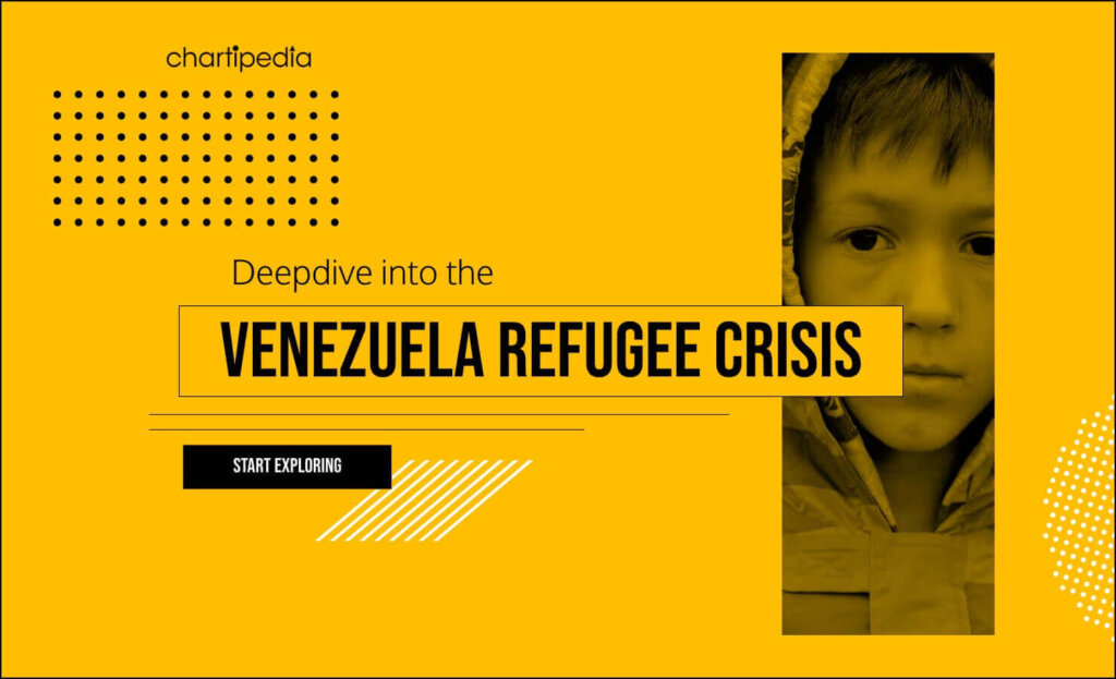
This technique is particularly effective for explaining complex processes, showcasing step-by-step guides, or telling a story that benefits from a chronological flow. Scrollytelling is especially popular in journalism because it can present a great deal of information and research.
6. Video
87% of video marketers say that video has directly increased their sales. That statistic shows just how powerful video can be in encouraging action and engagement. Obviously, video is its own format of visual storytelling. But video can also include animations, photos, and graphics. And video can be included in scrollytelling or visual timelines.
Learn How to Nail Your Video Strategy in Our Guide:
Video Marketing 101: How to Build an Effective Video Content Strategy
7. Data Charts & Graphs
If your story is backed by data, then charts and graphs can make that information accessible and understandable. They help highlight trends, patterns, and comparisons, and they allow your audience to grasp complex information quickly. Examples include bar charts, line graphs, pie charts, heat maps, scatter plots, and more.
8. Infographics
Infographics are standalone, sharable graphics that provide visual information on a topic. They often include multiple charts or graphs, along with text and images to provide an overview of a concept.
For instance, an infographic could explain the process of recycling. It could use various charts to show statistics, along with illustrations and text to guide the reader through the information. Usually, the infographic will include branding and source information, so you can encourage sharing and increase brand awareness.
5 Visual Storytelling Examples
Next, let’s take a look at some effective examples of visual storytelling. I’ve chosen a wide range of formats with varying degrees of complexity. That way, you can learn from them whether you’re a beginner or an experienced visual storyteller.
For each example, I’ll discuss its purpose, elements, and effectiveness. In fact, the final example is an email campaign that I created, and I’ll share the strategy, motivation, and tools behind the campaign.
1. 30-Year Timeline Video by Women for Women International
About the Brand: Women for Women International (WfWI)is a nonprofit that helps women survivors of war and conflict around the world.
Purpose of the Story: By outlining the organization’s 30-year history, WfWI demonstrates a long track record of advocacy and aid. This strategy helps build trust with prospective donors.
Visual Storytelling Elements: This video includes several elements: a timeline, maps, photos of people, data graphs, and animation.
What You Can Learn: Combine multiple visual elements to tell your full story. This video really shows the full scope of WfWI’s work:
- The timeline shows their influence through time.
- The map graphics illustrate their efforts around the world.
- The photos of individual women highlight that WfWI improves the lives of real women.
2. Marmot’s Brand Story
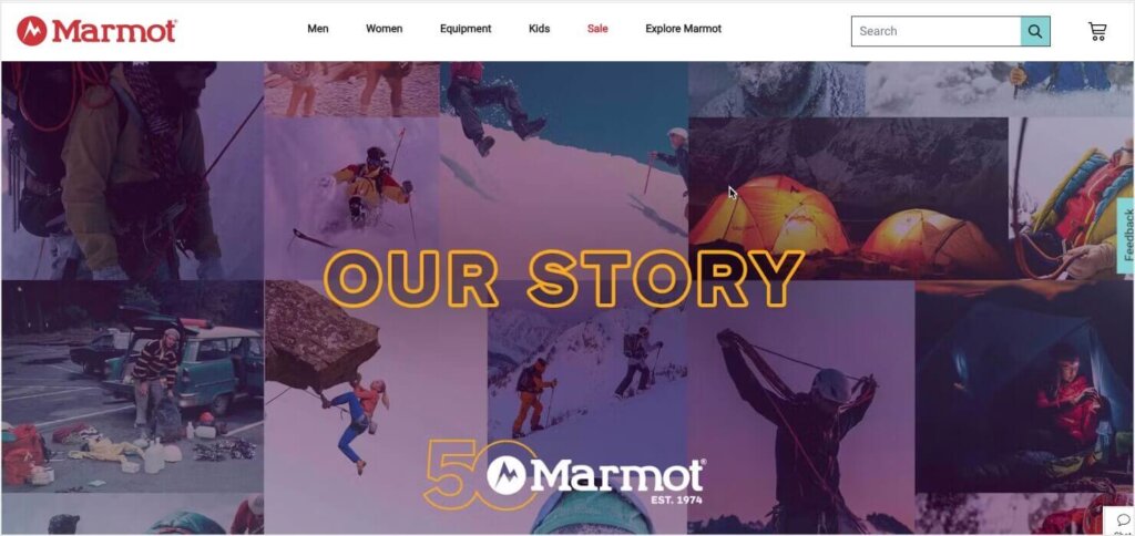
About the Brand: Marmot is an outdoor gear company with a 50-year history.
Purpose of the Story: The “Our Story” page on Marmot’s website focuses on the history of their brand. It introduces the company’s founders and highlights some of the brand’s biggest innovations. This timeline establishes the company’s position as a leader in the outdoor gear industry.
Visual Storytelling Elements: Marmot uses a simple timeline format. The timeline features photos of their founders and of real people using their products.
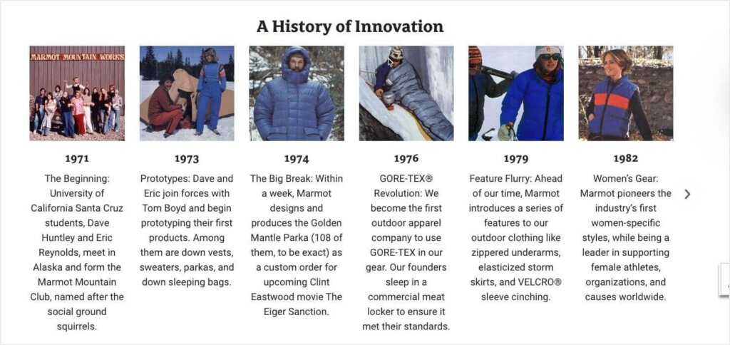
What You Can Learn: Visual storytelling doesn’t have to be highly technical or complex. Even a simple layout with lots of photos can be enough to establish a strong narrative. That said, the text beneath each year could benefit from better formatting to improve readability.
3. Scrollytelling Journalism by NBC News
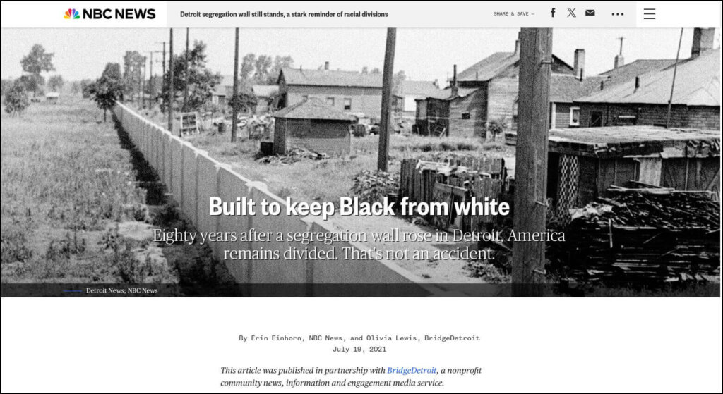
About the Brand: NBC News has been a leading U.S. news broadcaster since 1940.
Purpose of the Story: This piece of investigative journalism explains the history of segregation in Detroit, Michigan, including the construction of a physical wall.
Visual Storytelling Elements: This article uses scrollytelling to create an interactive experience. That experience includes historical photos, videos, and documents. There are several interactive maps, including one that moves forward in time as the user scrolls.
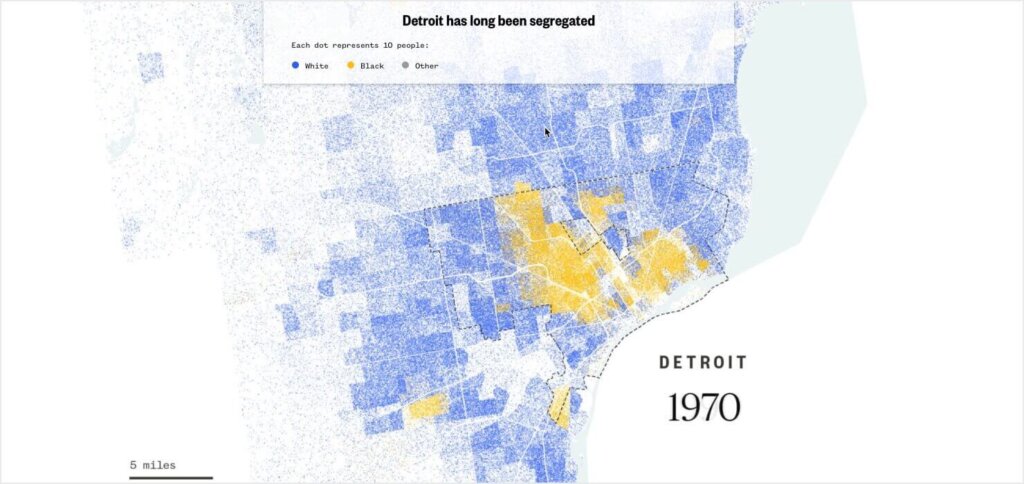
What You Can Learn: NBC News’ story shows the full power of scrollytelling and interactive visuals. You may not have the time or resources to create visual narratives this complex very often. But the effort can be worth it for your most important stories.
4. Year-in-Review Infographic by ACCEL Law Group
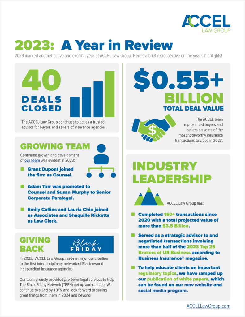
About the Brand: ACCEL Law Group is a law firm that focuses on insurance intermediaries.
Purpose of the Story: ACCEL’s Year in Review illustrates the firm’s success for its clients, its growth, and its pro bono work. Essentially, this infographic tells the story of what the company achieved in a single year.
Visual Storytelling Elements: This is an example of a simple and effective infographic with bold colors, easy-to-read text, and clean graphics.
What You Can Learn: Infographics are a great way to share data about your brand. Their strength comes in their versatility: you can use them on your website, in your email marketing, on social media, or even in printed promotional materials.
5. “Meet the Cast” Email from Tennessee Valley Art Association
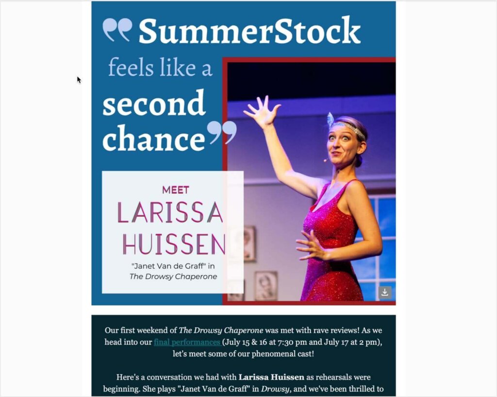
About the Brand: The Tennessee Valley Art Association (TVAA) is a nonprofit dedicated to the visual and performing arts in northern Alabama. I once held the role of Marketing Director for TVAA.
Purpose of the Story: In this email marketing campaign, I wanted to build excitement for the final 3 performances of our production of The Drowsy Chaperone. The musical was part of TVAA’s SummerStock series, which provides training and performance opportunities for young adult performers.
I decided to send a series of “Meet the Cast” emails featuring interviews with performers. I designed each email to promote ticket sales and tell a story about TVAA’s impact on a real person in our community. In Larissa’s interview, she talked about how SummerStock gave her an opportunity to get back to her love of performing after several years away.
Visual Elements: I had access to some excellent photos from dress rehearsals and performances. These images were vital to telling the story of Larissa’s return to the stage. I used Canva to create the graphic above, which I placed at the top of the email. I wanted the graphic to feature an emotional pull quote and establish the email’s content. I also included more photos throughout the email, interspersed with Larissa’s interview answers.
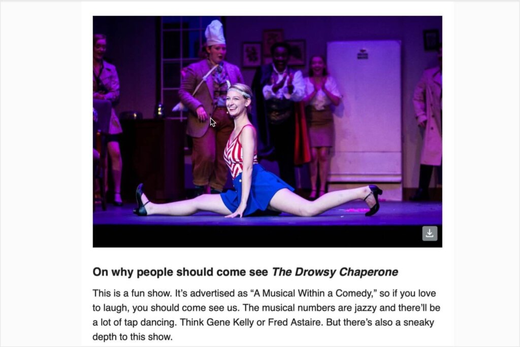
What You Can Learn: Always look for opportunities to tell personal stories about your brand’s impact. And use high-quality photos to draw your audience into your story. This visual narrative didn’t require advanced technical skills. It just needed a compelling story and some beautiful, joyful photos.
6 Tips for Visual Storytellers
1. Know Your Audience
Before you begin crafting your visual storytelling content, you need to understand your target audience. You should know who they are, what they care about, and how they interact with your content. That way, you can create visuals that resonate and engage.
Get To Know Your Audience With This Guide
2. Craft a Compelling Narrative
Next, decide on the story you want to tell. A well-crafted narrative is the backbone of effective visual storytelling. Your story should be clear, consistent, and emotionally engaging to leave a lasting impact on your audience.
Let’s look at each of those elements more closely:
- Clear Message: Define the core message you want to express. What do you want your audience to remember? For example, your message could be showcasing a product’s benefits, highlighting your brand’s mission, or sharing a success story.
- Consistency: Make sure your narrative aligns with your brand’s voice and values. Stay consistent in your tone, style, and messaging across all visual elements. This reinforces your brand identity and builds trust with your audience.
- Emotional Connection: Use stories that evoke emotions relevant to your audience. People are more likely to remember and share content that makes them feel something, whether it’s joy, nostalgia, empathy, or inspiration. Craft your narrative to connect with these emotions and make your story memorable.
3. Use High-Quality Visuals
High-quality visuals are great for capturing attention. They’re also key to showcasing your company’s professionalism. When you invest in top-notch images, graphics, and videos, you’ll elevate your visual storytelling. Earlier, I shared one of my own email campaigns that featured professional photos of an actress performing in a musical. If those photos had been out-of-focus or poorly lit, my visual narrative wouldn’t have had the same emotional impact. They also wouldn’t have done justice to the musical’s production quality.
4. Combine Various Visual Elements
I’ve already gone over many of the different visual storytelling elements, such as photos, animations, videos, and infographics. By mixing and matching these formats, you can create a richer and more engaging narrative.
5. Optimize for Your Chosen Platforms
Different platforms require different approaches to visual storytelling. Tailor your visuals to the format and audience of each platform, so your content is seen and appreciated by as many people as possible.
- Social Media: Each social media platform has its own audience and content format requirements. For example, Instagram favors high-quality photos and short videos, while LinkedIn is more suited to infographics and professional visuals. Optimize your visuals for the platform to maximize engagement.
- Website: Ensure that your website’s visuals are optimized for fast loading and mobile compatibility. High-resolution images and videos can slow down your site, so use tools like Tinify to compress files without losing quality. Also, ensure that your visuals are responsive so they look great on any device.
- Email Marketing: Use visuals to enhance email content and increase engagement. Incorporate images, GIFs, and infographics to make your emails more visually appealing. However, be mindful of file sizes to avoid long loading times.
6. Test and Adjust
Visual storytelling is not a one-and-done effort. To truly succeed, you must continually test, analyze, and refine your visuals.
- A/B Testing: Experiment with different visuals to see what resonates best with your audience. A/B testing allows you to compare two versions of a visual element to determine which one performs better. Use these insights to regularly optimize your visual content.
- Analyze Performance: Use analytics to measure the success of your visual storytelling. Track metrics such as engagement rates, click-through rates, and conversion rates to gauge how well your visuals are performing.
- Continuous Improvement: Regularly update and refine your visuals based on performance data. Trends and audience preferences can change over time, so it’s important to stay flexible and adapt your visual storytelling strategy as needed.
Use Visual Storytelling to Get More Leads
Once you’ve created some outstanding visual narratives, you’ll drive more engaged visitors to your website. Your evocative storytelling will have them interested in your brand and ready to learn more. What next?
OptinMonster is the most effective tool for turning website visitors into customers and subscribers. You can use our popups, floating bars, and other onsite campaigns to show visitors your best offers. Our robust display rules let you target your most engaged visitors right when they’re ready to act.
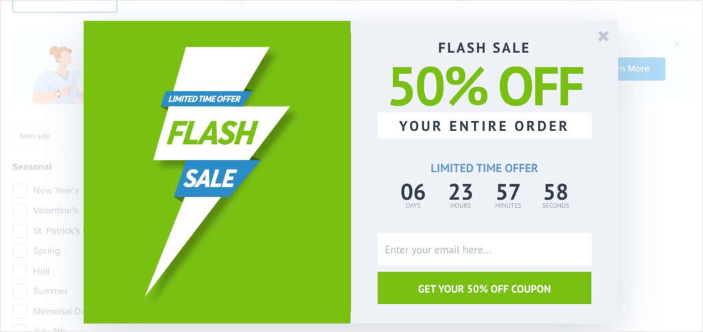
With our 700+ templates and easy drag-and-drop builder, you can have a high-converting campaign running on your site in minutes. Sign up for OptinMonster today, with our 14-day money-back guarantee.
Related Resources:





Add a Comment