Are you trying to grow your list and looking at the best method for doing so?
If so, you’re not alone. In fact, many business owners struggle to select the right tools to help scale their business.
Squarespace and Mailchimp are both services that offer email optin forms as a secondary product, with their primary focus being something else.
Squarespace is primarily a website builder, and Mailchimp is an established (and popular) email service provider (ESP).
Then there’s OptinMonster, the world’s best lead generation software.
That’s why, today, we’re going to look at Squarespace email campaigns vs. Mailchimp vs. OptinMonster to answer the following questions: which one offers the best BEST optin forms for growing your list?
And since this is such an in-depth post, we’ve made a helpful table of contents. Feel free to jump to the section that most interests you:
- Selecting Your Campaigns
- Designing Your Campaigns
- Targeting Your Audience
- Scaling Your Business
- The Final Verdict
Otherwise, let’s start at the beginning and look at what each company focuses on as its primary product or service.
Squarespace, Mailchimp, & OptinMonster
Before diving into our comparison, let’s get clear on exactly what each software is and its primary purpse.
1) Squarespace
Squarespace is a website builder that’s mostly used for eCommerce. That said, it can also be a great resource for small businesses, course creators, bloggers, and more.
It has an easy-to-use visual builder that lets you create stunning sites fast.
But over the years, Squarespace has expanded its services. This is true with its Email Campaigns addon. This refocused Squarespaces attention to email marketing as a secondary service.
As part of their push into email marketing, they began offering optin forms to help you grow subscribers.
The overall goal was to create a one-stop shop for digital marketers who wanted all their tools in the same place.
With Squarespace, you’d build your website, grow your email list, and send stunning campaigns from the same source.
While there are some advantages to going this route, there are definite drawbacks that we’ll consider toward the end of this post.
2) Mailchimp
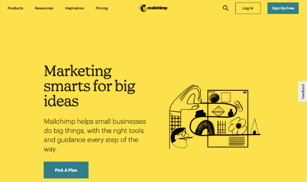
Mailchimp is a popular email service provider (ESP). It’s where many online business owners and marketers start their journey into email marketing.
It allows people to create and send unique email campaigns. You can also organize (or “segment”) your audience for more personalization.
While it’s a great option, some marketers have found it difficult to scale with Mailchimp as their company grows.
For other ESP options, you may want to check out this resource: 4 Mailchimp Alternatives to CRUSH Your Email Marketing.
As part of their services, Mailchimp began giving users the ability to create basic optin forms.
This would centralize your workflows, let you grow your list, and send emails from the same source.
3) OptinMonster
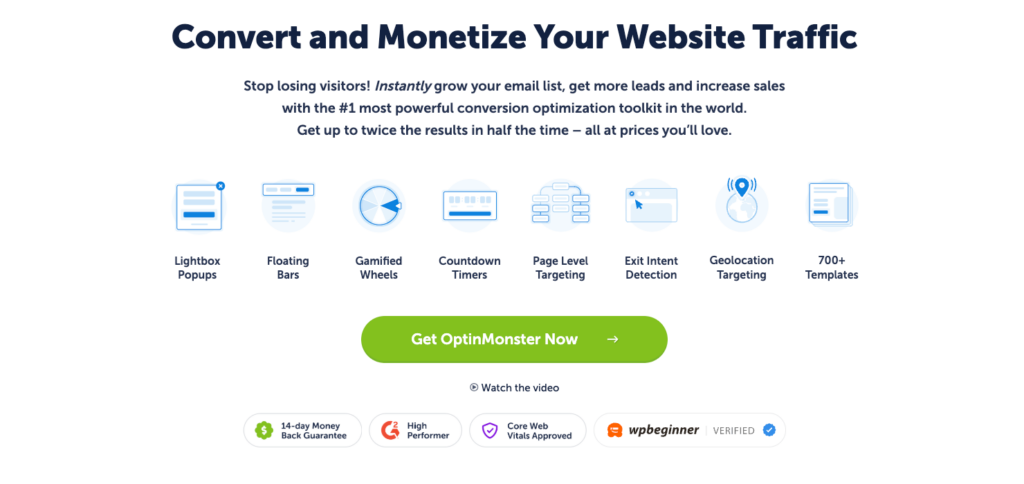
OptinMonster is the world’s #1 lead generation software. That means it’s the BEST tool for growing your list, boosting conversions, and driving more sales from your online store.
We need to be clear here:
OptinMonster isn’t a website builder like Squarespace. And it isn’t an ESP like Mailchimp.
That means OptinMonster doesn’t send your email campaigns. Instead, it focuses exclusively on growing your email list as efficiently and as quickly as possible.
This gives it a certain advantage over the other 2 platforms. Because rather than being a “jack of all trades, master of none,” OptinMonster is the complete master over lead generation.
As you’ll see, it gives users MORE freedom, flexibility, and power to drastically add new subscribers to their mailing lists.
Ready to dive right in and see it in action? Click below to start your 100% risk-free OptinMonster account today:
Now let’s dive into our Squarespace email campaign vs. Mailchimp vs. OptinMonster comparison.
Squarespace vs. Mailchimp vs. OptinMonster
We need to make something clear before diving into this comparison post.
We’re looking at these tools specifically to see which offers the best email optin campaigns to grow your list.
This is an important distinction because, again, both Squarespace and Mailchimp offer more than one service or product.
Squarespace is the website builder mainly used for eCommerce. And Mailchimp is an ESP that allows you to send email campaign sequences to your audience.
But both include optin forms for growing your email list, which is why we want to see how they stack up with OptinMonster.
Let’s dive in.
1. Selecting Your Campaigns
When we say, “selecting your campaigns,” we aren’t referring to how easy it is to select between the different options.
What we actually want to know is how many options there actually are. In other words, how many campaign types does each service offer to capture your audience’s email addresses?
Let’s look at each platform individually.
a) Squarespace
Squarespace offers a few different campaign types that include:
- Newsletter blocks
- Form blocks
- Promotional popups
- Announcement bars
These provide you with basic features to capture a user’s email address. The newsletter blocks can best be thought of as inline campaigns and rest directly on your page’s content.
Form blocks let you add forms for any purpose to your site, like collecting user feedback, user surveys, newsletter signups, and more.
Promotional popups are their solution that most closely resembles OptinMonster, though with various limitations that we’ll discuss in more detail later on.
The biggest thing to note is that you can only use one popup on your site at a time, which is where announcement bars come in.
If you want to do anything beyond one popup, you’ll need to add an announcement bar that hangs on the top or bottom of the user’s browser page.
2) Mailchimp
Mailchimp’s optin forms are also limited in terms of the types you can choose from. Here, you have 3 types of campaigns for growing your email list:
- Embedded forms (like inline campaigns)
- Popup forms
- Signup landing pages
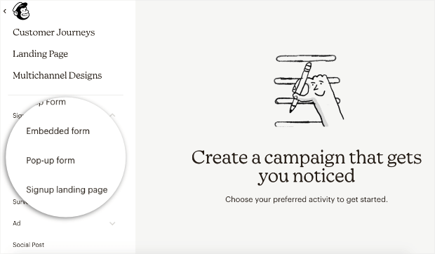
These provide you with the basic resources you need to grow your email list.
They also have a separate campaign for surveys which can be used to collect user feedback. It also captures your visitor’s email address in the process, which is why we mention it here.
But for the most part, you’ll use one of the 3 campaign types mentioned above to get new subscribers.
3) OptinMonster
OptinMonster has more campaign types than both Squarespace and Mailchimp.
That’s because OptinMonster is a tool that focuses exclusively on growing your email list. As such, it shouldn’t be a surprise that it offers more resources to do so.
With OptinMonster, you can use any of the following campaign types:
- Lightbox popup
- Floating bar
- Fullscreen welcome mat
- Slide-in scroll box
- Inline campaign
- Sidebar widget
- Gamified spin-to-win-wheel
- Content Locker
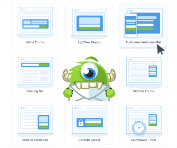
These give you plenty of options for attracting new subscribers and grabbing their email addresses.
This is important because it helps you prevent something called “popup fatigue.”
This is where your visitors get tired of seeing the same optin campaigns across your site, and they learn to ignore them altogether.
By using a variety of campaign types, you can keep your site’s visitors engaged with fresh campaigns that grab their attention every time.
Verdict: In this category, OptinMonster is, without a doubt, the winner. It’s the tool that offers you the most campaign types and gives you more resources for growing your list.
2. Designing Your Campaigns
Once you’ve selected your campaign type, you’ll need to design them to match your brand’s voice and style.
But what if you’re not a professional coder or don’t consider yourself “tech-savvy”?
You’ll need a tool that lets you design unique and beautiful forms without putting in too much work under the hood.
Let’s see how easy each platform makes it for your to design your email optin forms.
a) Squarespace
On the one hand, Squarespace offers a form builder that’s user-friendly and intuitive. Plus, it doesn’t require any coding skills, which is nice for many marketers.
But the flip side is that it’s easy to use because the customization options are so limited.
For promotional popups, for example, you don’t have templates to work from. Instead, you have a few basic layouts that you can choose:
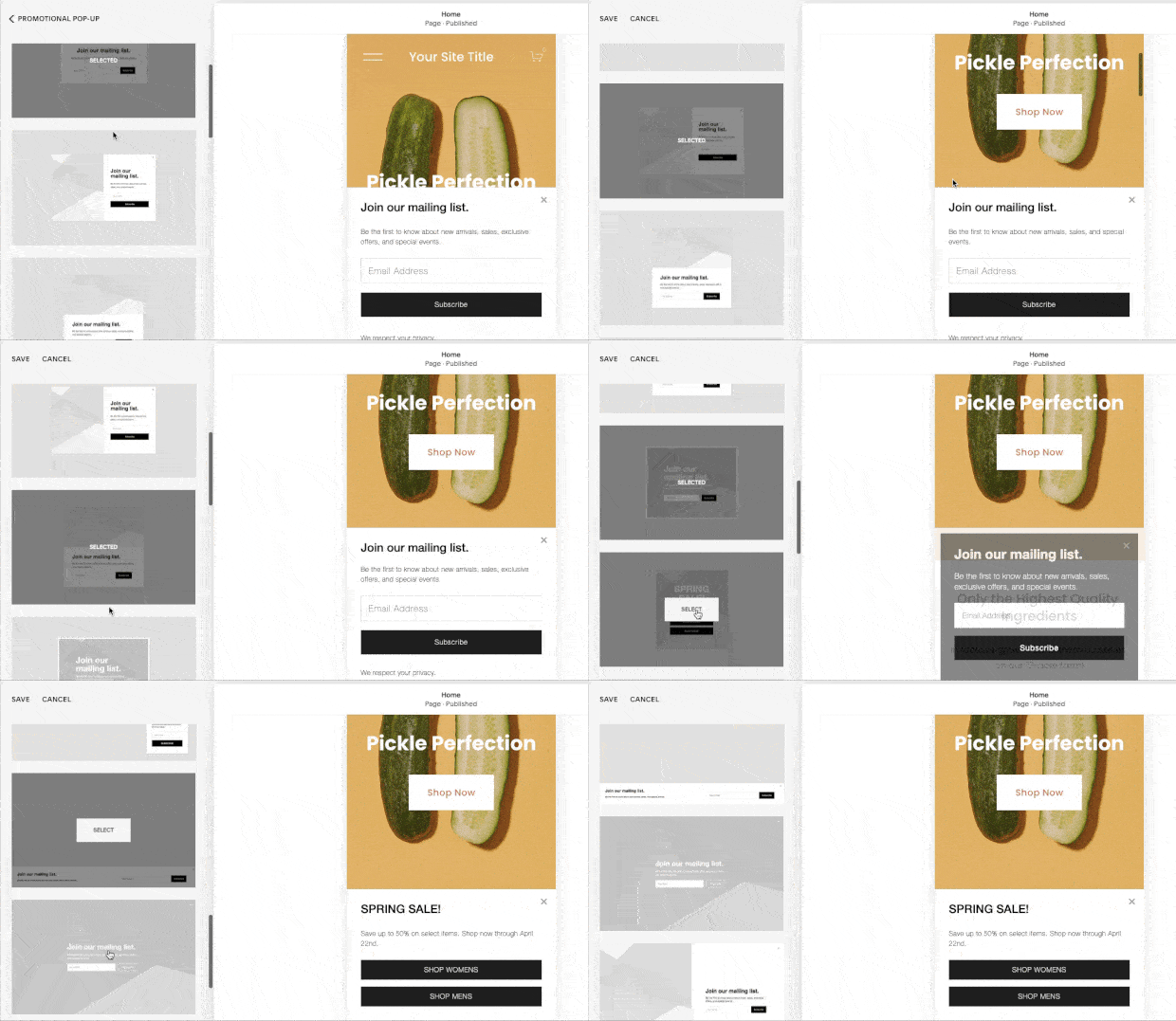
Once you’ve selected the layout for your campaign, you’ll have some customization options in the left-hand side editing menu.
But these options are limited and don’t let you add new features to the form.
You’ll be able to change the Content and the Style from your Squarespace editor.
Editing the Content lets you change the basic message of your campaign:
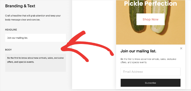
And the Style option gives you access to the fonts and colors of your campaign:
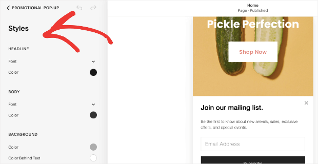
These are basic options that let you design functional forms, which likely won’t look as unique as you’d like.
b) Mailchimp
Like Squarespace, Mailchimp allows you to customize your forms without knowing any code. But, again, the customization options are limited.
You have a few layouts for each campaign type:
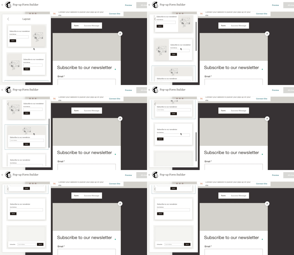
When you’ve selected your layout, editing is a bit more advanced than Squarespace’s form builder.
You can use the inline text editor to change any aspect of your campaign’s messaging:
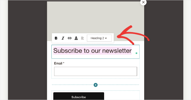
And at any point, you have quick access to styling options to change the font and colors of your campaign:
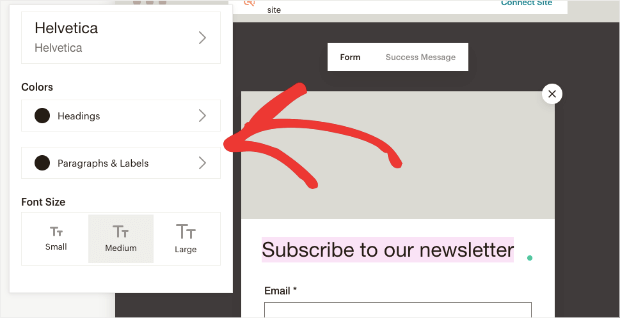
These give you basic customization options that will let you match your brand’s style but still leave you with generic-looking campaigns that likely won’t set your brand apart from the crowd.
c) OptinMonster
OptinMonster gives users 100% control over how their campaigns look, what they say, and which features are included.
That’s because OptinMonster uses a codeless drag and drop visual builder that lets you modify any aspect of your campaign.
For starters, you can choose from over 700 pre-made templates to get you started FAST:
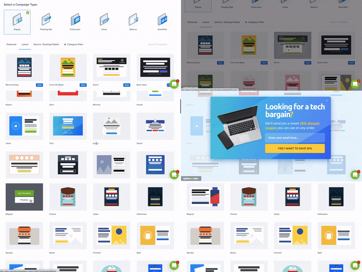
These templates are designed to save you time, energy, and headaches in the campaign creation process.
From there, you can use the inline text editor to modify any aspect of your campaigns:
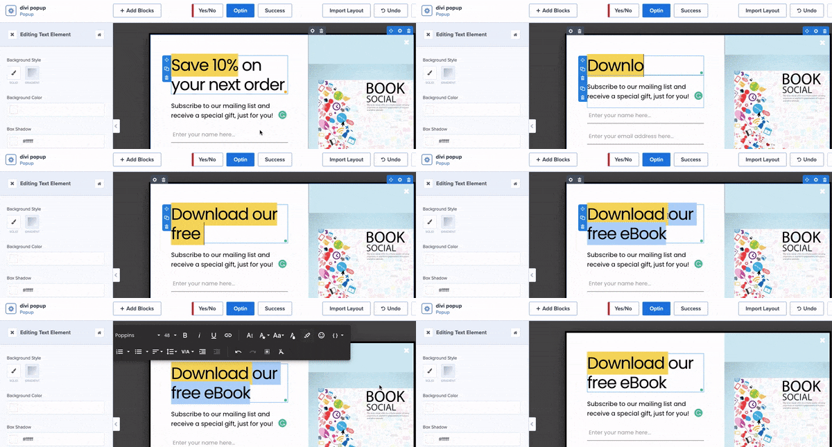
And if you want to add new features to your campaign, you can add “blocks” that fall right into place.
Just select the block you want, then drag and drop it where you’d like:
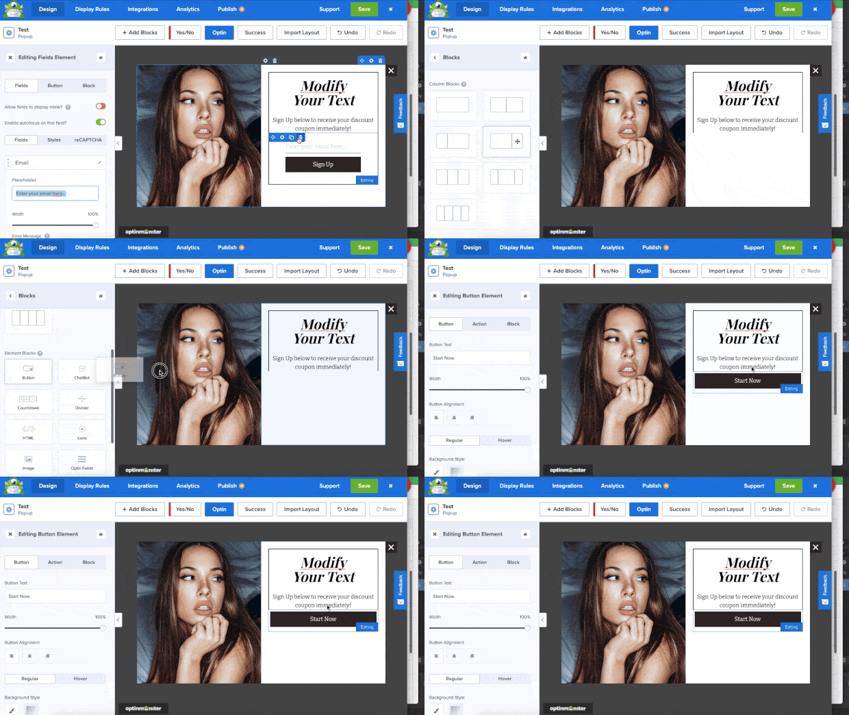
This lets you add features to your campaigns, like:
- Videos
- Images
- HTML
- Chatbots
- Countdown timers
- And much more…
This allows ANYONE to create stunning and unique campaigns in a matter of minutes.
You won’t need to be a professional coder or designer to have an optin campaign that perfectly represents what makes your brand so unique.
Verdict: In this category, OptinMonster stands far apart from the rest. It’s the only tool that gives you 100% control over how your campaign looks without requiring any technical knowledge.
3. Targeting Your Audience
Designing your campaign is only half the battle. The other half is making sure you’re showing it to the right people, in the right places, and at just the right time in their customer journey.
This is the only way to be confident that you’re not leaving any conversions on the table.
And by personalizing your user journey with optin campaigns, you’ll see a big rise in conversions.
Let’s see how each tool allows you to target your audience.
a) Squarespace
Squarespace gives you a few basic options for determining when and where your campaigns appear.
First, you can choose to have your campaign display:
- On any page
- On specific URLs
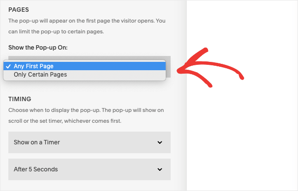
And to trigger the campaign, you’ll be able to show it on a:
- Timer
- Scroll depth
- Timer and scroll

You can also determine the frequency of these campaigns, so they don’t appear to the same people on every visit to your site.
b) Mailchimp
Mailchimp offers roughly the same amount of triggers as Squarespace, with one addition. These triggers include:
- After 5 seconds
- After 20 seconds
- Scroll to the middle of the page
- Scroll to the end of the page
- On exit
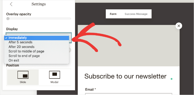
The biggest difference here is “On Exit.” This will make your campaign appear as users are actively leaving your website.
This is a crucial moment in the customer journey. That’s because many of your website visitors will come only once. And when they leave, they’ll be gone forever,
Exit popups are an excellent way to capture those visitors and bring them back to your site more often through email marketing.
But beyond these basic triggers, you don’t have much more control over where, when, and to whom your campaigns appear.
c) OptinMonster
OptinMonster gives you more targeting rules and triggers than any other tools on the market, Squarespace and Mailchimp included.
Without needing any technical knowledge, you have full control over what makes your campaign display.
You’ll see your options in OptinMonster’s intuitive Display Rules section of the editor:
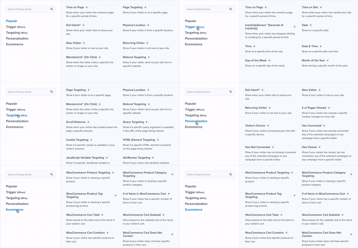
On top of the basic triggers like scroll depth, time on page, and targeting specific URLs, some of OptinMonster’s most popular triggers include:
- Exit-Intent® Technology: Recover abandoning visitors as they’re actively leaving your site.
- MonsterLinks™: Boost conversions by making campaigns open with the click of a button.
- OnSite Retargeting®: Show fresh campaigns to returning users to avoid ‘popup fatigue.’
- Geolocation: Personalize the customer journey by targeting users based on their physical location.
These are just a few examples, though there are many others.
There are also a wide range of eCommerce-specific triggers for platforms like Shopify and WooCommerce:
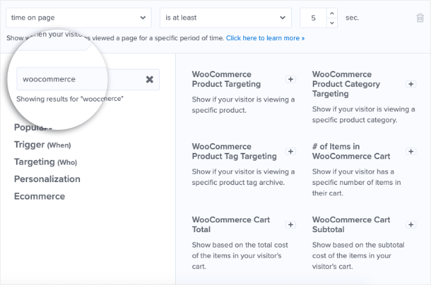
These allow you to show campaigns based on how users are interacting with your online store, what products they are (or aren’t) adding to their carts, what their cart total is, and much more.
These are the same kinds of rules that helped Fastrack recover 53% of their abandoning visitors.
Or how Crossrope was able to explode its list by 900%.
These targeting rules are crucial in getting the most conversions possible from your website.
Verdict: Again, OptinMonster comes out as the clear winner in this category. It goes far and beyond what Squarespace and Mailchimp allow you to do and is the ONLY tool that is sure to get you more conversions in the least amount of time.
4. Scaling Your Business
Last but certainly not least, there’s one more factor we need to consider in our Squarespace email campaign vs. Mailchimp vs. OptinMonster comparison: What happens when you scale?
One of the biggest downsides of using tools like Squarespace and Mailchimp to grow your list (rather than to build websites or send email campaigns) is that you’ll be stuck with that tool as you grow.
A lot of business owners forget to plan on their own success in terms of growth. They select tools completely based on budget and create different roadblocks later on.
This is the case with using Squarespace or Mailchimp to grow your email list.
If you wanted to eventually move to WordPress, for example, you’d need to completely re-create new forms for your website.
Or if you wanted to switch from Mailchimp to a different ESP, like Constant Contact, you’d also need to build new forms for your site from scratch.
But OptinMonster is a standalone product. It works with any website builder and connects to any ESP on the market.
That means it gives you more flexibility when it comes to working with other tools.
Rather than locking yourself into one software to handle everything, it’s often smarter to find standalone products that integrate with your other marketing tools.
This is exactly the problem that OptinMonster solves and gives you more freedom to change website builders or ESPs in the future.
The Final Verdict
When comparing Squarespace email campaigns vs. Mailchimp vs. OptinMosnter for specifically growing your email list, we can confidently say OptinMonster is the best tool for the job.
OptinMonster gives you MORE:
- Campaign options
- Freedom of design
- Targeting rules
- Flexibility for scaling your business
While both Squarespace and Mailchimp offer basic optin form capabilities, they’ll leave you with generic campaigns that won’t grab your audience’s attention.
Plus, you’ll need to totally remake those optin forms if you change website builders or ESPs.
It’s why 1,213,437+ websites trust OptinMonster with the success of their business.
You can see the same success by clicking below and starting your 100% risk-free trial today:
We hope you enjoyed our comparison of Squarespace email campaigns vs. Mailchimp vs. OptinMonster.
If you did, you’ll likely want to check out the following resources:
- Email Marketing for Beginners: The Ultimate Guide
- How to Run a Successful Email Marketing Campaign
- 17 Tips for Writing Email Copy That Converts
These articles will show you how to make a profitable email marketing strategy once you’ve added new subscribers to your mailing list.






Add a Comment