Do you want to add a thank you popup to your website to grow sales, increase subscribers, and boost engagement?
Whether you’re a publisher, marketer, or eCommerce store owner, you can use a thank you popup to:
- Offer exclusive discounts
- Gain more social media followers
- Grow your email list
- And more…
No matter what you use them for, the result is always the same: thank you popups improve user experience (UX) and build more loyalty for your brand.
So, in this article, we’ll show you how to set up a thank you popup on your website in minutes.
But first, let’s clarify what a thank you popup is.
What Is a Thank You Popup?
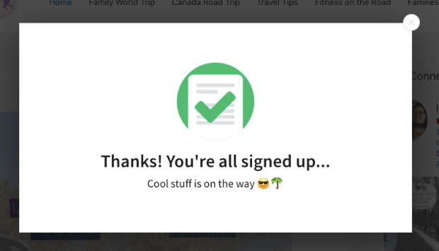
A thank you popup is a popup that’s displayed to your visitors once they’ve successfully completed an action on your site. Here’s a quick example:
This is a crucial moment in the customer journey that you should be making the most out of.
The customer is obviously engaged with your brand in a positive way (hence why you’re saying thank you), which makes this the perfect moment to:
- Upsell with an exclusive offer
- Share content to boost pageviews and strengthen SEO
- Add users to your mailing list to stay up-to-date
- Display a webinar registration form to move customers further down your sales funnel
- Ask for feedback, reviews, or testimonials
- And much more
In other words, this “thank you moment” happens at a time when your customer is excited to interact with your brand. Your job is to keep that feeling going for as long as possible.
Now, we’ll look at how you can create beautiful thank you popups that boost sales and subscribers.
How to Add a Thank You Popup to Your Website
For today’s tutorial, we’ll be using OptinMonster to create our thank you popup:
OptinMonster is hands down your best option for creating a professional thank you popup in minutes.
It has a drag and drop builder to save you hours of time in the campaign creation process. Plus, OptinMonster comes with powerful targeting rules.
This makes sure that your campaigns are seen by the right people, in the right places, at just the right time in their customer journey.
OptinMonster comes with several campaign targeting and trigger options to create a high-converting popup on your thank you page. Click the button below to start your 100% risk-free OptinMonster account today:
Today, we’ll look at the following scenarios for using thank you popups to increase user engagement:
- Adding a popup to your thank you page
- Using MonsterLinks™ to set up multi-step popups
- Showing OptinMonster’s Success view after a visitor has completed an optin
We’ll teach you how to use a thank you popup in each of those situations.
Let’s get started.
Method 1: Add a Popup to Your Thank You Page
To kick off this tutorial, we’ll create a popup that’s displayed on your thank you page.
For example, let’s say a website visitor has signed up for your email newsletter, and you want to take that opportunity to offer them a limited-time coupon.
So, when they sign up, they’ll land on your thank you page.
That’s where you’ll display a thank you popup. For this section of the tutorial, we’ll create a popup for a timed offer.
Not sure if you have a thank you page that’s ready to convert? Here’s a post with practical advice and real-world examples for building an effective thank you page.
Once you have that set up, you’re ready to add the popup!
Step 1: Create Your Popup Campaign
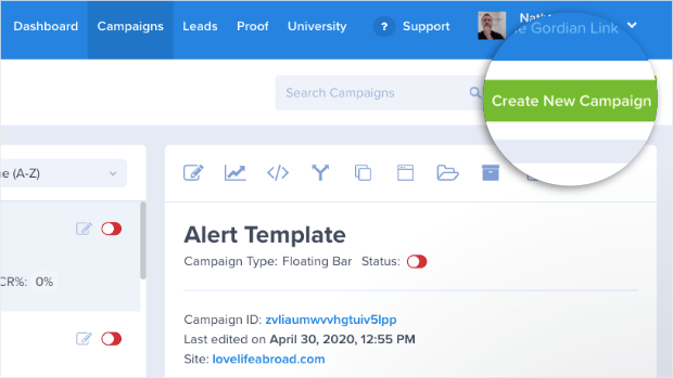
First, log into your OptinMonster dashboard and click Create New Campaign in the upper right-hand corner:
Choose your campaign type. In this tutorial, we’ll select a Popup:
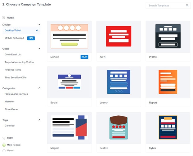
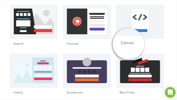
Now, it’s time to decide on a campaign template. OptinMonster has over 50 prebuilt templates to choose from:
But if you want to build your own campaign, that’s no problem either. You can create one from scratch using the Canvas template:
Whether you choose one of the pre-made templates provided by OptinMonster or build one from scratch, the design process couldn’t be easier.
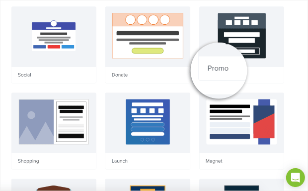
Everything can be configured in your OptinMonster campaign editor with a drag and a drop. For today’s tutorial, we’ll go with the Promo template because it already has the elements we need to create a popup for a timed offer:
- The countdown timer clearly shows how long our customer has to redeem the offer
- There’s enough space for the details of the sale
- It’s easy to add a coupon
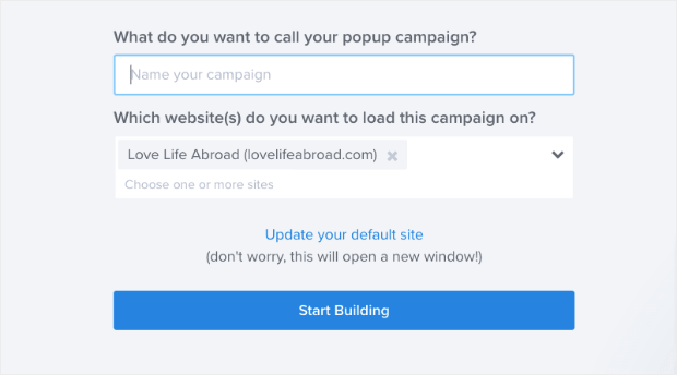
Once you select the template, you’ll need to give it a name, connect it to your site, and click Start Building:
Now you’re ready to design your thank you popup.
Step 2: Design Your Thank You Popup
There are so many options for customizing your popup, and editing your popup in the drag and drop builder is simple. Here’s how it works:
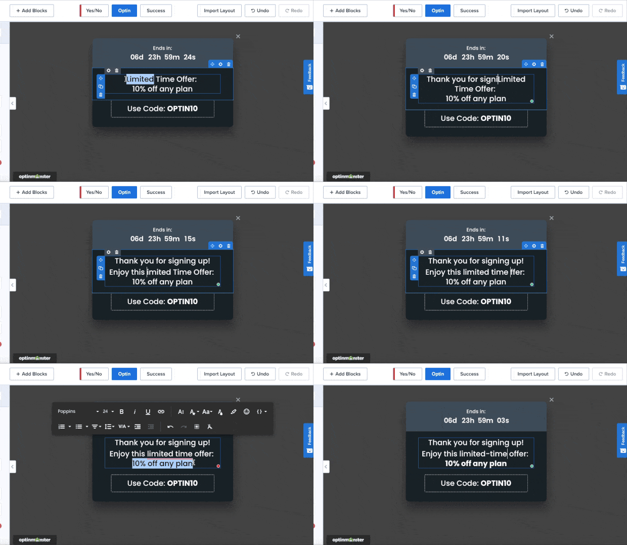
To change the text of your thank you popup, you can write directly in the campaign builder with OptinMonster’s inline text editor:
This allows you to quickly modify your message’s:
- Font-family
- Size
- Line height
- Alignment
- Style (bold, underline, and italic)
- And much more…
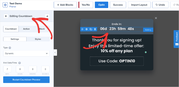
To make other kinds of changes to your campaign, you simply need to click on the element you want to change. This will pull up the editing tools on the left side:
This lets you change every part of your thank you popup. You can change the:
- Background colors
- Timer settings
- Coupon code
- And more…
Want to add a new element to your campaign? You can use our drag and drop builder to add new things like:
- Video
- Countdown
- HTML
- Additional optin fields
- Dividers
- And much more…
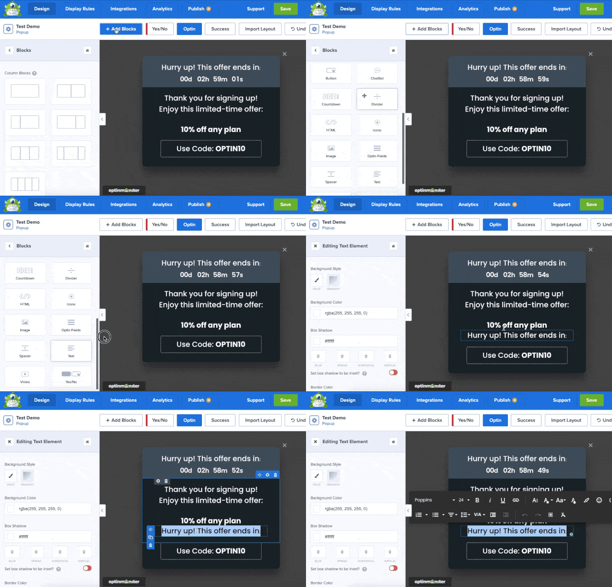
To do so, click + Add Blocks at the top of your editor, find the block you want to add to your thank you popup, then drag and drop it into place:
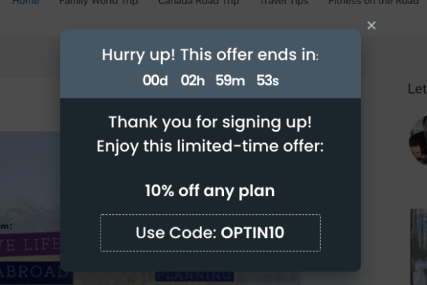
Here is the popup we created for today’s tutorial:
With OptinMonster’s pre-made templates, we made this in under 5 minutes.
Step 3: Set Display Rules
Next, you want to control when your visitor will see your popup.
For that, you’ll head over to Display Rules at the top of the editor.
You’ll find several different ways to display your popup. OptinMonster offers the most comprehensive targeting rules on the market.
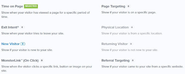
This is what allows you to personalize your campaigns and really drive conversions. Here’s a quick snapshot of some of OptinMonster’s Display Rules:
For this tutorial, though, let’s focus on Page Targeting. Find and click Page Targeting.
Next, go ahead and add your thank you page URL. If you get stuck, check out this post on formatting your page URL:
Finally, save and publish your campaign.
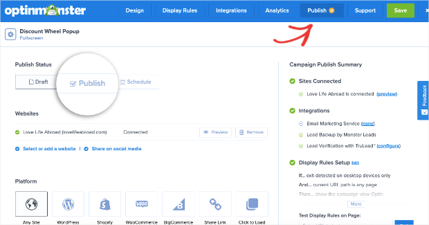
To publish your campaign, click Publish at top of your editor. Then switch the campaign from Draft to Publish:
If your site isn’t connected yet, no worries. Feel free to use these helpful tutorials to get set up:
Now, your site visitor will see your popup when they land on your thank you page.
Let’s turn our attention to the second way you can use thank you popups on your site: using MonsterLinks™.
Method 2: Using MonsterLinks™ For Multi-step Optins
One of the most effective ways to increase conversions on your site is to use multi-step optins.
You can do that easily with MonsterLinks™. This feature turns an anchor text or button into a clickable link that makes your popup appear.
How does this boost conversions? The idea based on a psychological trigger called the Zeigarnik effect.
This suggests that people who start a process are more likely to finish it. So when users click your button or text-based MonsterLink™, they’ve kicked off a process that will make them more likely to engage with your offer.
This is the exact strategy CodeInWP used to increase conversions by 1000% percent.
For this section of the tutorial, we’ll offer a guide to our customers after they’ve made a purchase. Here’s how the process will work:
- Customer will make a purchase
- They’ll arrive on a confirmation or “thank you page”
- The page will have a MonsterLink™ to make the thank you popup appear.
The first 2 steps are the same as we saw in Method #1 earlier in the tutorial. For a refresher, feel free to jump back to step 1 or step 2 to create and design your popup.
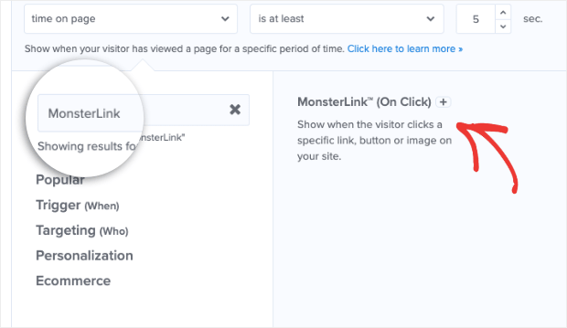
When your thank you popup is ready, head over to Display Rules just like you did before. Find and click MonsterLink™ (On Click):
Click Copy MonsterLinks™ Code:
This will give you the raw HTML version of your campaign’s embeddable link. That looks something like this:
<a href=”https://app.monstercampaigns.com/c/fogfajjog4gtlwe9b05g/” target=”_blank” rel=”noopener noreferrer”>Subscribe Now!</a>
But if you’re using a platform like WordPress, most page builders or buttons don’t require HTML. Instead, you’ll need the link that starts with “https://”. Here’s the regular URL from the MonsterLink™ provided above:
https://app.monstercampaigns.com/c/fogfajjog4gtlwe9b05g/
Now you can take this code and embed it with any anchor text or button of your choosing. When your site visitor clicks on the link in your thank you page, they’ll go to your optin form:
Make sure you save and publish your campaign just as you did before.
And to further increase conversions, consider combining MonsterLinks with Yes/No Forms.
Yes/No forms further leverage the Zeigarnik effect and can be a great way to generate new leads or follow up with a thank you popup.
Now, let’s look at our last method for creating a thank you popup: using OptinMonster’s Success view.
Method 3: Create a Success View Thank You Popup
In some circumstances, you don’t want to send your visitors to a thank you page. Instead, you simply want to thank them for signing up to your newsletter, joining a webinar, giving a positive review, and more.
OptinMonster’s Success view is one of the simplest ways to thank your visitors.
The success view is shown to a visitor after they’ve successfully opted in to your email list, made a purchase, downloaded a report, and more.
So instead of redirecting your visitor to a thank you page, you’d display the Success view after a user signs up to your offer.
To start, create your campaign by repeating these steps from Method #1 in this tutorial.
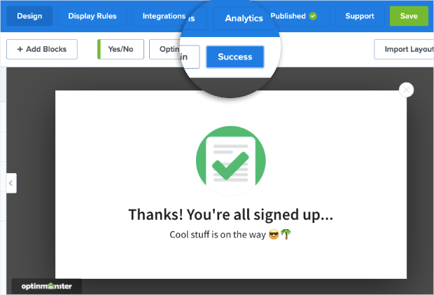
In OptinMonster’s campaign builder, select the Success tab:
There are many ways you can use your success page as a thank you popup. You could:
- Give a discount, coupon, or promotion
- Ask members to rate their experience with a survey form
- Upsell customers
- Give a free eBook or instructional guide
- Provide order or shipping details for purchases to improve UX
- And more…
This is important to bring up because many people create optin campaigns but leave the thank you message as an afterthought.
OptinMonster has a Success view ready to go for each popup template. While these work well out-of-the-box, you could take a few minutes to personalize the messaging to reach your goal.
This is equally true if you simply want to let users what’s coming next. Here’s the (very simple) thank you popup we made in less than 2 minutes:
This small message confirms that the user is signed up and lets them know an email is on the way.
Looking for more ideas on how to use the success view? Read this post for more examples on how to include success themes in your customer’s journey.
We hope this article will help you to create thank you popups that increase engagement, subscribers, and revenue.
If you enjoyed this post, you might also want to check out the following articles:
These have more information you need to grow your list and improve your email marketing strategy.












Add a Comment