Do you want to learn how to make a one page website in WordPress?
One page websites are simple to build. They can also have higher conversion rates than more complex websites.
In this tutorial, we will show you how to make your own website in WordPress.
Can a Website Be One Page?
Yes, a website can be a single page!
You can divide your one page website into multiple sections. Then you may want to use anchor links to help users navigate to the section they want.
Or you can have just one section, such as an email optin form. This works especially well if the rest of your website is still under development. The email optin can serve as a coming soon page.
Sales pages are often built as one page websites. Having no external links to distract the customer can help conversion rates. It’s also an opportunity to show off offer-specific branding.
What to Include in Your One Page Website
A one page website can have all the parts of a multipage website.
For a one page website about your business, you want to have the following sections:
Header
This is the first thing people see when they visit your one page website. You’ll want to include your business name here as well as a quick overview of what you do.
About
The About page is one of the most-visited pages on a larger website. So you want to make sure to include an About section on your one page website.
Use the About section to share a bit about yourself. This is also a great place to show that you really understand your customer’s needs.
The About section should not just be about you. You should explain how your business can help the reader.
Avoid these common conversion-killing mistakes on your About section.
Services/Products
Now, you can talk about your offer in more detail.
If you sell a service, explain what you can do for the reader. Focus on the benefits your service will bring, not all the details about scheduling or payment. (That part comes later!)
If you sell a product, show pictures of the product. Again, don’t just list the features. Talk about how each feature can help the reader get what they want.
Social Proof
Buyers make decisions based primarily on their emotions. Some powerful emotions you can appeal to are trust and belonging.
Social proof is a way to show that other people like your service or product. Some examples of social proof include product reviews, testimonials, case studies, media mentions or industry awards.
A visitor who reads a review might decide that they want the same result. Then they will imitate the person who wrote the review and purchase your product.
A potential client might see that your work was featured in a famous magazine. Then they might want to share some of that prestige by hiring your award-winning business.
Learn how to leverage the power of social proof with TrustPulse.
Call to Action
You want visitors to do something before they leave your one page website. So make sure to include a call to action.
Maybe that action is buying your product or booking your service. In that case, you can include a button to buy or schedule.
Or perhaps you want them to follow you on social media or share one of your posts. You can use Smash Balloon to display shareable social media content on your one page website.
Contact Information
A visitor may not be ready to follow your call to action yet. Or they want to do something different, like ask a question.
Include your contact information so that potential customers can reach you.
A fillable contact form makes it easy for visitors to get their questions answered.
Before You Build Your One Page Website
We know you’re eager to learn how to make a one page website in WordPress.
But before you get started, you need to make sure you have everything you need.
Just as it’s easier to cook a meal when you have all the ingredients available and measured, it’s much easier to build a one page website when you have all the parts ready to go.
You want to have the following things:
- Branding: Decide ahead of time what colors and fonts you will use. Have your logo ready as well if you have one.
- Images: Save any product or brand images you want to use into a specified folder.
- Copy: Write out what you’re going to say in each section of your one page website.
- Email list: If you’re planning to have an email optin form, make sure you have an account with an email service provider like Mailchimp or ConvertKit.
How to Build Your One Page Website in WordPress
Now you’re ready to build a one page WordPress website. In just 6 steps, you’ll be done!
Step 1: Sign Up for Hosting
First, you want to sign up for web hosting and a domain name.
Web hosting is like the land you build your website on. A domain name is like the mailing address that tells people how to find your one page website.
We recommend Bluehost for hosting because they also offer a free domain name.
If you need ideas for your domain name, try using Nameboy, the best domain name generator.
Step 2: Install SeedProd
The next step is to install the SeedProd plugin.
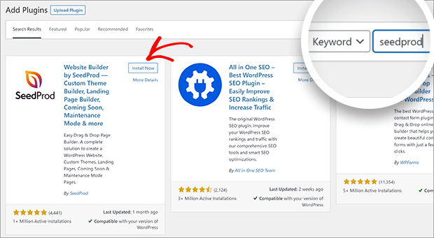
The easiest way is to use the plugin search to install the free version of SeedProd.
Search for SeedProd. Then click Install. Finally, click Activate.
You can upgrade to SeedProd Pro to build themes, collect emails, and access other growth tools.
Step 3: Create a New Landing Page
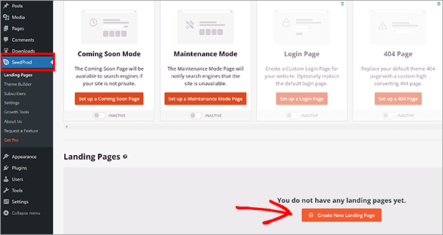
You now have a new option in your WordPress Admin area. First, click on SeedProd » Landing Pages. Then, click on the button Create a New Landing Page.
Because every one page website is different, we’re going to use the Blank Template. We promise to show you all the steps!
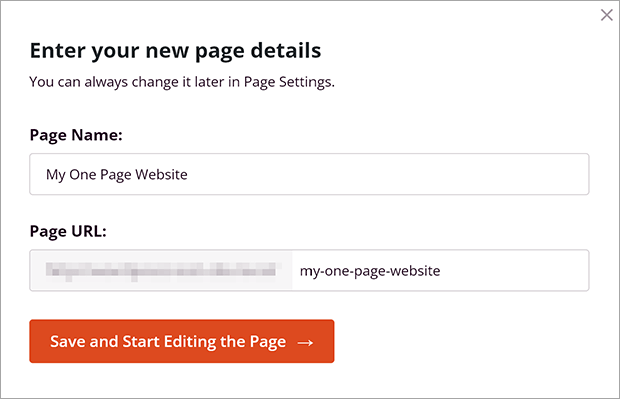
A window will pop up. Fill in your page name. Don’t worry, you can change this later if you need to!
Click Save and Start Editing the Page.
Step 4: Build Your One Page Website
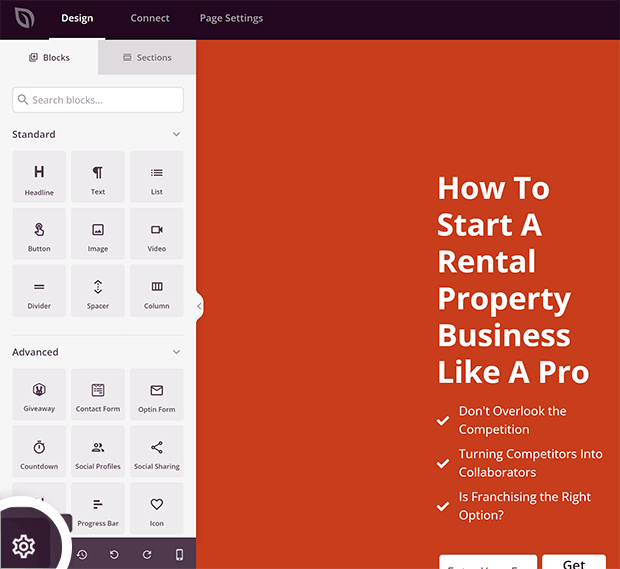
You are now in the SeedProd Builder.
Global Settings
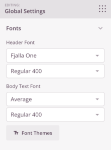
First, we will customize the global settings. This allows you to set fonts and colors for the entire page. You want your branding to look consistent throughout your one page website.
Click on the gear icon on the bottom left menu to bring up Global Settings.
Select your header font and body text font from the dropdown menus.
You can also click on Font Themes to see some recommended font pairings.
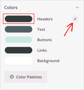
Next, we are going to choose your global colors.
You can click directly on the color preview to adjust the color. Or you can click on the pencil icon that appears when you mouse over each setting.
Just like the fonts, click on Color Palettes to see premade color combinations.
Add a Section
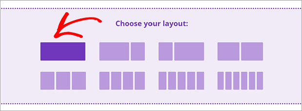
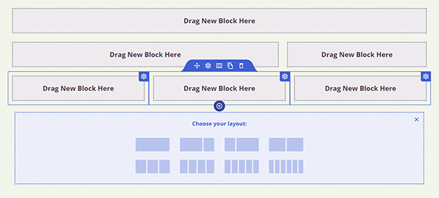
In the builder on the right side of the screen, you can choose your layout. We recommend a 1-column layout to keep your one page website simple and easy to navigate.
This will create a new section as well as a new row. Sections are outlined in purple when you mouse over. Rows are outlined in blue. You can add multiple rows in a single section. Each row can also have a different number of columns. Again, we recommend 1- or 2-column layouts to keep your website easy to use, especially on mobile.
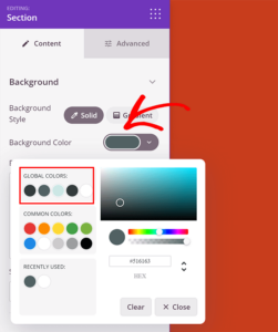
You can change the section background color by clicking on the section outlined in purple.
Click on the color preview for Background Color to adjust the color. You can choose from the global colors you chose earlier.
Add Blocks
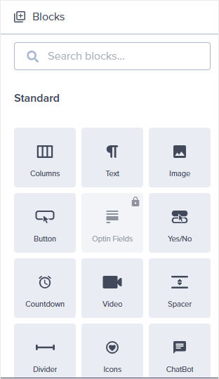
Blocks are the individual elements of your one page website. You can always access your Blocks by clicking on the icon of dots in the upper right corner of the editing panel.
The blocks you need will depend on what section you’re building. Here are our recommendations:
- About section: Use the Headline, Text, Video, and Image Blocks to tell your business origin story.
- Services/Products section: Use the Headline, Text, Image, Image Carousel, or Pricing Table Blocks to share your offers.
- Social Proof section: Use the Testimonials, Facebook Comments, or Twitter Embed Timeline Blocks to show what other people have to say about your business.
- Call to Action section: Invite visitors to join your email list with the Optin Form block, or include a Button block leading to your booking or purchase page.
- Contact section: Include your contact information in a Text Block or add a Contact Form block for people to reach out directly.
Step 5: Add Anchor Links
With all of your content on the same page, it’s very important to have a way to navigate your one page. Fortunately SeedProd makes this very easy with the Anchor and Nav Menu Blocks.
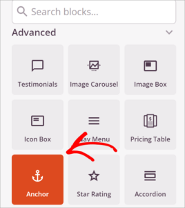
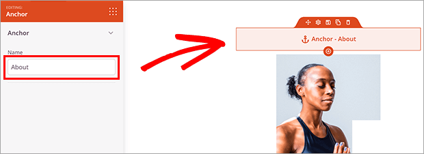
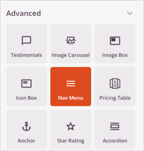
First, we will add the anchors. Anchors are invisible Blocks that name a section of your one page website. Find the Anchor Block under Advanced Blocks.
Drag it into the section that you want to name. It doesn’t matter where you put it because it will not show up when visitors see your page.
Click on the Anchor Block in the live builder and enter a section name in the indicated field.
Add an anchor block for each section that you want to be able to link.
Next, we will add the navigation menu. We recommend putting this at the top of your one page website. This lets visitors immediately jump to the part they want to read.
Find the Nav Menu block under Advanced Blocks.
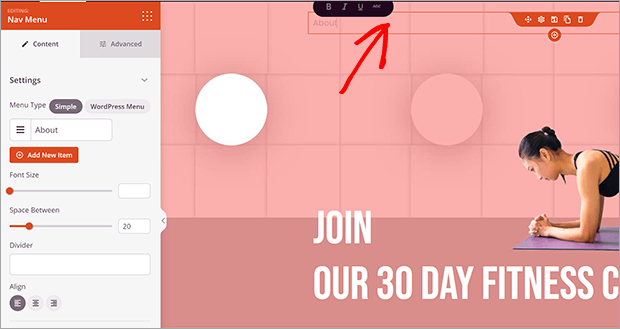
Drag it into the section where you want your menu.
Click on the Nav Menu block in the live builder. This will pull up the menu settings.
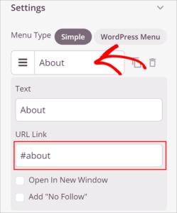
Click on the sample link automatically generated by SeedProd. Instead of a complete URL, you will put the anchor name for the first section you want to link to. Add a hashtag or pound sign # in front of the anchor name. It should look like this:
Repeat this process for all the anchors you made earlier.
Click on the Advanced tab. Here you can customize the appearance of the nav menu. Depending on your one page website design, you may want the nav menu to be horizontal or vertical. Play around with it until you get something you like!
Step 6: Add Your Call To Action (CTA)
Your call to action (CTA) is an important part of your one page website. SeedProd makes it easy to add a variety of CTAs. We’ll go over two of the most common: contact form and optin form.
Contact Form
Find the Contact Form block under Advanced blocks.
Drag it into the section where you want it to appear.
You will be asked if you would like to install WPForms. It’s a free form builder plugin. So go ahead and click Install WPForms.
The plugin will take just a few seconds to install.
Click + New Form in the editing panel.
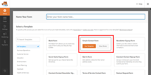
The WPForms window will appear. Choose a template or create a blank form. We recommend the Simple Contact Form template. You can customize it more in the next step.
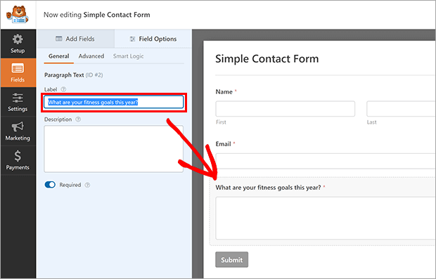
Click on a field to customize it or click the Add Fields tab to put more fields in. You can use the “Message” field title to remind visitors of how you can help them.
Click Save and then the X button to exit the WPForms window.
Your contact form is now on your one page website!
Optin Form
SeedProd can collect email addresses for you. You can use SeedProd’s subscriber feature or one of the many email marketing integrations.
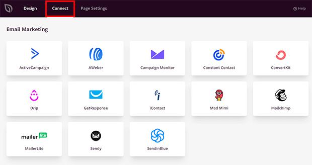
Click on the Connect tab at the top of the builder.
Choose your email marketing service and click Connect.
Click Connect New Account. Follow the directions. You will probably have to log into your email marketing service to get the API keys.
Click Save Integration Details.
Go back to the Design tab.
Find the Optin Form block under Advanced blocks.
Drag it into the section where you want it to appear.
Click on the Optin Form block to customize the settings. It’s already connected to your email marketing service, so you’re ready to collect emails on your one page website!
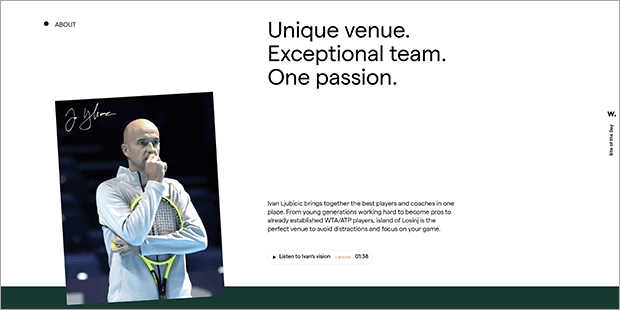
One Page WordPress Website Examples
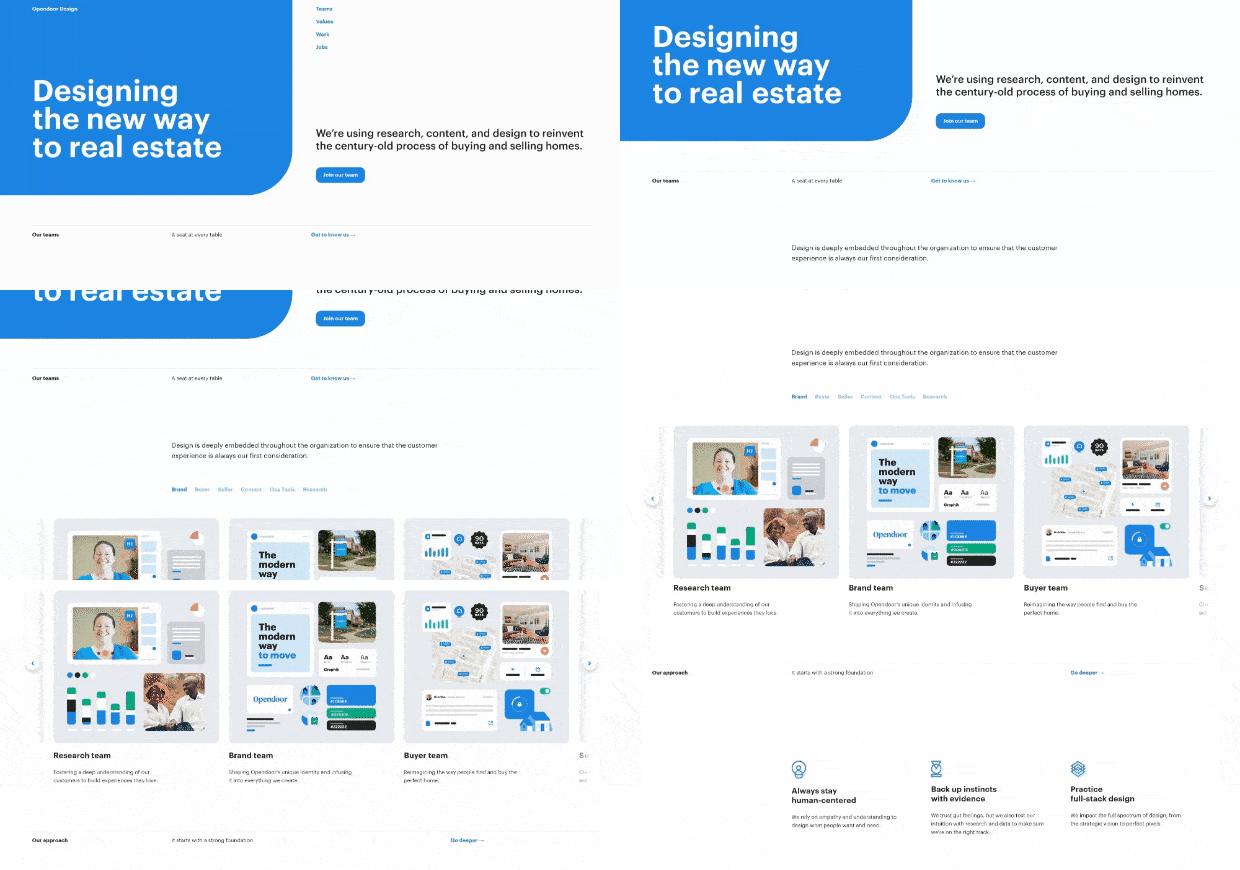
Open Door Design
The clean, simple color scheme of Open Door Design lets the portfolio really shine. Anchor links take you through the team structure, company values, work samples, and job postings. The one page website ends with a contact form. Interestingly, many of the links lead to the firm’s Medium blog.
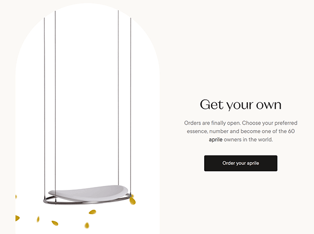
Aprile
Aprile’s one page website takes the visitor on a journey through the month of April. Interactive elements add visual interest, and also hide information until the viewer is ready. The call to action is an exclusive opportunity to buy the limited edition product.
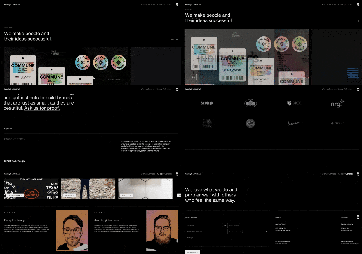
Always Creative
Always Creative’s homepage is a lovely example of a one page website for agencies. The anchor links in the fixed navigation make it easy to jump from their portfolio to their service descriptions and more. A simple contact form invites visitors to reach out.
All N 1 House of Beauty
The salon All N 1 House of Beauty is stunning proof that the one page website formula is anything but boring. The fullscreen introduction section has a button inviting users to scroll down for more information about the salon’s staff, services, and portfolio.
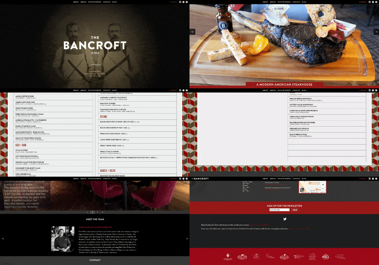
The Bancroft
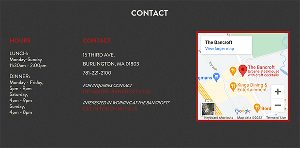
A restaurant like The Bancroft needs its one page website to do one thing: get people in the door. Large photos of the food and restaurant space tempt visitors to keep scrolling. Then the interactive menu teases diners about what they could have for their next meal. The end of the page is simply the restaurant’s location, hours, and contact information.
Is It Better to Have a One Page Website or Multiple Pages?
The answer depends on your business needs.
A one page website can help visitors stay focused. With only one page for search traffic to land on, your website may be able to climb the search ranks faster.
One page websites can be easier to optimize for mobile. With only one page, you can really optimize your WordPress site’s speed and performance.
One page websites are good for businesses with just one main service or product to promote. One page WordPress websites are also great for local businesses that simply need to get people into a physical location.
You’ll need multiple pages for more complex small business websites such as eCommerce sites, blogs, or publications.
Building a One Page WordPress Website
All done! Now you know how to make a one page website in WordPress.
If you want to add a Coming Soon page while you build your new website, check out our tutorial here. You can also read more about other drag and drop builders.
What are you waiting for? Get started with SeedProd to build your one page website.










Add a Comment