When you’re running an online store, your product pages are the key to turning visitors into customers. The default WooCommerce product pages are a good starting point, but they’re not tailored to your unique brand or audience. That’s why learning how to customize WooCommerce product pages can make a big difference in your sales and customer experience.
At OptinMonster, we’ve helped thousands of small businesses optimize their websites for better conversions. In this guide, I’ll walk you through proven methods to customize your WooCommerce product pages, from beginner-friendly tools to advanced coding options. By the end, you’ll know exactly how to create a product page that stands out and boosts your bottom line.
- Why You Should Customize WooCommerce Product Pages
- How to Customize WooCommerce Product Pages (4 Methods)
- Best Practices for WooCommerce Customization
- How to Convert More Product Page Visitors Into Customers
Why You Should Customize WooCommerce Product Pages
Customizing your product pages does more than just make them look good. It helps you create a better shopping experience for your customers, which can directly impact your sales. Here’s why customization is worth your time:
1. Enhanced Brand Identity and Differentiation
Your product page design is part of your brand. Customizing the layout, colors, and fonts can help you stand out from competitors using the same default WooCommerce template.
Example: A store selling handmade jewelry could use soft pastel colors and elegant typography to match their brand’s personality. This helps customers remember the brand and feel connected to its products.
2. Better User Experience for Higher Conversions
Shoppers want to find what they need quickly and easily. By organizing your product information clearly and adding helpful features, you can make their decision-making process smoother.
Example: Adding a size guide for clothing products can reduce uncertainty and prevent returns.
3. Optimized Pages for SEO and Mobile Users
Search engines rank websites higher when they provide a good user experience. Improve your SEO by customizing your pages with fast-loading images, mobile-friendly layouts, and proper meta descriptions.
Learn more about SEO with these resources:
• SEO Beginner’s Guide: Learn the Basics + Top Tips
• 10 SEO Ranking Factors to Get More Traffic
• The DIY Mobile SEO Guide: How to Have a Mobile-First Website
4. Integration of Advanced Features
With customization, you can add features like variation swatches, FAQ sections, or personalized recommendations that make shopping easier and more engaging for customers.
How to Customize WooCommerce Product Pages (5 Methods)
There’s no one-size-fits-all approach to customizing WooCommerce product pages. Depending on your skill level and needs, you can use one or a combination of the following methods.
- Method 1: Customize with WooCommerce Extensions
- Method 2: Use the Site Editor in WordPress
- Method 3: Customize Your WooCommerce Product Page with CSS
- Method 4: Use a Page Builder to Customize WooCommerce Product Pages (Recommended)
Method 1: Customize with WooCommerce Extensions
If you need extra functionality, WooCommerce extensions are a great solution. The WooCommerce Marketplace includes nearly 1000 extensions to help you customize your WooCommerce store.

Here are a few particularly helpful extensions:
- Advanced Product Variation: This extension lets you replace standard dropdowns with interactive swatches, such as color boxes or size buttons. It makes browsing easier and more visual.
- Composite Products: For products that require customization, like furniture or gift sets, this extension helps customers build their own configurations step-by-step.
- WooCommerce Tab Manager: This plugin allows you to reorder, rename, or create custom tabs for product pages. For instance, you can add a “How It Works” tab to explain complex products.
- Product Add-Ons: This extension enables features like gift wrapping, custom engraving, or priority shipping. You can also offer upsells, such as extended warranties for electronics.
Keep in mind that these are all paid extensions, and the price can add up quickly. If you have a new WooCommerce store, I recommend starting with just 1 or 2 necessary extensions.
Method 2: Using the Site Editor in WordPress
The Site Editor in WordPress is a fantastic tool for users who want more control over the look and feel of their product pages. It’s beginner-friendly and doesn’t require coding knowledge, making it ideal for small business owners.
Accessing the Site Editor: To access the Site Editor, follow these steps:
- Navigate to Appearance > Editor in your WordPress dashboard.
- Select Templates > WooCommerce in the panel on the left
- Scroll and click the Single Product template.
Customizing Page Layout: Once in the Site Editor, you’ll customize your product page layout with blocks, similar to the WordPress Block Editor. Here’s what it looks like:

You can:
- Rearrange the layout by moving blocks up, down, left, or right.
- Add new blocks, like banners or promotional messages, to highlight special offers.
- Add elements like image galleries, testimonial blocks, and call-to-action (CTA) buttons.
- Modify colors and typography by selecting a block and using the settings panel on the right.
Method 3: Customize Your WooCommerce Product Page with CSS
For those with a bit of technical expertise, CSS provides excellent flexibility in customizing the appearance of WooCommerce product pages. This method is best for more advanced users or those working with a developer.
Customizing a WooCommerce Product Page Using CSS
Using CSS for Design Customization: CSS (Cascading Style Sheets) is a simple way to control the appearance of your pages. Here’s how to add custom CSS:
- Go to Appearance > Customize > Additional CSS in your WordPress dashboard.
- Input your CSS code to make specific changes.
Here are 2 examples of CSS you can use to customize your product page.
1. Change Button Color: This makes your Add to Cart button stand out with a bold orange color.
.woocommerce div.product .button {
   background-color: #ff5722;
   color: #ffffff;
}
2. Adjust Product Title Size: This code changes your font size to 28 px with a bold font weight.
.woocommerce div.product .product_title {
   font-size: 28px;
   font-weight: bold;
}
Method 4: Use a Page Builder to Customize WooCommerce Product Pages (Recommended)
If you’re looking for a simple yet powerful way to customize WooCommerce product pages, using a page builder is the best option. Page builders let you create professional, fully customized pages without needing coding skills. One of the most user-friendly and feature-packed tools for this is SeedProd.
Why Choose SeedProd?
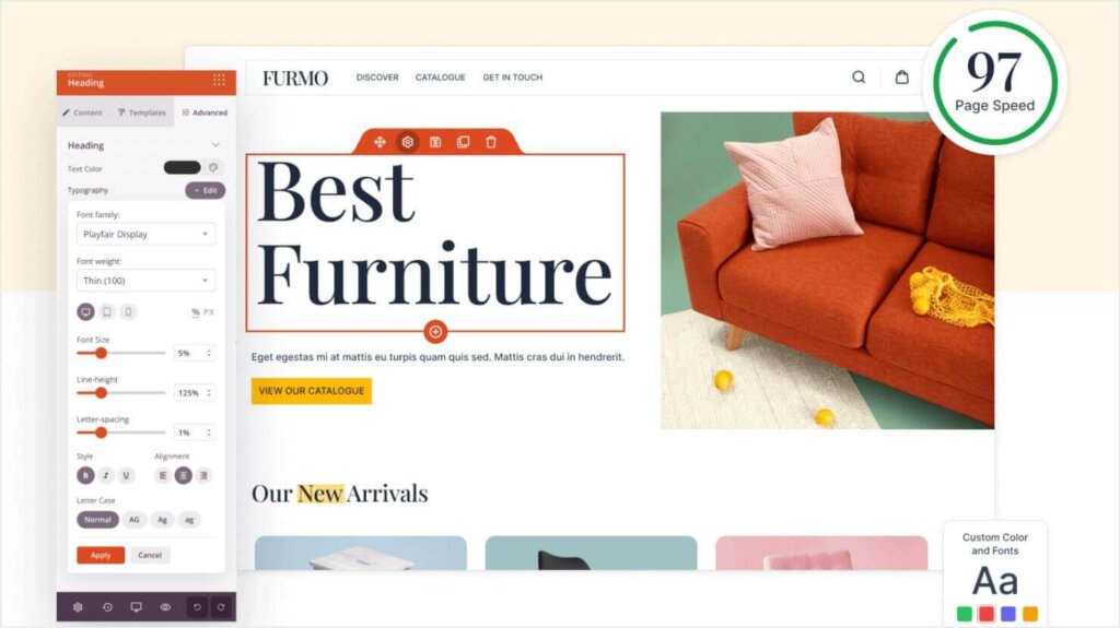
SeedProd is a drag-and-drop page builder designed for WordPress. You can build your entire website with it, and it’s perfect for creating high-converting WooCommerce product pages, thanks to its seamless WooCommerce integration. With SeedProd, you can:
- Build custom layouts from scratch or use pre-built templates.
- Add WooCommerce-specific blocks like product grids, Add to Cart buttons, and more.
- Customize colors, fonts, and images to match your brand.
- Improve conversions with advanced features like social proof and call-to-action elements.
SeedProd is very intuitive and beginner-friendly, so you’ll likely be able to build your product pages without much instruction. However, I’ll walk you through a few of the most important steps to designing a stunning WooCommerce product page with SeedProd.
Step 1) Download and Activate the SeedProd Plugin
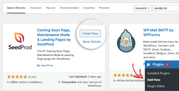
First, you’ll need to download the SeedProd plugin. From your WordPress admin menu, go to Plugins > Add New and search for SeedProd.
When you’ve located the plugin, click Install Now:
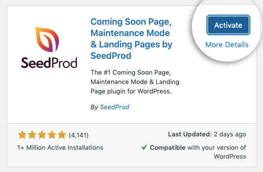
When it’s done installing, click Activate:
For advanced WooCommerce functionality, you’ll need a Pro plan or higher.
While you can create custom landing pages from their free Lite plan, we highly recommend upgrading to unlock all the WooCommerce page features.
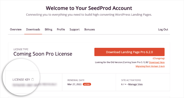
You’ll need to enter your license key. You can find this by logging into your SeedProd account and looking under Downloads:
Then go back to your WordPress admin menu and click SeedProd > Settings and enter your license key:
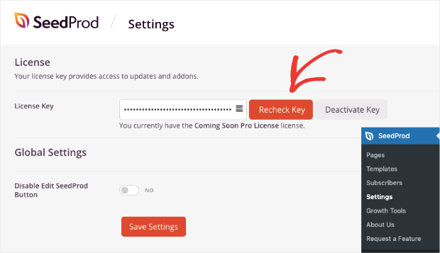
Once you enter your license key, you’re ready to design your first WooCommerce product page.
Step 2) Create Your First WooCommerce Product Page
From your WordPress admin menu, click SeedProd > Templates. This will give you access to tons of pre-built landing pages that you can use to get started:
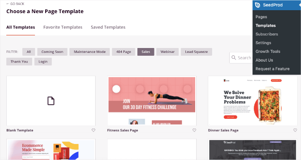
But for WooCommerce product pages, we’ll use the Blank Template:
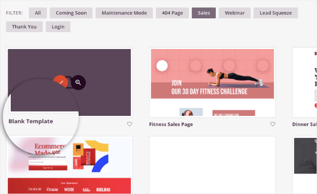
This will let us start from scratch and will be the easiest template to follow along with for this tutorial.
That said, you should take a few seconds to look through the templates to see if you find a landing page template that already fits with the product you’d like to promote.
Now you’ll just need to give your product page a name that will also automatically generate a URL slug:
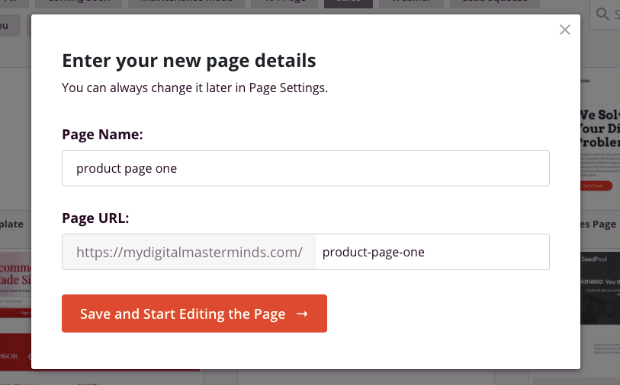
Click Save and Start Editing the Page.
Now you’re ready to build the perfect WooCommerce product page.
3) Customize Your WooCommerce Product Page
You’ll see the blank template in the SeedProd editor. As we mentioned earlier, customizing your product page couldn’t be easier.
All of the elements you can add to the page are found on the left-hand side:
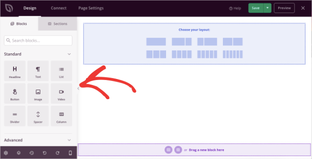
And you can add any of these new elements with a drag and a drop.
But first, we’ll start by choosing a single layout:
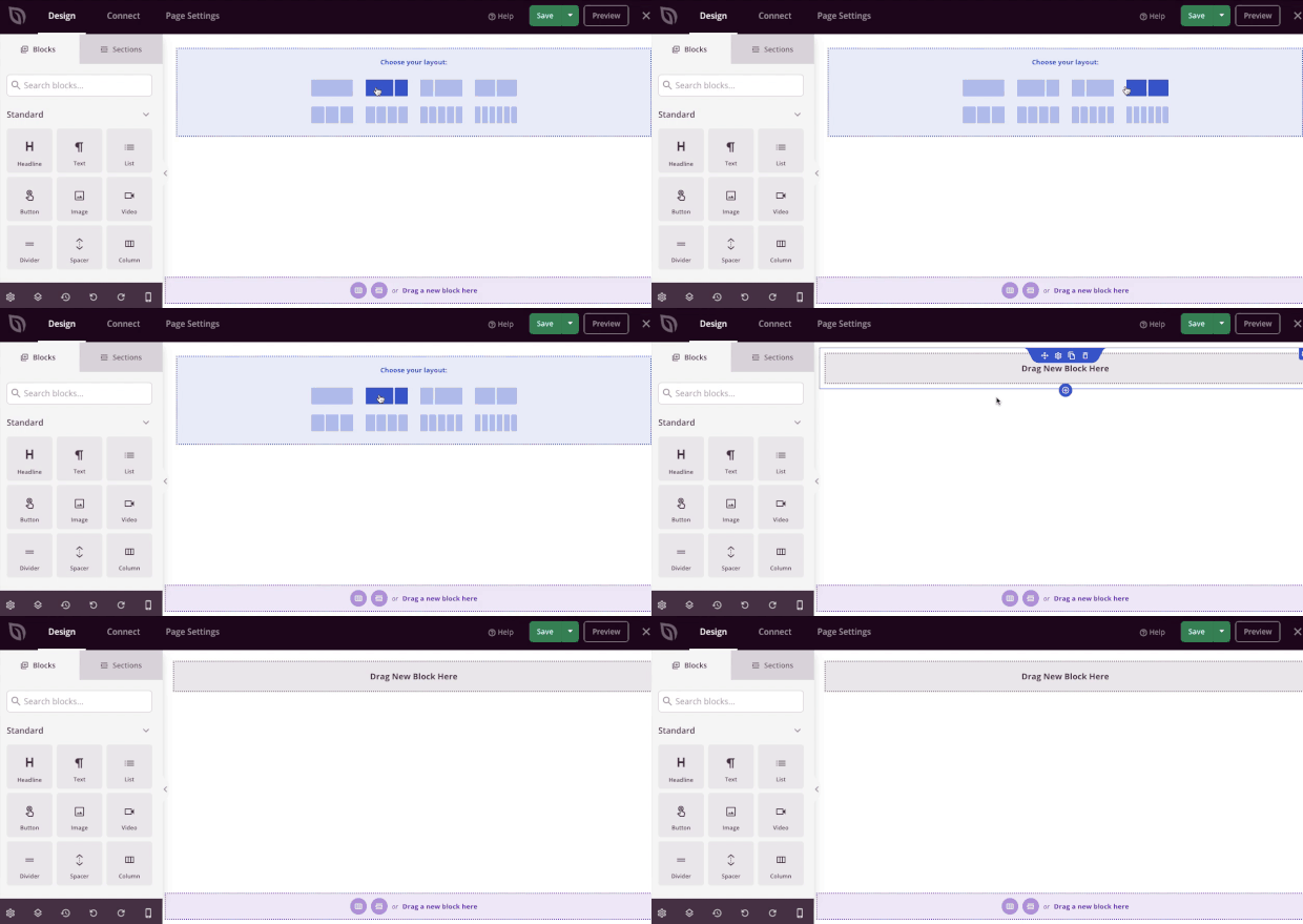
Now locate the Shortcode block from your editing menu on the left, and drag it into the center column of your product page:
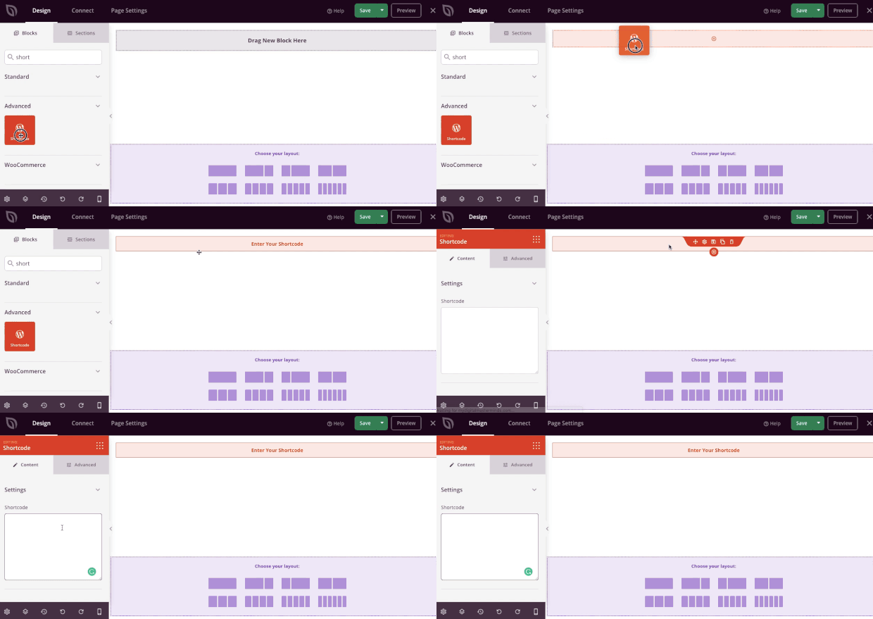
You can insert WooCommerce’s shortcode in the left-hand side editor to add your product to the page:
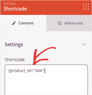
For a single product, you can use the following shortcode: [product id=”ID#”]
You can find your product’s ID# by hovering over the product in your WooCommerce products listing:
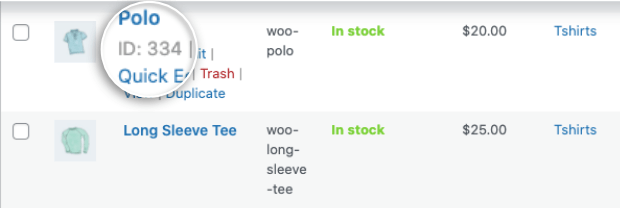
Once you enter the shortcode, you’ll see the product appear on a live preview of the page:
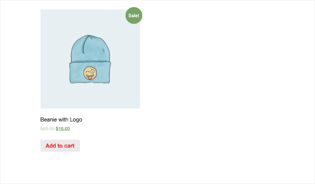
But as you can see, this isn’t the most exciting of pages. That’s why we’ll want to use SeedProd’s out-of-the-box features to edit the page.
With SeedProd, you can add:
- Images
- Headings
- Text descriptions
- Calls to action
- Videos
- Dividers
- Spacers
- And more…
Again, all of these features can be added in seconds with SeedProd’s drag and drop editor.
Plus, you’ll have full control over your page’s color, font family, text size, and other aesthetic elements that make your page stand out.
Here’s an example of the demo page we created in just 5 minutes:
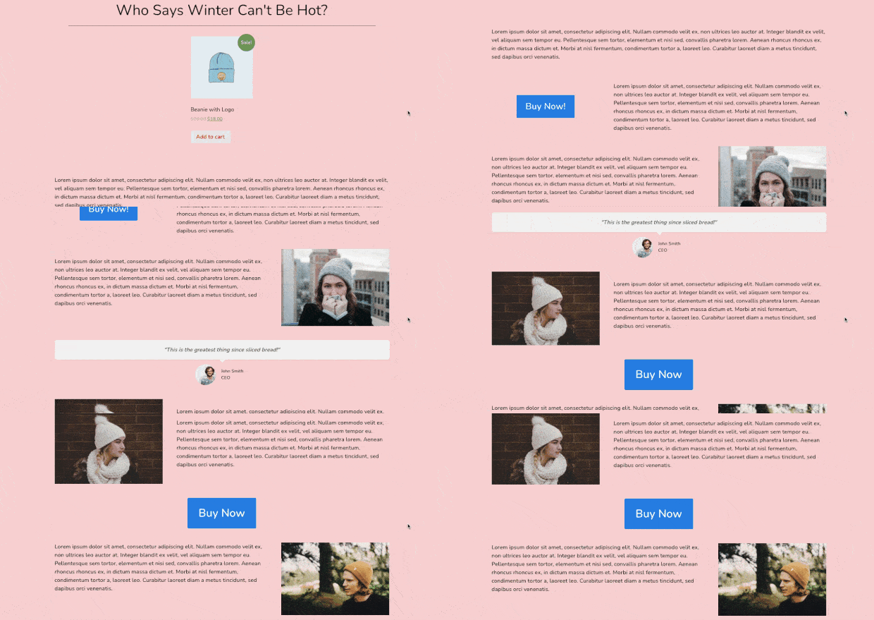
By using SeedProd, we were able to add new images of the product, a few more call-to-action (CTA) buttons, and social proof in the form of a testimonial.
Plus, we had 100% control over the page’s colors, fonts, spacing, and more.
To learn more about how to use SeedProd to build the perfect landing page for your WooCommerce product, check out this helpful resource: How to Create a Simple Landing Page in WordPress (+ 3 Examples).
But now, let’s turn our attention to one last aspect of this WooCommerce product page to make it extra powerful.
Step 4) Add SeedProd’s Custom WooCommerce Blocks
On your left-hand side menu of your SeedProd editor, scroll down until you find the WooCommerce section:
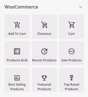
This gives you TONS of features to add to your custom WooCommerce product page. You can include:
- Add to cart buttons
- Go to cart
- Products grids
- Recent products
- And more…
Let’s see how easy it would be, for example, to add Sale Products to the bottom of our WooCommerce landing page.
Simply find the Sale Products block and drag and drop it where you’d like on your page:
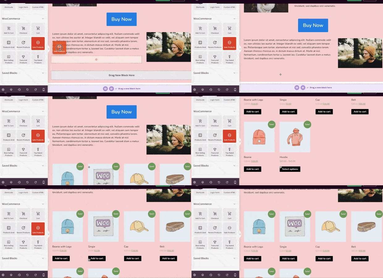
Now all of the items that are on sale in your WooCommerce store will be shown on your custom product page.
And adding the other advanced WooCommerce features to your product page is just as easy.
This has been a basic example of how you can modify your WooCommerce product pages. But hopefully, you’ve seen the customization options are limitless.
With SeedProd, anyone can build the perfect product pages for their WooCommerce store in just a few minutes.
Want to see it in action for yourself? Try out SeedProd today!
Best Practices for WooCommerce Customization
When customizing your WooCommerce product pages, always prioritize usability and performance. Follow these best practices to ensure your customizations benefit both your customers and your bottom line.
1. Focus User Experience
Make your pages visually appealing and easy to navigate. Avoid cluttering the layout with too many elements. Ensure that key information—like price, product description, and call-to-action buttons—is prominently displayed.
Tip: Test your product pages with friends or colleagues who aren’t familiar with your site to identify usability issues.
2. Mobile Optimization and Speed Considerations
More shoppers are using mobile devices to make purchases. Ensure your product pages are responsive and load quickly.
How to Optimize for Mobile:
- Use smaller, compressed images. I use Tinify to compress .png and .jpeg images in just a few seconds.
- Test your pages on multiple devices.
- Avoid overly complex layouts that don’t translate well to smaller screens.
Example: If your store sells clothing, make sure size guides and swatches are easy to use on smartphones.
3. Maintain SEO-Friendliness
Optimizing your product pages for search engines can help you rank higher and attract more customers.
SEO Tips:
- Write unique meta descriptions for each product.
- Use alt text for all images.
- Incorporate keywords like “customize WooCommerce product page” naturally in headings and descriptions.
4. Back Up Before Making Changes
Customizations can occasionally break your site, especially when dealing with code. Always back up your store before implementing changes.
Recommended Tool: Duplicator offers automated scheduled backups, a disaster recovery URL, and much more. With Duplicator, you can quickly restore your site if something goes wrong.
5. Avoid Overuse of Plugins for Performance
While plugins add functionality, too many can slow down your site. Only install plugins that are essential for your goals, and regularly audit them to ensure they’re still necessary.
How to Convert More Visitors Into Customers
Using the methods above, you can create great-looking and easy-to-use product pages for your WooCommerce store. Next, it’s time to focus on convincing your visitors to make a purchase. Here are some of my top suggestions for winning sales in your online store.
1) Create an Exit-Intent® Popup
It’s commonly known that many people who leave your website won’t come back.
And since most people don’t make a purchase on their first visit to any online store, that means you’re leaving tons of lost sales on the table.
To fix that, one of the best strategies is using an exit-intent popup from OptinMonster:
OptinMonster is hands down the best premium plugin for WordPress. It lets you build professional optin campaigns (like popups, floating bars, fullscreen welcome mats, and more) in a matter of minutes.
The campaigns can be used to accomplish any of your marketing objectives, such as increasing:
- Newsletter signups
- Webinar registration
- Survey respondents
- Testimonials and reviews
- Sales
Or any other marketing goals you want to reach.
But how does this help personalize your WooCommerce product page?
You can add an exit-intent popup to capture your audience’s attention as they’re trying to leave your website.
For this, there are 2 things you can do:
- Reduce cart abandonment by reminding customers they still have items in their cart
- Capture your visitor’s email to remain in contact with them
In the first scenario, you can create an exit-intent popup and add the WooCommerce shortcode [woocommerce_cart] directly to your popup.
This will show users the WooCommerce products they have in their cart and let them easily check out.
Here’s the fullscreen popup we built in less than 10 minutes to accomplish just that:
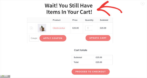
As users leave your website, this fullscreen campaign would appear to remind customers not to leave before checkout.
Then they can apply a coupon, update their cart, or proceed to checkout directly from your OptinMonster campaign.
This will boost overall sales for your WooCommerce product pages.
But you can also create an exit-intent popup designed to capture your audience’s email address.
Then you can use email marketing best practices to nurture the relationship until that new lead becomes a loyal (and paying) customer.
To create this kind of popup, you can use any of OptinMonster’s 700+ premade templates:
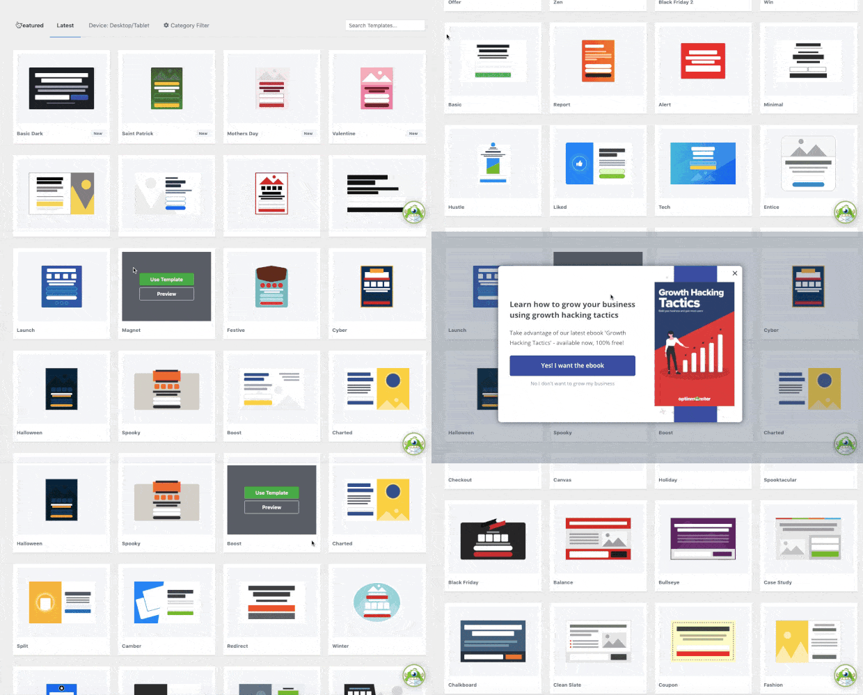
These templates save you hours of time, energy, and headaches as you find the right campaign for your target audience.
From there, you can create highly effective email capture campaigns like this one:

The best part is that you can sync OptinMonster campaigns with your email service provider (ESP) so your new leads go into an automated email series.
But now, you may be wondering, “Exit-intent popups sound good, but do they actually work?”
If you’re not totally sure, just check out this article on how Fastrack uses exit-intent popups to recover 53% of their visitors.
By adding an exit-intent popup to your WooCommerce product page, you increase overall conversions and sales for your online store.
BONUS: Done-For-You Campaign Setup ($297 value)
Our conversion experts will design 1 free campaign for you to get maximum results – absolutely FREE!
2) Build a Popup for WooCommerce-Specific Actions
While exit-intent popups are incredibly effective, OptinMonster gives you another way to personalize your product pages:
By adding WooCommerce-specific triggers to show your campaign.
OptinMonster comes with advanced targeting rules built for WooCommerce. These let you display an OptinMonster campaign when someone:
- Adds a product to their cart
- View a specific product page
- Look at a product category
- Reach a pre-determined cart total in your store
- Add a specific number of items to their cart
- And much more…
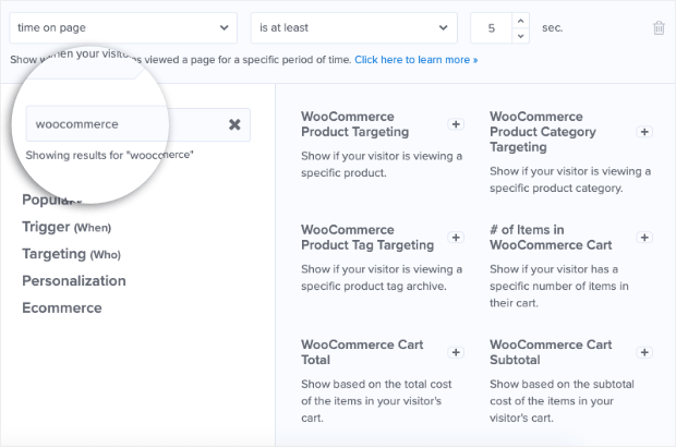
With these advanced targeting rules, you can create popups, floating bars, and more that appear when people interact with your WooCommerce store.
Imagine, for example, that someone is looking at the WooCommerce product page you built from this tutorial. And let’s say you’re selling high-end designer jeans.
But you’d also like your customer to add a luxury watch to the order.
When your visitors place a pair of jeans in their cart, it triggers the following campaign:

This is great because it accomplishes the same goals we saw earlier:
- You’ll capture your visitor’s email so you can reach them with reminders if they don’t complete checkout
- You’re more likely to increase the overall cart total from your WooCommerce store
In the end, both of these factors help grow your business and drive more revenue.
With OptinMonster’s advanced WooCommerce targeting rules, you can create sales and promotions that are as powerful as they are easy to set up.
Try out OptinMonster 100% risk-free today!
3) Add Live Sales Notifications to Boost Trust
We already mentioned how most people don’t make a purchase the first time they visit an online store.
This is especially true if your website doesn’t instantly look credible. To help with that, you should consider adding live sales notifications.
These are small messages that appear across your site or on pre-determined pages. They show your site’s visitors when other people have made a purchase.
Here’s an example of what live sales notifications look like:

These notifications leverage the power of FOMO (“fear of missing out”). This is something that affects nearly all online consumers.
The basic idea is this: people hate missing out on benefits they see others enjoying.
So when your visitor sees a notification that people are actively making a purchase, they’ll be more likely to do the same.
But how do you create these notifications if you aren’t a coder? For that, there’s no better tool than TrustPulse:

TrustPulse is the best social proof plugin for WordPress and can have a powerful impact on your WooCommerce product pages.
That’s because TrustPulse lets you add live social proof notifications to your site in a matter of minutes–even if you don’t have any technical skills to start with.
Everything about your TrustPulse notifications can be designed with drop-down menus, simple text field inputs, or choosing colors from a color wheel.
That makes the learning curve incredibly low.
To see just how easy it is, check out this helpful tutorial: How to Add a Live Sales Notification to WooCommerce to Increase Sales.
Not sure if live sales notifications will work for your store? TrustPulse users have seen an instant boost in sales by up to 15%.
That’s a big impact for such a small change.
Plus, TrustPulse is a fraction of the cost when compared with its closest competitors.
You can learn more about how TrustPulse stacks up to the competition by reading this post: FOMO vs UseProof vs TrustPulse: Which Is Best for Social Proof?
Or feel free to dive in and see the results for yourself by trying out TrustPulse 100% risk-free today!
Grow Your Business with Customized WooCommerce Product Pages
When you customize the product pages in your WooCommerce store, you can create a better user experience that leads to more sales. If you want the very easiest way to build fully customized pages, I recommend using SeedProd.
To reduce cart abandonment and grow your email marketing list, OptinMonster will help you turn more visitors into customers with Exit-Intent® popups and other onsite campaigns.
We hope you enjoyed this post. If you did, you should definitely check out the following:
- 26 Best WooCommerce Plugins to Increase Sales
- WooCommerce SEO: Your Ultimate Guide to Ranking #1
- How to Add a WooCommerce Announcement Bar (the Easy Way)
These resources will help you improve engagement and sales with your WooCommerce product pages.





Add a Comment