Do you want to boost sales with product recommendations, but not sure the best way to go about it?
Today, we’re going to teach you step-by-step how to set up a product recommendation popup with OptinMonster. That way, you can maximize your profits and see an immediate increase in sales conversions.
All while improving your customers’ shopping experience.
But before we get to the tutorial, let’s talk about what product recommendation popups are and why they’re so powerful.
What Are Product Recommendation Popups?
Product recommendation popups are campaigns that automatically display a product suggestion while users are looking at related content on your eCommerce site. They work by showing items in your product line that would complement whatever product your customer is currently considering.
Imagine you were looking for a new pair of jeans on your favorite fashion retail site. You found the perfect pair, read the reviews, and you’re ready to add that product to your cart.
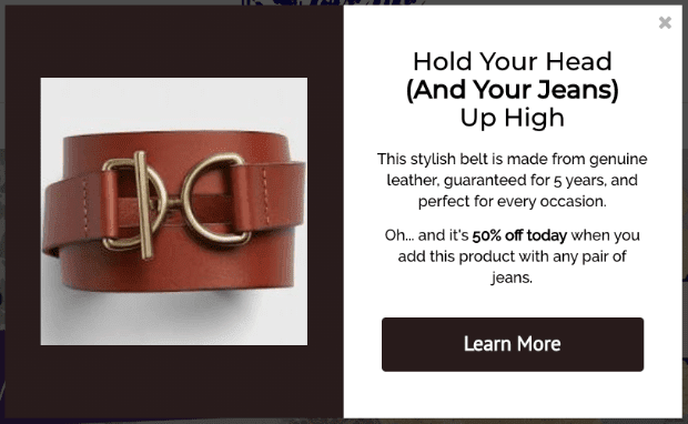
Then you see a popup with a related item, such as a belt:
NoteThe image above is the product recommendation popup we’ll be building today!
Up to this point, you didn’t even think about needing a belt for your new jeans. But now that you’ve seen the popup, you realize that a belt wouldn’t be such a bad idea after all. So you end up putting both in your shopping cart.
These popup suggestions can be very powerful.
In fact, the right product suggestion can generate an increase of 10–30% in revenue! With that in mind, let’s get to how you can make a product recommendation popup to get your customers to add more items to their cart.
Creating a Product Recommendation Popup
For this tutorial, we’ll be using OptinMonster to build the product recommendation popup campaign. Don’t have OptinMonster? Not a problem.
Get started today risk-free to start driving traffic, boosting conversions, and increasing sales. Once you’ve signed up, you’ll be all set to start making your product recommendations.
Are you more of a visual learner? If so, feel free to check out this helpful video tutorial:
Otherwise, feel free to keep reading our in-depth guide to creating a product recommendation popup. The following tutorial can be used for any eCommerce platform you have for your online store.
Let’s dive in!
Step 1: Create Your Campaign
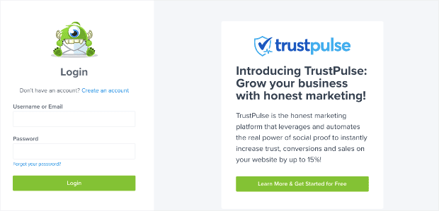
First, log into your OptinMonster account:
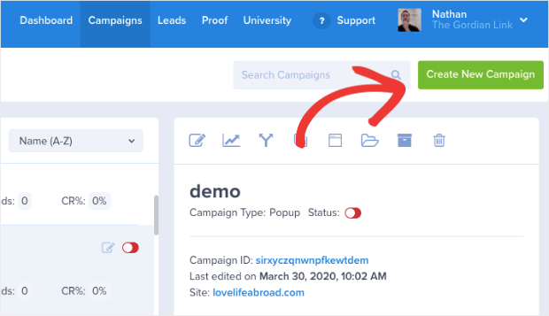
In your dashboard, go to the upper right-hand corner and click Create New Campaign:
Now it’s time to select your campaign type. For today’s tutorial, we’ll choose Popup:
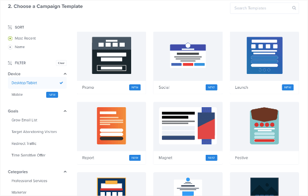
Then you need to select a template for your campaign:
At OptinMonster, we have over 50 pre-built templates that work across all devices, so you never have to worry about your campaign looking anything less than stellar.
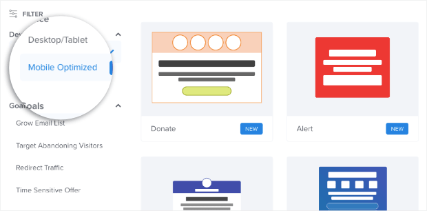
But depending on where your traffic is coming from, you may want to design your product recommendation to take a mobile-first design. If so, you can always filter your campaign templates on the left-hand side to save you time:
For today, though, we’ll simply choose Desktop/Tablet, though rest assured that these campaigns also perform well (and look great) on the majority of mobile devices.
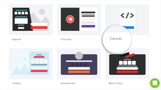
If you want a template that’s 100% custom, you can always build one from scratch with our Canvas template:
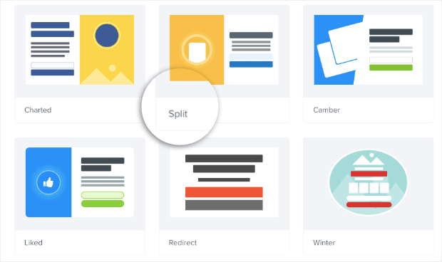
We’ll go another route in this tutorial, though, and select the Split template:
This is a good option for your product recommendation popup because it’s pre-designed with 2 columns. That means you can feature an image of your product on the left side, and give more information about your product’s features on the right.
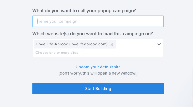
Now name your campaign, assign it to your website, and click Start Building:
Step 2: Customize Your Campaign
In this tutorial, we won’t be getting into too much detail regarding all the ways you can customize your product recommendation popup campaign.
Frankly, there are just too many customization options to cover.
If you’ve never created an OptinMonster campaign before, no worries. Just check out this helpful resource on how to design your first campaign.
But rest assured that editing your recommendation popup couldn’t be easier. To change any element of your campaign, simply click on it in your editor, and your editing tools will appear on the left-hand side.
Today, you’ll need to make a minimum of 3 changes:
- Adding an image of your product
- Changing the text of your campaign for your product description
- Inserting a button to redirect customers to your product page
Let’s briefly look at how to do each of those things.
Adding an Image of Your Product
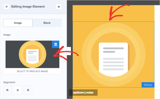
With the template we’re using, you’ll want to delete the image on the left-hand side of your campaign to create a space for your product image. You can do that by clicking the image and pulling up the editing menu on the left of your editor:
Then click the trashcan icon in the top right-hand corner of the image box in your editing tools:
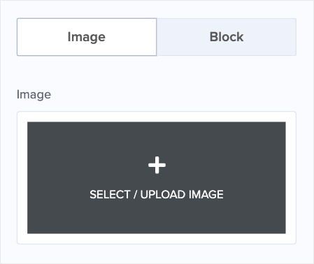
Now you can click the image box to select or upload a new image for your product suggest campaign:
Related ContentNeed some help with your visual content? Check out this post that includes 15 visual content creation tips you can start using now.
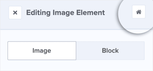
You’ll likely want to change the color of your image background to match your brand’s style. To do so, click on the Home icon at the top of your left-hand side menu:
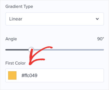
Then click Optin Settings » Optin View Styles to get to your campaign’s basic design features. Here, you can scroll down until you find First Color:
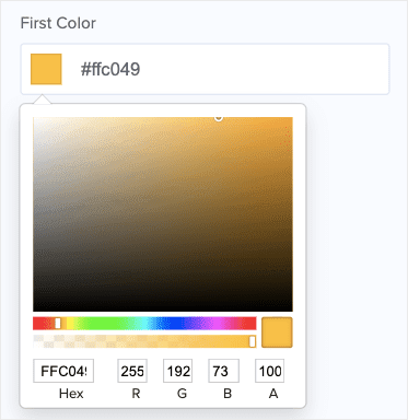
You can easily change this to your brand’s color, choose another option from the color wheel, or leave the background color white:
Changing the Text of Your Campaign for Your Product Design
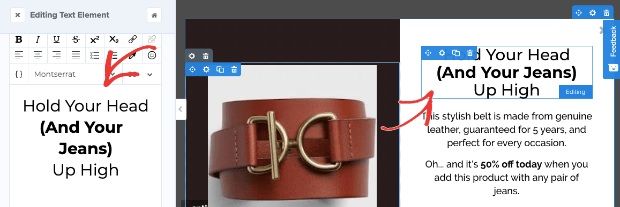
Now you’ll want to modify the text. To do so, simply click on the text block in the editor. That will pull up the editing tools on the left-hand side:
You can change the text to grab your reader’s attention. Try to make your headline something engaging to really draw your customers in. Then use the sub-text to talk about your product’s features and benefits.
Inserting a Button to Redirect Customers to Your Product Page
You’ll notice that in the template we chose, there’s an optin form that you need to remove. Simply locate and click the trashcan icon for the optin form’s element block (as you did earlier):
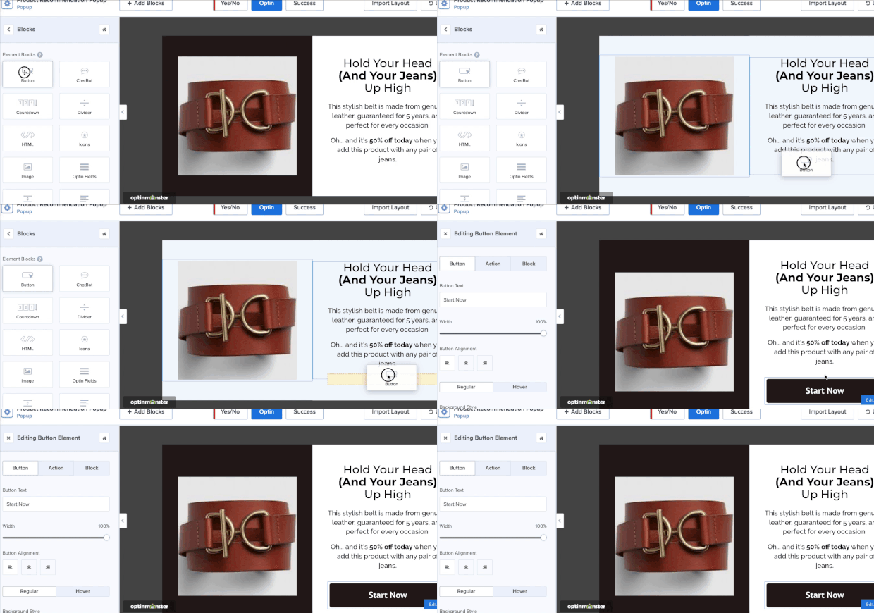
Then go back to + Add Block:
Scroll down and find the Button block. Drag and drop that into place:
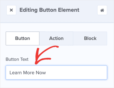
Now you need to change your button’s text and action. Click on the button element, and in the left-hand side menu, you can instantly change your button’s text:
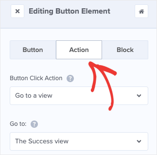
Then click on Action in your editing menu:
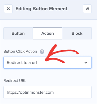
For Button Click Action, use the drop-down menu to change the settings from Go to a view to Redirect to a URL:
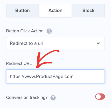
Then insert the URL of your recommended product page:
Pro Tip: We highly recommend activating Conversion Tracking to get more accurate data on your campaign’s performance. You can do that by clicking the Conversion Tracking toggle:
From here, you’re ready to set your display rules to make sure you’re showing your product suggestions at the right time of your customers’ journey.
Step 3: Display Your Product Recommendations
Once you have your campaign designed the way you like, it’s time to set up some display rules. That way, you can optimize your conversions by making sure you show your product suggestions when they’ll be most effective.
Though you can set any kind of display and trigger settings you’d like, today we’ll show you one of the simplest methods for product suggestions.
More specifically, we’ll show you how to match your product recommendation popup campaign with related product pages on your site.
That way, when users are browsing a product they’re interested in, you can show them another similar product to maximize your sales.
Here’s how you do that.
At the top of your editor, click Display Rules:
By default, your current condition is Time on page is at least 5 seconds. We’ll leave the first 2 fields as they are (time on page is at least) but extend the time to 10 seconds:
This gives users enough time to browse a product page before showing them another offer, but not so much time that they’ll leave before seeing your product suggestion.
NoteKeep in mind that this tutorial covers a popular use case for displaying product recommendations. You can easily change these display rules to fit your specific eCommerce strategy.
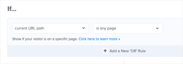
Then go to your second condition, current URL path is any page:
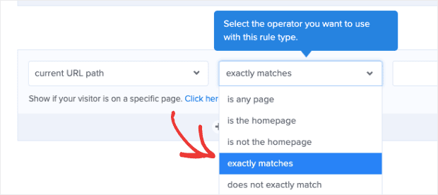
Change the second field from is any page to exactly matches:
And insert the link to the product page that you want your campaign to display on:
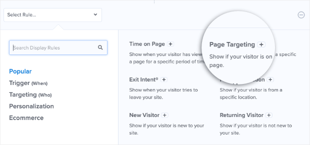
If you want to make the same product suggestion across multiple pages, you can add other URLs by clicking the Add a New ‘OR’ Rule:
Then select Page Targeting from your drop-down options:
And repeat the rule you previously created but with your new product page link. You can add as many URLs as you would like for your product recommendation campaign.
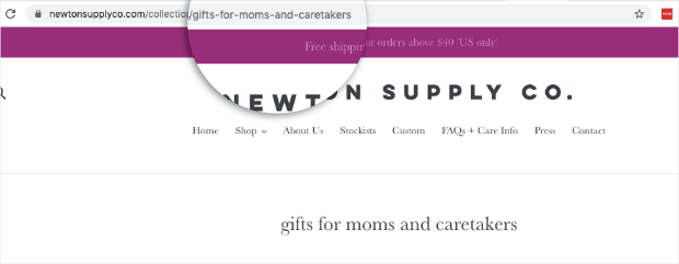
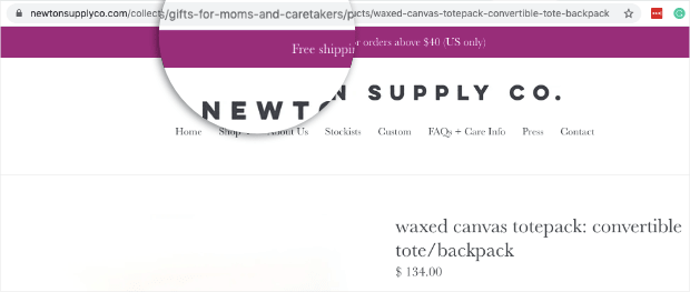
In some cases, you may want to attach the same product recommendation to an entire category of your eCommerce site. For instance, the Shopify store Newton Supply Co. has an entire category page for “gifts for mom + caretakers:”
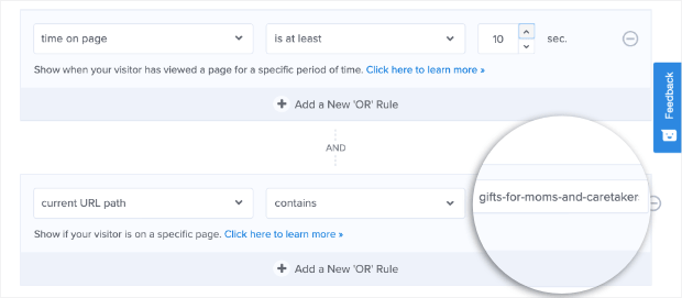
So every product they have in this category contains the same unique term “gifts-for-moms-and-caretakers” in the URL:
They could add a product suggestion by changing their display rule from current URL exactly matches to current URL contains and inserting their unique term for their product line’s URL:
Now anytime someone visited this category of their website, they would see the product recommendation popup.
And that’s it! Well, almost…
…don’t forget to Save and Publish your campaign.
Remember that, today, we simply covered one of the most common product recommendation techniques. By the end, we made this example in under 10 minutes:
You can customize your campaign with updated texts, adding your brand’s colors, including social proof, and more. You can also change the display rules depending on your product, audience, and eCommerce goals.
Nonetheless, we hope that you found this tutorial helpful. If so, feel free to pass it along to a friend.
Got any tips for displaying recommended products on your eCommerce store?
Let us know on Facebook, Twitter, or in the comments section below. We love hearing from our readers. Or, if you want new ways to boost conversions rates and sales, head over to our YouTube channel. We’ve got loads of helpful tutorials there.
Ready to put the theory away and take some action for your business?
Sign up for OptinMonster today to make more profit in less time! You can try it out risk-free with our money-back guarantee!











Add a Comment