So often we hear we should freely give away as much value in our content as possible, and that’s true. But what if you don’t have time to create new, valuable content just to give away? What do you do then?
In this case study, we’ll show you how Whole Whale increased conversions 100% simply by withholding the most valuable portions of existing content for subscribers only using OptinMonster’s content locking feature.
Meet Whole Whale
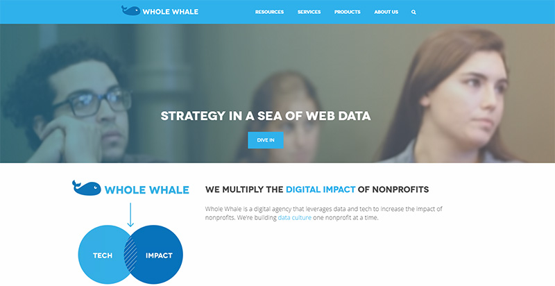
Whole Whale is a digital agency that leverages data and technology to increase the impact of nonprofits. They teach nonprofits through articles, videos, podcasts, events, and educational emails.
Their initial goal was to grow their email list so they could reach more nonprofit professionals, and increase the number of learning engagements.
Adding Subscribers Using Page Level Targeting
Whole Whale strategically places lightbox popups throughout the site with offers specific to the content the reader is viewing. They always trigger the optin with our exit-intent technology which displays a popup when the reader moves their mouse towards the browser, signaling their intent to leave.
They take advantage of our page-level targeting to match their messaging to specific user’s behaviors. For example, someone visiting their Jobs page likely has a different goal than someone visiting their events page. And someone referred to the site from LinkedIn may have a different motivation than someone referred by Pinterest. The key to high conversions is to understand your visitors and tailor your offer just to them.
Here are just a few examples of how you can target readers based on their behaviors:
- Visitors browsing specific pages
- Visitor has interacted with a campaign
- Visitors who are new vs. returning
- Visitors from a specific traffic source (Referrer Detection)
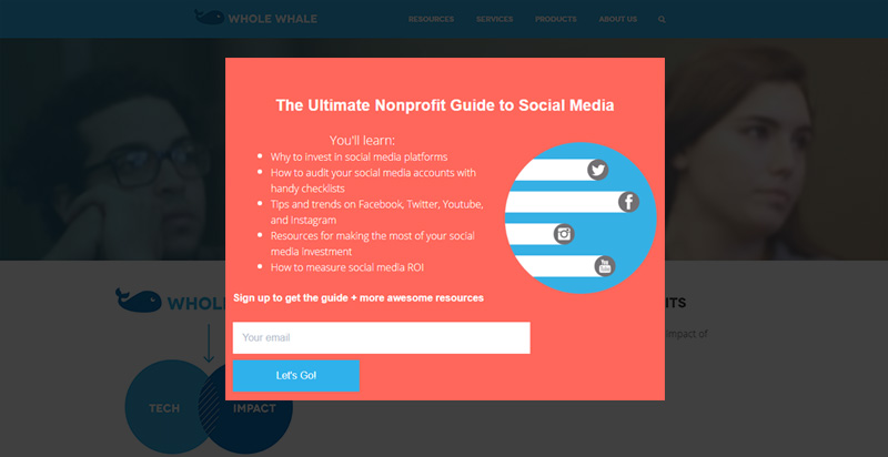
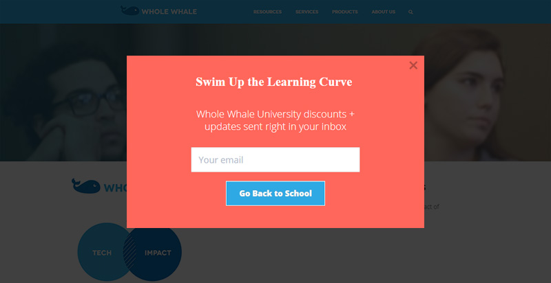
The exit-intent optin below shows only to visitors who were referred via Facebook or Twitter. For the non-profit already active on those networks, this lead magnet would be useful.
The optin above converts 3.05% of readers.
Improving List Quality Using Double Optins
The team at Whole Whale recommends using double-optin process for email marketing offers.
You might be curious about how the double optin differs from a single optin. A person who has subscribed to your list has given you permission to email them. The double opt-in is a two step version of that process. In step one, a potential subscriber fills out your optin. In step two, they’ll click a confirmation link in a follow-up email to confirm they really want to join your list.
It might seem counter intuitive to add yet another step to the subscription process. The opposite is true. While you may end up with a slightly smaller list, the list itself will be better quality. It also ensures fewer unsubscribes and bounced emails.
Increasing Conversions 62% Using Split-Testing
Whole Whale also recommends split-testing your optins. Split testing allows you to test one version of an optin against another to see which one performs better.
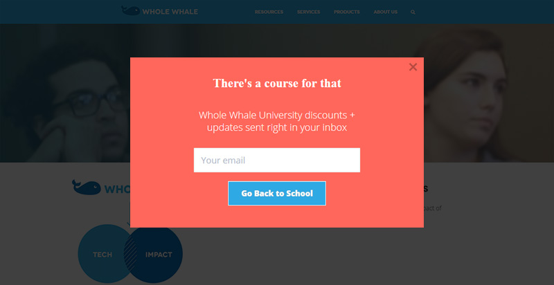
Below are two examples of a split test on the Whole Whale website. This optin converts 5.26% of readers:
The variation below, with a slightly different headline, converts nearly 8.47% of readers. That’s a huge 62% increase over the original optin.
Split testing provides valuable data about what messaging works, which can later be used in emails, on your website, and in social media posts.
Exploding the List 100% Using Content Locking
The targeted lightbox optins helped to add subscribers to the Whole Whale email list, but the one thing they did next changed the game for them.
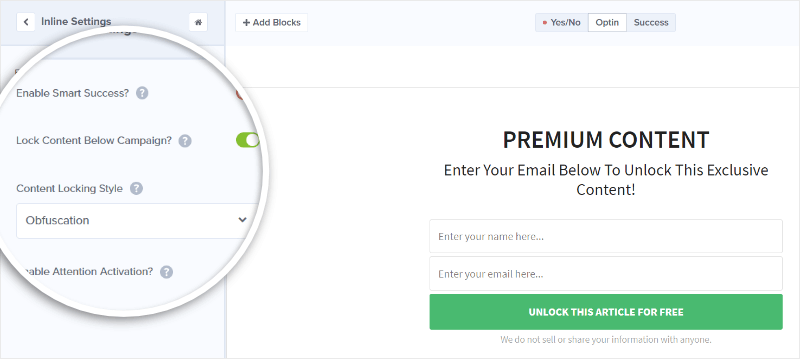
Whole Whale identified the most visited pages on their website. Then they added inline optins to the content of those pages with Content Locking activated.
Content Locking allows you to make portions of your content accessible to subscribers only. If a reader is already a subscriber, they will see the full blog post. If they’re not, they’ll see a blurred version of the protected content until they subscribe.
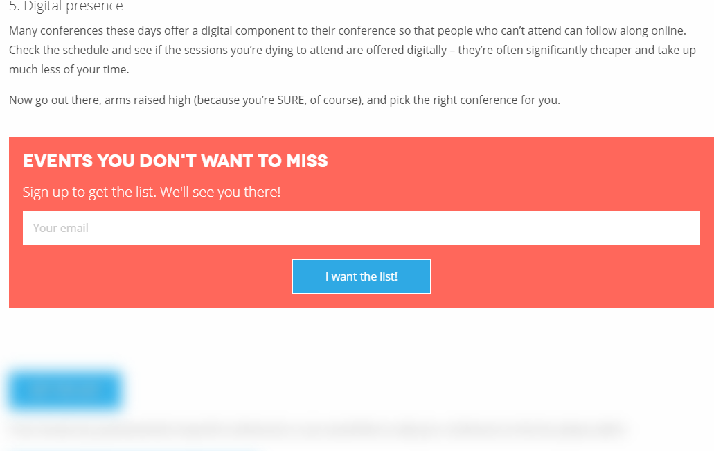
Here’s an example of what content locking looks like in action on the Whole Whale website. Whole Whale offers readers a list of 65 non-profit conferences, protected by a Content Locking optin. Readers must subscribe in order to reveal the list of conferences.
This optin converts at 21.42%.
By offering a clear and tangible incentive for signing up for their email list, they are able to turn their most visited pages into email capture pages.
They didn’t even need to create new lead magnet to use this method. They simply inserted the content locking optin prior to the most valuable portions of existing content.
Results
Whole Whale was able to easily reach their goal of growing their email list, without having to invest time and budget into creating new content.
- Whole Whale doubled their average monthly signups from 80 to 160.
- Whole Whale converts 21.42% of targeted readers into email subscribers with Content Locking.
- Whole Whale saved time and money on content creation by using existing resources.
When asked about their experience using OptinMonster, Whole Whale had this to say,
“It is so easy to set up and track an A/B test with OptinMonster. Plus, the integrations with MailChimp and Google Analytics are easy to setup and use. We use a similar approach using OptinMonster with their nonprofit clients.”
Are you ready to add hundreds to your list without creating endless new lead magnets? Get started using OptinMonster today.


